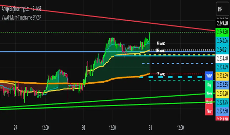
Smart Money vs Retail (COT Flow) 0213Smart Money vs Retail (COT Flow) 0213
Smart Money vs Retail (COT Flow) 0213
Smart Money vs Retail (COT Flow) 0213
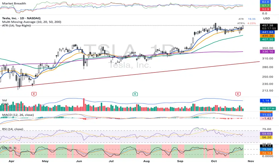
Indicateurs d'étendue
Trend Break + MSB + Fibo Zone [v1.0] dnmSure! Here’s the English translation of your text:
---
Swings are determined based on the HH/LL structure.
If the candle close breaks the swing level, the MSB (Market Structure Break) is confirmed.
After the MSB, the last swing high/low is used to calculate the Fibonacci 0.5 and 0.618 levels.
On the chart, the 0.5–0.618 range is displayed as a colored box.
A green box appears for a bullish break, and a red box appears for a bearish break.

Market Breadth & Forward ReturnsThis indicator shows how future index performance has historically behaved after different levels of market breadth. The heatmap reveals which breadth zones have tended to precede better or worse forward returns. This is strictly a statistical conditional-expectation map, not a set of signals.
Scope
This is not meant for any arbitrary asset.
It is meant for broad indices only (S&P 500, Nasdaq 100, Dow, Russell, major sector families).
The breadth data is derived from index-level market universes.
Do not apply this on single stocks, crypto or FX. The method only makes sense with large diversified universes.
Core method
Daily breadth is normalized 0 to 100.
For each bar, six forward horizons are evaluated on the index: performance after X days.
Each observation is placed into a breadth bin.
Each bin/horizon pair has mean, variance and count computed.
Each bin/horizon mean is t-tested against zero.
Benjamini-Hochberg False Discovery Rate weighting allocates weight only to horizons where evidence exists.
Weighted horizon means are aggregated and annualized (252 trading days).
The map displays annualized conditional forward returns per breadth bin.
Why this is robust
Non-repainting. Breadth is in the past, returns are strictly future, lookahead_off.
Multiple horizons avoid single-window biases.
Variance, t-tests and FDR correction drastically reduce false positives.
Bins with poor sample size are visually suppressed to avoid over-interpretation.
How to use
Daily timeframe only.
Select the correct index family (S&P 500, Nasdaq 100, Russell…).
Bin size 5 to 10 points is a realistic range.
Min occurrences per bin ≥ 5 recommended.
FDR alpha 0.05 to 0.10 is a good working envelope.
Interpret as conditional expectations, not a forecast guarantee.
Notes
Do not use on random assets.
Do not extrapolate outside the chosen index family.
Always keep symbol and timeframe visible when publishing.
Indicator by Julien Eche

Market Trend statusBullTrading Free Indicator Series
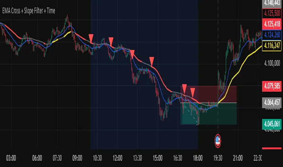
What is the Trend State Machine?
A “trend state machine” that fuses DMI (+DI/−DI) with ADX strength. It avoids bells and whistles and answers three things with minimal rules:
1. Whether the market is range-bound (chop) or trending;
2. If trending, whether it is bullish (long) or bearish (short);
3. The trend intensity tier (Strong / Extreme / Decaying) plus a 0–100 strength score.
1-Minute Quick Start (beginners can stop here)
1. Timeframe – pick your trading anchor first
• Crypto: 5–15m
• Gold: 5m or 15m
• FX: 15–30m
2. Mode – top of the panel: set Mode = Simple.
3. Sensitivity – set Sensitivity (1 conservative – 5 aggressive). Recommended:
• Crypto: 3 (use 4 in high volatility)
• Gold: 2–3
• FX: 2–3
• Indices: 2
4. Read the card (top-right)
• Environment: Range/Invalid, Bull Trend (Watch), Bull Trend (Confirmed) (bearish equivalents apply)
• Add-ons: | Strong, | Extreme, | Decay
• Also shows ADX, Enter/Exit thresholds, ΔDI, and Score.
5. Background & lines
• Green/Red background = in trend; deeper shade = stronger.
• Orange thick line = ADX, Green = +DI, Red = −DI; shaded band between lines is the enter/exit zone.
6. Minimal execution rules
• Trade with the trend only: consider entries only when Environment = Confirmed and direction is bull/bear.
• Prioritize strength: when Strong Trend triggers or Score > 70, prefer trend-following adds / enable trailing take-profit.
• Exit: when Exit/Flip alert fires, or after Decay if ADX falls back below the enter threshold, reduce/close.
Note: In Simple mode, built-in hysteresis (Enter > Exit) cuts whipsaws significantly—no need to hand-tune thresholds.
How to Use Alerts
• Three built-in fixed alerts:
1. Trend Confirmed (Bull/Bear) — entry/add trigger
2. Strong Trend — momentum reinforcement (chase/add or tighten trailing TP)
3. Exit or Flip — scale-out/close/observe the other side
• Want dynamic messages with numbers? Check “Enable dynamic alerts (alert())” and, when creating the alert, choose Any alert() function call.
Parameter Guidance (rules of thumb)
• Sensitivity: Higher = earlier entries but more false signals; lower = later confirmation but steadier.
• Timeframe: The smaller the timeframe, the lower the sensitivity you usually need; on higher timeframes you may nudge it up.
• Combos:
• Crypto: 5m/15m + Sens 3 (4 in heavy vol)
• Gold: 5m/15m + Sens 2–3
• FX: 15m/30m + Sens 2–3
• Indices: 15m/30m + Sens 2
Pro Mode Highlights (optional)
• Threshold Mode: switch from Fixed (default) to Percentile Adaptive for better robustness across regimes/markets.
• ΔDI / Slope / Hold / Cool-down:
• ΔDI min separation filters weak price/volume divergences.
• ADX slope > threshold on entry rejects “breakouts without growing strength”.
• Min hold bars confirms before output to reduce whipsaws.
• Cool-down bars prevent immediate re-entry after exit/flip.
• MTF Aggregation: enable MTF, default 3× current timeframe, HTF weight 0.3–0.5.
• Turn on Require HTF not opposite & HTF_ADX ≥ exit threshold to effectively filter higher-TF noise.
Reading Cheat Sheet (what you see = what it means)
• Environment: Range/Invalid → Stand down; avoid counter-trend.
• Trend (Watch) → Just entered the zone; wait for Confirmed or buy the pullback with small size.
• Trend (Confirmed) → Trend-following allowed; use Score and Strong/Decay to size/manage.
• Strong Trend → Consider chasing/relaxing TP; momentum is increasing.
• Extreme → Overheated; be cautious chasing—favor trailing to lock gains.
• Decay → Momentum bending down; prepare to trim or tighten stops.
Common Pitfalls & Fixes
• Whipsaws in ranges → Lower sensitivity or move up a timeframe; in Pro mode, enable Slope filter.
• Confirmation too late → During Trend (Watch), try a probe with smaller size; add on confirmation.
• Cross-asset differences → Use Percentile thresholds and MTF weight, or adjust via market presets (Gold/FX/Index).
• Single-signal bias → Always combine Environment + Score + Strong/Decay to avoid tunnel vision.
⸻
Disclaimer: This tool is for educational and research purposes only and does not constitute investment advice or a promise of profit. Trading involves risk; you are solely responsible for your gains and losses.
BullTrading免费指标系列
趋势状态机 是什么:
一个把 DMI(+DI/-DI) 与 ADX 强度合成的“趋势状态机”。它不追求花哨,而是用最小规则输出三件事:
1. 市场当前是 震荡还是趋势;
2. 如是趋势,是 多还是 空;
3. 趋势的 强弱等级(强趋势/极端/衰减)与一个 0–100 的强度分数。
一分钟上手(新手用这个就够)
1. 时间周期:先选你交易的主周期(例:加密 5–15m;黄金 5m 或 15m;外汇 15–30m)。
2. 模式:面板最上方“模式”= 简单。
3. 敏感度:设“敏感度(1保守–5激进)”。推荐:
• Crypto:3(波动大可 4)
• Gold:2–3
• FX:2–3
• 指数/股指:2
4. 读卡片(右上角)
• 环境:震荡/无效、多头趋势(观察)、多头趋势(已确认)(空头同理)
• 附加:|强趋势、|极端、|衰减
• 同时显示 ADX、进入/退出阈值、ΔDI、评分。
5. 底色 & 线
• 绿色/红色底色=处于趋势;颜色越实=越强。
• 橙色粗线=ADX,绿色=+DI,红色=-DI;中间阴影为进入/退出带。
6. 最小执行规则
• 只顺势:环境=已确认 且方向为多/空时才考虑进场。
• 强势优先:出现 强趋势 或评分>70 时,优先做顺势加仓/启动追踪止盈。
• 退出:出现 退出/翻转 告警,或 衰减 后 ADX 再跌回进入阈值下方时,减仓/平仓。
提醒:简单模式下,脚本已内置迟滞(进入>退出),可显著减少抖动;无需再手动校准阈值。
告警怎么用
• 已内置三条固定告警:
1. 趋势已确认(多/空) — 入场/加仓触发器
2. 强趋势 — 趋势强化(可做追击或加速移动止盈)
3. 退出或翻转 — 减仓/止盈/反向观察
• 想带数值的动态文案:勾选“启用动态告警 alert()”,创建告警时选择 Any alert() function call。
参数建议(简易法则)
• 敏感度:更激进(数字大)=更早进场但更易假信号;更保守(数字小)=更迟确认但更稳。
• 时间周期:越小周期越需要降低敏感度;越大周期可略升敏感度。
• 组合:
• Crypto:5m/15m + 敏感度 3(波动大时 4)
• Gold:5m/15m + 敏感度 2–3
• FX:15m/30m + 敏感度 2–3
• 指数:15m/30m + 敏感度 2
专业模式要点(进阶可选)
• 阈值模式:从“固定阈值(默认)”切到“百分位自适应”,在大波动/换市场时更鲁棒。
• ΔDI/斜率/驻留/冷却:
• ΔDI 最小分离度 过滤弱量价背离;
• 进入需 ADX 斜率>阈值 可拒绝“强度不增”的假突破;
• 最小驻留K数 确认后再输出,减少回撤抖动;
• 冷却K数 防止来回打脸。
• MTF 聚合:勾选“启用 MTF”,默认自动 3× 当前周期,HTF 权重 0.3–0.5。
• 要求HTF不反向且HTF_ADX≥退出阈值 打开,能有效剔除逆大级别噪音。
读图速查(你看到=代表什么)
• 环境:震荡/无效 → 暂停;不要逆势开单。
• 趋势(观察) → 刚进入阈值,等待 已确认 或回踩二次确认。
• 趋势(已确认) → 允许顺势;用评分和“强趋势/衰减”微调仓位。
• 强趋势 → 追击或放宽止盈,趋势动能在增强。
• 极端 → 过热区;谨慎追高,更多用移动止盈锁定。
• 衰减 → 动能下弯,准备减仓或收紧止盈。
常见坑 & 对策
• 在震荡箱体频繁进出:降低敏感度或升周期;专业模式勾选“斜率过滤”。
• 确认太慢错过起点:在确认前的“趋势(观察)”阶段,可用更小仓位的试探单,确认后加仓。
• 不同品种差异大:用“百分位”阈值与 MTF 权重;或按市场预设(Gold/FX/Index)微调。
• 只看一个信号:至少同时看 环境状态 + 评分 + 强/衰 三个维度,避免单指标偏差。
本指标仅供教育与研究,不构成投资建议或收益承诺;交易有风险,盈亏自负。

[Leo+] Scepter Algo$ LEO ✞ MONEY MAN® $
100% FREE FOREVER!
⚠️ Disclaimer – Please Read Carefully
Not Investment Advice:
All content shared in this server—including messages, media, discussions, and resources—is intended solely for educational and informational purposes. Nothing provided here constitutes financial, investment, or trading advice.
Personal Responsibility:
You are fully responsible for your own trading and investment decisions. Always conduct your own due diligence and consult with a licensed financial advisor before making financial decisions.
Third-Party Content:
This server is not responsible for any third-party content, links, tools, or resources shared by members. Use of such content is at your own risk.
Educational Purpose:
This is a learning-focused community. All discussions and shared materials are intended to support your personal development—not to replace professional financial guidance.
By joining and participating in this server, you acknowledge and accept that you are solely responsible for any actions or strategies you choose to undertake related to investing or trading.
By continuing to engage with this community, you agree to follow all server rules and accept the terms of service.
Enjoy exploring, testing and mastering these tools, happy trading!

Indicador Técnico Avanzado sbuscamos entradas para poder comprar y vender papeles de una correcta manera

FuTech : Darvas Box (Original Theory) IndicatorFuTech : Darvas Box (Original Theory) Indicator
📈 Introduction
🔹 This indicator implements the legendary Darvas Box theory developed by Nicolas Darvas in the 1950s, which helped him turn $25,000 into $2,000,000 in just 18 months.
🔹 Unlike other box indicators, this implementation strictly follows Darvas' original methodology while adding modern technical features for enhanced usability in today's markets.
===============================================================================
📊 What Makes This Implementation Unique
🔹 This indicator stands apart from other Darvas Box implementations in several key ways:
🔹 It implements the exact "high before low" rule that Darvas used - first identifying the roof (top) of the box, then waiting for the floor (bottom) to form
🔹 It offers two distinct methods for box detection - Swing Confirmation (which waits for price confirmation) and Lookback Period (simpler approach)
🔹 It includes Darvas' critical volume confirmation requirement with customizable parameters
🔹 It incorporates Darvas' focus on strong stocks near their highs through the 52-week high filter
🔹 It provides multi-timeframe capability, allowing application to intraday, daily, weekly, or monthly charts
🔹 It features dynamic box coloring based on breakout direction (green for upward, red for downward)
===============================================================================
🔍 Technical Implementation Details
📦 Box Formation Algorithm
🔹 The indicator constructs boxes using a sophisticated algorithm that follows Darvas' original approach:
🔹 For Swing Confirmation mode:
🔸 The system identifies potential swing highs by looking for price points that are higher than the previous N bars (user-defined)
🔸 Similarly, swing lows are identified as points lower than the previous N bars
🔸 The "high before low" rule ensures a roof is established before a floor is determined
🔸 Once both parameters are locked in, the box is drawn and extended horizontally
🔹 For Lookback Period mode:
🔸 The box high is simply the highest high of the last X bars (user-defined)
🔸 The box low is the lowest low of the last X bars
🔸 This provides a simpler but still effective implementation of Darvas' concept
🚀 Breakout Detection System
🔹 The indicator employs a dual-confirmation system for breakouts:
🔹 Upward Breakout Conditions:
🔸 Price must close above the box roof
🔸 Volume must exceed the volume moving average (default 20-period) multiplied by a factor (default 1.5x)
🔸 The 52-week high filter must be satisfied (price must be within the maximum drawdown percentage from the 52-week high)
🔹 Downward Breakout Conditions:
🔸 Price must close below the box floor
🔸 No volume confirmation is required for downward breakouts (following Darvas' approach)
📊 Volume Confirmation Mechanism
🔹 The indicator calculates volume thresholds using:
🔸 Volume Average = SMA(volume, N) where N is the user-defined period (default 20)
🔸 Volume Threshold = Volume Average × Volume Factor (default 1.5)
🔸 Only when current volume exceeds this threshold is an upward breakout considered valid
📈 Uptrend Filter
🔹 The indicator implements Darvas' focus on strong stocks through:
🔸 52-week High Calculation = Highest price over the past 52 weeks
🔸 Minimum Price Requirement = 52-week High × (1 - Maximum Drawdown %)
🔸 This ensures only stocks that are not too far from their highs generate signals
===============================================================================
🎯 How to Use This Indicator
🔷 Entry Signals
🔹 Wait for a green box to appear, indicating an upward breakout
🔹 Confirm that volume was above average during the breakout (shown by the indicator)
🔹 Verify the stock is within your acceptable distance from its 52-week high
🔹 Consider entering on the next candle after confirmation
🔷 Exit Signals
🔹 Exit when a red box appears, indicating a downward breakout
🔹 Alternatively, use trailing stops below newly formed box lows
🔹 Consider partial exits at predefined profit targets while letting the remainder run
🔷 Parameter Optimization
🔹 For swing traders, use longer lookback periods (20-50 bars)
🔹 For day traders, use shorter periods (5-15 bars)
🔹 Adjust the volume factor based on the asset's typical volatility
🔹 Modify the maximum drawdown percentage based on your risk tolerance
===============================================================================
📚 Historical Context and Trading Philosophy
🔹 Nicolas Darvas developed his box theory while traveling the world as a dancer.
🔹 With limited access to market information, he relied only on price charts and telegrams.
🔹 He discovered that strong stocks tend to pause after hitting new highs, forming what he called "boxes" - sideways ranges where the stock "rests" before its next move.
🔹 By buying only when price broke above these ranges with unusually high volume, he was able to ride powerful uptrends while cutting losses quickly when the breakdown occurred.
🔹 This indicator captures the essence of Darvas' approach - focusing on strength, confirming with volume, and selling weakness quickly - while adding modern technical features to enhance its utility in today's electronic trading environment.
===============================================================================
⚙️ Calculation Summary
🔹 The indicator performs the following calculations:
🔸 Box High = Highest swing high or lookback high (depending on selected method)
🔸 Box Low = Lowest swing low or lookback low (depending on selected method)
🔸 Upward Breakout = Price > Box High AND Volume > (Volume Average × Volume Factor)
🔸 Downward Breakout = Price < Box Low
🔸 Volume Average = SMA(Volume, N) where N is the volume period
🔸 Uptrend Filter = Price ≥ (52-week High × (1 - Maximum Drawdown %))
===============================================================================
🔔 Alert Configuration
🔹 To set up alerts:
🔸 Right-click on the chart and select "Add Alert"
🔸 Choose the Darvas Box indicator as the alert condition
🔸 Select either "Breakout Up" or "Breakout Down" as the alert condition
🔸 Configure your preferred notification method
🔹 This modernizes Darvas' telegram-based approach, allowing you to receive instant notifications when potential trading opportunities occur.
===============================================================================
📈 Conclusion
🔹 This FuTech : Darvas Box (Original Theory) indicator faithfully implements Nicolas Darvas' legendary trading method while adding modern technical features.
🔹 By focusing on strength, confirming with volume, and providing clear entry and exit signals, it offers traders a structured approach to trend following that has stood the test of time.
🔹 The indicator's multiple detection methods, volume confirmation, and trend filtering make it a comprehensive tool for implementing Darvas' box theory in today's markets.
===============================================================================
🙏 Credits : Inspired by @LevelUpTools

EMA, loopback 3, 80, low sensitveBasically EMA Mmentum based indicator. Use EMA SLOW, EMA FAST, Crossing to give buy and sell signal

EMA Momentum by NardThis indicator using basically EMA. This indicator will gives signal if there is a EMA momentum, to buy and sell
Trend scalping ROVTradingOnly trading with bullish or bearish trend. Working fine at m5 and m15 time frame

AG_STRATEGY📈 AG_STRATEGY — Smart Money System + Sessions + PDH/PDL
AG_STRATEGY is an advanced Smart Money Concepts (SMC) toolkit built for traders who follow market structure, liquidity and institutional timing.
It combines real-time market structure, session ranges, liquidity levels, and daily institutional levels — all in one clean, professional interface.
✅ Key Features
🧠 Smart Money Concepts Engine
Automatic detection of:
BOS (Break of Structure)
CHoCH (Change of Character)
Dual structure system: Swing & Internal
Historical / Present display modes
Optional structural candle coloring
🎯 Liquidity & Market Structure
Equal Highs (EQH) and Equal Lows (EQL)
Marks strong/weak highs & lows
Real-time swing confirmation
Clear visual labels + smart positioning
⚡ Fair Value Gaps (FVG)
Automatic bullish & bearish FVGs
Higher-timeframe compatible
Extendable boxes
Auto-filtering to remove noise
🕓 Institutional Sessions
Asia
London
New York
Includes:
High/Low of each session
Automatic range plotting
Session background shading
London & NY Open markers
📌 PDH/PDL + Higher-Timeframe Levels
PDH / PDL (Previous Day High/Low)
Dynamic confirmation ✓ when liquidity is swept
Multi-timeframe level support:
Daily
Weekly
Monthly
Line style options: solid / dashed / dotted
🔔 Built-in Alerts
Internal & swing BOS / CHoCH
Equal Highs / Equal Lows
Bullish / Bearish FVG detected
🎛 Fully Adjustable Interface
Colored or Monochrome visual mode
Custom label sizes
Extend levels automatically
Session timezone settings
Clean, modular toggles for each component
🎯 Designed For Traders Who
Follow institutional order flow
Enter on BOS/CHoCH + FVG + Liquidity sweeps
Trade London & New York sessions
Want structure and liquidity clearly mapped
Prefer clean charts with full control
💡 Why AG_STRATEGY Stands Out
✔ Professional SMC engine
✔ Real-time swing & internal structure
✔ Session-based liquidity tracking
✔ Non-cluttered chart — high clarity
✔ Supports institutional trading workflows

ma+ko Arrowsma+ko ARROWS is a clean Supertrend-based indicator that generates precise BUY and SELL arrows without repainting after candle close.

Multi MA Tools Pro**📈 MT MA Pro - Multi Moving Average Tools Pro**
**🔧 HOW TO USE:**
**🎯 BASIC SETUP:**
1. **Apply indicator** to any chart
2. **Enable/Disable** each MA type using toggle switches
3. **Customize lengths** (5, 10, 20, 50, 100, etc.)
4. **Set colors** for better visual distinction
5. **Choose timeframes** for multi-timeframe analysis
**📊 MOVING AVERAGE TYPES:**
- **SMA** - Simple Moving Average (Trend direction)
- **EMA** - Exponential Moving Average (Faster signals)
- **WMA** - Weighted Moving Average (Recent price emphasis)
- **ZLEMA** - Zero Lag EMA (Reduced lag)
- **RMA** - Running Moving Average (Smoother trends)
- **VWMA** - Volume Weighted MA (Price-volume correlation)
**🚨 5-8-13 STRATEGY ALERT SYSTEM:**
- **Real-time status** for SMA & EMA separately
- **Color-coded signals** for quick decision making
- **Action recommendations** based on price position
**🎨 CUSTOMIZATION OPTIONS:**
- Adjustable line widths and styles
- Multiple color schemes
- Flexible timeframe settings
- Individual MA visibility control
**⚡ TRADING STRATEGIES:**
- **Trend Identification** - Multiple MA crossovers
- **Support/Resistance** - MA clusters as dynamic levels
- **Multi-timeframe Analysis** - Higher timeframe context
- **Volume Confirmation** - VWMA for validation
**📱 IDEAL FOR:**
- Swing traders (4H, Daily timeframes)
- Day traders (15M, 1H timeframes)
- Position traders (Weekly, Monthly)
- All market types (Stocks, Crypto, Forex)
**🔍 PRO TIPS:**
- Combine with other indicators for confirmation
- Use alerts for key crossovers
- Adjust lengths based on market volatility
- Test different MA combinations
**⚠️ RISK DISCLAIMER:**
This indicator is for educational purposes only. Always use proper risk management and combine with other analysis tools. Past performance doesn't guarantee future results.
**📞 SUPPORT:**
For questions or suggestions, please refer to the indicator documentation or contact the developer.
---
*Master your trends with MT MA Pro!* 🚀

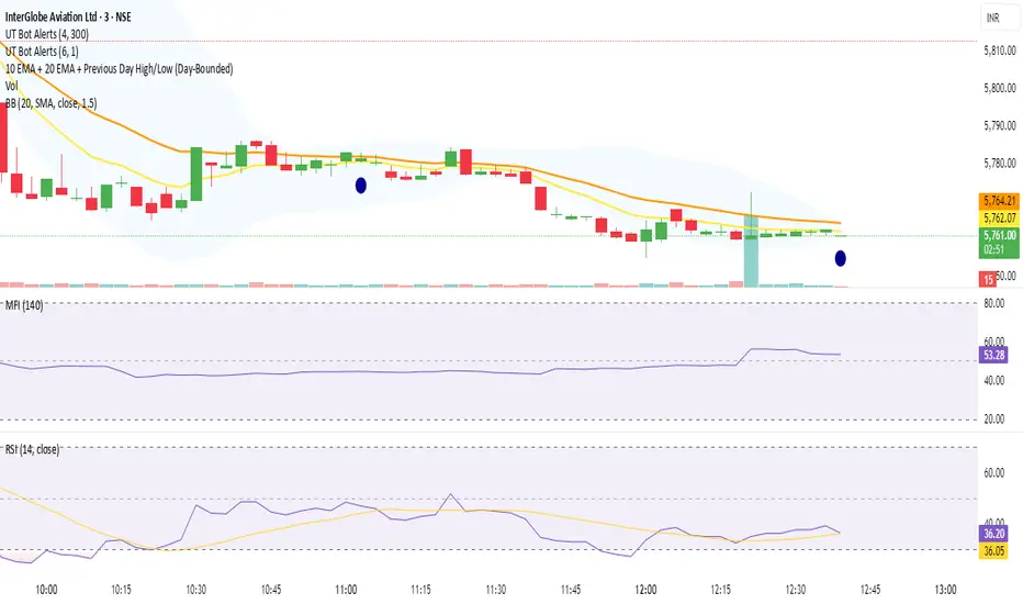
10 EMA + 20 EMA + Previous Day High/Low (Day-Bounded)it gives the reand and also plot the day's lowest volume.it is very helpful in reversals

XAUUSD Multi-Timeframe Supertrend Alert v2**Indicator Overview: XAUUSD Multi-Timeframe Supertrend Alert v2**
**Core Components:**
1. **Multi-Timeframe Supertrend System**
- Two Supertrend indicators (ST1 & ST2) with customizable timeframes
- ST1 typically set to Daily, ST2 to Weekly as main trend
- Visualized with distinct colors and background fills
2. **Customizable SMA**
- Adjustable period and timeframe
- Plotted as blue line for additional trend reference
3. **Neutral Zone System**
- Creates a neutral line offset from ST1 by customizable tick distance
- Yellow dashed line that adjusts based on ST1 trend direction
- **Alert Conditions:**
- **Test Buy Zone**: Both ST1 & ST2 in uptrend AND price enters neutral zone above ST1
- **Test Sell Zone**: Both ST1 & ST2 in downtrend AND price enters neutral zone below ST1
4. **Distance Lines from ST2**
- Upper/lower lines at customizable tick distance from ST2
- Purple dashed lines with touch alerts
**Trading Signals:**
- **Bullish Signal**: Price above ST2 but below ST1 (potential buy)
- **Bearish Signal**: Price below ST2 but above ST1 (potential sell)
- **Neutral Zone Alerts**: Price enters defined zone when both trends align
- **Line Touch Alerts**: Price touches distance lines from ST2
**Alert System:**
- Limited to 3 consecutive alerts per signal type
- Visual markers (triangles, diamonds, circles)
- Background coloring for signal zones
- Separate alert conditions for each signal type
**Visual Features:**
- Candles colored green/red based on signals
- Clear trend visualization with colored backgrounds
- Real-time alert markers without information table clutter
This indicator provides multi-timeframe trend analysis with precise entry zone detection and comprehensive alert system for XAUUSD trading. SAM89 M15, ST1 (5:10) M5, ST2 ( 1,5:20) H1, Test Buy Sell 7000, Line 15000

EMA6 or SMA6 Touch AlertThis script monitors the market and notifies you whenever the price touches either the 6-period EMA or the 6-period SMA.
It helps identify potential pullbacks, reaction points, or entry zones, as price interaction with these moving averages often signals short-term market shifts.
What the script does:
Calculates the EMA 6 and SMA 6
Detects if price touches either moving average within the candle
Plots both lines on the chart for visibility
Allows you to set alerts to receive automatic notifications
Best suited for:
Scalping
Day Trading
Pullback Entries
Short-term trend reactions
CHN-Super AnalizAutomatically determines support and resistance levels. Performs trend analysis. Determines stop level. Gives buy and sell signals.

VietNguyen Buy/Sell VIPThis is indicator of VietNammes, it is very good for trade Gold and Crypto.
VietNguyen DN

ASTER Key Levels & Alerts (Improved)TradingView Script Description
Title: ASTER Key Levels & Alerts (Improved)
Description:
Enhance your trading strategy with the "ASTER Key Levels & Alerts" indicator, designed for precision and decision-making on the Aster chart (e.g., ASTS). This Pine Script v6 tool overlays customizable key levels and zones to identify optimal entry, exit, and stop-loss points, complete with real-time alerts.Key Features:
Customizable Levels: Adjust add zones (Light & Main), breakout, stop, and take-profit (TP1-TP3

ATRThis script displays the Average True Range (ATR) value and the ATR as a percentage of the current closing price directly on the main chart as a clean table, with no lines or plots. It allows users to easily monitor both absolute volatility and its relative magnitude, making comparisons across different assets intuitive. The display position is customizable, offering flexibility for personal chart layouts. Ideal for traders seeking quick volatility insights, risk management guidance, or portfolio-wide comparisons.