Intraday Toolkit1. Visual Components of the Indicator
Understanding the visual cues is essential for quick decision-making during fast-moving intraday sessions:
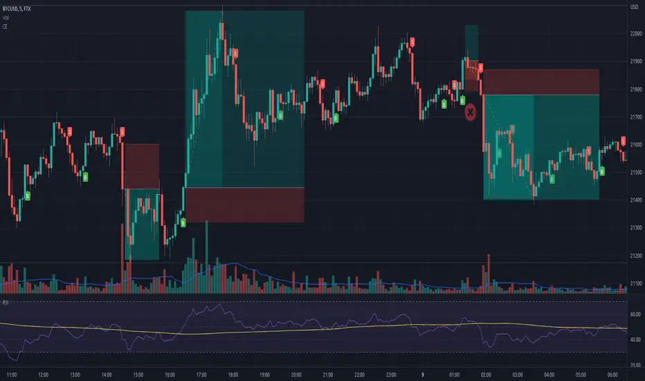
Trend Background: The background color represents the Primary Cycle (80-period) bias. Green indicates a bullish trend (price is above the primary cycle), and red indicates a bearish trend (price is below the primary cycle).
The Three Cycles:
Yellow Line: Short Cycle (20) – Used for momentum triggers.
Orange Line: Mid Cycle (40) – Represents the baseline for volatility envelopes.
Red Line: Primary Cycle (80) – Defines the overall trend direction.
Volatility Envelopes: Two green lines plotted at a distance (1.5x ATR) from the Mid Cycle. These act as exhaustion zones where price is likely to revert or consolidate.
Rule 3 Signals (Purple Circles): These appear when a specific 3-candle momentum breakout occurs.
2. Trading Strategy for 5m & 15m
This toolkit is most effective when you use the 15m chart for trend confirmation and the 5m chart for precise entries.
Long (Buy) Setup
Enter a long position when the following alignment occurs:
Bullish Bias: The background must be Green (Price > Primary Cycle).
Cycle Low: A pivot low must have been detected (the indicator identifies a local bottom).
Momentum Trigger: Price must close above the Yellow Short Cycle line while the previous candle was below it.
Rule 3 Confirmation: If a purple circle appears simultaneously, it confirms strong buying momentum.
Short (Sell) Setup
Enter a short position when the following alignment occurs:
Bearish Bias: The background must be Red (Price < Primary Cycle).
Cycle High: A pivot high must have been detected (the indicator identifies a local top).
Momentum Trigger: Price must close below the Yellow Short Cycle line while the previous candle was above it.
Rule 3 Confirmation: A purple circle above the price confirms a bearish momentum shift.
3. Exit and Take-Profit Logic
The script includes "State Control" to manage your exits effectively:
Targeting the Envelopes: The primary profit target is the Outer Green Envelope. If price touches the upper envelope (for longs) or lower envelope (for shorts), the trend may be exhausted.
Momentum Exit: If price crosses back over the Yellow Short Cycle line in the opposite direction of your trade, the toolkit considers the move over and signals an exit.
4. Specific Tips for Day Trading
Avoid "Counter-Trend" Signals: Do not take Buy signals if the background is Red, or Sell signals if the background is Green. The logic is built to filter these out for better win rates.
The "Rule 3" Advantage: Use the purple circles as a "second chance" entry. If you missed the initial Buy/Sell signal, a Rule 3 circle indicates momentum is still strong in that direction.
Timeframe Synergy: * 15m: Best for seeing the "Big Picture" and avoiding noise.
5m: Best for finding entries with smaller stop-losses near the Yellow Short Cycle line.
5m

Prev/Current Day Open & Close (RamtinFX)Draws three transparent vertical lines marking the previous day’s close, the current day’s open, and the current day’s close.

First 5 Minutes Open/Close LinesThis very simple indicator paints lines at the high and low of the first 5m candle of the session. It is primarily intended for big cap NYSE traded stocks with high volume. I wrote this indicator to save me the trouble of manually drawing the lines each day.
The lines drawn at the 5m high/low will remain constant regardless of which timeframe you switch to. In the example screenshot, we are looking at the 1m timeframe. This helps us switch effortlessly between different timeframes to see if a given price movement meets our entry criteria.
In addition to drawing lines at the first 5m high/low, it will optionally paint two zones, one each around the high and low. The boundaries of this zone are configurable and expressed as a percentage of the total movement of the first 5m bar. By default, it is set to 25%.
This indicator is based on the concept that the first 5m bar always has massive volume which helps us infer that price may react around the extremes of that movement. The basic strategy works something like this:
- You identify the high timeframe (HTF) trend direction of the stock
- You wait for the first 5m candle of the session to close
- You wait for price to puncture through the outer boundary of the zone marked by the indicator.
- You enter when price retraces to the high, or low, which marks the midpoint of the punctured zone.
- Only enter long on stocks in a HTF uptrend, and short on stocks in an HTF downtrend.
- Use market structure to identify stop loss and take profit targets
Note: Use at your own risk. This indicator and the strategy described herein are not in any way financial advice, nor does the author of this script make any claims about the effectiveness of this strategy, which may depend highly on the discretion and skill of the trader executing it, among many other factors outside of the author's control. The author of this script accepts no liability, and is not responsible for any trading decisions that you may or may not make as a result of this indicator. You should expect to lose money if using this indicator.

Chandelier Exit - Heikin AshiThis is a redesign of the Chandelier Exit indicator. It removes stupid transitions between Chandelier Exit' states and highlights initial points for both lines.
This indicator was originally developed by Charles Le Beau and popularized by Dr . Alexander Elder in his book "Come Into My Trading Room: A Complete Guide to Trading" (2002).
In short, this is a trailing stop-loss based on the Average True Range (ATR).
If "Heikin Ashi for calculation" is checked, then ATR and buy/sell signals are calculated based on heikin ashi candles.
You don't need to change bar style to heikin ashi.
Thanks to everget for the initial version.