Bandes et canaux

Levels S/R Boxes + Gaps + SL/TPWhat It Does:
Automatically identifies and displays:
🟦 Support/Resistance zones (horizontal boxes)
🟨 Price gaps (unfilled gaps from market open/close)
🎯 Stop Loss levels (where to protect trades)
💰 Take Profit levels (where to exit trades)
Purpose: Shows you exactly where price is likely to bounce, reverse, or break through.
Best Practices:
✅ Trade at the boxes - Don't chase price
✅ Use SL/TP lines - Automatic risk management
✅ Wait for confirmation - Candle pattern + S/R level
✅ Gaps get filled - Trade towards yellow boxes
✅ Solid lines = stronger - Prefer 3+ touch levels
❌ Don't ignore SL - Always protect yourself
❌ Don't trade middle - Wait for S/R zones
❌ Don't fight strong levels - Respect solid boxes
Settings (Quick Reference):
S/R Strength: 10 (default) - Lower = more levels, Higher = fewer stronger levels
Max Levels: 5 (default) - Number of S/R boxes to show
Show Gaps: ON - Display yellow gap boxes
Show SL/TP: ON - Display entry/exit suggestions

EMA Divergence Channel (Only Above EMA 200)shows ema divergence above 200 ema. When the 7 ema diverges from 21 and 50 really fast, the channel shows up

rahulp33It is a 15-min high-low for the day; this will help the fellow chartist understand a trend emerging for the day. This indicator, along with others, gives a general sense of the daily trend, but it's not the sole factor to consider.


FusionFlow Pro – Trend & Regime🌀 FusionFlow Pro — Trend & Regime
Introduction
FusionFlow Pro is a visual trend-and-regime map designed for traders who prefer clarity over noise.
It blends multiple concepts—trend direction, volatility, volume behavior, higher-timeframe bias, and a smooth neon-gradient ribbon—into a single, readable structure.
This tool was built over many revisions and experiments, and it’s offered freely for the community. The goal is simple: provide a clean way to understand market context without overwhelming the chart.
About the Indicator
FusionFlow Pro combines several market components into one display:
• Trend Engine
Two adaptive moving averages form the core directional structure. Their separation, strength, and interaction define whether the market is leaning bullish, bearish, or neutral.
• Regime Classifier
The script can interpret either ADX or Choppiness Index to determine whether conditions favor trending behavior or range-bound phases.
• Volume & Momentum Influence
Volume expansion and short-term momentum add additional context, helping highlight when market participation is rising or cooling.
• Higher-Timeframe Bias (HTF)
The option to reference a larger timeframe gives users a broader directional backdrop while still trading on their preferred interval.
• Neon Ribbon Visualization
The slow MA forms the backbone of a multi-gradient, distance-based ribbon.
When price hugs the ribbon, the fill becomes subtle and transparent; as price moves away, the ribbon becomes more visible.
This creates an intuitive sense of distance, pressure, and trend engagement.
• HUD Panel
A compact top-right panel summarizes the current trend state, regime, volume condition, HTF bias, and most recent event.
It acts as a quick reference so the chart stays readable even at fast timeframes.
Color Interpretation
FusionFlow Pro uses color to convey structure at a glance:
Ribbon Line:
• Uptrend: green-cyan tone
• Downtrend: soft red-magenta tone
• Neutral: cool gray-blue
Ribbon Fill:
A neon gradient cycles from lime → aqua → blue → violet → soft red.
The specific color is determined by the slow MA’s position inside a 50-bar normalization window.
Opacity Behavior:
• Near the ribbon: color is more pronounced
• Approaching the candles: the fill fades smoothly
• At the extremes: almost fully transparent
This tapered fade is intentional—it helps the shape remain visible without overwhelming the candles underneath.
HUD Colors:
Each HUD value shifts based on conditions—bullish, bearish, neutral, trending, choppy, strong volume, etc.—making it easy to read with peripheral vision.
Settings & Customization
FusionFlow Pro allows users to customize its behavior without assuming any specific market or style.
Different symbols—indices, crypto, commodities, forex, individual stocks—can have very different volatility and rhythm. Because of that, many traders tweak the MA lengths, ATR multiplier, volume factor, and regime settings depending on the symbol or timeframe they prefer.
Shorter lengths generally create a more reactive environment; longer lengths smooth out noise. ATR buffer and volume requirements can be increased or reduced depending on how tightly or loosely the user wants FusionFlow Pro to respond.
Instead of prescribing “best settings,” FusionFlow Pro stays neutral and flexible.
Experimenting with adjustments is part of the workflow, and finding a comfortable configuration is encouraged.
Disclaimer
This script is published purely for chart visualization and educational use.
It does not provide financial advice, does not guarantee outcomes, and should not be used as a sole basis for trading decisions.
Users remain responsible for their own analysis and risk management.

Multi-TF Flexible Triple MA + Envelope🔷 Main Features
1. Three Moving Averages (MA1, MA2, MA3)
Fully customizable types: SMA, EMA, WMA, VWMA, TEMA
Individual period and price source for each MA
Optional multi-timeframe (MTF) calculation
This allows you to build a flexible trend structure with local, medium-term, and higher-timeframe layers.
2. Envelope Based on MA3
The indicator includes an Envelope channel (upper and lower bands) derived from MA3.
Features:
Adjustable deviation in percentage
Enable/disable the channel
Optional fill between bands
Dotted line style mode
The Envelope helps visualize:
Overbought/oversold zones relative to trend
Volatility expansion and contraction
Dynamic support/resistance bounces
3. MA1–MA2 Crossover Signals
The indicator plots visual markers for crossover events:
🔺 MA1 crossing above MA2 — potential bullish impulse
🔻 MA1 crossing below MA2 — early warning of trend weakness or reversal
These signals can be used for entries, trend filtering, or confirmation of directional movement.
🎯 Why Use This Indicator
This tool combines several analytical approaches:
Dynamic trend levels (MAs)
Volatility structure through the Envelope
Multi-timeframe analysis
Clear visual crossover signals
It works well for:
Trend-following entry zones
Trading from Envelope boundaries
Identifying market expansion/compression
Filtering trend direction across multiple timeframes
Both intraday and swing trading

rahulpatkiIt is a 15-min high-low for the day; this will help the fellow chartist understand a trend emerging for the day. This indicator, along with others, provides a general idea of the daily trend, but it is not the only one to consider.

rahulpatkiIt is a 15-min high-low for the day; this will help the fellow chartist understand a trend emerging for the day. This indicator, along with others, provides a general idea of the daily trend, but it is not the only one to consider.

SPX Realized Volatility & Expected MoveRealized Volatility & Expected Move Dashboard
This indicator provides a sophisticated, multi-horizon view of an asset's historical volatility and projects the corresponding expected move (EM) in price points. Unlike indicators that rely on implied volatility (VIX), this tool uses the asset's own historical price action (Realized Volatility) to forecast future range potential.
Key Features & Calculations
Multi-Horizon Realized Volatility (RV): Calculates the annualized Realized Volatility based on log returns for three critical lookback periods:
30 Days (Long-Term): Measures structural volatility (default lookback).
9 Days (Short-Term): Captures recent market temperament.
1 Day (Immediate): Highly reactive to the previous day's movement.
Daily Timeframe Independence (Critical): The RV calculation is performed exclusively on Daily price data (via request.security), ensuring that the 30-day lookback is always 30 calendar days, regardless of whether you view the indicator on a 1-minute or 4-hour chart.
Expected Move Projection: Projects the calculated RV onto the price using the standard financial formula:
$$\text{EM}_{\text{H}} = \text{Price} \times \frac{\text{RV}_{\text{Annual}}}{100} \times \sqrt{\frac{\text{Horizon Days}}{252}}$$
Visual Bands: Plots the Upper and Lower Expected Move bands centered around the current price for all three horizons, providing clear targets for range expansion or contraction.
Comprehensive Table Output: A dashboard summarizes the key metrics, displaying:
Realized Vol (Annualized %): The raw volatility percentage.
Full Horizon Expected Move: The calculated price point move over the full 30-day, 9-day, or 1-day horizon.
Daily Equivalent Expected Move: The daily expected move derived from that RV, making it the most useful target for intraday trading (e.g., the $\pm 1\sigma$ move for today).
Interpretation & Usage
Identify Regime Changes: Compare the short-term RV (9D) against the long-term RV (30D). If 9D > 30D, volatility is accelerating; if 9D < 30D, volatility is contracting.
Set Intraday Targets: Use the 1 Day EM or the Daily Equivalent EM derived from the 9D/30D bands as dynamic support and resistance levels for the trading session.
Analyze Over-Extension: If the price trades outside the 30 Day EM bands, the move is historically extreme and may signal a sharp reversal or momentum exhaustion.

Multi-Timeframe Opening RangeMulti Time frame range created to find trends and look for blocks of time in which the market is most likely to pivot.
Also assists in finding trends more easily highs and lows.
Take bounces and rejections off the boxes it works well.

VIX Expected Daily Move [SPY/SPX] VIX Expected Daily Move Indicator
This indicator helps traders anticipate the expected daily trading range for the current chart's asset (e.g., SPY, ES, SPX) based on the CBOE Volatility Index (VIX), using the widely recognized "Rule of 16" method.
Key Features:
VIX-Based Range: Calculates the implied daily high and low targets by applying the formula:
$$\text{Expected Move} = \text{Open Price} \times \frac{\text{VIX}}{100} \times \frac{1}{\sqrt{252}}$$
(where $\sqrt{252} \approx 16$)
Anchor Time: The calculation is anchored to a user-defined time (default: market open at 09:30 Exchange Time) for reliable, non-repainting levels.
Persistent Levels: Levels are calculated once per day and plotted as lines and labels that persist and extend throughout the trading session.
Historical Backtesting: Includes an option to display the expected range for historical days, making it excellent for backtesting volatility strategies.
Customization: Easily adjust the VIX symbol, anchor time, and line colors/styles.
How to Use:
Set the VIX Symbol to your preferred volatility source (default: CBOE:VIX).
Set the Anchor Time to the market open or another time when you wish to lock in the day's expected volatility reading.
Use the plotted Expected High (red line) and Expected Low (green line) as potential support and resistance targets for intraday trading decisions.

MA Crossover20 Ema
200 Day Crossover
Marks Death and Golden Cross
Useful for longterm time frames and finding trends.
Can be used for intraday scalping but advised to be used with price action and other indicators like Williams %R or VWAP.

[iQ]PRO Dealing Range Cycle & Spectral Regression Histogram+🌟 PRO Dealing Range Cycle & Spectral Regression Histogram+ (DRC/SRH+)
Category: Advanced Market Cycle, Momentum, and Trend Analysis
The PRO Dealing Range Cycle & Spectral Regression Histogram+ is a meticulously engineered analytical tool, designed to provide our members with a superior, proprietary view of market structure, momentum, and mean reversion dynamics. This professional-grade indicator operates on a non-overlay panel, offering a clean and powerful interpretation layer distinct from the main price action.
🔬 Core Mechanism: Dual-Layered Analysis
This indicator combines two distinct, yet complementary, proprietary mathematical frameworks to deliver a holistic market picture:
The Dealing Range Cycle (DRC):
Utilizes a sophisticated, custom-displaced detrending oscillator built upon specialized percentage mathematics, rather than simple raw price differences.
The DRC identifies the latent cyclical forces within the price action, separating short-term noise from dominant swings.
It defines a "Dealing Range" through dynamically calculated High and Low Anchors, which represent the proprietary extremes of the current cycle. This framework provides invaluable context for understanding current price compression and expansion potentials.
The Quant Trend Signal is an integral component of the DRC, employing an adaptive logic to color-code the underlying direction of the core cyclical momentum, offering a robust directional confirmation.
The Spectral Regression Histogram (SRH+):
This component serves as the "Underpin Momentum" layer, a sensitive reading of current market velocity and pressure.
It employs a customized Spectral Regression Model to calculate deviations from an idealized price path. This is then passed through an advanced filtering and smoothing pipeline to extract high-frequency momentum components.
The SRH+ is visually presented as a Heatmap Histogram, dynamically color-graded to reflect the intensity of bullish (Gold/Yellow) or bearish (Bright Fuchsia) pressure. This gives users an immediate, spectral sense of the market's internal kinetic energy.
✨ Distinctive Features & Advantages
Proprietary Math Functions: The indicator relies on internalized custom mathematical functions (including specialized averages and high-precision linear regression) to generate unique, non-standard outputs that cannot be replicated with conventional indicators.
Decoupled Visualization: By operating on a separate panel, the DRC and SRH+ provide a noise-free environment for analysis, allowing for unambiguous interpretation of cyclical turning points and momentum shifts.
Intuitive Configuration: All core parameters, including Cycle Length, Regression Lookback, and Spectral Scale Factor, are meticulously organized into logical groups, allowing advanced users to fine-tune the engine without disrupting its proprietary internal logic.
The PRO DRC/SRH+ is not just an indicator; it is a diagnostic tool for the serious market participant, providing a powerful, proprietary lens to anticipate structural shifts and capitalize on the true rhythm of the market. Access is restricted to our most dedicated members, ensuring its edge remains sharp and exclusive.

SymFlex Band - MAD, RSI, ATRThe SymFlex Band is an adaptive volatility and momentum framework that merges
three independent band models into a unified analytical tool.
• The MAD Band measures deviation from the moving average using Median Absolute Deviation,
providing a stable view of range-based volatility.
• The RSI Momentum Band adjusts its upper and lower boundaries asymmetrically,
expanding in the direction of momentum and contracting against it.
• The ATR Band captures classical volatility expansion for breakout and trend-continuation conditions.
Rather than placing the three indicators separately on a chart, the script synchronizes
their center-line logic, compares their band distances, identifies the nearest active band,
and displays real-time correlation between their dynamic ranges.
This structure helps traders understand whether price behavior is dominated by
range compression, momentum imbalance, or volatility expansion.
The table summarizes:
• active band ranges
• breakout status
• distance from each band
• cross-band correlation
This indicator is designed purely for analysis. It does not generate trade entries.

[iQ]PRO Quadratic Spectral Regression Channel and Heatmap+✨ PRO Quadratic Spectral Regression Channel and Heatmap+ : Next-Generation Market Analysis
The PRO QSRCH+ indicator is an advanced, proprietary analytical tool designed for the discerning trader, combining sophisticated statistical models with high-frequency momentum detection. This unique fusion provides a multi-dimensional view of market structure, separating the persistent, underlying trend from the volatile, short-term cycle.
📊 Precision Channeling with Weighted Regression
At its core, PRO QSRCH+ utilizes a dynamically weighted regression channel to establish the primary market trajectory and define statistically significant deviation boundaries.
Adaptive Trend Definition: The center line of the channel serves as a highly responsive mean value, calculated over a user-defined lookback length. This weighting prioritizes recent price action, ensuring the trend definition remains relevant to current market conditions.
Volatile Boundaries: The upper and lower bands are precisely calibrated using a standard deviation factor to measure volatility and establish zones of statistical overextension.
Trend Coloring: The channel's appearance changes based on the calculated slope, providing an instantaneous visual confirmation of the macro trend direction (Bullish or Bearish).
Exhaustion Signals: Subtle markers are placed when price touches these boundaries, signaling potential short-term market exhaustion and a high probability of mean reversion.
🔬 High-Resolution Spectral Momentum
Integrated with the regression channel is a specialized Spectral Momentum Heatmap Histogram. This proprietary oscillator is engineered to isolate the cyclical (micro) component of price movement.
Residual Analysis: The indicator first extracts the residual price movement—the high-frequency fluctuations that exist outside the established regression trend—effectively acting as an intelligent high-pass filter.
Cycle Detection: This residual data is then processed through a proprietary spectral filter and smoothing mechanism. This process isolates the dominant market cycle, revealing hidden bursts of momentum and the precise timing of cyclical turns.
Heatmap Visualization: The Spectral Momentum is visualized in a separate pane as a vibrant histogram, dynamically colored and weighted based on its magnitude to provide an intuitive visual gauge of market energy.
🧩 The Multi-Factor State Engine
PRO QSRCH+ uniquely combines these two components into a comprehensive market state engine, visible directly on the price bars and via clear trading signals:
Candle Coloring: Price bars are painted with a four-state system, distinguishing between:
Strong Trend: Macro Trend (Channel Slope) and Micro Cycle (Spectral Momentum) are aligned.
Pullback/Rally: Macro Trend is maintained, but the Micro Cycle is currently counter-trend, signaling temporary consolidation or retracement.
Validated Signals: High-probability BUY/SELL signals are generated only when the fast Spectral Momentum cycle crosses zero in alignment with the macro trend defined by the Regression Slope. This validation filter is key to minimizing false signals and maximizing the probability of sustained directional moves.
PRO QSRCH+ provides a superior framework for market structure analysis, allowing traders to distinguish between low-risk trend continuation and high-risk cyclical exhaustion.

ATR Based TMA Bands [NeuraAlgo]ATR-Based TMA Bands
ATR-Based TMA Bands is a volatility-adaptive channel system built around a smoothed Triangular Moving Average (TMA).
It identifies trend direction, momentum shifts, and reversal opportunities using a combination of TMA structure and ATR-driven channel expansion.
Perfect for traders who want a clean, intelligent, and adaptive market framework.
Made by NeuraAlgo.
🔷 How It Works
1. 🔹 TMA Midline (Core Trend)
The indicator builds a smooth and stable midline using:
📐 Triangular Moving Average
🔄 Additional EMA smoothing
This creates a low-noise trend curve that reacts cleanly to real momentum changes.
2. 📈 Volatility-Adjusted Bands
The channels are built from:
📊 Standard Deviation × Expansion Multiplier
📏 Three ATR-based outer layers
These bands:
Expand in high volatility
Contract in stable markets
Reveal pullbacks, breakout zones, and exhaustion points
3. 🔁 Trend Tilt Algorithm
Slope is measured using an ATR-normalized tilt formula:
atrBase = ta.atr(smoothLen)
tilt = (midline - midline ) / (0.1 * atrBase)
This classifies the trend into:
Bullish
Bearish
Neutral
The bar colors and midline adjust automatically to match market direction.
4. 🔄 Reversal Detection (Turn Signals)
The indicator flags directional flips:
Turn Up → bearish → bullish shift
Turn Down → bullish → bearish shift
These are early reversal alerts ideal for swing traders.
5. 🎯 Flip Buy / Flip Sell Signals
Deep volatility extensions create high-probability re-entry zones:
Flip Buy → price rebounds from oversold ATR zone
Flip Sell → price rejects from overbought ATR zone
Great for:
Mean-reversion entries
Trend re-tests
Pullback trades
Exhaustion signals
📌 How to Use This Indicator
✔ Trend Trading
Follow trend using tilt-colored candles
Use midline as dynamic trend filter
Use channels for breakout/pullback entries
✔ Reversal Trading
Watch for Turn Up / Turn Down labels
Flip signals show where the market is over-stretched
✔ Risk Management
ATR channels automatically adjust to volatility
Helps with smarter SL/TP placement
⭐ Best For
Trend traders
Swing traders
Reversal hunters
Volatility lovers
Anyone wanting a smart, clean technical framework
💡 Core Features
TMA-smoothed trend detection
Multi-layer ATR expansion channels
Intelligent trend tilt algorithm
Turn Up / Turn Down reversal markers
Flip Buy / Flip Sell exhaustion signals
Adaptive bar coloring
Clean and professional visual design


Bitcoin Optimized ScalperBasically tracks orderflow and pairs with Hurst exponents and KAMA aggression to tell you when to enter short or long. Join my discord for more.
discord.gg

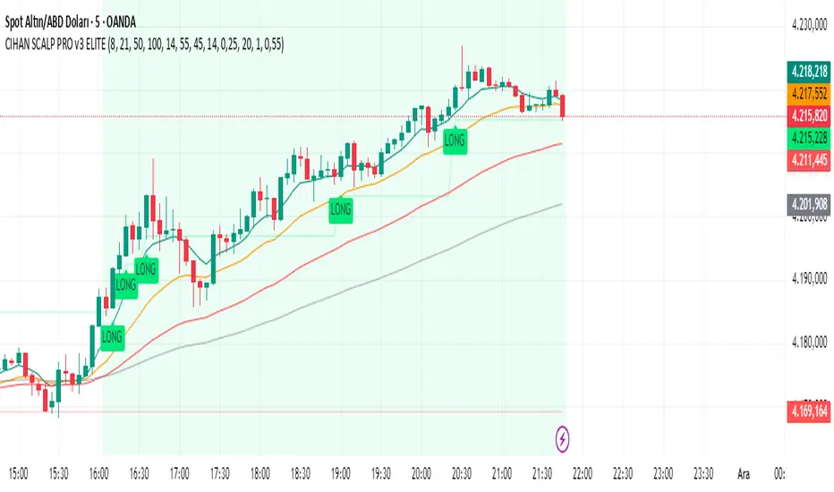
CIHAN SCALP PRO v3 ELITEI’m sharing a testable scalping strategy:
When you see a Long or Short signal, you can open a position without waiting for the candle to close and take quick profits with a short TP.
But the real game-changer is coming soon!
The Professional Scalping System I’ve been working on, with 85%+ accuracy, is almost ready.
This system is fully mechanical — no analysis needed, it instantly catches momentum and trend shifts.
It will be available soon with a small monthly subscription fee.
Stay tuned!
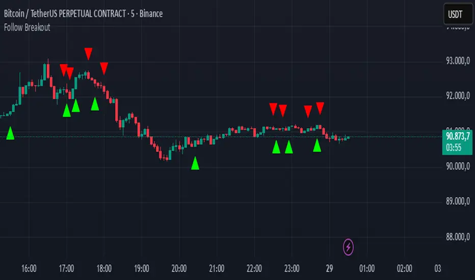
Follow BreakoutThe indicator tracks trend breakouts. It generates multiple signals during sideways trends.
Nifty Daily Movement Filter with DaysThis indicator provides detailed statistical analysis of NIFTY 50's daily percentage movements, categorized into four distinct volatility ranges with complete weekday distribution tracking.
Features:
Analyzes daily price movements from January 1, 2024 to November 28, 2025
Categorizes volatility into 4 ranges:
0.01-0.25% (Very Low - Blue)
0.26-0.50% (Low - Green)
0.51-0.75% (Medium - Orange)
0.76%+ (High - Red)
Visual Elements:
Color-coded background highlights for each volatility range
Distinct marker shapes below bars (circles, triangles, squares, diamonds)
Labels showing day of week and exact percentage change
Comprehensive statistics table with:
Total count per volatility range
Complete Monday-Friday breakdown for each range
Overall totals by day of week
Use Cases:
Identify volatility patterns across different days of the week
Track frequency of calm vs volatile trading sessions
Analyze if specific weekdays tend toward higher/lower movements
Historical volatility distribution analysis for strategy development
Risk assessment and position sizing based on historical volatility patterns

BURAK KRİPTO AL - SAT BOTUBURAK CRYPTO BUY-SELL BOT — Designed for high performance in crypto markets!This strategy is built on a powerful algorithm optimized with years of real trading experience. It follows trends while perfectly catching buy-at-the-bottom and sell-at-the-top opportunities.Main Features:
Trend direction detection with EMA + SMA combination
Overbought/oversold filters using RSI and Stochastic
Volume confirmation (volume breakout filter included)
ATR-based dynamic stop loss and take profit
Sideways market filter — prevents unnecessary trades
Works on all cryptocurrencies (BTCUSDT, ETHUSDT, SOLUSDT, XRPUSDT, etc.)
Both long and short signals (can be turned off separately)
High win rate and excellent profit factor in backtests Who is it for?Daily and swing traders
Spot and futures traders
Those who want to run fully automated bots (easily connected via alerts to 3Commas, Pionex, Bitsgap, etc.)
How to use:Add the script to your chart
Create an alert → “Alert on BURAK CRYPTO BUY-SELL BOT”
In the alert message field, write: For buy: BUY {{ticker}}
For sell: SELL {{ticker}}
Connect to your bot and let it do the rest automatically!
Disclaimer: No strategy guarantees 100% profit. Always apply your own risk management. Past performance is not indicative of future results.If you like it, don’t forget to hit the Like button and leave a comment! ♡
Any questions? Drop them in the comments — I reply as fast as possible!#crypto #bitcoin #tradingbot #tradingview #signals #altsat
