Session Open Vertical LinesThis script automatically draws vertical lines on your chart at the exact opening times of three market sessions (in your chart’s timezone):
Asian session → red line
London session → yellow line
US session → blue line
Bandes et canaux

Sessions & ORB Pro | Bifrost InstituteSessions & ORB Pro | BI
Professional Session Analysis and Opening Range Breakout Tracker
This advanced indicator provides comprehensive session tracking and Opening Range Breakout (ORB) analysis across multiple global trading sessions. Designed for intraday traders, this tool helps identify key support and resistance levels, session volatility patterns, and potential breakout opportunities.
Overview
Session-based trading is crucial for understanding market behavior, as different global sessions (US, European, Asian) exhibit distinct characteristics in terms of volatility, volume, and price action. This indicator allows traders to:
Identify Session Highs and Lows: Track the boundaries of each trading session to spot key support/resistance levels
Monitor Opening Range Breakouts: Capture the first 5, 15, or 30 minutes of major exchange openings to identify early directional bias
Analyze Multi-Session Patterns: View up to 4 concurrent or sequential sessions with full historical data
Customize Visual Analysis: Tailor colors, styles, and overlays for each session independently
Key Features
Multi-Session Support
Configure up to 4 independent trading sessions (US, Europe, Asia, Custom)
Fully customizable session times with timezone support (UTC offset, Chart timezone, or Exchange timezone)
Daylight Savings Time adjustment for accurate session timing
Session range boxes with adjustable transparency and outline styles
Historical session tracking (1-20 previous sessions)
Opening Range Breakout (ORB)
Track Opening Range for major exchanges: NYSE, LSE, TSE, TSX, ASX, HKEX, SSE
Configurable ORB periods: 5-minute, 15-minute, or 30-minute ranges
Visual ORB boxes with customizable colors and outline styles
ORB High/Low lines with optional extension beyond session close
Individual color control for each session's ORB
Session Analytics
Session High/Low: Horizontal lines marking the session's price extremes
Trendline: Linear regression trendline showing session directional bias
Mean: Session average price for mean reversion analysis
VWAP: Volume-weighted average price for institutional level analysis
Range Boxes: Visual representation of each session's price range
Advanced Customization
Individual Color Pickers: Set unique colors for each overlay type per session
Line Styles: Choose between Solid, Dashed, or Dotted for all line types
Label Options: Customize labels to show Date (d/M), Day of Week (ddd), and/or Price
Extend Options: Extend Session H/L and ORB lines beyond current bar
Outline Styles: Independent control of Range and ORB outline appearance
Information Dashboard
Optional real-time dashboard displaying:
Session Status: Open/Closed indicator for each session
Trend: R² correlation coefficient showing directional strength
Volume: Cumulative session volume
σ (Sigma): Session standard deviation for volatility analysis
Range: Session High, Low, and Range in points
ORB: Opening Range High, Low, and Range in points
Dashboard is fully customizable with toggleable columns and adjustable size/position.
Flexible Configuration
Time Zone Management: Three modes for precise session timing
Historical Display: Show/hide previous sessions for cleaner charts
Label Customization: Independent label size and content options for Session H/L vs ORB
Range Settings: Adjustable transparency, outlines, and label positioning
Use Cases
Session Traders: Identify when specific markets are most active and volatile
ORB Traders: Capture early session momentum and breakout opportunities
Support/Resistance: Use session highs/lows as key price levels
VWAP Strategies: Track institutional activity through session VWAP
Multi-Market Analysis: Monitor overlap between global trading sessions
Default Configuration
The indicator comes pre-configured with US (NYSE), Europe (LSE), and Asia (TSE) sessions, making it immediately useful for forex, indices, and global equity traders. Session D is available for custom session requirements.
Perfect for day traders, scalpers, and swing traders who rely on session-based analysis and institutional order flow.

Coin Jin Multi SMA+ BB+ SMA forecast Ver2.02This script provides a complete trend-analysis system based on the
5 / 20 / 60 / 112 / 224 / 448 / 896 SMAs.
It precisely detects bullish/bearish alignment and automatically identifies
12 advanced trend-shift signals (Start, End, and Reversal).
Key Features:
● 9 SMA lines (including custom X1 & X2)
Each SMA supports custom color, width, and style (Line/Step/Circles).
● Bollinger Bands with customizable options
Fully adjustable length, source, width, style, fill transparency, and more.
● SMA Forecast (curved projection)
– Slope computed via linear regression
– Predicts up to 30 future bars
– Forced dotted style ensures visibility at all zoom levels
● 12 Advanced Trend Signals (alertcondition)
Automatically detects:
Start of full alignment (with/without SMA 896)
End of alignment
Bull ↔ Bear transitions
Perfect for momentum trading, trend-following, reversal detection, or automated alert systems.
● Labeling last value of each SMA
Each SMA prints a label such as "5", “20”, “60”, “896”, or custom lengths at the latest bar.
이 스크립트는 5 / 20 / 60 / 112 / 224 / 448 / 896 이동평균선을 기반으로
정배열·역배열 상태를 정밀하게 분석하고,
총 12가지 고급 추세 신호(시작·종료·전환) 를 자동으로 감지하는 통합 추세 분석 도구입니다.
주요 기능:
● 9개의 SMA 표시 (커스텀 X1, X2 포함)
각 SMA는 색상·굵기·형태(Line/Step/Circle)를 개별 설정할 수 있습니다.
● 볼린저밴드 표시 및 채우기 옵션
BB 길이, 소스, 타입, 두께, 투명도 등을 자유롭게 조절 가능.
● SMA Forecast (미래 방향 곡선 예측)
– 기울기 기반 선형회귀 슬로프 계산
– 곡선 형태로 미래 30봉까지 예측
– 점선(Dotted) 강제 적용으로 어떤 배율에서도 선명하게 표시
● 12가지 고급 추세 신호(alertcondition)
정배열·역배열의
Start (처음 완성될 때)
End (깨질 때)
Switch (전환)
을 모두 자동 탐지하여 트레이딩뷰 알림으로 받을 수 있음.
● SMA 마지막 가격 라벨 표시
각 SMA 끝 지점에 “5 / 20 / 60 / ... / 896” 식으로 라벨 표시.


SIGMA 0.20المؤشر SIGMA 0.20 هو نظام تداول متكامل مبني بلغة Pine Script لإعطاء إشارات واضحة وقوية للانعكاسات والاتجاهات.
💡 الوظائف الأساسية:
إشارات شراء وبيع محسّنة
مناطق الاختراق أو الكسر مع أهداف صعودًا وهبوطًا
عرض مناطق محورية مثل افتتاح اليوم، أول شمعة 4 ساعات، أول 5 دقائق
قناة الانحدار الخطي لرصد الاتجاه (Linear Regression)
لوحة معلومات Dashboard توضح الاتجاه العام، RSI، ADX، DI
صندوق السيناتور لتحديد دعم ديناميكي بناءً على قيعان قوية
✅ المميزات:
يعتمد على إشارات حقيقية
لا يكرر الإشارات كل شمعة بل فقط عندما تتحقق الشروط
يستخدم فلترة الإشارات القوية
يحتوي على رسومات ذكية (Boxes, Labels, Lines) لتوضيح كل عنصر بصريًا
⚠️ إخلاء المسؤولية:
هذا المؤشر أداة تحليل فني فقط ولا يُعتبر توصية مالية أو دعوة للشراء أو البيع. التداول في الأسواق المالية ينطوي على مخاطر وقد يؤدي إلى خسارة رأس المال. المستخدم يتحمّل كامل المسؤولية في اتخاذ قراراته بناءً على هذا المؤشر.
The SIGMA 0.20 indicator is a complete trading system built using Pine Script, designed to provide clear and strong signals for trend reversals and directions.
💡 Core Features:
Enhanced buy and sell signals
Breakout or breakdown zones with upside and downside targets
Displays key zones like daily open, first 4H candle, and first 5-minute candle
Linear Regression channel for identifying the overall trend
Dashboard panel showing trend direction, RSI, ADX, and DI
Senator Zone for identifying dynamic support based on strong pivot lows
✅ Advantages:
Based on real signals
Does not repeat signals on every candle – only when valid conditions are met
Uses advanced filtering to ensure high-quality signals
Includes smart visual elements (Boxes, Labels, Lines) to clearly highlight each signal
⚠️ Disclaimer:
This indicator is for technical analysis purposes only and does not constitute financial advice or a recommendation to buy or sell. Trading in financial markets involves risk and may result in loss of capital. The user bears full responsibility for any decisions made based on this tool.

SMA Cross + KC Breakout + ATR StopThis is the same script previously published with the exception of utilizing SMA vs EMA for those who prefer that moving average type.

MicroX- in side bar 4-7In Side bar
Shading the range of the host candle for a group of 4-7 candles makes it easier to read the movement.
تظليل نطاق الشمعة الحاضنة لمجموعة من الشموع 4-7 لتسهيل قراءة الحركة

VOSC+RSI Pro-Trend V22 (Bollinger Integration) [PersianDev]this is an extention of andicator volume osc and rsi

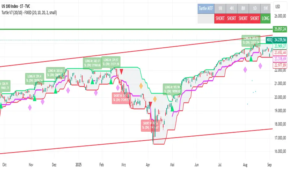
Turtle System 1 (20/10) + N-Stop + MTF Table V7.2🐢 Description: Turtle System 1 (20/10) IndicatorThis indicator implements the original trading signals of the Turtle Trading System 1 based on the classic Donchian Channels. It incorporates a historically correct, volatility-based Trailing Stop (N-Stop) and a Multi-Timeframe (MTF) status dashboard. The script is written in Pine Script v6, optimized for performance and reliability.📊 Core Logic and ParametersThe system is a pure trend-following model, utilizing the more widely known, conservative parameters of the Turtle System 1:FunctionParameterValueDescriptionEntry$\text{Donchian Breakout}$$\mathbf{20}$Buy/Sell upon breaking the 20-day High/Low.Exit (Turtle)$\text{Donchian Breakout}$$\mathbf{10}$Close the position upon breaking the 10-day Low/High.Volatility$\mathbf{N}$ (ATR Period)$\mathbf{20}$Calculation of market volatility using the Average True Range (ATR).Stop-LossMultiplier$\mathbf{2.0} BER:SETS the initial and Trailing Stop at $\mathbf{2N}$.🛠️ Key Technical Features1. Original Turtle Trailing Stop (Section 4)The stop-loss mechanism is implemented with the historically accurate Turtle Trailing Logic. The stop is not aggressively tied to the current candle's low/high, which often causes premature exits. Instead, the stop only trails in the direction of the trend, maximizing the previous stop price against the new calculated $\text{Close} \pm 2N$:$$\text{New Trailing Stop} = \text{max}(\text{Previous Stop}, \text{Close} \pm (2 \times N))$$2. Reliable Multi-Timeframe (MTF) Status (Section 6)The indicator features a robust MTF status table.Purpose: It calculates and persistently stores the Turtle System 1 status (LONG=1, SHORT=-1, FLAT=0) for various timeframes (1H, 4H, 8H, 1D, and 1W).Method: It uses global var int variables combined with request.security(), ensuring the status is accurately maintained and updated across different bars and timeframes, providing a reliable higher-timeframe context.3. VisualizationsChannels: The 20-period (Entry) and 10-period (Exit) Donchian Channels are plotted.Stop Line: The dynamic $\mathbf{2N}$ Trailing Stop is visible as a distinct line.Signals: plotshape markers indicate Entry and Exit.MTF Table: A clean, color-coded status summary is displayed in the upper right corner.
Multi-Timeframe TTM Squeeze Pro with alerts and screenersBased of John Carters TTM Squeeze. Must open the settings and select wether you want to match the timeframe in your chart. This must be done in the pinescreener as well otherwise results will not be correct.
---
# **Squeeze Momentum Pro – Enhanced Screener + EMA Cross Alerts**
This custom version of the Squeeze Momentum indicator expands the standard TTM-style squeeze with screening and automated alert logic so you can quickly find high-quality setups across many tickers.
---
## **What This Script Does**
This indicator plots a three-level squeeze visual similar to TTM Squeeze:
Dot meanings in this indicator
Orange dot:
Strongest squeeze – Bollinger Bands are inside the tightest Keltner level (highest volatility compression).
Red dot:
Medium squeeze – still compressed, but not as tight as orange.
Black dot:
Weak squeeze / lowest level of volatility compression.
Price is coiling, but not as tight as the higher levels.
Green dot (“Fired”):
Squeeze has released — Bollinger Bands have expanded out of the channels and momentum is moving.
A momentum histogram is plotted to show directional pressure during the squeeze.
---
## **Major Improvements Added**
### **① Screenable Conditions for Stock Scanners**
This version includes multiple `alertcondition()` flags so the script can be used as a **Pine Screener inside TradingView**.
Currently it can screen for:
✔ Price closing above the 50-SMA
✔ Presence of an **orange (strong) squeeze dot**
✔ 6/20 EMA crossover signals inside a squeeze
These can be used inside the TradingView Screener or in watchlists to automatically highlight qualifying tickers.
---
### **② 6/20 EMA Trend Signals (Filtered by Squeeze)**
A crossover system was added:
* **Bullish Signal:** 6 EMA crosses above 20 EMA
* **Bearish Signal:** 6 EMA crosses below 20 EMA
But **these signals only trigger if the market is in a red or orange squeeze**, which helps remove noise and focus on valid setups.
---
### **③ Visual Markers Under the Histogram**
Whenever an EMA crossover occurs during a squeeze:
* A **green up-triangle** is plotted for a bullish cross
* A **red down-triangle** for a bearish cross
These markers are drawn **below the histogram**, keeping the display clean while still providing quick visual cues.
---
### **④ Fully Non-Repainting Logic**
All signals and squeeze calculations are based on standard fully-resolved `ta.*` functions, making the results stable both in backtesting and real-time.
---
## **Who This Script Helps**
This version is ideal for:
* Traders who use TradingView’s screener and want automated breakout/continuation filtering
* Traders who scan large watchlists for squeeze setups
* Users who want trend confirmation during volatility compression
---
## **How to Use It**
1. Add the script to your chart
2. Open TradingView Alerts or Screener
3. Select the conditions you want, for example:
* *“Orange Squeeze Detected”*
* *“Squeeze Fire after 3 squeeze dots*
* *“4 REd Dots in a row.”*
* *“Buy Alert”*
* *“EMA 6/20 Bullish Crossover (Squeeze Only)”*
* *“Close Above 50 SMA”*
Once active, TradingView will automatically flag symbols that meet the criteria.
---
## **Summary**
This enhanced Squeeze Momentum indicator turns the standard TTM-style visual into a **true screening and alert system** by adding:
* Multi-level squeezes
* EMA trend signals
* Screener-compatible alert conditions
* Clean visual signals
* Non-repainting logic
It helps traders quickly locate high-probability setups across any watchlist or market.

Donchian Channels + Fibs//@version=6
indicator(title="Donchian Channels + Fibs", shorttitle="DC Fibs", overlay=true, timeframe="", timeframe_gaps=true)
// --- 1. 输入设置 ---
length = input.int(20, minval = 1, title="Length")
offset = input.int(0, "Offset")
show_fibs = input.bool(true, "Show Fib Levels")
// --- 2. 核心计算 ---
lower = ta.lowest(length) // 0.0 (下轨)
upper = ta.highest(length) // 1.0 (上轨)
basis = math.avg(upper, lower) // 0.5 (中轨)
range_val = upper - lower // 高度
// --- 3. 斐波那契计算 ---
f_786 = lower + range_val * 0.786
f_618 = lower + range_val * 0.618
f_382 = lower + range_val * 0.382
f_236 = lower + range_val * 0.236
// --- 4. 绘图 (已修复样式错误) ---
// 上下轨 (最粗实线)
u = plot(upper, "Upper 1.0", color = #2962FF, linewidth=2, offset = offset)
l = plot(lower, "Lower 0.0", color = #2962FF, linewidth=2, offset = offset)
// 中轴 (中等实线)
plot(basis, "Basis 0.5", color = #FF6D00, linewidth=1, offset = offset)
// 斐波那契内部线
// 修复点:删除了不支持的 style_dashed/dotted,改为默认实线,但保留了透明度
// 0.786 (偏红)
plot(show_fibs ? f_786 : na, "Fib 0.786", color = color.new(#f23645, 30), linewidth=1, offset = offset)
// 0.618 (橙色)
p_618 = plot(show_fibs ? f_618 : na, "Fib 0.618", color = color.new(color.orange, 30), linewidth=1, offset = offset)
// 0.382 (橙色)
p_382 = plot(show_fibs ? f_382 : na, "Fib 0.382", color = color.new(color.orange, 30), linewidth=1, offset = offset)
// 0.236 (偏绿)
plot(show_fibs ? f_236 : na, "Fib 0.236", color = color.new(#089981, 30), linewidth=1, offset = offset)
// --- 5. 背景填充 ---
fill(p_618, p_382, color = color.new(color.orange, 85), title="Golden Zone Fill")
fill(u, l, color = color.rgb(33, 150, 243, 95), title = "Background")

Support Resistance - Dynamic MTFSupport Resistance - Dynamic MTF
Description
Support Resistance - Dynamic MTF v2 is an advanced multi-timeframe indicator that identifies key support and resistance levels by analyzing pivot points across multiple timeframes. This enhanced version combines the power of current timeframe price action with higher timeframe structure to find the most significant S/R levels where price is likely to react.
What Makes This Different?
Traditional S/R indicators only look at the current chart timeframe. This MTF version allows you to:
Incorporate Higher Timeframe Structure: See where daily S/R levels are while trading on a 5-minute chart
Combine Multiple Timeframes: Merge pivots from both timeframes for stronger, more reliable S/R zones
Dynamic Calculation: S/R levels automatically update as new pivots form
Strength-Based Ranking: Shows only the strongest S/R levels with the most pivot confluence
Key Features
🎯 Multi-Timeframe Analysis
Three Operating Modes:
Current TF Only: Traditional single-timeframe S/R detection
Higher TF Only: Use exclusively higher timeframe pivots for major levels
Combined: Merge both timeframes for comprehensive S/R identification
📊 Dynamic S/R Zones
Automatically identifies S/R zones by clustering nearby pivot points
Calculates zone "strength" based on number of pivots within the zone
Adjustable channel width to control zone clustering sensitivity
Shows only top N strongest levels (customizable 1-10)
🎨 Visual Clarity
Color-Coded Levels: Red for resistance, Green for support
Distance Labels: Shows exact price and percentage distance from current price
HTF Pivot Markers: Optional markers showing where higher timeframe pivots formed
Clean Lines: Extends S/R lines across the chart with customizable style
⚙️ Highly Customizable
Adjustable pivot period (4-30 bars)
Source selection (High/Low or Close/Open)
Maximum number of pivots to track (5-100)
Channel width percentage
Minimum strength threshold
Line style, width, and colors
How It Works
Pivot Detection: Identifies pivot highs and lows on both current and higher timeframes
Zone Clustering: Groups nearby pivots that fall within the channel width
Strength Calculation: Counts how many pivots exist within each zone
Ranking: Sorts zones by strength and displays the top N levels
Dynamic Updates: Recalculates when new pivots form on either timeframe
Settings Guide
MTF Settings
Enable Multi-Timeframe: Turn MTF functionality on/off
Higher Timeframe: Select the HTF (empty = auto, or choose specific timeframe)
MTF Mode: Choose how to combine timeframes
Current TF Only: Standard S/R detection
Higher TF Only: Trade using only HTF structure
Combined: Best of both worlds - most comprehensive
Setup
Pivot Period: How many bars left/right to confirm a pivot (default: 10)
Source: Use actual High/Low or Close/Open for pivots
Maximum Number of Pivots: How many historical pivots to analyze (default: 20)
Maximum Channel Width %: How close pivots must be to form a zone (default: 10%)
Maximum Number of S/R: How many S/R levels to display (default: 5)
Minimum Strength: Minimum pivots required to show a level (default: 2)
Display
Label Location: Where to place price labels (bars ahead)
Line Style: Solid, Dotted, or Dashed
Line Width: 1-4 pixels
Colors: Customize resistance and support colors
Show Pivot Points: Display where pivots formed
Show HTF Markers: Display higher timeframe pivot markers
Use Cases
Day Trading (Scalping)
Chart: 5-minute
HTF: 15-minute or 1-hour
Use: Identify intraday key levels for entries/exits
Swing Trading
Chart: 1-hour or 4-hour
HTF: Daily or Weekly
Use: Find major support/resistance for multi-day holds
Options Trading
Chart: Any timeframe
HTF: One or two levels higher
Use: Identify high-probability rejection zones for puts/calls
Breakout Trading
Use alerts (Resistance Broken / Support Broken)
Enter on confirmed breakouts of strong S/R levels
Higher strength levels = more significant breakouts
How to Use
Add to Chart: Apply indicator to your chart
Enable MTF: Toggle on and select higher timeframe
Choose Mode: Start with "Combined" for best results
Adjust Settings: Tune channel width and minimum strength for your asset
Watch for Reactions: Price typically reacts at these levels (bounces or breaks)
Set Alerts: Use built-in alerts for breakouts
Trading Tips
✅ Strong Levels: Higher strength number = more significant level
✅ HTF Priority: When HTF and current TF conflict, HTF usually wins
✅ Breakout Confirmation: Wait for clean break + retest before entering
✅ Risk Management: Place stops just beyond S/R levels
✅ Confluence: Best trades happen when S/R aligns with other indicators
Best Timeframe Combinations
Your ChartHTF SettingBest For1-min5-minScalping5-min15-min or 1HDay trading15-min1H or 4HIntraday swing1H4H or DSwing trading4HD or WPosition tradingDailyWeeklyLong-term investing
Alerts Available
Resistance Broken: Price breaks above a resistance level
Support Broken: Price breaks below a support level
S/R Breakout: Any support or resistance breakout

Faraz Perfect Structure Scalper + Long Short (Indicator Alerts)XL/XS = Swing-quality trend continuation signals
Buy/Sell Scalp = TEMA+MACD-based fast scalp entries
Designed for MNQ/NQ but can be used on any instrument.
_______
What this script does
Plots structure-based levels (support/resistance, breakout, stop levels).
Marks perfect trend entries as XL (long) and XS (short) using structure + RSI + MACD + 200 EMA trend.
Marks base Long/Short signals as earlier, more aggressive entries.
Adds scalper signals (Buy Scalp / Sell Scalp) based on a TEMA + MACD momentum engine (inspired by ITG style logic) for fast in–out trades.
________
How I use it
I trade scalps primarily from the Buy/Sell Scalp triangles.
I use XL/XS and the structure bands to understand higher-quality swing entries and where price is likely to react.
I avoid trading when price is in the orange “no-add zone” between structure and breakout.
Warning
Futures are highly leveraged. Backtest and forward-test any setup first.
Scalper signals are designed for quick execution with tight risk management.

IDX - 7UP v6 ENHANCED alertsIDX-7UP v6 ENHANCED — Short Public Description
IDX-7UP v6 ENHANCED is a multi-confirmation trend system built for FX, indices, commodities, and metals.
It combines Supertrend, multi-asset strike levels, volume momentum, standard-deviation zones, support/resistance, RSI, ADX, and session behavior to generate high-probability BUY/SELL signals.
The indicator includes four signal types:
REV (reversal), CONT (trend continuation), STRK (strike-momentum break), and SESS (session re-entry).
Each signal is scored using an 8-point confirmation model to ensure quality.
Features include:
• Auto-strike detection for 10 symbols
• Optional simple or detailed chart labels
• Daily SD levels, S/R, ADX-colored trend MA
• Volume spike detection
• Full dashboard with trend, RSI, ADX, volume, and last signal info
• Buy/Sell alerts included
Designed for traders who want structured, strike-based trend detection with strong filtering and clean visual signals.
Alerts
The script includes three alert types:
Buy Signal, Sell Signal, Any Signal Detected
Alerts fire immediately when confirmation thresholds are met.
Confirmation Scoring (0-8 Points)
Every signal passes through an 8-point confirmation system including:
Strike proximity or strike alignment
Daily Standard-Deviation levels (+1, +0.3, -0.3, -1)
Support/Resistance breaks or bounces
Volume filter or high-volume continuation
RSI momentum (OB/OS or rising/falling sequences)
ADX trend-strength filter
SMA-based trend alignment (SMA8 & SMA21)
Signals must meet your minimum confirmation threshold before triggering.

Donchian Predictive Channel (Zeiierman)█ Overview
Donchian Predictive Channel (Zeiierman) extends the classic Donchian framework into a predictive structure. It does not just track where the range has been; it projects where the Donchian mid, high, and low boundaries are statistically likely to move based on recent directional bias and volatility regime.
By quantifying the linear drift of the Donchian midline and the expansion or compression rate of the Donchian range, the indicator generates a forward propagation cone that reflects the prevailing trend and volatility state. This produces a cleaner, more analytically grounded projection of future price corridors, and it remains fully aligned with the signal precision of the underlying Donchian logic.
█ How It Works
⚪ Donchian Core
The script first computes a standard Donchian Channel over a configurable Length:
Upper Band (dcHi) – highest high over the lookback.
Lower Band (dcLo) – lowest low over the lookback.
Midline (dcMd) – simple midpoint of upper and lower: (dcHi + dcLo)/ 2.
f_getDonchian(length) =>
hi = ta.highest(high, length)
lo = ta.lowest(low, length)
md = (hi + lo) * 0.5
= f_getDonchian(lenDC)
⚪ Slope Estimation & Range Dynamics
To turn the Donchian Channel into a predictive model, the script measures how both the midline and the range are changing over time:
Midline Slope (mSl) – derived from a 1-bar difference in linear regression of the midline.
Range Slope (rSl) – derived from a 1-bar difference in linear regression of the Donchian range (dcHi − dcLo).
This pair describes both directional drift (uptrend vs. downtrend) and range expansion/compression (volatility regime).
f_getSlopes(midLine, rngVal, length) =>
mSl = ta.linreg(midLine, length, 0) - ta.linreg(midLine, length, 1)
rSl = ta.linreg(rngVal, length, 0) - ta.linreg(rngVal, length, 1)
⚪ Forward Projection Engine
At the last bar, the indicator constructs a set of forward points for the mid, upper, and lower projections over Forecast Bars:
The midline is projected linearly using the midline slope per bar.
The range is adjusted using the range slope per bar, creating either a widening cone (expansion) or a tightening cone (compression).
Upper and lower projections are then anchored around the projected midline, with logic that keeps the structure consistent and prevents pathological flips when slope changes sign.
f_generatePoints(hi0, md0, lo0, steps, midSlp, rngSlp) =>
upPts = array.new()
mdPts = array.new()
dnPts = array.new()
fillPts = array.new()
hi_vals = array.new_float()
md_vals = array.new_float()
lo_vals = array.new_float()
curHiLocal = hi0
curLoLocal = lo0
curMidLocal = md0
segBars = math.floor(steps / 3)
segBars := segBars < 1 ? 1 : segBars
for b = 0 to steps
mdProj = md0 + midSlp * b
prevRange = curHiLocal - curLoLocal
rngProj = prevRange + rngSlp * b
hiTemp = 0.0
loTemp = 0.0
if midSlp >= 0
hiTemp := math.max(curHiLocal, mdProj + rngProj * 0.5)
loTemp := math.max(curLoLocal, mdProj - rngProj * 0.5)
else
hiTemp := math.min(curHiLocal, mdProj + rngProj * 0.5)
loTemp := math.min(curLoLocal, mdProj - rngProj * 0.5)
hiProj = hiTemp < mdProj ? curHiLocal : hiTemp
loProj = loTemp > mdProj ? curLoLocal : loTemp
if b % segBars == 0
curHiLocal := hiProj
curLoLocal := loProj
curMidLocal := mdProj
array.push(hi_vals, curHiLocal)
array.push(md_vals, curMidLocal)
array.push(lo_vals, curLoLocal)
array.push(upPts, chart.point.from_index(bar_index + b, curHiLocal))
array.push(mdPts, chart.point.from_index(bar_index + b, curMidLocal))
array.push(dnPts, chart.point.from_index(bar_index + b, curLoLocal))
ptSet.new(upPts, mdPts, dnPts)
⚪ Rejection Signals
The script also tracks failed Donchian breakouts and marks them as potential reversal/reversion cues:
Signal Down: Triggered when price makes an attempt above the upper Donchian band but then pulls back inside and closes above the midline, provided enough bars have passed since the last signal.
Signal Up: Triggered when price makes an attempt below the lower Donchian band but then snaps back inside and closes below the midline, also requiring sufficient spacing from the previous signal.
// Base signal conditions (unfiltered)
bearCond = high < dcHi and high >= dcHi and close > dcMd and bar_index - lastMarker >= lenDC
bullCond = low > dcLo and low <= dcLo and close < dcMd and bar_index - lastMarker >= lenDC
// Apply MA filter if enabled
if signalfilter
bearCond := bearCond and close < ma // Bearish only below MA
bullCond := bullCond and close > ma // Bullish only above MA
signalUp := false
signalDn := false
if bearCond
lastMarker := bar_index
signalDn := true
if bullCond
lastMarker := bar_index
signalUp := true
█ How to Use
The Donchian Predictive Channel is designed to outline possible future price trajectories. Treat it as a directional guide, not a fixed prediction tool.
⚪ Map Future Support & Resistance
Use the projected upper and lower paths as dynamic future reference levels:
Projected upper band ≈ is likely a resistance corridor if the current trend and volatility persist.
Projected lower band ≈ likely support corridor or expected downside range.
⚪ Trend Path & Volatility Cone
Because the projection is driven by midline and range slopes, the channel behaves like a trend + volatility cone:
Steep positive midline slope + expanding range → accelerating, high-volatility trend.
Flat midline + compressing range → coiling/contracting regime ahead of potential expansion.
This helps you distinguish between a gentle drift and an aggressive move that likely needs more risk buffer.
⚪ Reversion & Rejection Signals
The Donchian-based signals are especially useful for mean-reversion and fade-style trades.
A Signal Down near the upper band can mark a failed breakout and a potential rotation back toward the midline or the lower projected band.
A Signal Up near the lower band can flag a failed breakdown and a potential snap-back up the channel.
When Filter Signals is enabled, these signals are only generated when they align with the chart’s directional bias as defined by the moving average. Bullish signals are allowed only when the price is above the MA, and bearish signals only when the price is below it.
This reduces noise and helps ensure that reversions occur in harmony with the prevailing trend environment.
█ Settings
Length – Donchian lookback length. Higher values produce a smoother channel with fewer but more stable signals. Lower values make the channel more reactive and increase sensitivity at the cost of more noise.
Forecast Bars – Number of bars used for projecting the Donchian channel forward.
Higher values create a broader, longer-term projection. Lower values focus on short-horizon price path scenarios.
Filter Signals – Enables directional filtering of Donchian signals using the selected moving average. When ON, bullish signals only trigger when the price is above the MA, and bearish signals only trigger when the price is below it. This helps reduce noise and aligns reversions with the broader trend context.
Moving Average Type – The type of moving average used for signal filtering and optional plotting.
Choose between SMA, EMA, WMA, or HMA depending on desired responsiveness. Faster averages (EMA, HMA) react quickly, while slower ones (SMA, WMA) smooth out short-term noise.
Moving Average Length – Lookback length of the moving average. Higher values create a slower, more stable trend filter. Lower values track price more tightly and can flip the directional bias more frequently.
-----------------
Disclaimer
The content provided in my scripts, indicators, ideas, algorithms, and systems is for educational and informational purposes only. It does not constitute financial advice, investment recommendations, or a solicitation to buy or sell any financial instruments. I will not accept liability for any loss or damage, including without limitation any loss of profit, which may arise directly or indirectly from the use of or reliance on such information.
All investments involve risk, and the past performance of a security, industry, sector, market, financial product, trading strategy, backtest, or individual's trading does not guarantee future results or returns. Investors are fully responsible for any investment decisions they make. Such decisions should be based solely on an evaluation of their financial circumstances, investment objectives, risk tolerance, and liquidity needs.

EMA Cloud5 EMA works as a single indicator.
You can see 8-21-55-100-200 EMAs all together in one indicator.
There is also a cloud between the 8 and 21 EMA. When the 8 EMA is above the 21 EMA, the cloud appears green. When the 21 EMA is above the 8 EMA, the cloud appears red.

MaxToro 1H Pivots HL + Sessions + Wick Detector + EMAs [v2.4]MaxToro 1H Pivots + Sessions + Wick Detector + EMAs — Indicator Description
The MaxToro 1H Pivots + Sessions + Wick Detector + EMAs indicator is a multi-tool market-structure system designed to highlight liquidity, wick imbalances, intraday session behavior, and dynamic trend direction. It combines several professional-grade tools into a single clean overlay.
Core Features
1. Automatic Pivot High/Low Mapping (1H-Style Labels)
Plots swing highs and lows using customizable left/right lengths.
Labels each pivot with the exact price for easy reference.
Helps identify structural shifts, liquidity zones, and trending environments.
2. Session Visualization (Tokyo, London, New York)
Highlights the three major trading sessions directly on the chart.
Custom session times (America/Chicago timezone).
Each session has a separate color for fast volatility recognition.
Ideal for traders using:
Time-of-day models
ICT Killzones
Session-based liquidity shifts
3. Wick Rejection Detector
This system identifies candles with abnormally large wicks, helping you detect:
Liquidity sweeps
Rejection zones
Stop hunts
Market inefficiencies
Features include:
Upper wick detections
Lower wick detections
Bar highlighting
Optional wick-range lines
Alerts for both upper and lower wick events
Perfect for spotting algorithmic manipulation and reversal zones.
4. EMA Trend Filters (20 / 50 / 100 / 200)
This version includes a full moving average suite:
EMA 20 → short-term momentum
EMA 50 → mid-term trend
EMA 100 → structure bias
EMA 200 → higher-timeframe trend anchor
Features:
Toggle on/off
Adjustable opacity
Clean color-coded lines
Works as dynamic support/resistance
Confluence with pivots & wick sweeps
5. Information Table
A corner-based info box shows wick conditions in real time:
Wick multiplier
Upper wick signal (true/false)
Lower wick signal (true/false)
Helps traders interpret candle behavior without scanning every bar.
What This Indicator Helps You Do
✔ Identify liquidity sweeps
Wick detector + pivot labels show where algorithms take out highs/lows.
✔ Improve directional bias
EMA 100/200 and pivot structure help confirm trend direction.
✔ Read session-driven volatility
You instantly see when price is entering or exiting high-volume killzones.
✔ Catch reversals early
Wick rejections highlight exhaustion, displacement setups, and trap candles.
✔ Trade with confidence
You always know:
Where pivots are
What session you’re in
Where major EMAs sit
Whether candles show aggressive wick pressure
Ideal For
ICT/SMC traders
Liquidity & sweep-based strategies
Session-based traders
Trend-followers or scalpers
Anyone using 1H pivots for intraday directional bias
Summary
This all-in-one indicator blends institutional concepts—liquidity mapping, wick manipulation, time-of-day behavior, and trend structure—to give you a complete picture of the market in one clean visual tool.
Perfect for mechanical execution and top-down confluence.

3MA Slope Detection_三均线斜率侦测Detect the slope of the moving average and change its color to determine whether it has entered a trend or is consolidating.

VM TRADERS 3 Moving Averages SimpleThis indicator displays three Simple Moving Averages (SMA) that can be toggled on/off individually. Perfect for traders who use multiple SMAs to identify trends, support/resistance levels, and potential entry/exit points.
Features:
- SMA 30 (White) - Short-term trend
- SMA 50 (Yellow) - Medium-term trend
- SMA 100 (Blue) - Long-term trend
- Toggle each SMA on/off independently
- Customizable periods and colors
- Clean and organized settings interface
Ideal for swing trading, trend following, and multi-timeframe analysis across Forex, Crypto, Stocks, and Synthetic indices.

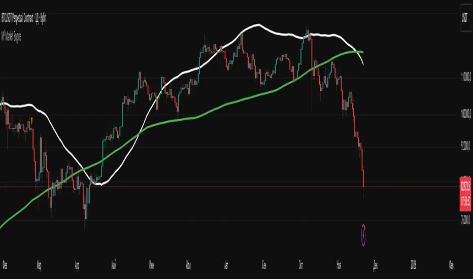
M² Market EngineWhat the indicator can do:
1. Plots up to 5 moving averages simultaneously on the same chart.
2. Uses a single price source (default: close, but any standard source can be selected).
3. Allows you to switch the type of all moving averages with one parameter: SMA / EMA / WMA / RMA
4. Provides full individual control over each MA:
- custom period
- custom color
- custom line thickness (1–5)
- ability to disable/hide any MA
5. Works on any timeframe and any asset
Mars Mission ModelIdentifies Fair Value Gaps (FVGs) during the New York AM session (8-11 AM EST) that form outside Bollinger Bands, then tracks Previous Day High/Low liquidity sweeps to generate inverse FVG signals when conditions align.
What makes this unique:
This is NOT a standard FVG indicator. Uniquely combines session-specific FVG detection with Bollinger Band volatility filtering AND PDH/PDL liquidity sweep confirmation to generate inverse signals. This triple-filter confluence approach is an original methodology not found in existing indicators.
Core Logic:
Detects 3-candle Fair Value Gaps (where candle 1's high/low doesn't overlap with candle 3's low/high). When the middle candle closes beyond the Bollinger Bands during NY AM session, a green box marks the qualified FVG.
The indicator simultaneously tracks Previous Day High/Low levels and monitors for liquidity sweeps (price trading through these levels) during the NY AM session, marked with rocket emojis 🚀.
Inverse FVG Signals:
When a qualified FVG gets mitigated (price closes back through it) AND the corresponding PDH/PDL was already swept in that session, an inverse signal appears (alien emoji 👽):
Bullish FVG mitigated + PDH swept = Bearish inverse signal
Bearish FVG mitigated + PDL swept = Bullish inverse signal
This proprietary combination of session timing, volatility expansion, liquidity sweeps, and FVG mitigation creates a focused reversal detection system that doesn't exist in any open-source indicator.
Let's go to Mars 🚀
For educational use only. Not financial advice.

9 Custom Horizontal Levels + Text LabelsThis tool provides nine fully customizable price levels for volatility-based analysis.
Each line allows manual price input and independent control of visibility, color, and style.
Common uses include constructing volatility bands such as ±1 SD and ±2 SD around a settlement or reference price. Traders can quickly map key levels, visualize market structure, and adapt the lines to fit any strategy.

ST – Soothing areas 2TF [Soothing Trades]Short Description
ST – Soothing areas 2TF runs two Soothing Areas engines at once (e.g. 15m + Daily).
It finds bullish/bearish zones from Heikin Ashi body gaps on each higher timeframe, filters them per symbol and per timeframe, and tracks mitigation with optional same-day border outlines. HTF1 and HTF2 areas have their own colors, labels, and behavior, so you can see intraday and higher-timeframe structure together on one chart.
Full Description
This is the dual-timeframe version of Soothing Areas: two independent higher-timeframe engines, one chart.
Core logic
You choose two higher timeframes: HTF1 (e.g. 15m, 30m, 1h) and HTF2 (e.g. 4h, 1D, 1W).
For each HTF, the script:
• Uses the Heikin Ashi version of your symbol.
• Detects body gaps between past Heikin Ashi candles, which often mark strong directional moves.
• Classifies valid gaps: Bullish area (demand/support) or Bearish area (supply/resistance).
• Applies a per-symbol, per-timeframe minimum area height filter so only significant gaps become areas.
• Anchors the box at the previous HTF open time using xloc=bar_time to keep geometry stable across chart timeframes.
• Extends the right edge forward while the area is active (if the "extend while active" option is enabled).
Mitigation logic
Each HTF has its own mitigation penetration setting (0–1):
• 1.00 = the HTF body must penetrate essentially the full height of the area.
• Lower values = shallower penetration required to count as mitigated.
For each area, on every bar, the indicator:
• Recomputes the HTF Heikin Ashi body (H/L) projected to the chart timeframe.
• Checks if the HTF body overlaps the area's vertical range.
• Checks if penetration meets or exceeds the specified fraction of the box height.
• If both conditions are true, the area flips from active → mitigated.
Mitigation styles & same-day outline persistence
For each HTF, there are two modes after mitigation:
Standard mitigated styling (outline persistence OFF):
• The box switches to your mitigated colors (bull/bear) and separate fill/border opacity + width.
• The area is visually de-emphasised vs active zones but still visible.
Same-day outline persistence (outline persistence ON):
• On mitigation, the box becomes border-only (no fill) using dedicated outline colors, width, and style (solid/dashed/dotted).
• The outline continues to extend right for the rest of the current day.
• Next day, it stops extending and is flagged as no longer persistent.
• This lets you keep a visual memory of "where the move happened and was mitigated today" without covering your chart in solid boxes.
Visibility & labeling
• HTF1 & HTF2 can be toggled independently (show/hide boxes).
• Active boxes can have labels with separate toggles for HTF1 and HTF2.
• Custom text, for example "HTF1" and "HTF2".
• Separate text colors for each engine.
• Position: Top-Right of the box, or Middle-Right (vertically centered).
• Labels are dynamically updated as the box extends so they stay at the current right edge.
Per-symbol per-timeframe thresholds
• Up to four symbol slots (e.g. NQ, GC, YM, ES).
• For each symbol you can define: Minimum area height for HTF1 and Minimum area height for HTF2.
• Any symbol that isn't matched falls back to Default – HTF1 / Default – HTF2.
• This way, an NQ 15m area doesn't have to follow the same threshold as an ES Daily area.
How traders use it
• Map intraday Soothing Areas (HTF1) together with higher-timeframe Soothing Areas (HTF2) to see where local setups align with bigger structure.
• Identify which intraday zones sit inside daily/weekly zones.
• Distinguish which areas are fresh vs mitigated vs only remaining as outlines that day.
• Use HTF2 for major bias and HTF1 for more precise execution.
• Watch border-only outlines to understand where the market has already satisfied liquidity during the current day.
Visual features
• Dual-timeframe Heikin Ashi body gap detection
• Independent colors for HTF1 and HTF2 (bullish/bearish)
• Active vs mitigated states with customizable styling
• Optional same-day border-only outline persistence
• Per-symbol, per-timeframe minimum gap filtering
• Optional labels on active boxes with custom text and positioning
• Time-anchored geometry for stable display across chart timeframes
Notes & disclaimer
• Works across most symbols supported by TradingView Pine Script v6.
• Best on instruments where higher-timeframe Heikin Ashi structure is informative (indices, futures, FX majors, liquid crypto, etc.).
• Provided for educational purposes only and is not financial advice.
Always test any approach on demo and manage your own risk.
