Relative Strength HSIWe add the relative strength indicator. We try to maximize the alpha, when there is price divergence, we should notice. Indicateur Pine Script®par pwangauconnect3
RSI with Zone Colors//@version=6 indicator(title="RSI with Zone Colors", shorttitle="RSI+", format=format.price, precision=2, timeframe="", timeframe_gaps=true) //// ==== INPUT SETTINGS ==== rsiLength = input.int(14, title="RSI Length", minval=1) source = input.source(close, title="Source") ob_level = input.int(70, title="Overbought Level") os_level = input.int(30, title="Oversold Level") //// ==== RSI CALCULATION ==== change = ta.change(source) up = ta.ma(math.max(change, 0), rsiLength) down = ta.ma(-math.min(change, 0), rsiLength) rsi = down == 0 ? 100 : 100 - (100 / (1 + up / down)) //// ==== COLOR BASED ON ZONES ==== rsiColor = rsi > ob_level ? color.red : rsi < os_level ? color.green : #2962FF //// ==== PLOT RSI ==== plot(rsi, title="RSI", color=rsiColor, linewidth=2) //// ==== ZONE LINES ==== hline(ob_level, "Overbought", color=#787B86) hline(50, "Middle", color=color.new(#787B86, 50)) hline(os_level, "Oversold", color=#787B86) //// ==== FILL ZONES ==== zoneColor = rsi > ob_level ? color.new(color.red, 85) : rsi < os_level ? color.new(color.green, 85) : na fill(plot(ob_level, display=display.none), plot(rsi > ob_level ? rsi : ob_level, display=display.none), color=zoneColor, title="OB Fill") fill(plot(os_level, display=display.none), plot(rsi < os_level ? rsi : os_level, display=display.none), color=zoneColor, title="OS Fill") //// ==== COLOR CANDLE WHEN RSI IN ZONE ==== barcolor(rsi > ob_level ? color.red : rsi < os_level ? color.green : na)Indicateur Pine Script®par pkgoglobal3
RSI with Zone ColorsRSI with zone cooler highlight for everyone 🔹 Short description (for the “Description” box) RSI with Zone Colors This indicator plots a classic RSI and highlights the overbought / oversold zones with clear colors. The RSI line changes color when it enters each zone, the zones are softly filled in the RSI pane, and the price candles on the main chart are recolored whenever RSI is overbought or oversold. It’s designed to make momentum shifts easy to see at a glance on any symbol or timeframe. ⸻ 🔹 What the script does (explanation) 1. Custom RSI calculation • Uses the price source you choose (close by default) and the RSI length you set. • Calculates average up-moves and down-moves, then builds a classic RSI value from 0–100. 2. Configurable levels • Overbought Level (default 70) • Oversold Level (default 30) • Midline at 50 is drawn automatically. 3. RSI line color by zone • Above OB level → RSI line becomes red (overbought zone). • Below OS level → RSI line becomes green (oversold zone). • Between the two levels → blue (normal zone). 4. Zone lines • Horizontal lines at Overbought, Oversold, and 50 are plotted to clearly mark each region. 5. Zone fills • The space around the overbought area is filled with a soft red background. • The space around the oversold area is filled with a soft green background. • Transparency is used so the RSI line stays visible. 6. Candle colors on the main chart • When RSI is overbought, price candles are colored red. • When RSI is oversold, price candles are colored green. • In the normal zone, candles keep their default color. → This lets you see RSI conditions directly on the price chart without looking down at the indicator pane all the time. ⸻ 🔹 How to use (for “How to use / Strategy idea” section) You can copy-paste and tweak this: How to use • Apply this indicator to any symbol and timeframe. • Adjust RSI Length, Overbought Level, and Oversold Level to match your trading style (for example 14 / 80 / 20 for stronger filters). • Use the red overbought zone to look for potential exhaustion after strong up moves. • Use the green oversold zone to look for potential exhaustion after strong down moves. • Candle colors on the main chart help you see when RSI is extended without taking your eyes off price. • This script is meant as a visual aid, not a complete trading system. Combine it with your own trend, structure, and risk-management rules. ⸻ 🔹 Optional disclaimer (short) This script is for educational and informational purposes only and is not financial advice. Always test any idea on a demo account before using it with real capital.Indicateur Pine Script®par pkgoglobal6
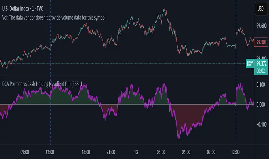
DCA Position vs Cash HoldingThis indicator visualizes the performance of a simulated dollar-cost averaging (DCA) strategy compared to simply holding cash. It models the cumulative position size and value of buying a fixed dollar amount of the asset per candle over a configurable lookback period. 🔍 What It Shows: Simulates buying $1 (or any amount) of the asset per candle Tracks the total units accumulated and their current market value Plots the difference between the DCA position value and total cash spent Highlights when DCA buyers are underwater — a potential contrarian buy zone 📈 How to Use: Values above zero indicate DCA outperformance vs cash Values below zero signal structural drawdown — often a high-conviction bulk-buy opportunity Use as a sentiment overlay to time discretionary adds or confirm regime shifts ⚙️ Inputs: Lookback Window: Number of candles used to simulate DCA accumulation DCA Amount: Dollar value purchased per candle This tool is ideal for traders seeking to quantify accumulation efficiency, identify cycle inflection points, and visualize sentiment-weighted cost basis dynamics.Indicateur Pine Script®par slopipMis à jour 10
Bull/Bear FVG Density RatioThis indicator tracks the directional frequency of Fair Value Gaps (FVGs) over a configurable lookback window, offering a clean, responsive measure of market imbalance. 🔍 What It Does: Detects bullish and bearish FVGs using a 3-bar displacement logic Calculates the ratio of FVGs to candles over the last N bars Plots separate density curves for bullish and bearish FVGs Includes a threshold line to help identify regime shifts (e.g., drought vs spate) 📈 How to Use: Use rising density to confirm trend strength or breakout momentum Watch for crossovers above the threshold to signal active imbalance regimes Combine with price action or volume overlays for high-confluence setups ⚙️ Inputs: Lookback Window: Number of candles used to calculate FVG density Threshold: Visual guide for regime classification (default: 0.2) This tool is ideal for traders who want to move beyond symptomatic signals and model structural causality. It pairs well with lifecycle scoring, retest velocity, and HTF overlays.Indicateur Pine Script®par slopip30
Easy [CHE] Easy — Minimalist Pine Script for detecting EMA direction changes to define fixed price zones for simple support and resistance visualization, ideal for manual trading workflows. Summary This indicator's programming is kept minimalist and super simple, with core logic in under 20 lines for easy comprehension and modification. It creates fixed price zones based on divergences between a base exponential moving average and its smoother counterpart, helping traders spot potential consolidation or reversal areas without dynamic adjustments. By locking the zone at the high and low of the signal bar, it avoids over-expansion in volatile conditions, offering a stable reference line colored by price position relative to the zone. This approach differs from expanding channels by prioritizing simplicity and persistence until a new qualifying signal, reducing visual clutter while highlighting directional bias through midpoint coloring. Motivation: Why this design? Traders often face noisy signals from moving averages that flip frequently in sideways markets or lag during breakouts, leading to premature entries or missed opportunities. This indicator addresses that by focusing on confirmed direction shifts between the base and smoothed averages, then anchoring a non-expanding zone to capture the initial price range of the shift. The result is a cleaner tool for marking equilibrium levels, assuming price respects these bounds in ranging or mildly trending conditions. What’s different vs. standard approaches? - Reference baseline: Traditional moving average crossovers or simple channels that update every bar. - Architecture differences: - Zones are set only on new divergence signals and remain fixed until reset by a gap from the prior zone. - No ongoing high-low expansion; relies on persistent variables to hold bounds across bars. - Midpoint plotting with conditional coloring based on close position, plus a highlight for zone initiations. - Practical effect: Charts show persistent horizontal references instead of drifting lines, making it easier to gauge if price is rejecting or embracing the zone—useful for avoiding false breaks in low-volatility setups. How it works (technical) The indicator first computes a base exponential moving average of closing prices over a user-defined length, then applies a second exponential moving average to smooth that base. It checks if both the base and smoothed values are increasing or decreasing compared to their prior values, indicating aligned direction. A signal triggers when this alignment breaks, marking a potential shift. On a new signal, if the current bar's high and low fall outside any existing zone (or none exists), the zone bounds update to those extremes and persist via dedicated variables. The midpoint of these bounds becomes the primary plot line, colored green if below the close (bullish lean), red if above (bearish lean), or gray otherwise. A secondary thick line highlights the midpoint briefly when a zone first sets, aiding visual confirmation. No higher timeframe data or external fetches are used, so updates occur on each bar close without lookahead. Parameter Guide EMA Length — Sets the period for the base moving average; longer values smooth more, reducing signal frequency but increasing lag. Default: 50. Trade-offs/Tips: Shorter for faster response in intraday charts (risks noise); longer for daily trends (may miss early shifts). Smoother Length — Defines the period for the secondary smoothing on the base average; higher values dampen minor wiggles for stabler direction checks. Default: 3. Trade-offs/Tips: Keep low (2–5) for sensitivity; increase to 7+ if zones trigger too often in choppy markets, at cost of delayed signals. Reading & Interpretation The main circle plot at the zone midpoint serves as a dynamic equilibrium line: green suggests price is above the zone (potential strength), red indicates below (potential weakness), and gray shows containment within bounds (neutral consolidation). A sudden thick foreground line at the midpoint flags a fresh zone start, prompting review of the prior bar's context. Absence of a plot means no active zone, implying reliance on price action alone until the next signal. Practical Workflows & Combinations - Trend following: Enter long on green midpoint after a higher low touches the zone lower bound, confirmed by structure like higher highs; filter shorts similarly on red with lower highs. - Exits/Stops: Use the opposite zone bound as a conservative stop (e.g., below lower for longs); trail aggressively to midpoint on strong moves, tightening near gray neutrality. - Multi-asset/Multi-TF: Defaults work across forex and stocks on 1H–Daily; for crypto volatility, shorten EMA Length to 20–30. Pair with volume oscillators for confirmation, avoiding isolated use. Behavior, Constraints & Performance - Repaint/confirmation: Plots update on bar close using historical closes, so confirmed signals hold; live bars may shift until close but without future references. - security()/HTF: Not used, eliminating related repaint risks. - Resources: Minimal overhead—no loops, arrays, or bar limits exceeded; suitable for real-time on any timeframe. - Known limits: Fixed zones may lag in strong trends (price drifts away without reset); signals skip if no gap from prior zone, potentially missing clustered shifts. Assumes standard OHLC data; untested on non-equity assets. Sensible Defaults & Quick Tuning Start with EMA Length at 50 and Smoother Length at 3 for balanced daily charts. If signals fire too frequently (e.g., in ranges), extend EMA Length to 100 for fewer but stabler zones. For sluggish response in trends, drop Smoother Length to 2 and EMA Length to 30, monitoring for added noise. In high-vol setups, widen both to 75/5 to filter extremes, trading speed for reliability. What this indicator is—and isn’t This is a lightweight visualization layer for EMA-driven zones, aiding manual chart reading and basic signal spotting. It is not a standalone system, predictive model, or automated alert generator—integrate with broader analysis like market structure and risk rules. (Unknown/Optional: No built-in alerts or multi-timeframe scaling.) Disclaimer The content provided, including all code and materials, is strictly for educational and informational purposes only. It is not intended as, and should not be interpreted as, financial advice, a recommendation to buy or sell any financial instrument, or an offer of any financial product or service. All strategies, tools, and examples discussed are provided for illustrative purposes to demonstrate coding techniques and the functionality of Pine Script within a trading context. Any results from strategies or tools provided are hypothetical, and past performance is not indicative of future results. Trading and investing involve high risk, including the potential loss of principal, and may not be suitable for all individuals. Before making any trading decisions, please consult with a qualified financial professional to understand the risks involved. By using this script, you acknowledge and agree that any trading decisions are made solely at your discretion and risk. Do not use this indicator on Heikin-Ashi, Renko, Kagi, Point-and-Figure, or Range charts, as these chart types can produce unrealistic results for signal markers and alerts. Best regards and happy trading ChervolinoIndicateur Pine Script®par chervolino77
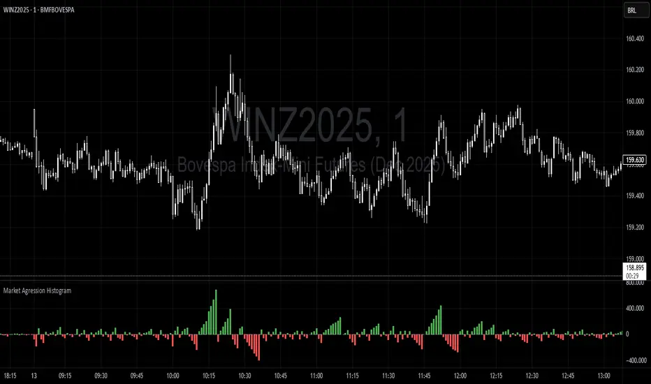
Trading Range Aggression Histogram This indicator is a histogram that accumulates the net volume of aggressive buying and selling per candle, representing the dominant market pressure within defined time-frame. The indicator works by continuously summing volumes as long as the aggression remains in the same direction, resetting and reversing the accumulation when the pressure changes sides. This creates visual waves that facilitate the perception of phases dominated by buyers and sellers over time. The tool is useful to identify moments of strength, weakness, and potential reversals in a dynamic market, especially in short-term trading. Indicateur Pine Script®par destrobr0685Mis à jour 25
RSI Regime: Continuation vs Reversal Indicator Description: RSI Regime (Continuation vs. Reversal) This indicator uses the standard Relative Strength Index (RSI) to analyze market momentum and categorize it into three "regimes." Its primary goal is to help you determine if an overbought (OB) or oversold (OS) signal is likely to be a continuation of the current trend or a reversal point. It also identifies "Fast Trend Starts," which are exceptionally fast and powerful moves from one extreme to the other. Core Features & How to Read It 1. The Three RSI Regimes (Background Color) The script calculates a moving average (SMA) of the RSI to determine the dominant medium-term momentum. This is shown as the background color: Bull Regime (Green Background): The RSI's average is high (e.g., above 55). The market is in a clear uptrend. Bear Regime (Red Background): The RSI's average is low (e.g., below 45). The market is in a clear downtrend. Range Regime (Orange Background): The RSI's average is in the middle. The market is consolidating or undecided. 2. Overbought (OB) & Oversold (OS) Signals When the RSI line crosses into the overbought (e.g., >70) or oversold (e.g., <30) zones, the indicator generates one of two types of signals: A) Continuation Signals (Small Triangles: ►) These signals suggest an OB/OS reading is just a "pause" and the main trend will likely continue. Orange ► (at the top): Appears when RSI becomes overbought while the market is already in a Bull Regime. This suggests the uptrend is strong, and this OB signal may not lead to a big drop. Teal ► (at the bottom): Appears when RSI becomes oversold while the market is already in a Bear Regime. This suggests the downtrend is strong, and this OS signal may not lead to a big bounce. (Note: An optional Price EMA filter can be enabled to make these signals more strict.) B) Reversal Signals (Small Labels: "OS→>50" / "OB→<50") These labels appear after an OB/OS signal to confirm that a reversal has actually occurred. "OS→>50 Reversal" (Aqua Label): Appears if the RSI becomes oversold and then recovers back above the 50 midline within a set number of bars. This confirms the oversold dip was a reversal point. "OB→<50 Reversal" (Orange Label): Appears if the RSI becomes overbought and then falls back below the 50 midline within a set number of bars. This confirms the overbought peak was a reversal point. 3. "Fast Trend Starts" (Large Labels) This is a unique feature that identifies the fastest percentile of market moves. It measures how many bars it takes for the RSI to go from one extreme to the other and flags when a move is in the top 5% (default) of all historical moves. "Long Pullbacks (Fast OS→BullRange)" (Large Green Label): This powerful signal appears when the RSI moves from oversold (<30) all the way up to the bull range (>60) exceptionally fast. It identifies a very strong, fast, and decisive bounce that could signal the start of a new uptrend. "Short Pumps (Fast OB→BearRange)" (Large Red Label): This appears when the RSI moves from overbought (>70) all the way down to the bear range (<40) exceptionally fast. It identifies a very sharp, fast rejection or "pump-and-dump" that could signal the start of a new downtrend. Key User Inputs RSI Length (14): The lookback period for the main RSI calculation. OB (70) / OS (30): The standard overbought and oversold levels. Bull/Bear Range Threshold (60/40): These are the levels used to confirm the "Fast Trend Starts." They are separate from the OB/OS levels. RSI Regime SMA Length (21): The lookback period for the moving average that determines the background regime. Use Price EMA filter (true): If checked, the small "Continuation" triangles will only appear if the price is also above (for bulls) or below (for bears) its own 50-period EMA. Fastest X% duration (5.0): This sets the percentile for the "Fast Trend Start" labels. 5.0 means it only flags moves that are in the fastest 5% of all recorded moves. Indicateur Pine Script®par Cmo2231
VWAP CATS background flipped 4.0VWAP CATS Background Flipped 4.0 is a sophisticated Pine Script v5 indicator for TradingView that combines a configurable moving average (MA) with dynamic Gann Square of 9 levels to create a multi-layered background shading system for price action analysis. It visualizes support/resistance zones around a central MA (often VWAP or RVWAP) using incremental offsets (either % or absolute points), generating symmetrical bands that resemble a "CATS" (Concentric Adaptive Tiered System) — hence the name.The background is "flipped" in the sense that shading intensity and structure emphasize higher-tier zones, and labels are placed to the right of the chart for future projection.Key FeaturesFeature Description Multi-MA Engine Supports 20+ MA types: EMA, DEMA, TEMA, SMA, VWAP, RVWAP, HMA, ALMA, custom volume blends (CVB1–4) RVWAP Mode Rolling VWAP with adaptive or fixed time window (days/hours/minutes) Gann Square of 9 Logic Generates 80+ symmetric levels (0.25x to 17x increment) above/below the MA Dual Increment Mode Choose Percent or Points for spacing Background Fills Tiered transparency fills between Gann levels (darker = stronger zones) Visual MA Offset Shift MA line left/right without breaking fill alignment Smart Labels Projected labels on last bar: "FV", "normal", "high", "3/4" at key levels Performance Optimized Hidden plots + label cleanup to prevent lag Primary Use Cases 1. Institutional VWAP Anchoring Use RVWAP (1-day fixed) as maRaw Set Increment = 0.5 points or 0.05% Watch price interaction with "normal" (2x), "high" (4x), "3/4" (6x) zones Ideal for intraday scalping on indices (ES, NQ) or forex 2. Swing Trading with Gann Projections Use 400-period SMA/EMA on daily chart Increment in Percent mode (~1.22%) Identify confluence when price rejects at 2x, 4x, or 6x bands Labels project future targets to the right 3. Volume-Weighted Mean Reversion Select CVB1–CVB4 for heavy volume smoothing Use Points mode for stocks with stable tick sizes (e.g. $0.50 increments) Trade mean reversion between ±1x and ±2x bands 4. Risk Management & Stop Placement Place stops beyond 2x or 4x bands Take profits at next major tier (e.g. 4x → 6x) Pro Tips Enable "Use Fixed Time Period" for RVWAP to avoid session reset issues Increase i_label_offset on lower timeframes to avoid overlap Combine with volume profile or order flow for confluence The "FV" label marks the Fair Value MA — core anchor Summary"VWAP CATS Background Flipped 4.0" turns any moving average into a dynamic Gann-based pricing grid with intelligent background shading and forward-projected labels — perfect for institutional-style mean reversion, swing targeting, and risk-defined trading." Indicateur Pine Script®par surfchaser16
Moving Average Ribbon (10x, per-MA timeframe)A flexible moving‑average ribbon that plots up to 10 MAs, each with its own type, length, source, color, and independent timeframe selector for true multi‑timeframe analysis without repainting on higher‑timeframe pulls. What it does Plots ten moving averages with selectable types: SMA, EMA, SMMA (RMA), WMA, and VWMA. Allows per‑line timeframe inputs (e.g., 5, 15, 60, 1D, 1W) so you can overlay higher‑ or equal‑timeframe MAs on the current chart. Uses a non‑repainting request pattern for higher‑timeframe series to keep lines stable in realtime. How to use Leave a TF field blank to keep that MA on the chart’s timeframe; type a timeframe (like 15 or 1D) to fetch it from another timeframe. Typical trend‑following setup: fast MAs (10–21) on chart TF, mid/slow MAs (34–200) from higher TFs for bias and dynamic support/resistance. Color‑code faster vs slower lines and optionally hide lines you don’t need to reduce clutter. Best practices Prefer pulling equal or higher timeframes for stability; mixing lower TFs into a higher‑TF chart can create choppy visuals. Combine with price action and volume/volatility tools (e.g., RSI, Bollinger Bands) for confirmation rather than standalone signals. Showcase example charts in your publish post and explain default settings so users know how to interpret the ribbon. Inputs Show/Hide per MA, Type (SMA/EMA/SMMA/WMA/VWMA), Source, Length, Color, Timeframe. Defaults cover common lengths (10/20/50/100/200 etc.) and can be customized to fit intraday or swing styles. Limitations This is an analysis overlay, not a signal generator; it doesn’t place trades or alerts by default. Effectiveness depends on instrument liquidity and user configuration; avoid overfitting to one market or regime. Attribution and etiquette Provide a brief explanation of your calculation choices and note that MA formulas are standard; credit any borrowed concepts or snippets if used.Indicateur Pine Script®par hh_00abcd8
US Leverage Overlay — Margin Debt & Total Credit (YoY / Z-score)What this does An overlay indicator that brings U.S. leverage proxies from FRED onto your main price chart (left axis). Choose between a proxy for investor margin debt or total credit market debt and view them as YoY %, Z-score of YoY, or an Indexed Level so they’re comparable with price without wrecking the scale. Data sources (FRED symbols) --- Margin (investor leverage proxy): FRED:BOGZ1FL663067003Q Brokers & Dealers; Receivables Due from Customers ≈ margin loans (quarterly). --- TotalCredit (economy-wide leverage): FRED:TCMDO All sectors; Debt Securities & Loans; Liability (quarterly). Note: These are quarterly series. The indicator samples monthly and holds values between official prints, so you’ll see step-like updates when new data drops. Views (pick one in settings) --- YoY % — 12-month rate of change. Above 0% = leverage expanding; below 0% = contracting. --- Z-score (YoY) — Standardizes YoY vs. its recent history to flag unusual moves (regime shifts). --- Indexed Level — 100 × (level / moving average), a compact “above/below trend” view. How to read quickly --- Rising YoY % > 0 → leverage expansion (often supportive for risk). --- Falling YoY % < 0 → deleveraging headwind. --- Z-score spikes (±2) → unusually fast changes; watch for volatility or policy inflections. --- Indexed Level crossing down through 100 → slipping below trend. Inputs --- Data source: Margin or TotalCredit --- YoY/Z-score lookbacks and Index baseline length --- Overlay: overlay=true, scale=scale.left (uses its own left axis by default) Tips --- If it spawns in a sub-pane, right-click the label → Move to → Main chart. --- For context, consider adding related series on separate panes: FRED:TOTALSL (Consumer Credit), FRED:REVOLSL (Credit Cards), FRED:BUSLOANS (C&I Loans), FRED:TDSP (Debt Service Ratio). --- Occasionally FRED returns “Failed to fetch”; re-add or reload fixes it. Why it’s useful Equity drawdowns often line up with turns in leverage (households, corporates, or brokers). This overlay gives you a clean, normalized read so you can spot expansion vs. contraction alongside price action. Compatibility --- Pine Script® v6 --- Works on any chart timeframe (data internally sampled monthly) Educational use only — not financial advice.Indicateur Pine Script®par brian768313
Morning Star & Rising Star Detector - Neon CandlesMorning Star & Rising Star to determine several levels and forecast what might happen next with the price.Indicateur Pine Script®par crypticone4032
Improved ICT MultiTF A+ IndicatorThis indicator provides ICT-style multi time frame fair value gaps with a 4-hour moving average bias. It prioritizes 15-minute gaps and falls back to 5-minute and 1-minute gaps when none are present. It also includes alert conditions for long and short signals based on session filters and bias.Indicateur Pine Script®par SBD_KD4
My scriptTest to see if i can use pine script. Will help democratize access. Indicateur Pine Script®par aryan_dugar0
Contango/Backwardation Monitor This is an indicator to display the spread difference between two products. I designed it around VX1! and VX2! but any other two products can be chosen. It is a simple subtraction of VX2-VX1. I will go through the options first and what they do followed by what contango/backwardation is in my own words. You will need the data package for VX futures for the default version to work. INPUTS -Apply Smoothing: choose to apply smoothing or not. -Smoothing Method: choose between SMA,EMA,WMA, etc. -Line Width: Width of line if line is chosen style(can be changed in style section) -Threshold 1-5: This is the level at which the line will change colors(defaults are for VX) -Color 1-5: The color the line will change to when crossing threshold. Towards Backwardation: Background color change when line is slanted down Towards Contango: Background color change when line is slanted up Bars to Confirm Trend: This is my method to cut down on background color changes. It is how many bars consecutive going back needed to change color. STYLE -All colors and whatnot can be changed here(threshold colors can be changed here or on the input page). T1 Line-T5 line: These are simple horizontal lines that can be used to denote threshold areas or whatever you want. Contango/Backwardation-These terms are used mostly with futures to define the calendar spread between two contracts. Contango is when that spread is is getting longer and backwardation is when that spread is closing. In terms of VIX futures, Contango would imply that volatility is stabilizing and the S and P will likely gain. Backwardation, woudl eb the opposite. The most simple way to read this indicator with default settings- If the line is up, red, and the background is red, then you can assume S and P prices are going down. And if the opposite is true, then prices are likely going up. Please feel free to ask any questions and I will do my best to answer them. Indicateur Pine Script®par NoMorePaperTrading4433
Hourly ORB NY Session (5/15min) - FixedDrawing ORB each hour in NY session First ORB is 9.30 to 11.00am then every hour we have a 15 min ORB 11am 12pm 1pm 2pm 3pm You dont need anything else than this! Simple and powerfulIndicateur Pine Script®par hasan_ammar_fastMis à jour 17