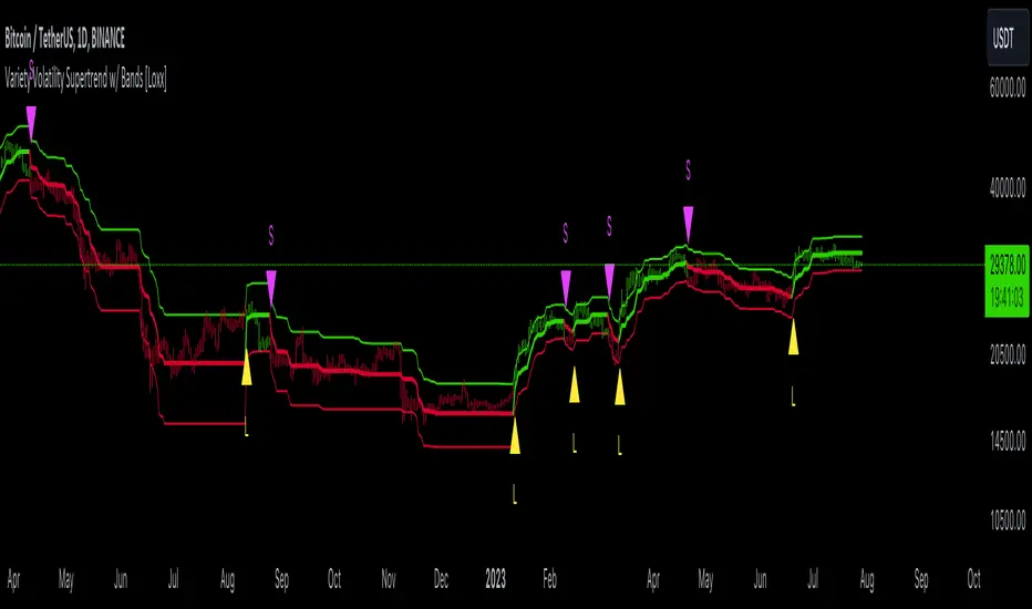
Variety Volatility Supertrend w/ Bands [Loxx]Variety Volatility Supertrend w/ Bands indicator is a powerful and highly customizable tool for traders. Building upon the foundational concept of the classic Supertrend indicator, this variant adds a plethora of user-driven options and features that can cater to diverse trading styles and market scenarios.
The Supertrend indicator is traditionally used to identify market trends by overlaying a line on the price chart, which changes color and position in relation to the price based on the trend direction. The Variety Volatility Supertrend w/ Bands takes this a step further by offering various volatility calculations, visual enhancements, explicit trading signals, and alert conditions.
It provides five options for volatility calculations, enabling users to select the most suitable measure for their strategy. This indicator also allows users to control the display of the upper, lower, and mid bands, which can serve as dynamic support and resistance levels. Further, it can display explicit trading signals when the trend changes direction and set up alerts for these signals.
█ User Inputs
Source: Defines the source of the price data, typically the closing price.
Period: Defines the lookback period for the chosen volatility calculation.
Mid Price Period: Defines the number of periods for calculating the mid-price.
Multiplier: The factor by which the volatility measure (e.g., ATR) is multiplied.
Volatility Type: The user can choose one of five different calculations for the volatility measure: ATR, Standard Error, Standard Deviation, Custom Standard Deviation with Sample Correction, and Custom Standard Deviation without Sample Correction.
Classic Supertrend: Enables the classic version of the Supertrend indicator if set to true.
Show Upper Band, Show Lower Band, Show Mid: Determines whether the upper, lower, and middle bands of the Supertrend indicator are displayed.
Outer Line Width, Mid Line Width: Controls the line widths of the outer and middle lines.
Color Bars: Colors the price bars based on the direction of the trend if enabled.
Show signals: Displays trading signals on the chart if enabled.
Bull Color, Bear Color: Controls the colors of the Supertrend indicator during bullish and bearish market conditions.
█ Computations
The script begins by calculating the chosen volatility measure (ATR, Standard Error, Standard Deviation, etc.) and the mid-price, which is the average of the highest and lowest prices over the specified Mid Price Period. It then calculates the upper and lower bands by adding and subtracting the product of the Multiplier and the volatility measure from the mid-price.
The script then compares the current price with the previous upper and lower bands to determine the trend direction. If the current price is greater than the previous upper band, the trend is considered bullish. If it's less than the previous lower band, the trend is bearish.
█ Visualizations
The script plots the upper, lower, and mid bands on the chart based on the user's settings. If Color Bars is enabled, the script colors the price bars based on the trend direction. If Show signals is enabled, the script displays shapes on the chart to represent trading signals when the trend changes direction.
█ Alerts
Finally, the script sets up alert conditions for long and short trading signals. When these conditions are met, TradingView sends an alert to the user with a message indicating the indicator's name, the type of signal (long or short), and the symbol and closing price of the asset.
█ Visualization Modes
Classic Supertrend
The Classic Supertrend mode essentially transforms the "Variety Volatility Supertrend w/ Bands " indicator to behave more like the traditional Supertrend indicator.
In the traditional Supertrend indicator, there is a single line that shifts positions based on the trend direction. When the market is in an uptrend, the Supertrend line is plotted below the price, acting as a dynamic support level. Conversely, when the market is in a downtrend, the Supertrend line moves above the price, acting as a dynamic resistance level.
When you set Classic Supertrend to True in this script, it mimics this behavior. It will only display one line (the Supertrend line) instead of the upper and lower bands. The Supertrend line will switch between the calculated upper band and lower band based on the trend direction:
In an uptrend, it plots the lower band as the Supertrend line (acting as a dynamic support level).
In a downtrend, it plots the upper band as the Supertrend line (acting as a dynamic resistance level).
Thus, when Classic Supertrend is True, the display is similar to the regular Supertrend indicator, offering a more simplified, less cluttered view of the price trend.
See here for the Classic Supertrend
Supertrend Moving Average with Bands
When the Classic Supertrend option is turned off in the "Variety Volatility Supertrend w/ Bands " indicator, the indicator displays upper and lower bands along with the midline, depending on the user's settings. These bands can serve as dynamic support and resistance levels, and they move and adjust based on the market's volatility.
Support and resistance are key concepts in technical analysis. Support is a price level where the price tends to find a floor as it falls, indicating a greater amount of demand or buying interest that can prop up the prices. Resistance, on the other hand, is a price level where rising prices tend to stop rising, indicating a greater amount of supply or selling interest.
In the context of the "Variety Volatility Supertrend w/ Bands " indicator:
Upper Band: This can act as a dynamic resistance level in a downtrend. When prices are falling, they might struggle to rise above this band. If prices do break above the upper band, it could be a sign that the downtrend is reversing, and a new uptrend may be beginning.
Lower Band: Conversely, this can act as a dynamic support level in an uptrend. When prices are rising, they might bounce off this band and continue to rise. If prices break below the lower band, it could indicate that the uptrend is reversing, and a new downtrend may be beginning.
The benefit of these dynamic support and resistance levels is that they adjust automatically as market conditions change, potentially offering more relevant insights into price behavior compared to static support and resistance levels.
See here for the Supertrend Moving Average with Bands
█ Volatility Types
The "Variety Volatility Supertrend w/ Bands " indicator provides five options for the volatility calculation. Volatility is a statistical measure of the dispersion of returns for a given security or market index. In most cases, the higher the volatility, the riskier the security. Here's a quick summary of each option:
Average True Range (ATR): This is a common volatility measure in the world of trading, particularly for commodities and forex markets. It measures the average of true price ranges over a specified period. The true range considers the most recent period's high-low range, the previous close to the most recent high, and the previous close to the most recent low, taking the highest value.
Standard Error: This is a measure of the accuracy of predictions made with statistical techniques. In the context of trading, the standard error can give traders an idea of the quality of their volatility or price level estimates. It's calculated using the standard deviation of the price data, the square root of the number of data points.
Standard Deviation: This is a measure of the dispersion of a set of data from its mean. It's a commonly used volatility measure in finance. In trading, a higher standard deviation suggests greater price volatility.
Custom Standard Deviation - with Sample Correction: This is a variation of the standard deviation calculation, but it applies a correction for small sample sizes. It's calculated similarly to the standard deviation, but the sum of the squares is divided by (n-1) instead of n to provide a more accurate estimate when working with a small number of data points.
Custom Standard Deviation - without Sample Correction: This is another variation of the standard deviation calculation, but without the sample correction. This might be used when the number of data points is sufficiently large that the correction is not necessary.
The choice of volatility measure can have a significant impact on the sensitivity of the Supertrend indicator. Some measures may result in wider bands and fewer trend changes, while others may produce narrower bands and more frequent trend changes. The choice of volatility measure should align with the trader's strategy and risk tolerance.
█ Multiple Timeframe options
The "Variety Volatility Supertrend w/ Bands " indicator, like most indicators on the TradingView platform, can be applied to various timeframes, regardless of the chart's current timeframe. The timeframe of an indicator is determined by the timeframe of the price data it processes.
This indicator's flexibility with timeframes allows it to be used in different trading strategies. Day traders might use shorter timeframes like 1-minute or 15-minute charts, swing traders might use 1-hour or 4-hour charts, and long-term investors might use daily or weekly charts.
See here for the Supertrend Moving Average with Bands on 4-hour chart using Daily data
Deviation
EMA-Deviation-Corrected T3 [Loxx]EMA-Deviation-Corrected T3 is a T3 moving average that uses EMA deviation correcting to produce signals. This comes via the beloved genius Mladen.
The origin of the correcting algorithm can be attributed to Dr. Alexander Uhl, who developed a method to filter the moving average and identify signals. Originally, this method utilized standard deviation as a measure to correct the average values.
However, the current indicator in question employs a modified version of the correcting method. Instead of using standard deviation for calculation, it uses EMA deviation, which stands for Exponential Moving Average deviation. The idea behind using EMA deviation is two-fold:
Efficiency: EMA deviation can be calculated faster than standard deviation, resulting in more efficient code execution.
Signal Reduction: Surprisingly, this modified "correcting" approach generates fewer signals compared to using standard deviation. This is because EMA deviation is more responsive to price changes, making the correcting process less sensitive to whipsaws or false signals.
What is T3?
The T3 moving average, short for "Tim Tillson's Triple Exponential Moving Average," is a technical indicator used in financial markets and technical analysis to smooth out price data over a specific period. It was developed by Tim Tillson, a software project manager at Hewlett-Packard, with expertise in Mathematics and Computer Science.
The T3 moving average is an enhancement of the traditional Exponential Moving Average (EMA) and aims to overcome some of its limitations. The primary goal of the T3 moving average is to provide a smoother representation of price trends while minimizing lag compared to other moving averages like Simple Moving Average (SMA), Weighted Moving Average (WMA), or EMA.
To compute the T3 moving average, it involves a triple smoothing process using exponential moving averages. Here's how it works:
Calculate the first exponential moving average (EMA1) of the price data over a specific period 'n.'
Calculate the second exponential moving average (EMA2) of EMA1 using the same period 'n.'
Calculate the third exponential moving average (EMA3) of EMA2 using the same period 'n.'
The formula for the T3 moving average is as follows:
T3 = 3 * (EMA1) - 3 * (EMA2) + (EMA3)
By applying this triple smoothing process, the T3 moving average is intended to offer reduced noise and improved responsiveness to price trends. It achieves this by incorporating multiple time frames of the exponential moving averages, resulting in a more accurate representation of the underlying price action.
Included
Bar coloring
Signals
Alerts
Loxx's Expanded Source Types

Korea pump kairiIn crypto assets, illiquid coins are often pumped on Korean exchanges.
The purpose of this indicator is to show the price deviation of the three symbols xxx/USDT Spot, xxx/USD Perpetual and xxx/KRW in terms of USD.
The xxx/USD Spot is set to a base value of 0 and the indicator shows how much the xxx/USD Perpetual and xxx/KRW Spot deviate from it.
Example of use)
Binance XEM/USDT Spot
Binance XEM/USDT Perp.
Upbit XEM/KRW Spot
For xxx/usd perp, SMA and, optionally, MA cross can also be displayed.
And for KRW/USD and USDT/USD, you can use the defaults as they are, or you can set your preferred symbols.

Price based concepts / quantifytools- Overview
Price based concepts incorporates a collection of multiple price action based concepts. Main component of the script is market structure, on top of which liquidity sweeps and deviations are built on, leaving imbalances the only standalone concept included. Each concept can be enabled/disabled separately for creating a selection of indications that one deems relevant for their purposes. Price based concepts are quantified using metrics that measure their expected behavior, such as historical likelihood of supportive price action for given market structure state and volume traded at liquidity sweeps. The concepts principally work on any chart, whether that is equities, currencies, cryptocurrencies or commodities, charts with volume data or no volume data. Essentially any asset that can be considered an ordinary speculative asset. The concepts also work on any timeframe, from second charts to monthly charts. None of the indications are repainted.
Market structure
Market structure is an analysis of support/resistance levels (pivots) and their position relative to each other. Market structure is considered to be bullish on a series of higher highs/higher lows and bearish on a series of lower highs/lower lows. Market structure shifts from bullish to bearish and vice versa on a break of the most recent pivot high/low, indicating weak ability to defend a key level from the dominating side. Supportive market structure typically provides lengthier and sustained trending environment, making it an ideal point of confluence for establishing directional bias for trades.
Liquidity sweeps
Liquidity sweeps are formed when price exceeds a pivot level that served as a provable level of demand once and is expected to display demand again when revisited. A simple way to look at liquidity sweeps is re-tests of untapped support/resistance levels.
Deviations
Deviations are formed when price exceeds a reference level (market structure shift level/liquidity sweep level) and shortly closes back in, leaving participating breakout traders in an awkward position. On further adverse movement, stuck breakout traders are forced to cover their underwater positions, creating ideal conditions for a lengthier reversal.
Imbalances
Imbalances, also known as fair value gaps or single prints, depict areas of inefficient and one sided transacting. Given inclination for markets to trade efficiently, price is naturally attracted to areas that lack proper participation, making imbalances ideal targets for entries or exits.
Key takeaways
- Price based concepts consists of market structure, liquidity sweeps, deviations and imbalances.
- Market structure shifts from bullish to bearish and vice versa on a break of the most recent pivot high/low, indicating weak ability to defend a key level from the dominating side.
- Supportive market structure tends to provide lengthier and sustained movement for the dominating side, making it an ideal foundation for establishing directional bias for trades.
- Liquidity sweeps are formed when price exceeds an untapped support/resistance level that served as a provable level of demand in the past, likely to show demand again when revisited.
- Deviations are formed when price exceeds a key level and shortly closes back in, leaving breakout traders in an awkward position. Further adverse movement compels trapped participants to cover their positions, creating ideal conditions for a reversal.
- Imbalances depict areas of inefficient and one sided transacting where price is naturally attracted to, making them ideal targets for entries or exits.
- Price based concepts are quantified using metrics that measure expected behavior, such as historical likelihood of supportive structure and volume traded at liquidity sweeps.
- For practical guide with practical examples, see last section.
Accessing script 🔑
See "Author's instructions" section, found at bottom of the script page.
Disclaimer
Price based concepts are not buy/sell signals, a standalone trading strategy or financial advice. They also do not substitute knowing how to trade. Example charts and ideas shown for use cases are textbook examples under ideal conditions, not guaranteed to repeat as they are presented. Price based concepts notify when a set of conditions are in place from a purely technical standpoint. Price based concepts should be viewed as one tool providing one kind of evidence, to be used in conjunction with other means of analysis.
Price based concepts are backtested using metrics that reasonably depict their expected behaviour, such as historical likelihood of supportive price movement on each market structure state. The metrics are not intended to be elaborate and perfect, but to serve as a general barometer for feedback created by the indications. Backtesting is done first and foremost to exclude scenarios where the concepts clearly don't work or work suboptimally, in which case they can't be considered as valid evidence. Even when the metrics indicate historical reactions of good quality, price impact can and inevitably does deviate from the expected. Past results do not guarantee future performance.
- Example charts
Chart #1 : BTCUSDT
Chart #2 : EURUSD
Chart #3 : ES futures
Chart #4 : NG futures
Chart #5 : Custom timeframes
- Concepts
Market structure
Knowing when price has truly pivoted is much harder than it might seem at first. In this script, pivots are determined using a custom formula based on volatility adjusted average price, a fundamentally different approach to the widely used highest/lowest price within X amount of bars. The script calculates average price within set period and adjusts it to volatility. Using this formula, the script determines when price has turned significantly enough and aggressively enough to constitute a relevant pivot, resulting in high accuracy while ruling out subjective decision making completely. Users can adjust length of market structure basis and sensitivity of volatility adjustment to achieve desired magnitude of pivots, reflected on the average swing metrics. Note that structure pivots are backpainted. Typical confirmation time for a pivot is within 2-3 bars after peak in price.
Market structure shifts
Generally speaking, traders consider market structure to have shifted when most recent structure high/low gets taken out, flipping underlying bias from one side over to the other (e.g. from bullish structure favoring upside to bearish structure favoring downside). However, there are many ways to approach the concept and the most popular method might not always be the best one. Users can determine their own market structure shift rules by choosing source (close, high, low, ohlc4 etc.) for determining structure shift. Users can also choose additional rules for structure shift, such as two consecutive closes above/below pivot to qualify as a valid shift.
Liquidity sweeps
Users can set maximum amount of bars liquidity levels are considered relevant from the moment of confirmed pivot. By default liquidity levels are monitored for 250 bars and then discarded. Level of tolerance can be set to anything between 100 and 1000 bars. For each liquidity sweep, relative volume (volume relative to volume moving average) is stored and added to average calculations for keeping track of typical depth of liquidity found at sweeps.
Deviations
Users can set a maximum amount of bars price has to spend above/below reference level to consider a deviation to be in place. By default set to 6 bars.
Imbalances
Users can set a desired fill point for imbalances using the following options: 100%, 75%, 50%, 25%. Users can also opt for excluding insignificant imbalances to attain better relevance in indications.
- Backtesting
Built-in backtesting is based on metrics that are considered to reasonably quantify expected behaviour of the main concept, market structure. Structure feedback is monitored using two metrics, supportive structure and structure period gain. Rest of the metrics provided are informational in nature, such as average swing and average relative volume traded at liquidity sweeps. Main purpose of the metrics is to form a general barometer for monitoring whether or not the concepts can be viewed as valid evidence. When the concepts are clearly not working optimally, one should adjust expectations accordingly or take action to improve performance. To make any valid conclusions of performance, sample size should also be significant enough to eliminate randomness effectively. If sample size on any individual chart is insufficient, one should view feedback scores on multiple correlating and comparable charts to make up for the loss.
For more elaborate backtesting, price based concepts can be used in any other script that has a source input, including fully mechanic strategies utilizing Tradingview's native backtester. Each concept and their indications (e.g. higher low on a bearish structure, lower high on a bullish structure, market structure shift up, imbalance filled etc.) can be utilized separately and used as a component in a backtesting script of your choice.
Structure feedback
Structure feedback is monitored using two metrics, likelihood of supportive price movement following a market structure shift and average structure period gain. If either of the two employed tests indicate failed reactions beyond a tolerable level, one should take action to improve feedback by adjusting the settings. If feedback metrics after adjusting the settings are still insufficient, the concepts are working suboptimally for the given chart and cannot be regarded as valid technical evidence as they are.
Metric #1 : Supportive structure
Each structure pivot is benchmarked against its respective structure shift level. Feedback is considered successful if structure pivot takes place above market structure shift level (in the case of bullish structure) or below market structure shift level (in the case of bearish structure). Structure feedback constitutes as one test indicating how often a market structure state results in price movement that can be considered supportive.
Metric #2 : Structure period gain
Each structure period is expected to present favorable appreciation, measured from one market structure shift level to another. E.g. bullish structure period gain is measured from market structure shift up level to market structure shift down level that ends the bullish structure period. Bearish structure is measured in a vice versa manner, from market structure shift down level to market structure shift up level that ends the bearish structure period. Feedback is considered successful if average structure period gain is supportive for a given structure (positive for bullish structure, negative for bearish structure).
Additional metrics
On top of structure feedback metrics, percentage gain for each swing (distance between a pivot to previous pivot) is recorded and stored to average calculations. Average swing calculations shed light on typical pivot magnitude for better understanding changes made in market structure settings. Average relative volume traded at liquidity sweep on the other hand gives a clue of depth of liquidity typically found on a sweeps.
Feedback scores
When market structure (basis for most concepts) is working optimally, quality threshold for both feedback metrics are met. By default, threshold for supportive structure is set to 66%, indicating valid feedback on 2/3 of backtesting periods on average. On top, average structure period gain needs to be positive (for bullish structures) and negative (for bearish structure) to qualify as valid feedback. When both tests are passed, a tick indicating valid feedback will appear next to feedback scores, otherwise an exclamation mark indicating suboptimal performance on either or both. If both or either test fail, market structure parameters need to be optimized for better performance or one needs to adjust expectations accordingly.
Verifying backtest calculations
Backtest metrics can be toggled on via input menu, separately for bullish and bearish structure. When toggled on, both cumulative and average counters used in backtesting will appear on "Data Window" tab. Calculation states are shown at a point in time where cursor is hovered. E.g. when hovering cursor on 4th of January 2021, backtest calculations as they were during this date will be shown.
- Alerts
Available alerts are the following.
- HH/HL/LH/LL/EQL/EQH on a bullish/bearish structure
- Bullish/bearish market structure shift
- Bullish/bearish imbalance created
- Bullish/bearish imbalance filled
- Bullish/bearish liquidity sweep
- Bullish/bearish deviation
- Visuals
Each concept can be enabled/disabled separately for creating a selection indications that one deems relevant for their purposes. On top, each concept has a stealth visual option for more discreet visuals.
Unfilled imbalances and untapped liquidity levels can be extended forward to better gauge key areas of interest.
Liquidity sweeps have an intensity option, using color and width to visualize volume traded at sweep.
Market structure states and market structure shifts can be visualized as chart color.
Metric table can be offsetted horizontally or vertically from any four corners of the chart, allowing space for tables from other scripts.
Table sizes, label sizes and colors are fully customizable via input menu.
- Practical guide
The basic idea behind market structure is that a side (bulls or bears) have shown significant weakness on a failed attempt to defend a key level (most recent pivot high/low). In the same way, a side has shown significant strength on a successful attempt to break through a key level. This successful break through a key level often leads to sustained lengthier movement for the side that provably has the upper hand, making it an ideal tool for establishing directional bias.
Multi-timeframe view of market structure provides crucial guidance for analyzing market structure states on any individual timeframe. If higher timeframe market structure is bullish, it doesn't make sense to expect contradicting lower timeframe market structure to provide significant adverse movement, but rather a normal correction within a long term trend. In the same way, if lower timeframe market structure is in agreement with higher timeframe market structure, one can expect a reliable trending environment to ensue as multiple points of confluence are in place.
Bullish structure can be considered constructive on a series of higher highs and higher lows, indicating strong interest from bulls to sustain an uptrend. Vice versa is true for bearish structure, a series of lower highs and lower lows can be considered constructive. When structure does not indicate strong interest to maintain a supportive trend (lower highs on bullish structure, higher lows on bearish structure), a structure shift and a turn in trend might be nearing.
Market structure shifts are of great interest for breakout traders who position for continuation. Structure shifts can indeed be fertile ground for executing a breakout trade, but breakouts can easily turn into fakeouts that leave participants in an awkward position. When price moves further away from the underwater participants, potential for snowball effect of covering positions and driving price further away is elevated.
Liquidity sweeps as a concept is based on the premise that pivoting price is evidence of meaningful depth of liquidity found at/around pivot. If liquidity existed at a pivot once, it is likely to exist there in the future as well. When price grinds against liquidity, it is on a path of resistance rather than path of least resistance. Pivots are also attractive placements for traders to set stop-losses, which act as fuel for price to move to the opposite direction when swept and triggered.
Behind tightly formed pivots are potentially many stop-loss orders lulled in the comfort of having many layers of levels protecting their position. Compression that leaves such clusters of unswept liquidity rarely goes unvisited.
As markets strive for efficient and proper transacting most of the time, imbalances serve as points in price where price is naturally attracted to. However, imbalances too are contextual and sometimes one sided trading is rewarded with follow through, rather than with a fill. Identifying market regimes give further clue into what to expect from imbalances. In a ranging environment, one can expect imbalances to fill relatively quick, making them ideal targets for entries and exits.
On a strongly trending environment on the other hand imbalances tend to stick for a much longer time. In such environments continuation can be expected with no fills or only partial fills. Signs of demand preventing fill attempts serve as additional clues for imminent continuation.

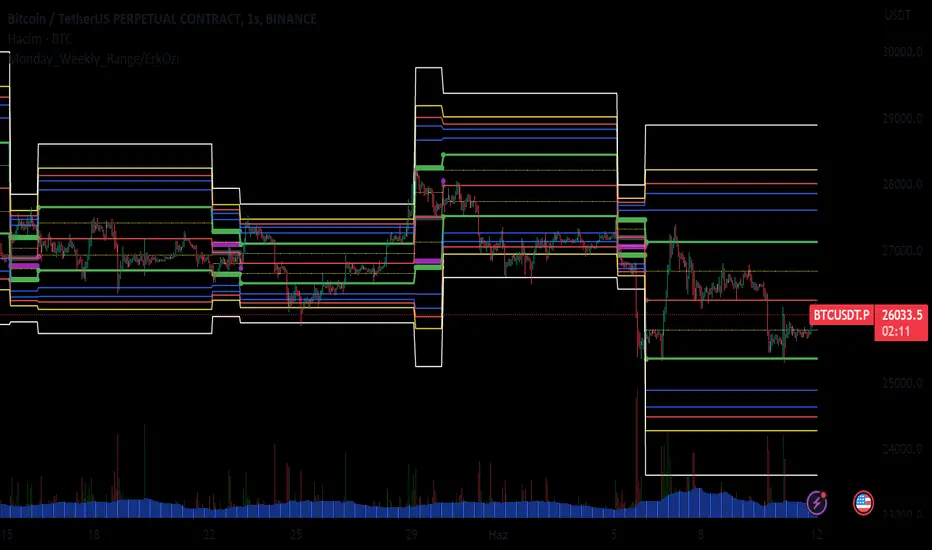
Monday_Weekly_Range/ErkOzi/Deviation Level/V1"Hello, first of all, I believe that the most important levels to look at are the weekly Fibonacci levels. I have planned an indicator that automatically calculates this. It models a range based on the weekly opening, high, and low prices, which is well-detailed and clear in my scans. I hope it will be beneficial for everyone.
***The logic of the Monday_Weekly_Range indicator is to analyze the weekly price movement based on the trading range formed on Mondays. Here are the detailed logic, calculation, strategy, and components of the indicator:
***Calculation of Monday Range:
The indicator calculates the highest (mondayHigh) and lowest (mondayLow) price levels formed on Mondays.
If the current bar corresponds to Monday, the values of the Monday range are updated. Otherwise, the values are assigned as "na" (undefined).
***Calculation of Monday Range Midpoint:
The midpoint of the Monday range (mondayMidRange) is calculated using the highest and lowest price levels of the Monday range.
***Fibonacci Levels:
// Calculate Fibonacci levels
fib272 = nextMondayHigh + 0.272 * (nextMondayHigh - nextMondayLow)
fib414 = nextMondayHigh + 0.414 * (nextMondayHigh - nextMondayLow)
fib500 = nextMondayHigh + 0.5 * (nextMondayHigh - nextMondayLow)
fib618 = nextMondayHigh + 0.618 * (nextMondayHigh - nextMondayLow)
fibNegative272 = nextMondayLow - 0.272 * (nextMondayHigh - nextMondayLow)
fibNegative414 = nextMondayLow - 0.414 * (nextMondayHigh - nextMondayLow)
fibNegative500 = nextMondayLow - 0.5 * (nextMondayHigh - nextMondayLow)
fibNegative618 = nextMondayLow - 0.618 * (nextMondayHigh - nextMondayLow)
fibNegative1 = nextMondayLow - 1 * (nextMondayHigh - nextMondayLow)
fib2 = nextMondayHigh + 1 * (nextMondayHigh - nextMondayLow)
***Fibonacci levels are calculated using the highest and lowest price levels of the Monday range.
Common Fibonacci ratios such as 0.272, 0.414, 0.50, and 0.618 represent deviation levels of the Monday range.
Additionally, the levels are completed with -1 and +1 to determine at which level the price is within the weekly swing.
***Visualization on the Chart:
The Monday range, midpoint, Fibonacci levels, and other components are displayed on the chart using appropriate shapes and colors.
The indicator provides a visual representation of the Monday range and Fibonacci levels using lines, circles, and other graphical elements.
***Strategy and Usage:
The Monday range represents the starting point of the weekly price movement. This range plays an important role in determining weekly support and resistance levels.
Fibonacci levels are used to identify potential reaction zones and trend reversals. These levels indicate where the price may encounter support or resistance.
You can use the indicator in conjunction with other technical analysis tools and indicators to conduct a more comprehensive analysis. For example, combining it with trendlines, moving averages, or oscillators can enhance the accuracy.
When making investment decisions, it is important to combine the information provided by the indicator with other analysis methods and use risk management strategies.
Thank you in advance for your likes, follows, and comments. If you have any questions, feel free to ask."
Anchored Three Sigma RangeThis indicator serves to display the standard deviation model based on open price from the selected anchored timeframe. Per statistics the price may stay within the three sigma range most of the time, most significantly within first sigma range 68% of the time.
If price breaks the statistical probabilities and out of the three sigma range entirely it could be considered anomalous and perhaps useful for trade planning, use the fib extensions in various ways to have dynamic profit targets, support or resistance.
How is this different
This indicator differs from others in that I've not really seen any others generating solely horizontal levels, anchored from open price and including fib extensions.
How to use
To use this indicator add to the chart, select anchor timeframe, fib display mode and adjust style to liking. Depending on trade plans use the range breaks, consolidations or fib extensions as required.
One could utilize range consolidation for advanced options neutral trades, range breaks for scalping directionally or high fib extensions for rejection based trades. Based on timeframe anchorage there could be some really amazing combinations for any style of trading, comment any unique findings!
What markets
This indicator can be used on anything that has a price :D
Conditions
Any condition is applicable.

Average Variation Bands OscillatorSimilar to how a donchian% of channel helps to visualize trend and volatility, this tool helps identify those same characteristics, if the oscillator is generally above the 50 mark, it is considered to be trending upwards, and the reverse if it is generally bellow 50.
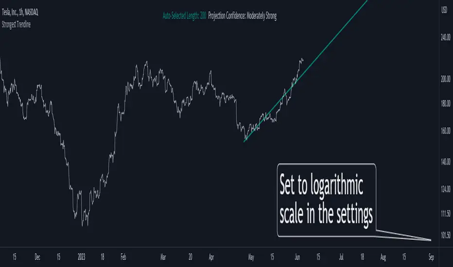
Strongest TrendlineUnleashing the Power of Trendlines with the "Strongest Trendline" Indicator.
Trendlines are an invaluable tool in technical analysis, providing traders with insights into price movements and market trends. The "Strongest Trendline" indicator offers a powerful approach to identifying robust trendlines based on various parameters and technical analysis metrics.
When using the "Strongest Trendline" indicator, it is recommended to utilize a logarithmic scale . This scale accurately represents percentage changes in price, allowing for a more comprehensive visualization of trends. Logarithmic scales highlight the proportional relationship between prices, ensuring that both large and small price movements are given due consideration.
One of the notable advantages of logarithmic scales is their ability to balance price movements on a chart. This prevents larger price changes from dominating the visual representation, providing a more balanced perspective on the overall trend. Logarithmic scales are particularly useful when analyzing assets with significant price fluctuations.
In some cases, traders may need to scroll back on the chart to view the trendlines generated by the "Strongest Trendline" indicator. By scrolling back, traders ensure they have a sufficient historical context to accurately assess the strength and reliability of the trendline. This comprehensive analysis allows for the identification of trendline patterns and correlations between historical price movements and current market conditions.
The "Strongest Trendline" indicator calculates trendlines based on historical data, requiring an adequate number of data points to identify the strongest trend. By scrolling back and considering historical patterns, traders can make more informed trading decisions and identify potential entry or exit points.
When using the "Strongest Trendline" indicator, a higher Pearson's R value signifies a stronger trendline. The closer the Pearson's R value is to 1, the more reliable and robust the trendline is considered to be.
In conclusion, the "Strongest Trendline" indicator offers traders a robust method for identifying trendlines with significant predictive power. By utilizing a logarithmic scale and considering historical data, traders can unleash the full potential of this indicator and gain valuable insights into price trends. Trendlines, when used in conjunction with other technical analysis tools, can help traders make more informed decisions in the dynamic world of financial markets.
Volume+This volume indicator uses a long WMA to establish an average volume and calculates the standard deviation based on that average. Each deviation level from 1 to 3 is also plotted with the bar color gradually increasing in intensity when more than one standard deviation is exceeded.

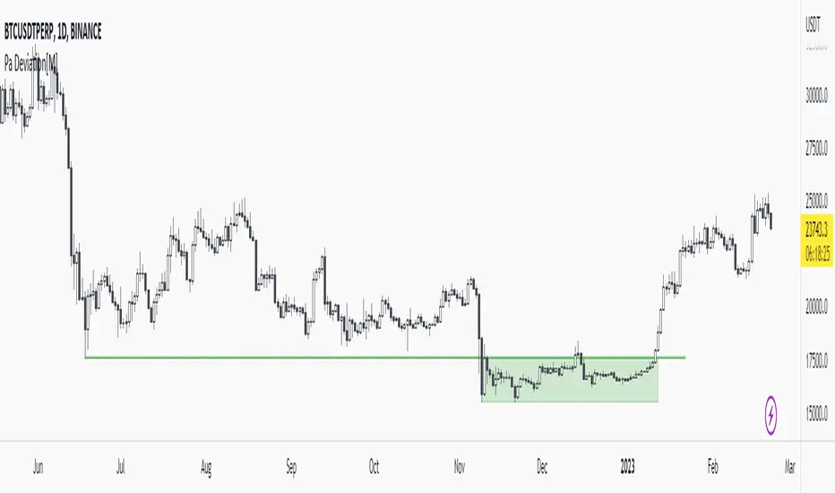
Pa Deviation[M]Hello everyone,
First of all, what is deviation?
It can be said that the price goes down (or goes out) under the past pivot zone and enters the range again after lingering for a while. (I think so)
I think there is a sign of trend reversal as it hunts the stops below (or above) the pivot zone as well. (RektProof also has a strategy for this.)
In this indicator, I determined the deviation limits with the atr of the pivot regions. For example, the deviation area (pivot zone - atr) must be greater than. It should also make a grand entrance into the range.
Let me tell you a little about the settings:
Pivot Length: It is the value entered for determining the pivot regions. For example, if the pivot length is 5, the low must be less than the past 5 lows and the next 5 lows.
Minimum Bar: The value that determines the minimum bar of the deviation area. For example, if the minimum bar is 4, the indicator will show deviation areas consisting of minimum 4 bars.
Example Deviation:
1.Pivots and Pivot Lines
As you can see in the image, there are many pivot points. Let's take the lowest pivot point and draw an imaginary line. This is our pivot line
2.Deviation
As you can see, an accumulation has occurred under our pivot line. If the price goes above our pivot line again, it will be a deviation.
3.Return to Range
Voila! Price accumulated below the pivot line and splendidly rose above the pivot line. This is the deviation area for us now.
Other Examples:
Pair Prowler [CR]█ OVERVIEW
Pair Prowler v6 Enhanced is a sophisticated oscillator-based trading system designed for traders seeking high-probability setups with multiple confirmation layers. The indicator combines proprietary signal generation with institutional-grade filters to identify optimal entry and exit points while minimizing false signals.
The system features adaptive zones that dynamically adjust to market conditions, multi-timeframe support/resistance analysis, volume-weighted mean reversion filters, and real-time performance tracking. A comprehensive confluence scoring system evaluates each potential trade across eight technical dimensions, allowing traders to filter for only the highest-quality opportunities.
█ KEY FEATURES
Adaptive Dynamic Zones
Rather than using fixed overbought/oversold levels, the indicator employs statistical methods to calculate adaptive zones that adjust to recent price behavior. These zones automatically widen during high volatility and tighten during consolidation, ensuring signals remain relevant across all market conditions.
VWAP Mean Reversion Filter
This filter uses volume-weighted price analysis to identify when price has moved significantly away from fair value. The system calculates statistical deviation from VWAP and only permits:
- Long entries when price is substantially below VWAP (oversold relative)
- Short entries when price is substantially above VWAP (overbought relative)
Higher Timeframe Support/Resistance Filter
To avoid entries near major reversal zones, the indicator analyzes pivot highs and lows from a user-selected higher timeframe. The system maintains a database of recent support and resistance levels and blocks trades that would occur too close to these critical price levels. This prevents getting stopped out by predictable institutional activity at key levels.
Divergence Detection
The indicator automatically identifies four types of divergences between price and the oscillator.
Risk Entry Signals
For aggressive traders, the indicator provides early warning signals that fire before the main entry triggers. These risk entries offer better entry prices but come with lower probability. They are visually distinct from standard entries and can be toggled on or off.
Safe Exit Zones
In addition to standard exit signals, the system identifies optimal profit-taking zones using statistical analysis and adaptive thresholds. These safe exit zones are highlighted with background coloring to alert traders when positions have reached favorable risk-reward levels.
Performance Statistics Panel
A comprehensive real-time statistics dashboard tracks:
- Total trades executed (long and short separately)
- Win rate percentages (overall, long-only, short-only)
- Profit factor calculation
- Total and average profit/loss per trade
- Largest winning and losing trades
- Maximum consecutive wins and losses
The panel can be positioned in any corner of the chart and updates automatically as trades close. Note that statistics represent theoretical performance based on signal timing and do not account for slippage, commissions, or execution delays.
Comprehensive Alert System
The indicator includes over 20 pre-configured alert types
█ HOW TO USE
Initial Setup
1 — Select your preferred base strategy from the Signal Settings group. Strategy 1 is recommended for most traders as it provides a balanced approach suitable for various market conditions.
2 — Configure the VWAP filter threshold based on your trading style:
Lower thresholds (1.0–1.5) for more frequent entries
Higher thresholds (2.0+) for fewer but more extreme reversals
3 — Set the HTF S/R filter timeframe to approximately 4–6 times your chart timeframe. For example, use 4H pivots when trading on 1H charts.
Reading Signals
Entry signals appear as triangles at the oscillator level:
- Green upward triangles indicate long entries
- Red downward triangles indicate short entries
- Small circles mark early risk entries
Exit signals appear as opposite-colored triangles. Background shading indicates special conditions like safe exit zones or averaging opportunities.
Interpreting Statistics
Use the performance panel to gauge strategy effectiveness:
- Win rates above 50% indicate positive edge
- Profit factor above 1.5 suggests robust performance
- Review max consecutive losses for position sizing guidance
Remember that past theoretical performance does not guarantee future results.
█ NOTES
Timeframe Considerations
This indicator works on all timeframes but performs optimally on 15-minute to 4-hour charts. Very low timeframes (1m–5m) may produce excessive signals, while daily and weekly charts may produce insufficient signals for active trading.
Market Conditions
The adaptive nature of the indicator allows it to function in both trending and ranging markets. However, extremely choppy or low-liquidity conditions may reduce signal quality. The confluence scoring system helps filter these periods automatically.
VWAP Behavior
VWAP resets at session boundaries for traditional markets (stocks) but runs continuously for 24-hour markets (crypto, forex). The z-score filter accounts for this difference automatically.
HTF Pivot Lag
Higher timeframe pivots require confirmation bars before being identified, introducing slight lag. Pivots are detected retrospectively once the full pattern completes on the selected timeframe.
Performance Tracking Limitations
The statistics panel tracks theoretical entry at close of signal bar and exit at close of exit bar. Actual trading results will differ due to:
- Slippage and spread costs
- Commission and fees
- Execution timing and delays
- Partial fills or rejections
- Overnight holding costs
Use the statistics as a comparative tool for optimization rather than a profit predictor.
Filter Interactions
All filters work sequentially. A signal must pass the VWAP filter, then the S/R filter. If any filter rejects the signal, it will not appear on the chart. This hierarchical approach ensures only fully validated setups generate alerts.
Optimization Guidelines
If receiving too many signals, tighten filter thresholds. If receiving too few signals, relax filters. Monitor the statistics panel over at least 50 trades before making significant parameter adjustments.

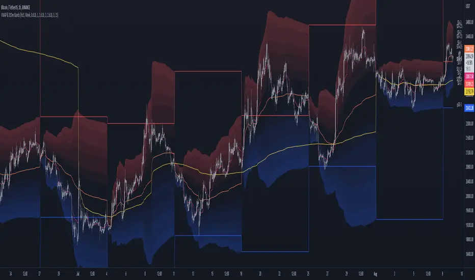
MTF VWAP & StDev BandsMulti Timeframe Volume Weighted Average Price with Standard Deviation Bands
I used the script "Koalafied VWAP D/W/M/Q/Y" by Koalafied_3 and made some changes, such as adding more standard deviation bands.
The script can display the daily, weekly, monthly, quarterly and yearly VWAP.
Standard deviation bands values can be changed (default values are 0.618, 1, 1.618, 2, 2.618, 3).
Also the previous standard deviation bands can be displayed.
[Sidders]Std. Deviation from Mean/MA (Z-score)This indicator visualizes in a straight forward way the distance price is away from the mean in absolute standard deviations (Z-score) over a certain lookback period (can be configured). Additionally I've included a moving average of the distance, the MA type can be configured in the settings.
Personally using this indicator for some of my algo mean reversion strategies. Price reaching the extreme treshold (can be configured in settings, standard is 3) could be seen as a point where price will revert to the mean.
I've included alerts for when price crosses into extreme areas, as well as alerts for when crosses back into 'normal' territory again. Both are also plotted on the indicator through background coloring/shapes.
Since I've learned so much from other developers I've decided to open source the code. Let me know if you have any ideas on how to improve, I'll see if I can implement them.
Enjoy!

Sequence Distribution Reporta basic tool to retrieve statistics of the distribution of price range sequences.

TrendTracers Bitcoin Stock to Flow ModelFor the best results, make sure to view this indicator on a bitcoin chart with a very long history (e.g. BNC:BLX)!
This model treats Bitcoin as being comparable to commodities such as gold, silver or platinum. These are known as ‘store of value’ commodities because they retain value over long time frames due to their relative scarcity. It is difficult to significantly increase their supply i.e. the process of searching for gold and then mining it is expensive and takes time. Bitcoin is similar because it is also scarce. In fact, it is the first-ever scarce digital object to exist. There are a limited number of coins in existence and it will take a lot of electricity and computing effort to mine the remaining coins still to be mined, therefore the supply rate is consistently low.
The stock-to-flow model predicts value changes in a straightforward manner. It compares an asset’s current stock to the rate of new production, or how much is produced in a year.
Calculation:
Take bitcoin production in a period, divide it by that period and then multiply by 365 to get the estimated yearly production and then calculate the stock to flow.
yearlyFlow = ((stockChange) / period ) * 365
stockToFlow = (stock - missingBitcoins) / yearlyFlow
Model Value = -1.84ᵉ * stockToFlow³.³⁶ (mathematical model to calculate the model price)
For more information about the calculations followed: stats.buybitcoinworldwide.com
Features:
Works on the Daily, Weekly and Monthly Timeframe.
Allows you to adjust between a 10-day period and a 463-day period.
Has the option to account for missing bitcoins, lets you adjust the amount of missing bitcoins.
The ability to toggle a standard deviation of the Model Value with a multiplier of 1, 2 or 3
Displays a Stock to Flow Deviation Ratio: If the Deviation Ratio is close to 0 it means the price of Bitcoin is close to the Model Value Line(or Stock to Flow Ratio). If the Deviation Ratio is close to 1 or -1, it means the price of bitcoin is near the selected deviation levels.
You can toggle between the Overlay version and the Oscillator version, default is on Oscillator version. If you want to switch: Untick Oscillator mode in the indicator settings, click on the three dots and select "move to existing pane above". Then click on the three dots again and select Pin to scale A. Done!
As a bonus: Now you can toggle a "1-year Realized Price" graph, while it's not officially part of the Stock to Flow Model it does share similar technicals about supply and scarcity. The 1-year Realized Price is the realized market cap divided by total amount of generated coins.
I just noticed that, while the color gradient function is pretty cool, it does not allow for end users to customize their colors after applying this indicator to their chart. Sorry!

Weighted Standard Deviation BandsLinearly weighted standard deviations over linearly weighted mean.
The rationale of the study can be deduced from my latest publications where I go deeper into explaining the benefits of linear weighting, but in short, I can remind that by using linear weighting we are able to increase the information gain by communicating the sequential nature of time series to the calculations via linear weighting.
Note, that multiplier parameters can take both negative and positive values resulting in ability to have, for example, 1st and 6th weighted standard deviations higher than the weighted mean.
Despite the modification of the classic standard deviation formula, I assume that mathematical qualities of standard deviation will hold due to the fact we can alternately weight the window itself, and then apply the classic standard deviation over the weighted window. In both cases, the results will be the same.
Aight that was too formal, but your short strangles should be happy
Here is it, for you

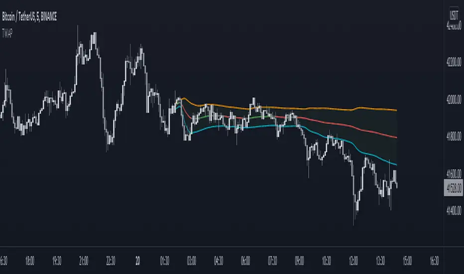
Anchored TWAP with StDev Bands [MrShadow]TWAP with:
- Anchoring: Custom, Day, Week, Month, Quarter, Year (custom anchoring can be selected by dragging a vertical line through the chart)
- Standard Devation Bands
- Auto-coloring depending on the trend
Ergodic Mean Deviation Indicator [CC]The Ergodic Mean Deviation Indicator was created by William Blau and this is a hidden gem that takes the difference between the current price and it's exponential moving average and then double smooths the result to create this indicator. This double smoothing of course creates a lag that allows it to give off a sustained buy signal during a bullish trend and vice versa. This is a very fun indicator to experiment with and surprised that no one on here gives William Blau much attention so I will go ahead and publish the rest of his scripts eventually. I have included strong buy and sell signals in addition to normal ones so strong signals are darker in color and normal signals are lighter in color. Buy when the line turns green and sell when it turns red.
Let me know if there are any other indicators or scripts you would like to see me publish!

[UPRIGHT Trading] Top & Bottom Finder [Premium]Hello Traders,
Today I'm releasing an updated version of my previous Top & Bottom Finder (M.Right_Top & Bottom Finder 1.0).
The timing of this release couldn't be more perfect with everyone trying to 'find the bottom'. And the increased volatility that we've been seeing as of late.
Essentially, my indicator uses volatility and standard deviations among other things to assist you in finding the top or bottom of trends. You may also notice that it uses a lot of different strength indicators to provide an additional layer of complexity and confirmation.
Not just an RSI, but an RSI ema, smoothed OBV RSI's, and other volume RSI's. This is a truly unique and powerful tool for any Trader - whether you've just started or you've been trading for 20 years, I'm confident you will find value in the UPRIGHT Trading Top & Bottom Finder.
How to use it:
When it detects the trend Bottoming or Topping the histogram will change color. Bottom - Green/blue, Top - Red, (different shades of colors for different types of detection).
I've spent several hours tweaking the calculations and filters to enhance the accuracy, so this will be a noticeable upgrade from my original Top & Bottom Finder.
The length of the histogram bar can be an indication in itself, especially when it lines up close to one of the plotted lines and has noticeable direction change following this.
I've added a lot of text and pictures to help display it's capabilities, features, and customizability.
As always, it's fully customizable with alerts. Can toggle any thing on or off, and change the colors to suit your style.
3 Unique RSI's, different colors on the histogram will show different levels of detection. Some are more accurate in some timeframes than others. Bright Green and Bright Red are the most different from the rest.
I've jam-packed this indicator with Buy/Sell and Confirmation Signals and even background highlights (with colors that can mesh together). Feel free to find what works best for you.
RSI color indications and background highlights aid in confirmation. Also, as mentioned previously, sometimes a gray bar will land on a Fib and it will be a bottom signal.
The above chart should look like this
Good luck Traders,
Cheers,
Mike
(UPRIGHT Trading)

Time-of-Day DeviationCreates a 'Time-of-Day' Deviation cone starting from the first bar of the session based upon data from previous days.

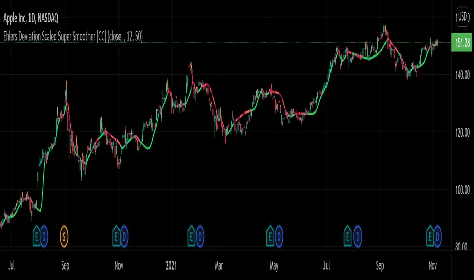
Ehlers Deviation Scaled Super Smoother [CC]The Deviation Scaled Super Smoother was created by John Ehlers and this is an excellent moving average that changes direction very quickly and can keep up with the current underlying trend. This indicator works by applying a Hann Windowed Moving Average to the stock's momentum and scaling that by the Root Mean Square and then using that value in the input for a Super Smoother . I have included strong buy and sell signals in addition to normal ones so lighter colors are normal signals and darker colors are strong ones. Buy when the line turns green and sell when it turns red.
Let me know if there are any other scripts you would like to see me publish!
WhaleCrew Crypto ArbitrageVisualizes the price difference (deviation) off BTC/ETH across multiple exchanges (Spot and/or Perpetuals)
Spot prices are represented by circles, while perpetual prices are shown as crosses.
Spot:
Binance
FTX
Bitfinex
Coinbase
Perpetuals:
Binance
FTX
Bybit
BitMEX

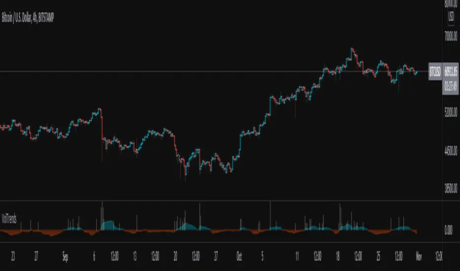
Volume TrendsThis script provides clear volume trends on any time frame. You set a long term volume trend moving average (ex 100 periods). A shorter term MA of your choice (10 in this example) will oscillate above and below based on the standard deviations of its current value relative to the long term #.
Similarly, large volume bars are plotted in terms of st dev above the long term MA.
Very useful in spotting capitulation bottoms and/or blow-off tops.