Crypto Radar — Spot Signal This script is designed to help traders avoid rushing into a trade too early or at the wrong time. Designed this way, it's a great help.
Forecasting

TTS Calculator Forex calculator - Input account size, risk size and stop loss size, to get your lot size.

Monthly, Weekly Open + Daily Pivot (Broken Lines, fixed)monthly open line weekly open and daily pivot
This TradingView indicator plots three key reference levels on your chart:
Monthly Open Line – shows the current month’s opening price.
Weekly Open Line – shows the current week’s opening price.
Daily Pivot Line – shows the pivot level based on the previous day’s high, low, and close.
Each line resets at the start of its new period (month, week, or day), so the lines are broken, not continuous.
You can fully customize visibility, color, and thickness for each line.
It helps traders quickly see market bias and important support/resistance levels for better intraday or swing trading decisions.
ATC v6 with ORB by SabnATC v6 with ORB: Advanced Automatic Session and Opening
Range Indicator
ATC v6 is an advanced indicator designed by Alfa Trade Club for
TradingView users. This tool not only automatically marks important session
opens, closes, or specific times of financial markets on your chart but also
visualizes powerful Opening Range (ORB) strategies directly on your chart.
This tool removes the need to manually monitor critical trading hours, allowing
you to easily analyze price action in relation to these important timeframes.
Key Features
This indicator comes with a set of powerful features to provide the flexibility,
visual clarity, and strategic advantage that traders need:
1. Multi-Time Zone Support The indicator is based on the world's most
important financial market centers:
New York (America/New_York)
London (Europe/London)
Tokyo (Asia/Tokyo)
Istanbul (Europe/Istanbul)
This allows you to always set the lines accurately according to the local time of
the market you are trading.
2. Advanced 3-Stage Timing (Pre / Main / Next) Each time line is more than
just a simple line; it can manage a three-stage event cycle:
"Pre-Session": Draws a dotted line a few minutes before the main time you
specify (e.g., market open). This allows you to see the price level just before a
significant event.
"Main Session": Marks the opening price at the exact event time (e.g., 08:00
London Open) with a solid line.
"Next / ORB" (Opening Range): Draws another dotted line a specified number
of minutes after the main event (e.g., 15 minutes later). This is used to define the
Opening Range.
3. Automatic Price Boxes (Volatility & ORB) The indicator can draw two
different types of boxes based on this timing:
Opening Volatility Box (Pre -> Main): If the "Pre-Session" feature is active, the
indicator draws a colored box between the price at the pre-session moment and
the price at the main event. This box visualizes the initial volatility at the session
open.
Opening Range Box (Main -> Next): If the "Next" feature is active, the indicator
draws a box between the price at the main event and the "next" event.
4. Customizable Time Lines You have full control over each line. Users can:
Enable/Disable each line.
Set any desired hour and minute.
Define the "Pre" and "Next" durations in minutes.
Assign a different color for visual distinction.
5. Smart and Efficient Drawing
Forward-Extending Lines: All drawn lines and boxes automatically extend from
the moment they are created until the next day. This makes it easy to track how
these levels act as support/resistance throughout the day.
High Performance: Instead of deleting old lines and drawing new ones when a
new day starts, the code intelligently extends the existing lines into the next day
Weekend and DST Protection: Automatically skips weekends (from Friday to
Monday) and is not affected by Daylight Saving Time (DST) changes.
Who Is It For?
Session-Focused Traders: Ideal for those who track volatility during the London,
New York, Asian, or Istanbul session opens.
Day Traders: Perfect for those who want to mark important economic data
release times or daily market open/close levels.
Technical Analysts: A powerful aid for those who want to visually analyze how
opening prices at specific times and time ranges play a role throughout the day.
ATC v6 with ORB is much more than just a simple session line; it is a dynamic
analysis and strategy tool that combines price and time.

DeMARK 9-13For the first time ever, the power and precision of DeMARK is now available on TradingView. Combining core elements of the renowned Sequential® and Combo® studies, the DeMARK 9-13® indicator delivers the same unique insights in a streamlined interface.
The Sequential and Combo family of indicators have been trusted by the top financial firms, funds and figures for decades to enhance their trading and investment strategies. Known for their 9 Setup® and 13 Countdown® readings, these studies are designed to highlight potential market reversals as well as key areas of support, resistance and momentum. With DeMARK 9-13, users can access these groundbreaking techniques in one integrated offering.
While it's often said, "the trend is your friend," it's also crucial to recognize when it's about to end. Identifying potential market inflection points allows you to buy weakness and sell strength, improving your cost basis, reducing risk and allowing you to capitalize on a greater portion of the reversal.
At its core, 9s and 13s are constructed to measure market momentum and exhaustion. Both Sequential and Combo consist of two phases: Setup and Countdown. The Setup phase compares price activity across nine consecutive bars to define the market environment, while the Countdown phase performs a separate 13-bar comparison to indicate when a reversal may be imminent. A 9-13 reading reflects the fulfillment of both phases. When combined with TDST® lines and Risk Levels®, this approach provides a more comprehensive view of the market.
The DeMARK 9-13 indicator consists of:
Sequential
Combo
9 Setup
13 Countdown
TD Setup Trend (TDST)
Perfected® Setup
Risk Levels & Zones
Together, these elements provide an unparalleled view into the inner workings of the market, helping you anticipate shifts and act with greater precision.
🟡 DESCRIPTION
SETUP
The initial stage of the DeMARK 9-13 indicator is the Setup phase. This series is the same for both Sequential and Combo and compares the close of the current bar to the close four bars earlier. Buy Setup counts are displayed in blue below the data set and fulfilled when there are nine consecutive closes less than the close four bars earlier. Sell Setup counts are displayed in blue above the data set and fulfilled when there are nine consecutive closes greater than the close four bars earlier.
During the active Setup, all number counts remain visible to show the progress of the series. Upon completing the Setup, the 9 is recorded and the 1-8 counts are removed. This reduces visual distraction and allows for more result history (due to TradingView’s 500-label limit). Setups are always counting, with Price Flips® occurring as the series alternates between Buy and Sell Setups.
PERFECTED SETUPS
Setups can be classified as either “Perfected” or “Imperfected.” The Setup is Perfected when the 9 is completed and the 6 and 7 bars have been exceeded. In the case of a Buy Setup, the low of bars 8 or 9 must be less than the low of bars 6 and 7. Conversely, in the case of a Sell Setup, the high of bars 8 or 9 must be greater than the high of bars 6 and 7. The point at which the Setup is perfected is displayed with a solid blue dot, matching the color of the Setup series.
Generally speaking, the market will reverse or stabilize within one to four bars of a completed and Perfected Setup 9. The strength and duration of this response can be assessed with the implementation of other indicators, such as TDST® lines.
TD SETUP TREND (TDST)
The TDST indicator is derived from the Setup phase and is used to confirm market trends and identify likely trend failures. A TDST resistance line is drawn from the highest true high of the completed 9 Buy Setup series, while a TDST support line is drawn from the lowest true low of the completed 9 Sell Setup series. These TDST lines provide an indication of market support, resistance and momentum to help evaluate the integrity of the move.
TDST lines are displayed in a lighter blue than the Setup phase. When Breakout Qualifiers are enabled, TDST lines can be considered qualified or disqualified. Disqualified TDSTs appear as a dashed line, indicating potential support in the case of TDST support lines or resistance in the case of TDST resistance lines. Qualified TDSTs appear as a solid line and will stop drawing when a breakout or breakdown occurs, suggesting continued momentum.
COUNTDOWN
Once the Setup phase is completed, the second stage of the DeMARK 9-13 indicator can begin — the Countdown phase. Sequential and Combo share the same Setup series, but there are subtle differences in their respective Countdown phases, each constructed to identify areas of potential trend exhaustion in different market conditions.
Sequential is designed to respond in both trending and consolidating markets, while Combo is more responsive in trending environments and inactive during periods of market consolidation. For that reason, we often say that Combo identifies the highest or lowest points of a move, with Sequential identifying secondary tests. When aligned, these results are even more powerful.
SEQUENTIAL COUNTDOWN
A Sequential Buy Countdown is possible upon completion of a Buy Setup and looks for 13 closes less than or equal to the low two bars earlier. Sequential Buy Countdown counts are displayed as a dark green number below the data set and can begin as early as the 9 bar of a completed Buy Setup. A Sequential Sell Countdown is possible upon completion of a Sell Setup and looks for 13 closes greater than or equal to the high two bars earlier. Sequential Sell Countdown counts are displayed as a dark red number above the data set and can begin as early as the 9 bar of a Sell Setup. Because of this overlap, Sequential Countdown requires as few as 12 bars beyond the 9 Setup to complete the cycle.
Unlike the Setup phase, Countdown counts need not be consecutive. During the active Countdown, all number counts remain visible to display the progress of the series. Upon completing the Countdown, the 13 is confirmed and the 1-12 counts are removed. This reduces visual distraction and allows for more result history (due to TradingView’s 500-label limit).
A completed Sequential 13 Countdown marks the fulfillment of the 9-13 reading and identifies potential market exhaustion. Additional elements of Sequential Countdown like Intersection, Countdown Deferral, Risk Levels and the 12-bar rule can be used to provide further detail and are outlined below.
COMBO COUNTDOWN
A Combo Buy Countdown is possible upon completion of a Buy Setup and looks for 13 closes less than or equal to the low two bars earlier, with additional rules based on the Combo version selected. Combo Buy Countdown counts are displayed as a light green number below the data set and can begin as early as the 1 bar of a completed Buy Setup. A Combo Sell Countdown is possible upon completion of a Sell Setup and looks for 13 closes greater than or equal to the high two bars earlier, with additional rules based on the Combo version selected. Combo Sell Countdown counts are displayed as a magenta number above the data set and can begin as early as the 1 bar of a Sell Setup. Because of this overlap, Combo Countdown requires as few as four bars beyond the 9 Setup to complete the cycle.
Unlike the Setup phase, Countdown counts need not be consecutive. During the active Countdown, all number counts remain visible to display the progress of the series. Upon completing the Countdown, the 13 is confirmed and the 1-12 counts are removed. This reduces visual distraction and allows for more result history (due to TradingView’s 500-label limit).A completed Combo 13 Countdown marks the fulfillment of the 9-13 reading and identifies potential market exhaustion. Additional elements of Combo Countdown like Risk Levels and the 12-bar rule can be used to provide further detail and are outlined below.
RISK LEVELS
When a 9 Setup or 13 Countdown indication is recorded, a Risk Level is generated to identify the zone within which a reversal should occur. This level accounts for any residual trend momentum without invalidating the buy or sell indication. For a completed buy indication, the Risk Level marks the price above which the 9 or 13 remains active and serves as additional support. Conversely, for a completed sell indication, it marks the price below which the 9 or 13 remains active and serves as additional resistance. This level can be viewed as the maximum threshold the indication can withstand before the prevailing momentum overwhelms and negates it and is often used to establish stop-loss areas.
Risk Level line colors correspond to the completed Setup, Sequential Countdown or Combo Countdown that generated it. Shaded risk zones can also be displayed, further highlighting the indication window. When Breakout Qualifiers are enabled, the Risk Level can be considered qualified or disqualified. Disqualified Risk Levels appear as a dashed line, indicating likely support in the case of a buy indication and likely resistance in the case of a sell indication. Qualified Risk Levels appear as a solid line and will stop drawing when a breakout or breakdown occurs, suggesting continued momentum.
4-BAR & 12-BAR METRICS
Generally speaking, the market should see some sort of response within four bars of a completed 9 Setup indication and 12 bars of a completed 13 Countdown indication. If the chart has not responded in that time the existing trend is likely to continue.
INTERSECTION
Intersection is an elective setting unique to Sequential Countdown. When enabled, it postpones the start of the Countdown phase until the price range of the later Setup counts overlap with the price activity of any Setup count occurring three or more bars earlier. This is intended as a pressure release to avoid commencing the count during an extraordinary breakaway market event or aberration. The Intersection level’s color matches its corresponding Buy and Sell Countdown reading and is displayed as a horizontal line on the confirming bar.
COUNTDOWN DEFERRAL
The Sequential Countdown phase of the DeMARK 9-13 indicator includes two optional Countdown Deferral qualifiers — the 13 vs. 8 rule and the 8 vs. 5 rule.
The 13 vs. 8 Countdown Deferral rule is designed to ensure that the tail end of the Countdown is representative of the existing trend. To fulfill this restriction, the low of the 13 bar must be less than or equal to the close of the 8 bar in the case of a Sequential Buy Countdown, while the high of the 13 bar must be greater than or equal to the close of the 8 bar in the case of a Sequential Sell Countdown. Because Countdown counts can increment in a sideways market, this rule helps to confirm that a trend has remained intact and improves accuracy as the series reaches its completion.
When enabled, this Countdown Deferral condition substitutes a “+” for what would otherwise be a “13,” thereby postponing the count. A Sequential Buy Countdown deferral is displayed in dark green below the data set, while a Sequential Sell Countdown deferral is displayed in dark red above the data set. Note that this optional setting is enabled by default and labeled “Last vs. 8 Qualifier” in the DeMARK 9-13 indicator settings.
Whereas the 13 vs. 8 rule is designed to ensure that the tail end of the Sequential series is representative of the existing trend, the 8 vs. 5 Countdown Deferral rule is designed to ensure that the body of the Countdown phase is properly configured. As with the 13 vs. 8 rule, the 8 vs. 5 rule matches the color and placement of its corresponding Buy or Sell Countdown series and substitutes a "+" for what would otherwise be an "8," thereby postponing the count. The 13 vs. 8 comparison is critical to the Countdown phase, while the 8 vs. 5 comparison is elective and provides additional confidence that the trend has remained intact.
COUNTDOWN RECYCLE®
Markets are constantly evolving to reflect new information. Just as fundamentals experience occasional adjustments impacting the expectations of the asset, so too do technical analysis and market timing. This is most often reflected in the Sequential and Combo Countdown phase by a process known as Recycling.
Recycling occurs when a Countdown 13 is interrupted by a subsequent overlapping “22” Setup count in the same direction. Recycling suggests that the new Setup is sufficiently strong to weaken the impact of a confirmed Countdown series and resets the process. A recycling indication is represented as an “R” where the Countdown 13 was previously displayed, matching the color and placement of that Buy or Sell Countdown series.
COUNTDOWN CANCELLATION
Once completed, a 9 Setup and 13 Countdown confirmation is permanent and never altered. However, it’s important to note that Countdowns can be cancelled during their construction phase. There are two scenarios where a Countdown series would be removed from the chart.
The first Countdown cancellation scenario occurs when a subsequent 9 Setup is confirmed in the opposite direction prior to the completion of the Countdown phase. The reasoning is that market conditions have changed from what they were when the initial Setup was fulfilled, making the newer Setup more relevant. Upon confirming an opposing 9 Setup, the incomplete Countdown phase is canceled and removed from the chart.
The second Countdown cancellation scenario takes place when the TDST in the opposite direction is violated, suggesting a conclusion to the previous trend and a confirmation of a new one. In these cases, a true low that occurs above the Buy Setup’s TDST resistance line, or a true high that occurs below the Sell Setup’s TDST support line, cancels the incomplete Countdown phase and removes the counts from the chart.
🟡 SETTINGS
DISPLAY
Setup : Displays the Setup phase of the Sequential and Combo indicators. The first swatch controls the color of the Buy Setup phase displayed below the data set. The second swatch controls the color of the Sell Setup phase displayed above the data set.
TDST : Displays the TDST lines for the Sequential and Combo indicators. The first swatch controls the color of the TDST resistance lines associated with the Buy Setup phase. The second swatch controls the color of the TDST support lines associated with the Sell Setup phase.
Sequential Countdown : Displays the Countdown phase of the Sequential indicator. The first swatch controls the color of the Buy Countdown phase displayed below the data set. The second swatch controls the color of the Sell Countdown phase displayed above the data set.
Combo Countdown : Displays the Countdown phase of the Combo indicator. The first swatch controls the color of the Buy Countdown phase displayed below the data set. The second swatch controls the color of the Sell Countdown phase displayed above the data set.
Indicator font size : Adjusts the size of the Sequential and Combo indicator counts displayed above and below the data set. ( Default: 18 )
Display full series count : Displays the full Sequential and Combo numerical series for the active 9 Setup and 13 Countdown phases only, or for all completed indications (within TradingView’s 500-label limit). ( Default: Active only )
SETUP
Bars to Setup : Number of consecutive bars needed to complete the Setup phase. ( Default: 9 )
Bars to look back : Defines the bar to which the current Setup count is compared. ( Default: 4 )
Setup compare : Determines whether equal prices should increment the Setup count. ( Default: Without equal )
Count completion weight : Adjusts the font weight of the Setup completion counts displayed above and below the data set. ( Default: Bold )
Setup Perfection : Identifies when Setup Perfection occurs, with the low of the final two Buy Setup counts less than the lows three or four bars prior to completion, and the high of the final two Sell Setup counts greater than the highs three or four bars prior to completion. With the default “Bars to Setup” setting of “9,” Perfection occurs when the low of Buy Setup bar 8 or 9 is less than the lows of bars 6 and 7, and the high of Sell Setup bar 8 or 9 is greater than the highs of bars 6 and 7. ( Default: Enabled )
Enable Setup Risk Level : Displays the Risk Level tied to the Setup. ( Default: On )
Enable Setup Risk Level Zone : Shades the area between the completed Setup and its Risk Level. ( Default: On )
TD SETUP TREND (TDST)
TDST line thickness : Adjusts the thickness of TDST support and resistance lines. ( Default: Standard )
COUNTDOWN (SHARED)
Bars to Countdown : Number of bars needed to complete the Countdown phase. ( Default: 13 )
Bars to look back : Defines the bar to which the current Countdown count is compared. ( Default: 2 )
Countdown comparison value : Output used in the Countdown look back comparison. For Aggressive settings, Low/High is required. ( Default: Close )
Termination Count price value : Allows the final count of the Countdown phase to use a different comparison value for more flexibility. ( Default: Open or Close )
Countdown compare : Determines whether equal prices should increment the Countdown count. ( Default: With equal )
Count completion weight : Adjusts the font weight of the Countdown completion counts displayed above and below the data set. ( Default: Bold )
SEQUENTIAL COUNTDOWN
Enable Intersection : Toggles the Sequential Intersection phase requirement. ( Default: Off )
8 vs. 5 Qualifier : Qualifier requiring the low of the 8 Buy Countdown to be less than the close of the 5 count, and the high of the 8 Sell Countdown to be greater than the close of the 5 count. ( Default: Off )
Last vs. 8 Qualifier : Qualifier requiring the low of the final Buy Countdown count to be less than the close of the 8 count, and the high of the final Sell Countdown to be greater than the close of the 8 count. With the default “Bars to Countdown” setting of “13,” the low of the 13 Buy Countdown would need to be less than the close of the 8 count, and the high of the 13 Sell Countdown would need to be greater than the close of the 8 count. ( Default: On )
Enable Risk Level : Displays the Risk Level tied to the Countdown. ( Default: On )
Enable Risk Level Zone : Shades the area between the completed Countdown and its Risk Level. ( Default: On )
COMBO COUNTDOWN
Combo version : Determines the version of Combo used for the Countdown phase, whether it’s Standard, Conservative or Aggressive. ( Default: Standard )
Enable Risk Level : Displays the Risk Level tied to the Countdown. ( Default: On )
Enable Risk Level Zone : Shades the area between the completed Countdown and its Risk Level. ( Default: On )
RECYCLE
Enable Recycle : Toggles Recycling, replacing the final Sequential and Combo Countdown count with an “R” when its rules are met. With the default “Bars to Countdown” setting of “13,” a recycled 13 count would be replaced with the ‘R’. ( Default: On )
Setup Count : Defines the number of consecutive Setup bars required to trigger a Recycle. ( Default: 22 )
CANCEL
Reverse Setup : Incomplete Countdowns are cancelled when a Setup in the opposite direction is confirmed. ( Default: On )
TDST Rule : Incomplete Buy Countdowns are cancelled when a true low exceeds the Buy Setup’s TDST resistance line, and incomplete Sell Countdowns are cancelled when a true high breaks the Sell Setup’s TDST support line. ( Default: On )
BREAKOUT QUALIFIERS
Enable Breakout Qualifiers : Breakout Qualifier rules will dictate whether TDST and Risk Level line breakouts can be considered qualified or disqualified. Qualified lines are solid and will stop drawing when a breakout or breakdown occurs, suggesting continued momentum. Disqualified lines are dashed, serving as resistance in the case of a false breakout and support in the case of a false breakdown. When Breakout Qualifier rules are disabled, a line becomes solid on any close beyond the level. ( Default: On )
🟡 DISCLAIMER
By subscribing to and or using DeMARK 9-13 or any other DeMARK Indicators on TradingView, you acknowledge that you have read, understood and agree to the DeMARK for TradingView Terms of Service (located in the DeMARK account signature) as well as any updates to those terms which may happen from time-to-time.
The DeMARK Indicators are powerful tools designed to assist the individual process you use to understand financial markets and make investment decisions but they are not trading systems. Any information presented is not, and should not be construed as, financial or investment advice. You should not make any investment decision based solely on the information provided by these tools. The products we offer do not recommend or endorse any specific securities, financial products or investment strategies. Any information, data or analysis presented by any DeMARK products or tools is generic and does not consider your personal financial situation, investment objectives or risk tolerance. All investment decisions are yours alone and are made at your own risk. Those risks include, but are not limited to, potential system errors, data inaccuracies or outages.
From time to time unauthorized and unaffiliated third parties use the DeMARK name or the names of our copyrighted and/or trademarked products in an unapproved, inaccurate and misleading manner. While we do our best to remove these examples, some fake, flawed and fraudulent may exist. The only official and accurate sources of our products are those listed on the DeMARK company website. Unauthorized reproduction, copying, scraping, republishing, distribution, dissemination or any other use of our name, trademarks and/or copyrighted materials (including this script documentation) is prohibited.
Without in any way limiting DeMARK’s exclusive rights under copyright, trademark and all other intellectual property protections, any use of DeMARK products to “train” generative artificial intelligence (AI) technologies to generate text is expressly prohibited. DeMARK reserves all rights to license uses of this work for generative AI training and development of machine learning language or machine learning visual models.
The data and analysis in our products are based on sources believed to be reliable, but DeMARK does not control or guarantee the accuracy, completeness or timeliness of this information.
As a DeMARK subscriber or user, you are responsible for conducting your own research and due diligence before making any investment decisions.
Past performance, including any simulated or historical data, is not indicative of future results.
Script payant

Squeeze Momentum Early In and Out CandlesJohn Carter presented some candles called "Early In and Out Candles". Although I couldn't imitate the exact candles and warnings I create better indications and bars in my opinion.
When the Candles are above Donchian MA then we have a bullish Momentum.
When the Candles are bellow Donchian MA then we have bearish momentum.
This indicator works best to get an WARNING to enter and close EARLY positions.
Bullish:
When the candles are Light Blue then we have early warning to enter.
When the candles are Dark Blue then we have early warning to close the position.
Bearish:
When the candles are Red then we have early warning to enter.
When the candles are Yellow then we have early warning to close the position.
IMPORTANT NOTES:
Always combine it with the Squeeze Pro indicator.
Suggested Donchian MA: 5 (You can adjust it).
Don't let candles only to be your closing indication once again there are EARLY WARNINGS therefore can move your stop loses to maximize your profits when you are exiting.
I tested my self and I found that is the best strategy when we get Dark Blue candle in the Bullish move I move my stop loss little bit bellow the candle.
Therefore here we go we have early warnings for In and Out.
Thank you and Good Luck.

Average Dollar Volume by Mashrab
Standard Mode: By default, it shows a 20-period SMA of the Dollar Volume. This is great for swing trading to see if money flow is increasing over days.
Day Trading Mode: Go to the indicator settings (User Input) and check "Reset Average Daily".
The line will now represent the Cumulative Average for today only.
Example: If it's 10:00 AM, the line shows the average dollar volume per bar since the market opened at 9:30 AM. This helps you spot if the current 5-minute bar is truly igniting compared to the rest of the morning.
How to Use for Day Trading
Add the script to your 1-minute chart.
Ensure "Reset Average Daily" is checked in the settings (I made it default to true for you).
Look at the Table in the top right:
Avg Dollar Vol: This tells you the average money flowing into the stock per minute today.
1% Threshold: This gives you the exact number your friend likely uses to gauge "minimum viable liquidity" or specific risk calculations.

Market Sessions [ApexFX]Unlock a clearer view of the market's 24-hour cycle with the Market Sessions indicator. This tool is designed to be clean, simple, and powerful, helping you track global market activity directly on your chart.
Core Features:
Four Pre-configured Sessions: Easily track the New York, London, Tokyo, and Sydney sessions. Each session is fully customizable, allowing you to change the name, time, and color.
Visual Session Ranges: The indicator automatically draws a colored box (or "range") highlighting the high and low of each active session, with a clear session name label on top.
Simple Timezone Control: Forget confusing GMT strings. A single integer input (e.g., -4 for NY, +1 for London) allows you to perfectly align the indicator with your local timezone or the exchange's time.
Dynamic Dashboard: Get an at-a-glance summary of all market sessions in a clean dashboard, locked to the top-right of your chart.
Live Market Status: The dashboard shows you:
Session: The custom name for each market, color-coded to match its range.
Status: See which markets are "Active" (green) or "Inactive" (red) in real-time.
Trend: A simple trend-following metric (based on a 50-SMA) for active sessions.
Volume: A basic volume average check (based on a 50-SMA) to gauge activity.
This indicator is perfect for traders who want to identify session overlaps, target specific market volatility, or simply understand the context of price action throughout the global trading day.

Price vs 10 EMA % DifferencePrice trade far from 10 EMA. Price can not sustain far from EMA for very long. Either Price will come to EMA or EMA will be adjusted slowly according to price. EMA adjusted to price movment is sloww process so here it is an opportunity that SL will be very low. When the Sudden novment in Price leads to Distance bwtween 10 ema so there are chances that price will come back to EMA.

XenoSmooth Predictive Candles - Advanced Heikin Ashi CandlesXenoSmooth Predictive Candles
Summary in one paragraph
A synthetic candle engine for crypto, FX, equities, and futures on intraday to swing timeframes. It reduces noise and flip delay so structure is easier to read. The core novelty is a predictive open with inertia plus slope lead fused with a zero lag body filter and an overshoot based wick model normalized by the real range and capped by ATR. Add it to a clean chart, hide regular candles if desired, and tune lengths. Shapes can move while the bar is open and settle on close. For conservative workflows read on bar close.
Scope and intent
• Markets. Major FX pairs, index futures, large cap equities, liquid crypto
• Timeframes. One minute to daily
• Purpose. Faster and smoother visual structure than Heikin Ashi while keeping causality and realistic wicks
Originality and usefulness
• Unique concept. Predictive open with inertia and slope lead plus selectable zero lag body filter and ATR capped wick overshoot in percent of real range
• Failure mode addressed. Late flips in chop and unreal long wicks from raw extremes
• Testability. Every control is an input. Users can toggle body method, lengths, clipping, and percent modeling
• Portable yardstick. ATR based wick cap and percent of bar range scale across symbols
Method overview in plain language
Build a robust base price from O, H, L, and extra weight on Close. Smooth it with a chosen filter to produce the synthetic close. Drive a predictive open that follows the synthetic close with tunable inertia and a small lead from the last bar slope. Model wicks as the portion of the real extremes that extends beyond the synthetic body, smooth that overshoot, normalize by the bar range if selected, then cap by ATR to avoid tail spikes. Clamp synthetic values to the real high and low if enabled.
Base measures
• Range basis. True Range for the ATR cap and High minus Low for percent normalization
• Return basis. Not used
Components
• Body Base Blend. Weighted O H L with a close bias to stabilize the base
• Zero Lag Body Filter. ZLEMA or Super Smoother or WMA to set the synthetic close
• Predictive Open. Inertial follow of the synthetic close plus a slope lead term
• Wick Overshoot Model. Smoothed extension beyond the body, optional percent of real range, ATR cap
• Clamp Option. Keeps synthetic open and close inside the real bar range
Fusion rule
• Synthetic close equals filtered base
• Synthetic open equals previous open plus inertia times distance to synthetic close plus slope lead
• Wicks equal smoothed overshoot above and below the body, optionally percent of range then converted back to price and capped by ATR
Inputs with guidance
Setup
• Signal timeframe. Uses the chart timeframe
• Invert direction. Not applicable
• Session windows. Not applicable
Logic
• Body length. Core smoothing length for the synthetic close. Typical 6 to 14. Higher gives smoother and slower. Lower gives faster flips
• Body method. ZLEMA or Super Smoother or WMA. ZLEMA is fastest. Super Smoother is calmest
• Close weight in base. 0 to 1. Higher gives stronger emphasis on close and less noise
• Open inertia. 0 to 1. Higher makes the open follow the close more tightly
• Lead gain. 0 to 1. Higher adds more phase lead. Keep modest to avoid overshoot
• Clamp body to real range. On keeps synthetic body inside high and low
• Wick smooth length. Typical 4 to 10. Higher reduces jitter
• Overshoot as percent. On stabilizes wicks across regimes
• ATR length. Typical 10 to 20 for the cap
• Max wick equals ATR times. 0 disables. 1.0 to 2.0 contains extreme tails
Filters
• Efficiency or trend filter. Not used
• Micro versus macro range relation. Not used
• Location filter. Not used
Realism and responsible publication
• No performance claims
• Intrabar motion reminder. Shapes can move while a bar forms and settle on close
• Strategies must use standard candles for signals and orders
Honest limitations and failure modes
• High impact releases and thin liquidity can distort wicks and produce gaps that any smoother cannot predict
• Very quiet regimes can reduce contrast. Consider longer body length
• Session time on the chart controls the definition of each bar

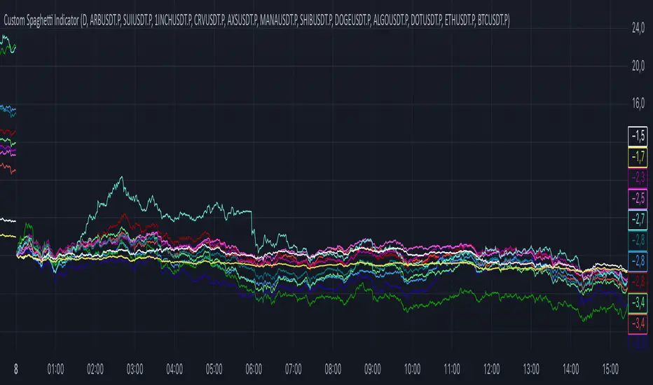
DEMI Spaghetti IndicatorCorrelation Pairs Spread Trader
🎯 Purpose
This indicator is specifically designed for correlation spread trading between highly correlated cryptocurrency pairs. Each color group represents two assets that typically move together, allowing traders to identify spread trading opportunities when the correlation temporarily breaks.
📊 How It Works For Spread Trading
Color-Coded Correlation Groups: Similar colors = correlated pairs
Spread Visualization: The difference between lines shows the spread between correlated assets
Mean Reversion Signals: When correlated pairs diverge significantly, it creates potential mean reversion opportunities
💡 Trading Strategy
Identify Correlated Pairs (same color group)
Monitor Spread Divergence - when percentage changes differ significantly
Enter Spread Trades:
Buy the underperforming asset
Sell the outperforming asset
Wait for Correlation Restoration - profit when spread narrows back to normal
🎨 Correlation Groups:
🔴 Red Group: ARB/SUI - DeFi tokens
🔵 Blue Group: 1INCH/CRV - DEX tokens
🟢 Green Group: AXS/MANA - Gaming/Metaverse
🟣 Purple Group: SHIB/DOGE - Meme coins
🟦 Teal Group: ALGO/DOT - Layer 1 protocols
⚪ Yellow/White: ETH/BTC - Market leaders
RSI Multi-Timeframe HeatmapThe RSI Multi-Timeframe Heatmap displays the Relative Strength Index (RSI) across multiple timeframes in a single, easy-to-read visual grid.
It allows traders to instantly assess RSI conditions (overbought, oversold, neutral) across short-, medium-, and long-term perspectives — all at once.
Each column represents a different timeframe, and each cell is color-coded based on the RSI value.
The active cell in each column shows the current RSI for that timeframe, with both the numerical value and a background color that corresponds to RSI intensity.
Features
Displays RSI values for multiple timeframes simultaneously.
Includes the following timeframes:
5m, 15m, 30m, 45m, 1h, 2h, 3h, 4h, 6h, 8h, 12h, 23h, 1d, 1w, and the current chart timeframe.
Color-coded RSI heatmap with intuitive gradient from cold (oversold) to hot (overbought).
Uses closing prices for RSI calculation.
Table layout updates in real-time on every bar.
Highly visual and ideal for multi-timeframe momentum analysis.
Each timeframe has 3 values - current, 7 bars ago and 14 bars ago.

Trend Indicator🚀 Trend Indicator Pro – The Smart Money Edge
Catch Every Major Trend Shift – The Moment It Happens.
(Image of chart not shown correctly, message me for a screenshot)
Instantly See the Trend. Trade with Confidence.
Tired of guessing tops and bottoms? Trend Indicator Pro turns chaos into clarity with real-time, color-coded candles and pinpoint entry arrows – no lag, no noise.
How It Works
Smart Volatility Bands
Dynamically adapt to market conditions using ATR-based trailing logic – tighter in calm markets, wider in chaos.
One-Candle Trend Detection
The exact bar a trend flips is highlighted:
Purple Candle + ▲ → Fresh Uptrend Starting
Yellow Candle + ▼ → Downtrend Confirmed
Visual Trend Lock™
Green Candles = Ride the uptrend
Red Candles = Short or stand aside
→ No second-guessing.

Relative Price Strength - NIFTY MidcapThis script calculates the Relative Price Strength (RPS) of the current stock or instrument compared to the NIFTY Midcap 100 index. RPS is a ratio that helps traders identify whether a stock is outperforming or underperforming a benchmark index.

Major exchages total Open interest & Long/Short OI trends📊 Indicator: Major Exchanges Total OI & Long/Short Trends
This Pine Script™ indicator is designed to provide a comprehensive analysis of Open Interest (OI) and Long/Short position trends across major cryptocurrency exchanges (Binance, Bybit, OKX, Bitget, HTX, Deribit). It serves as a powerful tool for traders seeking to understand market liquidity, participant positioning, and overall market sentiment.
🔑 Key Features and Functionalities
Aggregated Multi-Exchange Open Interest (OI):
Consolidates real-time Open Interest data from user-selected major cryptocurrency exchanges.
Provides a unified view of the total OI, offering insights into the collective market liquidity and the aggregate size of participants' open positions.
Visualized Combined OI Candles:
Presents the aggregated total OI data in a candlestick chart format.
Displays the Open, High, Low, and Close of the combined OI, with color variations indicating increases or decreases from the previous period. This enables intuitive visualization of OI trend shifts.
Estimated Long/Short OI and Visualization:
Calculates and visualizes estimated Long and Short position Open Interest based on the total aggregated OI data.
Estimation Logic:
Employs a sophisticated logic that considers both price changes and OI fluctuations to infer the balance between Long and Short positions. For instance, an increase in both price and OI may suggest an accumulation of Long positions, while a price decrease coupled with an OI increase might indicate growing Short positions.
Initial 50:50 Ratio:
The estimation for Long/Short OI begins with an assumption of a 50:50 ratio at the initial data point available for the selected timeframe. This establishes a neutral baseline, from which subsequent price and OI changes drive the divergence and evolution of the estimated Long/Short balance.
Flexible Visualization Options:
Allows users to display Long/Short OI data in either line or candlestick styles, with customizable color schemes. This flexibility aids in clearly discerning bullish or bearish positioning trends.
💡 Development Background
The development of this indicator stems from the critical importance of Open Interest data in the cryptocurrency derivatives market. Recognizing the limitations of analyzing individual exchange OI in isolation, the primary objective was to integrate data from leading exchanges to offer a holistic perspective on market sentiment and overall positioning dynamics.
The inclusion of the Long/Short position estimation feature is crucial for deciphering the specific directional biases of market participants, which is often not evident from raw OI data alone. This enables a deeper understanding of how positions are being accumulated or liquidated, moving beyond simple OI change analysis.
Furthermore, a key design consideration was to leverage the characteristic where the indicator's data start point dynamically adjusts with the chart's timeframe selection. This allows for the analysis of short-term Long/Short trends on shorter timeframes and long-term trends on longer timeframes. This inherent flexibility empowers traders to conduct analyses across various time scales, aligning with their diverse trading strategies.
🚀 Trading Applications
Leveraging Combined Open Interest (OI):
Trend Confirmation: A sustained increase in total OI signifies growing market interest and capital inflow, potentially confirming the strength of an existing trend. Conversely, decreasing OI may suggest diminishing participant interest or widespread position liquidation.
Validation of Price Extremes: If price forms a new high but OI fails to increase or declines, it could signal a potential trend reversal (divergence). Conversely, a sharp increase in OI during a price decline might indicate a surge in short positions or renewed selling pressure.
Identifying Volatility Triggers: Monitoring rapid shifts in OI during significant news events or market catalysts can help assess immediate market reactions and liquidity changes.
📈Utilizing Long/Short OI Trends
Assessing Market Bias: A sustained dominance or rapid increase in Long OI suggests a prevalent bullish sentiment, which could inform decisions to enter or maintain long positions. The inverse scenario indicates bearish sentiment and potential short entry opportunities.
Anticipating Squeezes: The indicator can help identify scenarios conducive to short or long squeezes. Excessive short positioning followed by a price uptick can trigger a short squeeze, leading to rapid price appreciation. Conversely, an oversupply of long positions preceding a price drop can result in a long squeeze and sharp declines.
Divergence Analysis: Divergences between price action and Long/Short OI estimates can signal potential trend reversals. For example, if price is rising but the increase in Long OI slows down or Short OI begins to grow, it may suggest weakening buying pressure.
🕔Timeframe-Specific Trend Analysis:
Shorter Timeframes (e.g., 1m, 5m, 15m): Ideal for identifying short-term shifts in participant positioning, beneficial for day trading and scalping strategies. Provides insights into immediate market reactions to price movements.
Longer Timeframes (e.g., 1h, 4h, Daily): Valuable for evaluating broader positioning trends and the sustainability or potential reversal of medium-to-long-term trends. Offers a macro perspective on Long/Short dynamics, suitable for swing trading or long-term investment strategies.
This indicator integrates complex market data, provides nuanced Long/Short position estimations, and offers multi-timeframe analytical capabilities, empowering traders to make more informed and strategic decisions.

The Sentiment Indicator - Ultimate Hybrid v2(image shown of chart is not the coloured candles - message for a screenshot)
The Sentiment Indicator – Ultimate Hybrid v2
Most indicators react. This one anticipates.
Using dual-timeframe sentiment normalization, it blends institutional money flow, market participation, global risk appetite, and adaptive momentum into one real-time composite score — then colours your candles from blood red (panic) to deep green (conviction).
What You See
Dark Green Candles = Institutional buying confirmed
(Filtered by volume, flow, and participation — no fakeouts)
Early Warning Flash = Short-term sentiment collapsing while price still high
→ Your edge to exit or hedge before the drop
Dynamic Thresholds = Levels shift with market regime — never static
Trend Boost Engine = Rewards sustained moves, punishes chop
Built for Real Traders
Works on SPY, QQQ, IWM, stocks, futures, crypto
No repainting | No lookahead | Fully transparent logic
Top-right dashboard shows every layer in real time
Dark Green Gate™ blocks false strength signals
How It Works (The Edge)
We analyse 12 major assets and over 20 institutional-grade metrics — including:
Smart money flow (volume-weighted, momentum-adjusted)
Market breadth (% of stocks above key MAs)
Global risk-on/risk-off signals (equities, bonds, commodities, EM)
VIX regime penalties
Up/down volume panic ratio
All fused into one adaptive composite score using dual-timeframe normalization (long-term stability + short-term sensitivity).
Key Inputs You Control
Primary Lookback (default: 40) – Core sensitivity
Early Warning Threshold (default: -15) – Catch tops early
Money Flow Weight (default: 50%) – Prioritize volume action
Dark Green Gate™ – ON/OFF – Blocks false strength signals
Exclusive Features
Early Warning System™ – Flashes when short-term sentiment collapses while price is still high
Dynamic Thresholds – Auto-adjust to current market volatility
Trend Boost Engine – Rewards sustained moves above the 150-day MA
Dark Green Gate™ – Requires volume + flow + price confirmation for top-tier signals
Works Everywhere
SPY, QQQ, IWM, ES, NQ, stocks, crypto
Work on daily, weekly
Real-time dashboard with every layer visible
Stop reacting. Start anticipating.

P1 - Multi-Instrument Weekly Levels - Version 11.9.25.5Levels based on RDGD channels.
// ===========================================================================
// Multi-Instrument Weekly Levels + MSL X + Alerts + ES to SPX Converter
// Version: 11.9.25.5
//
// VERSION TRACKING:
// Format: xx.xx.xx.x (Month.Day.Year.Revision)
// - First number: Month (11 = November)
// - Second number: Day (9 = 9th)
// - Third number: Year (25 = 2025)
// - Fourth number: Revision (5 = updated MSL/NPL values and reorganized settings)
//
// CHANGE LOG:
// 11.9.25.5 - Updated MSL/NPL values and reorganized settings layout
// 11.9.25.4 - Updated NQ Monday and Weekly levels
// 11.9.25.3 - Fixed showSPXLevels variable name (capital L)
// 11.9.25.2 - Updated SPY, QQQ, ES, YM, RTY, GC weekly and daily levels
// 11.9.25.1 - Initial version saved as starting script
// ===========================================================================

Vicky IndicatorMomentum indicator used for day trading only. Focus on the line. If it crosses below midline then sell options and square off when it crosses midline on the up. Color changes added for better understanding. This is more refined than other indicators and gives better entry and exits

Hisse/XU100 Relatif EMA 5/14/34/233 Alt GöstergeThis indicator includes the moving averages EMA 5, 14, 34, and 233 as a composite. It helps to look at the charts as a composite.

Magnificent 7 Basket This indicator is engineered for traders focused specifically on the seven most influential technology stocks (At the time of writing). It moves beyond single-asset analysis by establishing a sophisticated multi-factor validation system. Its primary mission is to filter out the noise and transient volatility of the local chart you are observing by determining whether the price action is fundamentally aligned with the coordinated capital flow driving Market Leadership (the Magnificent 7) and Global Risk Appetite (the U.S. Dollar Index, DXY).
The indicator achieves this by integrating three distinct data streams—local momentum, Mag 7 synchronized flow, and DXY context—into one final, powerful metric: the Self-Confirming Line (the Combined Plot). This line is a statistically refined score that provides the ultimate signal. It tells you, with high conviction, if the local move you are observing is merely an isolated event or is genuinely supported by coordinated capital deployment across the most influential assets in the market: Apple (AAPL), Microsoft (MSFT), Alphabet (GOOGL), Amazon (AMZN), Nvidia (NVDA), Tesla (TSLA), and Meta Platforms (META). This validation is crucial because trades that lack systemic backing are often high-risk, low-reward propositions.
Part I: The Alignment Philosophy – Systemic Context in Modern Markets
1. Market Leadership: The Magnificent 7 Index as a Capital Flow Barometer
The Mag 7 basket is not simply an aggregate of large stocks; it is the thermometer of risk appetite for the highest-value technology companies. Their collective momentum serves as a real-time proxy for the conviction of institutional capital managers.
The Necessity of Validation: When one of the seven stocks flashes a buy signal, the movement must be checked against the collective health of the Mag 7. If one stock is rising while the basket is stagnating or declining, the local move is likely based on short-term news or a temporary enthusiasm spike. Such moves often lack the institutional commitment required for sustained follow-through.
High-Conviction Bullish Confirmation: Imagine one of the seven stocks is completing a bullish pattern breakout. If the indicator confirms that the Mag 7 basket is simultaneously exceeding its adaptive volatility threshold (M7s signal), it signifies a coordinated "risk-on" movement. This confirms that the market leaders are validating the sentiment on your chart, greatly increasing the probability that the breakout will continue. The Self-Confirming Line will reflect this powerful alignment by spiking higher than the local Raw Line.
Contradiction and Caution (Bearish Warning): Conversely, if one of the seven stocks shows a deep, alarming pullback, but the Mag 7 basket is holding firm or showing synchronized positive inertia, the indicator issues a warning. The local pullback is likely a shallow, temporary correction that will quickly be bought up by liquidity flowing among the leaders. By identifying this contradiction, the Self-Confirming Line warns against premature bearish entries that are swimming against the overwhelming systemic current.
2. Global Risk Appetite: The DXY as the Inverse Barometer
The DXY (U.S. Dollar Index) measures the value of the dollar relative to a basket of six major foreign currencies. Because the Dollar is the world's primary reserve currency and a dominant component of global liquidity, its strength or weakness profoundly impacts risk assets, particularly the globally operating Magnificent 7 technology companies.
DXY Strength (The Headwind): A rising DXY signals a tightening of global liquidity, a shift toward safer assets, or the repatriation of capital. For U.S.-based technology giants with substantial international revenue, a strong DXY acts as a systemic Headwind. This structural drag can suppress equity prices even if local earnings news is good. The indicator uses this relationship to penalize the final sentiment score, cautioning you to reduce leverage or size.
DXY Weakness (The Tailwind): A falling DXY suggests greater risk tolerance and capital moving out of safe havens. This creates a powerful systemic Tailwind for the technology sector. The indicator magnifies the conviction score when the local price movement is aligned with this liquidity flow, validating the strength of the bullish move.
Part II: Core Mechanics and Calculation Detail – The Engine Room
The indicator is built upon a layered system of filters and adaptive calculations to produce a reliable, filtered signal.
1. The Basket Calculation and The Adaptive Threshold
The Mag 7 basket's external validation score is generated through a rigorous, multi-step calculation. This process ensures the signal is based on the aggregate quality of momentum, not just raw price movement.
A. Calculating the Basket Total Score (BTS)
Individual Component Fetch: The script first makes seven distinct request.security calls to simultaneously fetch the price data for each of the seven Magnificent 7 stocks, ensuring they are all synchronized to the current bar's close time.
Individual Quality Scoring: For each of the seven stocks, the system calculates a proprietary Momentum Quality Score. This score is based on the stock’s closing strength, its raw Moving Average divergence, and most importantly, its current RSI Strike Batch (detailed below). This step ensures poor-quality moves (e.g., short-lived, high-volume spikes that immediately reverse) do not contribute meaningfully to the basket’s total conviction.
Aggregation: The seven Individual Quality Scores are summed up to create the Basket Total Score (BTS). This BTS represents the instantaneous, aggregated momentum quality of the entire market leadership group.
Standard Deviation Context: The script then calculates the historical standard deviation (volatility) of the BTS over the user-defined Basket Adaptive Lookback. This provides the essential context: How significant is the current BTS movement relative to recent systemic volatility?
B. The M7 Labels (Statistical Significance + Quality Filter)
The M7 confirmation labels (M7s, M7m, M7w) that appear on the price bars are generated only when two conditions are met, acting as a two-factor authentication system for systemic strength: on the left of the labels is a number representing how many of the 7 stocks reached RSI on the viewable timeframe. These labels appear in blue below for buying and orange above in selling pressure.
Statistical Significance (Standard Deviation Check): The current Basket Total Score (BTS) must exceed its historical standard deviation by a defined multiple:
M7w (Weak/Initial): BTS > 1.0 Standard Deviation
M7m (Medium/Confirmation): BTS > 1.5 Standard Deviations
M7s (Strong/High Conviction): BTS > 2.0 Standard Deviations
RSI Quality Check (Accumulation Filter): The collective RSI Strike Batch Count (explained below) for the Mag 7 must indicate a measured accumulation rather than an exhaustion spike. The M7 label will only print on the bar if the combined RSI quality of the basket is within the desirable RSI Strike Batches (55-75). If the BTS is statistically significant (Condition 1) but the underlying RSI profile of the components suggests exhaustion (RSI > 80), the M7 label is suppressed, filtering out false-breakout signals.
The M7 label is thus a powerful confirmation: the move is statistically massive and structurally healthy.
2. RSI Strike Batches and Identifying "Hot Periods"
The core of the "Accumulation Filter" relies on proprietary RSI target ranges, called RSI Strike Batches, designed to find measured, persistent institutional flow as opposed to retail-driven extremes.
A. Defining RSI Strike Batches
Instead of treating the Relative Strength Index (RSI) as a binary overbought/oversold signal, the system uses distinct bands that correlate with different phases of large capital deployment:
RSI Range (Batch)
Interpretation
Momentum Quality
55-65
Early Accumulation/Distribution
The first phase of clear directional bias. Large capital actively establishing positions. This is the highest momentum zone.
65-75
Sustained Trend/Mid-Cap Deployment
Strong follow-through. Trend continuation is confirmed, but liquidity is starting to thin.
75-80
Late-Stage Euphoria/Liquidity Trap
Price is nearing exhaustion. The risk of quick reversal is high. This range penalizes the score.
B. The "Hot Period" Confirmation
A Hot Period is identified when a significant number of Mag 7 components are simultaneously operating within the highest quality momentum zones (RSI 55-65 or 65-75).
Detection: The indicator counts how many of the seven stocks fall into these bullish or bearish strike batches on the current bar.
Conviction Magnification: When, for example, four or more of the Mag 7 stocks are simultaneously in the RSI 55-65 Bullish Strike Batch, it signals synchronized, coordinated capital deployment across the sector. This is a true "Hot Period" of high institutional conviction.
Signal Output: When a Hot Period is detected, the external validation score (which feeds into the Self-Confirming Line) is magnified significantly. This prevents the system from generating high-conviction signals during periods when all the leaders are simply exhibiting exhausted overbought (RSI > 80) conditions, ensuring trades are entered during the measured, sustained phase of accumulation.
Part III: Interpreting the Sentiment Plot Lines – Alignment and Divergence
The indicator plots two distinct lines at the bottom of the chart. Mastering the interplay between these two plots is the key to trading with the indicator.
Sentiment Line
Data Source
Interpretation Focus
Key Use Case
AAI Sentiment Index (The Raw Line)
Internal to the current chart only.
Local Momentum. Measures the asset's own strength, volatility, and internal MA crosses.
Identifying early, pre-validated trade setups, confirming local divergences (e.g., price higher, Raw Line lower).
Self-Confirming Line (The Combined Plot)
Raw Line + Mag 7 Score + DXY Weight.
Systemic Alignment. The final, filtered score validated by external market leadership and global risk context.
The primary signal for trade entry/exit confirmation, position sizing, and determining true conviction.
A. High-Conviction Alignment (The Trade Confirmation)
High-conviction trades occur when the two lines move in synchronized fashion, with the Self-Confirming Line leading or sustaining a level significantly higher than the Raw Line.
Example: High-Conviction Long Entry:
Raw Line Fires: Your local chart begins to move up, and the Raw Line (local momentum) breaks above the centerline. This is your initial setup alert.
Self-Confirming Line Confirms: The Self-Confirming Line immediately follows, not just crossing the centerline, but often exceeding the Raw Line's initial height. This powerful action confirms the Mag 7 leaders are providing a strong synchronized push (M7s signal likely fired, confirming a Hot Period).
Action: This is the ideal moment for a confirmed trade entry, allowing for larger position sizing and a higher expectation of follow-through.
B. Cautionary Divergence (The Risk Filter)
Divergence occurs when the two lines fail to agree, signaling a disconnect between the local price action and the systemic market support.
Example: Bearish Trap Divergence (A Long Warning):
Raw Line Fires Strongly: Your local asset is rocketing up, and the Raw Line spikes to an extreme high (e.g., +80).
Self-Confirming Line Lags: Despite the local spike, the Self-Confirming Line remains flat, moves only slightly, or—critically—starts declining.
Interpretation: This is a severe warning. The local spike is likely a short-term liquidity event. The other six Mag 7 leaders are not confirming this move, or the DXY is suddenly acting as a Headwind. The system is telling you: "The market is not buying this move."
Action: Avoid entering long, or significantly reduce position size. This pattern often precedes a sharp reversal or a failed breakout.
Part IV: Deep Dive into Setting Customization – Adapting to Your Asset
1. AAI Sentiment Weight (% - Balance Slider)
This controls the balance of importance between the local chart's internal momentum and the external indices' input.
Focusing on Individual Stock Volatility (TSLA, NVDA):
Goal: Focus primarily on the local chart's own volatile swings, using the external data as a soft, contextual filter.
Action: Increase the AAI Sentiment Weight (e.g., 70-80%). This forces the Self-Confirming Line to closely track the Raw AAI Line.
Trading Stable, High-Cap Leaders (AAPL, MSFT):
Goal: Demand strong external validation for every signal. Ensure that movement is overwhelmingly validated by the other Mag 7 members.
Action: Decrease the AAI Sentiment Weight (e.g., 20-30%). The Self-Confirming Line becomes heavily influenced by the Mag 7 Basket Momentum Score.
2. Individual Stock MA Weight (% - Basket Importance)
This setting determines the proportional importance of the Mag 7 basket score within the total external component of the calculation.
High Weight: When trading one of the Mag 7 stocks that is highly sensitive to the overall basket flow. This ensures signals fire with high conviction only when the leadership stocks are aligned.
Lower Weight: When focusing on stock-specific news events that temporarily decouple one stock from the other six. The Mag 7 momentum will still be measured, but its influence on the Self-Confirming Line will be significantly reduced, allowing the local momentum to be more dominant in the final validated score.
Part V: Execution and Auxiliary Tools
1. The Dynamic Strike Price Line
This line is calculated as a function of the current Self-Confirming Line's magnitude and the user-defined Target Price Multiplier (%). It does not represent a static resistance level, but rather a dynamic projection of where price should travel given the current level of confirmed, systemic momentum.
2. Adaptive Brightness Range Lines (Dynamic Support/Resistance)
These dynamic support and resistance zones are derived from recent high-volume pivots and short-term volatility envelopes. Their key innovation is a visual cue tied to volatility: the closer the price approaches a range boundary, the brighter the line becomes. This provides an immediate visual warning that the asset is entering a high-probability reversal, consolidation, or test zone.
3. PoS Trend Projection (Probability of Success Filter)
This is a forward-looking trend line that is governed by the internal Probability of Success (PoS) filter. The line uses the validated sentiment to project the likely path of price over the next few bars. The line disappears when conditions are uncertain or contradictory.
Part VI: Screen Clarity and Toggling Features for Focused Analysis
The indicator provides granular visibility controls to ensure the raw price action is never obscured. You can toggle off auxiliary features to allow the trader to focus solely on the primary instrument and the final, most crucial signal: the Self-Confirming Line.
Achieving a Minimalist View by Toggling Features Off
For a clean chart, you can disable the following:
Show Adaptive Brightness Range Lines: Removes the dynamic support/resistance lines.
Show Strike Price Line: Removes the dynamic take-profit/invalidation line.
Show PoS Trend Projection: Removes the forward-looking trend line.
Show M7 Confirmation Labels: Removes the M7s, M7m, and M7w labels that appear directly above or below the price candles. By toggling these off, you rely purely on the magnitude of the Self-Confirming Line in the bottom pane for your M7 confirmation.
This leaves you with a focused view of the price action and the Self-Confirming Line, which is the final, validated, systemic conviction score.
This is a request for access script.
Always trade with risk control, do your own research, exercise market awareness.

Reversals & Pullbacks PRO🚀 Reversals & Pullbacks Pro — Predict Market Turning Points with Precision
Stop chasing trends — start anticipating them.
The Reversals & Pullbacks Pro indicator identifies high-probability reversal and pullback zones before they happen, using advanced mean reversion logic and momentum change signals.
What it does:
✅ Detects major reversals and minor pullbacks in real time
✅ Uses dynamic mean reversion algorithms to spot over-extended price moves
✅ Highlights premium entry zones for counter-trend and trend-reversal setups
✅ Works across many markets — Designed for Forex and Indices but can be used on Crypto
✅ Clean visuals with smart alerts (no repainting after candle close)
💡 Perfect for:
Swing traders, scalpers, and day traders who want to catch price turning points before everyone else.
⏱️ Don’t react — predict.
Upgrade your trading with Reversals & Pullback Pro and trade market reversals like a PRO!
