[HFT] Leaky Bucket: FPGA-Based Order Flow SimulationDescription:
This indicator is a functional simulation of a hardware-based "Leaky Bucket" algorithm, typically used in FPGA (Field-Programmable Gate Array) chips for High-Frequency Trading (HFT) and network traffic shaping.
Unlike standard volume indicators (like OBV or CMF) that rely on floating-point Moving Averages (EMA/SMA), this script uses Bitwise Integer Math to simulate hardware registers. This approach removes the lag associated with smoothing and provides a raw, "tick-by-tick" representation of Order Flow exhaustion.
█ Underlying Concepts (How it works)
Integer Math & Bitwise Logic: The script eschews standard float calculations for int registers. Instead of division, it uses Bitwise Right Shift (>>) to simulate the "leak" rate. This mimics how hardware processes data streams with near-zero latency.
The Leaky Bucket Model:
Flow (Input): Volume * Price Delta flows into a "Bucket" (Accumulator Register).
Leak (Output): The bucket leaks at a constant rate determined by the Decay Shift.
Saturation: If the Flow > Leak, the bucket fills. We simulate a 32-bit integer saturation limit (sat_limit). When the bucket hits this limit, it represents "Panic Buying/Selling" — the market capability to absorb orders is saturated.
█ Uniqueness & Originality This is custom-built code, not a mashup of existing indicators. It translates hardware logic (Verilog/VHDL concepts) into Pine Script:
It introduces a "Saturation Warning" mechanism that detects when volume pressure exceeds mathematical limits.
It implements a "Gray Line" Strategy, focusing on volatility decay rather than momentum initiation.
█ How to Use: The "Gray Line" Strategy
This tool is designed for Mean Reversion and Exhaustion Trading, specifically on M1 to M5 timeframes.
Do NOT trade the breakout: When you see massive Green (Long) or Purple (Short) bars, this indicates "Extreme Momentum". Do not enter yet. Wait.
Wait for the "Gray Line": The signal is generated when the Extreme Momentum stops and the bar turns Gray (Neutral).
Signal L (Long): Generated when a sequence of Extreme Short bars (Purple) ends, and the histogram returns to Gray/Maroon. This confirms sellers are exhausted.
Signal S (Short): Generated when a sequence of Extreme Long bars (Green) ends, and the histogram returns to Gray/Teal. This confirms buyers are exhausted.
█ Disclaimer This script is intended for educational purposes regarding HFT algorithms and Order Flow analysis. It does not provide financial advice.
HFT

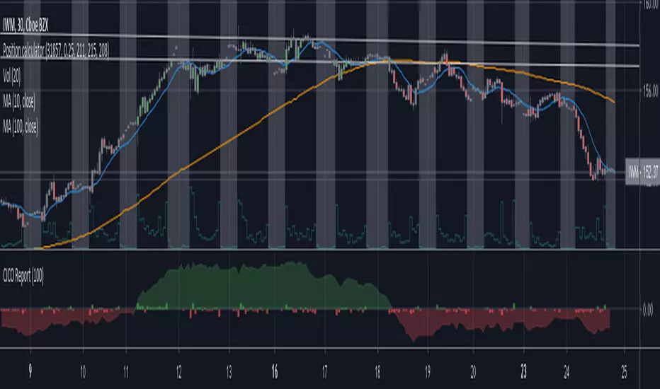
Cash in/Cash out Report (CICO) - Quiets market noiseThe cash in/cash out report (CICO for short) was built with the intent to quiet the market noise. The blunt way to say it, this indicator quiets the market manipulators voice and helps the retail investor make more money. I believe money is better of in the 99% hands versus the greedy hoarding that is currently going on. There are dozens of companies in the SP500 that have the same tax rate as unborn babies, nada. These hoarders also have machine learning high frequency trading bots that purposely create fear and anxiety in the markets. When all of the major markets move at the exact same time of day on frequent occasions, I see red flags. I recommend looking into Authorized participants in the ETF market to understand how the markets can be manipulated, specifically Creation and Redemption.
Enough of my rant. This indicator is open source. Directions on how to use the indicator can be found within the code. The basic summary is, clear your charts to bare minimums. Make the colors gray on all candles. Then apply this indicator. The indicator will color the "buy" and "sell" signals on the chart. Keep in mind, markets are manipulated to create fear in the retail investors little heart and can change drastically at any second. This indicator will show real time changes in running sum into and out of the market, it is estimated by average prices and not exact.
Once the chart is all greyed out and the indicator is applied you will see an area colored red and green. What this indicator does is takes a running sum of the new money into and out of the market. It takes the average of the high and low price times the volume. If the price is going up the value is positive, going down will be negative. Then the running sum is displayed. The area section is the running sum and the column bars are each value. When a market is steadily increasing in value you will see the large green area grow. When markets shift, values and display will change in color and vector. Full descriptions are available within the script in the comment sections.
I hope this help you make more money. If this helps you grow profits, give it a like!
Happy investing 99%er!