Inner Bar Strength (IBS)Inner Bar Strength (IBS) Indicator
The Inner Bar Strength (IBS) indicator is a technical analysis tool designed to measure the position of the closing price relative to the day's price range. It provides insights into market sentiment by indicating where the close occurs within the high and low of a specific timeframe. The IBS value ranges from 0 to 1, where values near 1 suggest bullish momentum (close near the high), and values near 0 indicate bearish momentum (close near the low).
How It Works
The IBS is calculated using the following formula:
IBS = (Close−Low) / (High−Low)
IBS = (High−Low) / (Close−Low)
Close: Closing price of the selected timeframe.
Low: Lowest price of the selected timeframe.
High: Highest price of the selected timeframe.
The indicator allows you to select the timeframe for calculation (default is daily), providing flexibility to analyze different periods based on your trading strategy.
Key Features
Inner Bar Strength (IBS) Indicator
The Inner Bar Strength (IBS) indicator is a technical analysis tool designed to measure the position of the closing price relative to the day's price range. It provides insights into market sentiment by indicating where the close occurs within the high and low of a specific timeframe. The IBS value ranges from 0 to 1, where values near 1 suggest bullish momentum (close near the high), and values near 0 indicate bearish momentum (close near the low).
How It Works
The IBS is calculated using the following formula:
IBS=Close−LowHigh−Low
IBS=High−LowClose−Low
Close: Closing price of the selected timeframe.
Low: Lowest price of the selected timeframe.
High: Highest price of the selected timeframe.
The indicator allows you to select the timeframe for calculation (default is daily), providing flexibility to analyze different periods based on your trading strategy.
Key Features
Timeframe Selection: Customize the timeframe to daily, weekly, monthly, or any other period that suits your analysis.
Adjustable Thresholds: Input fields for upper and lower thresholds (defaulted at 0.9 and 0.1) help identify overbought and oversold conditions.
Visual Aids: Dashed horizontal lines at the threshold levels make it easy to visualize critical levels on the chart.
How to Use the IBS Indicator
When the IBS value exceeds the upper threshold (e.g., 0.9), it suggests the asset is closing near its high and may be overbought.
When the IBS value falls below the lower threshold (e.g., 0.1), it indicates the asset is closing near its low and may be oversold.
Use RSI to confirm overbought or oversold conditions identified by the IBS.
Incorporate moving averages to identify the overall trend and filter signals.
High trading volume can strengthen signals provided by the IBS.
If the price is making lower lows while the IBS is making higher lows, it may signal a potential upward reversal.
If the price is making higher highs and the IBS is making lower highs, a downward reversal might be imminent.
Conclusion
The Inner Bar Strength (IBS) indicator is a valuable tool for traders seeking to understand intraday momentum and potential reversal points. By measuring where the closing price lies within the day's range, it provides immediate insights into market sentiment. When used alongside other technical analysis tools, the IBS can enhance your trading strategy by identifying overbought or oversold conditions, confirming breakouts, and highlighting potential divergence signals.
Indicateur de Momentum (MOM)

TechniTrendMasterIntroducing "TechniTrendMaster"
The TechniTrendMaster indicator is designed to bring clarity and depth to your trading strategy. This indicator combines robust trend analysis with volume insights, giving you a comprehensive view of the market’s pulse. Let's break down the features.
🔵 Analysis Mode
TechniTrendMaster's Analysis Mode provides various configurations tailored to specific market behaviors. Here are the options you can utilize:
🔹Strong Movements: Focuses on powerful market shifts, ideal for capturing major trend changes and high-momentum moves. Perfect for identifying strong breakout opportunities.
🔹Reversal: Detects potential turning points in the market, signaling when a trend might be about to change direction, allowing for well-timed entries and exits.
🔹Consolidations: Spots periods of low volatility where the market moves sideways, helping you avoid trading traps and anticipate breakout scenarios.
🔹Momentum-Driven: Prioritizes momentum in the market, identifying when the force behind price movement is accelerating or decelerating.
🔹Balanced: Offers a well-rounded view of the market by weighing both trend direction and volume equally, making it suitable for stable market conditions.
🔹Volatility Adapted: Adjusts to periods of increased or decreased volatility, providing accurate signals regardless of market conditions.
🔹Trend Confirmation: Confirms the strength and sustainability of a trend, allowing traders to enter trades with higher confidence.
🔹Short-Term Scalping: Tailored for traders who focus on Short-Term and Scalp trades, offering rapid insights for intraday or short-term trading strategies.
🔵 Trend Analysis Mode
The Trend Analysis Mode allows you to customize how trends are detected and analyzed:
🔹Default: A balanced mode for general use, offering reliable trend identification across different market conditions.
🔹Aggressive: A more sensitive setting that reacts quickly to market changes, ideal for traders looking to capitalize on smaller, quicker movements.
🔹Conservative: Takes a cautious approach, favoring long-term stability over short-term fluctuations, perfect for risk-averse traders.
🔹Volatility Aware: Focuses on adapting to volatility shifts, giving accurate trend signals even in erratic markets.
🔹Range Bound: Targets horizontal price movements and channel trades, helping traders take advantage of well-defined ranges.
🔵 Divergence
Divergence is a powerful tool within TechniTrendMaster, highlighting discrepancies between price movement and underlying volume. These differences can indicate potential reversals or trend continuations before they are visible on price charts alone.
🔵 Hidden Divergence
Hidden divergence is a subtle yet crucial signal that reveals when an existing trend might resume after a temporary correction. This mode provides early detection of trend continuity opportunities, giving traders a significant advantage in timing.
🔵 Divergence Mode
TechniTrendMaster includes different divergence detection settings to suit your analysis style:
🔹Standard: Captures typical divergence patterns for general analysis.
🔹Short-Term Focused: Concentrates on short-lived divergences, offering rapid detection of shifts for active traders.
🔹Long-Term Analysis: Highlights divergence in a broader context, which is better for understanding the overall market direction.
🔹High Sensitivity: Prioritizes capturing even the smallest shifts in the market, making it excellent for high-frequency trading or volatile environments.
🔹Low Sensitivity: Reduces market noise, only reacting to more significant changes in trend or volume. It’s perfect for traders who seek higher accuracy with fewer false signals.
🔵 Dynamic Channel
TechniTrendMaster features a Dynamic Channel, that automatically adapts to market conditions. This channel provides a visual guide to price action, adjusting in real-time based on current trends and volatility. It identifies key support and resistance zones, making it easier to spot breakouts, trend continuations, or potential reversals.
🔵 Volume Integration
Volume is a critical part of TechniTrendMaster, offering deeper insights beyond just price movement. By analyzing volume patterns alongside trends, the indicator highlights the strength and reliability of market shifts. This integration ensures that traders can distinguish between genuine movements backed by solid volume and weak trends that might not hold.
🔵 A Solution for All Trading Styles
TechniTrendMaster’s strength lies in its versatility. No matter your trading approach—be it scalping, swing trading, trend following, or range trading—this indicator adapts to your needs. Here's how it caters to different trader profiles:
🔹Scalpers get precise, quick-response insights through the Short-Term Scalping and High Sensitivity settings, helping them capture minute price movements.
🔹Swing Traders benefit from modes like Reversal, Balanced, and Momentum-Driven, which focus on identifying trends and shifts that occur over several days.
🔹Long-Term Investors will find the Conservative, Low Sensitivity, and Long-Term Analysis modes ideal for filtering noise and sticking to broader market trends.
🔹Volatility Traders can rely on the Volatility Adapted and Volatility Aware options to get accurate signals even during unpredictable periods.
🔓 Unlock Access :
Check out the Author's Instructions or Dm me to Unlock the Access.

Average Bullish & Bearish Percentage ChangeAverage Bullish & Bearish Percentage Change
Processes two key aspects of directional market movements relative to price levels. Unlike traditional momentum tools, it separately calculates the average of positive and negative percentage changes in price using user-defined independent counts of actual past bullish and bearish candles. This approach delivers comprehensive and precise view of average percentage changes.
FEATURES:
Count-Based Averages: Separate averaging of bullish and bearish %𝜟 based on their respective number of occurrences ensures reliable and precise momentum calculations.
Customizable Averaging: User-defined number of candle count sets number of past bullish and bearish candles used in independent averaging.
Two Methods of Candle Metrics:
1. Net Move: Focuses on the body range of the candle, emphasizing the net directional movement.
2. Full Capacity: Incorporates wicks and gaps to capture full potential of the bar.
The indicator classifies Doji candles contextually, ensuring they are appropriately factored into the bullish or bearish metrics to avoid mistakes in calculation:
1. Standard Doji - open equals close.
2. Flat Close Doji - Candles where the close matches the previous close.
Timeframe Flexibility:
The indicator can be applied across any desired timeframe, allowing for seamless multi-timeframe analysis.
HOW TO USE
Select Method of Bar Metrics:
Net Move: For analyzing markets where price changes are consistent and bars are close to each other.
Full Capacity: Incorporates wicks and gaps, providing relevant figures for markets like stocks
Set the number of past candles to average:
🟩 Average Past Bullish Candles (Default: 10)
🟥 Average Past Bullish Candles (Default: 10)
Why Percentage Change Is Important
Standardized Measurement Across Assets:
Percentage change normalizes price movements, making it easier to compare different assets with varying price levels. For example, a $1 move in a $10 stock is significant, but the same $1 move in a $1,000 stock is negligible.
Highlights Relative Impact:
By measuring the price change as a percentage of the close, traders can better understand the relative impact of a move on the asset’s overall value.
Volatility Insights:
A high percentage change indicates heightened volatility, which can be a signal of potential opportunities or risks, making it more actionable than raw price changes. Percents directly reflect the strength of buying or selling pressure, providing a clearer view of momentum compared to raw price moves, which may not account for the relative size of the move.
By focusing on percentage change, this indicator provides a normalized, actionable, and insightful measure of market momentum, which is critical for comparing, analyzing, and acting on price movements across various assets and conditions.
X-Force Selector中文說明
X-Force 篩選者 是基於 Mark Minervini 概念設計的強勢標的篩選指標,旨在幫助交易者捕捉市場中的極端強勢標的。此指標運用多重篩選條件,使交易者能在價格達到特定關鍵位置時精準進場,專注於上漲動能強勁、突破阻力較小的標的。
指標篩選條件
100% 關鍵價位:當價格位於365根K棒的最低點的100%之上時,顯示該標的處於強勢區域,具備顯著的上漲動能。
25% 高點價位:同時,當價格位於365根K棒的高點以下25%之上時,代表該標的上方阻力較小,是一個潛在的突破信號。
滿足以上兩個條件的標的才會被視為進場機會,這符合 Minervini 所強調的「專注於強勢標的」的策略。Minervini 的概念強調當標的價格突破關鍵價位時,可能帶來更高的回報潛力,且風險相對較小。
加密貨幣與時間周期的應用
在加密貨幣交易中,1小時到4小時的小時間框架適合使用100%、66%、33%這些百分比範圍參數,以反映市場的高波動特性。對於更短周期,建議進一步縮小百分比,以提高指標對短期波動的敏感度,並增強篩選結果的準確性。
靈活的篩選與戰警風格
此指標的設計結合了 Minervini 的概念和戰警風格,旨在精準鎖定極具潛力的突破標的。X-Force 篩選者適合追隨趨勢的交易者,尤其是熱衷於 Mark Minervini 策略的投資者,使交易者能夠專注於市場中最具上漲動能的標的,實現更精確的進場決策。
English Description
X-Force Selector is a powerful trend-filtering indicator inspired by Mark Minervini’s trading concepts, designed to help traders capture assets with extreme strength in the market. By applying multiple filtering criteria, this indicator enables precise entry decisions when price reaches specific key levels, focusing on assets with strong upward momentum and minimal resistance.
Indicator Selection Criteria
100% Key Price Level: When the price is above 100% of the lowest low over the past 365 bars, it indicates the asset is in a strong zone with substantial upward momentum.
25% High Price Level: Additionally, when the price is within 25% below the 365-bar high, it signals reduced resistance above, indicating potential for a breakout.
Assets meeting both criteria are considered potential entry opportunities, aligning with Minervini's strategy of “focusing on strong assets.” Minervini’s concept emphasizes capturing high-potential assets as they break through critical levels, aiming for higher returns with relatively low risk.
Application to Cryptocurrency and Timeframes
In cryptocurrency trading, shorter timeframes such as 1H to 4H are well-suited for the 100%, 66%, and 33% thresholds, reflecting the high volatility of crypto markets. For even smaller timeframes, it is recommended to reduce these percentages to enhance the indicator’s sensitivity to short-term fluctuations, improving the accuracy of filtered results.
Flexible Filtering with a Battle-Ready Style
With a design inspired by Minervini's concepts and a battle-ready scanning approach, the X-Force Selector precisely locks onto high-potential breakout candidates. This indicator is ideal for trend-following traders, especially those applying Mark Minervini’s strategies, enabling them to concentrate on assets with the strongest upward momentum for precise entry decisions.

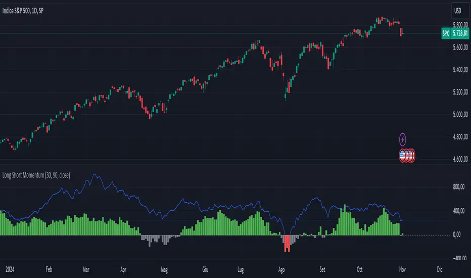
Long Short MomentumThis indicator is designed to visualize short-term and long-term momentum trends.The indicator calculates two momentum lines based on customizable lengths: a short momentum (Short Momentum) over a smaller period and a long momentum (Long Momentum) over a longer period. These lines are plotted relative to the chosen price source, typically the closing price.
The histogram, colored dynamically based on momentum direction, gives visual cues:
Green: Both short and long momentum are positive, indicating an upward trend.
Red: Both are negative, indicating a downward trend.
Gray: Mixed momentum, suggesting potential trend indecision.
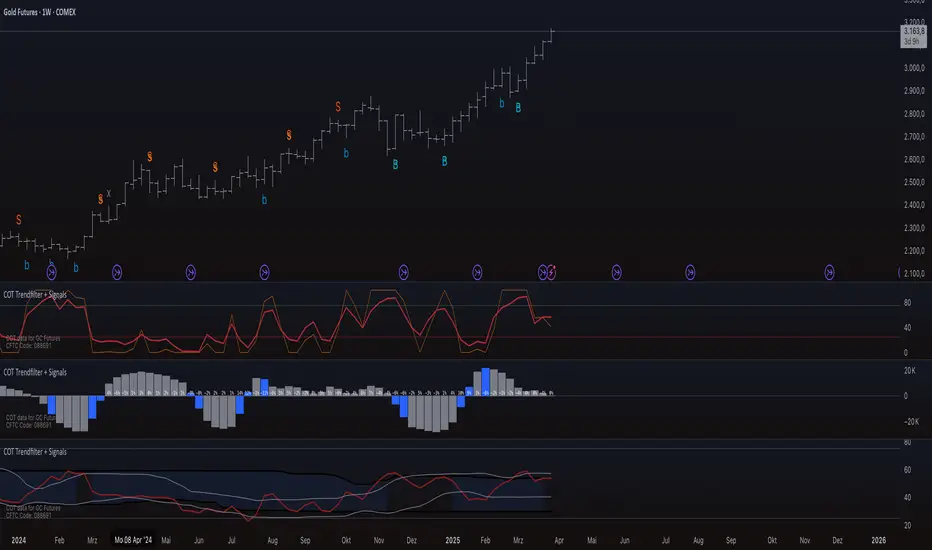
COT Trendfilter + SignalsCOT Trendfilter + Signals Indicator
Data Processing and Usage: The COT indicator processes Commitments of Traders (COT) data provided by the CFTC. Users can select from various participant groups, including Commercials, Large Speculators, and Small Speculators. However, it is important to note that the signal logic of the indicator is exclusively applicable to the net positions of Commercials. This is because Commercials tend to trade contrarily, meaning their trading decisions often run against the prevailing market trend.
Functionality of the Indicators
1. Cycle COT
The cCOT is an enhanced version of the classic RSI. It incorporates additional smoothing based on market vibrations, along with adaptive upper and lower bands based on cyclical memory. The cCOT uses the current dominant cycle length as input and highlights trading signals when the signal line crosses above or below the adaptive bands. Compared to the standard RSI, the cCOT responds more quickly to market movements.
For detailed information on the cCOT, please refer to Chapter 4 "Fine tuning technical indicators" in the book "Decoding the Hidden Market Rhythm, Part 1" by Lars von Thienen.
2. Adaptive Ultra-Smooth Momentum Indicator
The Adaptive Ultra-Smooth Momentum Indicator (CSI) provides an optimized momentum oscillator based on the current dominant cycle. It addresses three common issues with standard indicators: excessive false signals, signal delay, and the need for length adjustments. The CSI offers adaptive smoothing, zero delay, and accurate detection of turning points.
For further information about the CSI, please refer to Chapter 10 "Cycle Swing Indicator: Trading the swing of the dominant cycle" in the book "Decoding the Hidden Market Rhythm, Part 1" by Lars von Thienen.
Signals and Validation
The indicator generates various trading signals:
cCOT:
A buy signal is indicated by an airplane emoji (🛫), while a sell signal is marked by another airplane emoji (🛬).
COT Momentum:
A buy signal is shown by the symbol “∿” in green, while a sell signal is represented by the same symbol in red.
Standard COT Index (Willco):
A buy signal is depicted by a “B” (in green), while a sell signal is shown by an “S” (in red).
Additionally, the validity of the signals is checked. If a previous signal becomes invalid in the following week, it is marked with a gray “x,” indicating that these signals may not be reliable. Users can also switch between net positions, long, and short to analyze the most relevant data for them.
Background Color
The color in the channel can indicate the strength of the Commercials' long-term trend. A channel background color signals an active long-, short-term trend, while no color suggests that there is no clear long-term trend present.
Strange behavior
When only a sharp spike is displayed and the rest is flat, the length settings of the Cycle Length Index should be increased. This can occur when the length is too short, resulting in an unusual spike to properly generate the channel.
Disclaimer
The use of this indicator and the generated signals is at your own risk. The author assumes no responsibility for trading decisions made based on these signals. Please be aware that trading financial instruments involves risks.
Nova Volume Indicator (NVI) by SplitzMagicNova Volume Indicator
The Nova Volume Indicator is an innovative trading tool designed to enhance your trading strategy by analysing volume momentum and market dynamics. This indicator empowers traders to make informed decisions by providing clear and actionable buy and sell signals based on real-time data.
How It Works:
The Nova Volume Indicator utilizes advanced algorithms to assess volume changes and price movements. Key features include:
Volume Momentum Calculation: By evaluating the relationship between price changes and volume, the indicator identifies significant momentum shifts, enabling traders to pinpoint entry and exit points with precision.
Trend Direction Filter: The indicator includes a price filter that determines the prevailing market trend based on a moving average. This ensures that trades align with the overall market direction, enhancing the probability of success.
Alert System: With customizable alert thresholds, users receive notifications when momentum crosses defined levels, keeping them informed of potential trading opportunities without the need for constant monitoring.
No Trade Signal: A black background on the histogram indicates that there are no valid trading opportunities at that moment. Use this feature to avoid entering trades during uncertain market conditions.
How to Use the Nova Volume Indicator for Entries:
Identifying the Trend: Before making any trades, check the indicator's trend direction. If the price is above the moving average, focus on bullish signals; if below, look for bearish signals.
Spotting Entries:
Buy Signal: Look for a green histogram bar indicating positive volume momentum. Enter a trade at the close of the candle when the momentum score exceeds your alert threshold and the price is above the moving average.
Sell Signal: A red histogram bar signals negative volume momentum. Enter a short position at the close of the candle when the momentum score falls below the alert threshold and the price is below the moving average.
Setting Stops and Targets: Place your stop-loss below the recent swing low for buy trades or above the recent swing high for sell trades. Aim for a minimum 1:2 risk-to-reward ratio to maximize your profitability.
Customizable Settings:
The Nova Volume Indicator offers several input settings to help you tailor the indicator to your unique trading style:
Signal Period: Adjust the period for calculating the signal line (EMA of momentum score). A shorter period reacts quickly, while a longer one smooths the signals.
Volatility Period: Control the lookback period for assessing market volatility. Shorter periods capture recent fluctuations, and longer periods provide a broader view of price behavior.
Price Filter MA Length: Set the period for the moving average used to filter trades based on price action, helping determine the trend direction.
Alert Threshold: Define the level at which the indicator signals potential buying or selling opportunities. Customize this setting to suit your trading preferences.
The Nova Volume Indicator is a powerful addition to any trader’s toolkit, designed to simplify decision-making and improve trading outcomes. Whether you're a beginner or a seasoned trader, this indicator offers the insights you need to navigate the markets confidently. Explore its customizable features to create a unique trading experience tailored to your needs. Start using the Nova Volume Indicator today and elevate your trading journey!
Any questions you may have or if you have anything to input to improve this then please leave a comment.

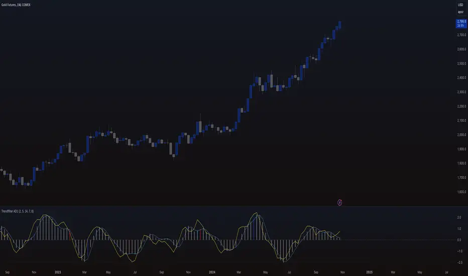
Trendfilter AD1
The "Trendfilter AD1" indicator is a versatile tool for trend detection that combines volume changes, price ranges, ATR (Average True Range), and moving averages. It also considers the momentum of True High/Low over a specified period (PROFF). The indicator integrates various mathematical calculations to measure market trends and volatility. Key features include the use of Powerbar colors, which indicate significant activity from large market participants.
Trendfilter LW
The Trendfilter LW section of the script calculates trend strength by comparing short-term and long-term simple moving averages (SMA) of closing prices, and by assessing cumulative price differences. The result is displayed as a histogram, with positive values indicating bullish trends and negative values indicating bearish trends. This helps traders visualize the strength and direction of long-term and short-term trends.
Trendfilter SP
The Trendfilter SP section combines volume changes, ATR data, and Z-score calculations to smooth out trend signals and provide a clearer assessment of market trends. It uses these data points to filter out noise and highlight significant trend changes. The combined Z-score, smoothed by an EMA, offers precise trend indications and helps traders identify whether the prevailing market forces are bullish or bearish.
What is it for?
The indicator helps traders identify trends and assess market volatility. By combining volume and price movements, it highlights potential trend reversals and shifts in market strength. The calculation of True High/Low (PROFF) measures market momentum over a set period, providing insights into price dynamics. The indicator also uses color-coded bars to represent different levels of market activity and trend strength, with Powerbar colors specifically highlighting major market moves driven by large traders.
How is it used?
Traders can customize the indicator through settings such as Volume Change Periods, EMA periods, and the True High/Low period (PROFF). The indicator generates signals based on significant volume and price fluctuations, with trends displayed through color-coded bars. The Trendfilter LW section calculates trend strength using SMA and cumulative price differences, while the Trendfilter SP section combines volume and ATR data with Z-score calculations to smooth out trend signals. These elements together provide a clear picture of market direction and strength.
EMA Ribbon + ADX MomentumHere's a description for your TradingView indicator publication:
The EMA Ribbon + ADX Momentum indicator combines exponential moving averages (EMA) with the Average Directional Index (ADX) to identify strong trends and potential trading opportunities. This powerful tool offers:
🎯 Key Features:
EMA Ribbon (10, 21, 34, 55) for trend direction
ADX integration for trend strength confirmation
Clear visual signals with color-coded backgrounds
Real-time trend status display
Strength metrics with exact percentage values
📊 How It Works:
EMA Ribbon: Four EMAs form a ribbon pattern that shows trend direction through their stacking order
ADX Integration: Confirms trend strength when above the threshold (default 25)
Visual Signals:
Green background: Strong bullish trend
Red background: Strong bearish trend
Gray background: Neutral or weak trend
📈 Trading Signals:
STRONG BULL: EMAs properly stacked bullish + high ADX + DI+ > DI-
STRONG BEAR: EMAs properly stacked bearish + high ADX + DI- > DI+
BULL/BEAR TREND: Shows regular trend conditions without strength confirmation
NEUTRAL: No clear trend structure
🔧 Customizable Parameters:
ADX Length: Adjust trend calculation period
ADX Threshold: Modify strength confirmation level
ADX Panel Toggle: Show/hide the ADX indicator panel
💡 Best Uses:
Trend following strategies
Entry/exit timing
Trade confirmation
Market structure analysis
Risk management tool
This indicator helps traders identify not just trend direction, but also trend strength, making it particularly useful for both position entry timing and risk management. The clear visual signals and real-time metrics make it suitable for traders of all experience levels.
Note: As with all technical indicators, best results are achieved when used in conjunction with other forms of analysis and proper risk management.
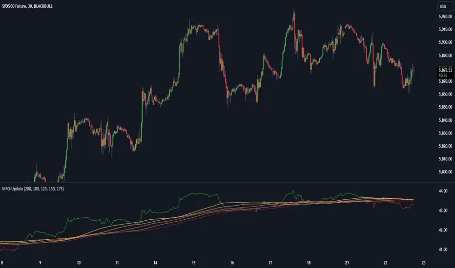
Momentum Flow OscillatorIndicator Overview: Momentum Flow Oscillator (MFO)
The Momentum Flow Oscillator (MFO) is a powerful tool for detecting shifts in market momentum. It combines a momentum-based calculation with a dynamic ribbon of moving averages to help traders identify trend reversals, continuations, and market consolidations. The MFO offers a clear visual representation of market conditions and assists traders in making informed decisions based on the relationship between momentum and its underlying trends.
The MFO line (green) is plotted alongside a Base Line (black) and a series of moving averages (ribbon). The ribbon is composed of five moving averages of different lengths, which allow traders to spot trends, momentum shifts, and potential trade opportunities. It is important to note that the ribbon tends to be a slower-moving component of the indicator, providing long-term trend signals rather than quick, reactive signals.
Components of the Indicator:
Momentum Flow Index (MFI):
This green line is the core of the indicator, representing market momentum derived from price and volume action. It reacts to changes in market dynamics and helps identify periods of strength and weakness.
Base Line (Black Line):
The black line is a 200-period moving average of the momentum flow. This acts as a dynamic support/resistance level for the MFI, smoothing out the price action over a longer period and providing a clearer trend signal.
Moving Averages Ribbon:
The ribbon is composed of five moving averages with different periods (100, 125, 150, 175, and 200). These moving averages create a visual "ribbon" that helps identify trends and consolidations, allowing traders to visualize the market’s momentum over different time frames.
The ribbon acts as a slower-moving indicator, helping to confirm long-term trends. Traders should keep in mind that the ribbon provides signals with a lag, making it ideal for trend-following rather than quick, short-term trades.
How to Use the Momentum Flow Oscillator (MFO):
1. Bullish Momentum Signals:
When the MFI (green line) crosses above the Base Line and the SMA ribbon, it indicates increasing momentum in the market. This signal is particularly strong when the MFI stays above the ribbon for an extended period.
Trade Example: Traders can use this as a buy signal when the MFI crosses above the ribbon, indicating that momentum is shifting to the upside. If the ribbon starts fanning out, it suggests the market is trending strongly upward, which may support a long position.
2. Bearish Momentum Signals:
When the MFI crosses below the Base Line and the SMA ribbon, it signals decreasing momentum. This is a bearish sign, indicating that the market may be preparing for a downturn.
Trade Example: A trader can use the cross below the ribbon as a sell signal or consider entering a short position when momentum weakens. If the ribbon fans out in a downward direction, it suggests the market is trending lower, and a short position may be warranted.
3. Neutral or Caution Signals:
When the MFI fluctuates within the SMA ribbon or crosses in and out frequently, the market may be in a consolidation phase or range-bound. In this situation, the trend is uncertain, and momentum is not strong enough to break decisively in either direction.
Trade Example: Traders may want to avoid taking new positions when the MFI is moving sideways within the ribbon, as this indicates indecision in the market. Waiting for a breakout above or below the ribbon can provide clearer signals for trading.
4. Trend Confirmation with Ribbon Expansion:
When the SMA ribbon expands, it indicates strong momentum in the direction of the trend. A clear widening of the ribbon with the MFI above (bullish) or below (bearish) signals a strong, sustainable trend.
Trade Example: As the ribbon expands, it confirms the strength of the trend, and traders can use this as confirmation to either hold an existing position or add to it.
5. Reversal Signals from Ribbon Contraction:
When the SMA ribbon contracts or the MFI crosses back and forth over the Base Line, it signals a potential reversal or a weakening of the existing trend.
Trade Example: In these cases, traders might consider closing positions or preparing for a reversal, as the contraction often signals a potential breakout in the opposite direction.
Example of Using the MFO in Trading:
In the provided chart image, you can see the MFI moving below the Base Line and the SMA ribbon for an extended period. This indicates bearish momentum, and traders could use this signal to enter a short position or avoid long positions until the MFI shows signs of crossing back above the ribbon. When the MFI crosses above the ribbon, it can signal a potential bullish reversal, indicating it might be time to re-enter long positions or close short positions.
Additional Trading Tips:
Combine with Other Indicators: The MFO can be used in combination with other technical tools such as volume-based indicators, trendlines, or oscillators like RSI or MACD to confirm signals and increase accuracy.
Use Different Time Frames: Traders can apply the MFO on different time frames (e.g., daily, weekly) to capture both short-term and long-term trends. Crossovers in longer time frames provide stronger confirmation of trend direction.
Conservative Entry: For more conservative traders, waiting for the MFI to fully cross above or below the ribbon (rather than within it) can help filter out false signals and avoid entering trades during consolidation phases.
Conclusion:
The Momentum Flow Oscillator offers traders a versatile and visual approach to gauging market momentum and trend strength. By observing the interaction between the MFI and the SMA ribbon, traders can spot trend changes early, confirm existing trends, and stay out of choppy, sideways markets. Keep in mind that the ribbon is a slower-moving part of the indicator—perfect for trend-following strategies but less ideal for fast, reactive trades. Use this indicator to increase your confidence in your trading decisions and improve your ability to capture trends in the market.
3CRGANG - HISTOGRAMThe 3CRGANG - HISTOGRAM is a breakthrough tool, developed to consolidate multiple oscillators, including their Fibonacci-modified versions, into a single, streamlined indicator. This isn’t just a combination of tools—i t’s a carefully engineered solution built to address the nuanced challenges traders face, such as market noise, varying data availability, and trend alignment across multiple timeframes.
Behind the scenes, significant debugging ensures it performs flawlessly even in situations where volume data isn’t provided by brokers. With automatic adjustments that adapt to different conditions, the indicator allows traders to remain focused on decision-making. Every enhancement, from signal optimization to noise reduction, reflects careful design choices to provide practical, actionable insights.
This tool is designed to give traders clarity, speed, and an edge, enabling them to focus on the markets without worrying about technical details.
How It’s Different from Basic Indicators
Rather than simply mashing up popular indicators like MACD, RSI, and more , —it’s a strategic tool designed to detect key momentum shifts, divergences, and trends in real time.
This script combines Fibonacci-modified oscillators and classic indicators in a unique way, providing multi-dimensional insights to enhance your trading decisions.
Reduce market noise: Fast and slow averages are used to generate histograms that filter out false signals.
Optimize alerts: Fibonacci-based calculations fine-tune oscillators to detect trends at key turning points.
Multi-timeframe momentum: This allows for tracking higher timeframe momentum while making decisions on lower timeframes—a powerful feature for trend alignment.
Key Features and Unique Value
Oscillator Flexibility: Choose from multiple oscillators to fit your strategy, including both momentum-based and volatility-based approaches.
Fibonacci Enhancements: These versions increase precision, providing greater confidence in signals at critical levels.
MTF Compatibility: Analyze higher timeframe momentum on shorter charts to maintain alignment with the broader trend.
Custom Alerts: Color-coded histograms and moving averages provide visual cues to keep your trades in sync with momentum changes.
How It Works
The indicator plots fast and slow averages for the selected oscillator, and the difference between these averages forms the histogram. Custom color coding shows whether momentum is increasing or weakening. The proprietary modification factor adjusts the signal sensitivity, allowing traders to fine-tune the indicator for their strategy.
Visual Alerts:
Green Bars: Indicate bullish momentum.
Red Bars: Suggest bearish momentum.
Buy Only / Sell Only Zones: Alert traders when the indicator suggests favoring either long or short trades.
This indicator minimizes false signals by blending momentum oscillators with volume-weighted filters and smooth moving averages, ensuring better signal quality.
Use Case: Like a Traffic Light for Your Trades
Green means Go: Enter or hold long positions during green bars, signaling upward momentum.
Red means Stop (or Go Short): Exit long positions or enter short trades when red bars appear, indicating bearish momentum.
The Buy Only and Sell Only alerts help traders stay aligned with dominant trends and avoid counter-trend trades in high-momentum phases.
Real-World Examples :
Divergences (BTCUSD):
When the price action ranges, wedges, or behaves unusually, the histogram—being highly sensitive — alerts traders ahead of potential reversals or continuation moves.
This gives traders more time to assess market conditions and prepare their strategy before momentum shifts.
Multi-Timeframe Momentum (ADAUSD):
Momentum from a higher timeframe aligns with the trend on a lower timeframe, helping traders time their entries accurately.
The Priceless Edge for Traders
The 3CRGANG offers more than just another way to analyze markets—it provides a priceless edge by streamlining multiple indicators into a single tool. With the flexibility to switch between oscillators, multi-timeframe momentum tracking, and proprietary enhancements, it’s designed to help traders stay ahead in both trending and volatile markets.
Disclaimer
This indicator is a trading tool designed to provide insights into market trends, but it does not guarantee results. Trading involves risk, and past performance does not predict future outcomes. Use it alongside proper risk management practices.

Pip hunter 1-Minute Scalping Strategy [manesisnet]NOTE: This is my first attempt to write an indicator using pine script and it's not recommended for serious trading, just use it for your own research or feel free to create your own versions based on the below.
Overview: The "1-Minute Scalping Strategy" is a custom TradingView indicator designed for short-term traders looking to capitalize on quick price movements in the 1-minute timeframe. This strategy combines moving averages and the Relative Strength Index (RSI) to generate buy and sell signals while filtering out potential false entries by confirming trends on a higher timeframe.
How It Works:
Moving Averages:
The indicator uses two Simple Moving Averages (SMAs):
A fast SMA (5-period) for short-term price movements.
A slow SMA (20-period) to identify the overall trend.
Buy signals are generated when the fast SMA crosses above the slow SMA, indicating bullish momentum.
Sell signals occur when the fast SMA crosses below the slow SMA, indicating bearish momentum.
Higher Time Frame Confirmation:
To enhance the accuracy of the signals, the strategy checks the trend on a higher timeframe (default is 5 minutes).
A buy signal is only valid if the current price is above the higher timeframe SMA, confirming that the overall trend is bullish.
A sell signal is only valid if the current price is below the higher timeframe SMA, confirming a bearish trend.
This confirmation helps avoid false breakouts and ensures that trades are aligned with the prevailing market direction.
Relative Strength Index (RSI):
The RSI is used to assess market momentum and potential reversal points.
The indicator calculates a 14-period RSI to identify overbought and oversold conditions.
For buy signals, the RSI must be below 60 (indicating the market is not overbought).
For sell signals, the RSI must be above 40 (indicating the market is not oversold).
This helps to filter out trades that might occur during extreme market conditions.
Visual Representation:
The fast SMA (5-period) is plotted in blue, the slow SMA (20-period) in red, and the higher timeframe SMA in orange.
Buy signals are indicated with a green label below the bar, while sell signals are indicated with a red label above the bar.
This visual representation allows traders to quickly identify potential entry points.
Alerts:
The script includes alert conditions for buy and sell signals, enabling traders to receive notifications when the conditions for entering trades are met.

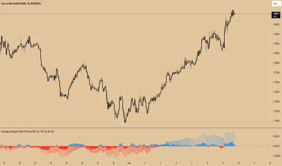
Kurutoga Histogram with HTF and LTF
Kurutoga Histogram:
The Kurutoga Histogram is a technical analysis indicator designed to measure price divergence from the 50% level of a recent price range. By calculating how far the current price is from the midpoint of a selected base length of candles, the histogram provides insight into the momentum, strength, and potential reversals in the market. Additionally, it can be applied across multiple timeframes to provide a comprehensive view of both short- and long-term market dynamics.
Key Components:
Base Length:
The base length is the number of candles (bars) over which the high and low prices are observed. The default base length is typically 14 periods, but it can be adjusted according to the trader's preference.
This base length defines the range from which the 50% level, or midpoint, is calculated.
50% Level (Midpoint):
The midpoint is the average of the highest high and the lowest low over the selected base length. This 50% level acts as an equilibrium point around which the price fluctuates.
Formula:
Midpoint = (Highest High + Lowest Low) / 2
The price’s distance from this midpoint is an indicator of how strong the current trend or divergence is.
Price Divergence:
The main calculation of the histogram is the difference between the current closing price and the midpoint of the price range.
Formula:
Divergence = Close Price − Midpoint
A positive divergence (price above the midpoint) indicates bullish strength, while a negative divergence (price below the midpoint) indicates bearish strength.
Multi-Timeframe Analysis:
The Kurutoga Histogram can be applied to both the current timeframe and a higher timeframe (HTF), allowing traders to gauge price movement in both short-term and long-term contexts.
By comparing the histograms of multiple timeframes, traders can determine if there is alignment (confluence) between trends, which can strengthen trade signals or provide additional confirmation.
Color-Coded Histogram:
Blue Bars (Positive Divergence): Represent that the price is above the 50% level, indicating bullish momentum. Taller blue bars suggest stronger upward momentum, while shrinking bars suggest weakening strength.
Red Bars (Negative Divergence): Represent that the price is below the 50% level, indicating bearish momentum. Taller red bars suggest stronger downward momentum, while shrinking bars suggest a potential reversal or consolidation.
The histogram’s color intensity and transparency can be adjusted to enhance the visual effect, distinguishing between current timeframe (LTF) and higher timeframe (HTF) divergence.
Interpretation:
Bullish Signals: When the histogram bars are blue and growing, the price is gaining momentum above the midpoint of its recent range. This could signal an ongoing uptrend.
Bearish Signals: When the histogram bars are red and growing, the price is gaining momentum below the midpoint, signaling an ongoing downtrend.
Momentum Shifts: When the histogram bars shrink in size (whether blue or red), it could indicate that the current trend is losing strength and may reverse or enter consolidation.
Neutral or Sideways Movement: When the histogram bars hover around zero, it means the price is trading near the midpoint of its recent range, often signaling a lack of strong momentum in either direction.
Multi-Timeframe Confluence:
When the current timeframe (LTF) histogram aligns with the higher timeframe (HTF) histogram (e.g., both are showing strong bullish or bearish divergence), it may provide stronger confirmation of the trend's strength.
Divergence between timeframes (e.g., bullish on LTF but bearish on HTF) may suggest that price movements on lower timeframes are not yet reflected in the broader trend, signaling caution.
Applications:
Trend Identification: The Kurutoga Histogram is highly useful for detecting when the price is trending away from its equilibrium point, providing insight into the strength of ongoing trends.
Momentum Analysis: By measuring the divergence from the 50% level, the histogram helps traders identify when momentum is increasing or decreasing.
Reversal Detection: Shrinking histogram bars can signal weakening momentum, which often precedes trend reversals.
Consolidation and Breakouts: When the histogram remains near zero for an extended period, it suggests consolidation, which often precedes a breakout in either direction.
Advantages:
Clear Visuals: The use of a color-coded histogram makes it easy to visually assess whether the market is gaining bullish or bearish momentum.
Multi-Timeframe Utility: The ability to compare current timeframe signals with higher timeframe signals adds an extra layer of confirmation, reducing false signals.
Dynamic Adjustment: By adjusting the base length, traders can fine-tune the sensitivity of the indicator to match different markets or trading styles.
Limitations:
Lagging Indicator: Like most divergence indicators, the Kurutoga Histogram may lag slightly behind actual price movements, especially during fast, volatile markets.
Requires Confirmation: This indicator works best when used in conjunction with other technical tools like moving averages, support/resistance levels, or volume indicators, to avoid relying on divergence alone.
Conclusion:
The Kurutoga Histogram is a versatile and visually intuitive tool for measuring price divergence from a key equilibrium point, helping traders to assess the strength of trends and identify potential reversal points. Its use across multiple timeframes provides deeper insights, making it a valuable addition to any trading strategy that emphasizes momentum and trend following.
Trend Following Regression CloudTrend Following Regression Cloud Indicator
The Trend Following Regression Cloud is a versatile trading tool designed to help you effortlessly identify the market's prevailing trend. By analyzing price movements over multiple time frames, it provides a clear visual representation of whether the market is trending upwards or downwards.
How It Works:
- Adaptive Analysis: The indicator calculates linear regression lines over various periods ranging from short-term to long-term (e.g., 10, 20, 50, up to 500 periods). This means it adapts quickly to recent market changes, capturing new trends as they develop.
- Noise Reduction: By comparing and weighting the slopes of these regression lines, it filters out insignificant price fluctuations (market noise). This ensures that the signals you receive are more reliable and less prone to false alarms.
- Cloud Calculation: The cloud is generated by first calculating the slopes of multiple linear regression lines over different lengths. The differences between the slopes of shorter-term and longer-term regressions are then computed and weighted by their respective lengths. By summing up these weighted differences, the indicator produces a "total distance" value. This value is applied to a baseline (such as a 100-period simple moving average) to create the cloud line. The area between the baseline and the cloud line is filled, and its color changes based on whether the total distance is positive or negative, providing a visual cue of the market's trend direction.
- Visual Representation: The indicator plots two lines—a base line and a cloud line—creating a shaded area (the "cloud") between them. The color of this cloud changes based on market conditions:
- Green Cloud: Indicates that short-term trends are stronger than long-term trends, suggesting an upward market movement. This could be a good time to consider buying.
- Red Cloud: Signifies that the market may be trending downwards, as long-term trends overpower short-term ones. This could be an opportune moment to consider selling.

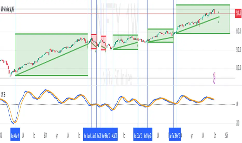
RoC Momentum CycleRoC Momentum Cycles (RMC) is derived from RoC (Rate of Change) indicator.
Motivation behind RMC: Addressing RoC’s Shortcomings
While the Rate of Change (RoC) indicator is a valuable tool for assessing momentum, it has notable limitations that traders must be aware of. One of the primary challenges with the traditional RoC is its sensitivity to price fluctuations, which can lead to false signals in volatile markets. This often results in premature entries or exits, impacting trading performance.
By smoothing out the RoC calculations and focusing on more consistent signal generation (using SMA on smoothed RoC), RMC offers a more consistent representation of price trends.
Momentum Cycles
RMC helps visualize momentum cycles in a much better way compared to RoC.
Long Momentum Cycle : A cross-over of smoothed RoC (blue line) above averaged signal (orange line) below zero marks start of a new potential upside cycle which ends when the blue line comes back to zero line from above.
Short Momentum Cycle : A cross-under of blue line below orange line above zero marks beginning of a potential downside cycle which ends when the blue line comes back to zero from below.
Momentum-Based Buy/Sell SignalsBuy Signal:
Triggered when ROC > threshold and the MACD line crosses above the Signal line.
Sell Signal:
Triggered when ROC < threshold and the MACD line crosses below the Signal line.
Visual Elements:
Green labels with "Buy" are displayed below the bars for buy signals.
Red labels with "Sell" are displayed above the bars for sell signals.
The background turns green during a buy signal and red during a sell signal for better visual clarity.

Price-Shift Oscillator (PSO)The PSOscillator calculates an oscillator value based on price movements over a specific period. Oscillators like this one are typically used to identify momentum shifts, and trend direction. Here's a breakdown of how the logic behind it works:
Key Concepts for Beginners:
Oscillators:
In this case, the PSOscillator helps indicate whether the market momentum is positive (price might rise) or negative (price might fall).
Input Parameters:
oscPeriod: This is the number of bars (or candles) used to calculate the oscillator. It affects how sensitive the oscillator is to price changes. A lower period makes it more sensitive to short-term movements, while a higher period smoothens it out.
smaPeriod: This is a simple moving average (SMA) applied to the oscillator for additional smoothing, further reducing noise.
Calculation Logic:
The JpOscillator uses recent price data to calculate its value. Specifically, it looks at the closing prices of the current and previous bars (candles). periods ago).
This calculation aims to identify how much recent price action is deviating from past price behavior.
Essentially, it tells us whether the current price is higher or lower relative to the past, and how the trend is evolving over recent periods.
Smoothing:
After calculating the oscillator values, we apply optional smoothing to make it less "jumpy." This is useful in reducing the noise caused by small, insignificant price movements.
The sma_from_array function averages out the recent oscillator values to make the signal smoother, depending on the oscPeriod.
Oscillator Levels:
Above Zero:
If the oscillator is above 0, it means the price is gaining momentum upwards (bullish signal), which is why we color the histogram green.
Below Zero: If the oscillator is below 0, it indicates downward momentum (bearish signal), which is why we color the histogram red.
You can think of the zero line as a "neutral zone." Crossing above it means momentum is shifting to the upside, and crossing below it means momentum is shifting to the downside.
Histogram Plotting:
The values of the oscillator are plotted as a histogram (bars). The color changes based on whether the oscillator is above or below zero (green for positive and red for negative momentum).
The moving average (SMA) of the oscillator is plotted as a line to help identify trends over time.
Using two different coloring methods for a histogram in a trading strategy can provide a trader with distinct, layered information about market conditions, trends, and momentum shifts. Each coloring method can highlight different aspects of the price action or the oscillator behavior. Here’s how a trader might use both methods to their advantage:
ETHUSDT Daily
1. Color Based on Oscillator Position Relative to Zero
This method colors the histogram green when the oscillator value is above zero and red when it's below zero. This coloring strategy is straightforward and helps a trader quickly identify whether the market's momentum is generally bullish or bearish.
Advantages:
Trend Confirmation: When the oscillator remains above zero and green, it can confirm a bullish trend, and vice versa for a bearish trend with red colors below zero.
Quick Visual Reference: Easy to see at a glance, helping in fast decision-making processes.
2. Color Based on the Change of the Oscillator
This method changes the color based on whether the oscillator is increasing or decreasing compared to its previous value. For instance, a darker shade of green might be used if the oscillator value is rising from one period to the next, indicating increasing bullish momentum, and a darker red if declining, indicating increasing bearish momentum.
Advantages:
Momentum Insight: This coloring method gives insights into the strength of the movement. An oscillator that is increasing (even below zero) might suggest a weakening of a bearish trend or the start of a bullish reversal.
Detecting Reversals: Seeing the oscillator rise from negative to less negative or drop from positive to less positive can alert traders to potential early reversals before they cross the zero line.
Strategic Use in Trading:
A trader can use these two methods together by applying a multi-layered approach to analyze the oscillator:
Overall Trend Assessment:
Above Zero (Green): Considered bullish; look for buy opportunities, especially if the color gets brighter (indicating strengthening).
Below Zero (Red): Considered bearish; look for sell opportunities, especially if the color gets darker (indicating strengthening).
Short-Term Momentum and Entries:
Brightening Green: Could indicate a good time to enter or add to long positions as bullish momentum increases.
Darkening Red: Could indicate a good time to enter or add to short positions as bearish momentum increases.
Lightening Color: If red starts to lighten (become less intense), it might suggest a bearish trend is losing steam, which could be an exit signal for shorts or an early warning for a potential long setup.
Risk Management:
Switch in Color Intensity: A sudden change in color intensity can be used as a trigger for tightening stops or taking partial profits, helping manage risk by responding to changes in market momentum.

PRICE STREAK [DIGGERDOG]PRICE STREAK
This Pine Script, titled **"PRICE STREAK "**, tracks the number of consecutive up or down price closes and visualizes the result in a histogram-style plot. It provides a visual representation of price momentum by counting the number of consecutive days where the closing price is either higher or lower than the previous day. The histogram changes color depending on whether the streak is upward (green) or downward (red).
Key Features:
1. **Upcount and Dncount Calculation:**
- **Upcount** is incremented each time the current close is higher than the previous close. It resets when the close price decreases.
- **Dncount** is incremented each time the current close is lower than the previous close. It resets when the close price increases.
- The script does not differentiate between upward and downward streak lengths in terms of plotting; it combines them in one cumulative count.
2. **Plot with Color-Coded Streaks:**
- The script plots the sum of **Upcount** and **Dncount** as a histogram, where:
- **Green bars** represent upward price streaks (the price is closing higher).
- **Red bars** represent downward price streaks (the price is closing lower).
3. **Threshold Line:**
- A horizontal line is plotted at a value of **2** as a visual threshold to help identify periods where streaks exceed this value. This can be adjusted as needed to indicate different threshold levels for streak significance.
How It Works:
1. **Price Streak Logic:**
- For each bar, the script compares the closing price to the previous bar's closing price:
- If the current close is greater than the previous close, the **Upcount** is incremented, and **Dncount** is reset.
- If the current close is less than the previous close, the **Dncount** is incremented, and **Upcount** is reset.
- The cumulative count of these streaks is plotted.
2. **Color-Coded Histogram:**
- The histogram uses a dynamic color based on whether the streak is upward or downward:
- **Green** for upward streaks.
- **Red** for downward streaks.
Visualization:
- The histogram will help you easily spot whether there has been a significant price streak, whether upward or downward, and how long the streaks last.
- The threshold line helps in identifying when the streaks are significant by providing a reference point (e.g., streaks greater than 2).
Customizations:
- **Threshold**: You can adjust the value of the horizontal line (`hline(2)`) to any number that suits your strategy.
- **Colors**: The green and red colors can be changed to your preference for visual clarity.
Use Case:
This script is ideal for traders who want to track the **momentum** in price movements. If a stock has several consecutive up days or down days, it may indicate **strong momentum** or **trend exhaustion**, depending on the length of the streak. This indicator can help identify potential trend continuation or reversal points.
If you need additional customizations or have any questions, feel free to ask!

Prime OscilatorPrime Oscilator is a powerful tool designed to help traders track momentum shifts and confirm trends in volatile markets. This oscillator-based tool integrates advanced market analysis techniques to provide a clear picture of momentum and trend direction, helping traders stay in sync with the prevailing market conditions.
Core Features of Prime Oscilator
Oscillator-Based Momentum Tracking: Prime Oscilator operates as a dynamic oscillator that tracks shifts in market momentum by analyzing the relationship between the A/D line and its signal line. This allows traders to identify potential changes in market direction and confirm trend strength.
Trend Confirmation Filter: Prime Oscilator incorporates a long-term trend filter, using a 50-period Simple Moving Average (SMA) to confirm whether the market is trending upward or downward. This helps traders focus on trades that align with the broader market direction.
Adaptive Signal Line: The oscillator’s signal line adjusts dynamically to reflect short-term momentum changes, allowing traders to react quickly to evolving market conditions. This makes the Prime Oscilator highly responsive to both fast-moving and stable markets.
Color-Coded Oscillator Line: The oscillator line changes color based on the current market conditions, providing a visual cue of momentum shifts. The line remains green during upward momentum and red during downward momentum, giving traders an easy way to gauge the market direction.
How Prime Oscilator Works
Prime Oscilator blends the power of trend analysis with momentum tracking to provide a comprehensive view of market conditions. By analyzing the Accumulation/Distribution (A/D) line and comparing it to a dynamic signal line, traders can monitor momentum shifts and confirm trends.
A/D Line Crossover: The indicator uses the relationship between the A/D line and the signal line to detect potential momentum changes. When the A/D line moves relative to the signal line, it reflects shifts in market momentum, allowing traders to follow the direction of the trend.
Trend Filtering: To ensure that momentum is aligned with the broader market direction, Prime Oscilator uses a 50-period SMA as a trend filter. This confirms whether the market is in an uptrend or downtrend and helps traders avoid focusing on short-term fluctuations that go against the prevailing trend.
Why It's Useful for Traders
Prime Oscilator is especially valuable for traders looking for a reliable way to track momentum shifts while aligning their trades with the overall market trend. This reduces noise and ensures that traders focus on opportunities that are in line with broader market movements.
Momentum-Based Trend Analysis: By tracking momentum changes, Prime Oscilator helps traders stay on top of potential market shifts without the noise that comes from traditional indicators.
Clear Visual Feedback: The color-coded oscillator line provides instant feedback on market conditions, allowing traders to focus on decision-making rather than analyzing multiple indicators.
Flexible Across Markets and Timeframes: Whether you are trading in volatile markets or more stable environments, Prime Oscilator adapts to different market conditions, ensuring you always have a clear picture of momentum and trend.
Prime Oscilator is ideal for traders who:
Scalp or trade intraday: Quickly captures momentum shifts in short timeframes.
Swing traders: Identifies potential trend reversals in higher timeframes while confirming momentum strength.
Trend followers: Ensures your trades are aligned with the prevailing market trend by confirming momentum shifts.
By combining momentum analysis with trend direction, Prime Oscilator offers a dynamic view of the market, helping traders navigate changing conditions with ease.
Why It's Worth Paying For
Prime Oscilator provides several unique advantages that make it a valuable tool for traders:
Clear and Actionable Insights: The oscillator-based momentum tracking gives traders a clear understanding of when the market's momentum is shifting, allowing for more informed trading decisions.
No Lagging: Unlike some trend-following indicators, Prime Oscilator reacts dynamically to market changes, helping traders stay aligned with the current market direction.
Adaptable and Flexible: Whether you trade on shorter timeframes or hold longer positions, Prime Oscilator adapts seamlessly to various market conditions. The trend filter ensures that traders remain aligned with broader market trends.
Visual Simplicity: The color-coded oscillator line and background shading provide an easy-to-read way of monitoring market conditions, enabling faster decision-making.
How to Get Access
To gain access to Prime Oscilator , please send me a direct message on TradingView or follow the provided link to request access. Ensure that access requests are made privately so the comments section remains focused on discussions related to the script’s performance and use.
Risk Disclaimer
While Prime Oscilator offers valuable insights into market momentum and trends, it’s important to note the following:
Past performance is not indicative of future results: Prime Oscilator ’s trend and momentum analysis are based on historical data, and no indicator can predict future price movements with certainty.
Market Conditions: The effectiveness of the Prime Oscilator may vary across different market conditions, and traders should always use proper risk management when trading.
Trading Risks: Like any trading tool, Prime Oscilator should be used as part of a comprehensive trading strategy that includes risk management techniques such as stop-loss orders and position sizing.

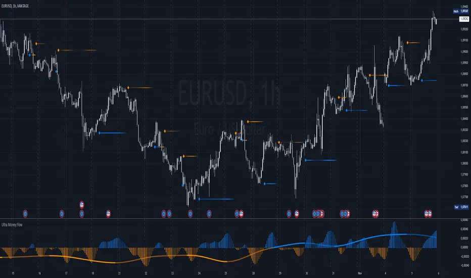
Ultra Money FlowIntroduction
The Ultra Money Flow script is a technical indicator for analyzing stock trends. It highlights buying and selling power, helping you identify bullish (rising) or bearish (falling) market trends.
Detailed Description
The Ultra Money Flow script calculates and visually displays two main components: Fast and Slow money flow. These components represent short-term and long-term trends, respectively.
Here's how it works:
.........
Inputs
You can adjust the speed of analysis (Fast Length and Slow Length) and the type of smoothing applied (e.g., Simple Moving Average, Exponential Moving Average).
Choose colors for visualizing the trends, with blue for bullish (positive) and orange for bearish (negative) movements.
.....
Money Flow Calculation
The script analyzes price changes (delta) over specified periods.
It separates upward price movements (buying power) from downward ones (selling power).
It then calculates the difference between these powers for both Fast and Slow components.
The types of smoothing methods range from traditional ones like the Simple Moving Average (SMA) to advanced ones like the Double Expotential Moving Average (DEMA) or the Triple Exponential Moving Average (TEMA) or the Recursive Moving Average (RMA) or the Weigthend Moving Average (WMA) or the Volume Weigthend Moving Average (VWMA) or Hull Moving Average (HMA).
Very Special ones are the Triple Weigthend Moving Average (TWMA) wich created RedKTrader .
I created the Multi Weigthend Moving Average (MWMA) wich is a simple signal line to the TWMA.
.....
Divergence
This indicator can show divergence by comparing the direction of price movements with the indicator value.
If the price and the indicator move in opposite directions, you can use these signals to help decide when to buy or sell.
.....
Auto Scaling
The script adjusts its calculations based on the time frame you are viewing, whether it's minutes, hours, or days, ensuring accurate representation across different time scales.
.....
Plotting
The script plots the Fast component as a histogram and the Slow component as a line, using the chosen colors to indicate bullish or bearish trends.
The thickness and transparency of these plots give additional clues about the strength of the trend.
.........
By using this indicator, traders can easily spot shifts in buying and selling power, allowing for better-informed decisions in the market.
Special Thanks
I use the TWMA-Function created from RedKTrader to smooth the values.
Special thanks to him for creating and sharing this function!
Custom MACD Oscillator with Bar ColoringCustom MACD Oscillator with Bar Coloring
This custom MACD indicator is a fusion of two powerful MACD implementations, combining the best features of both the MACD Crossover by HPotter and the Multiple Time Frame Custom MACD Indicator by ChrisMoody. The indicator enhances the traditional MACD with customizable options and dynamic bar coloring based on the relationship between the MACD and Signal lines, providing a clear visual representation of momentum shifts in the market.
Key Features:
MACD Oscillator: Built on the core MACD principle, showing the difference between two Exponential Moving Averages (EMA) for momentum tracking.
Signal Line: A Simple Moving Average (SMA) of the MACD, helping to identify potential entry/exit points through crossovers.
Multiple Time Frame Support: Allows users to view MACD and Signal data from different timeframes, giving a broader view of the market dynamics.
Bar Coloring: Bars are colored green when the MACD is above the Signal line (bullish), red when the MACD is below (bearish), and blue during neutral conditions.
Histogram with Custom Colors: A customizable histogram visualizes the difference between the MACD and Signal lines with color-coding to represent changes in momentum.
Cross Dots: Visual markers at points where the MACD crosses the Signal line for easy identification of potential trend shifts.
This indicator is a versatile tool for traders who want to visualize MACD-based momentum and crossover signals in multiple timeframes with clear visual cues on price bars.
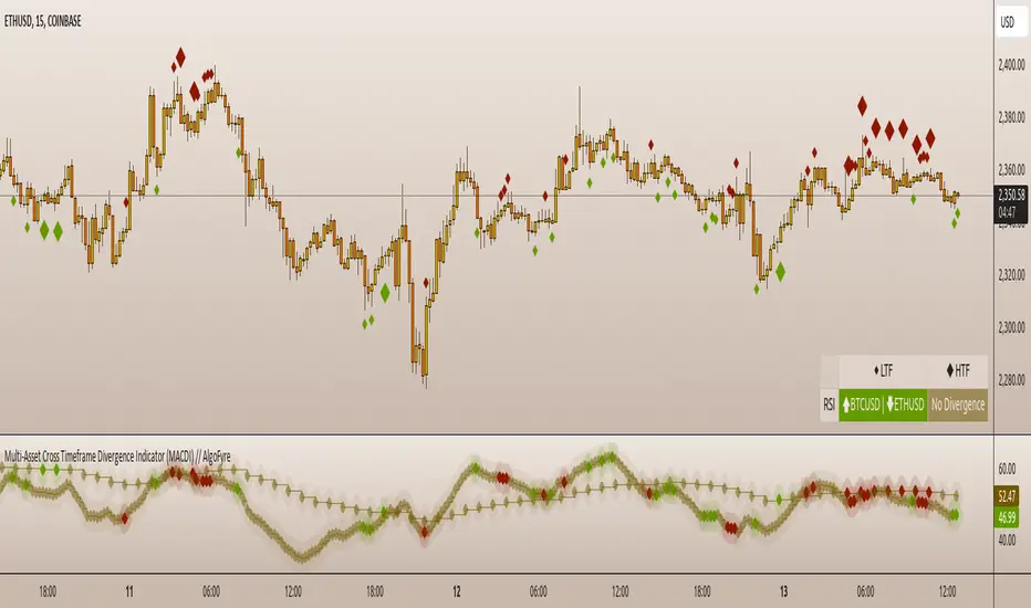
Multi-Asset Cross Timeframe Divergence Ind. (MACDI) // AlgoFyreThe Multi-Asset Cross Timeframe Divergence Indicator (MACDI) identifies divergences in momentum like RSI across multiple assets and timeframes. It visually highlights lagging correlated asset momentum divergences, helping traders spot inefficiencies and potential trade opportunities in the following asset.
🔶 KEY FEATURES
🔸Average Momentum Trendline for Each Timeframe
The Average Momentum Trendline feature calculates the average momentum of multiple assets over specified timeframes. It uses smoothed values to determine the momentum trend for each timeframe on the average aggregated momentum of both assets. This trendline helps traders identify the overall direction of the market momentum, providing a clearer picture of potential price movements.
🔸Real-time Divergence Indication and Alert Table
The Real-time Divergence Indications and Alert Table feature visualizes detected divergences between the momentum values of the two assets across different timeframes. It identifies both bullish and bearish divergences, signaling lagging reversals in the the following asset and potential trading opportunities. When a divergence is detected, the system generates real-time visual indications on the chart and in an overview table for traders to act promptly. The alert table provides a comprehensive overview of all detected divergences, making it easier for traders to monitor and respond to market changes.
🔸Color and Size Based Labels on Price Chart based on Divergence Type
The Color and Size Based Labels feature visually represents divergences directly on the price chart. Bullish and bearish divergences are marked with distinct colors and sizes, making them easily identifiable at a glance. Larger labels indicate higher timeframes and thus generally more significance.
🔶 INSTRUCTION GUIDELINES
🔸Identify Divergence Clusters
The more divergences align, the higher the probability of a potential trend reversal in the asset. When multiple multi-timeframe divergences occur in both lower and higher timeframes within a local cluster, the probability of a reversal increases. This is valid for both for bullish and bearish divergences.
🔸Spot Low Probability Divergences
To further increase the probability, analyze the current state of the average momentum trendline. For a bullish reversal, a relatively low level of the average momentum trendline is preferred, whereas for a bearish reversal, a relatively high level is preferred.
🔶 INDIVIDUAL CONFIGURATION
🔸Leading Asset
This input allows the user to select the leading asset for the divergence analysis.
🔸Following Asset
This input allows the user to select the following asset for the divergence analysis.
🔸Higher Timeframe
This input sets the higher timeframe for the analysis.
🔸Lower Timeframe
This input sets the lower timeframe for the analysis.
🔸Show RSI Divergence
This input enables or disables the display of RSI divergence signals.
🔸RSI Length
This input sets the length of the RSI calculation.
🔸RSI Source
This input sets the source data for the RSI calculation (e.g., close price).
🔸RSI Smoothing Length
This input sets the length of the smoothing applied to the RSI values.
🔸Smoothing Method
This input sets the method used for smoothing the RSI values.
🔶 CONCLUSION
The Multi-Asset Cross Timeframe Divergence Indicator (MACDI) is a powerful tool for identifying momentum divergences across multiple assets and timeframes. Its visual cues and customizable table make it easy to use and interpret, providing valuable insights for trading decisions.
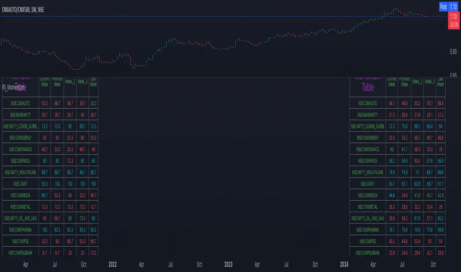
Relative Strength and MomentumRelative Strength and Momentum Indicator
Unlock deeper market insights with the Relative Strength and Momentum Indicator—a powerful tool designed to help traders and investors identify the strongest stocks and sectors based on relative performance. This custom indicator displays essential information on relative strength and momentum for up to 15 different symbols, compared against a benchmark index, all within a clear and organized table format.
Key Features:
1. Customizable Inputs: Choose up to 15 symbols to compare, along with a benchmark index, allowing you to tailor the indicator to your trading strategy. The 'Lookback Period' input defines how many weeks of data are analyzed for relative strength and momentum.
2. Relative Strength Calculation: For each selected symbol, the indicator calculates the Relative Strength (RS) against the chosen benchmark. This RS is further refined using an exponential moving average (EMA) to smooth the results, providing a more stable trend overview.
3. Momentum Analysis: Momentum is determined by analyzing the rate of change in relative strength. The indicator calculates a momentum rank for each symbol, based on its relative strength’s improvement or deterioration.
4. Percentile Ranking System: Each symbol is assigned a percentile rank (from 1 to 100) based on its relative strength compared to the others. Similarly, momentum rankings are also assigned from 1 to 100, offering a clear understanding of which assets are outperforming or underperforming.
5. Visual Indicators:
a. Green: Signals improving or stable relative strength and momentum.
b. Red: Indicates declining relative strength or momentum.
c. Aqua: Highlights symbols performing well on both relative strength and momentum—ideal candidates for further analysis.
6. Two Clear Tables:
a. Relative Strength Rank Table: Displays weekly rankings of relative strength for each symbol.
b. Momentum Table: Shows momentum trends, helping you identify which symbols are gaining or losing strength.
7. Color-Coded for Easy Analysis: The tables are color-coded to make analysis quick and straightforward. A green color means the symbol is performing well in terms of relative strength or momentum, while red indicates weaker performance. Aqua marks symbols that are excelling in both areas.
Use Case:
a. Sector Comparison: Identify which sectors or indexes are showing both relative strength and momentum to pick high-potential stocks. This allows you to align with broader market trends for improved trade entries.
b. Stock Selection: Quickly compare symbols within the same sector to find the stronger performers.