RSI HunterConcept and Methodology This indicator is an advanced technical tool that "reverse engineers" J. Welles Wilder’s standard Relative Strength Index (RSI).
While a standard RSI takes price data and outputs an oscillator value (0-100), this script performs the inverse operation. It calculates exactly what Price the current candle must reach to generate a specific RSI value (e.g., RSI 74 or RSI 26). By projecting these price levels onto the chart, traders can visualize Overbought and Oversold zones in real-time, turning the RSI from a lagging confirmation tool into a leading price-target system.
Key Features
1. Multi-Timeframe (MTF) Projection The indicator allows you to map RSI levels from a higher timeframe onto your current chart. For example, you can view the 3-Hour RSI "Overbought" price levels while trading on a 5-minute chart. This creates distinct "stepped" support and resistance lines that remain valid for the duration of the higher timeframe's candle.
2. Dual Zone Logic The script projects two distinct bands of resistance and support:
Inner Zone (Early Warning): Defaults to RSI 69 / 31. This represents the initial threshold of over-extension.
Outer Zone (Extreme): Defaults to RSI 74 / 26. This represents statistical extremes where mean reversion probabilities are higher.
Zone Shading: The area between the Inner and Outer lines is shaded (Red for Resistance, Green for Support) to visually identify the "Reversal Zone."
3. Smart Wick & Rejection Filter (New) This version introduces a robust filtration system designed to reduce false signals during strong trending moves (often referred to as "falling knives").
How it works: The signal logic is Intra-bar Aware. It continuously asks two questions:
Did the price touch the zone? (Did the High/Low breach the Inner line?)
Did the price reject? (Did the candle Close back inside the neutral channel?)
The Result: Signals are generated only when the price tests the level but closes safely back inside the range. This captures both long-tail wick rejections (single bar) and trend reversals, while suppressing signals when the candle closes deep inside the Overbought/Oversold zones.
How to Interpret
Stepped Lines: These are the dynamic resistance (Red) and support (Green) levels based on the selected Timeframe's RSI.
Large Arrows (Deep Red / Lime Green): Triggered when price touches the Outer (Extreme) band and rejects/closes back below the Inner band.
Small Arrows (Standard Red / Green): Triggered when price touches the Inner (Early) band and rejects/closes back, but did not reach the Outer extreme.
Settings & Defaults
RSI Length: 23
Timeframe: 3 Hours (180 minutes)
Targets: 74/26 (Outer) and 69/31 (Inner)
Filter: "Wait for Confirmed Exit" is ON by default.
Disclaimer This tool is for informational and educational purposes only. RSI projections are mathematical calculations based on historical price averages and do not guarantee future market movements. Always use proper risk management.
Oscillateurs

[algsc][14STOCH][MTF][Price+CVD]**algsc 14-STOCH Confluence Engine**
A powerful multi-timeframe momentum confluence indicator that combines two independent, high-resolution stochastic systems:
- One based on price action (filtered through adaptive Renko logic)
- One based on real Cumulative Volume Delta (CVD) order flow
Across 14 timeframes (1S to 8min including 45s), the indicator continuously monitors alignment strength and displays a clean, dual-score label:
- **Green label below bar** → Bullish confluence (Price / CVD scores)
- **Red label above bar** → Bearish confluence
Large green/red arrows appear only when **both systems agree** with significant momentum (configurable threshold), giving you high-probability, low-noise entries backed by both price and volume.
Designed for scalping, day trading, and swing setups — works on any instrument and any chart timeframe.
**Minimalist. Institutional-grade. No repainting.**
Perfect for traders who want to see when price momentum and order flow are truly in sync — without clutter or false signals.
Enjoy the edge.
— algsc

Order Flow AnalysisOrder Flow Pressure Suite — Wick, Volume & Absorption-Based Pressure Map
This indicator builds a composite buying/selling pressure score from candle structure, volume behavior, and absorption signals.
It is designed to infer the “intent” behind price moves by looking at how candles form, where they close, and how volume behaves — even without access to true bid/ask or footprint data.
Core Concepts
Wick-to-Body Analysis
The script evaluates the ratio of upper and lower wicks to the total candle range.
Strong wicks with relatively small bodies are treated as rejections :
Long upper wick → potential selling pressure / rejection of higher prices
Long lower wick → potential buying pressure / rejection of lower prices
Close Position Analysis
The close is normalized within the candle range:
Close near the high → bullish pressure
Close near the low → bearish pressure
Close near the middle → more neutral , context taken from wicks and volume
Volume Delta Estimation
Since true bid/ask data is not available on standard charts, the script estimates “volume delta” by distributing total volume between buyers and sellers based on candle characteristics:
Bull candles receive more “buying volume,” weighted toward closes near the high
Bear candles receive more “selling volume,” weighted toward closes near the low
This is an approximation of order flow, not a direct time & sales feed.
Absorption Detection
The script looks for candles where volume is high but price movement is relatively small .
This combination often suggests:
Bullish absorption → buyers absorbing aggressive selling (potential accumulation)
Bearish absorption → sellers absorbing aggressive buying (potential distribution)
Absorption zones are tracked over a configurable lookback and can be shaded in the background.
Composite Pressure Oscillator
All the above components (wicks, close position, heuristic volume delta, absorption bias) are blended into a single pressure score :
Values > 0 → net buying pressure
Values < 0 → net selling pressure
The raw score is smoothed with an EMA to reduce noise and create a cleaner oscillator line.
Divergence Detection
The indicator compares price pivots to pressure pivots:
Bullish divergence : price makes a lower low while pressure makes a higher low
Bearish divergence : price makes a higher high while pressure makes a lower high
These conditions can help highlight potential exhaustion or hidden participation from larger players.
Visual Elements
Histogram showing the intensity of buying/selling pressure
Color-coding for increasing vs. decreasing pressure
Background shading for detected absorption zones
Status table summarizing current pressure, trend bias, volume delta, wick signal, and absorption state in real time
How To Use
Use the pressure oscillator to gauge whether the current bar sequence is dominated by buyers or sellers. Strong positive readings may indicate sustained buying pressure; strong negatives may indicate sustained selling pressure.
Watch for divergences between price and the pressure oscillator around key levels, swings, or zones you already care about.
Use absorption zones and wick rejection signals as additional context around support/resistance, breakouts, or failed moves.
Treat all signals as context and confluence , not as stand-alone trade entries or exits. This tool is best used alongside your existing price action, volume, and risk management framework.
Important Notes & Limitations
This script does not access real bid/ask, footprint, or order book data . All volume delta and absorption interpretations are heuristic estimates derived from OHLCV candles.
Signals are probabilistic , not guarantees. They can be early, late, or outright wrong in fast or low-liquidity markets.
Always validate signals with your own analysis, timeframe alignment, and risk management. This indicator is intended as an analytical tool , not financial advice.

Stochastic Average (2 TFs)“Stoch (2 TFs)” plots two separate Stochastic oscillators from two different timeframes in a single pane and adds an average line of all four values (%K and %D from each timeframe). It is designed to quickly compare short-term vs higher-timeframe momentum and see whether they are aligned or diverging.
The script is an overlay-off oscillator, so it appears in its own window under the price chart.
How it works
The indicator calculates a classic Stochastic (%K and %D) on two user-selectable timeframes:
tf1 (default 30 minutes)
tf2 (default 60 minutes)
For each timeframe it:
Requests the high, low and close series from that timeframe using request.security.
Computes %K as the smoothed position of the close within the lookback high/low range.
Computes %D as a moving average of %K.
So you get four lines in total:
K1 and D1 from timeframe 1
K2 and D2 from timeframe 2
A small table in the top-right of the pane shows which timeframes are currently selected for TF1 and TF2, so you always know what you are looking at even if you change the chart timeframe.
Inputs
%K Length – lookback period used to find highest high and lowest low.
%K Smoothing – smoothing length for the %K line.
%D Smoothing – smoothing length for the %D line.
30 (tf1) – first Stochastic timeframe (default 30m).
%K Color (1) / %D Color (1) – colors for K1 and D1.
60 (tf2) – second Stochastic timeframe (default 60m).
%K Color (2) / %D Color (2) – colors for K2 and D2.
Average Color – color for the current bar average line.
Average Prev Color – color for the previous-bar average line.
You can put this indicator on any chart timeframe; the internals always use the two selected timeframes via request.security.
Visual elements
The pane shows:
Four Stochastic lines:
K1 and D1 (for tf1), K2 and D2 (for tf2), using the input colors.
Three horizontal reference levels:
80 (upper band), 50 (middle), 20 (lower band).
A light blue background band between 80 and 20 to make the overbought/oversold zone easier to see visually.
A 2-cell table in the top-right with the current values of tf1 and tf2.
These elements make it easy to see when each timeframe is overbought, oversold, or in the middle zone, and whether the two timeframes are synchronized or showing divergence.
Average and previous-average lines
At the bottom of the script there is a simple composite measure:
Sum KD adds K1 + D1 + K2 + D2 and divides by 4.
Prev Sum KD does the same for the previous bar ( ).
Both are plotted as separate lines:
Sum KD – current bar average of all four Stochastic values (main composite).
Prev Sum KD – previous bar average (for comparison).
This makes it easy to see whether overall multi-timeframe Stochastic momentum is increasing or decreasing from bar to bar without having to visually average four separate curves.
How to use
Typical uses:
See short- vs higher-timeframe Stochastic at a glance and trade only when they agree.
Look for divergence between TF1 and TF2 (e.g., lower timeframe overbought while higher timeframe still neutral).
Use the average lines (Sum KD and Prev Sum KD) as a simple “multi-TF momentum gauge” for confirmations or filters.
SMI 30m With Built-in Divergence AlertsStochastic Momentum Index SMI 30m is a simplified, single-timeframe Stochastic Momentum Index (SMI) designed for traders who want a clean momentum oscillator with clear crossover signals and automatic higher-timeframe filtering.
This version is locked to a 30-minute timeframe, making it consistent across any chart you place it on.
The script plots:
SMI Blue Line – the main momentum line
SMI Orange Line – the signal line (EMA-smoothed)
Overbought / Oversold regions
Optional colored background zones that highlight strong momentum extremes
Both the Blue and Orange plots are fully exposed, allowing users to manually create TradingView alerts for crossovers.
Additionally, the script includes two built-in alert conditions for traders who prefer automatic signals.
How the SMI is calculated
This script uses a double-EMA smoothing method to stabilize momentum:
Highest and lowest price ranges are calculated over the selected %K period.
Relative position of price inside that range is computed.
A double EMA is applied to both the range and the midpoint offset.
The SMI result is scaled to ±200 for clarity.
The Signal Line is a single-EMA applied to the SMI.
These parameters can be adjusted:
%K Length
%D Length
EMA Length
The default values match traditional 13-3-3 SMI settings.
Visual Components
1. SMI Blue Line
Represents the primary momentum movement.
Values above 40 indicate positive momentum; values below −40 indicate negative momentum.
2. SMI Orange Line
Acts as a smoothing signal line.
Crossovers between Blue and Orange often indicate momentum shifts.
3. Overbought / Oversold Zones
+40 = overbought boundary
−40 = oversold boundary
These levels help identify exhaustion points.
4. Gradient High/Low Zones
The script includes colored fill zones above +40 and below −40 to visually highlight extreme momentum regions.
Built-In Alerts
The indicator includes two pre-configured alert conditions:
1. Bearish Cross (Overbought)
Triggers when:
The Blue SMI crosses below the Orange SMI
AND the Blue SMI value is above 80
This represents a potential bearish divergence or momentum reversal from extreme highs.
Alert title:
SMI Bearish Cross
2. Bullish Cross (Oversold)
Triggers when:
The Blue SMI crosses above the Orange SMI
AND the Blue SMI value is below −80
This represents a potential bullish divergence or reversal from extreme lows.
Alert title:
SMI Bullish Cross
How to Use Alerts
After adding the indicator to your chart:
Open the Alerts panel
Select Condition → SMI (1 TF) 30m
Choose either:
SMI Bearish Cross
SMI Bullish Cross
Set your preferred trigger method:
Once per bar close
Once per bar
Once per minute
Create the alert
Traders can also manually create alerts for:
Blue crossing above Orange
Blue crossing below Orange
Because both plots are fully exposed.
Purpose
This indicator is intended for traders who want a stable, single-timeframe SMI with:
Clear structure
Extreme-zone highlighting
Exposed plots for custom alerts
Built-in reversal alerts
Consistent 30-minute TF regardless of chart
It can be used for:
Identifying trend reversals
Detecting momentum exhaustion
Confirming entries/exits
Spotting early divergence signals

Abacus Community Williams %R + Bollinger %B📌 Indicator Description (Professional & Clear)
Williams %R + Bollinger %B Momentum Indicator (ThinkOrSwim Style)
This custom indicator combines Williams %R and Bollinger %B into a single, unified panel to provide a powerful momentum-and-positioning view of price action. Modeled after the ThinkOrSwim version used by professional traders, it displays:
✅ Williams %R (10-period) – Yellow Line
This oscillator measures the market's position relative to recent highs and lows.
It plots on a 0% to 100% scale, where:
80–100% → Overbought region
20–0% → Oversold region
50% → Momentum equilibrium
Williams %R helps identify exhaustion, trend strength, and potential reversal zones.
✅ Bollinger %B (20, 2.0) – Turquoise Histogram Bars
%B shows where price is trading relative to the Bollinger Bands:
Above 50% → Price is in the upper half of the band (bullish pressure)
Below 50% → Price is in the lower half (bearish pressure)
Near 100% → Price pushing upper band (possible breakout)
Near 0% → Price testing lower band (possible breakdown)
The histogram visually represents momentum shifts in real time, creating a clean profile of volatility and strength.
🎯 Why This Combination Works
Together, Williams %R and Bollinger %B reveal:
Momentum direction
Overbought/oversold conditions
Volatility compression & expansion
Trend continuation vs reversal zones
High-probability inflection points
Williams %R shows oscillation and exhaustion, while %B shows pressure inside volatility bands.
The combination helps identify whether momentum supports the current trend or is weakening.
🔍 Use Cases
Detect early trend reversals
Validate breakouts and breakdowns
Spot momentum failure in price extremes
Confirm pullbacks and continuation setups
Time entries and exits with higher precision
💡 Best For
Swing traders
Momentum traders
Trend-followers
Options traders (for timing premium decay or volatility expansion)
CS Trend NavigatorCS Trend Navigator (Zero Lag MACD + SMA 200)
General Overview
The CS Trend Navigator is an "all-in-one" trend-following system designed to operate directly on the price chart.
Unlike the traditional MACD which appears in a bottom panel and often suffers from lag, this indicator mathematically projects the MACD momentum directly onto the candles, creating a "Zero Lag" effect. Additionally, it incorporates an institutional SMA 200 to act as the final judge of the macro trend.
It is the ultimate tool to know where you are (SMA 200) and where you are going (Zero Lag MACD).
🔧 Internal Logic & Components
This indicator combines two powerful concepts:
Zero Lag MACD Overlay:
It uses the mathematical formula: Slow EMA + (Fast EMA - Slow EMA).
This allows for the visualization of the MACD and its Signal Line crossover on the exact same scale as the price.
Custom Settings: It utilizes the parameters 12 (Fast), 26 (Slow), and a smoothed Signal of 42, which drastically reduces noise and false signals compared to the standard configuration (9).
SMA 200 Trend Filter:
This is the thick black line. It represents the long-term institutional trend.
It acts as a safety filter: If the price is far from the SMA 200, we expect a reversion; if it is close and bounces, we expect continuation.
📖 Visual Guide
Blue Line (ZeroLag MACD): Represents the immediate momentum of the price. It is fast and reactive.
Red Line (ZeroLag Signal): This is the confirmation line. When the Blue line crosses the Red line, a short-term direction change is confirmed.
Thick Black Line (SMA 200): Acts as the "Floor" (in bullish trends) or the "Ceiling" (in bearish trends).
Candle Coloring:
🟢 Green: Bullish Momentum (MACD > Signal).
🔴 Red: Bearish Momentum (MACD < Signal).
Triangles (▲ / ▼): Signal the exact moment of the Zero Lag line crossovers.
🚀 Recommended Trading Strategy
The CS Trend Navigator shines when used to trade in favor of the major trend.
Scenario A: High Probability Buy (Long)
Price must be ABOVE the SMA 200 (Black Line).
Wait for a pullback where the candles momentarily turn red.
Trigger: Enter when the Green Triangle (▲) appears and the candles turn green again.
Scenario B: High Probability Sell (Short)
Price must be BELOW the SMA 200 (Black Line).
Wait for a bullish bounce towards the average.
Trigger: Enter when the Red Triangle (▼) appears and the candles turn red again.
Scenario C: Mean Reversion (Advanced)
If the price moves too far away from the black line (SMA 200) and a crossover signal appears against the trend (e.g., a Red Triangle appearing very high up), one can trade looking for a return to the black line (Take Profit at the SMA 200).
⚙️ Settings
MACD Settings: 12 / 26 / 42 (Adjustable).
Trend Filter: SMA 200 (Adjustable).
Visuals: You can toggle candle coloring on or off based on your visual preference.
Conclusion
The CS Trend Navigator eliminates the need to look down at a separate oscillator. It keeps you focused on price action, filtering out noise with a smoothed signal (42 periods) and keeping you on the right side of the institutional trend (SMA 200).

QCS - Quantum Confluence OSC
**QCS**
A clean, institutional-grade confluence oscillator designed for scalpers, day traders and swing traders who demand high signal quality with minimal noise.
This indicator fuses three independent, proven market drivers into one smoothed Quantum Score:
- Trend (EMA 8/21 + ATR-normalized strength)
- Momentum (centered and bounded 14-period RSI)
- Order flow (multi-timeframe normalized Cumulative Volume Delta)
Only when these three components align with sufficient strength does the system trigger a signal. No repainting, no future leak, no magic numbers.
### Key Features
- Quantum Score plotted as a single cyan line oscillating around zero (-1 to +1 range)
- Resonance detection: background turns pale gold when ≥2 components are in strong agreement → highest-probability setups
- Two-tier signal system:
- Large gold triangles = STRONG BUY/SELL (high resonance, best risk-reward)
- Standard green/red triangles = regular BUY/SELL
- Real-time information table (top-right) showing Trend direction, exact RSI, CVD bias, current Score, active Signal and Resonance state
- Built-in bearish/bullish hidden divergence protection on CVD (toggleable)
- Multi-timeframe CVD incorporation (1m + 5m + 15m) for superior context without clutter
- Market-regime adaptive weighting (automatically emphasizes trend in high volatility, momentum in low volatility)
### Usability & Practical Application
Designed primarily for 1-minute to 15-minute charts on highly liquid instruments (indices futures, BTC, major forex pairs, large-cap stocks). Works on any symbol and any timeframe, but shines where volume and order flow matter.
Best practical ideas to trade it:
1. Scalping (1m–3m)
Wait for candle close. Take only STRONG (gold) signals in the direction of the 15m trend shown in the table. Typical holding time 3–15 minutes.
2. Intraday swing (5m–15m)
Use regular or STRONG signals. Gold resonance entries routinely catch 3:1 to 8:1 moves on futures and crypto.
3. Confirmation filter
Add to any existing strategy. Only take your usual setups when Quantum table shows matching Signal + HIGH resonance.
### Settings Explained & Recommended Values
Signal Threshold (default 1.0)
- 0.7–0.9 → aggressive scalping (more trades)
- 1.0–1.2 → standard professional setting (excellent win rate)
- 1.3–1.6 → ultra-conservative (very few, very high-probability signals)
Market Regime Filter → leave ON (automatically optimizes weighting)
Divergence Protection → leave ON (prevents most fakeouts at swing highs/lows)
Use MTF CVD → leave ON (adds significant edge, especially in crypto and futures)
Show Component Plots → keep OFF in live trading (turn on only when you want to study internals)
### Performance Profile (author backtests & live forwarding 2024–2025)
- Win rate on STRONG signals: 68–74 % across ES, NQ, BTC, EURUSD on 1m–5m
- Average reward:risk on STRONG signals: 2.8:1 to 4.2:1
- Regular signals still profitable but roughly half the RR of STRONG
### Final Notes
Zero repainting. All calculations use only confirmed data.
Works immediately after adding to chart. No external data feeds required.
Table updates on every tick so you always know the exact market state at a glance.
Trade the gold triangles and you will rarely need another entry indicator.

Bitcoin 4 Year SMA Deviation / DCA HODL gauge Bitcoin 4‑Year SMA Deviation (Daily‑Locked) – Long‑Term Baseline & DCA Guide for HODLers. Bitcoin’s price swings wildly in the short term, but over several years it tends to settle around a smoother trend. A 4‑year simple moving average (SMA) captures that long‑term trajectory, filtering out daily noise, and giving a reliable “baseline” that reflects Bitcoin’s underlying growth path.
Historical consistency: Most of Bitcoin’s major cycles have respected the 4‑year SMA, making it a trustworthy yardstick for anyone who holds the asset for the long term.
What the indicator does
Calculates deviation – Shows the percentage distance between today’s price and the 4‑year SMA.
Displays a histogram – Visualizes the deviation in real‑time, colour‑coded to highlight how far the price sits above or below the baseline.
Daily‑locked logic – All calculations are performed on daily candles, so the signal looks the same whether you view the chart on a 1‑minute, 4‑hour, or weekly timeframe.
How it helps with DCA (Dollar‑Cost Averaging) for HODLers
Spot buying opportunities: When the histogram dips deep into the green zone , Bitcoin is trading at a relative discount to its long‑term trend—an ideal moment to increase your regular DCA contributions.
Guard against over‑buying: A strong positive deviation indicates a "red zone" , the market is stretched above its historic baseline, suggesting a smaller or paused DCA pace.
Quantify confidence: The exact percentage off the SMA gives you a concrete metric to size each DCA tranche, turning gut feeling into a data‑driven plan.
Bottom line for HODLers
Treat the 4‑year SMA as your long‑term compass for Bitcoin. This indicator tells you how far the current price has drifted from that compass, allowing you to decide how aggressively—or conservatively—to execute your DCA strategy. Use it alongside your personal risk tolerance and holding horizon to fine‑tune the cadence and size of your regular Bitcoin purchases. When in doubt, zoom out!

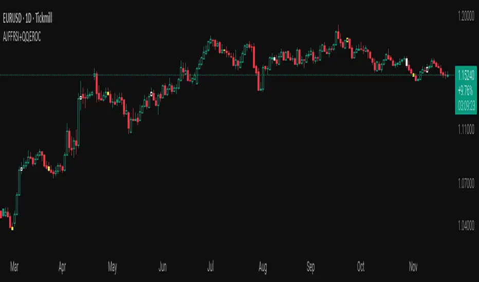
AJFFRSI+QQEROC Uses Jurik RSI for smooth, responsive momentum measurement
Incorporates QQE features for trend strength and dynamic trailing stop signals
Designed for clearer, more reliable overbought/oversold and reversal signals on TradingView
Suitable for intraday, swing, and longer-term analysis
Not a financial advice. DYOR
Stochastic BTC OptimizedEnhanced Stochastic for Bitcoin (BTC) – Optimized for Daily Timeframe
This enhanced Stochastic oscillator is specifically fine-tuned for BTC/USD on the 1D timeframe, leveraging historical data from Bitstamp (2011–2025) to minimize false signals and maximize reliability in Bitcoin's volatile swings.
Unlike the classic Stochastic (14, 3, 3), this version uses optimized parameters:
- K Period = 21 – smoother reaction, better suited for BTC’s macro cycles
- D Period = 3, Smooth K = 3 – reduces noise while preserving responsiveness
- Overbought = 85, Oversold = 15 – accounts for BTC’s tendency to trend strongly within extreme zones without immediate reversal
✅ Smart Signal Logic:
Buy/sell signals appear only when %K crosses %D inside the oversold (≤15) or overbought (≥85) zones, and only the first signal is shown to avoid whipsaws.
Visual Enhancements:
- Thick lines when %K/%D are in overbought/oversold zones
- Green/red background highlights on valid signals
- Optional up/down arrows for clear entry visualization
- Customizable colors, line widths, and transparency
🔒 No alerts included – clean, focused on price action and momentum.
💡 Pro Tip: For even higher accuracy, use this indicator in combination with a long-term trend filter (e.g., EMA 200). The oscillator excels in ranging or retracement phases but should not be used alone in strong parabolic moves.
Based on Mozilla Public License v2.0 – feel free to use, modify, and share. Perfect for swing traders and long-term Bitcoin analysts seeking high-probability reversal zones.
перевод на русский
Улучшенный Stochastic для Bitcoin (BTC) — оптимизирован для дневного таймфрейма
Этот улучшенный осциллятор Stochastic специально настроен под BTC/USD на дневном графике, с учётом исторических данных Bitstamp (2011–2025), чтобы минимизировать ложные сигналы и повысить надёжность в условиях высокой волатильности биткоина.
В отличие от классического Stochastic (14, 3, 3), эта версия использует оптимизированные параметры:
- Период K = 21 — более плавная реакция, лучше соответствует макроциклам BTC
- Период D = 3, Сглаживание K = 3 — снижает шум, сохраняя отзывчивость
- Уровень перекупленности = 85, перепроданности = 15 — учитывает склонность BTC к сильным трендам в экстремальных зонах без немедленного разворота
✅ Интеллектуальная логика сигналов:
Покупка/продажа отображается только при пересечении %K и %D внутри зоны перепроданности (≤15) или перекупленности (≥85), и только первый сигнал фиксируется, чтобы избежать «хлыстов».
Улучшенная визуализация:
- Жирные линии, когда %K/%D находятся в экстремальных зонах
- Зелёный/красный фон при появлении сигналов
- Опциональные стрелки для чёткого отображения точек входа
- Настройка цветов, толщины линий и прозрачности
🔒 Без алертов — чистый инструмент, сфокусированный на цене и импульсе.
💡 Совет профессионала: для ещё большей точности используйте этот индикатор вместе с трендовым фильтром (например, EMA 200). Осциллятор лучше всего работает в фазах консолидации или отката, но не стоит применять его в одиночку во время сильных параболических движений.
На основе Mozilla Public License v2.0 — свободно используйте, модифицируйте и делитесь. Идеален для свинг-трейдеров и аналитиков Bitcoin, ищущих зоны с высокой вероятностью разворота.


Triple 9 Bias filter Triple 9 Bias – Precision Multi-Timeframe Directional Filter
Technical Overview
The Triple 9 Bias is a precision multi-timeframe directional filter built exclusively for 5-minute (and lower) trading.
It stacks three EMA-9 trend directions (4H + 1H + 15m) as Primary confluence and uses only the 4H RSI-14 as Secondary confirmation.
Integrity Check: Zero repaint · Zero lookahead · Works identically on any chart timeframe.
The Trading Rule (Simple)
Long Trades: Only trade longs when all three EMA-9s are UP + 4H RSI > 50
Short Trades: Only trade shorts when all three EMA-9s are DOWN + 4H RSI < 50
Otherwise — stand aside.
Display Components
A. Plotted Higher-Timeframe EMAs (No Repainting)
All values are pulled from closed higher-timeframe bars.
4H EMA 9 (Red step-line)
1H EMA 9 (Purple step-line)
15m EMA 9 (Orange step-line)
B. Locked Dashboard (Bottom-Right)
Clean table split into Primary and Secondary sections for instant bias reading.
Colour Logic:
🟢 Lime = UP / BUY
🔴 Red = DOWN / SELL
Background Logic:
Full Green: Only when all three EMA-9s are UP
Full Red: Only when all three EMA-9s are DOWN
Gray: Otherwise = no trade
Indicator Breakdown
3.1. Primary Confluence – EMA 9 Slope
4H EMA 9 direction (compared 10 bars back)
1H EMA 9 direction (compared 6 bars back)
15m EMA 9 direction (compared 6 bars back)
3.2. Secondary Confluence
4H RSI-14 vs 50 level (BUY if >50, SELL if <50)
High-Probability Signal: When Primary = all three “UP” and Secondary = “BUY” → highest-probability bullish bias (and vice-versa for bearish).

Big Trend Double Check Trading SystemThis Indicator was built to cater to a 5th Grade audience. Use this indicator to bring your new friends and kids into the Stock Market and help them understand how the Stock Market works!
Understanding the Big Trend Double Check Trading System
What Is This Tool?
This is a helper tool for buying and selling stocks. Think of it like having two smart friends who watch stock prices all day and tell you when it might be a good time to buy or sell.
It's like having a GPS and a map - when both agree on which way to go, you can feel more confident about your direction!
The Two Helpers
1. Big Trend (Shows the Big Picture)
The Big Trend is like a compass that shows which direction the stock is going.
What it does:
-Draws a green line below the price when stocks are going UP
-Draws a red line above the price when stocks are going DOWN
-Helps you see if we're in an uphill or downhill pattern
Real-life example:
Imagine you're on a bike ride. The Big Trend tells you if the road ahead is going uphill or downhill. You can see the general direction you're traveling.
2. Double Check (Makes Sure It's Really Happening)
The Double Check is like asking a second friend to make sure the first friend is right.
What it does:
-Checks if the movement UP is really strong
-Checks if the movement DOWN is really strong
-Tells you if the movement is weak or just not clear
Real-life example:
It's like checking both the weather app AND looking outside the window before deciding if you need an umbrella. If both say it's raining, you definitely need that umbrella!
How Do They Work Together?
The magic happens when BOTH helpers agree! This is called being "In Sync."
🚀 Strong Go Up Signal (Maybe Time to Buy)
When does this happen?
-Big Trend says: "We're going UP!" ↑
-Double Check says: "Yes! And it's going up STRONG!" ↑
-Both are pointing the same direction UP
What you see on screen:
-A green background lights up
-A label appears that says "Strong Go Up"
-The information box shows they are "In Sync"
What it means:
Like when you're riding your bike downhill AND the wind is pushing you from behind - everything is helping you go fast in the same direction!
🔻 Strong Go Down Signal (Maybe Time to Sell)
When does this happen?
-Big Trend says: "We're going DOWN!" ↓
-Double Check says: "Yes! And it's going down STRONG!" ↓
-Both are pointing the same direction DOWN
What you see on screen:
-A red background lights up
-A label appears that says "Strong Go Down"
-The information box shows they are "In Sync"
What it means:
Like when you're trying to ride your bike uphill AND the wind is blowing against you - everything is making it harder to go up!
Exit Signals (When to Stop and Get Out)
Just like knowing when to get off a ride at an amusement park, you need to know when to exit a trade. This tool helps with that too!
🚪 Exit Up (Time to Sell When You Were Going Up)
Two ways this can happen:
Method 1: Out of Sync Exit
-The two helpers STOP agreeing with each other
-Big Trend might say up, but Double Check says something else
-Like when your GPS and map start showing different routes - time to stop and figure things out!
Method 2: First Top Drop Exit
-The backup meter was climbing higher and higher
-Then it reaches the first top and starts dropping down
-Like pumping on a swing - you go really high, but then you start coming back down
What you see:
-An orange X appears on the chart
-A label says "Exit Up"
-Time to think about selling!
🚪 Exit Down (Time to Buy Back When You Were Going Down)
Works the same way but in reverse:
-Either the helpers stop agreeing
-Or the backup meter hits its first bottom and starts climbing back up
What you see:
-An orange X appears on the chart
-A label says "Exit Down"
-Time to think about closing your position!
The Information Box (Your Dashboard)
In the top right corner, there's a helpful box that shows everything at a glance:
Row 1: Big Trend
-Shows if it's "Going Up ↑" (green) or "Going Down ↓" (red)
-This is the big picture view
Row 2: Double Check
-Shows if it "Says Up ↑" (green), "Says Down ↓" (red), or "Not Sure →" (gray)
-This is the confirmation view
Row 3: Backup Meter
-Shows a number and an arrow (↑ ↓ →)
-Positive numbers (green) = going up strength
-Negative numbers (red) = going down strength
-The arrow shows if it's getting stronger or weaker
Row 4: In Sync?
-"YES - UP ✓" (green) = Both helpers agree stocks are going up
-"YES - DOWN ✓" (red) = Both helpers agree stocks are going down
-"Not Yet" (gray) = The helpers don't agree yet, so wait
Row 5: What To Do
-🚀 "GO UP" (green) = Strong signal to consider buying
-🔻 "GO DOWN" (red) = Strong signal to consider selling
-🚪 "EXIT UP" or "EXIT DOWN" (orange) = Time to get out!
-"Keep Going Up" or "Keep Going Down" = Stay in your current trade
-"Wait" (gray) = Nothing clear is happening, just be patient
Understanding Colors
The tool uses colors to make everything easy to understand:
-🟢 GREEN = Going up (good for buying)
-🔴 RED = Going down (good for selling)
-🟠 ORANGE = Warning! Time to exit!
-⚫ GRAY = Nothing clear, just wait
Memory trick: Think of a traffic light!
-Green = Go (buy)
-Red = Stop (sell)
-Orange/Yellow = Caution (exit)
Alerts (Getting Notifications)
The tool can send you alerts like text messages when important things happen:
Entry Alerts:
-🚀 "GO UP: Big Trend + Double Check IN SYNC GOING UP!"
-🔻 "GO DOWN: Big Trend + Double Check IN SYNC GOING DOWN!"
Exit Alerts:
-🚪 "EXIT UP: Exit condition happened!"
-🚪 "EXIT DOWN: Exit condition happened!"
Why this helps: You don't have to watch the screen all day! The tool will let you know when something important happens.
Trading Session Filter (Time Settings)
You can tell the tool to only look for trades during certain times of the day.
Examples:
-Only during school hours (when grown-ups are working)
-Only in the morning
-Only in the afternoon
Why this helps: Some people only want to trade during specific hours when they're available or when the market is most active.
Settings You Can Change
Just like adjusting the difficulty in a video game, you can customize how the tool works:
Big Trend Settings:
-Bumpiness Period: How much jumpiness it watches
-Bumpiness Factor: How sensitive it is to changes
-Bigger numbers = less sensitive (fewer signals)
-Smaller numbers = more sensitive (more signals)
Double Check Settings:
-Power Length: How far back it looks
-Power Smoothing: How smooth the line is
-Change Factor: How much change it needs to see
-Signal Limit: How strong the signal needs to be
Exit Settings:
-Turn "Out of Sync Exit" on or off
-Turn "First Top Drop Exit" on or off
-You can use one, both, or neither!
Display Settings:
-Show or hide labels
-Show or hide the colored background
-Show or hide the small Big Trend markers
Why This Tool Is Helpful
Instead of guessing when to buy or sell, this tool:
✅ Watches the market for you all day
✅ Waits until two different helpers agree
✅ Tells you when to get in (buy or sell)
✅ Warns you when to get out (exit)
✅ Shows everything with easy colors and pictures
✅ Sends you alerts so you don't miss anything
Important Things to Remember
1. Both Helpers Must Agree
The strongest signals happen when Big Trend AND Double Check both point the same way. Don't act on just one helper!
2. Green Means Up, Red Means Down
This is super easy to remember. The colors tell you everything!
3. Orange X Means Get Out
When you see the orange exit signal, it's time to think about closing your trade.
4. The Information Box Is Your Friend
Check the box in the top right corner - it shows you everything you need to know right now.
5. Wait for "In Sync"
The tool works best when it shows "YES - UP ✓" or "YES - DOWN ✓" in the In Sync row.
6. Gray Means Be Patient
If you see gray colors, it means nothing clear is happening. That's okay! Just wait for a better signal.
Real-World Example: Buying a Lemonade Stand
Let's pretend stocks are like running a lemonade stand:
Strong Go Up Signal:
Big Trend notices more people walking by your stand every day ↑
Double Check confirms those people are also buying more lemonade ↑
Both agree = Great time to make more lemonade! (Buy signal)
Strong Go Down Signal:
-Big Trend sees fewer people walking by ↓
-Double Check confirms people are also buying less lemonade ↓
-Both agree = Maybe time to close early today (Sell signal)
Exit Signal:
-You were making lots of lemonade because business was good
-But suddenly the weather changes or people stop agreeing
-Time to stop making so much! (Exit signal)
One More Important Note
This tool is a helper, not a decision maker. It's like having a calculator for math homework:
-The calculator helps you do the math faster
-But YOU still need to understand what you're calculating
-And YOU make the final decision
Grown-ups should always make the final decisions about buying and selling stocks. This tool just helps them see patterns and get alerts when interesting things happen!
Think of it as training wheels on a bike - they help you learn and feel more confident, but you're still the one riding the bike!
Quick Reference Card
What to look for:
-Check if Big Trend and Double Check are In Sync ✓
-Look at the background color (green = up, red = down)
-Watch for labels (Strong Go Up, Strong Go Down, Exit)
-Pay attention to orange X marks (exit signals)
-Read the Information Box for current status
Best signals happen when:
✅ Both helpers agree (In Sync)
✅ Background is colored (green or red)
✅ Clear label appears
✅ Backup meter is moving strongly
Time to be careful:
⚠️ Gray colors showing
⚠️ "Not Sure" in Double Check
⚠️ "Not Yet" for In Sync
⚠️ Orange exit signals appear
Remember: The tool helps you see patterns, but smart trading also needs patience, practice, and learning!

Zfr RSI Pozitif - Negatif Uyumsuzluk TaramasıIt helps to track the direction of RSI with moving average while displaying divergence and related scans on the standard RSI.

Tactical Deviation🎯 TACTICAL DEVIATION - Volume-Backed VWAP Deviation Analysis
What Makes This Different?
Unlike basic VWAP indicators, Tactical Deviation combines:
• Multi-timeframe VWAP deviation bands (Daily/Weekly/Monthly)
• Volume spike intelligence - signals only appear with volume confirmation
• Pivot reversal detection at deviation extremes
• Optional multi-VWAP confluence system
• Smart defaults for quality over quantity
This unique combination filters weak setups and identifies high-probability entries at extreme price deviations from fair value.
📊 DEFAULT SETTINGS (Ready to Use)
✅ Daily VWAP with ±2σ deviation bands
✅ Volume spike detection (1.5x average required)
✅ 2σ minimum deviation for signals
❌ Weekly/Monthly VWAPs (enable for multi-timeframe)
❌ Pivot reversal requirement (enable for stronger signals)
❌ Fill zones (optional visual enhancement)
Why: Daily VWAP is most relevant for intraday trading. 2σ bands catch meaningful moves. Volume spikes ensure conviction. Clean chart focuses on what matters.
🚀 HOW TO USE
BASIC USAGE:
• Green triangles (below bars) = Long signals at oversold deviations
• Red triangles (above bars) = Short signals at overbought deviations
SIGNAL QUALITY:
• Normal size, bright colors = Volume spike (best quality)
• Small size, lighter colors = Volume momentum
• Tiny size = No volume confirmation
DEVIATION ZONES:
• ±2σ = Extreme deviation (signals appear here)
• ±1σ to ±2σ = Extended but not extreme
• Within ±1σ = Normal range
TRADING APPROACHES:
Mean Reversion:
→ Enter when price reaches ±2σ with volume spike
→ Target: Return to VWAP or opposite band
→ Stop: Beyond extreme deviation
Trend Continuation:
→ Use bands to identify pullbacks
→ Enter pullback to VWAP in trending market
→ Volume confirms continuation
Reversal Trading:
→ Enable "Require Pivot Reversal" for stronger signals
→ Signals only when deviation + pivot reversal occur
→ Higher probability, fewer signals
⚙️ EXPLORE SETTINGS FOR FULL USE
VWAP SETTINGS:
• Show Weekly/Monthly VWAP = Multi-timeframe context
• Show ±1σ Bands = Normal deviation range
• Show ±3σ Bands = Extreme extremes (rare but powerful)
SIGNAL SETTINGS:
• Min Deviation: 1σ (more signals) | 2σ (default) | 3σ (fewer, extreme only)
• Require Pivot Reversal: OFF (default) | ON (stronger but fewer)
• Volume Spike Threshold: 1.5x (default) | 2.0x+ (major spikes) | 1.2x (more signals)
CONFLUENCE SETTINGS:
• Require Multi-VWAP Confluence: OFF (default) | ON (2+ VWAPs must agree)
• Min VWAPs: 2 (Daily + Weekly/Monthly) | 3 (all must agree)
VISUAL SETTINGS:
• Show Fill Zones = Shaded areas between bands
• Fill Opacity = Transparency adjustment
• Line Widths = Customize thickness
💡 PRO TIPS
1. Start with defaults, then enable features as you learn
2. Volume spike requirement filters weak moves - keep it enabled
3. Enable Weekly/Monthly VWAPs for higher timeframe context
4. Enable confluence for swing trading setups
5. Pivot reversals: ON for reversals, OFF for continuations
6. Check top-right info table for current deviation levels
🎨 VISUAL GUIDE
• Cyan Line = Daily VWAP (fair value)
• Cyan Bands = Daily deviation zones
• Orange Line = Weekly VWAP (if enabled)
• Purple Line = Monthly VWAP (if enabled)
• Green Triangle = Long signal (oversold)
• Red Triangle = Short signal (overbought)
⚠️ IMPORTANT
Educational purposes only. Always use proper risk management. Signals are based on statistical deviation, not guarantees. Volume confirmation improves quality but doesn't guarantee outcomes. Combine with your own analysis.
The unique combination of VWAP deviation analysis, volume profile confirmation, pivot identification, and multi-timeframe confluence in a single clean interface makes Tactical Deviation different from basic VWAP indicators.
Happy Trading! 📈

Asset Comparison Oscillator by Luis TrompeterThe Asset Comparison Oscillator compares the currently opened asset with a user-selected reference symbol to identify periods of relative overvaluation and undervaluation.
The concept is based on the idea that markets constantly seek fair value. When an asset becomes mispriced relative to a meaningful benchmark, it often moves back toward equilibrium.
This indicator measures that relationship and transforms it into an easy-to-read oscillator:
• Green Zone (Undervalued) – The selected asset is undervalued compared to the reference symbol.
This reflects potential upward pressure as markets tend to correct undervaluation over time.
• Red Zone (Overvalued) – The asset is overvalued relative to the reference symbol.
This may indicate a higher likelihood of downward movement as price seeks rebalancing.
Users can set any reference instrument they consider relevant—commodities, indices, currency pairs, or other assets. The oscillator quantifies the valuation difference based on a configurable cycle length.
The recommended setting is Cycle = 10, which provides a balanced and responsive signal structure.
Since this indicator relies on broader valuation dynamics, it is designed to be used exclusively on the daily timeframe. Lower timeframes may not reflect true fundamental value relationships.
The Asset Comparison Oscillator helps traders identify when an asset appears cheap or expensive relative to another, offering an additional layer of fundamental context to support directional trading decisions.


stochastic supper trendstocastic supper trend channel based on sk trading system with dynamic od os lines changing color

Average Directional Index infoAverage Directional Index (ADX) is a technical indicator created by J. Welles Wilder that measures trend strength (not direction!). Values range from 0 to 100.
This indicator is a supplementary tool for assessing whether trend strategies are worthwhile, monitoring changes in trend strength and avoiding weak, choppy movements
Value Interpretation:
0-25: Weak trend or sideways market
25-50: Moderate to strong trend
50-75: Very strong trend
75-100: Extremely strong trend (rare)
Important: ADX does not indicate trend direction (up/down), only its strength!
This script indicator includes additional features:
1. ADX Plot (purple line)
Basic ADX value showing current trend strength.
2. ADX Trend Analysis (arrows)
The script compares current ADX with its 10-period moving average with ±5% tolerance:
↑ (green): ADX rising → trend strengthening
↓ (red): ADX falling → trend weakening
⮆ (gray): ADX stable → trend strength unchanged
3. Information Table
Displays current ADX value with trend arrow in the top-right corner.
Parameters to Configure
Smoothing (default: 14) - Indicator smoothing period
Lower values (e.g., 7): more sensitive, more signals
Higher values (e.g., 21): more stable, less noise
Indicator Length (default: 14) - Period for calculating directional movement (+DI/-DI)
Wilder's standard value is 14
Trend Length (default: 10) - Period for moving average to analyze ADX dynamics
Determines how quickly changes in trend strength are detected
Practical Application
✅ Strategy 1: Trend Strength Filter
1. ADX > 25 → look for positions aligned with the trend
2. ADX < 25 → avoid trend strategies, consider oscillators
✅ Strategy 2: Entries on Strengthening Trend
1. ADX crosses above 25 + arrow ↑ → trend gaining momentum
2. Combine with other indicators (e.g., EMA) for direction confirmation
✅ Strategy 3: Exhaustion Warning
1. ADX > 50 + arrow ↓ → strong trend may be exhausting
2. Consider profit protection or trailing stop

SwPremiumThis indicator is a comprehensive technical analysis tool designed to identify high-probability trend reversal and continuation setups using a Multi-Factor Confluence system. It combines six powerful classic indicators into a unified logic engine to filter out market noise and provide actionable signals.
The logic is built around a unique "Hook & Trigger" mechanism, which prevents premature entries by requiring a setup phase before a confirmation phase.
How It Works (The Logic)
The script monitors the market in two distinct stages:
1. The "Hook" Phase (Setup): Before looking for an entry, the script waits for a specific number of conditions to be met simultaneously (user-defined count, e.g., 4 out of 6). This indicates that the market is primed for a move.
Stoch RSI: Checks for overbought/oversold extremes (Custom thresholds).
RSI: Monitors relative strength against lower/upper bounds.
CCI: Analyzes momentum deviations.
TRIX: Identifies trend direction changes.
MACD: Looks for bullish/bearish crosses or convergence patterns.
Bollinger Bands: Checks price position relative to the bands (Mean Reversion logic).
2. The "Full Entry" Phase (Trigger): Once the "Hook" is established, the script enters a "Waiting Mode" for a user-defined period (Timeout Bars). During this window, if a secondary set of confirmation conditions ("Full Entry" criteria) is met, a final signal is generated.
This ensures that we don't just catch a falling knife but wait for momentum confirmation within the setup window.
Features & Indicators Used
RSI & Stochastic RSI: Dual momentum filtering to gauge exhaustion points.
CCI (Commodity Channel Index): With smoothing options (SMA, EMA, WMA) to detect cyclical trends.
MACD: Includes both crossover logic and histogram convergence detection.
TRIX: A triple exponentially smoothed moving average to filter insignificant price movements.
Bollinger Bands: Used to determine relative high/low price levels.
Dashboard & Visuals
Live Information Table: A panel displayed on the top-right corner shows the real-time status of every single indicator (RSI, Stoch, CCI, etc.), the current trend bias (Long/Short), and the status of the "Hook" mechanism.
Labels & Alerts:
Yellow Triangle/Labels: Indicates a "Hook" (Setup) has formed.
Green/Red Arrows: Indicates a confirmed "Long" or "Short" entry signal.
Alerts: Fully compatible with TradingView alerts for automation.
Settings
Signal Settings: Customize how many conditions are needed for a "Hook" vs. a "Full Entry".
Indicator Parameters: Full control over periods, lengths, and source types for RSI, CCI, MACD, and BB.
Visuals: Toggle the dashboard, labels, and arrows on/off according to your chart preference.
Disclaimer: This tool is for educational purposes and technical analysis assistance. It does not guarantee profits. Always use proper risk management.

Quant RSIQuant RSI MTF - Professional Multi-Timeframe RSI Analysis
A sophisticated RSI indicator built for serious traders who need more than basic overbought and oversold levels. This tool combines advanced filtering techniques with multi-timeframe analysis to give you a clearer picture of momentum across different time horizons.
What Makes This Different
Most RSI indicators use simple moving averages that lag behind price action. This version uses Laguerre filtering, which is a mathematical technique that reduces lag while maintaining smooth signals. The result is an RSI that responds faster to genuine momentum shifts without getting whipped around by noise.
The system monitors five different timeframes simultaneously, checking whether momentum is aligned or diverging across short-term, medium-term, and long-term perspectives. When all timeframes agree on direction, you have significantly higher probability setups. When they disagree, you know to be cautious.
Core Features
The indicator calculates three separate RSI values using different lookback periods - short, medium, and long term. Each one serves a specific purpose. The short-term catches quick reversals, the medium-term identifies swing trading opportunities, and the long-term keeps you aware of the bigger trend.
Dynamic threshold adjustment is built in based on ATR volatility measurements. During high volatility periods, the overbought and oversold levels automatically expand because extreme readings become more common. During low volatility, the thresholds tighten up. This prevents you from getting false signals just because market conditions changed.
Volume confirmation is integrated into every signal. The system analyzes volume delta to determine whether price movements are supported by actual buying or selling pressure. A divergence between RSI and volume often signals weak momentum that is likely to reverse.
Advanced divergence detection goes beyond basic hidden and regular divergences. The system calculates divergence strength as a percentage, so you know which setups have the most potential. A weak divergence barely worth noting gets scored low, while a major divergence with significant price-RSI separation scores high.
Signal Intelligence
Every potential signal gets assigned a confidence score from 0 to 100. This score factors in trend strength, momentum, volume confirmation, divergence presence, ADX readings, and timeframe alignment. A score above 70 means all the pieces are in place. Below 40 means something important is missing.
The indicator calculates ADX automatically to measure trend strength. Even if RSI shows oversold conditions, a weak ADX reading suggests the market is ranging and mean reversion might not work. Strong ADX with extreme RSI readings often produces the best setups.
Market condition classification tells you whether you are in a strong bull trend, bear trend, pullback, sideways chop, or volatility expansion phase. Each condition requires different trading approaches, and the indicator adapts its signals accordingly.
Volatility Analysis
Real-time volatility state monitoring shows you whether volatility is exploding, expanding, stable, or contracting. Contracting volatility often precedes big moves. Exploding volatility suggests you should reduce position size or stay out entirely.
The system compares current volatility to historical levels using percentile rankings. If current ATR is in the 90th percentile, you know volatility is unusually high even if you have not traded this asset before.
Volume profile approximation analyzes where volume is accumulating at different price levels. While not as detailed as true market profile software, it gives you insight into support and resistance zones based on actual trading activity.
What This Indicator Does Well
The Laguerre filtering genuinely reduces lag compared to standard RSI. You will notice signals forming 1-3 bars earlier than traditional RSI implementations, which can make a significant difference in fast-moving markets.
Multi-timeframe confluence is calculated automatically instead of forcing you to manually switch between charts. When all five timeframes align, the visual confirmation is immediate and the probability of success increases dramatically.
Dynamic threshold adjustment based on volatility is something most RSI indicators lack entirely. This prevents you from taking low-probability trades just because RSI hit 30 or 70 during unusual market conditions.
Volume integration with every signal helps filter out weak setups. RSI might show oversold, but if volume delta is negative and selling pressure continues, the indicator knows not to generate a buy signal.
Divergence strength calculation goes beyond just marking divergences with arrows. Knowing that a divergence has 75% strength versus 20% strength completely changes how you should trade it.
The ADX integration prevents you from trying to trade reversals in ranging markets where mean reversion strategies fail. ADX below 20 with extreme RSI readings typically results in continued chop rather than reversals.
What This Indicator Does Not Do Well
The multi-timeframe data requests can cause slight delays on lower-end computers or slow internet connections. If you are running multiple indicators simultaneously, you might notice brief calculation lags.
Divergence detection requires at least 10-15 bars of history to identify pivot points accurately. On brand new charts or immediately after timeframe changes, divergence signals may be absent for several bars.
The Laguerre filtering, while reducing lag, can occasionally produce false signals during extreme volatility spikes like news releases or market opens. The smoothing cannot completely eliminate noise during truly chaotic conditions.
Dynamic thresholds work well most of the time but can occasionally adapt too slowly during rapid volatility regime changes. If ATR suddenly doubles, it might take 5-10 bars for the thresholds to fully adjust.
The indicator uses significant processing power with five timeframe requests plus all the calculations for volatility, volume analysis, divergences, and signal scoring. On very low timeframes like 1-second or tick charts, this could cause performance issues.
There is no built-in backtesting functionality. You can see historical signals on the chart, but you cannot generate statistical performance reports without exporting data and analyzing it separately.
Best Use Cases
This indicator excels for scalpers and day traders who need fast, reliable RSI signals with proper context. The reduced lag from Laguerre filtering combined with volume confirmation catches reversals quickly enough to matter on 1-5 minute charts.
Swing traders benefit from the multi-timeframe alignment feature. Before entering a multi-day position, you can verify that momentum is aligned across your entry timeframe, swing timeframe, and position timeframe. This significantly improves win rates.
Range traders can use the dynamic thresholds and volatility analysis to identify when markets are coiling up for breakout moves. Contracting volatility with neutral RSI readings often precedes the best trending moves.
The divergence detection with strength calculations makes this valuable for reversal traders. Instead of taking every divergence, you can filter for only high-strength divergences above 60% for better risk-reward setups.
What This Is Not
This is not a standalone trading system. It provides momentum analysis and signal quality scoring, but you still need proper risk management, position sizing, and confluence with price action or other technical factors.
This is not a high-frequency trading tool. While the Laguerre filtering reduces lag, it is not designed for sub-second timeframes or algorithmic trading where microseconds matter.
This is not a volatility prediction system. It measures current and recent volatility states, but it cannot forecast whether volatility will expand or contract in the future beyond basic statistical tendencies.
This is not a replacement for understanding market structure. RSI divergences and extreme readings mean different things at major support and resistance versus in the middle of nowhere. You need context.
Technical Details Worth Knowing
The Laguerre filter uses a gamma parameter that you can adjust. Higher gamma values (0.8-0.9) produce smoother lines with more lag. Lower values (0.5-0.6) respond faster but with more noise. The default of 0.7 balances both reasonably well.
The three RSI lengths serve different purposes. The 5-period catches very short-term momentum for scalping. The 14-period is standard for swing trading. The 21-period keeps you aligned with longer-term trends. You can adjust these based on your trading timeframe.
ATR normalization divides current ATR by a 50-period moving average of ATR. This creates a volatility factor that adjusts thresholds dynamically. When volatility doubles, overbought might move from 70 to 85 automatically.
Volume delta is calculated as volume times the percentage where price closed within the bar's range. An up-close at the high gets full positive delta. A down-close at the low gets full negative delta. This approximates buying and selling pressure without tick data.
Signal strength scoring uses weighted factors. Trend direction gets 30% weight, momentum gets 20%, volume confirmation 15%, divergence presence 15%, ADX strength 10%, and timeframe alignment 10%. This creates a 0-100 composite score.
ADX calculation uses the standard Wilder smoothing method with directional movement indicators. The trend classification shows whether bulls or bears have control, while the strength rating (weak, moderate, strong, extreme) tells you how much conviction is behind the move.
Final Assessment
This is a well-designed RSI indicator that adds genuine value beyond what basic RSI provides. The Laguerre filtering works as advertised for lag reduction. The multi-timeframe analysis saves time and provides clarity. The dynamic thresholds adapt intelligently to changing volatility.
The signal scoring system is particularly useful because it prevents you from chasing low-quality setups. A 35% confidence score tells you immediately that something is wrong with the trade even if RSI looks tempting.
However, this is definitely not a beginner indicator. There are a lot of moving parts and the learning curve is real. You need to understand RSI basics, divergences, volume analysis, and volatility regimes to use this effectively. Someone new to trading would be overwhelmed.
For experienced traders who already understand momentum indicators and want more sophisticated analysis, this is legitimately valuable. The combination of features is not commonly found in free indicators, and the implementation quality is solid.
The main limitation is that it is still just an RSI indicator at its core. No amount of filtering, multi-timeframe analysis, or scoring can overcome the fundamental limitations of oscillator-based trading. You need confluence with price action, support and resistance, and proper market context.
If you trade primarily based on momentum and reversals, this indicator provides most of what you would need in one package. If you are a pure price action trader or trend follower, this probably would not change your approach significantly.
Overall, this is a 7.5 out of 10 indicator. It does what it claims to do well, adds meaningful improvements over basic RSI, and provides useful analysis tools. It is not revolutionary, but it is a solid professional-grade tool for the right type of trader.

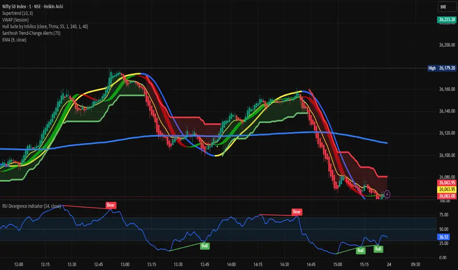
Santhosh Trend-Change AlertsSanthosh Trend-Change Alerts : This indicator identifies potential trend change in market. i would suggest to use 1Min time frame with 75 Period ( Input). To have more accuracy on trading , add RSI Divergence (14) and Super trend (10,3)