Buy Sell Trend MonitorDescription
The purpose of this indicator is to create symbols that try to show the most accurate positions possible for trading. The formation of BUY/SELL symbols is based on the intersection of SYMBOL(Himself), BTC.D, BTC and DXY indices. The resulting signals take values between 0 and 16. These values represent the strength of the signal, and the higher its numerical value, the stronger the signal. Here, 2 different calculation methods are followed for BTC and Altcoins. In BTC, calculations are made according to the direction of BTC Market value and DXY averages, while in Altcoins, calculations are made according to the direction of BTC, BTC.D and DXY averages. If DXY for BTC is trending downwards and the BTC market value is trending upwards, the BUY symbol is formed depending on the level at which the trend occurs. For altcoins, if DXY is trending down, BTC is trending up and BTC.D is trending down, the BUY symbol is formed depending on the level at which the trend occurs. For the SELL signal, the opposite is true.
Symbols are drawn according to standard ticker and OHLC4 values.
The averages of the 1-length RSI value of these symbols are taken as the 6-length SMA.
Symbols
The symbols are explained one by one below.
Orange Line: Bitcoin Marketcap line.
White Line: DXY line.
Red Line: Bitcoin Dominance line.
Aqua Line: Current Symbol line.
Best Use
This indicator should be used for SPOT trades. Regardless, since it is not possible to know exactly the direction of the market, it should be considered to buy gradually at buy signals and sell gradually at sell signals.
It should be followed for at least a 4-hour period. We do not recommend its use as the margin of error will increase in shorter time periods.
Since the signals are not guaranteed to work 100%, we do not recommend you to trade with all your money.
No Repainting
Repainting is definitely not done. After the symbols appear, the closing should be expected. Once the closing occurs, the symbol will now be permanent.
Disclaimer
This indicator is for informational purposes only and should be used for educational purposes only. You may lose money if you rely on this to trade without additional information. Use at your own risk.
Version
v1.0
Recherche dans les scripts pour "BTC"

BitCoin RSI TrendWhat is it?
This indicator will plot the RSI of BTC with a red or green background based on the top and bottom values which you can set.
How to use it?
For example, you want to trade only if the RSI of BTC is between 50 and 70, so the top value is 70 and bottom is 50. If the RSI value between those values the background will be green, else it will be red.
Why to use it?
The buy and sell strength of the BTC controls the other coins, and it is noticeable when the BTC is over sold and the RSI exceeding the 70, the price will reverse its movement to down, thus it is advisable to not open long position if the RSI of BTC is above the 70-75. Also, if the RSI is under 50 there is a big possibility to move down further to the over bought areas. The best is to buy a altcoins when the BTC RSI is between 50 and 70.
For example, I could avoid a bad long trade on MATICUSDT when the RSI of BTC is going under 50
Or, get a good long trade on MATICUSDT when the RSI of BTC is between 50 and 70

KTA - ALT/BTC Strength DetectorThis is an indicator that displays the Relative Strength Index (RSI) of Total Crypto Market Capitalization Excluding BTC (ALT MCAP.) and BTC ONLY Market Capitalization (BTC MCAP.). Both RSI's have a lookback of 60Days, and the timeframe is hardcoded to daily. So it's a lookback of 60 days calculation for both RSI's.
The histogram is a visual representation of the difference between the BTC MCAP. RSI and the ALT MCAP. RSI If the color of the histogram bars is blue, this indicates that the BTC MCAP. RSI is higher than the ALT MCAP. RSI (BTC MCAP RSI crossed over ALT MCAP RSI) and visa versa for the green bars (ALT MCAP RSI crossed over BTC MCAP RSI).
This indicator can show the strength of the cryptocurrency market (excluding bitcoin) capitalization versus the Bitcoin-only market capitalization.
Yellow trendline = ALT MCAP. 60 day RSI
Purple trendline = BTC MCAP. 60 day RSI
Note: Histogram base has been set to 50 to fit the histogram in the same area as the RSI's so the calculation for the histogram is ( (ALT MCAP. 60day RSI / BTC MCAP. 60day RSI) *50 ).
Please note I am not a finical advisor, and I do not intend to give financial advice; I am only making this chart as I love scripting here on Trading View, and I would like to give something back to this fantastic community.
I hope you enjoy it.
Best,
KTA

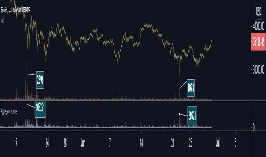
Aggregated Volume Colored (Bitcoin, ETH, Altcoins, everything)BITSTAMP:BTCUSD
This indicator aggregates trading volume data of up to 10 symbols and can display the individual data by color.
It is useful for assets which are traded on multiple exchanges, like cryptocurrencies, commodities, forex and derivatives showing you what is happening across the market and on the individual exchanges to give you beter insights.
You can change the symbols from which the indicator gathers data in the settings under inputs, just like the colors, and you can add a moving average.
By default trading volume is aggregated from the following symbols:
Binance, BTC /USDT
Binance, BTC /BUSD
Bingbon, BTC /USD
Huobi, BTC /USDT
OkeX, BTC /USDT
Coinbase, BTC /USD
Bitfinex, BTC /USD
Gemini, BTC /USD
Kraken, XBT/USD
Bitstamp, BTC /USD

Aggregated VolumeBITSTAMP:BTCUSD
This indicator aggregates trading volume data of assets which are traded on multiple exchanges (like cryptocurrencies, commodities, forex and derivatives) to give you better insights on the markets.
You can change the markets from which the indicator gathers data in the settings under inputs.
By default, data is aggregated from the following markets:
Binance, BTC /USDT
Binance, BTC /BUSD
Bitfinex, BTC /USD
Coinbase, BTC /USD
Bingbon, BTC /USD
Bitstamp , BTC /USD
Kraken, XBT/USD
Gemini, BTC /USD
OkeX, BTC /USDT
Huobi, BTC /USDT
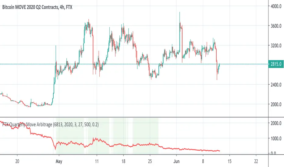
FTX BTC Quarterly Move ArbitrageThis script is for arbitraging BTC's volatility on FTX.
We use 3 factors to detect the best timing for arbitraging:
1. BTC Quarterly Move current price
2. BTC Quarterly Move strike price
3. BTC current price
When green background appears, long BTC and short BTC move.
When red background appears, short BTC and short BTC move.
Wasabi Tool+: BTC Dominance & Market Cap (Top 12 Coins)Wasabi Tool+: BTC Dominance & Market Cap (Top 12 Coins)
This indicator is to show the valid and correct bitcoin dominance (in the form of candle bars , not like the previous line style)among the top 12 coins except stable coins as well as the total market cap of the top 12 coins without stable coins .
The line in orange, shown in the chart above, is the original BTC dominance provided by TradingView whereas the candle bar chart is what this indicator illustrates as a correct and valid BTC dominance by default. You can go to the settings to show the top 12 coins market cap as well.
As of now, it looks like the TradingView's BTC dominance is showing some strange and invalid bars probably due to TOTAL2 with some corrupted bars.
* Chart setup:
For the bitcoin dominance, it is strongly recommended for you to apply this indicator to the BTC.D(bitcoin dominance) daily or weekly non-log chart. For the top 12 non-Stable market cap, you can apply it to either TOTAL, BTC, ETH, or XRP daily or weekly chart. For you not to be confused with the T.V.'s chart, please go to the settings and change the default candle chart to line style.
* This indicator will provide a vital information for investors to assess the current market situation.
Here's the list of all top 15 coins included in the calculation:
BTC
ETH
XRP
BCH
EOS
LTC
BNB
BSV
XLM
ADA
TRX
XMR
This indicator won't be shared.
-----
"Korean"
Wasabi Tool+: BTC Dom. + Market Cap (Top 12 Coins w/o Stables)
와사비 툴+: 비트 도미넌스 + 시총 (스테이블 제외 상위 12개 코인)
이전 발표한 시총순위 15개 도미넌스 지표가 캔들바가 아닌 실선이어서 캔들이용자에게 다소 해석의 어려움이 있었는데,
현 지표는 비트 도미넌스와 시총을 선택 표시 가능하고, 실선이 아니라, 캔들로 표시하는 새로운 지표입니다.
현 지표는 스테이블 코인을 제외한 시총순위로 12개의 코인을 선별해서, 스테이블코인을 제외한 비트코인의 도미넌스와 시총순위 12개 총시총을 정확하게 계산해서 캔들 바의 형태로 보여주는 지표입니다.
위의 차트상에 오렌지색선은 트레이딩뷰 제공 비트코인 도미넌스이고, 캔들바 차트가 이 지표가 제공하는 정확한 비트코인 도미넌스 입니다. 셋팅에서 스테이블제외 시총순위 12개 코인 시총을 표시하도록 변경 가능합니다.
현재, 트레이딩뷰의 비트코인 도미넌스는 TOTAL2의 왜곡된 값에 의해 도미넌스 정보도 왜곡된 값을 보여 주고 있는 것 같습니다.
현 지표는 현재 마켓 상황을 판단하는데 도움을 주는 중요한 정보를 정확하게 제공합니다.
* 차트적용
비트코인 도미넌스를 보기 위해서는, 가급적, BTC.D(비트코인 도미넌스) 일봉이나 주봉차트(로그 비적용)에 적용하셔야 합니다. 만일, 12개 시총을 보기위해서는 TOTAL, BTC, ETH, or XRP 일봉이나 주봉 (로그 비적용)을 추천합니다.
* 총 시총에 포함된 12개 탑 코인은 아래와 같습니다.
BTC
ETH
XRP
BCH
EOS
LTC
BNB
BSV
XLM
ADA
TRX
XMR
현 지표는 비공개. 비공유합니다. 가끔 지표시황 공개시 참고하세요.

Bollinger ALTswap Alert v1.0 (MA28 Rotation ALT↔BTC)Inspired by: Bollinger Awesome Alert R1 by JustUncleL
What is it?
BBALTSWAP overlays Bollinger Bands (20, 2), a 3-EMA, and a Rotation MA (default 28), then gives state-change alerts to rotate between ALT ↔ BTC on any ALT/BTC chart.
Core rotation rule
• Rotate → ALT when close > Bollinger middle and close > MA28.
• Rotate → BTC when close < Bollinger middle and close < MA28.
• Otherwise: Wait (no rotation).
Labels only print when the state changes (to avoid spam). You can also compute the rotation on a higher timeframe (default 4h) while viewing a lower one (e.g., 1h).
Optional extras
• Breakout arrows (scalping-style) when 3-EMA crosses the Bollinger middle with an Awesome Oscillator direction filter.
• Bollinger Squeeze coloring (relative width) to highlight expansion/contraction.
• Min bars between labels to throttle how often rotation labels appear.
Inputs (highlights)
• Use EMA for Bollinger / Rotation MA
• Bollinger length & multiplier
• AO fast/slow lengths
• Higher-timeframe selector for rotation (default 240 = 4h)
• Show breakout arrows / show “Wait” / min bars between labels
How to use (simple playbook)
1. Chart: open your ALT/BTC pair (e.g., ETHBTC).
2. Direction: leave rotation HTF at 4h for steadier signals.
3. Execution: take rotations on bar close; manage entries on your lower TF (1h/15m) if desired.
4. Override check (optional): when BTCUSDT is in a fresh breakout, prefer BTC even if ALT flashes briefly.
Alerts
Add two alerts, Once per bar close:
• “Rotate to ALT (state change)”
• “Rotate to BTC (state change)”
Notes
• Works on any ALT/BTC pair.
• The breakout arrows are optional and independent from the rotation signals.
• This tool is educational; not financial advice.

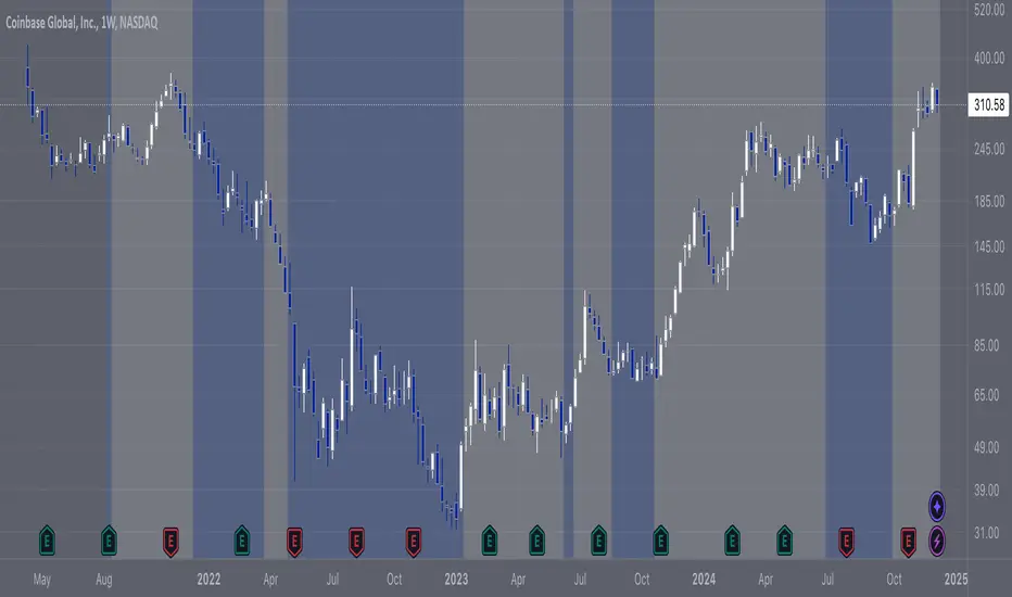
COIN/BTC Trend OscillatorThe COIN/BTC Trend Oscillator is a versatile tool designed to measure and visualize momentum divergences between Coinbase stock ( NASDAQ:COIN ) and Bitcoin ( CRYPTOCAP:BTC ). It helps identify overbought and oversold conditions, while also highlighting potential trend reversals.
Key Features:
VWAP-Based Divergence Analysis:
• Tracks the difference between NASDAQ:COIN and CRYPTOCAP:BTC relative to their respective VWAPs.
• Highlights shifts in momentum between the two assets.
Normalized Oscillator:
• Uses ATR normalization to adapt to different volatility conditions.
• Displays momentum shifts on a standardized scale for better comparability.
Overbought and Oversold Conditions:
• Identifies extremes using customizable thresholds (default: ±80).
• Dynamic background colors for quick visual identification:
• Blue for overbought zones (potential sell).
• White for oversold zones (potential buy).
Rolling Highs and Lows Detection:
• Tracks turning points in the oscillator to identify possible trend reversals.
• Useful for spotting exhaustion or accumulation phases.
Use Case:
This indicator is ideal for trading Coinbase stock relative to Bitcoin’s momentum. It’s especially useful during strong market trends, helping traders time entries and exits based on extremes in relative performance.
Limitations:
• Performance may degrade in choppy or sideways markets.
• Assumes a strong correlation between NASDAQ:COIN and CRYPTOCAP:BTC , which may not hold during independent events.
Pro Tip: Use this oscillator with broader trend confirmation tools like moving averages or RSI to improve reliability. For macro strategies, consider combining with higher timeframes for alignment.
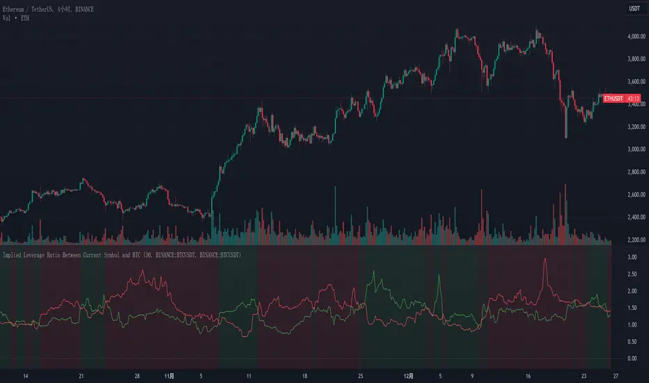
Implied Leverage Ratio Between Current Symbol and BTCThis script calculates and visualizes the implied leverage ratio between the current symbol and Bitcoin (BTC). The implied leverage ratio is computed by comparing the cumulative price changes of the two symbols over a defined number of candles. The results provide insights into how the current symbol performs relative to BTC in terms of bullish (upward) and bearish (downward) movements.
Features
Cumulative Up and Down Ratios:
The script calculates the cumulative price increase (up) and decrease (down) ratios for both the current symbol and BTC. These ratios are based on the percentage changes relative to each candle's opening price.
Implied Leverage Ratio:
For bullish movements, the cumulative up ratio of the current symbol is divided by BTC's cumulative up ratio.
For bearish movements, the cumulative down ratio of the current symbol is divided by BTC's cumulative down ratio.
These values reflect the implied leverage of the current symbol relative to BTC in both directions.
Customizable Comparison Symbol:
By default, the script compares the current symbol to BINANCE:BTCUSDT. However, you can specify any other symbol to tailor the analysis.
Interactive Visualization:
Green Line: Represents the ratio of cumulative up movements (current symbol vs. BTC).
Red Line: Represents the ratio of cumulative down movements (current symbol vs. BTC).
A horizontal zero line is included for reference, ensuring the chart always starts from zero.
How to Use
Add this script to your chart from the Pine Editor or the public library.
Customize the number of candles (t) to define the period over which cumulative changes are calculated.
If desired, replace the comparison symbol with another asset in the input settings.
Analyze the green and red lines to identify relative strength and implied leverage trends.
Who Can Benefit
Traders and Analysts: Gain insights into the relative performance of altcoins, stocks, or other instruments against BTC.
Leverage Seekers: Identify assets with higher or lower implied leverage compared to Bitcoin.
Market Comparisons: Understand how various assets react to market movements relative to BTC.
This tool is particularly useful for identifying potential outperformers or underperformers relative to Bitcoin and can guide strategic decisions in trading pairs or market analysis.
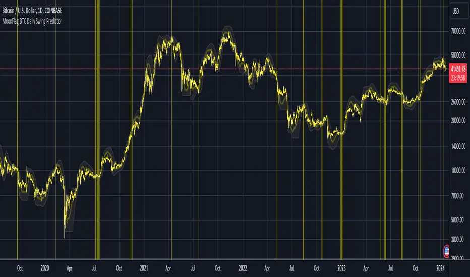
MoonFlag BTC Daily Swing PredictorThis script mainly works on BTC on the daily timeframe. Other coins also show similar usefulness with this script however, BTC on the daily timeframe is the main design for this script.
(Please note this is not trading advice this is just comments about how this indicator works.)
This script is predictive. It colors the background yellow when the script calculates a large BTC swing is potentially about to happen. It does not predict in which direction the swing will occur but it leads the price action so can be useful for leveraged trades. When the background gets colored with vertical yellow lines - this shows that a largish price swing is probably going to occur.
The scripts also shades bands around the price action that are used to estimate an acceptable volatility at any given time. If the bands are wide that means price action is volatile and large swings are not easily predicted. Over time, with reducing volatility, these price action bands narrow and then at a set point or percentage (%) which can be set in the script settings, the background gets colored yellow. This indicates present price action is not volatile and a large price swing is potentially going to happen in the near future. When price action breaks through the narrowing bands, the background is no longer presented because this is seen as an increase in volatility and a considerable portion of the time, a large sudden drop in price action or momentous gain in price is realized.
This indicator leads price action. It predicts that a swing is possibly going to happen in the near future. As the indicator works on the BTC daily, this means on a day-to-day basis if the bands continually narrow - a breakout is more likely to happen. In order to see how well this indicator works, have a look at the results on the screenshot provided. Note the regions where vertical yellow lines are present on the price action - and then look after these to see if a sizeable swing in price has occurred.
To use this indicator - wait until yellow vertical lines are presented on the BTC daily. Then use your experience to determine which way the price action might swing and consider entering a trade or leveraged trade in this direction. Alternatively wait a while to see in which direction the break-out occurs and considering and attempt to trade with this. Sometimes swings can be unexpected and breakout in one direction before then swinging much larger in the other. Its important to remember/consider that this indicator works on the BTC daily timeframe, so any consideration of entering a trade should be expected to cover a duration over many days or weeks, or possibly months. A large swing is only estimated every several plus months.
Most indicators are based on moving averages. A moving average is not predictive in the sense in that it lags price actions. This indicator creates bands that are based on the momentum of the price action. A change in momentum of price action therefore causes the bands to widen. When the bands narrow this means that the momentum of the price action is steady and price action volatility has converged/reduced over time. With BTC this generally means that a large swing in price action is going to occur as momentum in price action then pick-up again in one direction or another. Trying to view this using moving averages is not easy as a moving average lags price action which means that it is difficult to predict any sudden movements in price action ahead of when they might occur. Although, moving averages will converge over time in a similar manner as the bands calculated by this script. This script however, uses the price action momentum in a predictive manner to estimate where the price action might go based on present price momentum. This script therefore reacts to reduced volatility in price action much faster than a set of moving averages over various timescales can achieve.
MoonFlag
Optimized Logarithmic Curve for Bitcoin (BTC/USD) by FICASHello everyone!
I'd like to share with you a handy tool that is incredibly useful for analyzing Bitcoin's price movements. This optimized logarithmic curve indicator is a refined version of the popular "My BTC log curve" indicator, originally created by @quantadelic.
We have made several improvements to enhance its predictive capabilities when it comes to identifying potential price bottoms for Bitcoin BTC/USD.
Description:
In this detailed analysis, we are excited to introduce you to an optimized version of the popular "My BTC log curve" indicator, originally created by @quantadelic. We have refined the indicator for enhanced predictive capabilities when it comes to identifying potential price bottoms for Bitcoin BTC/USD. By putting ourselves in the reader's shoes, we aim to provide a comprehensive and meaningful explanation of our analysis and predictions using this improved tool.
The logarithmic curve is a powerful tool for analyzing price movements in a non-linear fashion, allowing traders and investors to identify critical turning points and trends. With the optimized logarithmic curve, we can more accurately predict potential price bottoms, ultimately guiding better-informed trading and investment decisions.
Key Features of the Optimized Logarithmic Curve:
Improved predictive capabilities: The refined logarithmic curve has been optimized to provide more accurate predictions of potential price bottoms, enabling traders to make better-informed decisions.
Enhanced visualization: The optimized curve offers a clearer visual representation of Bitcoin's price movements, making it easier for traders to identify patterns and trends.
Adaptability: This indicator can be applied to various timeframes, providing insights for both short-term and long-term traders.
The optimized logarithmic curve indicator is based on a logarithmic regression of the USD price of Bitcoin, calculated according to the equation:
y = A * exp(beta * x^lambda + c) + m * x + b
where x is the number of days since the genesis block. All parameters are editable in the script options, allowing traders to customize the curve to their preferences.
Here are some of the key changes made to the original indicator to create the optimized logarithmic curve:
Midline Calculation: The optimized logarithmic curve utilizes an updated method for calculating the midline, which better represents the average price movement of Bitcoin over time. This improved midline calculation provides a more accurate representation of Bitcoin's historical price trajectory, making it easier to identify potential price bottoms.
Cross Line Calculation: We have modified the way cross lines are calculated in the optimized logarithmic curve. These new cross lines are derived from a combination of the updated midline calculation and historical support and resistance levels. This change allows traders to more accurately identify critical points in the market where price action is likely to reverse or continue its trend.
Table Display: a powerful visualization tool designed to provide a comprehensive overview of the relationships between various exponential curves and the Bitcoin price. This table display, integrated into the "FiCAS BTC log curve" indicator, enables traders and analysts to quickly compare and assess the impact of these curves on the market.
Our analysis using the optimized logarithmic curve suggests that Bitcoin might be at a critical price bottom, indicating that selling at this point may not be the most prudent course of action. Instead, traders and investors could consider taking advantage of the potential upswing as the market moves away from the identified price bottom.
Key highlights of this Optimized Logarithmic Curve for Bitcoin (BTC/USD) by FICAS:
Custom Pine Script: Pinescript code serves as the backbone of this strategy, providing a strong foundation for identifying potential opportunities based on the relationships between exponential curves and Bitcoin price.
MACD Indicator: The Moving Average Convergence Divergence (MACD) is integrated to help traders recognize trend reversals, bullish or bearish market conditions, and potential entry or exit points.
Momentum Indicator: By incorporating the Momentum (10, close) indicator, traders can identify the strength of price movements and potential trend continuations or reversals.
RSI and SMA: The Relative Strength Index (RSI) is used to assess overbought or oversold conditions, while the Simple Moving Average (SMA) with a period of 14 and an applied factor of 2 smoothens the data for better trend identification.
IMPORTANT:
While this indicator can be applied to traditional BTC/USD charts, we highly recommend using it on the following chart for optimal results in identifying price bottoms:
BITSTAMP:BTCUSD / CRYPTOCAP:BTC.D * 100
By employing the optimized logarithmic curve indicator on the recommended chart, traders can gain a more accurate perspective on potential price bottoms, leading to improved decision-making.
In conclusion, the optimized logarithmic curve indicator provides valuable insights into Bitcoin's price movements, allowing traders and investors to make more informed decisions. We encourage you to test this refined tool and share your thoughts in the comments section. Special thanks to @quantadelic, the first creator of this indicator, for inspiring us to develop this optimized version. If you have any questions or require further clarification, please feel free to ask. Wishing you success in your trading and investment endeavors!
Please ensure you understand and abide by the TradingView House Rules when using this indicator: www.tradingview.com
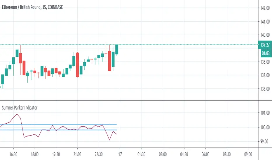
Sumner-Parker Indicator (Over/Under Priced BTC or ETH)This is to be used when trading between ETH/GBP, BTC/GBP and ETH/BTC .
It compares ETH/GBP and BTC/GBP with each other to determine if the ETH/BTC price matches.
From it you can predetermine whether the value of the asset you are watching is overpriced or underpriced and therefore predict the candle to follow.
When watching ETH:
If the value is high, the value of BTC is too high and ETH should raise to match in the next bar and vice versa.
When watching BTC:
If the value is high, the value of BTC is too high and should drop on the next bar and vice versa.
The Upper and Lowers are set at double the percentage fees on the exchange you use. This just helps in recognising beneficial trades.
Bitcoin Cost per Transaction (USD)The Bitcoin Cost per Transaction (USD) is the result of dividing the miners' revenue (Block Reward + Transaction Fees) between the number of transactions per block.
Here is an example with made up numbers:
Block reward is 12.5 BTC + 0.5 BTC in transaction fees.
There are 2700 transactions in the block.
Current exchange rate is 5700 USD/BTC.
(12.5 BTC + 0.5 BTC) / 2700 transactions = 0.00481481 BTC per transaction
5700 USD/BTC * 0.00481481 BTC per transaction = $27.44 per transaction
Hope that helps!

God of Scalping BTCUnleash divine precision in the chaotic realm of BTC scalping with the God of Scalping BTC—a bespoke, price-action powerhouse crafted for lightning-fast entries and exits on 1-5 minute charts. Forged from raw momentum velocity (no recycled RSI or MACD here), this indicator detects micro-trend accelerations to pinpoint surge moments where BTC's volatility bends to your will.Core Mechanics:Velocity Engine: Calculates fast (default: 3-bar) and slow (default: 8-bar) price speeds, then derives normalized acceleration using ATR (14-bar) to filter noise in BTC's wild swings.
Surge Detection: Smoothed signal line confirms crossovers—bullish when acceleration surges above signal with positive bias; bearish on the downside.
Volume Guardian: Triggers only on 20%+ volume spikes above its EMA (10-bar), ensuring conviction behind the chaos.
Visual Oracle:Blue/Red Lines: Fast (EMA close, 3-bar) and slow (EMA close, 8-bar) velocity trends for trend context.
Background Glow: Subtle green/red tint for real-time momentum bias.
Divine Arrows: Green triangles below bars for BUY surges; red above for SELL—your scalp signals from the heavens.
Scalping Ritual:Optimal Altar: Load on BTCUSD/USDT (1m-5m). Tune lengths for your broker's feed.
Invocation: Enter long on green arrow (target 0.1-0.3% gains), short on red. Tight stops at recent swings; exit on opposite signal or threshold breach (1.5x mult).
Alerts: Built-in notifications—"God Surge Buy: BTC Scalp Entry!"—to summon you mid-prayer (er, trade).
Backtested for BTC's fury, this isn't a holy grail, but a scalper's Excalibur: pure, adaptive, and unyielding. Trade wisely—markets are mortal, your edge is eternal.
Grok's xAI Signal (GXS) Indicator for BTC V6Grok's xAI Signal (GXS) Indicator: A Simple Guide
Imagine trying to decide if Bitcoin is a "buy," "sell," or "wait" without staring at 10 different charts. The GXS Indicator does that for you—it's like a smart dashboard for BTC traders, overlaying signals right on your price chart. It boils down complex market clues into one easy score (from -1 "super bearish" to +1 "super bullish") and flashes green/red arrows or shaded zones when action's needed. No fancy math overload; just clear visuals like tiny triangles for trades, colored clouds for trends, and a bottom "mood bar" (green=up vibe, red=down, gray=meh).
At its core, GXS mixes three big-picture checks:
Price Momentum (50% weight): Quick scans of RSI (overbought/oversold vibes), MACD (speed of ups/downs), EMAs (is price riding the trend wave?), and Bollinger Bands (is the market squeezing for a breakout?). This catches short-term "hot or not" energy.
Network Health (30% weight): A simple "NVT" hack using trading volume vs. price to spot if BTC feels undervalued (buy hint) or overhyped (sell warning). It's like checking if the crowd's too excited or chill.
Trend Strength (20% weight): ADX filter ensures signals only fire in "trending" markets (not choppy sideways noise), plus a MACD boost for extra momentum nudge.
Why this approach? BTC's wild—pure price charts give false alarms in flat times, while ignoring volume/network ignores the "why" behind moves. GXS blends old-school TA (reliable for patterns) with on-chain smarts (crypto-specific "under the hood" data) and a trend gate (skips 70% of bad trades). It's conservative: Signals need the score to cross ±0.08 and a strong trend, reducing noise for swing/position traders. Result? Fewer emotional guesses, more "wait for confirmation" patience—perfect for volatile assets like BTC where hype kills.
Quick Tips to Tweak for Better Results
Start with defaults, then experiment on historical charts (backtest via TradingView's strategy tester if pairing with one):
Fewer False Signals: Bump thresholds to ±0.15 (buy/sell)—trades only on stronger conviction, cutting whipsaws by 20-30% in choppy markets. Or raise ADX thresh to 28 for "only big trends."
Faster/Slower Response: Shorten EMAs (e.g., 5/21) or RSI (10) for quicker scalps; lengthen (12/50) for swing holds. Test on 4H/daily BTC.
Volume Sensitivity: If NVT flips too often, extend its length to 20—smooths on-chain noise in bull runs.
Visual Polish: Crank cloud opacity to 80% for subtler fills; toggle off EMAs if they clutter. Enable table for score breakdowns during live trades.
Risk Tip: Always pair with stops (e.g., 2-3% below signals). On BTC, tweak in bull markets (looser thresh) vs. bears (tighter).
In short, GXS is your BTC "sixth sense"—balanced, not black-box. Tweak small, track win rate, and let trends lead. Happy trading!

QUBIC↔BTC ProjectionQUBIC↔BTC Projection — Short & Simple
WHAT IT DOES
- Shows where QUBIC might roughly land if BTC reaches a target price you choose.
- Draws a midline (estimate) and a band around it (safety margin).
HOW TO USE
1) Check symbols:
- QUBIC/USDT (e.g., GATEIO:QUBICUSDT)
- BTC/USDT (e.g., BINANCE:BTCUSDT)
2) Set at the top:
- "BTC Target ($)": enter your desired BTC price (e.g., 117000).
- "Lookback": number of candles used for the estimate (more = smoother, less = more reactive).
- "Band ±σ": width of the band (1 is a good start).
3) Info display:
- Choose "Panel top-right/bottom-right" (fixed corner) or "Label" (on chart).
- Adjust text size to your liking.
- Optional: "Compact format" for tiny QUBIC prices (e.g., 0.(5)156).
WHAT YOU SEE
- Midline = rough direction for QUBIC at your BTC target.
- Band = room to the downside/upside.
- The panel/label shows the numbers as text.
NOTE
- This is an estimate, not a promise. Use it as guidance, not a guarantee.

Degen Screener – ALTs vs. BTCDegen Screener – ALTs vs. BTC
🛠️ What This Script Does:
This multi-asset screener monitors up to 10 cryptocurrencies and compares their RSI strength relative to Bitcoin (BTC) — acting like BTC is the "north star." It's perfect for catching early shifts in momentum across the crypto market.
🎨 Color Logic:
RSI Column:
RSI < 30 → Green (oversold)
RSI > 70 → Red (overbought)
In between → Gray
Relative RSI Column:
0 → Green (stronger than BTC)
< 0 → Red (weaker than BTC)
Trend Column:
🤑 → Bullish shift (green background)
🖕 → Bearish shift (red background)
🔔 Alert Conditions:
Alerts fire when all three of these are true:
RSI is below 30 (oversold)
The asset is stronger than BTC
Momentum is turning bullish (🤑)
Perfect for spotting early reversals in oversold altcoins.
✅ How to Use:
Add the script to any chart (doesn’t matter which asset)
Customize the list of up to 10 symbols
Set your timeframe
Enable the alert condition: Relative RSI Signal
💡 Notes:
Script runs on whatever chart you’re on, but it pulls data from the 10 assets you select on your indicator.
⚠️ Disclaimer:
This tool is for educational and informational purposes only. It is not financial advice. Always do your own research.

Cross-Exchange BTC Volume[nakano]## Cross-Exchange BTC Volume
### Overview 📊
This indicator aggregates Bitcoin (BTC) volume from multiple major cryptocurrency exchanges in real-time and displays it as a stacked column chart. Additionally, it shows a label on the right side of the chart detailing the latest volume from each exchange and its percentage сьогодніs total market volume, helping to visually grasp market liquidity and trading concentration.
### Main Features ✨
* **Multi-Exchange Volume Aggregation**: Sums up the volume from major BTC/USD and BTC/USDT pairs on Binance, Coinbase, Bybit, Kraken, Bitstamp, Bitfinex, Gemini, HTX (formerly Huobi), and KuCoin, as well as BTC/JPY pairs on Bitflyer, Binance, Kraken, and Bitfinex.
* **Stacked Volume Chart**: Displays the volume from each exchange as a color-coded stacked column chart, allowing for an at-a-glance understanding of the overall volume composition.
* **Detailed Volume Label**: Shows a text label on the right side of the chart with the **latest volume** from each exchange (rounded to one decimal place, formatted as "0.x" if less than 1, or with thousand separators if 1 or greater) and its percentage of the current total volume. This label can be toggled on/off in the settings.
* **Dynamic Updates**: Volume data updates according to the chart's timeframe.
### What it Displays 📈
* **Stacked Volume Chart (Lower Pane)**:
* Volume from each exchange is displayed in a color-coded stacked format. The chart legend indicates which color corresponds to which exchange group (e.g., "Cumulative: Sum below BINANCEUSDT"). Volumes are stacked from the bottom, with the top border representing the total volume.
* **Detailed Volume Label (Right Side of Chart)**:
* A single text label is displayed on the right side of the chart, showing the volume figures and market share percentages for each exchange (or group).
* This label is updated when calculations are performed on the right edge of the chart (where the latest bars appear). The volume and percentage figures displayed are based on the **latest data** at that point.
* The displayed content is as follows:
* `BINANCE(US)`: Total volume and percentage for Binance USD(T/C) pairs.
* `COINBASE(US)`: Total volume and percentage for Coinbase USD(C) pairs.
* `BYBIT(US)`: Volume and percentage for Bybit USDT pair.
* `KRAKEN(US)`: Total volume and percentage for Kraken USD(T) pairs.
* `BITSTAMP`: Volume and percentage for Bitstamp USD pair.
* `BITFINEX(US)`: Volume and percentage for Bitfinex USD pair.
* `BITFLYER(JP)`: Volume and percentage for Bitflyer JPY pair.
* `BINANCE(JP)`: Volume and percentage for Binance JPY pair.
* `KRAKEN(JP)`: Volume and percentage for Kraken JPY pair.
* `BITFINEX(JP)`: Volume and percentage for Bitfinex JPY pair.
* `OTHER (incl. HTX)`: Total volume and percentage for Gemini (USD), HTX (USDT), and KuCoin (USDT).
### Inputs ⚙️
* **Show Labels**: `true` (checked) to display the detailed volume label, `false` (unchecked) to hide it. Default is `true`.
### How to Use / Use Cases 💡
* Understand which exchanges are experiencing active BTC trading.
* Check which exchange's volume reacts алкоголь (significantly) to specific news or events.
* Observe changes in volume share among exchanges across different time zones (e.g., Asia, Europe, US sessions).
* Analyze increases/decreases in overall market volume and the contribution of each exchange.
### Notes 📝
* This indicator is written in `//@version=6`.
* Volume data is sourced from symbols provided by TradingView for each exchange. Data may become unavailable due to changes in exchange APIs, symbol names, etc.
* A single detailed volume label is displayed, updating to reflect the latest situation as the chart updates. Its content is triggered to update based on the **latest volume data** when bars in the most recent part of the chart are calculated.
* The source code is subject to the terms of the Mozilla Public License 2.0.
---
**© nakano**

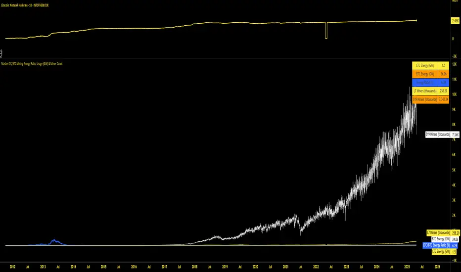
Master LTC/BTC Mining Energy Ratio, Usage (GW) & Miner CountThis Pine Script indicator, "Master LTC/BTC Mining Energy Ratio, Usage (GW) & Miner Count," calculates and visualizes key metrics for Litecoin (LTC) and Bitcoin (BTC) mining operations. Using IntoTheBlock hashrate data, it estimates the number of L7 (LTC) and S19 (BTC) miners, computes energy consumption in gigawatts (GW) based on calibrated efficiency values, and derives the LTC/BTC energy ratio as a percentage. The script plots these metrics—energy ratio, LTC/BTC energy usage, and miner counts (in thousands)—and displays a concise table summarizing the results. Assuming most miners use previous-generation hardware, it provides a clear comparison of the energy dynamics between LTC’s Scrypt and BTC’s SHA-256 algorithms.
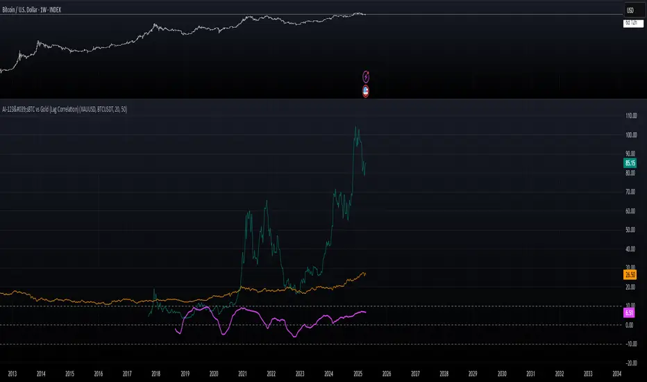
AI-123's BTC vs Gold (Lag Correlation)
DISCLAIMER
I made this indicator with the help of ChatGPT and using what I have learned so far from The Pine Script Mastery Course, LOTS of edits based on what I have learned so far had to be made as well as additions and modifications to my liking thanks to what I have learned so far. I am aware this already exists but I have done my best to make a first ever script/indicator while learning how to properly publish as well, so please bear that in mind.
Overview
This indicator analyzes the correlation between Bitcoin (BTC) and Gold (XAUUSD), with a customizable lag applied to the Gold price, providing insight into the macro relationship between these two assets.
It is designed for traders and investors who want to track how Bitcoin and Gold move in relation to each other, particularly when Gold is lagged by a specific number of days.
Key Features:
BTC and Gold (Lagged) Price Overlay: Display Bitcoin (BTC) and Gold (XAUUSD) prices on the chart, with an adjustable lag applied to the Gold price.
Rolling Correlation Calculation: Measures the correlation between Bitcoin and lagged Gold prices over a customizable lookback period.
Adjustable Lag: The number of days that Gold is lagged relative to Bitcoin is fully customizable (default: 20 days).
Customizable Correlation Length: Allows you to choose the lookback period for the correlation (default: 50 days), providing flexibility for short-term or long-term analysis.
Normalized Plotting: Prices of Bitcoin and Gold are normalized for better visual alignment with the correlation values. BTC is divided by 1000, and Gold by 100.
Correlation Scaling: The correlation value is amplified by 10 for better visual clarity and comparison with price data.
Zero Line: Horizontal line representing a correlation of 0, making it easier to identify positive or negative correlation shifts.
Maximum Correlation Lines: Horizontal lines at +10 and -10 values for extreme correlation scenarios.
Input Settings:
Gold Symbol: Customize the Gold ticker (default: OANDA:XAUUSD).
Bitcoin Symbol: Customize the Bitcoin ticker (default: BINANCE:BTCUSDT).
Lag (in trading days): Adjust the number of trading days to lag the Gold price relative to Bitcoin (default: 20).
Correlation Length (days): Set the number of days over which the rolling correlation is calculated (default: 50).
How to Use:
Price Comparison: The BTC (Spot) and Lagged Gold plots give you a side-by-side visual comparison of the two assets, normalized for clarity.
Correlation Line: The correlation line helps you gauge the strength and direction of the relationship between BTC and lagged Gold. Positive values indicate a strong positive correlation, while negative values indicate a negative correlation.
Visual Analysis: Watch how the correlation shifts with changes in lag and correlation length to identify potential market dynamics between Bitcoin and Gold.
Potential Applications:
Macro Trading: Track how Bitcoin and Gold behave in relation to each other during periods of economic uncertainty or inflation.
Sentiment Analysis: Use the correlation data to understand the sentiment between digital and traditional assets.
Strategic Timing: Identify potential opportunities where Bitcoin and Gold show a strong correlation or diverge based on the lag adjustment.
Understanding Macro Trends/Correlations.
Disclaimer:
This indicator is for informational purposes only. The correlation between Bitcoin and Gold does not guarantee future performance, and users should conduct their own research and use risk management strategies when making trading decisions.
Notes: This script uses historical data, so results may vary across different timeframes.
Customization options allow users to adjust the lag and correlation length to better fit their trading strategy.
Future Enhancements: Additional Correlation Line: A second correlation line for different lengths of lag or different assets.
Color-Coding of Correlation: Future updates may include color-coded correlation strength, visually indicating positive or negative correlation more effectively.
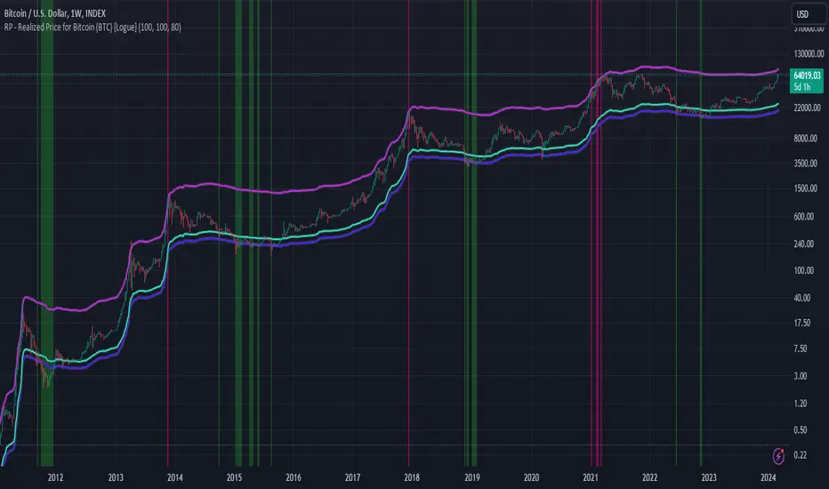
RP - Realized Price for Bitcoin (BTC) [Logue]Realized Price (RP) - The RP is summation of the value of each BTC when it last moved divided by the total number of BTC in circulation. This gives an estimation of the average "purchase" price of BTC on the bitcoin network based on when it was last transacted. This indicator tells us if the average network participant is in a state of profit or loss. This indicator is normally used to detect BTC bottoms, but an extension can be used to detect when the bitcoin network is "highly" overvalued. Because the "strength" of the BTC tops has decreased over the cycles, a logarithmic function for the extension was created by fitting past cycles as log extension = slope * time + intercept. This indicator triggers when the BTC price is above the realized price extension. For the bottoms, the RP is shifted downwards at a default value of 80%. The slope, intercept, and RP bottom shift can all be modified in the script.
Momentum Regime Filter BTC by [VanHelsing]Momentum Regime Filter BTC by
This is a usefull indicator what shows you a macro state of BTC trend.
Most of the trend indicators get lost in the ranging market or switch to bearish during simple pullbacks.
And I decided to creat it to ignore all this noise from a market and see what exactly major trend is!
-How it Works:
For find out what curent trend on BTC is, it using RSI and Normalized Momentum square.
When squre of both momentum and rsi is above zero it is an uptrend when below it is down trend.
I can say it is an momentum indicator. It works only on BTC and on all exchanges of it.
-How to read it
-BackTest (2D BTC Index, momentum length = 15, linear reg = 5) it works on any BTC exchange
