Shadow Corp 90min Boxes90-min cycle boxes, marks 90min session highs and lows with color coded boxes.Indicateur Pine Script®par BlackRabbitFX28
Intraday Time Cycle Levels (Labels + Alerts + Colors)Jag japp detta spelet fram och tbx. Tack för ert förtoende.Indicateur Pine Script®par Andreipip1121
SCPEM - Socionomic Crypto Peak Model (0-85 Scale)SCPEM Indicator Overview The SCPEM (Socionomic Crypto Peak Evaluation Model) indicator is a TradingView tool designed to approximate cycle peaks in cryptocurrency markets using socionomic theory, which links market behavior to collective social mood. It generates a score from 0-85 (where 85 signals extreme euphoria and high reversal risk) and plots it as a blue line on the chart for visual backtesting and real-time analysis. #### How It Works The indicator uses technical proxies to estimate social mood factors, as Pine Script cannot fetch external data like sentiment indices or social media directly. It calculates a weighted composite score on each bar: - Proxies derive from price, volume, and volatility data. - The raw sum of factor scores (max ~28) is normalized to 0-85. - The score updates historically for backtesting, showing mood progression over time. - Alerts trigger if the score exceeds 60, indicating high peak probability. Users can adjust inputs (e.g., lengths for RSI or pivots) to fine-tune for different assets or timeframes. Metrics Used (Technical Proxies) Crypto-Specific Sentiment Approximated by RSI (overbought levels indicate greed). Social Media Euphoria Based on volume relative to its SMA (spikes suggest herding/FOMO). Broader Social Mood Proxies Derived from ATR volatility (high values signal uncertain/mixed mood). Search and Cultural Interest Proxied by OBV trend (rising accumulation implies growing interest). Socionomic Wildcard Uses Bollinger Band width (expansion for positive mood, contraction for negative). Elliott Wave Position Counts recent price pivots (more swings indicate later wave stages and exhaustion).Indicateur Pine Script®par gtvsteve8
Simplified STH-MVRV + Z-ScoreSimplified Short Term Holder MVRV (STH-MVRV) + Z-Score Indicator Description: This indicator visualizes the Short Term Holder Market Value to Realized Value ratio (STH-MVRV) and its normalized Z-Score, providing insight into Bitcoin’s market cycle phases and potential overbought or oversold conditions. How it works: The STH-MVRV ratio compares the market value of coins held by short-term holders to their realized value, helping to identify periods of profit-taking or accumulation by these holders. The indicator calculates three versions: STH-MVRV (MVRV): Ratio of current MVRV to its 155-day SMA. STH-MVRV (Price): Ratio of BTC price to its 155-day SMA. STH-MVRV (AVG): Average of the above two ratios. You can select which ratio to display via the input dropdown. Threshold Lines: Adjustable upper and lower threshold lines mark significant levels where market sentiment might shift. The indicator also plots a baseline at 1.0 as a reference. Z-Score Explanation: The Z-Score is a normalized value scaled between -3 and +3, calculated relative to the chosen threshold levels. When the ratio hits the upper threshold, the Z-Score approaches +2, indicating potential overbought conditions. Conversely, reaching the lower threshold corresponds to a Z-Score near -2, signaling potential oversold conditions. This Z-Score is shown in a clear table in the top right corner of the chart for easy monitoring. Data Sources: MVRV data is fetched from the BTC_MVRV dataset. Price data is sourced from the BTC/USD index. Usage: Use this indicator to assess short-term holder market behavior and to help identify buying or selling opportunities based on extremes indicated by the Z-Score. Combining this tool with other analysis can improve timing decisions in Bitcoin trading.Indicateur Pine Script®par simonweisser_business44
Katik Cycle 56 DaysThis script plots vertical dotted lines on the chart every 56 trading days, starting from the first bar. It calculates intervals based on the bar_index and draws the lines for both historical and future dates by projecting the lines forward. The lines are extended across the entire chart height using extend=extend.both, ensuring visibility regardless of chart zoom level. You can customize the interval length using the input box. Note: Use this only for 1D (Day) candle so that you can find the changes in the trend...Indicateur Pine Script®par Katik1438
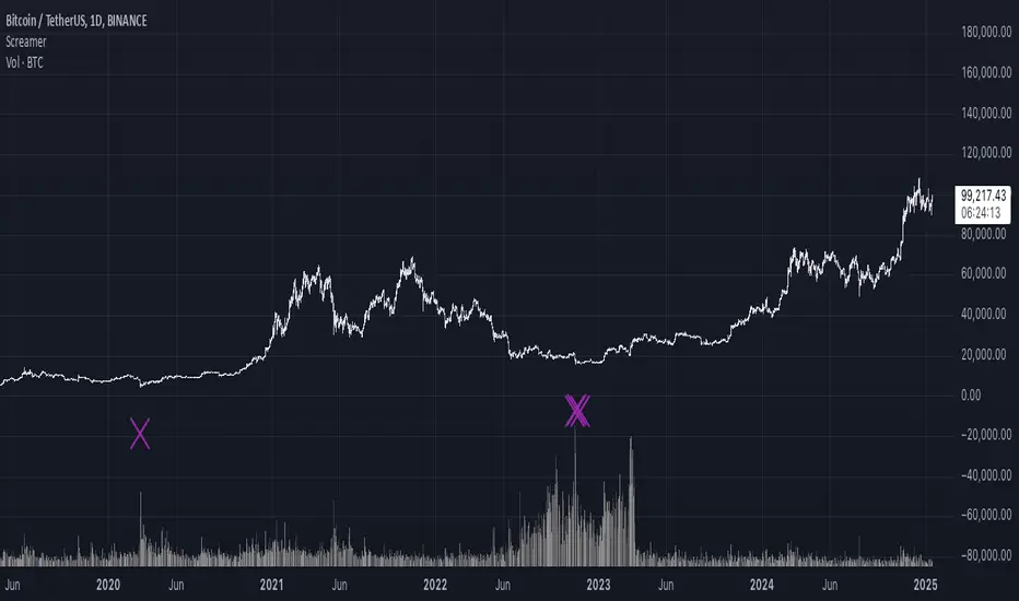
It Screams When Crypto BottomsGet ready to ride the crypto rollercoaster with your new favourite tool for catching Bitcoin at its juiciest, most oversold moments. This isn’t just another boring indicator — it screams when it’s time to load your bags and get ready for the ride back up! Expect it to scream just once or twice per cycle at the very bottom, so you know exactly when the party starts! Why You'll Love It: Crypto-Exclusive Magic: It does not really matter what chart you are on; this indicator only bothers about the original and realised market cap of BTC. We all know the rest will follow. Big Picture Focus: Designed for daily. No noisy intraday drama — just pure, clear signals. Screaming Alerts: When the signal hits, it’s like a neon sign screaming, “Crypto Bottomed!" Think of this indicator as your backstage pass to the crypto world’s most dramatic moments. It’s not subtle — it’s bold, loud, and ready to help you time the market like a pro. P.S.: Use it only on a daily chart. Don’t even try it on shorter timeframes — it won’t scream, and you’ll miss the show! 🙀Indicateur Pine Script®par AlexFuch44
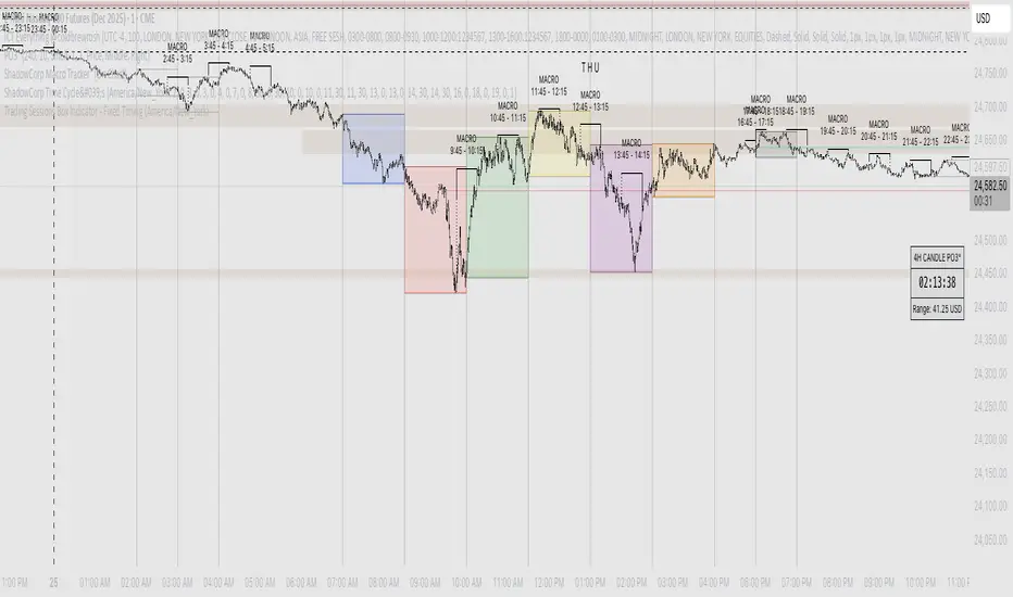
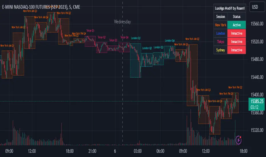
AMDX Time ZoneThis script is base on the theory of @traderdaye, on the TimeZone AMDX Accumulation Manipulation Distribution X reversal / continuation OR AMDX It show you the box on intraday Timeframe: Q1: 18.00 - 19.30 | Q2: 19.30 - 21.00 | Q3: 21.00 - 22.30 | Q4: 22.30 - 00.00 (90min Cycles of the Asian Session) Q1: 00.00 - 01.30 | Q2: 01.30 - 03.00 | Q3: 03.00 - 04.30 | Q4: 04.30 - 06.00 (90min Cycles of the London Session) Q1: 06.00 - 07.30 | Q2: 07.30 - 09.00 | Q3: 09.00 - 10.30 | Q4: 10.30 - 12.00 (90min Cycles of the NY Session) Q1: 12.00 - 13.30 | Q2: 13.30 - 15.00 | Q3: 15.00 - 16.30 | Q4: 16.30 - 18.00 (90min Cycles of the PM Session) You can extend this theory to the day => to the week => to the month Thanks LuxAlgo for the base, Hope you enjoy it Indicateur Pine Script®par roamin12955738
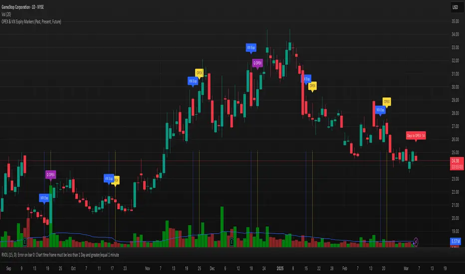
OPEX & VIX Expiry Markers (Past, Present, Future)Expiry Date Indicator for Options & Index Traders Track Key Expiration Dates Automatically For traders focused on options, indices, and expiration-based strategies, staying aware of key expiration dates is essential. This TradingView indicator automatically plots OPEX, VIX Expiry, and Quarterly Expirations on your charts—helping you plan trades more effectively without manual tracking. Features: ✔ OPEX Expiration Markers – Highlights the third Friday of each month, when equity and index options expire. ✔ VIX Expiration Tracking – Marks Wednesday VIX expirations, useful for volatility-based trades. ✔ Quarterly Expiration Highlights – Identifies major market expiration cycles for better trade management. ✔ Live Countdown to Next OPEX – Displays how many days remain until the next expiration. ✔ Works on Any Timeframe – Past, present, and future expiration dates update dynamically. ✔ Customizable Settings – Enable or disable specific features based on your trading style. Ideal for Traders Who Use: 📈 SPX / SPY / NDX / VIX Options Strategies 📅 Iron Condors, Credit Spreads, and Expiration-Based Trades This tool helps traders stay ahead of expiration cycles, ensuring they never miss an important date. Simple, effective, and built for seamless integration into your trading workflow. This keeps it professional and to the point without overhyping it. Let me know if you'd like any further refinements! 🚀Indicateur Pine Script®par similarTruffle374471151
SOL Hedge | 8500 TargetHigh efficiency and risk control. This script provides a structured framework for high-frequency execution while maintaining strict boundaries on losses and overtrading. ### Core Advantages **1. Strict Risk Management** The strategy enforces a fixed 1:3 risk-to-reward ratio. By automating the exit points immediately upon entry, it eliminates "hope-trading" or moving stop losses manually, ensuring that a single win covers the cost of three losses. **2. Overtrading Prevention** The daily trade limit (set to 100) acts as a mechanical circuit breaker. This protects the account from catastrophic "revenge trading" by hard-locking the script once the quota is reached, regardless of market conditions. **3. Execution Speed** Because the logic is purely mechanical and lacks heavy indicator processing, it is extremely lightweight. This minimizes calculation lag, allowing for rapid entry and exit cycles that are difficult to perform manually at high volumes. **4. Visual and Operational Clarity** The UI is streamlined for focus. The color-coded background provides instant confirmation of the current bias, and the simplified input panel allows for quick adjustments to pip targets without digging into the code. **5. Instrument Versatility** The pip-calculation logic is dynamic. It automatically detects the decimal precision of the asset (Forex vs. Yen pairs), making it portable across different markets without needing manual code rewrites for price formatting. **In short:** The script excels at enforcing discipline through hardcoded limits and a healthy reward-to-risk ratio. It removes emotional bias and provides a scalable framework for high-volume trading.Stratégie Pine Script®par oxaam4795
ICT IPDA LookbackThis description is tailored for the TradingView community, using the specific terminology associated with Michael Huddleston's (ICT) Interbank Price Delivery Algorithm (IPDA). 📜 TradingView Indicator Description ICT IPDA Lookback Engine (20-40-60 Day Cycles) Overview This indicator automates the IPDA Data Range lookback periods as taught by Michael J. Huddleston (ICT). In the Interbank Price Delivery Algorithm, time is the primary filter. The algorithm references specific lookback windows—20, 40, and 60 trading days—to seek liquidity and rebalance inefficiencies. Instead of manually counting bars every morning, this tool plots precise vertical anchors to help you identify the Institutional Order Flow and the "Draw on Liquidity" (DOL) within the current dealing range. 🛠️ Key Features Rolling Lookback Anchors: Automatically plots red vertical lines at the 20, 40, and 60-day intervals. Time-Based Accuracy: Calculated using calendar-adjusted trading days to ensure the lines land on the correct institutional data points, regardless of weekends or holidays. Multi-Asset Support: Works seamlessly across Forex, Futures, Indices, and Commodities. Real-Time Movement: The lines shift dynamically with the current candle, maintaining the exact IPDA window as the algorithm processes new data. 💡 How to Use (ICT IPDA Logic) Define the Context: Look back at the 20-day range (Short-term), 40-day range (Intermediate-term), and 60-day range (Long-term). Identify PD Arrays: Use these vertical lines to anchor your search for Old Highs/Lows, Fair Value Gaps (FVG), and Order Blocks (OB) within those specific windows. Determine Premium vs. Discount: Check where the current price sits relative to the Highs and Lows of these three ranges to establish your Daily Bias. Quarterly Shifts: Monitor how price reacts as it reaches the extremity of the 60-day lookback, often signaling a potential "Quarterly Shift" in institutional direction. 📖 Technical Details Indicator Type: Overlay Calculations: Uses timenow and millisecond conversion for precise "Calendar Day" placement. Best Timeframes: Designed for the Daily (1D) chart but can be used on lower timeframes (H4, H1, M15) to visualize the higher-timeframe data ranges while scalping.Indicateur Pine Script®par jellylungs8
Bitcoin Cycles Halvins/Tops/Bottoms By CrBeThis Script shows you the actual Bitcoin tops and bottoms dates.Indicateur Pine Script®par crs199349
Time CyclesA new version because the previous didn't work, only for my own entertainmentIndicateur Pine Script®par DanielMarcell141
Timeframe Quadrants | InvrsROBINHOODTimeframe Quadrant Visualizer Summary This indicator is a powerful visualization tool designed to help traders analyze price action by dividing various timeframes into four distinct, color-coded quadrants. By breaking down periods from a full year to a single minute, it offers a unique perspective on market cycles and intraday patterns. The script includes fully customizable colors and display styles, allowing you to tailor the visual output to your specific charting needs. Key Features Multiple Timeframe Divisions: Choose to divide a Year, Month, Week, Day, Hour, or Minute into four parts. Customizable Quadrant Logic: Year: Divided into calendar quarters (Jan-Mar, Apr-Jun, Jul-Sep, Oct-Dec). Month: Divided into four approximate weeks (Days 1-7, 8-14, 15-21, 22-end). Week: Divided into four 42-hour blocks, starting from Sunday at 00:00. Day: Divided into four 6-hour blocks. Hour: Divided into four 15-minute blocks. Minute: Divided into four 15-second blocks. Flexible Display Options: Visualize the quadrants as either a full Background Color overlay or a Bar Overlay that colors the price bars directly. Timeframe Separators: A vertical line is automatically drawn at the beginning of each selected timeframe (e.g., at the start of each new day when "Day" is selected), making it easy to see where each period begins. Full Color Customization: All four quadrant colors are user-definable, along with a global transparency setting to ensure the indicator complements your chart without obscuring price action. Timezone-Aware: All calculations are performed based on a user-selected timezone from a dropdown menu, ensuring accuracy and consistency across different markets and trading sessions. As an added option, there is a manual input if the timezone is not available. How to Use Add to Chart: Add the "Timeframe Quadrants" indicator to your chart. Open Settings: Hover over the indicator's name on your chart and click the Settings (gear) icon. Configure the Indicator: Timeframe: Select the primary time period you want to divide (e.g., "Day", "Week", "Hour"). Display Method: Choose whether you want the quadrants to appear as a Background Color or a Bar Overlay. Timezone: Select the desired timezone from the dropdown menu. This is crucial for aligning the quadrants with specific market sessions (e.g., "America/New_York" for the NYSE session). Quadrant Colors: Customize the color for each of the four quadrants. Transparency %: Adjust the transparency of the colors to your preference. Underlying Concepts This script operates by using Pine Script's built-in time and date variables. It identifies the current bar's position within the user-selected timeframe (timeframe_choice) and assigns it to one of four quadrants based on pre-defined logic. For example, when "Day" is selected, it uses the hour() function to determine which 6-hour block the current bar falls into. The vertical separator lines are generated by detecting a change in the relevant time unit (e.g., ta.change(dayofmonth)), which marks the first bar of a new period. Disclaimer: This tool is intended for visual analysis and pattern recognition. It does not generate buy or sell signals and should be used in conjunction with your own trading strategy and risk management. Past performance is not indicative of future results.Indicateur Pine Script®par InvrsROBINHOOD17
Day of Week Highlighter# 📅 Day of Week Highlighter - Global Market Edition **Enhanced visual trading tool that highlights each day of the week with customizable colors across all major global financial market timezones.** ## 🌍 Global Market Coverage This indicator supports **27 major financial market timezones**, including: - **Asia-Pacific**: Tokyo, Sydney, Hong Kong, Singapore, Shanghai, Seoul, Mumbai, Dubai, Auckland (New Zealand) - **Europe**: London, Frankfurt, Zurich, Paris, Amsterdam, Moscow, Istanbul - **Americas**: New York, Chicago, Toronto, São Paulo, Buenos Aires - **Plus UTC and other key financial centers** ## ✨ Key Features ### 🎨 **Fully Customizable Colors** - Individual color picker for each day of the week - Transparent overlays that don't obstruct price action - Professional color scheme defaults ### 🌐 **Comprehensive Timezone Support** - 27 major global financial market timezones - Automatic daylight saving time adjustments - Perfect for multi-market analysis and global trading ### ⚙️ **Flexible Display Options** - Toggle individual days on/off - Optional day name labels with size control - Clean, professional appearance ### 📊 **Trading Applications** - **Market Session Analysis**: Identify trading patterns by day of week - **Multi-Market Coordination**: Track different markets in their local time - **Pattern Recognition**: Spot day-specific market behaviors - **Risk Management**: Avoid trading on historically volatile days ## 🔧 How to Use 1. **Add to Chart**: Apply the indicator to any timeframe 2. **Select Timezone**: Choose your preferred market timezone from the dropdown 3. **Customize Colors**: Set unique colors for each day in the settings panel 4. **Enable/Disable Days**: Toggle specific days on or off as needed 5. **Optional Labels**: Show day names with customizable label sizes ## 💡 Pro Tips - Use different color intensities to highlight your preferred trading days - Combine with other session indicators for comprehensive market timing - Perfect for swing traders who want to identify weekly patterns - Ideal for international traders managing multiple market sessions ## 🎯 Perfect For - Day traders tracking intraday patterns - Swing traders analyzing weekly cycles - International traders managing multiple markets - Anyone wanting better visual organization of their charts **Works on all timeframes and instruments. Set it once, trade with confidence!** --- *Compatible with Pine Script v6 | No repainting | Lightweight performance*Indicateur Pine Script®par Vandalistt7
Hidden Markov Model Market Regimes [LuxAlgo]The Hidden Markov Model Market Regimes tool provides a probabilistic framework for identifying the current state of the market by applying a Hidden Markov Model (HMM) to price action and volatility data. 🔶 USAGE The indicator identifies four distinct market regimes. Each regime is represented by a unique color, and the oscillator values (0-100%) represent the probability of the market being in that specific state. 🔹 Regime Breakdown & Trading Implications Low Volatility Trend (Gray): Characterized by steady, consistent returns with minimal price swings. Ideal for trend-following strategies and "buy-and-hold" positions. High Volatility Chop (Orange): Large price swings without a clear directional trend. Suggests a "risk-off" environment or mean-reversion strategies. Crash Regime (Red): Extreme negative returns coupled with a spike in volatility. Indicates high panic; traders may look for hedging opportunities. Accumulation (Blue): Low volatility with neutral-to-rounding price action. Often occurs at the end of a bear cycle, signaling a potential "bottom-fishing" zone. 🔹 Visual Cues The indicator features background highlighting that changes based on the "Dominant State" (the state with the highest current probability). When a specific probability line crosses above the 50% "Neutral" line, the model is gaining conviction. Crosses above 80% indicate "High Confidence" in that regime. Users should watch for "probability flips," where one regime's dominance is rapidly overtaken by another, signaling a structural shift in the market. 🔶 DETAILS The script implements a specialized version of the Forward Algorithm to estimate the likelihood of hidden states. 🔹 Heuristic vs. Trained ML It is important to note that this indicator is accurately described as a "Heuristic" or "Static" HMM rather than a traditional Machine Learning model. Unlike modern ML models that require extensive training on historical datasets (using algorithms like Baum-Welch or Expectation-Maximization), this model uses fixed mathematical parameters and predefined heuristic-based emission profiles. This approach ensures deterministic behavior—the model will always react to the same price patterns in the same way—and eliminates the "black box" nature of traditional ML while still providing the probabilistic benefits of a Markov chain. 🔹 Mathematical Logic Log Returns: The model utilizes log returns ( TSX:LN (Close_{t} / Close_{t-1})$) rather than simple percentage changes to ensure time-additivity and a more symmetric distribution of data. Emission Likelihoods: The model uses Gaussian-style probability density functions to compare normalized returns and volatility against "ideal" profiles for each state. For example, the Crash Regime likelihood increases when returns are significantly below the mean and volatility is significantly above the mean. Transition Matrix (Markov Property): This defines the "memory" of the system. The matrix is weighted toward "persistence" (diagonal values), meaning the market is statistically more likely to stay in its current regime than to jump to a different one every bar. 🔶 SETTINGS 🔹 HMM Settings Lookback Period: The window used to calculate the mean and standard deviation for normalizing returns and volatility. Learning Rate: Controls how quickly the model updates its internal probabilities. Range: 0.01 (very slow/stable) to 1.0 (instant/reactive). 🔹 Dashboard Enable Dashboard: Toggles the visibility of the on-screen information table. Position: Determines where the dashboard is anchored (Top Right, Bottom Right, or Bottom Left). Size: Adjusts the scale of the dashboard text and cells. Indicateur Pine Script®par LuxAlgo63
Goertzel Browser [Loxx]As the financial markets become increasingly complex and data-driven, traders and analysts must leverage powerful tools to gain insights and make informed decisions. One such tool is the Goertzel Browser indicator, a sophisticated technical analysis indicator that helps identify cyclical patterns in financial data. This powerful tool is capable of detecting cyclical patterns in financial data, helping traders to make better predictions and optimize their trading strategies. With its unique combination of mathematical algorithms and advanced charting capabilities, this indicator has the potential to revolutionize the way we approach financial modeling and trading. █ Brief Overview of the Goertzel Browser The Goertzel Browser is a sophisticated technical analysis tool that utilizes the Goertzel algorithm to analyze and visualize cyclical components within a financial time series. By identifying these cycles and their characteristics, the indicator aims to provide valuable insights into the market's underlying price movements, which could potentially be used for making informed trading decisions. The primary purpose of this indicator is to: 1. Detect and analyze the dominant cycles present in the price data. 2. Reconstruct and visualize the composite wave based on the detected cycles. 3. Project the composite wave into the future, providing a potential roadmap for upcoming price movements. To achieve this, the indicator performs several tasks: 1. Detrending the price data: The indicator preprocesses the price data using various detrending techniques, such as Hodrick-Prescott filters, zero-lag moving averages, and linear regression, to remove the underlying trend and focus on the cyclical components. 2. Applying the Goertzel algorithm: The indicator applies the Goertzel algorithm to the detrended price data, identifying the dominant cycles and their characteristics, such as amplitude, phase, and cycle strength. 3. Constructing the composite wave: The indicator reconstructs the composite wave by combining the detected cycles, either by using a user-defined list of cycles or by selecting the top N cycles based on their amplitude or cycle strength. 4. Visualizing the composite wave: The indicator plots the composite wave, using solid lines for the past and dotted lines for the future projections. The color of the lines indicates whether the wave is increasing or decreasing. 5. Displaying cycle information: The indicator provides a table that displays detailed information about the detected cycles, including their rank, period, Bartel's test results, amplitude, and phase. This indicator is a powerful tool that employs the Goertzel algorithm to analyze and visualize the cyclical components within a financial time series. By providing insights into the underlying price movements and their potential future trajectory, the indicator aims to assist traders in making more informed decisions. █ What is the Goertzel Algorithm? The Goertzel algorithm, named after Gerald Goertzel, is a digital signal processing technique that is used to efficiently compute individual terms of the Discrete Fourier Transform (DFT). It was first introduced in 1958, and since then, it has found various applications in the fields of engineering, mathematics, and physics. The Goertzel algorithm is primarily used to detect specific frequency components within a digital signal, making it particularly useful in applications where only a few frequency components are of interest. The algorithm is computationally efficient, as it requires fewer calculations than the Fast Fourier Transform (FFT) when detecting a small number of frequency components. This efficiency makes the Goertzel algorithm a popular choice in applications such as: 1. Telecommunications: The Goertzel algorithm is used for decoding Dual-Tone Multi-Frequency (DTMF) signals, which are the tones generated when pressing buttons on a telephone keypad. By identifying specific frequency components, the algorithm can accurately determine which button has been pressed. 2. Audio processing: The algorithm can be used to detect specific pitches or harmonics in an audio signal, making it useful in applications like pitch detection and tuning musical instruments. 3. Vibration analysis: In the field of mechanical engineering, the Goertzel algorithm can be applied to analyze vibrations in rotating machinery, helping to identify faulty components or signs of wear. 4. Power system analysis: The algorithm can be used to measure harmonic content in power systems, allowing engineers to assess power quality and detect potential issues. The Goertzel algorithm is used in these applications because it offers several advantages over other methods, such as the FFT: 1. Computational efficiency: The Goertzel algorithm requires fewer calculations when detecting a small number of frequency components, making it more computationally efficient than the FFT in these cases. 2. Real-time analysis: The algorithm can be implemented in a streaming fashion, allowing for real-time analysis of signals, which is crucial in applications like telecommunications and audio processing. 3. Memory efficiency: The Goertzel algorithm requires less memory than the FFT, as it only computes the frequency components of interest. 4. Precision: The algorithm is less susceptible to numerical errors compared to the FFT, ensuring more accurate results in applications where precision is essential. The Goertzel algorithm is an efficient digital signal processing technique that is primarily used to detect specific frequency components within a signal. Its computational efficiency, real-time capabilities, and precision make it an attractive choice for various applications, including telecommunications, audio processing, vibration analysis, and power system analysis. The algorithm has been widely adopted since its introduction in 1958 and continues to be an essential tool in the fields of engineering, mathematics, and physics. █ Goertzel Algorithm in Quantitative Finance: In-Depth Analysis and Applications The Goertzel algorithm, initially designed for signal processing in telecommunications, has gained significant traction in the financial industry due to its efficient frequency detection capabilities. In quantitative finance, the Goertzel algorithm has been utilized for uncovering hidden market cycles, developing data-driven trading strategies, and optimizing risk management. This section delves deeper into the applications of the Goertzel algorithm in finance, particularly within the context of quantitative trading and analysis. Unveiling Hidden Market Cycles: Market cycles are prevalent in financial markets and arise from various factors, such as economic conditions, investor psychology, and market participant behavior. The Goertzel algorithm's ability to detect and isolate specific frequencies in price data helps trader analysts identify hidden market cycles that may otherwise go unnoticed. By examining the amplitude, phase, and periodicity of each cycle, traders can better understand the underlying market structure and dynamics, enabling them to develop more informed and effective trading strategies. Developing Quantitative Trading Strategies: The Goertzel algorithm's versatility allows traders to incorporate its insights into a wide range of trading strategies. By identifying the dominant market cycles in a financial instrument's price data, traders can create data-driven strategies that capitalize on the cyclical nature of markets. For instance, a trader may develop a mean-reversion strategy that takes advantage of the identified cycles. By establishing positions when the price deviates from the predicted cycle, the trader can profit from the subsequent reversion to the cycle's mean. Similarly, a momentum-based strategy could be designed to exploit the persistence of a dominant cycle by entering positions that align with the cycle's direction. Enhancing Risk Management: The Goertzel algorithm plays a vital role in risk management for quantitative strategies. By analyzing the cyclical components of a financial instrument's price data, traders can gain insights into the potential risks associated with their trading strategies. By monitoring the amplitude and phase of dominant cycles, a trader can detect changes in market dynamics that may pose risks to their positions. For example, a sudden increase in amplitude may indicate heightened volatility, prompting the trader to adjust position sizing or employ hedging techniques to protect their portfolio. Additionally, changes in phase alignment could signal a potential shift in market sentiment, necessitating adjustments to the trading strategy. Expanding Quantitative Toolkits: Traders can augment the Goertzel algorithm's insights by combining it with other quantitative techniques, creating a more comprehensive and sophisticated analysis framework. For example, machine learning algorithms, such as neural networks or support vector machines, could be trained on features extracted from the Goertzel algorithm to predict future price movements more accurately. Furthermore, the Goertzel algorithm can be integrated with other technical analysis tools, such as moving averages or oscillators, to enhance their effectiveness. By applying these tools to the identified cycles, traders can generate more robust and reliable trading signals. The Goertzel algorithm offers invaluable benefits to quantitative finance practitioners by uncovering hidden market cycles, aiding in the development of data-driven trading strategies, and improving risk management. By leveraging the insights provided by the Goertzel algorithm and integrating it with other quantitative techniques, traders can gain a deeper understanding of market dynamics and devise more effective trading strategies. █ Indicator Inputs src: This is the source data for the analysis, typically the closing price of the financial instrument. detrendornot: This input determines the method used for detrending the source data. Detrending is the process of removing the underlying trend from the data to focus on the cyclical components. The available options are: hpsmthdt: Detrend using Hodrick-Prescott filter centered moving average. zlagsmthdt: Detrend using zero-lag moving average centered moving average. logZlagRegression: Detrend using logarithmic zero-lag linear regression. hpsmth: Detrend using Hodrick-Prescott filter. zlagsmth: Detrend using zero-lag moving average. DT_HPper1 and DT_HPper2: These inputs define the period range for the Hodrick-Prescott filter centered moving average when detrendornot is set to hpsmthdt. DT_ZLper1 and DT_ZLper2: These inputs define the period range for the zero-lag moving average centered moving average when detrendornot is set to zlagsmthdt. DT_RegZLsmoothPer: This input defines the period for the zero-lag moving average used in logarithmic zero-lag linear regression when detrendornot is set to logZlagRegression. HPsmoothPer: This input defines the period for the Hodrick-Prescott filter when detrendornot is set to hpsmth. ZLMAsmoothPer: This input defines the period for the zero-lag moving average when detrendornot is set to zlagsmth. MaxPer: This input sets the maximum period for the Goertzel algorithm to search for cycles. squaredAmp: This boolean input determines whether the amplitude should be squared in the Goertzel algorithm. useAddition: This boolean input determines whether the Goertzel algorithm should use addition for combining the cycles. useCosine: This boolean input determines whether the Goertzel algorithm should use cosine waves instead of sine waves. UseCycleStrength: This boolean input determines whether the Goertzel algorithm should compute the cycle strength, which is a normalized measure of the cycle's amplitude. WindowSizePast and WindowSizeFuture: These inputs define the window size for past and future projections of the composite wave. FilterBartels: This boolean input determines whether Bartel's test should be applied to filter out non-significant cycles. BartNoCycles: This input sets the number of cycles to be used in Bartel's test. BartSmoothPer: This input sets the period for the moving average used in Bartel's test. BartSigLimit: This input sets the significance limit for Bartel's test, below which cycles are considered insignificant. SortBartels: This boolean input determines whether the cycles should be sorted by their Bartel's test results. UseCycleList: This boolean input determines whether a user-defined list of cycles should be used for constructing the composite wave. If set to false, the top N cycles will be used. Cycle1, Cycle2, Cycle3, Cycle4, and Cycle5: These inputs define the user-defined list of cycles when 'UseCycleList' is set to true. If using a user-defined list, each of these inputs represents the period of a specific cycle to include in the composite wave. StartAtCycle: This input determines the starting index for selecting the top N cycles when UseCycleList is set to false. This allows you to skip a certain number of cycles from the top before selecting the desired number of cycles. UseTopCycles: This input sets the number of top cycles to use for constructing the composite wave when UseCycleList is set to false. The cycles are ranked based on their amplitudes or cycle strengths, depending on the UseCycleStrength input. SubtractNoise: This boolean input determines whether to subtract the noise (remaining cycles) from the composite wave. If set to true, the composite wave will only include the top N cycles specified by UseTopCycles. █ Exploring Auxiliary Functions The following functions demonstrate advanced techniques for analyzing financial markets, including zero-lag moving averages, Bartels probability, detrending, and Hodrick-Prescott filtering. This section examines each function in detail, explaining their purpose, methodology, and applications in finance. We will examine how each function contributes to the overall performance and effectiveness of the indicator and how they work together to create a powerful analytical tool. Zero-Lag Moving Average: The zero-lag moving average function is designed to minimize the lag typically associated with moving averages. This is achieved through a two-step weighted linear regression process that emphasizes more recent data points. The function calculates a linearly weighted moving average (LWMA) on the input data and then applies another LWMA on the result. By doing this, the function creates a moving average that closely follows the price action, reducing the lag and improving the responsiveness of the indicator. The zero-lag moving average function is used in the indicator to provide a responsive, low-lag smoothing of the input data. This function helps reduce the noise and fluctuations in the data, making it easier to identify and analyze underlying trends and patterns. By minimizing the lag associated with traditional moving averages, this function allows the indicator to react more quickly to changes in market conditions, providing timely signals and improving the overall effectiveness of the indicator. Bartels Probability: The Bartels probability function calculates the probability of a given cycle being significant in a time series. It uses a mathematical test called the Bartels test to assess the significance of cycles detected in the data. The function calculates coefficients for each detected cycle and computes an average amplitude and an expected amplitude. By comparing these values, the Bartels probability is derived, indicating the likelihood of a cycle's significance. This information can help in identifying and analyzing dominant cycles in financial markets. The Bartels probability function is incorporated into the indicator to assess the significance of detected cycles in the input data. By calculating the Bartels probability for each cycle, the indicator can prioritize the most significant cycles and focus on the market dynamics that are most relevant to the current trading environment. This function enhances the indicator's ability to identify dominant market cycles, improving its predictive power and aiding in the development of effective trading strategies. Detrend Logarithmic Zero-Lag Regression: The detrend logarithmic zero-lag regression function is used for detrending data while minimizing lag. It combines a zero-lag moving average with a linear regression detrending method. The function first calculates the zero-lag moving average of the logarithm of input data and then applies a linear regression to remove the trend. By detrending the data, the function isolates the cyclical components, making it easier to analyze and interpret the underlying market dynamics. The detrend logarithmic zero-lag regression function is used in the indicator to isolate the cyclical components of the input data. By detrending the data, the function enables the indicator to focus on the cyclical movements in the market, making it easier to analyze and interpret market dynamics. This function is essential for identifying cyclical patterns and understanding the interactions between different market cycles, which can inform trading decisions and enhance overall market understanding. Bartels Cycle Significance Test: The Bartels cycle significance test is a function that combines the Bartels probability function and the detrend logarithmic zero-lag regression function to assess the significance of detected cycles. The function calculates the Bartels probability for each cycle and stores the results in an array. By analyzing the probability values, traders and analysts can identify the most significant cycles in the data, which can be used to develop trading strategies and improve market understanding. The Bartels cycle significance test function is integrated into the indicator to provide a comprehensive analysis of the significance of detected cycles. By combining the Bartels probability function and the detrend logarithmic zero-lag regression function, this test evaluates the significance of each cycle and stores the results in an array. The indicator can then use this information to prioritize the most significant cycles and focus on the most relevant market dynamics. This function enhances the indicator's ability to identify and analyze dominant market cycles, providing valuable insights for trading and market analysis. Hodrick-Prescott Filter: The Hodrick-Prescott filter is a popular technique used to separate the trend and cyclical components of a time series. The function applies a smoothing parameter to the input data and calculates a smoothed series using a two-sided filter. This smoothed series represents the trend component, which can be subtracted from the original data to obtain the cyclical component. The Hodrick-Prescott filter is commonly used in economics and finance to analyze economic data and financial market trends. The Hodrick-Prescott filter is incorporated into the indicator to separate the trend and cyclical components of the input data. By applying the filter to the data, the indicator can isolate the trend component, which can be used to analyze long-term market trends and inform trading decisions. Additionally, the cyclical component can be used to identify shorter-term market dynamics and provide insights into potential trading opportunities. The inclusion of the Hodrick-Prescott filter adds another layer of analysis to the indicator, making it more versatile and comprehensive. Detrending Options: Detrend Centered Moving Average: The detrend centered moving average function provides different detrending methods, including the Hodrick-Prescott filter and the zero-lag moving average, based on the selected detrending method. The function calculates two sets of smoothed values using the chosen method and subtracts one set from the other to obtain a detrended series. By offering multiple detrending options, this function allows traders and analysts to select the most appropriate method for their specific needs and preferences. The detrend centered moving average function is integrated into the indicator to provide users with multiple detrending options, including the Hodrick-Prescott filter and the zero-lag moving average. By offering multiple detrending methods, the indicator allows users to customize the analysis to their specific needs and preferences, enhancing the indicator's overall utility and adaptability. This function ensures that the indicator can cater to a wide range of trading styles and objectives, making it a valuable tool for a diverse group of market participants. The auxiliary functions functions discussed in this section demonstrate the power and versatility of mathematical techniques in analyzing financial markets. By understanding and implementing these functions, traders and analysts can gain valuable insights into market dynamics, improve their trading strategies, and make more informed decisions. The combination of zero-lag moving averages, Bartels probability, detrending methods, and the Hodrick-Prescott filter provides a comprehensive toolkit for analyzing and interpreting financial data. The integration of advanced functions in a financial indicator creates a powerful and versatile analytical tool that can provide valuable insights into financial markets. By combining the zero-lag moving average, █ In-Depth Analysis of the Goertzel Browser Code The Goertzel Browser code is an implementation of the Goertzel Algorithm, an efficient technique to perform spectral analysis on a signal. The code is designed to detect and analyze dominant cycles within a given financial market data set. This section will provide an extremely detailed explanation of the code, its structure, functions, and intended purpose. Function signature and input parameters: The Goertzel Browser function accepts numerous input parameters for customization, including source data (src), the current bar (forBar), sample size (samplesize), period (per), squared amplitude flag (squaredAmp), addition flag (useAddition), cosine flag (useCosine), cycle strength flag (UseCycleStrength), past and future window sizes (WindowSizePast, WindowSizeFuture), Bartels filter flag (FilterBartels), Bartels-related parameters (BartNoCycles, BartSmoothPer, BartSigLimit), sorting flag (SortBartels), and output buffers (goeWorkPast, goeWorkFuture, cyclebuffer, amplitudebuffer, phasebuffer, cycleBartelsBuffer). Initializing variables and arrays: The code initializes several float arrays (goeWork1, goeWork2, goeWork3, goeWork4) with the same length as twice the period (2 * per). These arrays store intermediate results during the execution of the algorithm. Preprocessing input data: The input data (src) undergoes preprocessing to remove linear trends. This step enhances the algorithm's ability to focus on cyclical components in the data. The linear trend is calculated by finding the slope between the first and last values of the input data within the sample. Iterative calculation of Goertzel coefficients: The core of the Goertzel Browser algorithm lies in the iterative calculation of Goertzel coefficients for each frequency bin. These coefficients represent the spectral content of the input data at different frequencies. The code iterates through the range of frequencies, calculating the Goertzel coefficients using a nested loop structure. Cycle strength computation: The code calculates the cycle strength based on the Goertzel coefficients. This is an optional step, controlled by the UseCycleStrength flag. The cycle strength provides information on the relative influence of each cycle on the data per bar, considering both amplitude and cycle length. The algorithm computes the cycle strength either by squaring the amplitude (controlled by squaredAmp flag) or using the actual amplitude values. Phase calculation: The Goertzel Browser code computes the phase of each cycle, which represents the position of the cycle within the input data. The phase is calculated using the arctangent function (math.atan) based on the ratio of the imaginary and real components of the Goertzel coefficients. Peak detection and cycle extraction: The algorithm performs peak detection on the computed amplitudes or cycle strengths to identify dominant cycles. It stores the detected cycles in the cyclebuffer array, along with their corresponding amplitudes and phases in the amplitudebuffer and phasebuffer arrays, respectively. Sorting cycles by amplitude or cycle strength: The code sorts the detected cycles based on their amplitude or cycle strength in descending order. This allows the algorithm to prioritize cycles with the most significant impact on the input data. Bartels cycle significance test: If the FilterBartels flag is set, the code performs a Bartels cycle significance test on the detected cycles. This test determines the statistical significance of each cycle and filters out the insignificant cycles. The significant cycles are stored in the cycleBartelsBuffer array. If the SortBartels flag is set, the code sorts the significant cycles based on their Bartels significance values. Waveform calculation: The Goertzel Browser code calculates the waveform of the significant cycles for both past and future time windows. The past and future windows are defined by the WindowSizePast and WindowSizeFuture parameters, respectively. The algorithm uses either cosine or sine functions (controlled by the useCosine flag) to calculate the waveforms for each cycle. The useAddition flag determines whether the waveforms should be added or subtracted. Storing waveforms in matrices: The calculated waveforms for each cycle are stored in two matrices - goeWorkPast and goeWorkFuture. These matrices hold the waveforms for the past and future time windows, respectively. Each row in the matrices represents a time window position, and each column corresponds to a cycle. Returning the number of cycles: The Goertzel Browser function returns the total number of detected cycles (number_of_cycles) after processing the input data. This information can be used to further analyze the results or to visualize the detected cycles. The Goertzel Browser code is a comprehensive implementation of the Goertzel Algorithm, specifically designed for detecting and analyzing dominant cycles within financial market data. The code offers a high level of customization, allowing users to fine-tune the algorithm based on their specific needs. The Goertzel Browser's combination of preprocessing, iterative calculations, cycle extraction, sorting, significance testing, and waveform calculation makes it a powerful tool for understanding cyclical components in financial data. █ Generating and Visualizing Composite Waveform The indicator calculates and visualizes the composite waveform for both past and future time windows based on the detected cycles. Here's a detailed explanation of this process: Updating WindowSizePast and WindowSizeFuture: The WindowSizePast and WindowSizeFuture are updated to ensure they are at least twice the MaxPer (maximum period). Initializing matrices and arrays: Two matrices, goeWorkPast and goeWorkFuture, are initialized to store the Goertzel results for past and future time windows. Multiple arrays are also initialized to store cycle, amplitude, phase, and Bartels information. Preparing the source data (srcVal) array: The source data is copied into an array, srcVal, and detrended using one of the selected methods (hpsmthdt, zlagsmthdt, logZlagRegression, hpsmth, or zlagsmth). Goertzel function call: The Goertzel function is called to analyze the detrended source data and extract cycle information. The output, number_of_cycles, contains the number of detected cycles. Initializing arrays for past and future waveforms: Three arrays, epgoertzel, goertzel, and goertzelFuture, are initialized to store the endpoint Goertzel, non-endpoint Goertzel, and future Goertzel projections, respectively. Calculating composite waveform for past bars (goertzel array): The past composite waveform is calculated by summing the selected cycles (either from the user-defined cycle list or the top cycles) and optionally subtracting the noise component. Calculating composite waveform for future bars (goertzelFuture array): The future composite waveform is calculated in a similar way as the past composite waveform. Drawing past composite waveform (pvlines): The past composite waveform is drawn on the chart using solid lines. The color of the lines is determined by the direction of the waveform (green for upward, red for downward). Drawing future composite waveform (fvlines): The future composite waveform is drawn on the chart using dotted lines. The color of the lines is determined by the direction of the waveform (fuchsia for upward, yellow for downward). Displaying cycle information in a table (table3): A table is created to display the cycle information, including the rank, period, Bartel value, amplitude (or cycle strength), and phase of each detected cycle. Filling the table with cycle information: The indicator iterates through the detected cycles and retrieves the relevant information (period, amplitude, phase, and Bartel value) from the corresponding arrays. It then fills the table with this information, displaying the values up to six decimal places. To summarize, this indicator generates a composite waveform based on the detected cycles in the financial data. It calculates the composite waveforms for both past and future time windows and visualizes them on the chart using colored lines. Additionally, it displays detailed cycle information in a table, including the rank, period, Bartel value, amplitude (or cycle strength), and phase of each detected cycle. █ Enhancing the Goertzel Algorithm-Based Script for Financial Modeling and Trading The Goertzel algorithm-based script for detecting dominant cycles in financial data is a powerful tool for financial modeling and trading. It provides valuable insights into the past behavior of these cycles and potential future impact. However, as with any algorithm, there is always room for improvement. This section discusses potential enhancements to the existing script to make it even more robust and versatile for financial modeling, general trading, advanced trading, and high-frequency finance trading. Enhancements for Financial Modeling Data preprocessing: One way to improve the script's performance for financial modeling is to introduce more advanced data preprocessing techniques. This could include removing outliers, handling missing data, and normalizing the data to ensure consistent and accurate results. Additional detrending and smoothing methods: Incorporating more sophisticated detrending and smoothing techniques, such as wavelet transform or empirical mode decomposition, can help improve the script's ability to accurately identify cycles and trends in the data. Machine learning integration: Integrating machine learning techniques, such as artificial neural networks or support vector machines, can help enhance the script's predictive capabilities, leading to more accurate financial models. Enhancements for General and Advanced Trading Customizable indicator integration: Allowing users to integrate their own technical indicators can help improve the script's effectiveness for both general and advanced trading. By enabling the combination of the dominant cycle information with other technical analysis tools, traders can develop more comprehensive trading strategies. Risk management and position sizing: Incorporating risk management and position sizing functionality into the script can help traders better manage their trades and control potential losses. This can be achieved by calculating the optimal position size based on the user's risk tolerance and account size. Multi-timeframe analysis: Enhancing the script to perform multi-timeframe analysis can provide traders with a more holistic view of market trends and cycles. By identifying dominant cycles on different timeframes, traders can gain insights into the potential confluence of cycles and make better-informed trading decisions. Enhancements for High-Frequency Finance Trading Algorithm optimization: To ensure the script's suitability for high-frequency finance trading, optimizing the algorithm for faster execution is crucial. This can be achieved by employing efficient data structures and refining the calculation methods to minimize computational complexity. Real-time data streaming: Integrating real-time data streaming capabilities into the script can help high-frequency traders react to market changes more quickly. By continuously updating the cycle information based on real-time market data, traders can adapt their strategies accordingly and capitalize on short-term market fluctuations. Order execution and trade management: To fully leverage the script's capabilities for high-frequency trading, implementing functionality for automated order execution and trade management is essential. This can include features such as stop-loss and take-profit orders, trailing stops, and automated trade exit strategies. While the existing Goertzel algorithm-based script is a valuable tool for detecting dominant cycles in financial data, there are several potential enhancements that can make it even more powerful for financial modeling, general trading, advanced trading, and high-frequency finance trading. By incorporating these improvements, the script can become a more versatile and effective tool for traders and financial analysts alike. █ Understanding the Limitations of the Goertzel Algorithm While the Goertzel algorithm-based script for detecting dominant cycles in financial data provides valuable insights, it is important to be aware of its limitations and drawbacks. Some of the key drawbacks of this indicator are: Lagging nature: As with many other technical indicators, the Goertzel algorithm-based script can suffer from lagging effects, meaning that it may not immediately react to real-time market changes. This lag can lead to late entries and exits, potentially resulting in reduced profitability or increased losses. Parameter sensitivity: The performance of the script can be sensitive to the chosen parameters, such as the detrending methods, smoothing techniques, and cycle detection settings. Improper parameter selection may lead to inaccurate cycle detection or increased false signals, which can negatively impact trading performance. Complexity: The Goertzel algorithm itself is relatively complex, making it difficult for novice traders or those unfamiliar with the concept of cycle analysis to fully understand and effectively utilize the script. This complexity can also make it challenging to optimize the script for specific trading styles or market conditions. Overfitting risk: As with any data-driven approach, there is a risk of overfitting when using the Goertzel algorithm-based script. Overfitting occurs when a model becomes too specific to the historical data it was trained on, leading to poor performance on new, unseen data. This can result in misleading signals and reduced trading performance. No guarantee of future performance: While the script can provide insights into past cycles and potential future trends, it is important to remember that past performance does not guarantee future results. Market conditions can change, and relying solely on the script's predictions without considering other factors may lead to poor trading decisions. Limited applicability: The Goertzel algorithm-based script may not be suitable for all markets, trading styles, or timeframes. Its effectiveness in detecting cycles may be limited in certain market conditions, such as during periods of extreme volatility or low liquidity. While the Goertzel algorithm-based script offers valuable insights into dominant cycles in financial data, it is essential to consider its drawbacks and limitations when incorporating it into a trading strategy. Traders should always use the script in conjunction with other technical and fundamental analysis tools, as well as proper risk management, to make well-informed trading decisions. █ Interpreting Results The Goertzel Browser indicator can be interpreted by analyzing the plotted lines and the table presented alongside them. The indicator plots two lines: past and future composite waves. The past composite wave represents the composite wave of the past price data, and the future composite wave represents the projected composite wave for the next period. The past composite wave line displays a solid line, with green indicating a bullish trend and red indicating a bearish trend. On the other hand, the future composite wave line is a dotted line with fuchsia indicating a bullish trend and yellow indicating a bearish trend. The table presented alongside the indicator shows the top cycles with their corresponding rank, period, Bartels, amplitude or cycle strength, and phase. The amplitude is a measure of the strength of the cycle, while the phase is the position of the cycle within the data series. Interpreting the Goertzel Browser indicator involves identifying the trend of the past and future composite wave lines and matching them with the corresponding bullish or bearish color. Additionally, traders can identify the top cycles with the highest amplitude or cycle strength and utilize them in conjunction with other technical indicators and fundamental analysis for trading decisions. This indicator is considered a repainting indicator because the value of the indicator is calculated based on the past price data. As new price data becomes available, the indicator's value is recalculated, potentially causing the indicator's past values to change. This can create a false impression of the indicator's performance, as it may appear to have provided a profitable trading signal in the past when, in fact, that signal did not exist at the time. The Goertzel indicator is also non-endpointed, meaning that it is not calculated up to the current bar or candle. Instead, it uses a fixed amount of historical data to calculate its values, which can make it difficult to use for real-time trading decisions. For example, if the indicator uses 100 bars of historical data to make its calculations, it cannot provide a signal until the current bar has closed and become part of the historical data. This can result in missed trading opportunities or delayed signals. █ Conclusion The Goertzel Browser indicator is a powerful tool for identifying and analyzing cyclical patterns in financial markets. Its ability to detect multiple cycles of varying frequencies and strengths make it a valuable addition to any trader's technical analysis toolkit. However, it is important to keep in mind that the Goertzel Browser indicator should be used in conjunction with other technical analysis tools and fundamental analysis to achieve the best results. With continued refinement and development, the Goertzel Browser indicator has the potential to become a highly effective tool for financial modeling, general trading, advanced trading, and high-frequency finance trading. Its accuracy and versatility make it a promising candidate for further research and development. █ Footnotes What is the Bartels Test for Cycle Significance? The Bartels Cycle Significance Test is a statistical method that determines whether the peaks and troughs of a time series are statistically significant. The test is named after its inventor, George Bartels, who developed it in the mid-20th century. The Bartels test is designed to analyze the cyclical components of a time series, which can help traders and analysts identify trends and cycles in financial markets. The test calculates a Bartels statistic, which measures the degree of non-randomness or autocorrelation in the time series. The Bartels statistic is calculated by first splitting the time series into two halves and calculating the range of the peaks and troughs in each half. The test then compares these ranges using a t-test, which measures the significance of the difference between the two ranges. If the Bartels statistic is greater than a critical value, it indicates that the peaks and troughs in the time series are non-random and that there is a significant cyclical component to the data. Conversely, if the Bartels statistic is less than the critical value, it suggests that the peaks and troughs are random and that there is no significant cyclical component. The Bartels Cycle Significance Test is particularly useful in financial analysis because it can help traders and analysts identify significant cycles in asset prices, which can in turn inform investment decisions. However, it is important to note that the test is not perfect and can produce false signals in certain situations, particularly in noisy or volatile markets. Therefore, it is always recommended to use the test in conjunction with other technical and fundamental indicators to confirm trends and cycles. Deep-dive into the Hodrick-Prescott Fitler The Hodrick-Prescott (HP) filter is a statistical tool used in economics and finance to separate a time series into two components: a trend component and a cyclical component. It is a powerful tool for identifying long-term trends in economic and financial data and is widely used by economists, central banks, and financial institutions around the world. The HP filter was first introduced in the 1990s by economists Robert Hodrick and Edward Prescott. It is a simple, two-parameter filter that separates a time series into a trend component and a cyclical component. The trend component represents the long-term behavior of the data, while the cyclical component captures the shorter-term fluctuations around the trend. The HP filter works by minimizing the following objective function: Minimize: (Sum of Squared Deviations) + λ (Sum of Squared Second Differences) Where: The first term represents the deviation of the data from the trend. The second term represents the smoothness of the trend. λ is a smoothing parameter that determines the degree of smoothness of the trend. The smoothing parameter λ is typically set to a value between 100 and 1600, depending on the frequency of the data. Higher values of λ lead to a smoother trend, while lower values lead to a more volatile trend. The HP filter has several advantages over other smoothing techniques. It is a non-parametric method, meaning that it does not make any assumptions about the underlying distribution of the data. It also allows for easy comparison of trends across different time series and can be used with data of any frequency. However, the HP filter also has some limitations. It assumes that the trend is a smooth function, which may not be the case in some situations. It can also be sensitive to changes in the smoothing parameter λ, which may result in different trends for the same data. Additionally, the filter may produce unrealistic trends for very short time series. Despite these limitations, the HP filter remains a valuable tool for analyzing economic and financial data. It is widely used by central banks and financial institutions to monitor long-term trends in the economy, and it can be used to identify turning points in the business cycle. The filter can also be used to analyze asset prices, exchange rates, and other financial variables. The Hodrick-Prescott filter is a powerful tool for analyzing economic and financial data. It separates a time series into a trend component and a cyclical component, allowing for easy identification of long-term trends and turning points in the business cycle. While it has some limitations, it remains a valuable tool for economists, central banks, and financial institutions around the world.Indicateur Pine Script®par loxx1111323
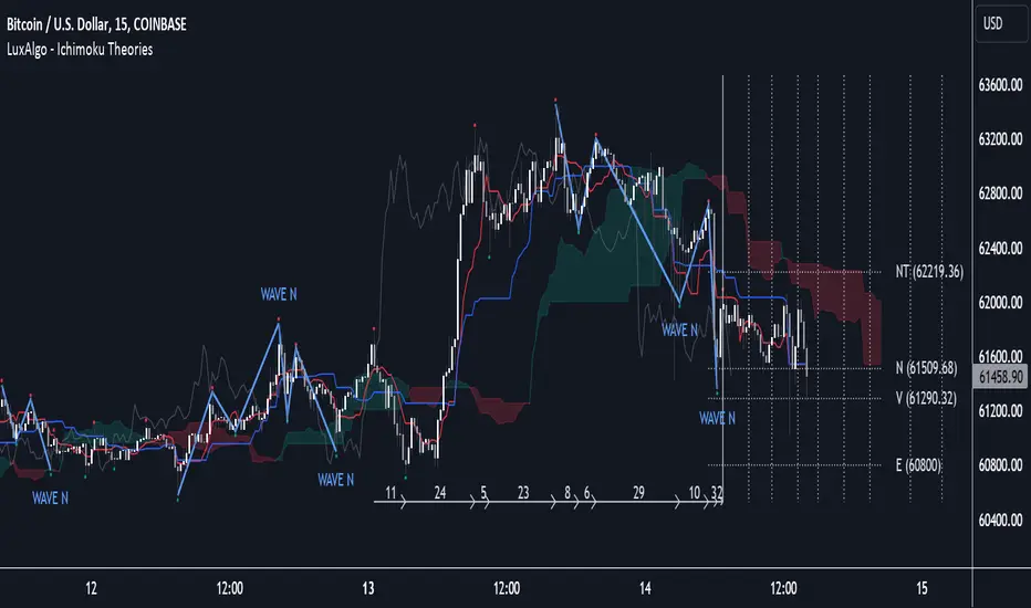
Ichimoku Theories [LuxAlgo]The Ichimoku Theories indicator is the most complete Ichimoku tool you will ever need. Four tools combined into one to harness all the power of Ichimoku Kinkō Hyō. This tool features the following concepts based on the work of Goichi Hosoda: Ichimoku Kinkō Hyō: Original Ichimoku indicator with its five main lines and kumo. Time Theory: automatic time cycle identification and forecasting to understand market timing. Wave Theory: automatic wave identification to understand market structure. Price Theory: automatic identification of developing N waves and possible price targets to understand future price behavior. 🔶 ICHIMOKU KINKŌ HYŌ Ichimoku with lines only, Kumo only and both together Let us start with the basics: the Ichimoku original indicator is a tool to understand the market, not to predict it, it is a trend-following tool, so it is best used in trending markets. Ichimoku tells us what is happening in the market and what may happen next, the aim of the tool is to provide market understanding, not trading signals. The tool is based on calculating the mid-point between the high and low of three pre-defined ranges as the equilibrium price for short (9 periods), medium (26 periods), and long (52 periods) time horizons: Tenkan sen: middle point of the range of the last 9 candles Kinjun sen: middle point of the range of the last 26 candles Senkou span A: middle point between Tankan Sen and Kijun Sen, plotted 26 candles into the future Senkou span B: midpoint of the range of the last 52 candles, plotted 26 candles into the future Chikou span: closing price plotted 26 candles into the past Kumo: area between Senkou pans A and B (kumo means cloud in Japanese) The most basic use of the tool is to use the Kumo as an area of possible support or resistance. 🔶 TIME THEORY Current cycles and forecast Time theory is a critical concept used to identify historical and current market cycles, and use these to forecast the next ones. This concept is based on the Kihon Suchi (translating to "Basic Numbers" in Japanese), these are 9 and 26, and from their combinations we obtain the following sequence: 9, 17, 26, 33, 42, 51, 65, 76, 129, 172, 200, 257 The main idea is that the market moves in cycles with periods set by the Kihon Suchi sequence. When the cycle has the same exact periods, we obtain the Taito Suchi (translating to "Same Number" in Japanese). This tool allows traders to identify historical and current market cycles and forecast the next one. 🔹 Time Cycle Identification Presentation of 4 different modes: SWINGS, HIGHS, KINJUN, and WAVES . The tool draws a horizontal line at the bottom of the chart showing the cycles detected and their size. The following settings are used: Time Cycle Mode: up to 7 different modes Wave Cycle: Which wave to use when WAVE mode is selected, only active waves in the Wave Theory settings will be used. Show Time Cycles: keep a cleaner chart by disabling cycles visualisation Show last X time cycles: how many cycles to display 🔹 Time Cycle Forecast Showcasing the two forecasting patterns: Kihon Suchi and Taito Suchi The tool plots horizontal lines, a solid anchor line, and several dotted forecast lines. The following settings are used: Show time cycle forecast: to keep things clean Forecast Pattern: comes in two flavors Kihon Suchi plots a line from the anchor at each number in the Kihon Suchi sequence. Taito Suchi plot lines from the anchor with the same size detected in the anchored cycle Anchor forecast on last X time cycle: traders can place the anchor in any detected cycle 🔶 WAVE THEORY All waves activated with overlapping The main idea behind this theory is that markets move like waves in the sea, back and forth (making swing lows and highs). Understanding the current market structure is key to having realistic expectations of what the market may do next. The waves are divided into Simple and Complex. The following settings are used: Basic Waves: allows traders to activate waves I, V and N Complex Waves: allows traders to activate waves P, Y and W Overlapping waves: to avoid missing out on any of the waves activated Show last X waves: how many waves will be displayed 🔹 Basic Waves The three basic waves The basic waves from which all waves are made are I, V, and N I wave: one leg moves V wave: two legs move, one against the other N wave: Three legs move, push, pull back, and another push 🔹 Complex Waves Three complex waves There are other waves like P wave: contracting market Y wave: expanding market W wave: double top or double bottom 🔶 PRICE THEORY All targets for the current N wave with their calculations This theory is based on identifying developing N waves and predicting potential price targets based on that developing wave. The tool displays 4 basic targets (V, E, N, and NT) and 3 extended targets (2E and 3E) according to the calculations shown in the chart above. Traders can enable or disable each target in the settings panel. 🔶 USING EVERYTHING TOGETHER Please DON'T do this. This is not how you use it Now the real example: Daily chart of Nasdaq 100 futures (NQ1!) with our Ichimoku analysis Time, waves, and price theories go together as one: First, we identify the current time cycles and wave structure. Then we forecast the next cycle and possible key price levels. We identify a Taito Suchi with both legs of exactly 41 candles on each I wave, both together forming a V wave, the last two I waves are part of a developing N wave, and the time cycle of the first one is 191 candles. We forecast this cycle into the future and get 22nd April as a key date, so in 6 trading days (as of this writing) the market would have completed another Taito Suchi pattern if a new wave and time cycle starts. As we have a developing N wave we can see the potential price targets, the price is actually between the NT and V targets. We have a bullish Kumo and the price is touching it, if this Kumo provides enough support for the price to go further, the market could reach N or E targets. So we have identified the cycle and wave, our expectations are that the current cycle is another Taito Suchi and the current wave is an N wave, the first I wave went for 191 candles, and we expect the second and third I waves together to amount to 191 candles, so in theory the N wave would complete in the next 6 trading days making a swing high. If this is indeed the case, the price could reach the V target (it is almost there) or even the N target if the bulls have the necessary strength. We do not predict the future, we can only aim to understand the current market conditions and have future expectations of when (time), how (wave), and where (price) the market will make the next turning point where one side of the market overcomes the other (bulls vs bears). To generate this chart, we change the following settings from the default ones: Swing length: 64 Show lines: disabled Forecast pattern: TAITO SUCHI Anchor forecast: 2 Show last time cycles: 5 I WAVE: enabled N WAVE: disabled Show last waves: 5 🔶 SETTINGS Show Swing Highs & Lows: Enable/Disable points on swing highs and swing lows. Swing Length: Number of candles to confirm a swing high or swing low. A higher number detects larger swings. 🔹 Ichimoku Kinkō Hyō Show Lines: Enable/Disable the 5 Ichimoku lines: Kijun sen, Tenkan sen, Senkou span A & B and Chikou Span. Show Kumo: Enable/Disable the Kumo (cloud). The Kumo is formed by 2 lines: Senkou Span A and Senkou Span B. Tenkan Sen Length: Number of candles for Tenkan Sen calculation. Kinjun Sen Length: Number of candles for the Kijun Sen calculation. Senkou Span B Length: Number of candles for Senkou Span B calculation. Chikou & Senkou Offset: Number of candles for Chikou and Senkou Span calculation. Chikou Span is plotted in the past, and Senkou Span A & B in the future. 🔹 Time Theory Show Time Cycle Forecast: Enable/Disable time cycle forecast vertical lines. Disable for better performance. Forecast Pattern: Choose between two patterns: Kihon Suchi (basic numbers) or Taito Suchi (equal numbers). Anchor forecast on last X time cycle: Number of time cycles in the past to anchor the time cycle forecast. The larger the number, the deeper in the past the anchor will be. Time Cycle Mode: Choose from 7 time cycle detection modes: Tenkan Sen cross, Kijun Sen cross, Kumo change between bullish & bearish, swing highs only, swing lows only, both swing highs & lows and wave detection. Wave Cycle: Choose which type of wave to detect from 6 different wave types when the time cycle mode is set to WAVES. Show Time Cycles: Enable/Disable time cycle horizontal lines. Disable for better performance. how last X time cycles: Maximum number of time cycles to display. 🔹 Wave Theory Basic Waves: Enable/Disable the display of basic waves, all at once or one at a time. Disable for better performance. Complex Waves: Enable/Disable complex wave display, all at once or one by one. Disable for better performance. Overlapping Waves: Enable/Disable the display of waves ending on the same swing point. Show last X waves: 'Maximum number of waves to display. 🔹 Price Theory Basic Targets: Enable/Disable horizontal price target lines. Disable for better performance. Extended Targets: Enable/Disable extended price target horizontal lines. Disable for better performance. Indicateur Pine Script®par LuxAlgo4545 6.7 K
Cycle Phase & ETA Tracker [Robust v4] Cycle Phase & ETA Tracker Description The Cycle Phase & ETA Tracker is a powerful tool for analyzing market cycles and predicting the completion of the current cycle (Estimated Time of Arrival, or ETA). It visualizes the cycle phase (0–100%) using a smoothed signal and displays the forecasted completion date with an optional confidence band based on cycle length variability. Ideal for traders looking to time their trades based on cyclical patterns, this indicator offers flexible settings for robust cycle analysis. Key Features Cycle Phase Visualization: Tracks the current cycle phase (0–100%) with color-coded zones: green (0–33%), blue (33–66%), orange (66–100%). ETA Forecast: Shows a vertical line and label indicating the estimated date of cycle completion. Confidence Band (±σ): Displays a band around the ETA to reflect uncertainty, calculated using the standard deviation of cycle lengths. Multiple Averaging Methods: Choose from three methods to calculate average cycle length: Median (Robust): Uses the median for resilience against outliers. Weighted Mean: Prioritizes recent cycles with linear or quadratic weights. Simple Mean: Applies equal weights to all cycles. Adaptive Cycle Length: Automatically adjusts cycle length based on the timeframe or allows a fixed length. Debug Histogram: Optionally displays the smoothed signal for diagnostic purposes. Setup and Usage Add the Indicator: Search for "Cycle Phase & ETA Tracker " in TradingView’s indicator library and apply it to your chart. Configure Parameters: Core Settings: Track Last N Cycles: Sets the number of recent cycles used to calculate the average cycle length (default: 20). Higher values provide stability but may lag market shifts. Source: Selects the data source for analysis (e.g., close, open, high; default: close price). Use Adaptive Cycle Length?: Enables automatic cycle length adjustment based on timeframe (e.g., shorter for intraday, longer for daily) or uses a fixed length if disabled. Fixed Cycle Length: Defines the cycle length in bars when adaptive mode is off (default: 14). Smaller values increase sensitivity to short-term cycles. Show Debug Histogram: Enables a histogram of the smoothed signal for debugging signal behavior. Cycle Length Estimation: Average Mode: Selects the method for calculating average cycle length: "Median (Robust)", "Weighted Mean", or "Simple Mean". Weights (for Weighted Mean): For "Weighted Mean", chooses "linear" (moderate emphasis on recent cycles) or "quadratic" (strong emphasis on recent cycles). ETA Visualization: Show ETA Line & Label: Toggles the display of the ETA line and date label. Show ETA Confidence Band (±σ): Toggles the confidence band around the ETA, showing the uncertainty range. Band Transparency: Adjusts the transparency of the confidence band (0 = fully transparent, 100 = fully opaque; default: 85). ETA Color: Sets the color for the ETA line, label, and confidence band (default: orange). Interpretation: The cycle phase (0–100%) indicates progress: green for the start, blue for the middle, and orange for the end of the cycle. The ETA line and label show the predicted cycle completion date. The confidence band reflects the uncertainty range (±1 standard deviation) of the ETA. If a warning "Insufficient cycles for ETA" appears, wait for the indicator to collect at least 3 cycles. Limitations Requires at least 3 cycles for reliable ETA and confidence band calculations. On low timeframes or low-volatility markets, zero-crossings may be infrequent, delaying ETA updates. Accuracy depends on proper cycle length settings (adaptive or fixed). Notes Test the indicator across different assets and timeframes to optimize settings. Use the debug histogram to troubleshoot if the ETA appears inaccurate. For feedback or suggestions, contact the author via TradingView. Cycle Phase & ETA Tracker Описание Индикатор Cycle Phase & ETA Tracker предназначен для анализа рыночных циклов и прогнозирования времени завершения текущего цикла (ETA — Estimated Time of Arrival). Он отслеживает фазы цикла (0–100%) на основе сглаженного сигнала и отображает предполагаемую дату завершения цикла с опциональной доверительной полосой, основанной на стандартном отклонении длин циклов. Индикатор идеально подходит для трейдеров, которые хотят выявлять циклические закономерности и планировать свои действия на основе прогнозируемого времени. Ключевые особенности Фазы цикла: Визуализирует текущую фазу цикла (0–100%) с цветовой кодировкой: зеленый (0–33%), синий (33–66%), оранжевый (66–100%). Прогноз ETA: Показывает вертикальную линию и метку с предполагаемой датой завершения цикла. Доверительная полоса (±σ): Отображает зону неопределенности вокруг ETA, основанную на стандартном отклонении длин циклов. Гибкие методы усреднения: Поддерживает три метода расчета средней длины цикла: Median (Robust): Медиана, устойчивая к выбросам. Weighted Mean: Взвешенное среднее, где недавние циклы имеют больший вес (линейный или квадратичный). Simple Mean: Простое среднее с равными весами. Адаптивная длина цикла: Автоматически подстраивает длину цикла под таймфрейм или позволяет задать фиксированную длину. Отладочная гистограмма: Опционально отображает сглаженный сигнал для анализа. Настройка и использование Добавьте индикатор: Найдите "Cycle Phase & ETA Tracker " в библиотеке индикаторов TradingView и добавьте его на график. Настройте параметры: Core Settings: Track Last N Cycles: Количество последних циклов для расчета средней длины (по умолчанию 20). Большие значения дают более стабильные результаты, но могут запаздывать. Source: Источник данных (по умолчанию цена закрытия). Use Adaptive Cycle Length?: Включите для автоматической настройки длины цикла по таймфрейму или отключите для использования фиксированной длины. Fixed Cycle Length: Длина цикла в барах, если адаптивная длина отключена (по умолчанию 14). Show Debug Histogram: Включите для отображения сглаженного сигнала (полезно для отладки). Cycle Length Estimation: Average Mode: Выберите метод усреднения: "Median (Robust)", "Weighted Mean" или "Simple Mean". Weights (for Weighted Mean): Для режима "Weighted Mean" выберите "linear" (умеренный вес для новых циклов) или "quadratic" (сильный вес для новых циклов). ETA Visualization: Show ETA Line & Label: Включите для отображения линии и метки ETA. Show ETA Confidence Band (±σ): Включите для отображения доверительной полосы. Band Transparency: Прозрачность полосы (0 — полностью прозрачная, 100 — полностью непрозрачная, по умолчанию 85). ETA Color: Цвет для линии, метки и полосы (по умолчанию оранжевый). Интерпретация: Фаза цикла (0–100%) показывает прогресс текущего цикла: зеленый — начало, синий — середина, оранжевый — конец. Линия и метка ETA указывают предполагаемую дату завершения цикла. Доверительная полоса показывает диапазон неопределенности (±1 стандартное отклонение). Если отображается предупреждение "Insufficient cycles for ETA", дождитесь, пока индикатор соберет минимум 3 цикла. Ограничения Требуется минимум 3 цикла для надежного расчета ETA и доверительной полосы. На низких таймфреймах или рынках с низкой волатильностью пересечения нуля могут быть редкими, что замедляет обновление ETA. Эффективность зависит от правильной настройки длины цикла (fixedL или адаптивной). Примечания Протестируйте индикатор на разных таймфреймах и активах, чтобы подобрать оптимальные параметры. Используйте отладочную гистограмму для анализа сигнала, если ETA кажется неточным. Для вопросов или предложений по улучшению свяжитесь через TradingView. Indicateur Pine Script®par Goldman_Gleb11
Aetherium Institutional Market Resonance EngineAetherium Institutional Market Resonance Engine (AIMRE) A Three-Pillar Framework for Decoding Institutional Activity 🎓 THEORETICAL FOUNDATION The Aetherium Institutional Market Resonance Engine (AIMRE) is a multi-faceted analysis system designed to move beyond conventional indicators and decode the market's underlying structure as dictated by institutional capital flow. Its philosophy is built on a singular premise: significant market moves are preceded by a convergence of context , location , and timing . Aetherium quantifies these three dimensions through a revolutionary three-pillar architecture. This system is not a simple combination of indicators; it is an integrated engine where each pillar's analysis feeds into a central logic core. A signal is only generated when all three pillars achieve a state of resonance, indicating a high-probability alignment between market organization, key liquidity levels, and cyclical momentum. ⚡ THE THREE-PILLAR ARCHITECTURE 1. 🌌 PILLAR I: THE COHERENCE ENGINE (THE 'CONTEXT') Purpose: To measure the degree of organization within the market. This pillar answers the question: " Is the market acting with a unified purpose, or is it chaotic and random? " Conceptual Framework: Institutional campaigns (accumulation or distribution) create a non-random, organized market environment. Retail-driven or directionless markets are characterized by "noise" and chaos. The Coherence Engine acts as a filter to ensure we only engage when institutional players are actively steering the market. Formulaic Concept: Coherence = f(Dominance, Synchronization) Dominance Factor: Calculates the absolute difference between smoothed buying pressure (volume-weighted bullish candles) and smoothed selling pressure (volume-weighted bearish candles), normalized by total pressure. A high value signifies a clear winner between buyers and sellers. Synchronization Factor: Measures the correlation between the streams of buying and selling pressure over the analysis window. A high positive correlation indicates synchronized, directional activity, while a negative correlation suggests choppy, conflicting action. The final Coherence score (0-100) represents the percentage of market organization. A high score is a prerequisite for any signal, filtering out unpredictable market conditions. 2. 💎 PILLAR II: HARMONIC LIQUIDITY MATRIX (THE 'LOCATION') Purpose: To identify and map high-impact institutional footprints. This pillar answers the question: " Where have institutions previously committed significant capital? " Conceptual Framework: Large institutional orders leave indelible marks on the market in the form of anomalous volume spikes at specific price levels. These are not random occurrences but are areas of intense historical interest. The Harmonic Liquidity Matrix finds these footprints and consolidates them into actionable support and resistance zones called "Harmonic Nodes." Algorithmic Process: Footprint Identification: The engine scans the historical lookback period for candles where volume > average_volume * Institutional_Volume_Filter. This identifies statistically significant volume events. Node Creation: A raw node is created at the mean price of the identified candle. Dynamic Clustering: The engine uses an ATR-based proximity algorithm. If a new footprint is identified within Node_Clustering_Distance (ATR) of an existing Harmonic Node, it is merged. The node's price is volume-weighted, and its magnitude is increased. This prevents chart clutter and consolidates nearby institutional orders into a single, more significant level. Node Decay: Nodes that are older than the Institutional_Liquidity_Scanback period are automatically removed from the chart, ensuring the analysis remains relevant to recent market dynamics. 3. 🌊 PILLAR III: CYCLICAL RESONANCE MATRIX (THE 'TIMING') Purpose: To identify the market's dominant rhythm and its current phase. This pillar answers the question: " Is the market's immediate energy flowing up or down? " Conceptual Framework: Markets move in waves and cycles of varying lengths. Trading in harmony with the current cyclical phase dramatically increases the probability of success. Aetherium employs a simplified wavelet analysis concept to decompose price action into short, medium, and long-term cycles. Algorithmic Process: Cycle Decomposition: The engine calculates three oscillators based on the difference between pairs of Exponential Moving Averages (e.g., EMA8-EMA13 for short cycle, EMA21-EMA34 for medium cycle). Energy Measurement: The 'energy' of each cycle is determined by its recent volatility (standard deviation). The cycle with the highest energy is designated as the "Dominant Cycle." Phase Analysis: The engine determines if the dominant cycles are in a bullish phase (rising from a trough) or a bearish phase (falling from a peak). Cycle Sync: The highest conviction timing signals occur when multiple cycles (e.g., short and medium) are synchronized in the same direction, indicating broad-based momentum. 🔧 COMPREHENSIVE INPUT SYSTEM Pillar I: Market Coherence Engine Coherence Analysis Window (10-50, Default: 21): The lookback period for the Coherence Engine. Lower Values (10-15): Highly responsive to rapid shifts in market control. Ideal for scalping but can be sensitive to noise. Balanced (20-30): Excellent for day trading, capturing the ebb and flow of institutional sessions. Higher Values (35-50): Smoother, more stable reading. Best for swing trading and identifying long-term institutional campaigns. Coherence Activation Level (50-90%, Default: 70%): The minimum market organization required to enable signal generation. Strict (80-90%): Only allows signals in extremely clear, powerful trends. Fewer, but potentially higher quality signals. Standard (65-75%): A robust filter that effectively removes choppy conditions while capturing most valid institutional moves. Lenient (50-60%): Allows signals in less-organized markets. Can be useful in ranging markets but may increase false signals. Pillar II: Harmonic Liquidity Matrix Institutional Liquidity Scanback (100-400, Default: 200): How far back the engine looks for institutional footprints. Short (100-150): Focuses on recent institutional activity, providing highly relevant, immediate levels. Long (300-400): Identifies major, long-term structural levels. These nodes are often extremely powerful but may be less frequent. Institutional Volume Filter (1.3-3.0, Default: 1.8): The multiplier for detecting a volume spike. High (2.5-3.0): Only registers climactic, undeniable institutional volume. Fewer, but more significant nodes. Low (1.3-1.7): More sensitive, identifying smaller but still relevant institutional interest. Node Clustering Distance (0.2-0.8 ATR, Default: 0.4): The ATR-based distance for merging nearby nodes. High (0.6-0.8): Creates wider, more consolidated zones of liquidity. Low (0.2-0.3): Creates more numerous, precise, and distinct levels. Pillar III: Cyclical Resonance Matrix Cycle Resonance Analysis (30-100, Default: 50): The lookback for determining cycle energy and dominance. Short (30-40): Tunes the engine to faster, shorter-term market rhythms. Best for scalping. Long (70-100): Aligns the timing component with the larger primary trend. Best for swing trading. Institutional Signal Architecture Signal Quality Mode (Professional, Elite, Supreme): Controls the strictness of the three-pillar confluence. Professional: Loosest setting. May generate signals if two of the three pillars are in strong alignment. Increases signal frequency. Elite: Balanced setting. Requires a clear, unambiguous resonance of all three pillars. The recommended default. Supreme: Most stringent. Requires perfect alignment of all three pillars, with each pillar exhibiting exceptionally strong readings (e.g., coherence > 85%). The highest conviction signals. Signal Spacing Control (5-25, Default: 10): The minimum bars between signals to prevent clutter and redundant alerts. 🎨 ADVANCED VISUAL SYSTEM The visual architecture of Aetherium is designed not merely for aesthetics, but to provide an intuitive, at-a-glance understanding of the complex data being processed. Harmonic Liquidity Nodes: The core visual element. Displayed as multi-layered, semi-transparent horizontal boxes. Magnitude Visualization: The height and opacity of a node's "glow" are proportional to its volume magnitude. More significant nodes appear brighter and larger, instantly drawing the eye to key levels. Color Coding: Standard nodes are blue/purple, while exceptionally high-magnitude nodes are highlighted in an accent color to denote critical importance. 🌌 Quantum Resonance Field: A dynamic background gradient that visualizes the overall market environment. Color: Shifts from cool blues/purples (low coherence) to energetic greens/cyans (high coherence and organization), providing instant context. Intensity: The brightness and opacity of the field are influenced by total market energy (a composite of coherence, momentum, and volume), making powerful market states visually apparent. 💎 Crystalline Lattice Matrix: A geometric web of lines projected from a central moving average. Mathematical Basis: Levels are projected using multiples of the Golden Ratio (Phi ≈ 1.618) and the ATR. This visualizes the natural harmonic and fractal structure of the market. It is not arbitrary but is based on mathematical principles of market geometry. 🧠 Synaptic Flow Network: A dynamic particle system visualizing the engine's "thought process." Node Density & Activation: The number of particles and their brightness/color are tied directly to the Market Coherence score. In high-coherence states, the network becomes a dense, bright, and organized web. In chaotic states, it becomes sparse and dim. ⚡ Institutional Energy Waves: Flowing sine waves that visualize market volatility and rhythm. Amplitude & Speed: The height and speed of the waves are directly influenced by the ATR and volume, providing a feel for market energy. 📊 INSTITUTIONAL CONTROL MATRIX (DASHBOARD) The dashboard is the central command console, providing a real-time, quantitative summary of each pillar's status. Header: Displays the script title and version. Coherence Engine Section: State: Displays a qualitative assessment of market organization: ◉ PHASE LOCK (High Coherence), ◎ ORGANIZING (Moderate Coherence), or ○ CHAOTIC (Low Coherence). Color-coded for immediate recognition. Power: Shows the precise Coherence percentage and a directional arrow (↗ or ↘) indicating if organization is increasing or decreasing. Liquidity Matrix Section: Nodes: Displays the total number of active Harmonic Liquidity Nodes currently being tracked. Target: Shows the price level of the nearest significant Harmonic Node to the current price, representing the most immediate institutional level of interest. Cycle Matrix Section: Cycle: Identifies the currently dominant market cycle (e.g., "MID ") based on cycle energy. Sync: Indicates the alignment of the cyclical forces: ▲ BULLISH , ▼ BEARISH , or ◆ DIVERGENT . This is the core timing confirmation. Signal Status Section: A unified status bar that provides the final verdict of the engine. It will display "QUANTUM SCAN" during neutral periods, or announce the tier and direction of an active signal (e.g., "◉ TIER 1 BUY ◉" ), highlighted with the appropriate color. 🎯 SIGNAL GENERATION LOGIC Aetherium's signal logic is built on the principle of strict, non-negotiable confluence. Condition 1: Context (Coherence Filter): The Market Coherence must be above the Coherence Activation Level. No signals can be generated in a chaotic market. Condition 2: Location (Liquidity Node Interaction): Price must be actively interacting with a significant Harmonic Liquidity Node. For a Buy Signal: Price must be rejecting the Node from below (testing it as support). For a Sell Signal: Price must be rejecting the Node from above (testing it as resistance). Condition 3: Timing (Cycle Alignment): The Cyclical Resonance Matrix must confirm that the dominant cycles are synchronized with the intended trade direction. Signal Tiering: The Signal Quality Mode input determines how strictly these three conditions must be met. 'Supreme' mode, for example, might require not only that the conditions are met, but that the Market Coherence is exceptionally high and the interaction with the Node is accompanied by a significant volume spike. Signal Spacing: A final filter ensures that signals are spaced by a minimum number of bars, preventing over-alerting in a single move. 🚀 ADVANCED TRADING STRATEGIES The Primary Confluence Strategy: The intended use of the system. Wait for a Tier 1 (Elite/Supreme) or Tier 2 (Professional/Elite) signal to appear on the chart. This represents the alignment of all three pillars. Enter after the signal bar closes, with a stop-loss placed logically on the other side of the Harmonic Node that triggered the signal. The Coherence Context Strategy: Use the Coherence Engine as a standalone market filter. When Coherence is high (>70%), favor trend-following strategies. When Coherence is low (<50%), avoid new directional trades or favor range-bound strategies. A sharp drop in Coherence during a trend can be an early warning of a trend's exhaustion. Node-to-Node Trading: In a high-coherence environment, use the Harmonic Liquidity Nodes as both entry points and profit targets. For example, after a BUY signal is generated at one Node, the next Node above it becomes a logical first profit target. ⚖️ RESPONSIBLE USAGE AND LIMITATIONS Decision Support, Not a Crystal Ball: Aetherium is an advanced decision-support tool. It is designed to identify high-probability conditions based on a model of institutional behavior. It does not predict the future. Risk Management is Paramount: No indicator can replace a sound risk management plan. Always use appropriate position sizing and stop-losses. The signals provided are probabilistic, not certainties. Past Performance Disclaimer: The market models used in this script are based on historical data. While robust, there is no guarantee that these patterns will persist in the future. Market conditions can and do change. Not a "Set and Forget" System: The indicator performs best when its user understands the concepts behind the three pillars. Use the dashboard and visual cues to build a comprehensive view of the market before acting on a signal. Backtesting is Essential: Before applying this tool to live trading, it is crucial to backtest and forward-test it on your preferred instruments and timeframes to understand its unique behavior and characteristics. 🔮 CONCLUSION The Aetherium Institutional Market Resonance Engine represents a paradigm shift from single-variable analysis to a holistic, multi-pillar framework. By quantifying the abstract concepts of market context, location, and timing into a unified, logical system, it provides traders with an unprecedented lens into the mechanics of institutional market operations. It is not merely an indicator, but a complete analytical engine designed to foster a deeper understanding of market dynamics. By focusing on the core principles of institutional order flow, Aetherium empowers traders to filter out market noise, identify key structural levels, and time their entries in harmony with the market's underlying rhythm. "In all chaos there is a cosmos, in all disorder a secret order." - Carl Jung — Dskyz, Trade with insight. Trade with confluence. Trade with Aetherium.Indicateur Pine Script®par DskyzInvestmentsMis à jour 1818510
Harmonic Frequency Visualizer [BackQuant]Harmonic Frequency Visualizer Overview Harmonic Frequency Visualizer is a cycle-analysis and cross-asset resonance tool that uses a simplified Discrete Fourier Transform (DFT) to measure how strongly specific cycle periods are present in price. It is not a “trend indicator” and it is not trying to predict direction by itself. Its job is to quantify rhythm: which repeating periods (in bars) are currently dominant, whether those cycles are expanding or contracting (phase direction), and whether multiple instruments are sharing the same dominant periods at the same time (resonance). This indicator has two main output modes: Spectrum : a frequency “snapshot” showing amplitude at each tested period for up to five instruments. Spectrogram : a history heatmap showing how the spectrum evolves through time (for the chart instrument). Spectrum Spectrogram On top of that, it produces a Dominant Cycle Oscillator derived from the dominant cycle’s phase, which gives a continuous cycle position metric (peak/trough style zones) without repainting. This is designed for traders who want cycle context the same way they want volatility context: not as a magic signal, but as structure. What “frequency” and “cycles” mean in trading terms A cycle period (say 21 bars) means: “a repeating pattern that tends to complete one full oscillation every 21 bars.” If price contains such a pattern, the DFT will detect a strong correlation between price and a 21-bar sine/cosine wave. Markets do not have perfectly stable periodic motion, but they often show: Mean-reverting swings around value. Trend pulses with pullback cadence. Volatility clustering that creates rhythmic expansions and contractions. Cycle tools are trying to measure those repeating components, and DFT is the standard mathematical way to do it. Where DFT comes from (the core idea) The Discrete Fourier Transform comes from Fourier analysis, a foundational signal processing concept: Fourier’s idea : any sufficiently well-behaved signal can be expressed as a sum of sine and cosine waves at different frequencies, each with: An amplitude (how strong that wave is). A phase (where you are within the wave cycle). In continuous math you get the Fourier Transform. In sampled data (like candles) you use the Discrete Fourier Transform. It converts a time series (price over time) into a frequency description (strength of different cycles). In markets: Time domain: candles and price series. Frequency domain: cycle periods and their strengths. Why sine and cosine, not just sine A sine wave alone cannot represent every phase alignment cleanly. DFT uses both cosine and sine components because together they form an orthogonal basis that can represent any phase shift. You can think of it like this: Cosine component captures “in-phase” alignment with the cycle. Sine component captures “quadrature” (90-degree shifted) alignment. Combining them gives full information: amplitude + phase. Mathematically, a single frequency component can be written as: A * cos(ωt + φ) But DFT estimates A and φ by separately accumulating cosine and sine projections. How this script implements the DFT (and what it is actually measuring) This is not a full-spectrum FFT across every frequency. It is a targeted DFT across a fixed set of cycle periods: Tested periods The script tests 8 predefined periods: 5, 8, 13, 21, 34, 55, 89, 120 These are Fibonacci-like cycle candidates commonly used in cycle/market structure work. The point is not that Fibonacci is magic. The point is that these represent a reasonable spread from short to long rhythms without needing hundreds of frequencies (which would be heavy in Pine). Normalization step (important) Before computing the DFT, the script normalizes the series: mn = SMA(src, lookback) sd = stdev(src, lookback) norm = (src - mn) / sd (if sd != 0) Why normalize: DFT amplitude depends on the scale of the input series. If you compare BTC and TLT raw prices, the magnitude is meaningless. Z-score normalization makes amplitude more comparable across instruments and regimes. So the spectrum is measuring “cyclical structure in standardized deviations,” not raw dollars. Projection onto cosine and sine For each tested period P: ω = 2π / P (angular frequency for that period) Compute: - sCos = Σ(norm * cos(ωk)) - sSin = Σ(norm * sin(ωk)) Interpretation: You are correlating the last window of normalized price with a cosine wave of period P. And also correlating it with a sine wave of period P. If the price has a strong P-bar rhythm, these sums grow in magnitude. Window length detail The script uses: window = min(lookback - 1, 99) So even if lookback is 200, the internal DFT accumulation caps at 100 bars for performance stability. This is a deliberate trade: stable computation in Pine, while still letting you define normalization lookback and overall context. Amplitude computation Once sCos and sSin are computed: raw magnitude = sqrt(sCos² + sSin²) This is the length of the vector (sCos, sSin). That vector length is the standard way to combine the orthogonal components into one strength metric. Then it scales it into a 0–100 “display amplitude”: amp = sqrt(sCos² + sSin²) / lookback * 100 * sensitivity amp is capped to 100 So: Higher amplitude means stronger alignment with that cycle period. Sensitivity is a user control to amplify or damp the display scaling. Important: amplitude here is not a probability, and it is not guaranteed “signal quality.” It is a standardized “how much of that cycle exists in the recent window” metric. Phase computation Phase is computed using atan2(sSin, sCos). That matters because: A simple atan(sin/cos) fails in different quadrants. atan2 correctly resolves the angle from -π to +π. Phase tells you where you are within the cycle: Two cycles can have same amplitude but opposite phase. Phase is what lets you infer “approaching peak vs trough” behavior. Dominant cycle selection The script chooses the dominant cycle as the period with the highest amplitude among the tested periods: domIdx = argmax(amp ) domAmp = max amplitude domPhase = phase at domIdx This dominant cycle is used for: Spectrogram history matrix (chart symbol). Dominant cycle oscillator. Data window outputs (dominant period, oscillator value). Spectrum View: what you see and how to read it In Spectrum mode, the indicator draws a frequency snapshot for up to five instruments. Each instrument gets a spectrum line (or bars/area depending on style) plotted across the 8 periods on the x-axis, with amplitude (0–100) on the y-axis. X-axis meaning Each x position corresponds to a period (5 → 120 bars). You are not looking at “frequency in Hz.” You are looking at “period in bars,” which is more intuitive in trading. Y-axis meaning Amplitude is a scaled measure of how strongly that period is present in the recent normalized data. Higher means stronger. Plot styles Waveform: connects amplitude points into a continuous shape, best for seeing spectrum shape. Bars: draws vertical bars per period, best for quick comparison. Area: similar to waveform but filled toward baseline for emphasis. Dominant peaks and phase direction labels The script highlights dominant cycles per symbol (if enabled): If max amplitude > 20, it labels that peak with the symbol name. If Show Phase Direction is enabled, it appends ▲ or ▼. Phase direction logic: rising = sin(phase) < 0 ▲ means cycle is in a “rising” phase segment ▼ means cycle is in a “falling” phase segment This is not “price will rise now.” It is “the dominant cycle’s instantaneous phase suggests you are on the upward vs downward half of that oscillation.” In real markets, you use this as context, not as a standalone trade trigger. It also draws small ▲/▼ markers on secondary peaks (amp > 15) to show phase direction of other meaningful cycles, giving you a richer picture than “one dominant period.” Resonance Zones: cross-asset harmonic alignment Resonance is where this tool becomes more than a single-chart curiosity. What resonance means here A resonance zone is flagged when at least 3 out of 5 instruments have strong amplitude at the same tested period. Mechanically: For each period i: - Count instruments with amp > 30 - If count >= 3, mark resonance at that period When resonance is detected: A vertical highlight box is drawn behind that period. A ⚡ marker is printed at the top. Interpretation: Multiple assets are expressing a similar cycle length at the same time. This can indicate macro rhythm, shared liquidity timing, or cross-market synchronization. This is especially useful when your instrument set includes: Rates proxy (TLT), commodities (oil, gold), and crypto indices. You can visually spot when markets are “vibrating” together at a shared period. Resonance is not automatically bullish or bearish. It is telling you “cycle length agreement,” which can help with timing models and contextual trade planning. Spectrogram View: frequency over time Spectrum mode is a snapshot. Spectrogram mode adds time evolution. What a spectrogram is A spectrogram is a 2D heatmap where: Rows = different periods (frequency bands). Columns = time history (bars ago → now). Color = amplitude strength. This allows you to see: Which cycles are persistent vs fleeting. When dominant cycle shifts occur (energy moves from one period to another). Cycle regime transitions (short cycles dominating in chop vs longer cycles dominating in trend). How the script builds the spectrogram matrix It maintains a matrix with: NUM_PERIODS rows (8 periods) histBars columns (history length) Each bar: Remove the oldest column. Append the newest amplitude array from chartSpec. So the spectrogram is always a rolling history of the chart symbol’s cycle amplitudes. It does not attempt to store five symbols (too heavy), it focuses on the active chart for time evolution. Heat coloring Amplitude values map to a custom gradient: Low = dark blue Mid = blue/cyan to orange High = yellow This makes dominant energy bands visually obvious. A stable bright band means persistent cycle dominance. Dominant Cycle Oscillator: phase mapped to a 0–100 oscillator The oscillator is derived from the dominant cycle phase (chart symbol): oscRaw = cos(domPhase) oscValue = 50 + 50 * oscRaw (maps -1..1 into 0..100) Interpretation: When cos(phase) ≈ +1, oscillator near 100 (cycle peak zone). When cos(phase) ≈ -1, oscillator near 0 (cycle trough zone). Midline 50 corresponds to the quarter-cycle transition points. It also colors the oscillator by phase direction: oscRising = sin(domPhase) < 0 Rising phase = green-ish Falling phase = red-ish This gives you a clean timing reference: The dominant period tells you the cycle length. The oscillator tells you where you are within that cycle. It is not forecasting price. It is telling you the current phase position of the strongest detected cycle component. Alerts and practical timing usage Alerts are based on the oscillator: Cross above 80: dominant cycle entering peak zone. Cross below 20: dominant cycle entering trough zone. Cross 50: midline cross (phase transition). In practice, you use these as “timing context” alerts, for example: If your trend model is bullish and cycle oscillator enters trough zone, it can hint at a favorable pullback timing window. If you are mean-reversion trading and cycle peak zone aligns with resistance, that confluence matters. Again: cycle timing needs structure confirmation. The oscillator alone is not a trade system. Multi-instrument design and non-repaint behavior The indicator requests five external instruments via request.security. It uses: close with lookahead_on This forces the data to be “previous confirmed close” so the spectral calculations do not repaint intra-bar. That matters because cycle measures can change drastically within a bar if you let them use live values. So: Spectra for external symbols are based on confirmed historical closes. Chart symbol spectrogram and oscillator are also stable in the sense they depend on confirmed series values (dominant phase updates bar-to-bar). Key parameters and how they change behavior Analysis Lookback Affects normalization and the DFT window cap: Higher lookback stabilizes mean/stdev normalization and reduces random shifts. Lower lookback makes the tool more reactive but more prone to regime noise. Because the inner DFT accumulation caps at 100 bars, very high lookback mostly affects normalization rather than the raw projection length. Sensitivity Scales displayed amplitude: Higher sensitivity makes peaks stand out more. Lower sensitivity compresses amplitude. It is a display control, not a physics constant. View Mode Spectrum: cross-asset snapshot comparison, resonance detection. Spectrogram: time evolution of cycle energy for chart symbol. Show Phase Direction Adds ▲/▼ markers derived from sin(phase). Useful for quick cycle position intuition, but do not treat ▲ as “buy.” Show Resonance Zones Marks periods where many instruments share strong energy. Useful for macro rhythm alignment. Highlight Dominant Cycles Labels peaks. If you disable it, the chart becomes cleaner but less informative. Spectrogram History Controls how many columns are stored. Higher makes a longer heatmap but costs more drawing. Limitations and what not to assume This tool is honest DSP applied to market data, but market data is not a stationary sine wave generator. Key limitations: Cycles drift. Dominant period can shift as regime changes. The tool only tests 8 candidate periods. If the true dominant period is 30, it will express as energy near 34 or distributed across neighbors. Normalization helps comparability, but does not make amplitude “absolute truth.” DFT assumes a stable frequency over the window. Markets often violate that. Phase-based oscillators are timing aids, not predictors. This is why the indicator is best used as: Context for entries/exits, not a standalone system. A way to see when cycle energy concentrates or disperses. A way to detect when multiple markets share a timing rhythm. How to use it properly (workflows) 1) Cycle regime identification If short periods (5–13) dominate, market is often choppy, reactive, and mean-reverting. If mid periods (21–55) dominate, market often shows swing structure. If long periods (89–120) dominate, market can be in slower macro drift, trend legs, or compressed volatility regimes. 2) Timing layer for an existing strategy Use your trend model to decide direction. Use dominant cycle oscillator to decide timing within that direction. Use spectrogram to avoid trading when dominant period is unstable or flipping rapidly. 3) Cross-asset confirmation If you see resonance at a period, watch whether your main instrument is also showing strength there. Resonance can justify holding a cycle-based timing thesis with more confidence because it is not isolated. 4) Expectation management If the spectrum is flat (no peaks above threshold), that is information: No clean dominant cycle, randomness dominates. Cycle-based timing will be unreliable. Summary Harmonic Frequency Visualizer uses a targeted Discrete Fourier Transform across predefined cycle periods to measure amplitude and phase of cyclical components in price. It supports multi-instrument spectrum comparison, resonance detection when several markets share strong energy at the same periods, and a spectrogram heatmap for the chart instrument showing how cycle dominance evolves over time. A dominant cycle oscillator maps phase into a 0–100 timing readout with alerts for peak/trough/midline transitions. It is a cycle context engine designed to complement trend, structure, and risk models, not replace them.Indicateur Pine Script®par BackQuant51
Quinn-Fernandes Fourier Transform of Filtered Price [Loxx]Down the Rabbit Hole We Go: A Deep Dive into the Mysteries of Quinn-Fernandes Fast Fourier Transform and Hodrick-Prescott Filtering In the ever-evolving landscape of financial markets, the ability to accurately identify and exploit underlying market patterns is of paramount importance. As market participants continuously search for innovative tools to gain an edge in their trading and investment strategies, advanced mathematical techniques, such as the Quinn-Fernandes Fourier Transform and the Hodrick-Prescott Filter, have emerged as powerful analytical tools. This comprehensive analysis aims to delve into the rich history and theoretical foundations of these techniques, exploring their applications in financial time series analysis, particularly in the context of a sophisticated trading indicator. Furthermore, we will critically assess the limitations and challenges associated with these transformative tools, while offering practical insights and recommendations for overcoming these hurdles to maximize their potential in the financial domain. Our investigation will begin with a comprehensive examination of the origins and development of both the Quinn-Fernandes Fourier Transform and the Hodrick-Prescott Filter. We will trace their roots from classical Fourier analysis and time series smoothing to their modern-day adaptive iterations. We will elucidate the key concepts and mathematical underpinnings of these techniques and demonstrate how they are synergistically used in the context of the trading indicator under study. As we progress, we will carefully consider the potential drawbacks and challenges associated with using the Quinn-Fernandes Fourier Transform and the Hodrick-Prescott Filter as integral components of a trading indicator. By providing a critical evaluation of their computational complexity, sensitivity to input parameters, assumptions about data stationarity, performance in noisy environments, and their nature as lagging indicators, we aim to offer a balanced and comprehensive understanding of these powerful analytical tools. In conclusion, this in-depth analysis of the Quinn-Fernandes Fourier Transform and the Hodrick-Prescott Filter aims to provide a solid foundation for financial market participants seeking to harness the potential of these advanced techniques in their trading and investment strategies. By shedding light on their history, applications, and limitations, we hope to equip traders and investors with the knowledge and insights necessary to make informed decisions and, ultimately, achieve greater success in the highly competitive world of finance. █ Fourier Transform and Hodrick-Prescott Filter in Financial Time Series Analysis Financial time series analysis plays a crucial role in making informed decisions about investments and trading strategies. Among the various methods used in this domain, the Fourier Transform and the Hodrick-Prescott (HP) Filter have emerged as powerful techniques for processing and analyzing financial data. This section aims to provide a comprehensive understanding of these two methodologies, their significance in financial time series analysis, and their combined application to enhance trading strategies. █ The Quinn-Fernandes Fourier Transform: History, Applications, and Use in Financial Time Series Analysis The Quinn-Fernandes Fourier Transform is an advanced spectral estimation technique developed by John J. Quinn and Mauricio A. Fernandes in the early 1990s. It builds upon the classical Fourier Transform by introducing an adaptive approach that improves the identification of dominant frequencies in noisy signals. This section will explore the history of the Quinn-Fernandes Fourier Transform, its applications in various domains, and its specific use in financial time series analysis. History of the Quinn-Fernandes Fourier Transform The Quinn-Fernandes Fourier Transform was introduced in a 1993 paper titled "The Application of Adaptive Estimation to the Interpolation of Missing Values in Noisy Signals." In this paper, Quinn and Fernandes developed an adaptive spectral estimation algorithm to address the limitations of the classical Fourier Transform when analyzing noisy signals. The classical Fourier Transform is a powerful mathematical tool that decomposes a function or a time series into a sum of sinusoids, making it easier to identify underlying patterns and trends. However, its performance can be negatively impacted by noise and missing data points, leading to inaccurate frequency identification. Quinn and Fernandes sought to address these issues by developing an adaptive algorithm that could more accurately identify the dominant frequencies in a noisy signal, even when data points were missing. This adaptive algorithm, now known as the Quinn-Fernandes Fourier Transform, employs an iterative approach to refine the frequency estimates, ultimately resulting in improved spectral estimation. Applications of the Quinn-Fernandes Fourier Transform The Quinn-Fernandes Fourier Transform has found applications in various fields, including signal processing, telecommunications, geophysics, and biomedical engineering. Its ability to accurately identify dominant frequencies in noisy signals makes it a valuable tool for analyzing and interpreting data in these domains. For example, in telecommunications, the Quinn-Fernandes Fourier Transform can be used to analyze the performance of communication systems and identify interference patterns. In geophysics, it can help detect and analyze seismic signals and vibrations, leading to improved understanding of geological processes. In biomedical engineering, the technique can be employed to analyze physiological signals, such as electrocardiograms, leading to more accurate diagnoses and better patient care. Use of the Quinn-Fernandes Fourier Transform in Financial Time Series Analysis In financial time series analysis, the Quinn-Fernandes Fourier Transform can be a powerful tool for isolating the dominant cycles and frequencies in asset price data. By more accurately identifying these critical cycles, traders can better understand the underlying dynamics of financial markets and develop more effective trading strategies. The Quinn-Fernandes Fourier Transform is used in conjunction with the Hodrick-Prescott Filter, a technique that separates the underlying trend from the cyclical component in a time series. By first applying the Hodrick-Prescott Filter to the financial data, short-term fluctuations and noise are removed, resulting in a smoothed representation of the underlying trend. This smoothed data is then subjected to the Quinn-Fernandes Fourier Transform, allowing for more accurate identification of the dominant cycles and frequencies in the asset price data. By employing the Quinn-Fernandes Fourier Transform in this manner, traders can gain a deeper understanding of the underlying dynamics of financial time series and develop more effective trading strategies. The enhanced knowledge of market cycles and frequencies can lead to improved risk management and ultimately, better investment performance. The Quinn-Fernandes Fourier Transform is an advanced spectral estimation technique that has proven valuable in various domains, including financial time series analysis. Its adaptive approach to frequency identification addresses the limitations of the classical Fourier Transform when analyzing noisy signals, leading to more accurate and reliable analysis. By employing the Quinn-Fernandes Fourier Transform in financial time series analysis, traders can gain a deeper understanding of the underlying financial instrument. Drawbacks to the Quinn-Fernandes algorithm While the Quinn-Fernandes Fourier Transform is an effective tool for identifying dominant cycles and frequencies in financial time series, it is not without its drawbacks. Some of the limitations and challenges associated with this indicator include: 1. Computational complexity: The adaptive nature of the Quinn-Fernandes Fourier Transform requires iterative calculations, which can lead to increased computational complexity. This can be particularly challenging when analyzing large datasets or when the indicator is used in real-time trading environments. 2. Sensitivity to input parameters: The performance of the Quinn-Fernandes Fourier Transform is dependent on the choice of input parameters, such as the number of harmonic periods, frequency tolerance, and Hodrick-Prescott filter settings. Choosing inappropriate parameter values can lead to inaccurate frequency identification or reduced performance. Finding the optimal parameter settings can be challenging, and may require trial and error or a more sophisticated optimization process. 3. Assumption of stationary data: The Quinn-Fernandes Fourier Transform assumes that the underlying data is stationary, meaning that its statistical properties do not change over time. However, financial time series data is often non-stationary, with changing trends and volatility. This can limit the effectiveness of the indicator and may require additional preprocessing steps, such as detrending or differencing, to ensure the data meets the assumptions of the algorithm. 4. Limitations in noisy environments: Although the Quinn-Fernandes Fourier Transform is designed to handle noisy signals, its performance may still be negatively impacted by significant noise levels. In such cases, the identification of dominant frequencies may become less reliable, leading to suboptimal trading signals or strategies. 5. Lagging indicator: As with many technical analysis tools, the Quinn-Fernandes Fourier Transform is a lagging indicator, meaning that it is based on past data. While it can provide valuable insights into historical market dynamics, its ability to predict future price movements may be limited. This can result in false signals or late entries and exits, potentially reducing the effectiveness of trading strategies based on this indicator. Despite these drawbacks, the Quinn-Fernandes Fourier Transform remains a valuable tool for financial time series analysis when used appropriately. By being aware of its limitations and adjusting input parameters or preprocessing steps as needed, traders can still benefit from its ability to identify dominant cycles and frequencies in financial data, and use this information to inform their trading strategies. █ Deep-dive into the Hodrick-Prescott Fitler The Hodrick-Prescott (HP) filter is a statistical tool used in economics and finance to separate a time series into two components: a trend component and a cyclical component. It is a powerful tool for identifying long-term trends in economic and financial data and is widely used by economists, central banks, and financial institutions around the world. The HP filter was first introduced in the 1990s by economists Robert Hodrick and Edward Prescott. It is a simple, two-parameter filter that separates a time series into a trend component and a cyclical component. The trend component represents the long-term behavior of the data, while the cyclical component captures the shorter-term fluctuations around the trend. The HP filter works by minimizing the following objective function: Minimize: (Sum of Squared Deviations) + λ (Sum of Squared Second Differences) Where: 1. The first term represents the deviation of the data from the trend. 2. The second term represents the smoothness of the trend. 3. λ is a smoothing parameter that determines the degree of smoothness of the trend. The smoothing parameter λ is typically set to a value between 100 and 1600, depending on the frequency of the data. Higher values of λ lead to a smoother trend, while lower values lead to a more volatile trend. The HP filter has several advantages over other smoothing techniques. It is a non-parametric method, meaning that it does not make any assumptions about the underlying distribution of the data. It also allows for easy comparison of trends across different time series and can be used with data of any frequency. Another significant advantage of the HP Filter is its ability to adapt to changes in the underlying trend. This feature makes it particularly well-suited for analyzing financial time series, which often exhibit non-stationary behavior. By employing the HP Filter to smooth financial data, traders can more accurately identify and analyze the long-term trends that drive asset prices, ultimately leading to better-informed investment decisions. However, the HP filter also has some limitations. It assumes that the trend is a smooth function, which may not be the case in some situations. It can also be sensitive to changes in the smoothing parameter λ, which may result in different trends for the same data. Additionally, the filter may produce unrealistic trends for very short time series. Despite these limitations, the HP filter remains a valuable tool for analyzing economic and financial data. It is widely used by central banks and financial institutions to monitor long-term trends in the economy, and it can be used to identify turning points in the business cycle. The filter can also be used to analyze asset prices, exchange rates, and other financial variables. The Hodrick-Prescott filter is a powerful tool for analyzing economic and financial data. It separates a time series into a trend component and a cyclical component, allowing for easy identification of long-term trends and turning points in the business cycle. While it has some limitations, it remains a valuable tool for economists, central banks, and financial institutions around the world. █ Combined Application of Fourier Transform and Hodrick-Prescott Filter The integration of the Fourier Transform and the Hodrick-Prescott Filter in financial time series analysis can offer several benefits. By first applying the HP Filter to the financial data, traders can remove short-term fluctuations and noise, effectively isolating the underlying trend. This smoothed data can then be subjected to the Fourier Transform, allowing for the identification of dominant cycles and frequencies with greater precision. By combining these two powerful techniques, traders can gain a more comprehensive understanding of the underlying dynamics of financial time series. This enhanced knowledge can lead to the development of more effective trading strategies, better risk management, and ultimately, improved investment performance. The Fourier Transform and the Hodrick-Prescott Filter are powerful tools for financial time series analysis. Each technique offers unique benefits, with the Fourier Transform being adept at identifying dominant cycles and frequencies, and the HP Filter excelling at isolating long-term trends from short-term noise. By combining these methodologies, traders can develop a deeper understanding of the underlying dynamics of financial time series, leading to more informed investment decisions and improved trading strategies. As the financial markets continue to evolve, the combined application of these techniques will undoubtedly remain an essential aspect of modern financial analysis. █ Features Endpointed and Non-repainting This is an endpointed and non-repainting indicator. These are crucial factors that contribute to its usefulness and reliability in trading and investment strategies. Let us break down these concepts and discuss why they matter in the context of a financial indicator. 1. Endpoint nature: An endpoint indicator uses the most recent data points to calculate its values, ensuring that the output is timely and reflective of the current market conditions. This is in contrast to non-endpoint indicators, which may use earlier data points in their calculations, potentially leading to less timely or less relevant results. By utilizing the most recent data available, the endpoint nature of this indicator ensures that it remains up-to-date and relevant, providing traders and investors with valuable and actionable insights into the market dynamics. 2. Non-repainting characteristic: A non-repainting indicator is one that does not change its values or signals after they have been generated. This means that once a signal or a value has been plotted on the chart, it will remain there, and future data will not affect it. This is crucial for traders and investors, as it offers a sense of consistency and certainty when making decisions based on the indicator's output. Repainting indicators, on the other hand, can change their values or signals as new data comes in, effectively "repainting" the past. This can be problematic for several reasons: a. Misleading results: Repainting indicators can create the illusion of a highly accurate or successful trading system when backtesting, as the indicator may adapt its past signals to fit the historical price data. This can lead to overly optimistic performance results that may not hold up in real-time trading. b. Decision-making uncertainty: When an indicator repaints, it becomes challenging for traders and investors to trust its signals, as the signal that prompted a trade may change or disappear after the fact. This can create confusion and indecision, making it difficult to execute a consistent trading strategy. The endpoint and non-repainting characteristics of this indicator contribute to its overall reliability and effectiveness as a tool for trading and investment decision-making. By providing timely and consistent information, this indicator helps traders and investors make well-informed decisions that are less likely to be influenced by misleading or shifting data. Inputs Source: This input determines the source of the price data to be used for the calculations. Users can select from options like closing price, opening price, high, low, etc., based on their preferences. Changing the source of the price data (e.g., from closing price to opening price) will alter the base data used for calculations, which may lead to different patterns and cycles being identified. Calculation Bars: This input represents the number of past bars used for the calculation. A higher value will use more historical data for the analysis, while a lower value will focus on more recent price data. Increasing the number of past bars used for calculation will incorporate more historical data into the analysis. This may lead to a more comprehensive understanding of long-term trends but could also result in a slower response to recent price changes. Decreasing this value will focus more on recent data, potentially making the indicator more responsive to short-term fluctuations. Harmonic Period: This input represents the harmonic period, which is the number of harmonics used in the Fourier Transform. A higher value will result in more harmonics being used, potentially capturing more complex cycles in the price data. Increasing the harmonic period will include more harmonics in the Fourier Transform, potentially capturing more complex cycles in the price data. However, this may also introduce more noise and make it harder to identify clear patterns. Decreasing this value will focus on simpler cycles and may make the analysis clearer, but it might miss out on more complex patterns. Frequency Tolerance: This input represents the frequency tolerance, which determines how close the frequencies of the harmonics must be to be considered part of the same cycle. A higher value will allow for more variation between harmonics, while a lower value will require the frequencies to be more similar. Increasing the frequency tolerance will allow for more variation between harmonics, potentially capturing a broader range of cycles. However, this may also introduce noise and make it more difficult to identify clear patterns. Decreasing this value will require the frequencies to be more similar, potentially making the analysis clearer, but it might miss out on some cycles. Number of Bars to Render: This input determines the number of bars to render on the chart. A higher value will result in more historical data being displayed, but it may also slow down the computation due to the increased amount of data being processed. Increasing the number of bars to render on the chart will display more historical data, providing a broader context for the analysis. However, this may also slow down the computation due to the increased amount of data being processed. Decreasing this value will speed up the computation, but it will provide less historical context for the analysis. Smoothing Mode: This input allows the user to choose between two smoothing modes for the source price data: no smoothing or Hodrick-Prescott (HP) smoothing. The choice depends on the user's preference for how the price data should be processed before the Fourier Transform is applied. Choosing between no smoothing and Hodrick-Prescott (HP) smoothing will affect the preprocessing of the price data. Using HP smoothing will remove some of the short-term fluctuations from the data, potentially making the analysis clearer and more focused on longer-term trends. Not using smoothing will retain the original price fluctuations, which may provide more detail but also introduce noise into the analysis. Hodrick-Prescott Filter Period: This input represents the Hodrick-Prescott filter period, which is used if the user chooses to apply HP smoothing to the price data. A higher value will result in a smoother curve, while a lower value will retain more of the original price fluctuations. Increasing the Hodrick-Prescott filter period will result in a smoother curve for the price data, emphasizing longer-term trends and minimizing short-term fluctuations. Decreasing this value will retain more of the original price fluctuations, potentially providing more detail but also introducing noise into the analysis. Alets and signals This indicator featues alerts, signals and bar coloring. You have to option to turn these on/off in the settings menu. Maximum Bars Restriction This indicator requires a large amount of processing power to render on the chart. To reduce overhead, the setting "Number of Bars to Render" is set to 500 bars. You can adjust this to you liking. █ Related Indicators and Libraries Goertzel Cycle Composite Wave Goertzel Browser Fourier Spectrometer of Price w/ Extrapolation Forecast Fourier Extrapolator of 'Caterpillar' SSA of Price Normalized, Variety, Fast Fourier Transform Explorer Real-Fast Fourier Transform of Price Oscillator Real-Fast Fourier Transform of Price w/ Linear Regression Fourier Extrapolation of Variety Moving Averages Fourier Extrapolator of Variety RSI w/ Bollinger Bands Fourier Extrapolator of Price w/ Projection Forecast Fourier Extrapolator of Price STD-Stepped Fast Cosine Transform Moving Average Variety RSI of Fast Discrete Cosine Transform loxfft Indicateur Pine Script®par loxx66394
Intraday Toolkit1. Visual Components of the Indicator Understanding the visual cues is essential for quick decision-making during fast-moving intraday sessions: Trend Background: The background color represents the Primary Cycle (80-period) bias. Green indicates a bullish trend (price is above the primary cycle), and red indicates a bearish trend (price is below the primary cycle). The Three Cycles: Yellow Line: Short Cycle (20) – Used for momentum triggers. Orange Line: Mid Cycle (40) – Represents the baseline for volatility envelopes. Red Line: Primary Cycle (80) – Defines the overall trend direction. Volatility Envelopes: Two green lines plotted at a distance (1.5x ATR) from the Mid Cycle. These act as exhaustion zones where price is likely to revert or consolidate. Rule 3 Signals (Purple Circles): These appear when a specific 3-candle momentum breakout occurs. 2. Trading Strategy for 5m & 15m This toolkit is most effective when you use the 15m chart for trend confirmation and the 5m chart for precise entries. Long (Buy) Setup Enter a long position when the following alignment occurs: Bullish Bias: The background must be Green (Price > Primary Cycle). Cycle Low: A pivot low must have been detected (the indicator identifies a local bottom). Momentum Trigger: Price must close above the Yellow Short Cycle line while the previous candle was below it. Rule 3 Confirmation: If a purple circle appears simultaneously, it confirms strong buying momentum. Short (Sell) Setup Enter a short position when the following alignment occurs: Bearish Bias: The background must be Red (Price < Primary Cycle). Cycle High: A pivot high must have been detected (the indicator identifies a local top). Momentum Trigger: Price must close below the Yellow Short Cycle line while the previous candle was above it. Rule 3 Confirmation: A purple circle above the price confirms a bearish momentum shift. 3. Exit and Take-Profit Logic The script includes "State Control" to manage your exits effectively: Targeting the Envelopes: The primary profit target is the Outer Green Envelope. If price touches the upper envelope (for longs) or lower envelope (for shorts), the trend may be exhausted. Momentum Exit: If price crosses back over the Yellow Short Cycle line in the opposite direction of your trade, the toolkit considers the move over and signals an exit. 4. Specific Tips for Day Trading Avoid "Counter-Trend" Signals: Do not take Buy signals if the background is Red, or Sell signals if the background is Green. The logic is built to filter these out for better win rates. The "Rule 3" Advantage: Use the purple circles as a "second chance" entry. If you missed the initial Buy/Sell signal, a Rule 3 circle indicates momentum is still strong in that direction. Timeframe Synergy: * 15m: Best for seeing the "Big Picture" and avoiding noise. 5m: Best for finding entries with smaller stop-losses near the Yellow Short Cycle line.Indicateur Pine Script®par sunya13
TASC 2025.01 Linear Predictive Filters█ OVERVIEW This script implements a suite of tools for identifying and utilizing dominant cycles in time series data, as introduced by John Ehlers in the "Linear Predictive Filters And Instantaneous Frequency" article featured in the January 2025 edition of TASC's Traders' Tips . Dominant cycle information can help traders adapt their indicators and strategies to changing market conditions. █ CONCEPTS Conventional technical indicators and strategies often rely on static, unchanging parameters, which may fail to account for the dynamic nature of market data. In his article, John Ehlers applies digital signal processing principles to address this issue, introducing linear predictive filters to identify cyclic information for adapting indicators and strategies to evolving market conditions. This approach treats market data as a complex series in the time domain. Analyzing the series in the frequency domain reveals information about its cyclic components. To reduce the impact of frequencies outside a range of interest and focus on a specific range of cycles, Ehlers applies second-order highpass and lowpass filters to the price data, which attenuate or remove wavelengths outside the desired range. This band-limited analysis isolates specific parts of the frequency spectrum for various trading styles, e.g., longer wavelengths for position trading or shorter wavelengths for swing trading. After filtering the series to produce band-limited data, Ehlers applies a linear predictive filter to predict future values a few bars ahead. The filter, calculated based on the techniques proposed by Lloyd Griffiths, adaptively minimizes the error between the latest data point and prediction, successively adjusting its coefficients to align with the band-limited series. The filter's coefficients can then be applied to generate an adaptive estimate of the band-limited data's structure in the frequency domain and identify the dominant cycle. █ USAGE This script implements the following tools presented in the article: Griffiths Predictor This tool calculates a linear predictive filter to forecast future data points in band-limited price data. The crosses between the prediction and signal lines can provide potential trade signals. Griffiths Spectrum This tool calculates a partial frequency spectrum of the band-limited price data derived from the linear predictive filter's coefficients, displaying a color-coded representation of the frequency information in the pane. This mode's display represents the data as a periodogram . The bottom of each plotted bar corresponds to a specific analyzed period (inverse of frequency), and the bar's color represents the presence of that periodic cycle in the time series relative to the one with the highest presence (i.e., the dominant cycle). Warmer, brighter colors indicate a higher presence of the cycle in the series, whereas darker colors indicate a lower presence. Griffiths Dominant Cycle This tool compares the cyclic components within the partial spectrum and identifies the frequency with the highest power, i.e., the dominant cycle . Traders can use this dominant cycle information to tune other indicators and strategies, which may help promote better alignment with dynamic market conditions. Notes on parameters Bandpass boundaries: In the article, Ehlers recommends an upper bound of 125 bars or higher to capture longer-term cycles for position trading. He recommends an upper bound of 40 bars and a lower bound of 18 bars for swing trading. If traders use smaller lower bounds, Ehlers advises a minimum of eight bars to minimize the potential effects of aliasing. Data length: The Griffiths predictor can use a relatively small data length, as autocorrelation diminishes rapidly with lag. However, for optimal spectrum and dominant cycle calculations, the length must match or exceed the upper bound of the bandpass filter. Ehlers recommends avoiding excessively long lengths to maintain responsiveness to shorter-term cycles. Indicateur Pine Script®par PineCodersTASC1212 1.6 K