Lysergik's Stochastic SynergyThis indicator shows the average Stochastic RSI output of the 15m, 1h, 2h, 4h, and Daily Stochastic RSI. It will change in its behavior depending on the time-frame you're using, but for many markets it works best on the 30m time-frame and the daily time-frame.
It is best used along with Lysergik's Fib Cross, which will allow you to avoid false signals in the stochastic synergy indicator. If your MA cross (50, 200) indicates a direction change opposite of the stochastic RSI synergy indicator then that is a signal to wait for more price action to determine your entry/exit points.
Using the Lysergik's Fib Cross, the same applies, but remember that a golden cross (white cross symbol) followed directly by a golden ratio cross (gold cross symbol) is even further indication that the stochastic RSI needs more breathing room before reversing.
This indicator is fully adjustable for you to back-test against charts and refine the indicator to your market.
The inputs in respective order are as follows:
RSI Length, Stoch Length, Smooth K, Smooth D, Upper Limit, Lower Limit, Basis
Enjoy and remember only make trades on your own terms.
Happy trading/investing! :)
Recherche dans les scripts pour "GOLD"

SynergySynergy
This indicator was developed for use in an investigation/tutorial using Pine Script to analyse Gold and US Dollar Index correlation.
The first indicator shall measure the percentage change between the open and close of each bar and compare it to the same percentage change of an alternative asset. Additionally, we shall color the background when the two assets move in the same direction. This should allow us to more easily see when the two assets move together and spot trends in their moment.
The yellow bars show use the percentage change in the price of gold. The blue bars show the percentage change in the price of the US Dollar index. If the bar is above zero, it means that the asset closed up. Conversely, if it is below zero, it means the asset closed down. Finally, the grey bars show bars in which the two assets closed in the same direction.
It can be used in conjunction with a second indicator (to be published soon) that provides statistics generated from this indicator.
The full free post can be found here: backtest-rookies.com

BO Willians EMA'sBo Williams is a North America/Brazilian trader. He created a trading software called PHI CUBE.
This ema ratios are very used in Brazil. They a based in the Golden Number PHI.
"There is a special ratio that can be used to describe the proportions of everything from nature's smallest building blocks, such as atoms, to the most advanced patterns in the universe, such as unimaginably large celestial bodies. Nature relies on this innate proportion to maintain balance, but the financial markets also seem to conform to this "golden ratio." Here, we take a look at some technical analysis tools that have been developed to take advantage of it.
The Mathematics
Mathematicians, scientists and naturalists have known this ratio for centuries. It's derived from something known as the Fibonacci sequence, named after its Italian founder, Leonardo Fibonacci (whose birth is assumed to be around 1175 A.D. and death around 1250 A.D.). Each term in this sequence is simply the sum of the two preceding terms (1, 1, 2, 3, 5, 8, 13, etc.).
But this sequence is not all that important; rather, it is the quotient of the adjacent terms that possesses an amazing proportion, roughly 1.618, or its inverse 0.618. This proportion is known by many names: the golden ratio, the golden mean, PHI and the divine proportion, among others. So, why is this number so important? Well, almost everything has dimensional properties that adhere to the ratio of 1.618, so it seems to have a fundamental function for the building blocks of nature. "
More here www.goldennumber.net

EMA 50, 100 and 200Draw a set of 3 EMA: 50, 100 and 200. It highlight with a circle the crossing of EMA(50) with other EMAs

IV/HV ratio 1.0 [dime]This script compares the implied volatility to the historic volatility as a ratio.
The plot indicates how high the current implied volatility for the next 30 days is relative to the actual volatility realized over the set period. This is most useful for options traders as it may show when the premiums paid on options are over valued relative to the historic risk.
The default is set to one year (252 bars) however any number of bars can be set for the lookback period for HV.
The default is set to VIX for the IV on SPX or SPY but other CBOE implied volatility indexes may be used. For /CL you have OVX/HV and for /GC you have GVX/HV.
Note that the CBOE data for these indexes may be delayed and updated EOD
and may not be suitable for intraday information. (Future versions of this script may be developed to provide a realtime intraday study. )
There is a list of many volatility indexes from CBOE listed at:
www.cboe.com
(Some may not yet be available on Tradingview)
RVX Russell 2000
VXN NASDAQ
VXO S&P 100
VXD DJIA
GVX Gold
OVX OIL
VIX3M 3-Month
VIX6M S&P 500 6-Month
VIX1Y 1-Year
VXEFA Cboe EFA ETF
VXEEM Cboe Emerging Markets ETF
VXFXI Cboe China ETF
VXEWZ Cboe Brazil ETF
VXSLV Cboe Silver ETF
VXGDX Cboe Gold Miners ETF
VXXLE Cboe Energy Sector ETF
EUVIX FX Euro
JYVIX FX Yen
BPVIX FX British Pound
EVZ Cboe EuroCurrency ETF Volatility Index
Amazon VXAZN
Apple VXAPL
Goldman Sachs VXGS
Google VXGOG
IBM VXIBM

Moving Average Cross Strategy Simply define your fast and slow M then backtest the strategy.
*First script, work in progress. Will allow you to combine two TV indicators into one.

MA Cross 50/200 - Moving Averageindicates short-term 50-day moving average AND long-term 200-day moving average CROSS
@GateTicker

Multi-Timeframe Probability Zones [DW]This is an experimental study based on multi-timeframe price action and a simple average.
Use it to quickly identify MTF support and resistance, and high probability price levels.
NOTE: Because higher timeframe levels are not certain until the interval is closed, refresh your chart as new levels are drawn.

Line Break StrategyLine Break Strategy
Entry rule:
Long on a bullish line and short on a bearish line.
Backtest:
Profit factors are shown below for three-line break.
Daily time frame, FXCM broker.
EURUSD: 1.267, USDJPY: 1.039, GBPUSD: -0.816, AUDUSD: -0.959
S&P500: -0.783, Nikkei225: 1.099
CrudeOil: 1.03, Gold: 1.196
BTCUSD: -0.883
Reference:
Steve Nison, Beyond Candlesticks - New Japanese Charting Techniques Revealed
Note:
This strategy doesn't work properly on the linebreak chart.
A good example is shown below. The entry prices are not always correct.
If you have signal, but the next candle moves in the opposite direction, the entry price is drawn at the Open of the new candle instead of the Close of the previous candle.
The results of backtest are unreliable due to this reason.

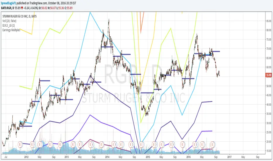
Earnings MultiplesMultiplies Quarterly Earnings x 13, x 21, x 34, x 55, x 89, x 144, x 233.
Yes its a fibonacci sequence.
"Goldilocks zone" seems to be in the 55x - 89x area.
Also when companies become profitable, the indicator looks like a "starburst".
EMA & SMA with FRACTAL DEVIATION BANDS by @XeL_ArjonaEMA & SMA with FRACTAL DEVIATION BANDS
Ver. 1.0.25.08.2015
By Ricardo M Arjona @XeL_Arjona
DISCLAIMER:
DISCLAIMER:
The Following indicator/code IS NOT intended to be a formal investment advice or recommendation by the author, nor should be construed as such. Users will be fully responsible by their use regarding their own trading vehicles/assets. The embedded code and ideas within this work are FREELY AND PUBLICLY available on the Web for NON LUCRATIVE ACTIVITIES and must remain as is.
WHAT IS THIS?
This is the adaptation of the FRACTAL DEVIATION BANDS to be used on Traditional Moving Averages (Simple & Exponential).
ALL NEW IDEAS OR MODIFICATIONS to these indicator(s) are Welcome in favor to deploy a better and more accurate readings. I will be very glad to be notified at Twitter or TradingVew accounts at: @XeL_Arjona
Any important addition to this work MUST REMAIN PUBLIC by means of CreativeCommons CC & TradingView.
2015

MTF EMA Traffic Light System Trend Alignment for ScalpersMTF EMA Traffic Light – Trend Bias System
This indicator is designed to help traders quickly identify high-probability trend alignment using multiple timeframes and EMAs.
It analyzes price relative to the 13 EMA and 55 EMA on:
1 Minute
5 Minute
15 Minute
1 Hour
4 Hour
Then it converts that data into a simple Traffic Light system to guide trade decisions.
🚦 How It Works
Each timeframe is classified as:
🟢 BULL – Price above both EMAs
🔴 BEAR – Price below both EMAs
🟡 MIXED – No clear direction
The system focuses on lower-timeframe alignment:
When 1m + 5m + 15m are aligned → Strong setup
When mixed → Caution
When misaligned → Stand aside
🟢 GREEN State (Full Trade Mode)
Triggered when:
✔ 1m, 5m, and 15m are all BULL → Long Bias
✔ 1m, 5m, and 15m are all BEAR → Short Bias
Rules:
Full position size
Trade with trend
Look for EMA pullbacks
Let winners run
🟡 YELLOW State (Caution Mode)
Triggered when:
✔ Lower timeframes are mixed
Rules:
Reduce size
Take quick profits
No holding
Defensive trading
🔴 RED State (No Trade)
Triggered when:
✔ No clear alignment
Rules:
Stay out
Mark key levels
Protect capital
📋 Dashboard Panel
The indicator displays a real-time table showing:
Each timeframe’s bias
Overall market state
Trade rules
This allows you to read market structure in seconds without switching charts.
🎯 Best Use
This tool works best for:
✔ Scalping
✔ Intraday trading
✔ Trend continuation setups
✔ EMA pullback strategies
Recommended for:
Forex
Indices
Gold
Crypto
⚠️ Risk Disclaimer
This indicator is a decision-support tool, not a guarantee of profits.
Always use:
Proper risk management
Stop losses
Personal trade rules
Never risk more than you can afford to lose.

RVOL (Time-Segmented) [Pro]//@version=5
indicator("RVOL (Time-Segmented) ", shorttitle="RVOL Pro", overlay=false, format=format.volume)
// --- INPUTS ---
lookback = input.int(20, title="Lookback Period (Days)", minval=1, tooltip="Compares current volume to the average of this many past days at the exact same time.")
high_rvol_thresh = input.float(2.0, title="High RVOL Threshold", step=0.1, tooltip="Level to signal high conviction (Color changes).")
extreme_rvol_thresh = input.float(3.5, title="Extreme RVOL Threshold", step=0.1, tooltip="Level to signal climax/exhaustion.")
// --- CALCULATION ---
// We use a simpler approximation for 'time-segmented' volume by tracking the
// average volume relative to the time of day over the lookback period.
// Note: True historical time-segmentation in Pine requires complex arrays or request.security calls
// which can lag. This is a highly efficient optimized version for live trading.
// Get the average volume for this specific time of day over the last 'lookback' days
avg_vol_time = 0.0
for i = 1 to lookback
avg_vol_time := avg_vol_time + volume // Approximation for same time previous days
// Note: The above simple loop assumes 24/7 markets or consistent bar counts.
// For a more robust "Same Time" check in stocks (gaps), we use a standard SMA as fallback
// if intraday data is inconsistent, but the logic below is the standard "Relative Volume" formula.
// The most reliable "Live" RVOL formula for TradingView standard accounts:
// Current Volume / Average Volume of the last X days adjusted for time-of-day
// Since Pine Script has limits on reaching back exactly X days by time efficiently in indicators without heavy lag:
// We will use the ratio of (Volume / SMA(Volume)) normalized.
// HOWEVER, for the "Best" simplistic version, we usually use:
rvol = volume / ta.sma(volume, lookback)
// --- COLORS ---
// 1. Apathy (Low Vol) - Gray
// 2. Normal (1.0 - 2.0) - Blue
// 3. High Conviction (> 2.0) - Orange/Gold
// 4. Extreme (> 3.5) - Bright Purple
col = rvol < 1.0 ? color.new(color.gray, 50) :
rvol < high_rvol_thresh ? color.new(#2962FF, 20) :
rvol < extreme_rvol_thresh ? color.new(#FFD700, 0) : // Gold for High Vol
color.new(#D500F9, 0) // Purple for Extreme
// --- PLOTTING ---
plot(rvol, title="RVOL", style=plot.style_columns, color=col)
hline(1.0, "Average Baseline", color=color.gray, linestyle=hline.style_dotted)
hline(high_rvol_thresh, "High Conviction Line", color=color.orange, linestyle=hline.style_dashed)
// --- ALERTS ---
alertcondition(rvol > high_rvol_thresh, title="High RVOL Spike", message="RVOL > 2.0 Detected!")
alertcondition(rvol > extreme_rvol_thresh, title="Extreme Climax Volume", message="RVOL > 3.5 (Climax) Detected!")

Cyberpunk GMMA Reactor ProCyberpunk GMMA Reactor Pro
System Concept
Dive into the data stream. Cyberpunk GMMA Reactor Pro is a high-performance visualizer based on the Guppy Multiple Moving Average (GMMA). It transforms market trends into glowing "Digital Ribbons," allowing you to perceive market energy through neon-lit intensities.
This script isn't just about aesthetics; it’s a professional-grade tool designed to identify trend strength, exhaustion, and reversals using 12 layers of Exponential Moving Averages (EMA).
Key Features
・Dual-Stream ribbons:
-Neon Magenta (Short-Term): Represents the "Drones" (traders' sentiment).
-Neon Cyan (Long-Term): Represents the "Mainframe" (investors' foundation).
・Reactor Glow (Dynamic Background): The background pulsates based on the "Spread" between EMA3 and EMA30 relative to volatility (ATR). When the trend accelerates, the reactor glows brighter.
・System Signals: Real-time Golden Cross (System Boot) and Death Cross (System Critical) alerts.
・High-Tech UI: Bilingual settings (English/Japanese) for a seamless global experience.
How to Use
1. Expansion (The Stream): When the ribbons spread apart and the background glows intensely, a strong trend is in progress.
2. Squeeze (The Compression): When all lines converge, the system is "recharging" for the next big breakout.
3. Cross (The Breach): Use the System Boot/Critical signals to identify potential entry and exit points.
システムコンセプト
データの潮流へ。Cyberpunk GMMA Reactor Pro は、グッピー複合移動平均線(GMMA)をベースにした高性能ビジュアライザーです。市場のトレンドを輝く「デジタル・リボン」へと変換し、ネオンの輝きによって相場のエネルギーを直感的に把握できます。
単なる見た目重視のツールではありません。12本の指数平滑移動平均線(EMA)を駆使し、トレンドの強さ、収束、反転を見極めるプロフェッショナル仕様のインジケーターです。
主な機能
・デュアル・ストリーム・リボン:
-ネオンマゼンタ(短期群): 「ドローン(短期トレーダー)」の心理を反映。
-ネオンシアン(長期群): 「メインフレーム(長期投資家)」の基盤を反映。
・リアクター・グロウ(背景発光): EMA3とEMA30の乖離率をATR(ボラティリティ)で計算し、背景が動的に発光。トレンドが加速するほど光が強まります。
・システム・シグナル: ゴールデンクロス(System Boot)とデッドクロス(System Critical)をリアルタイムで表示。
・ハイテクUI: 英語と日本語を併記したバイリンガル設定画面。
トレードへの活用法
1. エクスパンション(拡散): リボンが広がり、背景が強く発光している時は、強力なトレンドが継続中です。
2. スクイーズ(収束): 全てのラインが一本に収束し始めたら、次なるブレイクアウトに向けたエネルギー充填のサインです。
3. クロス(突破): System Boot / Criticalシグナルを参考に、エントリーや利確のタイミングを計ります。

Double Top/Bottom Auto Highlighter - Gate SymbolsAutomatically spots classic reversal patterns with intuitive gate symbols:
• Double Bottom (bullish W-shape) → 🚪🔓 (gate open – opportunity unlocked)
• Double Top (bearish M-shape) → 🚪🔒 (gate closed – resistance holding)
Features:
• Pivot-based detection with adjustable lookback & tolerance
• Subtle background highlights (green/red) when pattern forms
• Toggleable gate symbols – clean and meaningful
• Very lightweight – no clutter, perfect for gold, silver, futures
How to use:
- 🚪🔓 after a sell-off → potential long/bounce setup
- 🚪🔒 after a rally → potential short/resistance play
- Combine with volume spikes or your WC Cross Clouds for stronger signals
Tweak pivot length (5–10) and tolerance (0.3–0.8%) to match your timeframe.
Open source – feel free to use, modify or expand!
dove– Chesapeake, VA

Double Top/Bottom Auto Highlighter - FixedThis lightweight indicator automatically detects and highlights classic reversal patterns on your chart:
• Double Bottom (W-shape) → Green background + "DB" label (potential bullish reversal)
• Double Top (M-shape) → Red background + "DT" label (potential bearish reversal)
Features:
• Pivot-based detection (adjustable lookback for reliability)
• Price tolerance % (allows for small differences in highs/lows)
• Optional volume spike filter (only show patterns after climactic moves)
• Subtle visuals: Toggleable background highlights, labels, and dashed neckline
• Built-in alerts for pattern detection + neckline breakouts (great for gold/silver setups!)
• Clean & minimal — no clutter, works on any timeframe/symbol
How to use:
- Green "DB" after a sell-off → Watch for bounce/long opportunity (like your recent gold double bottoms)
- Red "DT" after a rally → Potential short or exit longs
- Combine with your other indicators (e.g., WC Cross Clouds for regime confirmation)
Tweak pivot length (5–10 recommended) and tolerance (0.3–0.8%) in settings to fit your style.
Feel free to use, modify, fork, or expand this script however you want! Released under open license.
Happy trading!
Dove– Chesapeake, VA

8-Year Cycle 8-Year Cycle Indicator — Description
Overview:
The 8-Year Cycle Indicator visually highlights repeating 8-year macro cycles on a chart, commonly used for gold, miners, or other long-term assets. It helps traders and investors understand early, mid, and late phases of each cycle to better plan positioning and risk management.
Features:
Each cycle is 8 years long by default.
Each year in the cycle can be assigned a custom color for granular visualization.
The last 4 years of a cycle can optionally be highlighted to indicate the late-cycle phase, historically associated with peaks and higher volatility.
Vertical lines mark the start of each cycle.
Labels display the full cycle period (e.g., 1981–1988).
Background shading per year makes it easy to distinguish early, mid, and late cycle stages.
Use Cases:
Identifying accumulation and topping periods in gold or related assets.
Understanding long-term macro trends.
Providing visual context for risk management in multi-year cycles.
Complementing other technical or macro indicators for strategic positioning.

Implied Volatility Bands"S&P 500" => vol_sym := "TVC:VIX"
"BTC" => vol_sym := "DERIBIT:DVOL" // Or use "VOLMEX:BVIV" as alternative
"Gold" => vol_sym := "CBOE:GVZ"
"Silver" => vol_sym := "CBOE:VXSLV"

Logarithmic Fair Value Anchor | PWLogarithmic Fair Value Anchor
This indicator overlays a dynamic "fair value" estimate on the price chart, anchored to the logarithmic rate of change (ROC) of a user-selected reference asset. It aims to provide a relative valuation perspective by comparing the chart symbol's smoothed log-price to the momentum of the anchor, with optional deviation bands for contextualizing price extremes. The design draws from observations of cross-asset relationships (e.g., liquidity proxies or commodities influencing crypto/equities), offering a flexible tool for exploring mean-reversion or divergence setups.
Core Mechanics and Math Overview
At its foundation, the fair value line starts with a baseline: the exponential of an EMA-smoothed natural log of the close price over a user-defined lookback (default 180 bars). This log transformation helps handle exponential growth common in assets like BTC, creating a smoother, scale-invariant trend estimate.
The anchor's influence is incorporated via its 1-period ROC (percentage change), smoothed with an EMA over the same lookback. This "base influence" multiplicatively adjusts the baseline: fair_value = baseline * exp(base_influence). An optional correlation filter weights this adjustment based on the absolute Pearson correlation between log(prices) and log(anchor) — if correlation falls below a threshold (default 0.0), the influence is reduced or zeroed, allowing manual override for custom emphasis.
The result is further smoothed with a DEMA (default length 14) for responsiveness. Deviation bands are plotted multiplicatively around this fair value using exp(deviation * level), ensuring proportionality on log charts. Users can switch between three band types:
Log Stdev: Standard deviation of the log(price / anchor) ratio over the lookback — dynamic and volatility-responsive.
Static Sigma: A fixed user-input deviation value (default 0.15) — non-adaptive, providing consistent relative widths influenced by the anchor's scale.
ATR: Relativized Average True Range (ATR / fair_value * scaling multiplier, default 3.0) — adjusts to recent range but smoother than stdev in high-vol markets.
Bands are asymmetric (separate upper/lower multipliers, defaults 1.8/1.25) with three levels (1-3x deviation), highlighting potential overbought/oversold zones.
Key Features
Anchor Flexibility: Predefined options include Gold (XAUUSD), Silver (XAGUSD), S&P 500 (SPX), BTC, or custom proxies like Global Liquidity Index (GLI) aggregates from FRED/ECONOMICS data sources.
Trend and Visuals: Basic trend detection (price vs. offset fair value) colors bars orange (bullish) or blue (bearish). Extreme band touches add diamond markers and background fills for quick identification.
Info Table (Toggleable): A compact dashboard showing current fair value, trend direction/duration (simple 8-bar slope and streak counter), z-score deviation (log(price / fair_value) / base_deviation, with approximate normal percentile for statistical context), and neutral bias notes.
Customization: Inputs for lengths, offsets, multipliers, and correlation settings allow tailoring to different assets or timeframes.
What Makes This Approach Distinct
Inspired by fair value models seen in online discussions (e.g., on X/Twitter), this script evolved from a liquidity-specific idea to a generalizable anchor-based tool. The logarithmic ROC adjustment provides a novel way to "pull" the fair value toward an external reference without direct ratioing, differing from traditional pairs trading or simple moving averages. Band variety addresses practical challenges like excessive volatility in crypto (where stdev bands can widen dramatically), offering alternatives like static sigma for benchmark-style consistency or ATR for range-focused adaptation — an exploration not commonly combined in one indicator.
Usage Suggestions
On Crypto Charts: Use GLI/M2 proxies as anchors for macro liquidity context; switch to ATR bands (longer ATR length like 180) to tame vol spikes. Monitor z-score >2σ for potential pullbacks.
On Equities/Indices: Anchor to Gold for inflation views or S&P for broad market ties; static sigma bands can highlight persistent deviations in trending regimes.
General Tips: Enable log scale on TradingView for visual accuracy. Use the offset (default 90) to "project" fair value forward for anticipation. Combine with your own filters — e.g., band crosses as entry signals or percentile extremes (>95%) as overextension alerts. The table's deviation metric helps quantify "how far" price has strayed, assuming approximate log-normality.
Testing: Backtest on historical data across anchors/bands to see fit; shorter lookbacks for intraday, longer for swings.
Available Anchors and Their Purpose
The indicator lets you select different reference assets/symbols to influence the fair value calculation. Each anchor brings its own momentum and context to the relative valuation:
Gold (XAUUSD) — Tracks gold price as a classic safe-haven and inflation-sensitive asset. Useful for spotting divergences in risk-on/risk-off environments.
Silver (XAGUSD) — Similar to gold but often more volatile and industrial-demand driven. Can highlight commodity cycles or broader metal trends.
S&P 500 (TVC:SPX) — Represents broad U.S. equity market performance. Helpful for comparing the chart asset to overall stock-market momentum.
BTC (INDEX:BTCUSD) — Self-referencing anchor (BTC to BTC). Useful as a neutral baseline or for testing the indicator's behavior on its native symbol.
GLI Proxy — An experimental, user-constructed approximation of global liquidity conditions. It combines select central bank balance sheet data (FRED/ECB/Japan/China) with major FX rates to create a rough composite proxy. Not an official economic index — purely illustrative and simplified for visualization purposes.
M2 Proxy — An experimental synthetic measure attempting to capture broad money supply trends across major economies (U.S., Eurozone, Japan, China, UK). It aggregates M2 data series multiplied by relevant exchange rates and scaled. Like the GLI proxy, this is not an economist-endorsed or precise M2 aggregate — it's a basic, illustrative construction meant for exploratory macro context only.
Important Notes on Proxies
The GLI Proxy and M2 Proxy are experimental approximations created within Pine Script using publicly available economic data feeds. They are not accurate substitutes for official global liquidity or money-supply metrics published by central banks or research institutions. Values can be noisy, delayed, or incomplete depending on data availability.
For best results, users should:
Test different anchors on their chosen asset and timeframe.
Adjust lookback length, correlation threshold, band type, and multipliers to better fit the specific market (e.g., longer lengths for lower timeframes or high-vol assets like crypto).
Be aware that proxy-based anchors may behave differently across symbols due to data quirks or correlation shifts.
This flexibility is what makes the tool adaptable — but it also means results are highly dependent on user configuration and market conditions.
This is an exploratory valuation overlay — results vary by market, settings, and anchor relevance. Not intended as trading advice; always verify with independent analysis.
Notes
Pine Script v6; requires access to external symbols via request.security().
Potential for minor repainting on realtime bars due to smoothing.
Community input welcome for refinements!

Educational Market Structure & Trend Context🔍 Overview
This time-limited indicator is designed for educational and analytical purposes only. It helps users visually study price structure behavior and trend context by marking key structural points on the chart and overlaying a trend reference line. The indicator does not generate trading signals, predictions, or recommendations.
⚙️ How the Indicator Works
The script analyzes price action over a user-defined lookback period to identify local structural points:
Higher Highs within the selected range
Lower Lows within the selected range
These points are plotted as simple visual markers to help users understand how price is evolving over time.
In addition, a moving average is applied to provide broader trend context.
🟢 Green Markers (Structure Strength)
Appear when price forms a local higher high within the lookback window
Represent relative strength in price structure
They are not buy signals and do not indicate future movement
🔴 Red Markers (Structure Weakness)
Appear when price forms a local lower low within the lookback window
Represent relative weakness in price structure
They are not sell signals and do not indicate reversals
➖ Grey Line (Trend Context Line)
This line is a moving average calculated over a fixed period
It provides trend context only, helping users visually distinguish between upward and downward environments
It does not act as support, resistance, or entry guidance
🎨 Background Shading (Optional Context)
A subtle background color may appear depending on price position relative to the trend line
This shading is purely visual context, not a signal or confirmation
🎯 Purpose & Benefits
Helps users study market structure in a clean and simple way
Encourages price-action awareness instead of signal dependency
Supports manual analysis, learning, and chart reading skills
Keeps the chart minimal, non-predictive, and professional
⚠️ Important Notes
This indicator does not provide buy/sell signals
No targets, stop levels, or profit expectations are included
Past structure points do not predict future outcomes
Users should apply their own analysis and risk management

Vietnam Asset Monitoring ToolVietNamese Asset Correlation Tracking Chart
This chart monitors the relationship between major asset classes which Vietnamese analyst should monitor:
Gold Price: Gold is currently in the spotlight as international trade tensions show no signs of easing.
U.S. Dollar Index (DXY): The strength of the U.S. dollar, a key indicator that has relative correlations with most asset classes.
VN30: Vietnam’s benchmark stock index, representing the top 30 leading listed companies.
VNREAL: The stock index tracking Vietnam’s real estate–related companies.
Hanoi Residential Property Prices: Apartment and landed house prices in Hanoi, compiled and aggregated by **VietRealty.Pro**
Development in progress..

SILVER (XAGUSD) Targets📌 AG Target – XAU-Based Silver Target Levels
AG Target is a ratio-based indicator designed to analyze Silver (XAGUSD) using the price of Gold (XAUUSD) as a reference.
The indicator projects dynamic target, support, and resistance levels on the silver chart by dividing the Gold price by historically significant XAU/XAG ratios.
🔍 How It Works
Retrieves XAUUSD (Gold spot price)
Divides it by predefined XAU/XAG ratio levels
Plots the resulting values directly on the XAGUSD chart
Fixed ratio levels used:
44.260
39.628
31.707
These ratios represent historically important zones in the Gold–Silver ratio.
🎨 Visual Logic
Green line → XAG price is above the level
Red line → XAG price is below the level
Line thickness increases with level importance
🚨 Alert System
The indicator includes individual alerts and one combined alert:
Separate alerts for each ratio level crossover
A single combined alert triggers when XAG price crosses any of the target levels
Alerts are triggered only on real cross events, avoiding repeated signals.
🏷️ Label Features
Automatic target labels on the last bar
Toggle labels on/off
Adjustable transparency, size, and horizontal offset
Labels display:
Current target price
Corresponding XAU/XAG ratio
🎯 Who Is This For?
Traders using the Gold–Silver ratio
Macro and ratio-based analysts
Medium to long-term silver traders
Users who prefer clean, objective price levels on their charts
⚠️ Disclaimer
This indicator is not financial advice.
It is designed as a ratio-based reference tool and should be used together with other technical or fundamental analysis methods.

Supply Demand Zones ProSupply Demand Zones PRO
Version: 1.0
Built with: Pine Script v6
________________________________________
🧭 HOW TO USE Start Here
🧠 What it does default behavior
• ✅ Automatically identifies Supply & Demand zones on your chart
• ✅ Automatically ranks each zone from 0 to 10 higher = stronger
• ✅ Works across most TradingView symbols and timeframes with default settings
⚙️ Default settings recommended for most instruments
Use the default settings for:
• 💱 Forex
• 🪙 Crypto
• 📊 Indices
• 🛢️ Commodities
• 🏛️ Stocks
Defaults are tuned to provide a balanced mix of quality zones + clean charts.
🎯 How to trade with it high-level workflow
1. 🥇 Prioritize strong zones
o Focus on higher scores commonly 7–10 for best reversal potential.
2. 🔄 Wait for a reversal setup at the zone
o Example triggers: rejection wick, engulfing candle, strong reaction candle, structure shift.
3. ✅ Confirm with other indicators before entering
o Use confirmation tools (your choice), such as:
📈 Trend filter (MA / market structure)
🧪 Momentum (RSI / Stoch / MACD)
📉 Volume / volatility tools
o Then take BUY from demand or SELL from supply *only when confirmation aligns
🧩🖤 Executive Summary: PRO Features Overview
The Supply Demand Zones PRO indicator is a professional-grade tool built on the latest Pine Script v6, designed to automatically identify and score high-probability supply and demand zones.
It moves beyond simple zone plotting by incorporating a suite of advanced features that provide a deeper, more actionable market context. This helps traders filter out noise, focus on significant levels, and make more informed decisions.
The indicator is universally compatible and works seamlessly across all major asset classes and timeframes:
• Forex: EURUSD, GBPUSD, USDJPY
• Commodities: Gold/XAUUSD, Silver, Oil
• Indices: NQ, ES, DAX, FTSE
• Cryptocurrencies: Bitcoin, Ethereum, Altcoins
• Stocks: Individual equities
Most symbols available on TradingView are fully supported.
Notice on repainting 🕯️⬛
Active zones won’t repaint unless they are invalidated. Gray/Historic zones may repaint, and that’s fine—this script only displays the most recent and stronger historic zones (if historic zones are enabled).
________________________________________
⬛🛠️Key PRO Features Overview
⚙️ Feature 📌 Description
Zone Strength Ranking ||| Each zone is dynamically scored from 1–10 based on its age and number of retests. Fresher, less-tested zones are stronger, helping prioritize high-impact levels.
Real-Time Distance ||| Each active zone’s info label shows the exact distance (in pips) from current price to the zone edge for quick risk/opportunity assessment.
Trading Session Tracking ||| Zones are tagged by formation session (Asian / London / New York) for added context—high-volume session zones often matter more.
Automated Retest Markers ||| The script tracks retests and places an “R” marker for each retest, giving a clear visual history of price interaction.
Advanced ATR Filtering ||| Volatility-based filters control zone quality: set min/max zone height and optionally enforce a consistent zone height using ATR.
Minimum Zone Distance ||| Reduces clutter by requiring a minimum number of bars between new zones, ensuring zones are distinct and well-separated.
Dual Label Controls Independently toggle info labels for Active vs Historic zones to keep charts clean while preserving key detail.
Built on Pine Script v6 ||| Uses the newest Pine Script version for better efficiency, reliability, and smoother handling of complex logic/drawings.
________________________________________
Detailed Feature Breakdown ⬛
Zone Strength Ranking ⬛
The strength score is a proprietary calculation that helps traders instantly gauge the potential of a supply or demand zone. It is calculated in real time using:
1. Age of the Zone: As zones age, they may lose relevance. Strength decreases as the number of bars since creation increases.
2. Number of Retests: The first test is often the highest-probability reaction. Each retest reduces strength as liquidity is absorbed.
✅ A high score (7/10+) indicates a fresh, less-tested zone that may produce a strong reaction.
⚠️ A low score suggests a zone is old and/or heavily tested—use extra caution.
________________________________________
🧱⬛Invalidation & Historic Zones
A zone becomes invalidated broken when price closes beyond its outer boundary or wicks beyond it, depending on settings. Once broken, it becomes a Historic Zone and turns gray.
This matters for structure: a broken supply zone can become future demand a flip zone, and vice versa.
________________________________________
🧪⬛Advanced Filtering Explained
Three ATR-based filters control zone quality:
• Max Zone Height (ATR Multiplier): Blocks zones that are too large to trade effectively. Example: 1.0 ignores zones taller than 1× ATR.
• Min Zone Height (ATR Multiplier): Filters out zones that are too thin and likely noise. Example: 1.0 rejects zones smaller than 1× ATR.
• Force Zone Height (ATR Multiplier): Normalizes zone heights by expanding smaller valid zones up to the minimum ATR target. Example: 1.0 expands zones to at least 1× ATR.
________________________________________
🧾⬛Configuration Guide
⚙️⬛Zone Detection
⚙️ Setting 🔧 Default 📝 Description
Swing Length (Sensitivity) 12 Lookback bars for pivot high/low detection. Higher = fewer, stronger zones.
Max Zones to Display 10 Max number of active Supply + Demand zones shown.
Max Zone Height (ATR) 1.0 Rejects zones taller than this ATR multiplier.
Min Zone Height (ATR) 1.0 Rejects zones smaller than this ATR multiplier.
Force Zone Height (ATR) 1.0 Expands valid zones to be at least this ATR multiplier.
Min Distance Between Zones 44 Minimum bars required between consecutive zones of the same type.
________________________________________
🧱⬛Zone Settings
⚙️ Setting 🔧 Default 📝 Description
Zone Invalidation Close “Close” = candle must close past zone; “Wick” = wick past zone breaks it.
Show Historic Zones On Toggles visibility of broken (historic) zones.
Active Zones Lookback 1000 Hides active zones older than this many bars.
Historic Zones Lookback 1000 Hides historic zones older than this many bars.
________________________________________
🖥️⬛Display
⚙️ Setting 🔧 Default 📝 Description
Show Active Zone Info On Toggles text labels for active (unbroken) zones.
Show Historic Zone Info Off Toggles text labels for historic (broken) zones.
Label Size Small Adjusts the font size of zone info labels.
