KNN OscillatorOverview
The KNN Oscillator is an advanced technical analysis tool designed to help traders identify potential trend reversals and market momentum. Using the K-Nearest Neighbors (KNN) algorithm, this oscillator normalizes KNN values to create a dynamic and responsive indicator. The oscillator line changes color to reflect the market sentiment, providing clear visual cues for trading decisions.
Key Features
Dynamic Color Oscillator: The line changes color based on the oscillator value – green for positive, red for negative, and grey for neutral.
Advanced KNN Algorithm: Utilizes the K-Nearest Neighbors algorithm for precise trend detection.
Normalized Values: Ensures the oscillator values are normalized to align with the stock price range, making it applicable to various assets.
Easy Integration: Can be easily added to any TradingView chart for enhanced analysis.
How It Works
The KNN Oscillator leverages the K-Nearest Neighbors algorithm to calculate the average distance of the nearest neighbors over a specified period. These values are then normalized to match the stock price range, ensuring they are comparable across different assets. The oscillator value is derived by taking the difference between the normalized KNN values and the source price. The line's color changes dynamically to provide an immediate visual indication of the market's state:
Green: Positive values indicate upward momentum.
Red: Negative values indicate downward momentum.
Grey: Neutral values indicate a stable or consolidating market.
Usage Instructions
Trend Reversal Detection: Use the color changes to identify potential trend reversals. A shift from red to green suggests a bullish reversal, while a shift from green to red indicates a bearish reversal.
Momentum Analysis: The oscillator's value and color help gauge market momentum. Strong positive values (green) indicate strong upward momentum, while strong negative values (red) indicate strong downward momentum.
Market Sentiment: The dynamic color changes provide an easy-to-understand visual representation of market sentiment, helping traders make informed decisions quickly.
Confirmation Tool: Use the KNN Oscillator in conjunction with other technical indicators to confirm signals and improve the accuracy of your trades.
Scalability: Applicable to various timeframes and asset classes, making it a versatile tool for all types of traders.
Recherche dans les scripts pour "algo"

LC: Trend & Momentum IndicatorThe "LC: Trend & Momentum Indicator" was built to provide as much information as possible for traders and investors in order to identify or follow trend and momentum. The indicator is specifically targeted towards the cryptocurrency market. It was designed and developed to present information in an way that is easy to consume for beginner to intermediate traders.
Indicator Overview
While the indicator provides trend data through a number of components, it presents this data in an easy to understand colour coded schema that is consistent across each component; green for an uptrend, red for a downtrend and orange for transition and/or chop. The indicator allows traders to compare price trends when trading altcoins between USD pairs, BTC pairs and the BTC/USDT pair. This is achieved by representing price trends in easy-to-consume trend bars, allowing traders to get as much information as possible in a quick glance. The indicator also includes RSI which is also a useful component in identifying trend and momentum. The RSI component includes a custom RSI divergence detection algorithm to assist traders in identifying changes in trend direction. By providing both Price Trend comparison and RSI components, a full picture is provided when determining trend and momentum of an asset without having to switch between trading pairs. This makes it particularly useful for the beginner to intermediate trader.
The indicator is split into three components:
RSI
The RSI is colour-coded to identify the RSI trend based on when it crosses an EMA. Green indicates that the RSI is in a bullish trend, red indicates a bearish trend and orange indicates a transition between trends. RSI regular divergences are detected using a custom algorithm built from the ground up. The algorithm uses a combination of ATR and candle structure to determine highs and lows for both price action and RSI. Based on this information, divergences are determined making sure to exclude any invalid divergences crossing over highs and lows for both price action and RSI.
Asset Price Trend Bar
The asset price trend is detected using a cross over of a fast EMA (length 8) and slow EMA (length 21) and is displayed as a trend bar (First bar in the indicator). There are additional customised confirmation and invalidation algorithms included to ensure that trends don't switch back and forth too easily if the EMAs cross due to deeper corrections. These algorithms largely use candle structure and momentum to determine if trends should be confirmed or invalidated. For price trends, green represents a bullish trend, red represents a bearish trend and orange can be interpreted as a trend transition, or a period of choppy price action.
BTC Price Trend Bars
When Altcoins are selected, a BTC pair trend bar (Second bar in the indicator) as well as a BTCUSDT trend bar (Third bar in the indicator) is displayed. The algorithm to determine these trends is based on exactly the same logic as the asset price trend. The same colour coding applies to these price trend bars.
Why are these components combined into a single indicator?
There are two primary reasons for this.
1. The colour coded schema employed across both RSI and price trends makes it user-friendly for the beginner to intermediate trader. It can be extremely difficult and overwhelming for a beginner to identify asset price trend, BTC relative price trends and the RSI trend. By providing these components in a single indicator it helps the user to identify these trends quickly while being able to find confluence across these trends by matching the colour coded schema employed across the indicator. For experienced traders this can be seen as convenient. For beginners it can be seen as a method to identify, and learn how to identify these trends.
2. It is not obvious, especially to beginners, the advantage of using the RSI beyond divergences and overbought/oversold when identifying trend and momentum. The trend of the RSI itself as well as it's relative % can be useful in building a picture of the overall price trend as well as the strength of that trend. The colour coded schema applied to the RSI trend makes it difficult to overlook, after which it is up to the trader to decide if this is important or not to their own strategies.
Indicator Usage
NOTE: It is important to always back test and forward test strategies before using capital. While a strategy may look like it is working in the short term, it may not be the case over varying conditions.
This indicator is intended to be used in confluence with trading strategies and ideas. As it was designed to provide easy-to-consume trend and momentum information, the usage of the indicator is based on confluence. It is up to a user to define, test and implement their own strategies based on the information provided in the indicator. The indicator aims to make this easier through the colour coded schema used across the indicator.
For example, using the asset price trend alone may indicate a good time to enter trades. However, adding further trend confluence may make the case stronger to enter the trade. If an asset price is trending up while the BTCUSDT pair is also trending up, it may add strength to the case that it may be a good time to enter long positions. Similarly, extra confluence may be added by looking at RSI, either at divergences, trend or the current RSI % level.

Edge AI Forecast [Edge Terminal]This indicator inputs the previous 150 closing prices in a simple two-layer neural network, normalizes the network inputs using a sigmoid function, uses a feedforward calculation to send it to the second layer, shows the MSE loss curve and uses both automatic and manual backpropagation (user input) to find the most likely forecast values and uses the analog forecasting algorithm to adjust and optimize the data furthermore to display potential prices on the chart.
Here's how it works:
The idea behind this script is to train a simple neural network to predict the future x values based on the sample data. For this, we use 2 types of data, Price and Volume.
The thinking behind this is that price alone can’t be used in this case because it doesn’t provide enough meaningful pattern data for the network but price and volume together can change the game. We’re planning to use more different data sets and expand on this in the future.
To avoid a bad mix of results, we technically have two neural networks, each processing a different data type, one for volume data and one for price data.
The actual prediction is decided by the way price and volume of the closing price relate to each other. Basically, the network passes the price and volume and finds the best relation between the two data set outputs and predicts where the price could be based on the upcoming volume of the latest candle.
The network adjusts the weights and biases using optimization algorithms like gradient descent to minimize the difference between the predicted and actual stock prices, typically measured by a loss function, (in this case, mean squared error) which you can see using the error rate bubble.
This is a good measure to see how well the network is performing and the idea is to adjust the settings inputs such as learning rate, epochs and data source to get the lowest possible error rate. That’s when you’re getting the most accurate prediction results.
For each data set, we use a multi-layer network. In a multi-layer neural network, the outputs of neurons in one layer serve as inputs to neurons in the next layer. Initially, the input layer of the neural network receives the historical data. Each input neuron represents a feature, such as previous stock prices and trading volumes over a specific period.
The hidden layers perform feature extraction and transformation through a series of weighted connections and activation functions. Each neuron in a hidden layer computes a weighted sum of the inputs from the previous layer, applies an activation function to the sum, and passes the result to the next layer using the feedforward (activation) function.
For extraction, we use a normalization function. This function takes a value or data (such as bar price) and divides it up by max scale which is the highest possible value of the bar. The idea is to take a normalized number, which is either below 1 or under 2 for simple use in the neural network layers.
For the activation, after computing the weighted sum, the neuron applies an activation function a(x). To introduce non-linearity into the model to pass it to the next layer. We use sigmoid activation functions in this case. The main reason we use sigmoid function is because the resulting number is between 0 to 1 and is better for models where we have to predict the probability as an output.
The final output of the network is passed as an input to the analog forecasting function. This is an algorithm commonly used in weather prediction systems. In this case, this is used to make predictions by comparing current values and assuming the patterns might repeat in the future.
There are many different ways to build an analog forecasting function but in our case, we’re used similarity measurement model:
X, as the current situation or set of current variables.
Y, as the outcome or variable of interest.
Si as the historical situations or patterns, where i ranges from 1 to n.
Vi as the vector of variables describing historical situation Si.
Oi as the outcome associated with historical situation Si.
First, we define a similarity measure sim(X,Vi) that quantifies the similarity between the current situation X and historical situation Si based on their respective variables Vi.
Then we select the K most similar historical situations (KNN Machine learning) based on the similarity measure sim(X,Vi). We denote the rest of the selected historical situations as {Si1, Si2,...Sik).
Then we examine the outcomes associated with the selected historical situations {Oi1, Oi2,...,Oik}.
Then we use the outcomes of the selected historical situations to forecast the future outcome Y^ using weighted averaging.
Finally, the output value of the analog forecasting is standardized using a standardization function which is the opposite of the normalization function. This function takes a normalized number and turns it back to its original value by multiplying it by the max scale (highest value of the bar). This function is used when the final number is produced by the network output at the end of the analog forecasting to turn the final value back into a price so it can be displayed on the chart with PineScript.
Settings:
Data source: Source of the neural network's input data.
Sample Bars: How many historical bars do you want to input into the neural network
Prediction Bars: How many bars you want the script to forecast
Show Training Rate: This shows the neural network's error rate for the optimization phase
Learning Rate: how many times you want the script to change the model in response to the estimated error (automatic)
Epochs: the network cycle or how many times you want to run the data through the network from the first layer to the last one.
Usage:
The sample bars input determines the number of historical bars to be used as a reference for the network. You need to change the Epochs and Learning Rate inputs for each asset and chart timeframe to get the lowest error rate.
On the surface, the highest possible epoch and learning rate should produce the most effective results but that's not always the case.
If the epochs rate is too high, there is a chance we face overfitting. Essentially, you might be over processing good data which can make it useless.
On the other hand, if the learning rate is too high, the network may overshoot the optimal solution and diverge. This is almost like the same issue I mentioned above with a high epoch rate.
Access:
It took over 4 months to develop this script and we’re constantly improving it so it took a lot of manpower to develop this script. Also when it comes to neural networks, Pine Script isn’t the most optimal language to build a neural network in, so we had to resort to a few proprietary mathematical formulas to ensure this runs smoothly without giving out an error for overprocessing, specially when you have multiple neural networks with many layers.
The optimization done to make this script run on Pine Script is basically state of the art and because of this, we would like to keep the code closed source at the moment.
On the other hand we don’t want to publish the code publicly as we want to keep the trading edge this script gives us in a closed loop, for our own small group of members so we have to keep the code closed. We only accept invites from expert traders who understand how this script and algo trading works and the type of edge it provides.
Additionally, at the moment we don’t want to share the code as some of the parts of this network, specifically the way we hand the data from neural network output into the analog method formula are proprietary code and we’d like to keep it that way.
You can contact us for access and if we believe this works for your trading case, we will provide you with access.
Quarterly Cycles [Dango]Introducing the Comprehensive Quarterly Cycle Indicator, a powerful and original tool designed to enhance your understanding of price action through the lens of quarterly cycles. This innovative script is a novel creation that accurately incorporates the nuances and complexities often overlooked by those who claim to have a quarterly cycle indicator.
Key Features:
- Displays 90-minute, daily, weekly, monthly, and yearly quarterly cycles
- Employs advanced algorithms and a deep understanding of cycle theory to precisely map out cycles
- Accounts for subtle nuances ignored by other indicators
How It Works:
The Comprehensive Quarterly Cycle Indicator meticulously calculates and visualizes various quarterly cycles based on a proprietary algorithm that determines the presence and absence of quarters. This intricate formula takes into account multiple factors and complex relationships between time and price to accurately identify when a quarter is present and when it isn't.
By leveraging this unique approach, the indicator can provide a more precise and reliable representation of quarterly cycles compared to other methods. The advanced algorithms employed by the script go beyond simple trend detection or scalping techniques, offering a comprehensive view of the underlying market rhythms.
The indicator's visual representation of quarterly cycles serves as an invaluable aid in recognizing time-based patterns, turning points, and potential trend shifts. Through the lens of this indicator, traders can gain a deeper understanding of how time influences market dynamics and can make more informed decisions based on this knowledge.
Intended Use:
The Comprehensive Quarterly Cycle Indicator is designed primarily for educational purposes, helping traders develop a keen intuition for interpreting price action through the lens of quarterly cycles. By studying the indicator's output alongside price movements, users can gain valuable insights into market dynamics and timing.
Please note that while this indicator is a powerful learning tool, it should not be considered a standalone trading system. As with any technical analysis tool, it is essential to combine its insights with other forms of analysis and risk management principles.
Limitations:
The indicator's accuracy may be impacted by extreme market volatility or unusual events
Quarterly cycles are one of many factors influencing price action and should not be relied upon in isolation
By offering a novel and accurate representation of quarterly cycles, this indicator aims to empower traders in their journey to understand and navigate the markets effectively. However, as with any trading tool, individual results may vary, and past performance does not guarantee future outcomes.
Disclaimer:
This indicator is provided for educational purposes only and should not be considered financial advice. Always conduct your own due diligence and consult with a financial professional before making any trading decisions.
Privacy of Code
Please note that the underlying logic and specific calculations used in the proprietary algorithm are not disclosed to protect the intellectual property of the script. The main reason for keeping these details hidden is due to the intricate formula used to determine when a quarter is actually present and when it isn't, taking into account various factors and complex relationships between time and price.
The proprietary algorithm is the result of extensive research, testing, and refinement, forming the core of the Comprehensive Quarterly Cycle Indicator's unique approach to identifying and visualizing quarterly cycles. By keeping the specific calculations confidential, the script maintains its competitive edge and ensures the protection of its intellectual property.
Despite not disclosing the exact details, the description aims to provide a clear understanding of the script's functionality, its unique approach to identifying quarterly cycles, and the potential benefits for traders. The information provided offers insights into the key features, general methodology, and advantages of utilizing the Comprehensive Quarterly Cycle Indicator in your trading analysis.
RBS | Profitholders Thanks for source code author , I have modified this for especially Indian market.
RBS Indicator is Rang Breakout System, This is same "Opening Range Breakout" which is a common trading strategy. The indicator can analyze the market trend in the current session and give "Buy / Sell", "Take Profit" and "Stop Loss" signals. For more information about the analyzing process of the indicator, you can read "How Does It Work ?" section of the description.
Features of RBS indicator :
Buy & Sell Signals
Up To 3 Take Profit Signals
Stop-Loss Signals
Alerts for Buy / Sell, Take-Profit and Stop-Loss
Session Dashboard
Back testing Dashboard
HOW DOES IT WORK ?
This indicator works best in 15-minute timeframe. Need to change Chart time frame depends on symbols , The idea is that the trend of the current session can be forecasted by analyzing the market for a while after the session starts. However, each market has it's own dynamics and the algorithm will need fine-tuning to get the best performance possible. So, we've implemented a "Back testing Dashboard" that shows the past performance of the algorithm in the current ticker with your current settings. Always keep in mind that past performance does not guarantee future results. So this is for educational purpose.
Here are the steps of the algorithm explained briefly :
1. The algorithm follows and analyzes the first 15 minutes (can be adjusted) of the session.
2. Then, algorithm checks for breakouts of the opening range's high or low.
3. If a breakout happens in a bullish or a bearish direction, the algorithm will now check for retests of the breakout. Depending on the sensitivity setting, there must be 0 / 1 / 2 / 3 failed retests for the breakout to be considered as reliable.
4. If the breakout is reliable, the algorithm will give an entry signal.
5. After the position entry, algorithm will now wait for Take-Profit or Stop-Loss zones and signal if any of them occur.
If you wonder how does the indicator find Take-Profit & Stop-Loss zones, you can check the "Settings" section of the description.
UNIQUENESS
While there are indicators that show the opening range of the session, they come short with features like indicating breakouts, entries, and Take-Profit & Stop-Loss zones. We are also aware of that different stock markets have different dynamics, and tuning the algorithm for different markets is really important for better results, so we decided to make the algorithm fully customizable. Besides all that, our indicator contains a detailed back testing dashboard, so you can see past performance of the algorithm in the current ticker. While past performance does not yield any guarantee for future results, we believe that a back testing dashboard is necessary for tuning the algorithm. Another strength of this indicator is that there are multiple options for detection of Take-Profit and Stop-Loss zones, which the trader can select one of their liking.
⚙️SETTINGS
Keep in mind that best chart timeframe for this indicator to work is the 15-minute timeframe on Indian Market.
TP = Take-Profit
SL = Stop-Loss
EMA = Exponential Moving Average
OR = Opening Range
ATR = Average True Range
1. Algorithm
RBS Timeframe -> This setting determines the timeframe that the algorithm will analyze the market after a new session begins before giving any signals. It's important to experiment with this setting and find the best option that suits the current ticker for the best performance. More volatile stocks will often require this setting to be larger, while more stabilized stocks may have this setting shorter.
Sensitivity -> This setting determines how much failed retests are needed to take a position entry. Higher sensitivity means that less retests are needed to consider the breakout as reliable. If you think that the current ticker makes strong movements in a bullish & bearish direction after a breakout, you should set this setting higher. If you think the opposite, meaning that the ticker does not decide the trend right after a breakout, this setting show be lower.
(High = 0 Retests, Medium = 1 Retest, Low = 2 Retests, Lowest = 3 Retests)
Breakout Condition -> The condition for the algorithm to detect breakouts.
Close = Bar needs to close higher than the OR High Line in a bullish breakout, or lower than the OR Low Line in a bearish breakout. EMA = The EMA of the bar must be higher / lower than OR Lines instead of the close price.
TP Method -> The method for the algorithm to use when determining TP zones.
Dynamic = This TP method essentially tries to find the bar that price starts declining the current trend and going to the other direction, and puts a TP zone there. To achieve this, it uses an EMA line, and when the close price of a bar crosses the EMA line, It's a TP spot.
ATR = In this TP method, instead of a dynamic approach the TP zones are pre-determined using the ATR of the entry bar. This option is generally for traders who just want to know their TP spots beforehand while trading. Selecting this option will also show TP zones at the ORB Dashboard.
"Dynamic" option generally performs better, while the "ATR" method is safer to use.
EMA Length -> This setting determines the length of the EMA line used in "Dynamic TP method" and "EMA Breakout Condition". This is completely up to the trader's choice, though the default option should generally perform well. You might want to experiment with this setting and find the optimal length for the current ticker.
Stop-Loss -> Algorithm will place the Stop-Loss zone using setting.
Safer = The SL zone will be placed closer to the OR High for a bullish entry, and closer to the OR Low for a bearish entry.
Balanced = The SL zone will be placed in the center of OR High & OR Low
Risky = The SL zone will be placed closer to the OR Low for a bullish entry, and closer to the OR High for a bearish entry.
Adaptive SL -> This option only takes effect if the first TP zone is hit.
Enabled = After the 1st TP zone is hit, the SL zone will be moved to the entry price, essentially making the position risk-free.
Disabled = The SL zone will never change.
2. RBS Dashboard
RBS Dashboard shows the information about the current session.
3. RBS Back testing
RBS Back testing Dashboard allows you to see past performance of the algorithm in the current ticker with current settings.
Total amount of days that can be back tested depends on your TV subscription.
Back testing Exit Ratios -> You can select how much of percent your entry will be closed at any TP zone while back testing. For example, %90, %5, %5 means that %90 of the position will be closed at the first TP zone, %5 of it will be closed at the 2nd TP zone, and %5 of it will be closed at the last TP zone.

Crypto Manipulation [ProjeAdam]OVERVIEW
Indicator that detects manipulation candles on the Binance exchange according to open interest, volume, candlestick analyzes and percent changes.
IMPORTANT NOTE: This indicator works in Crypto Binance Exchange and only in Future Parities.
Example ->> BTCUSDT.P -- ETHUSDT.P -- ADAUSDT.P
> Topics in the writing of the crypto manipulation indicator <
Market makers manipulate the crypto market because most people who trade on the stock exchange act with their emotions and are forced to close the transaction at a loss. In these manipulations, many people are liquidated and the money they earn is used as fuel in the market.
We can reduce the psychological impact that the market is trying to have on us with this indicator.
IF we detect manipulation candles in the market, we can control our fragile psychology and close our transactions in profit by trading with market-making formations in these areas.
ALGORITHM
In this indicator, I use 4 different datasets to detect manipulation candles in crypto market.
1- Extremely variable volume data in Spot and Future markets
2- Wicks formed by candles
3-Percentage change of price movement
4-Distance from the average value of people who open and close transactions in Future parity
When there is excessive volatility in price movement, the algorithm in this indicator notices this price volatility and calculates a manipulation value by dividing it by the volatility value in past price movements.
In my Python backtests, I noticed that when manipulation is done in the crypto market, there is extreme volatility in certain values. This is because there are more robots in the crypto exchange than in the Bist exchange and the total transaction volume is less than in other exchanges. We observe these data that change in a short time, the amount of volume created by people being liquidated, and the open positions that are forcibly closed due to this situation, only in Cryptocurrency exchanges.
How does the indicator work?
The manipulation candle does not give us information about the direction of price movement, it is only used as an auxiliary indicator. With the help of this indicator, we can prevent large losses by better determining our risk situation during and after manipulation.
We show our manipulation values as columns. We draw a channel over the values we show and we understand that there is manipulation in the candle of our values above this channel.
The indicator shows the manipulation value in the form of columns. Our manipulation value that goes outside the channel we have determined is colored red, within the channel it is colored yellow, and below the channel it is colored green. Red columns indicate candles that are manipulations.
As we observed in the example above, we observe excessive volume increase, momentum in open interest and wick candles during manipulation times. As these values increase, our manipulation value also increases.
What are the BIST and Crypto Exchanges and What are the differences between them?
The differences between the general structure of BIST Exchange and the general structure of the cryptocurrency exchange are as follows;
1- While trading takes place under goverment control in BIST Exchange, there are no regulations in the Cryptocurrency market yet.
2- Since BIST Exchange is a much larger market than the cryptocurrency exchange, manipulations can be made by very large money owners and large companies, but there is a monopolized situation in crypto.
3- We see instantaneous large changes in volume in the cryptocurrency market during manipulation times. While this situation is not seen effectively in the BIST exchange, volume changes have a great impact on the crypto exchange.
4- Since there are many open source codes in the cryptocurrency exchange and much easier and faster trading is allowed thanks to the robots produced by software, manipulations in the cryptocurrency exchange occur very quickly and in a short time.
5- We can know who opened and closed transactions in which candle in the cryptocurrency market, but we cannot access this data in Borsa Istanbul.
The majority of Borsa Istanbul users do not trade in crypto, and many users who trade in crypto do not know Borsa Istanbul because only TURKISH citizens can open transactions here.
Using two completely different algorithms and publishing two different indicators will be convenient for many users at this stage. The indicators to be used for these two exchanges, which have many different features that I have explained above, should also be different.
So What are the differences between the two algorithms?
1-Crypto manipulation indicator uses liquidation data, we cannot access this data on the Bist exchange.
2-While manipulations in the crypto exchange occur in very short periods of time, BIST generally moves slower than crypto.
3-By using the crypto manipulation indicator open interest data, we can access in detail on which candle the transaction was opened and closed, but we cannot access it on the Bist exchange.
In our example above, when manipulation candles are formed, you see the volumetric change and the change in open interest. The excessive increase in volume and the momentum of open interest data affects our crypto manipulation value.
The greater the volume increase, the greater the manipulation.
Regardless of the open interest direction, the greater the momentum change in value, the more manipulation has been done.
Our BIST manipulation indicator only focuses on the change of candles in the market structure. In other words, it cares about percentage changes and the change within the average. I tried to show in the example above that volume data is not a consistent variable in the BIST stock market when calculating manipulation.
The user types of the two different indicators vary greatly, and both indicators benefit the community by making calculations according to the metrics of their own exchanges. For the reasons I explained above, I thought it would be better to write two indicators for tradingview users that work with different algorithms on two different exchanges.
Example
In our example above, we see a manipulation candle clearing the stops formed, the market maker clearing the orders at the people's stop levels at the bottom to move the price up.
We can quickly control manipulation candles in 5 different parities at the same time by entering our parities in the settings panel.
In our example above, we observe a beautiful manipulation candle. As you can see, if there is an extreme increase in volume, a momentum movement in the open line and a candle with a wick, we should look for manipulation here.
SETTINGS PANEL
We have only two setting in this indicator.
Our multiplier value determines the width of the band value formed above our manipulation value. In the chart above, our multiplier value is 3.2. If we reduce our multiplier value, our manipulation sensitivity will decrease as there will be much more candles on the band.
If you have any ideas what to add to my work to add more sources or make calculations cooler, suggest in DM .

Tri-State SupertrendTri-State Supertrend: Buy, Sell, Range
( Credits: Based on "Pivot Point Supertrend" by LonesomeTheBlue.)
Tri-State Supertrend incorporates a range filter into a supertrend algorithm.
So in addition to the Buy and Sell states, we now also have a Range state.
This avoids the typical "whipsaw" problem: During a range, a standard supertrend algorithm will fire Buy and Sell signals in rapid succession. These signals are all false signals as they lead to losing positions when acted on.
In this case, a tri-state supertrend will go into Range mode and stay in this mode until price exits the range and a new trend begins.
I used Pivot Point Supertrend by LonesomeTheBlue as a starting point for this script because I believe LonesomeTheBlue's version is superior to the classic Supertrend algorithm.
This indicator has two additional parameters over Pivot Point Supertrend:
A flag to turn the range filter on or off
A range size threshold in percent
With that last parameter, you can define what a range is. The best value will depend on the asset you are trading.
Also, there are two new display options.
"Show (non-) trendline for ranges" - determines whether to draw the "trendline" inside of a range. Seeing as there is no trend in a range, this is usually just visual noise.
"Show suppressed signals" - allows you to see the Buy/Sell signals that were skipped by the range filter.
How to use Tri-State Supertrend in a strategy
You can use the Buy and Sell signals to enter positions as you would with a normal supertrend. Adding stop loss, trailing stop etc. is of course encouraged and very helpful. But what to do when the Range signal appears?
I currently run a strategy on LDO based on Tri-State Supertrend which appears to be profitable. (It will quite likely be open sourced at some point, but it is not released yet.)
In that strategy, I experimented with different actions being taken when the Range state is entered:
Continue: Just keep last position open during the range
Close: Close the last position when entering range
Reversal: During the range, execute the OPPOSITE of each signal (sell on "buy", buy on "sell")
In the backtest, it transpired that "Continue" was the most profitable option for this strategy.
How ranges are detected
The mechanism is pretty simple: During each Buy or Sell trend, we record price movement, specifically, the furthest move in the trend direction that was encountered (expressed as a percentage).
When a new signal is issued, the algorithm checks whether this value (for the last trend) is below the range size set by the user. If yes, we enter Range mode.
The same logic is used to exit Range mode. This check is performed on every bar in a range, so we can enter a buy or sell as early as possible.
I found that this simple logic works astonishingly well in practice.
Pros/cons of the range filter
A range filter is an incredibly useful addition to a supertrend and will most likely boost your profits.
You will see at most one false signal at the beginning of each range (because it takes a bit of time to detect the range); after that, no more false signals will appear over the range's entire duration. So this is a huge advantage.
There is essentially only one small price you have to pay:
When a range ends, the first Buy/Sell signal you get will be delayed over the regular supertrend's signal. This is, again, because the algorithm needs some time to detect that the range has ended. If you select a range size of, say, 1%, you will essentially lose 1% of profit in each range because of this delay.
In practice, it is very likely that the benefits of a range filter outweigh its cost. Ranges can last quite some time, equating to many false signals that the range filter will completely eliminate (all except for the first one, as explained above).
You have to do your own tests though :)

Recursive Micro Zigzag🎲 Overview
Zigzag is basic building block for any pattern recognition algorithm. This indicator is a research-oriented tool that combines the concepts of Micro Zigzag and Recursive Zigzag to facilitate a comprehensive analysis of price patterns. This indicator focuses on deriving zigzag on multiple levels in more efficient and enhanced manner in order to support enhanced pattern recognition.
The Recursive Micro Zigzag Indicator utilises the Micro Zigzag as the foundation and applies the Recursive Zigzag technique to derive higher-level zigzags. By integrating these techniques, this indicator enables researchers to analyse price patterns at multiple levels and gain a deeper understanding of market behaviour.
🎲 Concept:
Micro Zigzag Base : The indicator utilises the Micro Zigzag concept to capture detailed price movements within each candle. It allows for the visualisation of the sequential price action within the candle, aiding in pattern recognition at a micro level.
Basic implementation of micro zigzag can be found in this link - Micro-Zigzag
Recursive Zigzag Expansion : Building upon the Micro Zigzag base, the indicator applies the Recursive Zigzag concept to derive higher-level zigzags. Through recursive analysis of the Micro Zigzag's pivots, the indicator uncovers intricate patterns and trends that may not be evident in single-level zigzags.
Earlier implementations of recursive zigzag can be found here:
Recursive Zigzag
Recursive Zigzag - Trendoscope
And the libraries
rZigzag
ZigzagMethods
The major differences in this implementation are
Micro Zigzag Base - Earlier implementation made use of standard zigzag as base whereas this implementation uses Micro Zigzag as base
Not cap on Pivot depth - Earlier implementation was limited by the depth of level 0 zigzag. In this implementation, we are trying to build the recursive algorithm progressively so that there is no cap on the depth of level 0 zigzag. But, if we go for higher levels, there is chance of program timing out due to pine limitations.
These algorithms are useful in automatically spotting patterns on the chart including Harmonic Patterns, Chart Patterns, Elliot Waves and many more.
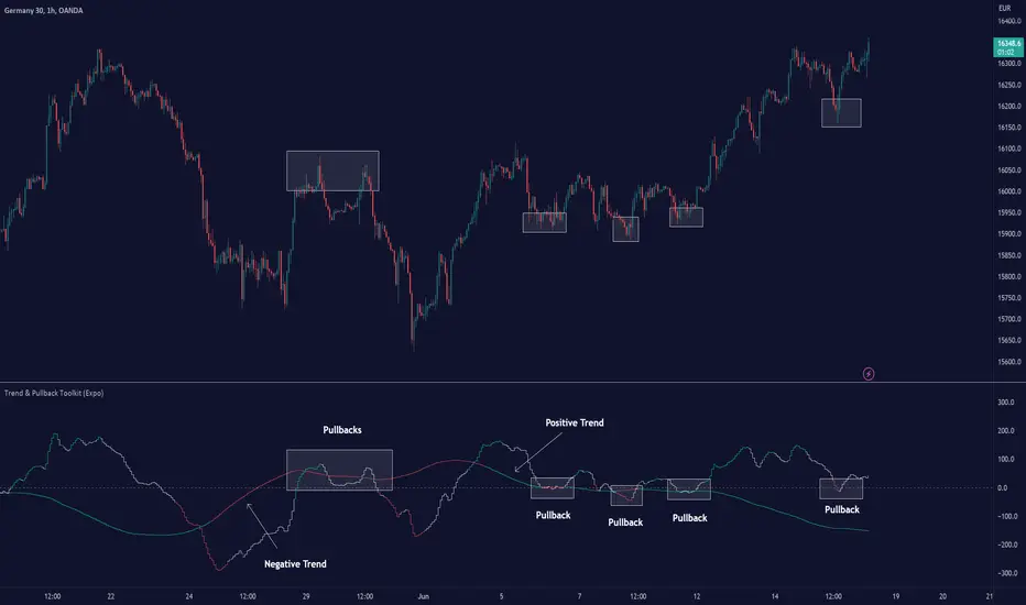
Trend & Pullback Toolkit (Expo)█ Overview
The Trend & Pullback Trading Toolkit is an all-encompassing suite of tools designed for serious traders who want a comprehensive trend approach. It empowers traders to align their strategies with prevailing market trends, thereby mitigating risk while maximizing profit potential.
The Toolkit helps traders spot, analyze, and react to market trends, pullbacks, and significant trends. It combines multiple trading methodologies, such as the Elliott Wave theory, cyclical analysis, retracement analysis, strength analysis, volatility analysis, and pivot analysis, to provide a thorough understanding of the market. All these tools can help traders detect trends, pullbacks, and major shifts in the overall trend. By integrating different methodologies, this toolkit offers a multifaceted approach to analyzing market trends.
In essence, the Trend & Pullback Toolkit is the complete package for traders seeking to detect, evaluate, and act upon market trends and pullbacks while being prepared for major trend shifts.
The Trend & Pullback Toolkit works in any market and timeframe for discretionary analysis and includes many oscillators and features, but first, let us define what a cycle is:
█ What is a cycle
This involves the analysis of recurring patterns or events in the market that repeat over a specific period. Cycles can exist in various time frames and can be identified and analyzed with various tools, including some types of oscillators or time-based analysis methods.
Traders must also be aware that cycles do not always repeat perfectly and can often shift, evolve, or disappear entirely.
█ Features & How They Work
Elliott Wave Cycles: This is a method of technical analysis that traders use to analyze financial market cycles and forecast market trends. Elliott Wave theory asserts that markets move in repetitive cycles, which traders can analyze to predict future price movement. The core principle behind the theory is that market prices alternate between an impulsive, or driving phase, and a corrective phase on all time scales of trend. This pattern forms a fractal, meaning it's a self-similar pattern that repeats regardless of the degree or size of the waves.
The Elliott Wave Cycle Feature uses the principle of the Elliott Wave to identify trends and pullbacks in real-time.
Ratio Wave Cycle: This method elaborates on the concept of how negative volatility, or the degree of variation in the negative returns of a financial instrument, influences the effectiveness of a relative price move. Essentially, it delves into the relationship between the negative fluctuations in the market and the resulting relative price change, exploring how the two aspects interact with each other.
The central concept is that trends are generally more stable and predictable than rapid retracements. Therefore, the indicator calculates the relationship between these two market movements. By doing so, it establishes a trend-based identification system. This system aids in forecasting future market movements, allowing traders to make informed decisions based on these predictions. Essentially, it uses the calculated relationship to discern the overall direction (trend) of the market despite temporary counter-movements (retracements), thereby providing a more robust trading signal.
Periodic Wave Cycle: Thi refers to patterns or events in price action that recur over a specific time period. Periodic cycles can range from short-term intraday cycles (like the tendency for stock market volatility to be high at the opening and close of trading) to long-term cycles trend cycles. Traders use this to predict future price movements and trends.
By identifying the phases of a cycle, traders can predict key turning points in the market.
Retracement Cycles: Retracements are temporary price reversals that occur within a larger trend. These retracements are a common occurrence in all markets and timeframes, representing a pause or counter-move within a larger prevailing trend. Retracements can be driven by a variety of factors, including profit-taking, market uncertainty, or a change in market fundamentals. Despite these periodic reversals, the overall trend (upwards or downwards) often continues after the retracement is complete.
Fibonacci retracement functions are primarily used to identify potential retracement levels.
Volatility Cycle: A volatility cycle refers to the periodic changes in the degree of dispersion or variability of a security's returns, expressed as a standard deviation or variance. This feature uses both measures.
Strength Cycle: Gauges the power of a market trend and its inherent impulses. This feature offers a broad perspective on the cyclical nature of markets, which alternate between periods of strength, often referred to as bull markets, and periods of weakness, known as bear markets. It effectively tracks the direction, intensity, and cyclic patterns of market behavior.
Let us define the difference between strength and impulse:
Strength: This refers to the power or force behind a price move. In trading, this refers to the momentum or volume supporting a price move.
Impulse: In the context of trading, an impulse usually refers to a strong move in price. Impulse moves are typically followed by corrective moves against the trend.
Pivot Cycles: Pivot cycles refer to the observation of recurring price patterns or turning points in the market. Pivots can be defined as significant highs or lows that act as potential reversal or support/resistance points. Pivot point analysis helps traders understand the prevailing market sentiment. Overall, pivot cycles provide traders with a framework to identify potential market turning points and price levels of interest.
█ How to use the Trend & Pullback Toolkit
Elliott Wave Cycles
Ratio Wave Cycle
Periodic Wave Cycle
Retracement Cycles
Volatility Cycle:
Strength Cycle
Pivot Cycles
█ Why is this Trend & Pullback Toolkit Needed?
The core philosophy of this toolkit revolves around the popular adage in trading circles: "The trend is your friend." This toolkit ensures that you are always in sync with the trend, thereby increasing the chances of successful trades.
Here's an overview of the key benefits:
Trend Identification: The toolkit includes sophisticated algorithms and indicators that help identify the prevailing trend in the market. These algorithms analyze price patterns, momentum, volume, and other factors to determine the direction and strength of the trend.
Risk Reduction: By enabling traders to trade with the trend, this toolkit reduces the risk of betting against market momentum.
Profit Maximization: Trading with the trend increases the likelihood of successful trades.
Advanced Analysis Tools: The toolkit includes tools that provide a deeper insight into market dynamics. These tools enable a multi-dimensional analysis of market trends, from Elliott Wave cycles and period cycles to retracement cycles, ratio wave cycles, pivot cycles, and strength cycles.
User-friendly Interface: Despite its sophistication, the toolkit is designed with user-friendliness in mind. It allows for customization and presents data in easy-to-understand formats.
Versatility: The toolkit is versatile and can be used across different markets - stocks, forex, commodities, and cryptocurrencies. This makes it a valuable resource for all types of traders.
█ Any Alert Function Call
This function allows traders to combine any feature and create customized alerts. These alerts can be set for various conditions and customized according to the trader's strategy or preferences.
█ In conclusion, The Trading Toolkit is a powerful ally for any trader, offering the capabilities to navigate the complexities of the market with ease. Whether you're a novice or an experienced trader, this toolkit provides a structured and systematic approach to trading.
-----------------
Disclaimer
The information contained in my Scripts/Indicators/Ideas/Algos/Systems does not constitute financial advice or a solicitation to buy or sell any securities of any type. I will not accept liability for any loss or damage, including without limitation any loss of profit, which may arise directly or indirectly from the use of or reliance on such information.
All investments involve risk, and the past performance of a security, industry, sector, market, financial product, trading strategy, backtest, or individual's trading does not guarantee future results or returns. Investors are fully responsible for any investment decisions they make. Such decisions should be based solely on an evaluation of their financial circumstances, investment objectives, risk tolerance, and liquidity needs.
My Scripts/Indicators/Ideas/Algos/Systems are only for educational purposes!
Script payant
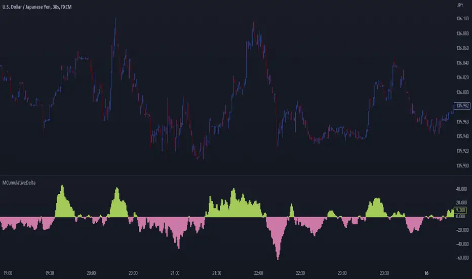
MCumulativeDelta* MCumulativeDelta Indicator *
The MCumulativeDelta Indicator shows the Buying / Selling pressure that is happening in the market. The Delta is powered by the *MBox Precision Delta* Algorithm. This indicator serves to show overall Accumulation and Distribution of the BUYERS and the SELLERS. It becomes possible to gauge if the market is overall Bullish or Bearish. This helps determine trade direction and keeping out of other trades that are counter to what the overall Buying / Selling is showing.
* WHAT THE SCRIPT DOES *
The script draws a histogram that can either be positive or negative. When the histogram is positive it means there are more Buyers in the Market. When the histogram is negative it means there are more sellers in the market. The more positive the histogram gets, the more BUYERS are flooding the market. The more negative the histogram gets, the more SELLERS are flooding the market. When the histogram switches over from negative to positive it is a Bullish sign of Buying. When the histogram switches over from positive to negative, it is a Bearish sign of Selling.
* HOW TO USE IT *
As the histogram becomes more negative, this shows that the SELLERS have taken control of the markets. Conversely, as the histogram becomes more positive, this shows that the Buyers have taken control of the markets. The side that is in control is the direction to generally place trades in, and at the same time filter out trades of the opposite direction.
* HOW IT WORKS *
The MCumulativeDelta histogram on the chart represents overall Buying / Selling. This is the DELTA (difference) between the BUYING and the SELLING. Taking the total BUYING and subtracting the total of SELLING, we produce the DELTA (difference) between the Buying / Selling and this is what is drawn by the histogram.
Unlike other Cumulative Delta indicators which determine delta from the Up / Down wick and just multiply by volume (not a true delta), the MCumulativeDelta indicator uses a sophisticated algorithm that analyzes price movement corresponding to volume movement.
The way the DELTA, BUYING, and SELLING is calculated is computed by the *MBox Precision Delta* Algorithm. The algorithm considers the following data points when making it's computation
1. Price moving up on increasing volume
2. Price moving up on decreasing volume
3. Price moving horizontally on increasing volume
4. Price moving horizontally on decreasing volume
5. Price moving down on increasing volume
6. Price moving down on decreasing volume
Using these data points allows MCumulativeDelta to effectively compute and define the following scenarios
1. Accumulation / Distribution
2. Buying / Selling Exhaustion
3. Buying / Selling EFFORT / NO RESULT
Once the scenario is determined, it will greatly aid in trade decision making. These scenarios are explained in the examples below
* EXAMPLE AND USE CASES *
- Accumulation Example -
When you see a large amount of BUYING (large positive histogram) and price entering an up trend, this is indicative of Accumulation and you would be looking for PULLBACKS to get into the up trend move.
- Distribution Example -
When you see a large amount of SELLING (large negative histogram) and price entering a down trend, this is indicative of Distribution and you would be looking for pullbacks to get into the down trend move.
- Buying EXHAUSTION Divergence -
As price makes higher highs, but the MCumulativeDelta histogram drops (becomes less positive) on the higher highs, it means BUYERS are exhausted. Potentially a reversal or change in behavior in the markets.
- Selling EXHAUSTION Divergence -
As price makes lower lows, but the MCumulativeDelta histogram contracts (becomes less negative) on the lower lows, it means SELLERS are exhausted. Potentially a reversal or change in behavior in the markets.
- BUYING EFFORT / NO RESULT -
As the MCumulativeDelta histogram increases positively, but price fails to make higher highs, it is a sign of EFFORT / NO RESULT on behalf of the Buyers. In this case Buyers are pushing hard to move price up, but are unable to, due to being OVERBOUGHT. If this is accompanied by visible SELLING, it would be a good short entry.
- SELLING EFFORT / NO RESULT -
As the MCumulativeDelta histogram increases negatively, but price fails to make lower lows, it is a sign of EFFORT / NO RESULT on behalf of the Sellers. In this case Sellers are pushing hard to move price down, but are unable to, due to being OVERSOLD. If this is accompanied by visible BUYING, it would be a good long entry.
* SETTING ALERTS *
- FOR CROSSING FROM BUYING TO SELLING OR SELLING TO BUYING -
To be alerted when the histogram crosses over from Buying to Selling (Positive to Negative) or Selling to Buying (Negative to Positive)
1. Right Click Chart -> Add Alert...
2. Select Condition to be "MCumulativeDelta"
3. Select "Crossing" with Value = 0
4. Options set "Once Per Bar Close"
5. Customize Any other Alert Options you want
* AUTHOR *
This script is published by MBoxWave LLC
Smart Money Concepts Probability (Expo)█ Overview
The Smart Money Concept Probability (Expo) is an indicator developed to track the actions of institutional investors, commonly known as "smart money." This tool calculates the likelihood of smart money being actively engaged in buying or selling within the market, referred to as the "smart money order flow."
The indicator measures the probability of three key events: Change of Character ( CHoCH ), Shift in Market Structure ( SMS ), and Break of Structure ( BMS ). These probabilities are displayed as percentages alongside their respective levels, providing a straightforward and immediate understanding of the likelihood of smart money order flow.
Finally, the backtested results are shown in a table, which gives traders an understanding of the historical performance of the current order flow direction.
█ Calculations
The algorithm individually computes the likelihood of the events ( CHoCH , SMS , and BMS ). A positive score is assigned for events where the price successfully breaks through the level with the highest probability, and a negative score when the price fails to do so. By doing so, the algorithm determines the probability of each event occurring and calculates the total profitability derived from all the events.
█ Example
In this case, we have an 85% probability that the price will break above the upper range and make a new Break Of Structure and only a 16.36% probability that the price will break below the lower range and make a Change Of Character.
█ Settings
The Structure Period sets the pivot period to use when calculating the market structure.
The Structure Response sets how responsive the market structure should be. A low value returns a more responsive structure. A high value returns a less responsive structure.
█ How to use
This indicator is a perfect tool for anyone that wants to understand the probability of a Change of Character ( CHoCH ), Shift in Market Structure ( SMS ), and Break of Structure ( BMS )
The insights provided by this tool help traders gain an understanding of the smart money order flow direction, which can be used to determine the market trend.
█ Any Alert function call
An alert is sent when the price breaks the upper or lower range, and you can select what should be included in the alert. You can enable the following options:
Ticker ID
Timeframe
Probability percentage
-----------------
Disclaimer
The information contained in my Scripts/Indicators/Ideas/Algos/Systems does not constitute financial advice or a solicitation to buy or sell any securities of any type. I will not accept liability for any loss or damage, including without limitation any loss of profit, which may arise directly or indirectly from the use of or reliance on such information.
All investments involve risk, and the past performance of a security, industry, sector, market, financial product, trading strategy, backtest, or individual's trading does not guarantee future results or returns. Investors are fully responsible for any investment decisions they make. Such decisions should be based solely on an evaluation of their financial circumstances, investment objectives, risk tolerance, and liquidity needs.
My Scripts/Indicators/Ideas/Algos/Systems are only for educational purposes!

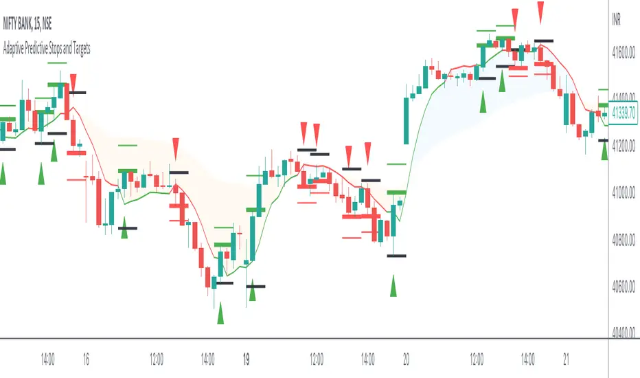
Adaptive Predictive Stops and Targets The indicator is an experiment to Predict Stops and 1st target for any liquid security and for any timeframe,
Intro
The indicator is made using Predictive Differential Filter of 2nd Degree
and an Adaptive Filter to generate Signals and define Targets and Stops
An adaptive filter is a system with a linear filter that has a transfer function controlled by variable parameters and a means to adjust those parameters according to an optimisation algorithm. Because of the complexity of the optimisation algorithms, almost all adaptive filters are digital filters. Thus Helping us classify our intent either long side or short side
The indicator use Adaptive Least mean square algorithm, for convergence of the filtered signals into a category of intents, (either buy or sell)
The Other Category of Filter used in the indicator is Predictive Differential Filter, which helps us estimate the acceleration of the prices and levels of significance for targeting and Stops
The Predictive Differential Filters are capable of predicting the next state of the input based on the interaction with a pre-specified number of filters, The prediction helps in minimising the quantisation error and in removing the granular noise which are caused by PCM systems.
How to Use
The logic to use is simple Buy at the High of the Signal Candle and Sell at the Low of the Signal Candle
Book your 50% position on the first target shown (respectively in green and red lines) and Trail the rest of the positions till you reach stop or breakeven!
vice versa for Sell,
Just Sell on the Low of the Signal Candle
What securities and timeframes will it work upon
The system is designed to work over any liquid security over any timeframe,
The Indicator has provisions for Alert
How to request Access
Just Private message me, do not use comment box for requesting access, use it only for constructive comments
Breakout Probability (Expo)█ Overview
Breakout Probability is a valuable indicator that calculates the probability of a new high or low and displays it as a level with its percentage. The probability of a new high and low is backtested, and the results are shown in a table— a simple way to understand the next candle's likelihood of a new high or low. In addition, the indicator displays an additional four levels above and under the candle with the probability of hitting these levels.
The indicator helps traders to understand the likelihood of the next candle's direction, which can be used to set your trading bias.
█ Calculations
The algorithm calculates all the green and red candles separately depending on whether the previous candle was red or green and assigns scores if one or more lines were reached. The algorithm then calculates how many candles reached those levels in history and displays it as a percentage value on each line.
█ Example
In this example, the previous candlestick was green; we can see that a new high has been hit 72.82% of the time and the low only 28.29%. In this case, a new high was made.
█ Settings
Percentage Step
The space between the levels can be adjusted with a percentage step. 1% means that each level is located 1% above/under the previous one.
Disable 0.00% values
If a level got a 0% likelihood of being hit, the level is not displayed as default. Enable the option if you want to see all levels regardless of their values.
Number of Lines
Set the number of levels you want to display.
Show Statistic Panel
Enable this option if you want to display the backtest statistics for that a new high or low is made. (Only if the first levels have been reached or not)
█ Any Alert function call
An alert is sent on candle open, and you can select what should be included in the alert. You can enable the following options:
Ticker ID
Bias
Probability percentage
The first level high and low price
█ How to use
This indicator is a perfect tool for anyone that wants to understand the probability of a breakout and the likelihood that set levels are hit.
The indicator can be used for setting a stop loss based on where the price is most likely not to reach.
The indicator can help traders to set their bias based on probability. For example, look at the daily or a higher timeframe to get your trading bias, then go to a lower timeframe and look for setups in that direction.
-----------------
Disclaimer
The information contained in my Scripts/Indicators/Ideas/Algos/Systems does not constitute financial advice or a solicitation to buy or sell any securities of any type. I will not accept liability for any loss or damage, including without limitation any loss of profit, which may arise directly or indirectly from the use of or reliance on such information.
All investments involve risk, and the past performance of a security, industry, sector, market, financial product, trading strategy, backtest, or individual's trading does not guarantee future results or returns. Investors are fully responsible for any investment decisions they make. Such decisions should be based solely on an evaluation of their financial circumstances, investment objectives, risk tolerance, and liquidity needs.
My Scripts/Indicators/Ideas/Algos/Systems are only for educational purposes!
MoonFlag Converging BandsThis script form a cloud that is made from multiple lines that are each similar to a moving average.
However, each line is different to moving averages as it uses an algorithm that is nonlinear, 'overshoot moving averages' better explains how they work.
A cloud (visible on the indicator plot) is formed from multiple 'overshoot moving average' lines, each with a different lookback length.
A single variable is provided in the settings which extends all lines which form the cloud.
So the cloud is formed from the max and min from multiple 'nonlinear' moving averages.
What is interesting here is that, ....when the cloud lines narrow or converge..... ,this signifies that all moving averages are narrowing.
However, as the algo does not use standard moving averages - it is a bit more spicy and has some merit with predicting a big or biggish move in advance, before it happens.
So, the overshoot moving averages have a predictive quality.
Whereas, standard moving averages always lag the present time price action.
Indeed, most indicators are based on moving averages and lag the price action.
I'll try and explain how the overshoot moving average works...
Each line which forms the cloud gives an indication of the price trend momentum.
So if the price action rises above a line. the line will follow and move up, however, when the price action reduces momentum or starts to move downwards, the underlying momentum will push the line to overshoot the price action. Hence the price action crossing lines (or extending beyond the cloud) can indicate a change in momentum of a price trend.
There is also a median line shown which can be quite useful. If the price action stays about the median, this would suggest increasing bullish momentum. Then if the price action crosses the median - this is reasonable grounds to think about getting out of a trade as a change in momentum, on multiple timeframes has occured.
So, ... why is this wavecloud important or how is it useful.
When the wavecloud gets narrow - this generally means that all moving averages are converging. However, moving averages lag real-time price action and therefore lack a predictive speculation. With the waveclound presented in this indicator, when the wavecloud narrows this can suggest/predict a sizeable move is about to happen. In the settings, there is a narrowing % variable which can be adjusted depending on which coin or timeframe someone is working with. If there is a lot of background shading (faster timeframes)- decrease the % narrowing. Conversely, if there is insufficient background lines (with longer timeframes), increase the narrowing %.
There are a few trends which are exceptions to predicting a big move. One is that the price trend continues at a steady pace and hence the wavecloud narrows on a steadily increasing or decreasing price.
Another is that the price is choppy and just goes up and down throwing all moving averages or most indicators into a non useful state. However, adjust the narrowing % for whatever price action is in play at the time and you might find you can neatly pick out a big price change.
So, which way does a big price action move go, up or down, I'll leave this one to you. If one is trying to find the end point of a massive bull run - there might be a wavecloud narrowing at the top, just before the price suddenly drops. If its sometime after a big crash and the price action has already been through a choppy phase, its possibly time for a big rise after one last sharp drop. There are all sorts of price action wavecloud formations however, nothing very predictive in terms of suggesting when a big move might be soon to happen is otherwise available. (Although I did find my other script 'Volume Effectiveness' has some merits.)
Timeframe is an important factor with this algorithm. I think the 4hour timeframe with bitcoin is reasonable. I've not extensively tested with other coins however, faster timeframes always render unpredictable results. Also if the timeframe is too long - its difficult to suggest what is going to happen in the near future.

FATL, SATL, RFTL, & RSTL Digital Signal Filter Smoother [Loxx]FATL, SATL, RFTL, & RSTL Digital Signal Filter (DSP) Smoother is is a baseline indicator with DSP processed source inputs
What are digital indicators: distinctions from standard tools, types of filters.
To date, dozens of technical analysis indicators have been developed: trend instruments, oscillators, etc. Most of them use the method of averaging historical data, which is considered crude. But there is another group of tools - digital indicators developed on the basis of mathematical methods of spectral analysis. Their formula allows the trader to filter price noise accurately and exclude occasional surges, making the forecast more effective in comparison with conventional indicators. In this review, you will learn about their distinctions, advantages, types of digital indicators and examples of strategies based on them.
Two non-standard strategies based on digital indicators
Basic technical analysis indicators built into most platforms are based on mathematical formulas. These formulas are a reflection of market behavior in past periods. In other words, these indicators are built based on patterns that were discovered as a result of statistical analysis, which allows one to predict further trend movement to some extent. But there is also a group of indicators called digital indicators. They are developed using mathematical analysis and are an algorithmic spectral system called ATCF (Adaptive Trend & Cycles Following). In this article, I will tell you more about the components of this system, describe the differences between digital and regular indicators, and give examples of 2 strategies with indicator templates.
ATCF - Market Spectrum Analysis Method
There is a theory according to which the market is chaotic and unpredictable, i.e. it cannot be accurately analyzed. After all, no one can tell how traders will react to certain news, or whether some large investor will want to play against the market like George Soros did with the Bank of England. But there is another theory: many general market trends are logical, and have a rationale, causes and effects. The economy is undulating, which means it can be described by mathematical methods.
Digital indicators are defined as a group of algorithms for assessing the market situation, which are based exclusively on mathematical methods. They differ from standard indicators by the form of analysis display. They display certain values: price, smoothed price, volumes. Many standard indicators are built on the basis of filtering the minute significant price fluctuations with the help of moving averages and their variations. But we can hardly call the MA a good filter, because digital indicators that use spectral filters make it possible to do a more accurate calculation.
Simply put, digital indicators are technical analysis tools in which spectral filters are used to filter out price noise instead of moving averages.
The display of traditional indicators is lines, areas, and channels. Digital indicators can be displayed both in the form of lines and in digital form (a set of numbers in columns, any data in a text field, etc.). The digital display of the data is more like an additional source of statistics; for trading, a standard visual linear chart view is used.
All digital models belong to the category of spectral analysis of the market situation. In conventional technical indicators, price indications are averaged over a fixed period of time, which gives a rather rough result. The use of spectral analysis allows us to increase trading efficiency due to the fact that digital indicators use a statistical data set of past periods, which is converted into a “frequency” of the market (period of fluctuations).
Fourier theory provides the following spectral ranging of the trend duration:
low frequency range (0-4) - a reflection of a long trend of 2 months or more
medium frequency range (5-40) - the trend lasts 10-60 days, thus it is referred to as a correction
high frequency range (41-130) - price noise that lasts for several days
The ATCF algorithm is built on the basis of spectral analysis and includes a set of indicators created using digital filters. Its consists of indicators and filters:
FATL: Built on the basis of a low-frequency digital trend filter
SATL: Built on the basis of a low-frequency digital trend filter of a different order
RFTL: High frequency trend line
RSTL: Low frequency trend line
Inclucded:
4 DSP filters
Bar coloring
Keltner channels with variety ranges and smoothing functions
Bollinger bands
40 Smoothing filters
33 souce types
Variable channels

Ehlers Autocorrelation Periodogram [Loxx]Ehlers Autocorrelation Periodogram contains two versions of Ehlers Autocorrelation Periodogram Algorithm. This indicator is meant to supplement adaptive cycle indicators that myself and others have published on Trading View, will continue to publish on Trading View. These are fast-loading, low-overhead, streamlined, exact replicas of Ehlers' work without any other adjustments or inputs.
Versions:
- 2013, Cycle Analytics for Traders Advanced Technical Trading Concepts by John F. Ehlers
- 2016, TASC September, "Measuring Market Cycles"
Description
The Ehlers Autocorrelation study is a technical indicator used in the calculation of John F. Ehlers’s Autocorrelation Periodogram. Its main purpose is to eliminate noise from the price data, reduce effects of the “spectral dilation” phenomenon, and reveal dominant cycle periods. The spectral dilation has been discussed in several studies by John F. Ehlers; for more information on this, refer to sources in the "Further Reading" section.
As the first step, Autocorrelation uses Mr. Ehlers’s previous installment, Ehlers Roofing Filter, in order to enhance the signal-to-noise ratio and neutralize the spectral dilation. This filter is based on aerospace analog filters and when applied to market data, it attempts to only pass spectral components whose periods are between 10 and 48 bars.
Autocorrelation is then applied to the filtered data: as its name implies, this function correlates the data with itself a certain period back. As with other correlation techniques, the value of +1 would signify the perfect correlation and -1, the perfect anti-correlation.
Using values of Autocorrelation in Thermo Mode may help you reveal the cycle periods within which the data is best correlated (or anti-correlated) with itself. Those periods are displayed in the extreme colors (orange) while areas of intermediate colors mark periods of less useful cycles.
What is an adaptive cycle, and what is the Autocorrelation Periodogram Algorithm?
From his Ehlers' book mentioned above, page 135:
"Adaptive filters can have several different meanings. For example, Perry Kaufman’s adaptive moving average ( KAMA ) and Tushar Chande’s variable index dynamic average ( VIDYA ) adapt to changes in volatility . By definition, these filters are reactive to price changes, and therefore they close the barn door after the horse is gone.The adaptive filters discussed in this chapter are the familiar Stochastic , relative strength index ( RSI ), commodity channel index ( CCI ), and band-pass filter.The key parameter in each case is the look-back period used to calculate the indicator.This look-back period is commonly a fixed value. However, since the measured cycle period is changing, as we have seen in previous chapters, it makes sense to adapt these indicators to the measured cycle period. When tradable market cycles are observed, they tend to persist for a short while.Therefore, by tuning the indicators to the measure cycle period they are optimized for current conditions and can even have predictive characteristics.
The dominant cycle period is measured using the Autocorrelation Periodogram Algorithm. That dominant cycle dynamically sets the look-back period for the indicators. I employ my own streamlined computation for the indicators that provide smoother and easier to interpret outputs than traditional methods. Further, the indicator codes have been modified to remove the effects of spectral dilation.This basically creates a whole new set of indicators for your trading arsenal."
How to use this indicator
The point of the Ehlers Autocorrelation Periodogram Algorithm is to dynamically set a period between a minimum and a maximum period length. While I leave the exact explanation of the mechanic to Dr. Ehlers’s book, for all practical intents and purposes, in my opinion, the punchline of this method is to attempt to remove a massive source of overfitting from trading system creation–namely specifying a look-back period. SMA of 50 days? 100 days? 200 days? Well, theoretically, this algorithm takes that possibility of overfitting out of your hands. Simply, specify an upper and lower bound for your look-back, and it does the rest. In addition, this indicator tells you when its best to use adaptive cycle inputs for your other indicators.
Usage Example 1
Let's say you're using "Adaptive Qualitative Quantitative Estimation (QQE) ". This indicator has the option of adaptive cycle inputs. When the "Ehlers Autocorrelation Periodogram " shows a period of high correlation that adaptive cycle inputs work best during that period.
Usage Example 2
Check where the dominant cycle line lines, grab that output number and inject it into your other standard indicators for the length input.