Cyclic Polygamma BandsThe polygamma function is the (n+1)st derivative of the logarithm of the gamma function where n is the respective order. An approximation of this derivative at order n=1 is taken and applied to my own calculation of upper and lower bands (along with a mean), to create the cyclic polygamma bands. Cyclic, as it is weighted to mimic the local alternations in price (peak to trough corresponding to turning points of a set of moving averages). Lower cyclic weights for trending markets, higher cyclic weights correspond to choppier markets. It has 3 plots. The CP-H, CP-Mean and CP-L, where the CP-H is the red band, CP-L is the green band and CP-Mean the mean of these 2 bands. The method of trading is dependent on the user, but generally in an (here, undefined) uptrend, prices that snap the CP-L are considered bullish. Same logic for shorts and the CP-H.
The raw calculation is the unfiltered calculation. Cyclic is recommended, but the CP-Mean has exhibited interesting behavior (use at your own discretion). Cyclic aims to follow the local cycles of price.
Low cyclic weight will allow the weight of the polygamma to be higher. High cyclic weight will mimic price more, responding quicker to price. Use high if markets are chopping.
Recherche dans les scripts pour "bands"

Bitcoin Power Law Bands (BTC Power Law) Indicator█ OVERVIEW
The 'Bitcoin Power Law Bands' indicator is a set of three US dollar price trendlines and two price bands for bitcoin , indicating overall long-term trend, support and resistance levels as well as oversold and overbought conditions. The magnitude and growth of the middle (Center) line is determined by double logarithmic (log-log) regression on the entire USD price history of bitcoin . The upper (Resistance) and lower (Support) lines follow the same trajectory but multiplied by respective (fixed) factors. These two lines indicate levels where the price of bitcoin is expected to meet strong long-term resistance or receive strong long-term support. The two bands between the three lines are price levels where bitcoin may be considered overbought or oversold.
All parameters and visuals may be customized by the user as needed.
█ CONCEPTS
Long-term models
Long-term price models have many challenges, the most significant of which is getting the growth curve right overall. No one can predict how a certain market, asset class, or financial instrument will unfold over several decades. In the case of bitcoin , price history is very limited and extremely volatile, and this further complicates the situation. Fortunately for us, a few smart people already had some bright ideas that seem to have stood the test of time.
Power law
The so-called power law is the only long-term bitcoin price model that has a chance of survival for the years ahead. The idea behind the power law is very simple: over time, the rapid (exponential) initial growth cannot possibly be sustained (see The seduction of the exponential curve for a fun take on this). Year-on-year returns, therefore, must decrease over time, which leads us to the concept of diminishing returns and the power law. In this context, the power law translates to linear growth on a chart with both its axes scaled logarithmically. This is called the log-log chart (as opposed to the semilog chart you see above, on which only one of the axes - price - is logarithmic).
Log-log regression
When both price and time are scaled logarithmically, the power law leads to a linear relationship between them. This in turn allows us to apply linear regression techniques, which will find the best-fitting straight line to the data points in question. The result of performing this log-log regression (i.e. linear regression on a log-log scaled dataset) is two parameters: slope (m) and intercept (b). These parameters fully describe the relationship between price and time as follows: log(P) = m * log(T) + b, where P is price and T is time. Price is measured in US dollars , and Time is counted as the number of days elapsed since bitcoin 's genesis block.
DPC model
The final piece of our puzzle is the Dynamic Power Cycle (DPC) price model of bitcoin . DPC is a long-term cyclic model that uses the power law as its foundation, to which a periodic component stemming from the block subsidy halving cycle is applied dynamically. The regression parameters of this model are re-calculated daily to ensure longevity. For the 'Bitcoin Power Law Bands' indicator, the slope and intercept parameters were calculated on publication date (March 6, 2022). The slope of the Resistance Line is the same as that of the Center Line; its intercept was determined by fitting the line onto the Nov 2021 cycle peak. The slope of the Support Line is the same as that of the Center Line; its intercept was determined by fitting the line onto the Dec 2018 trough of the previous cycle. Please see the Limitations section below on the implications of a static model.
█ FEATURES
Inputs
• Parameters
• Center Intercept (b) and Slope (m): These log-log regression parameters control the behavior of the grey line in the middle
• Resistance Intercept (b) and Slope (m): These log-log regression parameters control the behavior of the red line at the top
• Support Intercept (b) and Slope (m): These log-log regression parameters control the behavior of the green line at the bottom
• Controls
• Plot Line Fill: N/A
• Plot Opportunity Label: Controls the display of current price level relative to the Center, Resistance and Support Lines
Style
• Visuals
• Center: Control, color, opacity, thickness, price line control and line style of the Center Line
• Resistance: Control, color, opacity, thickness, price line control and line style of the Resistance Line
• Support: Control, color, opacity, thickness, price line control and line style of the Support Line
• Plots Background: Control, color and opacity of the Upper Band
• Plots Background: Control, color and opacity of the Lower Band
• Labels: N/A
• Output
• Labels on price scale: Controls the display of current Center, Resistance and Support Line values on the price scale
• Values in status line: Controls the display of current Center, Resistance and Support Line values in the indicator's status line
█ HOW TO USE
The indicator includes three price lines:
• The grey Center Line in the middle shows the overall long-term bitcoin USD price trend
• The red Resistance Line at the top is an indication of where the bitcoin USD price is expected to meet strong long-term resistance
• The green Support Line at the bottom is an indication of where the bitcoin USD price is expected to receive strong long-term support
These lines envelope two price bands:
• The red Upper Band between the Center and Resistance Lines is an area where bitcoin is considered overbought (i.e. too expensive)
• The green Lower Band between the Support and Center Lines is an area where bitcoin is considered oversold (i.e. too cheap)
The power law model assumes that the price of bitcoin will fluctuate around the Center Line, by meeting resistance at the Resistance Line and finding support at the Support Line. When the current price is well below the Center Line (i.e. well into the green Lower Band), bitcoin is considered too cheap (oversold). When the current price is well above the Center Line (i.e. well into the red Upper Band), bitcoin is considered too expensive (overbought). This idea alone is not sufficient for profitable trading, but, when combined with other factors, it could guide the user's decision-making process in the right direction.
█ LIMITATIONS
The indicator is based on a static model, and for this reason it will gradually lose its usefulness. The Center Line is the most durable of the three lines since the long-term growth trend of bitcoin seems to deviate little from the power law. However, how far price extends above and below this line will change with every halving cycle (as can be seen for past cycles). Periodic updates will be needed to keep the indicator relevant. The user is invited to adjust the slope and intercept parameters manually between two updates of the indicator.
█ RAMBLINGS
The 'Bitcoin Power Law Bands' indicator is a useful tool for users wishing to place bitcoin in a macro context. As described above, the price level relative to the three lines is a rough indication of whether bitcoin is over- or undervalued. Users wishing to gain more insight into bitcoin price trends may follow the author's periodic updates of the DPC model (contact information below).
█ NOTES
The author regularly posts on Twitter using the @DeFi_initiate handle.
█ THANKS
Many thanks to the following individuals, who - one way or another - made the 'Bitcoin Power Law Bands' indicator possible:
• TradingView user 'capriole_charles', whose open-source 'Bitcoin Power Law Corridor' script was the basis for this indicator
• Harold Christopher Burger, whose Bitcoin’s natural long-term power-law corridor of growth article (2019) was the basis for the 'Bitcoin Power Law Corridor' script
• Bitcoin Forum user "Trololo", who posted the original power law model at Logarithmic (non-linear) regression - Bitcoin estimated value (2014)

Ultimate Reversion BandsURB – The Smart Reversion Tool
URB Final filters out false breakouts using a real retest mechanism that most indicators miss. Instead of chasing wicks that fail immediately, it waits for price to confirm rejection by retesting the inner band—proving sellers/buyers are truly exhausted.
Eliminates fakeouts – The retest filter catches only genuine reversions
Triple confirmation – Wick + retest + optional volume/RSI filters
Clear visuals – Outer bands show extremes, inner bands show retest zones
Works on any timeframe – From scalping to swing trading
Perfect for traders tired of getting stopped out by false breakouts.
Core Construction:
Smart Dynamic Bands:
Basis = Weighted hybrid EMA of HLC3, SMA, and WMA
Outer Bands = Basis ± (ATR × Multiplier)
Inner Bands = Basis ± (ATR × Multiplier × 0.5) → The "retest zone"
The Unique Filter: The Real Retest
Step 1: Identify an extreme wick touching the outer band
Step 2: Wait 1-3 bars for price to return and touch the inner band
Why it works: Most false breakouts never retest. A genuine reversal shows seller/buyer exhaustion by allowing price to come back to the "halfway" level.
Optional Confirmations:
Volume surge filter (default ON)
RSI extremes filter (optional)
Each can be toggled ON/OFF
How to Use:
Watch for extreme wicks touching the red/lime outer bands
Wait for the retest – price must return to touch the inner band (dotted line) within 3 bars
Enter on confirmation with built-in volume/RSI filters
Set stops beyond the extreme wick

ST – EQ Bands, VWAP [Soothing Trades]Short Description
ST – EQ Bands, VWAP plots a smooth equilibrium line, inner and outer volatility bands (R1/S1, R2/S2), and VWAP on your chart. It's a fixed-settings overlay designed to show you fair value, stretch, and reaction zones at a glance, without any configuration.
Full Description
This tool combines three ideas into one clean overlay:
• A SuperSmoother equilibrium line (EQ) built from hlc3
• Two sets of ATR-scaled volatility bands (inner and outer)
• A standard VWAP line
All of them are updated in real time and extended to the left using horizontal line objects.
Core logic
• Source: hlc3 (average of high, low, close).
• The equilibrium line uses a fixed-length SuperSmoother filter (len = 200) to stay smooth but responsive.
• Volatility is measured using a smoothed version of true range (ATR) run through the same SuperSmoother engine.
• Inner and outer ranges are created by multiplying this smoothed ATR by constants, then by π (pi), and offsetting EQ up/down.
From those, the script derives:
• EQ – main equilibrium line.
• R1 / S1 – inner bands around EQ (moderate stretch).
• R2 / S2 – wider outer bands (stronger stretch).
• VWAP – TradingView's built-in volume-weighted average price.
How to read it
When price is near EQ, the market is hovering around its smoothed mean.
When price oscillates between S1 and R1, you're often in a controlled, rotational environment – good for mean-reversion or balanced trend trades.
When price pushes into R2/S2, the move is more extended:
• In slower regimes this can flag exhaustion / fade zones.
• In strong trends it can highlight powerful continuation swings where pullbacks toward inner bands are opportunities.
VWAP adds another layer:
• Price relative to VWAP vs EQ tells you if the market is leaning with or against where most volume has transacted.
• EQ + VWAP confluence can mark important "fair value" hubs or flip zones intraday.
Visual design
• EQ line (thicker) to stand out as the core reference.
• Inner bands (R1/S1) as subtle, nearby bands.
• Outer bands (R2/S2) as a dashed, more distant envelope.
• VWAP as its own line with distinct color and width.
• All lines extend left from the most recent bar so structure remains visible when you scroll back.
Inputs
This version is intentionally hard coded for simplicity and consistency:
• No user inputs in the panel; all key parameters (length, multipliers, colors, extension) are pre-tuned.
• Just add it to your chart and start reading the structure.
• (Advanced users can adjust internals directly in the code if they want to experiment, but that isn't required.)
Use cases
• Quickly see when price is compressed vs stretched.
• Frame trades around: EQ crosses and retests, Reactions at inner bands, Extreme moves into outer bands, VWAP alignment or divergence.
• Use as a higher-timeframe context tool in combination with your own entries and execution signals.
Notes & disclaimer
• Works across most symbols and timeframes supported by TradingView Pine Script v6.
• For educational and analytical use only. Not financial advice or a trading signal service.
• Always test and manage your own risk before using any indicator live.

TMA Dual BandsTMA Dual Bands - Adaptive Channel Indicator with Crossover Signals
TMA Dual Bands represents my interpretation of the classic Triangular Moving Average methodology, specifically designed to identify high-probability trading setups through the interaction of two adaptive channel systems. Unlike traditional channel indicators that rely on static calculations, this tool dynamically adjusts to market volatility while maintaining the smooth, reliable characteristics that make TMA-based systems so effective.
The indicator combines a MAIN channel (slow-moving, representing the broader trend) with a FAST channel (responsive, capturing momentum shifts). When these two systems interact in specific ways, they generate clear trading signals that can be used across multiple timeframes and market conditions.
The Mathematics Behind the Indicator
At its core, this indicator uses a sophisticated approach to calculating Triangular Moving Averages. Rather than using the traditional double Simple Moving Average method, I've implemented a double Weighted Moving Average calculation. This means the TMA is computed by taking a WMA of another WMA, which provides better responsiveness to recent price action while maintaining the smooth, triangular weighting distribution that gives this indicator its name.
The weighted approach significantly reduces lag compared to double-smoothed simple moving averages, allowing the indicator to catch trend changes earlier without sacrificing reliability. This is particularly important for the FAST channel, where responsiveness is crucial for signal generation.
Adaptive Volatility Bands
What makes this indicator truly unique is its adaptive band calculation system. Instead of using a single standard deviation like traditional Bollinger Bands, the indicator maintains separate variance calculations for upward and downward price movements. When price rises above the TMA centerline, the upper band variance increases while the lower band variance decreases proportionally. The opposite occurs when price falls below the centerline.
This asymmetric approach allows the bands to better reflect actual market conditions. During uptrends, the upper band expands to accommodate bullish volatility while the lower band contracts, creating a channel that naturally "leans" in the direction of the trend. The same principle applies in reverse during downtrends.
The full calculation uses a smoothed variance over approximately four times the base period, ensuring that band adjustments are gradual rather than erratic. The multiplier parameter allows you to adjust the sensitivity of the bands to volatility, with higher values creating wider channels that generate fewer but higher-quality signals.
Understanding the Signals
The signal generation mechanism is elegantly simple yet remarkably effective. A bullish signal occurs when the lower FAST band crosses above the lower MAIN band. This crossover indicates that short-term momentum has shifted decisively upward, strong enough to break through the slower-moving baseline channel. These signals typically appear after consolidation periods or healthy pullbacks in uptrends, making them excellent continuation entry points.
Conversely, bearish signals trigger when the upper FAST band crosses below the upper MAIN band. This pattern suggests that upward momentum has exhausted itself and that sellers are beginning to dominate. These signals often appear near resistance levels or at the culmination of extended rallies, providing excellent risk-reward opportunities for counter-trend or trend-reversal trades.
The visual representation enhances signal clarity. The MAIN TMA centerline changes color dynamically based on its slope, displaying green during upward movement and red during downward movement. This gives you instant visual confirmation of the prevailing trend direction. The signal markers themselves appear as diamond shapes positioned just outside the MAIN channel bands, with cyan diamonds indicating buy opportunities below the lower band and blue diamonds marking sell opportunities above the upper band. You could consider taking bull signals only on long trend, and vice versa for the sell signals.
Practical Application
The indicator works across multiple trading approaches and timeframes. For trend-following strategies, the most reliable signals occur when they align with the MAIN TMA color. Taking only green-colored uptrend signals and red-colored downtrend signals significantly improves win rates by ensuring you're always trading with the dominant momentum.
For breakout traders, the most powerful setups occur after periods of compression when the FAST bands squeeze inside the MAIN bands. This compression indicates low volatility and tight consolidation. When a signal finally triggers after such compression, it often leads to explosive moves as the market breaks out of its range.
Mean reversion traders can also benefit from this indicator by taking counter-trend signals when price reaches extreme band levels. However, this approach requires careful risk management and works best in clearly ranging market conditions.
Configuration and Customization
The default parameters have been carefully selected through extensive testing, with the MAIN period set to 133 bars and the FAST period at 19 bars. These values create an effective balance between trend identification and momentum responsiveness. However, the indicator is fully customizable to suit different trading styles and market conditions.
Traders focusing on longer-term positions might increase both periods proportionally, while scalpers and day traders might reduce them. The price type parameter allows you to choose how price is calculated for the TMA, with the weighted option providing the most responsive results. The band multiplier controls how wide the channels expand, with values between 2.5 and 4.0 being most common depending on your preferred signal frequency.
Technical Integrity
A critical feature of this indicator is its complete absence of repainting. All signals are generated and confirmed on closed bars, meaning that once a signal appears in historical data, it will remain exactly where it appeared regardless of subsequent price action. This makes the indicator equally reliable for backtesting historical data and trading live markets, a characteristic that many "magic indicator" systems cannot claim.
The calculation methodology ensures that what you see on your chart is exactly what you would have seen in real-time when that bar closed. There are no retrospective adjustments, no future-peeking calculations, and no algorithmic tricks that make historical performance look better than actual trading results would have been.
Conclusion
TMA Dual Bands offers a sophisticated yet user-friendly approach to technical analysis, combining time-tested TMA methodology with modern adaptive volatility concepts. The dual-channel system provides clear visual representation of market structure while the crossover signals offer objective entry points that remove much of the guesswork from trading decisions.
Whether you're a discretionary trader looking for high-probability setups or a systematic trader seeking reliable signals for automated strategies, this indicator provides the clarity and consistency needed for confident decision-making in dynamic market conditions.
---
**Developed by AlgoAlex81**
*Disclaimer: This indicator is provided for educational and informational purposes only. Past performance does not guarantee future results. Always practice proper risk management and never risk more than you can afford to lose.*

HiLo EMA Custom bandsHILo Ema custom bands
This advanced technical indicator is a powerful variation of "HiLo Ema squeeze bands" that combines the best elements of Donchian channels and EMAs. It's specially designed to identify price squeezes before significant market moves while providing dynamic support/resistance levels and predictive price targets.
Indicator Concept:
The indicator initializes EMAs at each new high or low - the upper EMA tracks highs while the lower EMA tracks lows. It draws maximum of 6 custom bands based on percentage, fixed value or Atr
Upper EM bands are drawn below uper ema, Lower EMA bands are drawn above lower ema
Customizable Options:
Ema length: 200 default
Calculation type: Ema (Default), HILO
Calculation type: Percent,Fixed Value, ATR
Band Value: Percent/Value/ATR multiple This is value to use for calculation type
Band Selection: Both,Upper,Lower
Key Features:
You can choose to draw either of one or both, the latter can be overwhelming initially but as you get used to it, it becomes a powerful tool.
When both bands are selected, upper and lower bands provide provides dual references and intersections
This creates a more trend-responsive alternative to traditional Donchian channels with clearly defined zones for trade planning.
If you select percaentage, note that the calulation is based FROM the respective EMA bands. So bands from lower EMA band will appear narrower compared to the those drawn from upper EMA band
Price targets or reversals:
Look of alignment of lines and price. The current level of one order could align with that of previous level of a different order because often markets move in steps
Settings Guide:
Recommended Settings:
Ema length: 200
Use one of the bands (not both) if using large length of say 1000
Calculation type: EMA
HILO will draw donchian like bands, this is useful if you only want flat price levels. In a rising market use upper and vise versa
Calculation type:
percentage for indices : 5, for symbols 10 or higher based on symbol volatility
Fixed value: about 10% of symbol value converted to value
Atr: 2 ideally
Perfect for swing traders and position traders looking for a more sophisticated volatility-based overlay that adapts to changing market conditions and provides predictive reversal levels.
Note: This indicator works well across multiple timeframes but is especially effective on H4, Daily and Weekly charts for trend trading.

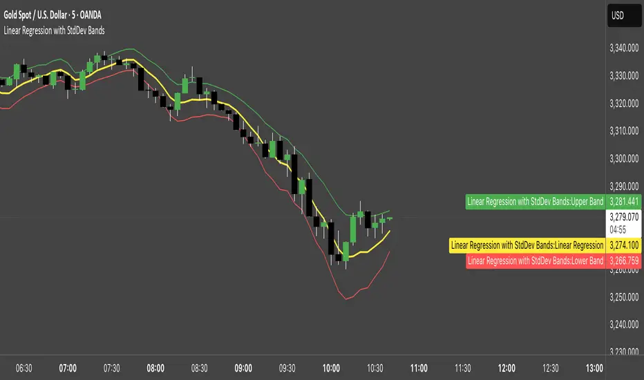
Linear Regression with StdDev BandsLinear Regression with Standard Deviation Bands Indicator
This indicator plots a linear regression line along with upper and lower bands based on standard deviation. It helps identify potential overbought and oversold conditions, as well as trend direction and strength.
Key Components:
Linear Regression Line: Represents the average price over a specified period.
Upper and Lower Bands: Calculated by adding and subtracting the standard deviation (multiplied by a user-defined factor) from the linear regression line. These bands act as dynamic support and resistance levels.
How to Use:
Trend Identification: The direction of the linear regression line indicates the prevailing trend.
Overbought/Oversold Signals: Prices approaching or crossing the upper band may suggest overbought conditions, while prices near the lower band may indicate oversold conditions.
Dynamic Support/Resistance: The bands can act as potential support and resistance levels.
Alerts: Option to enable alerts when the price crosses above the upper band or below the lower band.
Customization:
Regression Length: Adjust the period over which the linear regression is calculated.
StdDev Multiplier: Modify the width of the bands by changing the standard deviation multiplier.
Price Source: Choose which price data to use for calculations (e.g., close, open, high, low).
Alerts: Enable or disable alerts for band crossings.
This indicator is a versatile tool for understanding price trends and potential reversal points.
MACD & Bollinger Bands Overbought OversoldMACD & Bollinger Bands Reversal Detector
This indicator combines the power of MACD divergence analysis with Bollinger Bands to help traders identify potential reversal points in the market.
Key Features:
MACD Calculation & Divergence:
The script calculates the standard MACD components (MACD line, Signal line, and Histogram) using configurable fast, slow, and signal lengths. It includes a simplified divergence detection mechanism that flags potential bearish divergence—when the price makes a new swing high but the MACD fails to confirm the move. This divergence can serve as an early warning that the bullish momentum is waning.
Bollinger Bands:
A 20-period simple moving average (SMA) is used as the basis, with upper and lower bands drawn at 2 standard deviations. These bands help visualize overbought and oversold conditions. For example, a close at or above the upper band suggests the market may be overextended (overbought), while a close at or below the lower band may indicate oversold conditions.
Visual Alerts:
The indicator plots the Bollinger Bands on the chart along with labels marking overbought and oversold conditions. Additionally, it marks potential bearish divergence with a downward triangle, providing a quick visual cue to traders.
Usage Suggestions:
Confluence with Other Signals:
Use the divergence signals and Bollinger Band conditions as filters. For example, even if another indicator suggests a long entry, you might avoid it if the price is overbought or if MACD divergence warns of weakening momentum.
Customization:
All key parameters, such as the MACD lengths, Bollinger Band period, and multiplier, are fully configurable. This flexibility allows you to adjust the indicator to suit different markets or trading styles.
Disclaimer:
This script is provided for educational purposes only. Always perform your own analysis and backtesting before trading with live capital.
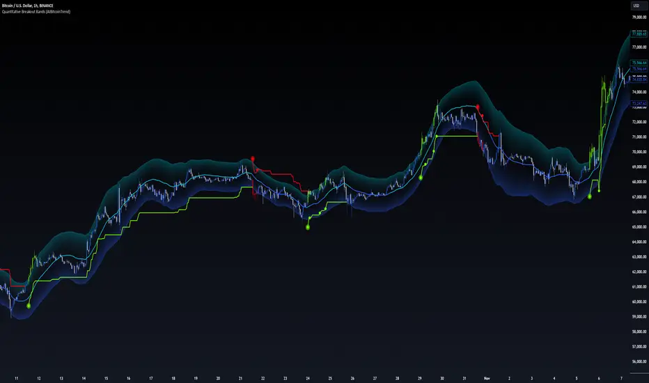
Quantitative Breakout Bands (AIBitcoinTrend)Quantitative Breakout Bands (AIBitcoinTrend) is an advanced indicator designed to adapt to dynamic market conditions by utilizing a Kalman filter for real-time data analysis and trend detection. This innovative tool empowers traders to identify price breakouts, evaluate trends, and refine their trading strategies with precision.
👽 What Are Quantitative Breakout Bands, and Why Are They Unique?
Quantitative Breakout Bands combine advanced filtering techniques (Kalman Filters) with statistical measures such as mean absolute error (MAE) to create adaptive price bands. These bands adjust to market conditions dynamically, providing insights into volatility, trend strength, and breakout opportunities.
What sets this indicator apart is its ability to incorporate both position (price) and velocity (rate of price change) into its calculations, making it highly responsive yet smooth. This dual consideration ensures traders get reliable signals without excessive lag or noise.
👽 The Math Behind the Indicator
👾 Kalman Filter Estimation:
At the core of the indicator is the Kalman Filter, a recursive algorithm used to predict the next state of a system based on past observations. It incorporates two primary elements:
State Prediction: The indicator predicts future price (position) and velocity based on previous values.
Error Covariance Adjustment: The process and measurement noise parameters refine the prediction's accuracy by balancing smoothness and responsiveness.
👾 Breakout Bands Calculation:
The breakout bands are derived from the mean absolute error (MAE) of price deviations relative to the filtered trendline:
float upperBand = kalmanPrice + bandMultiplier * mae
float lowerBand = kalmanPrice - bandMultiplier * mae
The multiplier allows traders to adjust the sensitivity of the bands to market volatility.
👾 Slope-Based Trend Detection:
A weighted slope calculation measures the gradient of the filtered price over a configurable window. This slope determines whether the market is trending bullish, bearish, or neutral.
👾 Trailing Stop Mechanism:
The trailing stop employs the Average True Range (ATR) to calculate dynamic stop levels. This ensures positions are protected during volatile moves while minimizing premature exits.
👽 How It Adapts to Price Movements
Dynamic Noise Calibration: By adjusting process and measurement noise inputs, the indicator balances smoothness (to reduce noise) with responsiveness (to adapt to sharp price changes).
Trend Responsiveness: The Kalman Filter ensures that trend changes are quickly identified, while the slope calculation adds confirmation.
Volatility Sensitivity: The MAE-based bands expand and contract in response to changes in market volatility, making them ideal for breakout detection.
👽 How Traders Can Use the Indicator
👾 Breakout Detection:
Bullish Breakouts: When the price moves above the upper band, it signals a potential upward breakout.
Bearish Breakouts: When the price moves below the lower band, it signals a potential downward breakout.
The trailing stop feature offers a dynamic way to lock in profits or minimize losses during trending moves.
👾 Trend Confirmation:
The color-coded Kalman line and slope provide visual cues:
Bullish Trend: Positive slope, green line.
Bearish Trend: Negative slope, red line.
👽 Why It’s Useful for Traders
Dynamic and Adaptive: The indicator adjusts to changing market conditions, ensuring relevance across timeframes and asset classes.
Noise Reduction: The Kalman Filter smooths price data, eliminating false signals caused by short-term noise.
Comprehensive Insights: By combining breakout detection, trend analysis, and risk management, it offers a holistic trading tool.
👽 Indicator Settings
Process Noise (Position & Velocity): Adjusts filter responsiveness to price changes.
Measurement Noise: Defines expected price noise for smoother trend detection.
Slope Window: Configures the lookback for slope calculation.
Lookback Period for MAE: Defines the sensitivity of the bands to volatility.
Band Multiplier: Controls the band width.
ATR Multiplier: Adjusts the sensitivity of the trailing stop.
Line Width: Customizes the appearance of the trailing stop line.
Disclaimer: This indicator is designed for educational purposes and does not constitute financial advice. Please consult a qualified financial advisor before making investment decisions.
Algo Bands [ProjeAdam]OVERVIEW:
The Algo Bands indicator is a technical analysis tool that calculates the highest, lowest, and average price levels over a user-defined number of bars. It generates buy and sell signals based on price interactions with these levels, visualizing them as bands on the chart. Additionally, the indicator provides multi-timeframe analysis and integrates alerts for timely trading decisions.
ALGORITHM:
1. Initialization and Function Definition
The Algo Bands indicator starts by defining functions to calculate critical price levels:
- High Band : A smoothed average of recent high price levels.
- Low Band : A smoothed average of recent low price levels.
- Average Band : The midpoint between the High Band and Low Band.
The smoothing process utilizes a Smoothed Moving Average (SMMA) to reduce noise and ensure accurate signal generation.
2. Inputs and Band Calculation
The indicator accepts customizable inputs for flexibility in trading strategies:
- Backward Length : The number of bars to consider for calculating high and low values.
- Number of Lines : Specifies how many recent high or low values are averaged.
- Smoothing Period : The length of the SMMA to smooth price data.
Using these inputs:
- The High Band is calculated as the smoothed average of the highest price values.
- The Low Band is calculated as the smoothed average of the lowest price values.
- The Average Band is the midpoint of the High and Low Bands.
3. Plotting the Bands
The Algo Bands indicator plots three main lines on the price chart:
- High Band : Plotted as a red step line, representing resistance levels.
- Low Band : Plotted as a green step line, indicating support levels.
- Average Band : Plotted as an orange line, showing the midpoint or equilibrium price.
4. Buy and Sell Conditions
Sell Condition:
The indicator triggers a sell signal when either of the following conditions is met:
A. Crossunder Condition :
- The closing price crosses below the High Band.
- The candle closes below its open price, confirming bearish sentiment.
- The closing price remains below both the High Band and the previous bar's open price.
B. Rejection Condition :
- The high price exceeds the High Band during the bar.
- However, the closing price fails to hold above the High Band and closes lower than both the High Band and the open price.
Buy Condition:
The indicator triggers a buy signal when either of the following conditions is met:
A. Crossover Condition :
- The closing price crosses above the Low Band.
- The candle closes above its open price, indicating bullish momentum.
- The closing price remains above both the Low Band and the previous bar's open price.
B. Rejection Condition :
- The low price dips below the Low Band during the bar.
- However, the closing price recovers and closes higher than both the Low Band and the open price.
5. Signal Visualization
The indicator visually represents buy and sell signals as follows:
- Sell Signals : Displayed as a red downward label (🔴) above the bar.
- Buy Signals : Displayed as a green upward label (🟢) below the bar.
The background colors between the bands also reflect market direction:
- Red for bearish trends.
- Green for bullish trends.
6. Alerts
The Algo Bands indicator includes customizable alerts to notify traders of trading signals:
- Alerts are triggered when Buy or Sell conditions are met.
- Integration with Telegram allows real-time notifications for immediate action.
7. Multi-Timeframe Analysis
The indicator supports analysis across multiple timeframes, including:
- 1 Hour
- 4 Hours
- Daily
It calculates the High and Low Bands for these timeframes to provide a comprehensive view of the market trend.
HOW DOES THE INDICATOR WORK?
1. Price Band Calculation :
- The highest and lowest price values are dynamically identified for a user-defined range.
- These values are smoothed using SMMA to produce the High Band and Low Band.
2. Signal Generation :
- Sell signals occur when the price crosses below or rejects the High Band.
- Buy signals occur when the price crosses above or rejects the Low Band.
3. Visualization :
- The bands are plotted on the chart to display resistance, support, and price equilibrium.
- Buy and Sell signals are marked with labels and color-coded backgrounds.
4. Alerts :
- Custom alerts notify traders in real time when signals are triggered.
BENEFITS OF THE ALGO BANDS INDICATOR:
- Trend Identification : Identifies support, resistance, and price equilibrium levels.
- Clear Buy/Sell Signals : Helps traders make timely entry and exit decisions.
- Noise Reduction : SMMA smoothing minimizes false signals.
- Multi-Timeframe Analysis : Provides insights across 1-hour, 4-hour, and daily timeframes.
- Customizable Parameters : Users can adjust settings for their trading style.
- Real-Time Alerts : Immediate notifications ensure timely actions.
- Visual Clarity : Labels and background colors enhance signal visibility.
- Ease of Use : Suitable for traders of all levels, from beginners to experts.
If you have any ideas what to add to my work to add more sources or make calculations cooler, suggest in DM .

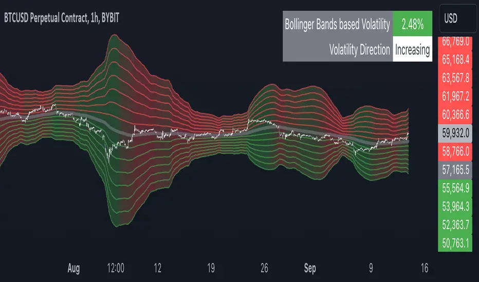
Multiple Bollinger Bands + Volatility [AlgoTraderPro]This indicator helps traders visualize price ranges and volatility changes. Designed to assist in identifying potential consolidation zones, the indicator uses multiple layers of Bollinger Bands combined with volatility-based shading. This can help traders spot periods of reduced price movement, which are often followed by breakouts or trend reversals.
█ FEATURES
Multiple Bollinger Bands: Displays up to seven bands with customizable standard deviations, providing a layered view of price range activity.
Volatility Measurement: Tracks changes in Bollinger Band width to display volatility percentage and direction (increasing, decreasing, or neutral).
Volatility Shading: Uses color-coded shading between the outermost bands to indicate changes in volatility, helping to visualize potential consolidation zones.
Customizable Inputs: Modify lookback periods, moving average lengths, and standard deviations for each band to tailor the analysis to your strategy.
Volatility Table: Displays a table on the chart showing real-time volatility data and direction for quick reference.
█ HOW TO USE
Add the Indicator: Apply it to your TradingView chart.
Adjust Settings: Customize the Bollinger Bands’ parameters to suit your trading timeframe and strategy.
Analyze Consolidation Zones: Use the multiple bands and volatility shading to identify areas of reduced price activity, signaling potential breakouts.
Monitor Volatility: Refer to the volatility table to track real-time shifts in market volatility.
Use in Different Markets: Adapt the settings for various assets and timeframes to assess market conditions effectively.
█ NOTES
• The indicator is useful in consolidating markets where price movement is limited, offering insights into potential breakout areas.
• Adjust the settings based on asset and market conditions for optimal results.
VWAP Bollinger BandsWhat makes this different from vwap bands / bollinger bands?
This indicator takes a bit of inspiration from bollinger but instead of utilizing built in pine script std dev that uses simple moving average internally, this version replaces that with vwap.
Also instead of traditional bollinger band basis of 20 period simple moving average, the basis here for the bands is the vwap.
How to use it?
Usage is similar to vwap itself, though the standard deviation bands will expand and contract like normal bollinger bands instead of vwap bands that just widen as the market movement continues. The bands tell a slightly different story from bollinger bands as the underlying data utilized is the vwap itself.
Which markets is this meant for?
Any market.
What conditions?
This aids in finding conditions of entry standard to vwap, but the bands could give key areas of focus for entries and exits better than standard bollinger bands or vwap bands.
CFB Adaptive MOGALEF Bands [Loxx]A Pine Script adaptation from MOGALEF Bands .
What are MOGALEF Bands?
Actual MOGALEF bands code is the final result of a lot of contributors. Syllables MO-GA-LEF are the initials of three of them.
The basic idea of bands: the markets are still in range, and trends that are moving ranges. The Mogalef bands try to estimate the current range and to project its on the future if prices move. This future estimation is often of great relevance and very useful, especialy for market profile users or pivot points users.
What is Composite Fractal Behavior ( CFB )?
All around you mechanisms adjust themselves to their environment. From simple thermostats that react to air temperature to computer chips in modern cars that respond to changes in engine temperature, r.p.m.'s, torque, and throttle position. It was only a matter of time before fast desktop computers applied the mathematics of self-adjustment to systems that trade the financial markets.
Unlike basic systems with fixed formulas, an adaptive system adjusts its own equations. For example, start with a basic channel breakout system that uses the highest closing price of the last N bars as a threshold for detecting breakouts on the up side. An adaptive and improved version of this system would adjust N according to market conditions, such as momentum, price volatility or acceleration.
Since many systems are based directly or indirectly on cycles, another useful measure of market condition is the periodic length of a price chart's dominant cycle, (DC), that cycle with the greatest influence on price action.
The utility of this new DC measure was noted by author Murray Ruggiero in the January '96 issue of Futures Magazine. In it. Mr. Ruggiero used it to adaptive adjust the value of N in a channel breakout system. He then simulated trading 15 years of D-Mark futures in order to compare its performance to a similar system that had a fixed optimal value of N. The adaptive version produced 20% more profit!
This DC index utilized the popular MESA algorithm (a formulation by John Ehlers adapted from Burg's maximum entropy algorithm, MEM). Unfortunately, the DC approach is problematic when the market has no real dominant cycle momentum, because the mathematics will produce a value whether or not one actually exists! Therefore, we developed a proprietary indicator that does not presuppose the presence of market cycles. It's called CFB (Composite Fractal Behavior) and it works well whether or not the market is cyclic.
CFB examines price action for a particular fractal pattern, categorizes them by size, and then outputs a composite fractal size index. This index is smooth, timely and accurate
Essentially, CFB reveals the length of the market's trending action time frame. Long trending activity produces a large CFB index and short choppy action produces a small index value. Investors have found many applications for CFB which involve scaling other existing technical indicators adaptively, on a bar-to-bar basis.
What is Jurik Volty used in the Juirk Filter?
One of the lesser known qualities of Juirk smoothing is that the Jurik smoothing process is adaptive. "Jurik Volty" (a sort of market volatility ) is what makes Jurik smoothing adaptive. The Jurik Volty calculation can be used as both a standalone indicator and to smooth other indicators that you wish to make adaptive.
What is the Jurik Moving Average?
Have you noticed how moving averages add some lag (delay) to your signals? ... especially when price gaps up or down in a big move, and you are waiting for your moving average to catch up? Wait no more! JMA eliminates this problem forever and gives you the best of both worlds: low lag and smooth lines.
Ideally, you would like a filtered signal to be both smooth and lag-free. Lag causes delays in your trades, and increasing lag in your indicators typically result in lower profits. In other words, late comers get what's left on the table after the feast has already begun.
Included:
-Color bars
-Fill levels

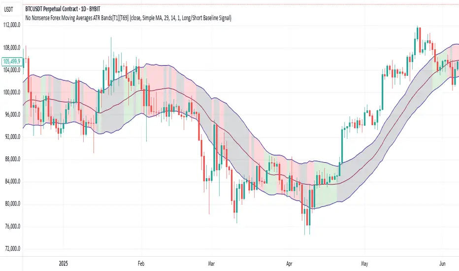
No Nonsense Forex Moving Averages ATR Bands[T1][T69]🔍 Overview
This indicator implements a No Nonsense Forex-style Baseline combined with ATR Bands, built using the moving_averages_library by Teyo69. It plots a configurable moving average and dynamically adjusts upper/lower ATR bands for trade zone detection and baseline confirmation.
✨ Features
30+ Moving Average types
ATR bands to define dynamic trade zones
Visual background highlighting for trade signals
Supports both "Within Range" and "Baseline Bias" display modes
Clean, minimal overlay with effective zone coloring
⚙️ How to Use
Choose MA Type: Select the baseline logic (SMA, EMA, HMA, etc.)
Configure ATR Bands: Adjust the ATR length and multiplier
Select Background Mode:
Within Range: Yellow = price inside band, Gray = outside
Long/Short Baseline Signal: Green = price above baseline, Red = below
Trade Setup:
Use the baseline for trend direction
Wait for confirmation or avoidance when price is outside the band
🛠 Configuration
Source: Price source for MA
MA Type: Any supported MA from the library
MA Length: Number of bars for smoothing
ATR Length: Period for Average True Range
ATR Multiplier: Width of the bands
Background Signal Mode: Choose visual signal type
⚠️ Limitations
Works with one MA at a time
Requires the moving_averages_library imported
Does not include confirmation or exit logic — use with full NNFX stack
💡 Tips
Combine with Volume or Confirmation indicators for NNFX strategy
Use adaptive MAs like KAMA, JMA, or VIDYA for dynamic baselines
Adjust ATR settings based on asset volatility
📘 Credits
Library: Teyo69/moving_averages_library/1
Inspired by: No Nonsense Forex (VP) Baseline + ATR Band methodology & MigthyZinger
Momentum BandsMomentum Bands indicator-->technical tool that measures the rate of price change and surrounds this momentum with adaptive bands to highlight overbought and oversold zones. Unlike Bollinger Bands, which track price, these bands track momentum itself, offering a unique view of market strength and exhaustion points. At its core, it features a blue momentum line that calculates the rate of change over a set period, an upper red band marking dynamic resistance created by adding standard deviations to the momentum average, a lower green band marking dynamic support by subtracting standard deviations, and a gray middle line representing the average of momentum as a central anchor. When the momentum line touches or moves beyond the upper red band, it often signals that the market may be overbought and a pullback or reversal could follow; traders might lock in profits or watch for short setups. Conversely, when it drops below the lower green band, it can suggest an oversold market primed for a bounce, prompting traders to look for buying opportunities. If momentum remains between the bands, it typically indicates balanced conditions where waiting for stronger signals at the extremes is wise. The indicator can be used in contrarian strategies—buying near the lower band and selling near the upper—or in trend-following setups by waiting for momentum to return toward the centerline before entering trades. For stronger confirmation, traders often combine it with volume spikes, support and resistance analysis, or other trend tools, and it’s useful to check multiple timeframes to spot consistent patterns. Recommended settings vary: short-term traders might use a 7–10 period momentum with 14-period bands; medium-term traders might keep the default 14-period momentum and 20-period bands; while long-term analysis might use 21-period momentum and 50-period bands. Visually, background colors help spot extremes: red for strong overbought, green for strong oversold, and no color for normal markets, alongside reference lines at 70, 30, and 0 to guide traditional overbought, oversold, and neutral zones. Typical bullish signals include momentum rebounding from the lower band, crossing back above the middle after being oversold, or showing divergence where price makes new lows but momentum doesn’t. Bearish signals might appear when momentum hits the upper band and weakens, drops below the middle after being overbought, or price makes new highs while momentum fails to follow. The indicator tends to work best in mean-reverting or sideways markets rather than strong trends, where overbought and oversold conditions tend to repeat.
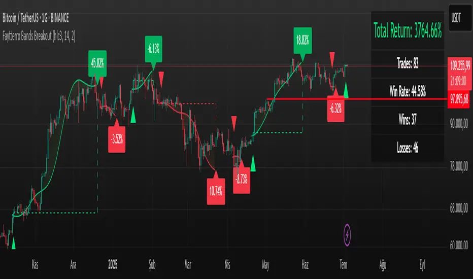
Faytterro Bands Breakout📌 Faytterro Bands Breakout 📌
This indicator was created as a strategy showcase for another script: Faytterro Bands
It’s meant to demonstrate a simple breakout strategy based on Faytterro Bands logic and includes performance tracking.
❓ What Is It?
This script is a visual breakout strategy based on a custom moving average and dynamic deviation bands, similar in concept to Bollinger Bands but with unique smoothing (centered regression) and performance features.
🔍 What Does It Do?
Detects breakouts above or below the Faytterro Band.
Plots visual trade entries and exits.
Labels each trade with percentage return.
Draws profit/loss lines for every trade.
Shows cumulative performance (compounded return).
Displays key metrics in the top-right corner:
Total Return
Win Rate
Total Trades
Number of Wins / Losses
🛠 How Does It Work?
Bullish Breakout: When price crosses above the upper band and stays above the midline.
Bearish Breakout: When price crosses below the lower band and stays below the midline.
Each trade is held until breakout invalidation, not a fixed TP/SL.
Trades are compounded, i.e., profits stack up realistically over time.
📈 Best Use Cases:
For traders who want to experiment with breakout strategies.
For visual learners who want to study past breakouts with performance metrics.
As a template to develop your own logic on top of Faytterro Bands.
⚠ Notes:
This is a strategy-like visual indicator, not an automated backtest.
It doesn't use strategy.* commands, so you can still use alerts and visuals.
You can tweak the logic to create your own backtest-ready strategy.
Unlike the original Faytterro Bands, this script does not repaint and is fully stable on closed candles.
Mad Trading Scientist - Guppy MMA with Bollinger Bands📘 Indicator Name:
Guppy MMA with Bollinger Bands
🔍 What This Indicator Does:
This TradingView indicator combines Guppy Multiple Moving Averages (GMMA) with Bollinger Bands to help you identify trend direction and volatility zones, ideal for spotting pullback entries within trending markets.
🔵 1. Guppy Multiple Moving Averages (GMMA):
✅ Short-Term EMAs (Blue) — represent trader sentiment:
EMA 3, 5, 8, 10, 12, 15
✅ Long-Term EMAs (Red) — represent investor sentiment:
EMA 30, 35, 40, 45, 50, 60
Usage:
When blue (short) EMAs are above red (long) EMAs and spreading → Strong uptrend
When blue EMAs cross below red EMAs → Potential downtrend
⚫ 2. Bollinger Bands (Volatility Envelopes):
Length: 300 (captures the longer-term price range)
Basis: 300-period SMA
Upper & Lower Bands:
±1 Standard Deviation (light gray zone)
±2 Standard Deviations (dark gray zone)
Fill Zones:
Highlights standard deviation ranges
Emphasizes extreme vs. normal price moves
Usage:
Price touching ±2 SD bands signals potential exhaustion
Price reverting to the mean suggests pullback or re-entry opportunity
💡 Important Note: Use With Momentum Filter
✅ For superior accuracy, this indicator should be combined with your invite-only momentum filter on TradingView.
This filter helps confirm whether the trend has underlying strength or is losing momentum, increasing the probability of successful entries and exits.
🕒 Recommended Timeframe:
📆 1-Hour Chart (60m)
This setup is optimized for short- to medium-term swing trading, where Guppy structures and Bollinger reversion work best.
🔧 Practical Strategy Example:
Long Trade Setup:
Short EMAs are above long EMAs (strong uptrend)
Price pulls back to the lower 1 or 2 SD band
Momentum filter confirms bullish strength
Short Trade Setup:
Short EMAs are below long EMAs (strong downtrend)
Price rises to the upper 1 or 2 SD band
Momentum filter confirms bearish strength
Supfabio Break-Return BandsSupfabio Break-Return Bands (B3 & B4 • 3-Candle Confirmation)
Supfabio Break-Return Bands is a volatility-based price action indicator built on top of a Two-Pole smoothing filter combined with ATR-derived dynamic bands.
It is designed to highlight price exhaustion, rejection, and potential reversal zones, with a strong emphasis on structural confirmation rather than immediate breakouts.
Core Concept
The indicator plots four volatility bands (Band 1 to Band 4) above and below a smoothed Two-Pole filter.
Signals are intentionally restricted to the outer bands, where price behavior is statistically more likely to show:
Volatility expansion
Liquidity grabs (stop runs / false breaks)
Strong rejection or mean-reversion behavior
Signal Logic
Band 4 (Primary Extreme Zone)
BUY and SELL signals are generated when:
Initial trigger (first candle)
Price either crosses the Band 4 level or
Touches and rejects the band (wick / pin behavior)
Confirmation on the 3rd candle (t + 2)
The confirmation candle:
Must not touch the same band again
Must close on the correct side of the band
Confirms that the initial break or pin was rejected
This delayed confirmation helps filter false breakouts and impulsive entries.
Band 3 (Secondary Setup)
On Band 3, signals are intentionally more selective:
Pin / rejection only
No direct cross signals
Uses the same 3-candle confirmation logic
This allows Band 3 signals to act as deeper pullback or early exhaustion setups.
Confirmation Mechanism
The script uses an internal state-based logic to:
Track the exact bar where the trigger occurred
Confirm signals only on the correct third candle
Prevent duplicate or consecutive signals from the same setup
Ensure pin-based triggers are not missed
Visual Elements
Main Two-Pole filter plotted as a thick continuous line
Volatility bands plotted with progressive line thickness
Band line styles (dotted / dashed) can be customized manually in the Style tab
Clear BUY and SELL labels plotted directly on the confirmation candle
Optional candle coloring based on filter direction
Alerts & Automation
Built-in alertcondition() for BUY and SELL
Alerts are suitable for webhook automation
Compatible with external systems and trading bots
Intended Use
This indicator is suitable for:
Reversal and exhaustion analysis
Mean-reversion strategies
Liquidity and rejection-based setups
Manual trading or automated execution
Intraday and higher-timeframe analysis
Notes
This script is intended as an analytical tool, not as a standalone trading system.
Signals should be used in combination with market structure, trend context, and proper risk management.

ATR Based TMA Bands [NeuraAlgo]ATR-Based TMA Bands
ATR-Based TMA Bands is a volatility-adaptive channel system built around a smoothed Triangular Moving Average (TMA).
It identifies trend direction, momentum shifts, and reversal opportunities using a combination of TMA structure and ATR-driven channel expansion.
Perfect for traders who want a clean, intelligent, and adaptive market framework.
Made by NeuraAlgo.
🔷 How It Works
1. 🔹 TMA Midline (Core Trend)
The indicator builds a smooth and stable midline using:
📐 Triangular Moving Average
🔄 Additional EMA smoothing
This creates a low-noise trend curve that reacts cleanly to real momentum changes.
2. 📈 Volatility-Adjusted Bands
The channels are built from:
📊 Standard Deviation × Expansion Multiplier
📏 Three ATR-based outer layers
These bands:
Expand in high volatility
Contract in stable markets
Reveal pullbacks, breakout zones, and exhaustion points
3. 🔁 Trend Tilt Algorithm
Slope is measured using an ATR-normalized tilt formula:
atrBase = ta.atr(smoothLen)
tilt = (midline - midline ) / (0.1 * atrBase)
This classifies the trend into:
Bullish
Bearish
Neutral
The bar colors and midline adjust automatically to match market direction.
4. 🔄 Reversal Detection (Turn Signals)
The indicator flags directional flips:
Turn Up → bearish → bullish shift
Turn Down → bullish → bearish shift
These are early reversal alerts ideal for swing traders.
5. 🎯 Flip Buy / Flip Sell Signals
Deep volatility extensions create high-probability re-entry zones:
Flip Buy → price rebounds from oversold ATR zone
Flip Sell → price rejects from overbought ATR zone
Great for:
Mean-reversion entries
Trend re-tests
Pullback trades
Exhaustion signals
📌 How to Use This Indicator
✔ Trend Trading
Follow trend using tilt-colored candles
Use midline as dynamic trend filter
Use channels for breakout/pullback entries
✔ Reversal Trading
Watch for Turn Up / Turn Down labels
Flip signals show where the market is over-stretched
✔ Risk Management
ATR channels automatically adjust to volatility
Helps with smarter SL/TP placement
⭐ Best For
Trend traders
Swing traders
Reversal hunters
Volatility lovers
Anyone wanting a smart, clean technical framework
💡 Core Features
TMA-smoothed trend detection
Multi-layer ATR expansion channels
Intelligent trend tilt algorithm
Turn Up / Turn Down reversal markers
Flip Buy / Flip Sell exhaustion signals
Adaptive bar coloring
Clean and professional visual design

Bollinger Bands Regression Forecast [BigBeluga]🔵 OVERVIEW
The Bollinger Bands Regression Forecast combines volatility envelopes from Bollinger Bands with a linear regression-based projection model .
It visualizes both current and future price zones by extrapolating the Bollinger channel forward in time, giving traders a statistical forecast of probable support and resistance behavior.
🔵 CONCEPTS
Classic Bollinger Bands use a moving average (basis) and standard deviation (deviation) to form dynamic envelopes around price.
This indicator enhances them with linear regression slope detection , allowing it to forecast how the band may expand or contract in the future.
Regression is applied to both the band’s basis and deviation components to predict their trajectory for a user-defined number of Forecast Bars .
The resulting forecast creates a smoothed, funnel-shaped projection that dynamically adapts to volatility.
▲ and ▼ markers highlight potential mean reversion points when price crosses the outer bounds of the bands.
🔵 FEATURES
Forecast Engine : Uses linear regression to project Bollinger Band movement into the future.
Dynamic Channel Width : Adapts standard deviation and slope for realistic volatility modeling.
Auto-Labeled Levels : Displays live upper and lower forecast values for quick reference.
Cross Signals : Marks potential overbought and oversold zones with ▲/▼ signals when price exits the band.
Trend-Adaptive Basis Color : Basis line automatically switches color to represent short-term trend direction.
Customizable Colors and Widths for complete visual control.
🔵 HOW TO USE
Apply the indicator to visualize both current Bollinger structure and its forward projection.
Use ▲/▼ breakout markers to identify short-term reversals or volatility shifts.
When price consistently rides the upper band forecast, the trend is strong and likely continuing.
When regression shows narrowing bands ahead, expect a volatility contraction or consolidation period.
For range traders, outer projected bands can be used as potential mean reversion entry points .
Combine with volume or momentum filters to confirm whether breakouts are genuine or fading.
🔵 CONCLUSION
Bollinger Bands Regression Forecast transforms classic Bollinger analysis into a predictive forecasting model .
By merging volatility dynamics with regression-based extrapolation, it provides traders with a forward-looking visualization of likely price boundaries — revealing not only where volatility is but also where it’s heading next.

Smoothed VWAP Bands🎯 Best Smoothing Setting for Scalping (What You Should Use)
Style σ Smoothing Result
Fast scalping (1min) EMA 14 Very responsive, still filters noise
Balanced intraday (1–5min) EMA 20 Best overall reliability
Slow confirmation (5–15min) EMA 30 Eliminates nearly all fakeouts
✅ What We Are Actually Smoothing
You are NOT smoothing VWAP itself.
You are smoothing the standard deviation (σ) that creates the VWAP bands:
✔ What this does:
* Computes the raw standard deviation (σ) of price relative to VWAP
* Smooths that σ using EMA smoothing
* Builds ±1 and ±2 bands using the smoothed σ
* You get clean, stable bands that filter fakeouts
✔ Result:
* Bands do NOT twitch in chop
* Fakeouts are filtered
* Real breakouts show obvious expansion

Rolling Volatility BandsMake sure to view it from the 1D candlestick chart.
The Rolling Volatility Bands indicator provides a statistically-driven approach to visualizing expected daily price movements using true volatility calculations employed by professional options traders. Unlike traditional Bollinger Bands which use price standard deviation around a moving average, this indicator calculates actual daily volatility from log returns over customizable rolling periods (20-day and 60-day), then annualizes the volatility using the standard √252 formula before projecting forward-looking probability bands. The 1 Standard Deviation bands represent a ~68% probability zone where price is expected to trade the following day, while the 2 Standard Deviation bands capture ~95% of expected movements. This methodology mirrors how major exchanges calculate expected moves for earnings and FOMC events, making it invaluable for options strategies like iron condors during low-volatility periods (narrow bands) or directional plays when volatility expands. The indicator works on any timeframe while always utilizing daily candle data via security() calls, ensuring consistent volatility calculations regardless of your chart resolution, and includes real-time annualized volatility percentages plus daily expected range statistics for comprehensive market analysis.

Super-Elliptic BandsThe core of the "Super-Elliptic Bands" indicator lies in its use of a super-ellipse mathematical model to create dynamic price bands around a central Simple Moving Average (SMA). Here's a concise breakdown of its essential components:
Central Moving Average (MA):
A Simple Moving Average (ta.sma(close, maLen)) serves as the baseline, anchoring the bands to the average price over a user-defined period (default: 50 bars).
Super-Ellipse Formula:
The bands are generated using the super-ellipse equation: |y/b| = (1 - |x/a|^p)^(1/p), where:
x is a normalized bar index based on a user-defined cycle period (periodBase, default: 64), scaled to range from -1 to +1.
a = 1 (fixed semi-major axis).
b is the volatility-based semi-minor axis, calculated as volRaw * mult, where volRaw comes from ta.stdev, ta.atr, or ta.tr (user-selectable).
p (shapeP, default: 2.0) controls the band shape:
p = 2: Elliptical bands.
p < 2: Pointier, diamond-like shapes.
p > 2: Flatter, rectangular-like shapes.
This formula creates bands that dynamically adjust their width and shape based on price volatility and a cyclical component.
enjoy....
