Fourier Smoothed Volume Zone Oscillator ( FSVZO )Overview 🔎
The fourier smoothed Volume Zone Oscillator (FSVZO) is a versatile tool designed to provide traders with a detailed understanding of market conditions by examining volume dynamics. FSVZO applies a series of advanced regularization techniques aimed at trying to reduce market noise, making signals potentially more readable and actionable. This indicator combines traditional technical analysis tools with a unique set of smoothing functions, aimed at creating a more balanced and reliable oscillator that can assist traders in their decision-making process.
A Combination of Technical Elements for a Unique Edge 🔀
FSVZO integrates a variety of technical elements to offer a comprehensive perspective on the market. These elements can be used individually or in combination, depending on user preferences. Here are the main components:
Volume Zone Oscillator (VZO): This foundational element leverages volume data to identify trends and shifts in buying or selling pressure. Unlike a standalone VZO, the FSVZO incorporates a Fourier-based regularization technique to reduce false signals, allowing traders to focus on meaningful volume-driven movements.
Ehler's White Noise Filter: This component is a sophisticated filter that helps distinguish genuine market signals from white noise. By isolating the meaningful movements in price and volume, the white noise filter contributes to the clarity and reliability of the signals generated.
Divergences Detection: FSVZO also provides divergence signals (both hidden and regular) based on the oscillator and price action. Divergences can be used to anticipate possible market reversals or confirmations, enhancing the trader's ability to recognize significant market shifts.
Money Flow Index (MFI) Smoothing: The MFI is calculated and then smoothed using wavelet and whitenoise techniques, providing a cleaner view of money flow within the market. This helps reduce erratic fluctuations and focuses on more consistent trends.
Trendshift Visualization: The FSVZO features an optional trendshift indicator, highlighting shifts between bullish and bearish conditions. These visual cues make it easier to identify trend reversals, aiding traders in timely decision-making.
Flexible Display Options 📊
FSVZO offers a variety of display modes to cater to different trading styles and visual preferences:
Neon Style Plot: The oscillator is presented with neon-style plots primarily for aesthetic purposes.
Color Blindness Modes 🌈: FSVZO includes several color palettes to accommodate traders affected by different types of color blindness (Protanopia, Deuteranopia, Tritanopia, Achromatopsia). These options ensure that everyone can easily interpret the signals, regardless of visual impairments.
Take Profit Areas & Alerts: The indicator can display take profit areas based on overbought or oversold conditions of the smoothed oscillator, marked by background hues to provide a clear visual signal. Alerts for high and low thresholds can also be enabled to identify moments of increased buying or selling interest.
Divergences and Trend Analysis 🔍
FSVZO also aims to identify bullish and bearish divergences:
Regular Bullish/Bearish Divergence: These occur when the oscillator diverges from the price action, indicating a possible reversal.
Hidden Bullish/Bearish Divergence: These occur within a trend, signaling continuation opportunities that help traders capitalize on ongoing trends.
FSVZO also supports additional filtering for divergences, allowing users to refine the detection of divergences to better suit their trading preferences.
Enhanced Noise Filtering 🔄
One of the unique features of FSVZO is its Fourier Regularization and Ehler's White Noise Filter, which help improve signal reliability by reducing the impact of market noise. These filtering methods are beneficial for traders seeking to avoid whipsaws and focus on more meaningful market movements.
Why FSVZO Stands Out 🔑
Noise Reduction: By combining multiple filtering techniques, FSVZO is designed to react to price changes as quickly as possible while offering various smoothing options to reduce noise, which may make it less responsive but more stable.
Flexible Visualization: The option to use different display modes and the inclusion of color blindness-friendly palettes make FSVZO versatile and accessible to all traders.
Detailed Divergence Analysis: The integration of both regular and hidden divergence detection helps improve the potential for identifying trading opportunities.
Advanced Regularization Techniques: The use of Fourier transformation and white noise filters adds a unique aspect to volume analysis, differentiating FSVZO from other traditional volume oscillators.
Conclusion 🔒
The Regularized Volume Zone Oscillator (FSVZO) is a unique tool that brings together multiple advanced techniques to help traders better understand market conditions and volume dynamics. The indicator is designed to react to price changes as quickly as possible, which may lead to false signals; however, it also offers smoothing options to help reduce noise at the cost of reduced reaction speed. This balance between responsiveness and stability provides traders with flexibility in adapting the indicator to different market conditions. However, as with all indicators, it is crucial to combine FSVZO with other tools and maintain sound risk management practices.
FSVZO is primarily designed for more experienced traders due the number of different signals it provides. It offers enhanced insights into volume trends and market movement, and should be used alongside other indicators to reduce risk and false signals
Recherche dans les scripts pour "price action"
Market Core [BigBeluga]MARKET CORE Toolkit
The BigBeluga Market Core Toolkit is a comprehensive suite of advanced trading indicators designed to provide traders with a holistic view of market dynamics, structure, and potential opportunities.
In an ever-evolving market, relying on a single indicator can leave traders vulnerable to gaps in their analysis. The BigBeluga Market Core Toolkit addresses this challenge by integrating a range of complementary indicators that work synergistically to reveal the full picture. From detecting key support and resistance levels to identifying market structure shifts, volume imbalances, inefficiencies or analysis of money flow, this toolkit covers every aspect of market behavior.
⬤ Order Blocks
BigBeluga Order Blocks revolutionize the way traders visualize potential areas of significant market activity. Unlike traditional order block indicators that often result in cluttered, noisy charts, these Order Blocks are designed for clarity and effectiveness. They simulate and predict where large areas of market orders may rest by analyzing volume and volatility, providing excellent support or resistance areas.
The blocks offer cleaner chart presentation with reasonable distribution, volume ratio visualization within each block, and categorization into Strong, High and Balanced blocks.
Additionally, a third line has been introduced to rank order blocks by volume using a modified percent rank method for more precise ranking.
This ranking system uses percentile ranks, a concept commonly used in standardized tests. In the context of order blocks, the percentile rank of a particular order block's volume is interpreted as the percentage of the order blocks strength. This method provides a more nuanced and statistically robust way of comparing and prioritizing order blocks.
Key features:
Cleaner chart presentation with reasonable distribution of blocks
Volume ratio visualization within each block (bullish vs bearish)
Categorization into High and Balanced blocks for easy identification of significant levels
Relative volume percentage and volume delta display
Advanced ranking system using modified percent rank method for volume comparison
These Order Blocks help traders:
Forecast excellent support or resistance areas
Gain insight into the balance of the market at specific levels
Identify significant market levels at a glance
Visualize market imbalances through volume delta
Prioritize order blocks based on their relative volume importance
Make more informed decisions about potential entry and exit points
⬤ Beluga Profile
The Beluga Profile is a revolutionary market analysis tool that transforms complex market data into a clear, intuitive visual narrative. At its core, it combines a Dual-Profile Analysis, merging Delta Volume Profile with Money Flow Profile to give traders a comprehensive view of market dynamics.
The percentage scale on the left side aren't just numbers; they represent the Levels Strength Percentage, a crucial ranking system that immediately draws your attention to the most significant price zones. Complementing this, a heat map overlay brings these strength levels to life, offering an instant, color-coded representation of where the market's most influential areas lie.
To the right, a detailed breakdown of volume and money flow for each level provides the hard data behind the visual cues. This granular information allows you to dive deep into the market's structure, understanding not just where the significant levels are, but why they matter.
Below the main chart, the Delta Volume Bar serves as a foundation, showing the average delta of the volume profile. This bar is more than just a measure of volume – it's a window into the underlying forces driving price movement. Just above this bar, a macro trend indicator in the form of an arrow offers a quick, clear signal of the overall market direction based on these delta volume calculations.
But the Beluga Profile doesn't just show you what's happening – it helps you understand the 'why' and 'how'. The Adaptive Points of Interest feature allows you to customize your analysis, focusing on the areas that matter most to your trading strategy. You can select from various options including Money Flow, Delta+, Delta-, Volume+, and Level % (Highest), tailoring the display to your specific analytical needs. This flexibility ensures you can focus on the most relevant data for your trading style. Real-time Active Price Tracking ensures you're always in sync with the latest market movements.
All of these elements work in concert, creating a symphony of market information. They empower you to:
Spot key price levels with uncanny precision
Foresee potential market turns before they happen
Grasp the quality and strength of price moves
Adjust your strategy on the fly as market conditions shift
Develop a holistic understanding of market structure and participant behavior
Make informed decisions backed by a clear view of the overall market trend
In essence, the Beluga Profile isn't just a tool – it's your market storyteller, translating the complex language of price, volume, and money flow into a narrative that you can understand and act upon with confidence.
⬤ Smart Money Concepts (SMC)
The Smart Money Concepts component of the toolkit focuses on automatically detecting key market structures crucial in technical analysis. It identifies and visualizes Break of Structure (BOS) and Change of Character (CHOCH) patterns, helping traders spot potential trend reversals and significant market movements. This includes BOS identification when price breaks previous support or resistance and CHOCH detection for potential trend reversals, with automatic detection of both bullish and bearish patterns.
The latest enhancement to this feature adds a new layer of analysis through Delta Volume Calculation. When a BOS or CHOCH is detected, the toolkit calculates the delta volume within the range from the high or low point to the break point. This analysis considers all the candles in this range and determines whether the volume is predominantly bullish, bearish, or neutral.
Bullish Volume: If the delta volume is bullish, a green diamond is plotted at the high or low point, indicating potential upward momentum.
Bearish Volume: If the delta volume is bearish, a red diamond is plotted, suggesting downward pressure.
Neutral Volume: When the volume is neutral, a yellow diamond is displayed, indicating a balance in buying and selling forces.
This visual representation of volume dynamics provides an additional layer of insight, helping traders assess the strength and direction of price movements following a structure break. You can see an example of this on the attached image, where the diamonds clearly indicate the type of volume driving the breakout.
The toolkit also incorporates Fair Value Gap (FVG) Detection. Fair Value Gaps represent inefficiencies in the market, where there is an imbalance between buy and sell orders. These gaps often act as magnets for price, potentially leading to future reversals or continuations when filled. The toolkit identifies and highlights these gaps, allowing traders to recognize areas where the market may seek to rebalance.
Additionally, Double Top and Bottom Pattern Detection has been integrated, identifying potential reversal points at these classic price formations. Double tops signal potential bearish reversals after a price peak, while double bottoms suggest potential bullish reversals after a price dip. These patterns can be crucial indicators for traders looking to capitalize on upcoming trend changes.
Smart Money Concepts help traders:
Identify potential trend reversals early with a clearer view of market structure.
Recognize significant changes in market structure and volume participation.
Differentiate between temporary pullbacks and genuine trend changes using volume insights (color coded diamonds).
Shows Fair Value gaps which helps to identify price momentum and inefficiencies in the market.
This enhancement ensures that traders can not only see structural changes but also understand the volume behind those moves, leading to more informed and confident trading decisions.
⬤ Support and Resistance Levels
This powerful tool is designed to identify key price levels in the market, providing traders with a clear visual representation of potential support and resistance areas. It goes beyond simple level identification by incorporating a sophisticated ranking system and adjustable sensitivity.
The grading system of levels is a unique feature that evaluates the significance of high and low points in the price action. It takes into consideration how many times the price has touched or interacted with specific levels. This means that levels which have been tested multiple times are given higher importance in the ranking. For example, a price level that has acted as support or resistance three times will be ranked higher than a level that has only been touched once.
By leveraging this grading system, traders can focus on the most significant levels that have repeatedly influenced price action, potentially improving the accuracy of their trading decisions and risk management strategies.
This Support and Resistance Levels indicator helps traders:
Identify and prioritize potential reversal points based on their historical significance and frequency of price interaction
Set more accurate entry and exit points aligned with key market levels, focusing on those with higher ranking
Understand the hierarchical structure of market support and resistance, distinguishing between major and minor levels
Plan stop-loss and take-profit levels with greater precision, using the ranking to gauge the strength of each level
Adapt their analysis to varying market strengths and volatilities, with the ability to filter out less significant levels
Recognize recurring price patterns and potential breakout levels based on the ranked historical price interactions
⬤ How to Use the Toolkit
Each of these indicators, while powerful on its own, works synergistically with the others to provide a more complete picture of the market.
The strength of this toolkit lies in its ability to analyze the market from multiple perspectives
Combining these advanced trading indicators into a cohesive toolkit empowers traders with a comprehensive, multi-dimensional view of the market that no single indicator could provide on its own. The market's complexity demands an approach that goes beyond relying on just one aspect, such as price action, volume, or order flow. Integrating these diverse indicators creates a robust analytical framework that captures the market from multiple angles, leading to more accurate insights and better-informed decision-making.
Analyze Order Blocks to identify potential support/resistance and volume imbalances
Use Beluga Profile for comprehensive market structure and trend analysis
Monitor SMC indicators for potential trend reversals and breakouts
Utilize Support and Resistance Levels for precise entry/exit points and risk management
Combine insights from all tools for a multi-dimensional view of market conditions
⬤ Customization
Each component of the toolkit offers various customization options to suit different trading styles and preferences. These inputs allow traders to adjust settings to better fit their analysis needs and strategies:
Order Blocks
- Order Blocks : Set the amount of Order Blocks on the chart.
- Color Selection : Choose the color for highlighting the order blocks on your chart.
Market Structure
- Sensitivity : Adjust the sensitivity for detecting market structure breaks. Higher sensitivity will detect more granular breaks, while lower sensitivity focuses on more significant movements.
- Data : Enable or disable the display of market structure data.
- Zigzag Option : Toggle Zigzag displays from highs and lows.
S/R (Support and Resistance)
- Sensitivity : Control how sensitive the tool is in detecting support and resistance levels. Lower sensitivity will highlight fewer but stronger levels, while higher sensitivity may reveal more levels.
- Width % : Adjust the width of the support and resistance zones to visually emphasize their importance.
- Color Selection : Choose colors for both support and resistance levels for better clarity.
FVG (Fair Value Gap)
- Max : Set the maximum number of fair value gaps to display. Higher values will show more gaps, while lower values will focus on the most prominent ones.
- Color Selection : Customize the color for the fair value gap areas.
Volume Profile
- Length : Define the look-back period for the volume profile analysis. A longer length considers more historical data, while a shorter length focuses on recent data.
- Levs : Choose the number of volume levels to display, allowing for more or fewer volume bars within the profile.
- BG : Enable or disable background shading for the volume profile.
- HeatMap : Activate or deactivate the heat map overlay for volume intensity visualization.
- POC (Point of Control) : Toggle the Point of Control display and choose between different metrics, such as volume+, money flow, Delta+ and Delta-, Level % (Highesr), to base the POC on.
- Color Selection : Customize the color for the Point of Control line.
These customization options provide traders with the flexibility to tailor the toolkit to their specific trading strategies, enhancing their ability to identify key market signals with precision.
Each component of the toolkit offers various customization options to suit different trading styles and preferences.
The BigBeluga Market Core Toolkit synthesizes complex market data into clear, actionable formats, providing traders with professional-level insights. It's a comprehensive market analysis system that can give traders a significant edge in understanding market behavior and identifying high-probability trade setups. While highly effective, it's recommended to use this toolkit in conjunction with fundamental analysis and sound risk management practices for optimal trading results.

AI Trend Navigator [K-Neighbor]█ Overview
In the evolving landscape of trading and investment, the demand for sophisticated and reliable tools is ever-growing. The AI Trend Navigator is an indicator designed to meet this demand, providing valuable insights into market trends and potential future price movements. The AI Trend Navigator indicator is designed to predict market trends using the k-Nearest Neighbors (KNN) classifier.
By intelligently analyzing recent price actions and emphasizing similar values, it helps traders to navigate complex market conditions with confidence. It provides an advanced way to analyze trends, offering potentially more accurate predictions compared to simpler trend-following methods.
█ Calculations
KNN Moving Average Calculation: The core of the algorithm is a KNN Moving Average that computes the mean of the 'k' closest values to a target within a specified window size. It does this by iterating through the window, calculating the absolute differences between the target and each value, and then finding the mean of the closest values. The target and value are selected based on user preferences (e.g., using the VWAP or Volatility as a target).
KNN Classifier Function: This function applies the k-nearest neighbor algorithm to classify the price action into positive, negative, or neutral trends. It looks at the nearest 'k' bars, calculates the Euclidean distance between them, and categorizes them based on the relative movement. It then returns the prediction based on the highest count of positive, negative, or neutral categories.
█ How to use
Traders can use this indicator to identify potential trend directions in different markets.
Spotting Trends: Traders can use the KNN Moving Average to identify the underlying trend of an asset. By focusing on the k closest values, this component of the indicator offers a clearer view of the trend direction, filtering out market noise.
Trend Confirmation: The KNN Classifier component can confirm existing trends by predicting the future price direction. By aligning predictions with current trends, traders can gain more confidence in their trading decisions.
█ Settings
PriceValue: This determines the type of price input used for distance calculation in the KNN algorithm.
hl2: Uses the average of the high and low prices.
VWAP: Uses the Volume Weighted Average Price.
VWAP: Uses the Volume Weighted Average Price.
Effect: Changing this input will modify the reference values used in the KNN classification, potentially altering the predictions.
TargetValue: This sets the target variable that the KNN classification will attempt to predict.
Price Action: Uses the moving average of the closing price.
VWAP: Uses the Volume Weighted Average Price.
Volatility: Uses the Average True Range (ATR).
Effect: Selecting different targets will affect what the KNN is trying to predict, altering the nature and intent of the predictions.
Number of Closest Values: Defines how many closest values will be considered when calculating the mean for the KNN Moving Average.
Effect: Increasing this value makes the algorithm consider more nearest neighbors, smoothing the indicator and potentially making it less reactive. Decreasing this value may make the indicator more sensitive but possibly more prone to noise.
Neighbors: This sets the number of neighbors that will be considered for the KNN Classifier part of the algorithm.
Effect: Adjusting the number of neighbors affects the sensitivity and smoothness of the KNN classifier.
Smoothing Period: Defines the smoothing period for the moving average used in the KNN classifier.
Effect: Increasing this value would make the KNN Moving Average smoother, potentially reducing noise. Decreasing it would make the indicator more reactive but possibly more prone to false signals.
█ What is K-Nearest Neighbors (K-NN) algorithm?
At its core, the K-NN algorithm recognizes patterns within market data and analyzes the relationships and similarities between data points. By considering the 'K' most similar instances (or neighbors) within a dataset, it predicts future price movements based on historical trends. The K-Nearest Neighbors (K-NN) algorithm is a type of instance-based or non-generalizing learning. While K-NN is considered a relatively simple machine-learning technique, it falls under the AI umbrella.
We can classify the K-Nearest Neighbors (K-NN) algorithm as a form of artificial intelligence (AI), and here's why:
Machine Learning Component: K-NN is a type of machine learning algorithm, and machine learning is a subset of AI. Machine learning is about building algorithms that allow computers to learn from and make predictions or decisions based on data. Since K-NN falls under this category, it is aligned with the principles of AI.
Instance-Based Learning: K-NN is an instance-based learning algorithm. This means that it makes decisions based on the entire training dataset rather than deriving a discriminative function from the dataset. It looks at the 'K' most similar instances (neighbors) when making a prediction, hence adapting to new information if the dataset changes. This adaptability is a hallmark of intelligent systems.
Pattern Recognition: The core of K-NN's functionality is recognizing patterns within data. It identifies relationships and similarities between data points, something akin to human pattern recognition, a key aspect of intelligence.
Classification and Regression: K-NN can be used for both classification and regression tasks, two fundamental problems in machine learning and AI. The indicator code is used for trend classification, a predictive task that aligns with the goals of AI.
Simplicity Doesn't Exclude AI: While K-NN is often considered a simpler algorithm compared to deep learning models, simplicity does not exclude something from being AI. Many AI systems are built on simple rules and can be combined or scaled to create complex behavior.
No Explicit Model Building: Unlike traditional statistical methods, K-NN does not build an explicit model during training. Instead, it waits until a prediction is required and then looks at the 'K' nearest neighbors from the training data to make that prediction. This lazy learning approach is another aspect of machine learning, part of the broader AI field.
-----------------
Disclaimer
The information contained in my Scripts/Indicators/Ideas/Algos/Systems does not constitute financial advice or a solicitation to buy or sell any securities of any type. I will not accept liability for any loss or damage, including without limitation any loss of profit, which may arise directly or indirectly from the use of or reliance on such information.
All investments involve risk, and the past performance of a security, industry, sector, market, financial product, trading strategy, backtest, or individual's trading does not guarantee future results or returns. Investors are fully responsible for any investment decisions they make. Such decisions should be based solely on an evaluation of their financial circumstances, investment objectives, risk tolerance, and liquidity needs.
My Scripts/Indicators/Ideas/Algos/Systems are only for educational purposes!

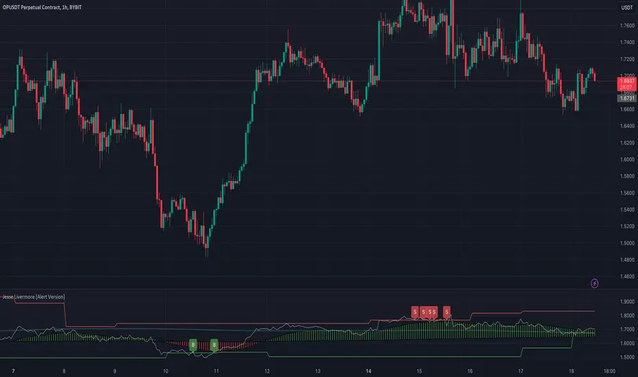
Jesse Livermore Strategy [Buy & Sell]Jesse Livermore was a famous trader who made a fortune in the early 20th century through his unique approach to trading.
While he did not leave behind a single, specific trading strategy that is attributed to him, I have tried to reproduce one.
His trading strategy was based on understanding market trends and sentiment, and he used several technical indicators to identify potential entry and exit points.
Some of the indicators he used include:
Price Action:
Jesse Livermore relied heavily on price action to make trading decisions.
He believed that the price itself was the best indicator of market sentiment, and that by analyzing the price movement, he could identify trends and market behavior.
Volume:
Livermore also used volume to confirm price movements.
He believed that a rise in volume along with a price increase indicated a strong bullish trend, while a decrease in volume with a price increase indicated a weak trend.
Pivot Points:
Another key component of Jesse Livermore's trading strategy was pivot points.
He used pivot points to identify potential support and resistance levels in the market, which he then used to identify potential entry and exit points.
Jesse Livermore outlined a simple trading system: wait for pivotal points before entering a trade.
When the points come into play, trade them using a buffer, trading in the direction of the overall market.
Let the price dictate your actions and stay with profitable trades until there is good reason to exit the trade.
The one I have tried to reproduce it's based on Pivot High and Low looking back 5 Days, and the average price oscillator.
When the price is bellow the support defined line it's time to Buy ( Long Position ), when the Price line is over the Resistance Line it's time to Sell ( Short Position )
This indicator has to be checked, and tried into a Real-Time context, so using the Replay functionality of TradingView is the best way to see and understand how Signals comes
(NB: look back into the chart without Replay should give you wrong Buy/Sell information)
The Indicator can be used on every TimeFrames, but the better ones are 5min - 15min.
I will add the possibility to choose the TimeFrames value for Pivot High and Low.
I will create a version with Alerts for Buy and Sell and the possibility to integrate it with "3commas Bot" where the best deal can be to set a TP to 1% for each Long or Short Entry.
Let's try it and comment for doubts or questions.
Multi SMI Ergodic OscillatorThe Multi SMI Ergodic Oscillator (Multi SMIEO) indicator can be used to identify potential buy and sell signals based on the relationship between the TSI and EMA lines.
The script is creating an indicator that plots multiple (3) sets of Time Series Indicator (TSI-Indicator) and Exponential Moving Average (EMA-Signal) lines as a single indicator.
The TSI is a momentum oscillator that helps identify overbought and oversold conditions. It is calculated using the close prices of an asset, a short-term moving average, and a long-term moving average. The script uses three different pairs of input values for the short-term and long-term periods, which can be adjusted by the user.
The EMA is a type of moving average that gives more weight to recent prices. It is calculated by applying a weighting factor to the most recent price, and then adding that weighted value to the previous EMA value. The script uses three different input values for the length of the EMA, which can also be adjusted by the user.
After calculating the TSI and EMA for each set, the script plots them on the same graph, with different colors and widths to differentiate them. The three sets of TSI and EMA lines are plotted to allow the user to compare the results of different periods. The script also plots a horizontal line at zero, which is used as a reference point for the oscillations of the indicator lines.
One way to use this indicator is to look for crossovers between the TSI and the EMA lines. A bullish crossover occurs when the TSI crosses above the EMA. This suggests that the buying pressure is increasing and a potential buy signal is generated. A bearish crossover occurs when the TSI crosses below the EMA. This suggests that the selling pressure is increasing and a potential sell signal is generated.
Some other ways that the indicator can be used include:
1. Identifying trends: The TSI and EMA lines can be used to identify the direction of the trend. An uptrend is present when the TSI and EMA lines are both trending upwards, while a downtrend is present when the TSI and EMA lines are both trending downwards.
2. Overbought and oversold conditions: The TSI can be used to identify overbought and oversold conditions. When the TSI is above the upper limit of the range, the asset is considered overbought and may be due for a price correction. Conversely, when the TSI is below the lower limit of the range, the asset is considered oversold and may be due for a price rebound.
3. Confirming price action: The Multi SMIEO indicator can be used to confirm price action. If a bullish divergence is present, it confirms a potential bullish reversal. If a bearish divergence is present, it confirms a potential bearish reversal.
4. Multiple time frame analysis: By using different periods for the TSI and EMA lines, the indicator can be used to analyze the asset on multiple time frames. It can be useful to compare the results of different periods to get a better understanding of the asset's price movements.
5. Risk management: This indicator can be used as an element of risk management strategy, it can help traders to identify overbought and oversold conditions to set stop loss or take profit levels.
The Multi SMI Ergodic Oscillator (Multi SMIEO) is a versatile indicator that can be used in a number of ways to analyze the price movements of an asset. It can be used to identify potential buy and sell signals, trends, overbought and oversold conditions, and to confirm price action. By using different periods for the TSI and EMA lines, the indicator can also be used to analyze the asset on multiple time frames. However, it is important to remember that indicators are based on historical data, and past performance does not guarantee future results.
It is important to use the indicator as part of a comprehensive trading strategy that includes risk management and other analysis techniques, such as fundamental and technical analysis. It is also important to keep in mind that indicators are not a standalone solution for trading, they should be used in conjunction with other market analysis and research techniques to generate better results.
Lastly, it is important to keep in mind that trading in financial markets comes with a certain level of risk and it is crucial to always have a proper risk management plan in place. Never invest more than you can afford to lose.

Physics CandlesPhysics Candles embed volume and motion physics directly onto price candles or market internals according to the cyclic pattern of financial securities. The indicator works on both real-time “ticks” and historical data using statistical modeling to highlight when these values, like volume or momentum, is unusual or relatively high for some periodic window in time. Each candle is made out of one or more sub-candles that each contain their own information of motion, which converts to the color and transparency, or brightness, of that particular candle segment. The segments extend throughout the entire candle, both body and wicks, and Thick Wicks can be implemented to see the color coding better. This candle segmentation allows you to see if all the volume or energy is evenly distributed throughout the candle or highly contained in one small portion of it, and how intense these values are compared to similar time periods without going to lower time frames. Candle segmentation can also change a trader’s perspective on how valuable the information is. A “low” volume candle, for instance, could signify high value short-term stopping volume if the volume is all concentrated in one segment.
The Candles are flexible. The physics information embedded on the candles need not be from the same price security or market internal as the chart when using the Physics Source option, and multiple Candles can be overlayed together. You could embed stock price Candles with market volume, market price Candles with stock momentum, market structure with internal acceleration, stock price with stock force, etc. My particular use case is scalping the SPX futures market (ES), whose price action is also dictated by the volume action in the associated cash market, or SPY, as well as a host of other securities. Physics allows you to embed the ES volume on the SPY price action, or the SPY volume on the ES price action, or you can combine them both by overlaying two Candle streams and increasing the Number of Overlays option to two. That option decreases the transparency levels of your coloring scheme so that overlaying multiple Candles converges toward the same visual color intensity as if you had one. The Candle and Physics Sources allows for both Symbols and Spreads to visualize Candle physics from a single ticker or some mathematical transformation of tickers.
Due to certain TradingView programming restrictions, each Candle can only be made out of a maximum of 8 candle segments, or an “8-bit” resolution. Since limits are just an opportunity to go beyond, the user has the option to stack multiple Candle indicators together to further increase the candle resolution. If you don’t want to see the Candles for some particular period of the day, you can hide them, or use the hiding feature to have multiple Candles calibrated to show multiple parts of the trading day. Securities tend to have low volume after hours with sharp spikes at the open or close. Multiple Candles can be used for multiple parts of the trading day to accommodate these different cycles in volume.
The Candles do not need be associated with the nominal security listed on the TV chart. The Candle Source allows the user to look at AAPL Candles, for instance, while on a TSLA or SPY chart, each with their respective volume actions integrated into the candles, for instance, to allow the user to see multiple security price and volume correlation on a single chart.
The physics information currently embeddable on Candles are volume or time, velocity, momentum, acceleration, force, and kinetic energy. In order to apply equations of motion containing a mass variable to financial securities, some analogous value for mass must be assumed. Traders often regard volume or time as inextricable variables to a securities price that can indicate the direction and strength of a move. Since mass is the inextricable variable to calculating the momentum, force, or kinetic energy of motion, the user has the option to assume either time or volume is analogous to mass. Volume may be a better option for mass as it is not strictly dependent on the speed of a security, whereas time is.
Data transformations and outlier statistics are used to color code the intensity of the physics for each candle segment relative to past periodic behavior. A million shares during pre-market or a million shares during noontime may be more intense signals than a typical million shares traded at the open, and should have more intense color signals. To account for a specific cyclic behavior in the market, the user can specify the Window and Cycle Time Frames. The Window Time Frame splits up a Cycle into windows, samples and aggregates the statistics for each window, then compares the current physics values against past values in the same window. Intraday traders may benefit from using a Daily Cycle with a 30-minute Window Time Frame and 1-minute Sample Time Frame. These settings sample and compare the physics of 1-minute candles within the current 30-minute window to the same 30-minute window statistics for all past trading days, up until the data limit imposed by TradingView, or until the Data Collection Start Date specified in the settings. Longer-term traders may benefit from using a Monthly Cycle with a Weekly Time Frame, or a Yearly Cycle with a Quarterly Time Frame.
Multiple statistics and data transformation methods are available to convey relative intensity in different ways for different trading signals. Physics Candles allows for both Normal and Log-Normal assumptions in the physics distribution. The data can then be transformed by Linear, Logarithmic, Z-Score, or Power-Law scoring, where scoring simply assigns an intensity to the relative physics value of each candle segment based on some mathematical transformation. Z-scoring often renders adequate detection by scoring the segment value, such as volume or momentum, according to the mean and standard deviation of the data set in each window of the cycle. Logarithmic or power-law transformation with a gamma below 1 decreases the disparity between intensities so more less-important signals will show up, whereas the power-law transformation with gamma values above 1 increases the disparity between intensities, so less more-important signals will show up. These scores are then converted to color and transparency between the Min Score and the Max Score Cutoffs. The Auto-Normalization feature can automatically pick these cutoffs specific to each window based on the mean and standard deviation of the data set, or the user can manually set them. Physics was developed with novices in mind so that most users could calibrate their own settings by plotting the candle segment distributions directly on the chart and fiddling with the settings to see how different cutoffs capture different portions of the distribution and affect the relative color intensities differently. Security distributions are often skewed with fat-tails, known as kurtosis, where high-volume segments for example, have a higher-probabilities than expected for a normal distribution. These distribution are really log-normal, so that taking the logarithm leads to a standard bell-shaped distribution. Taking the Z-score of the Log-Normal distribution could make the most statistical sense, but color sensitivity is a discretionary preference.
Background Philosophy
This indicator was developed to study and trade the physics of motion in financial securities from a visually intuitive perspective. Newton’s laws of motion are loosely applied to financial motion:
“A body remains at rest, or in motion at a constant speed in a straight line, unless acted upon by a force”.
Financial securities remain at rest, or in motion at constant speed up or down, unless acted upon by the force of traders exchanging securities.
“When a body is acted upon by a force, the time rate of change of its momentum equals the force”.
Momentum is the product of mass and velocity, and force is the product of mass and acceleration. Traders render force on the security through the mass of their trading activity and the acceleration of price movement.
“If two bodies exert forces on each other, these forces have the same magnitude but opposite directions.”
Force arises from the interaction of traders, buyers and sellers. One body of motion, traders’ capitalization, exerts an equal and opposite force on another body of motion, the financial security. A securities movement arises at the expense of a buyer or seller’s capitalization.
Volume
The premise of this indicator assumes that volume, v, is an analogous means of measuring physical mass, m. This premise allows the application of the equations of motion to the movement of financial securities. We know from E=mc^2 that mass has energy. Energy can be used to create motion as kinetic energy. Taking a simple hypothetical example, the interaction of one short seller looking to cover lower and one buyer looking to sell higher exchange shares in a security at an agreed upon price to create volume or mass, and therefore, potential energy. Eventually the short seller will actively cover and buy the security from the previous buyer, moving the security higher, or the buyer will actively sell to the short seller, moving the security lower. The potential energy inherent in the initial consolidation or trading activity between buy and seller is now converted to kinetic energy on the subsequent trading activity that moves the securities price. The more potential energy that is created in the consolidation, the more kinetic energy there is to move price. This is why point and figure traders are said to give price targets based on the level of volatility or size of a consolidation range, or why Gann traders square price and time, as time is roughly proportional to mass and trading activity. The build-up of potential energy between short sellers and buyers in GME or TSLA led to their explosive moves beyond their standard fundamental valuations.
Position
Position, p, is simply the price or value of a financial security or market internal.
Time
Time, t, is another means of measuring mass to discover price behavior beyond the time snapshots that simple candle charts provide. We know from E=mc^2 that time is related to rest mass and energy given the speed of light, c, where time ≈ distance * sqrt(mass/E). This relation can also be derived from F=ma. The more mass there is, the longer it takes to compute the physics of a system. The more energy there is, the shorter it takes to compute the physics of a system. Similarly, more time is required to build a “resting” low-volatility trading consolidation with more mass. More energy added to that trading consolidation by competing buyers and sellers decreases the time it takes to build that same mass. Time is also related to price through velocity.
Velocity = (p(t1) – p(t0)) / p(t0)
Velocity, v, is the relative percent change of a securities price, p, over a period of time, t0 to t1. The period of time is between subsequent candles, and since time is constant between candles within the same timeframe, it is not used to calculate velocity or acceleration. Price moves faster with higher velocity, and slower with slower velocity, over the same fixed period of time. The product of velocity and mass gives momentum.
Momentum = mv
This indicator uses physics definition of momentum, not finance’s. In finance, momentum is defined as the amount of change in a securities price, either relative or absolute. This is definition is unfortunate, pun intended, since a one dollar move in a security from a thousand shares traded between a few traders has the exact same “momentum” as a one dollar move from millions of shares traded between hundreds of traders with everything else equal. If momentum is related to the energy of the move, momentum should consider both the level of activity in a price move, and the amount of that price move. If we equate mass to volume to account for the level of trading activity and use physics definition of momentum as the product of mass and velocity, this revised definition now gives a thousand-times more momentum to a one-dollar price move that has a thousand-times more volume behind it. If you want to use finance’s volume-less definition of momentum, use velocity in this indicator.
Acceleration = v(t1) – v(t0)
Acceleration, a, is the difference between velocities over some period of time, t0 to t1. Positive acceleration is necessary to increase a securities speed in the positive direction, while negative acceleration is necessary to decrease it. Acceleration is related to force by mass.
Force = ma
Force is required to change the speed of a securities valuation. Price movements with considerable force have considerably more impact on future direction. A change in direction requires force.
Kinetic Energy = 0.5mv^2
Kinetic energy is the energy that a financial security gains from the change in its velocity by force. The built-up of potential energy in trading consolidations can be converted to kinetic energy on a breakout from the consolidation.
Cycle Theory and Relativity
Just as the physics of motion is relative to a point of reference, so too should the physics of financial securities be relative to a point of reference. An object moving at a 100 mph towards another object moving in the same direction at 100 mph will not appear to be moving relative to each other, nor will they collide, but from an outsider observer, the objects are going 100 mph and will collide with significant impact if they run into a stationary object relative to the observer. Similarly, trading with a hundred thousand shares at the open when the average volume is a couple million may have a much smaller impact on the price compared to trading a hundred thousand shares pre-market when the average volume is ten thousand shares. The point of reference used in this indicator is the average statistics collected for a given Window Time Frame for every Cycle Time Frame. The physics values are normalized relative to these statistics.
Examples
The main chart of this publication shows the Force Candles for the SPY. An intense force candle is observed pre-market that implicates the directional overtone of the day. The assumption that direction should follow force arises from physical observation. If a large object is accelerating intensely in a particular direction, it may be fair to assume that the object continues its direction for the time being unless acted upon by another force.
The second example shows a similar Force Candle for the SPY that counters the assumption made in the first example and emphasizes the importance of both motion and context. While it’s fair to assume that a heavy highly accelerating object should continue its course, if that object runs into an obstacle, say a brick wall, it’s course may deviate. This example shows SPY running into the 50% retracement wall from the low of Mar 2020, a significant support level noted in literature. The example also conveys Gann’s idea of “lost motion”, where the SPY penetrated the 50% price but did not break through it. A brick wall is not one atom thick and price support is not one tick thick. An object can penetrate only one layer of a wall and not go through it.
The third example shows how Volume Candles can be used to identify scalping opportunities on the SPY and conveys why price behavior is as important as motion and context. It doesn’t take a brick wall to impede direction if you know that the person driving the car tends to forget to feed the cats before they leave. In the chart below, the SPY breaks down to a confluence of the 5-day SMA, 20-day SMA, and an important daily trendline (not shown) after the bullish bounce from the 50% retracement days earlier. High volume candles on the SMA signify stopping volume that reverse price direction. The character of the day changes. Bulls become more aggressive than bears with higher volume on upswings and resistance, whiles bears take on a defensive position with lower volume on downswings and support. High volume stopping candles are seen after rallies, and can tell you when to take profit, get out of a position, or go short. The character change can indicate that its relatively safe to re-enter bullish positions on many major supports, especially given the overarching bullish theme from the large reaction off the 50% retracement level.
The last example emphasizes the importance of relativity. The Volume Candles in the chart below are brightest pre-market even though the open has much higher volume since the pre-market activity is much higher compared to past pre-markets than the open is compared to past opens. Pre-market behavior is a good indicator for the character of the day. These bullish Volume Candles are some of the brightest seen since the bounce off the 50% retracement and indicates that bulls are making a relatively greater attempt to bring the SPY higher at the start of the day.
Infrequently Asked Questions
Where do I start?
The default settings are what I use to scalp the SPY throughout most of the extended trading day, on a one-minute chart using SPY volume. I also overlay another Candle set containing ES future volume on the SPY price structure by setting the Physics Source to ES1! and the Number of Overlays setting to 2 for each Candle stream in order to account for pre- and post-market trading activity better. Since the closing volume is exponential-like up until the end of the regular trading day, adding additional Candle streams with a tighter Window Time Frame (e.g., 2-5 minute) in the last 15 minutes of trading can be beneficial. The Hide feature can allow you to set certain intraday timeframes to hide one Candle set in order to show another Candle set during that time.
How crazy can you get with this indicator?
I hope you can answer this question better. One interesting use case is embedding the velocity of market volume onto an internal market structure. The PCTABOVEVWAP.US is a market statistic that indicates the percent of securities above their VWAP among US stocks and is helpful for determining short term trends in the US market. When securities are rising above their VWAP, the average long is up on the day and a rising PCTABOVEVWAP.US can be viewed as more bullish. When securities are falling below their VWAP, the average short is up on the day and a falling PCTABOVEVWAP.US can be viewed as more bearish. (UPVOL.US - DNVOL.US) / TVOL.US is a “spread” symbol, in TV parlance, that indicates the decimal percent difference between advancing volume and declining volume in the US market, showing the relative flow of volume between stocks that are up on the day, and stocks that are down on the day. Setting PCTABOVEVWAP.US in the Candle Source, (UPVOL.US - DNVOL.US) / TVOL.US in the Physics Source, and selecting the Physics to Velocity will embed the relative velocity of the spread symbol onto the PCTABOVEVWAP.US candles. This can be helpful in seeing short term trends in the US market that have an increasing amount of volume behind them compared to other trends. The chart below shows Volume Candles (top) and these Spread Candles (bottom). The first top at 9:30 and second top at 10:30, the high of the day, break down when the spread candles light up, showing a high velocity volume transfer from up stocks to down stocks.
How do I plot the indicator distribution and why should I even care?
The distribution is visually helpful in seeing how different normalization settings effect the distribution of candle segments. It is also helpful in seeing what physics intensities you want to ignore or show by segmenting part of the distribution within the Min and Max Cutoff values. The intensity of color is proportional to the physics value between the Min and Max Cutoff values, which correspond to the Min and Max Colors in your color scheme. Any physics value outside these Min and Max Cutoffs will be the same as the Min and Max Colors.
Select the Print Windows feature to show the window numbers according to the Cycle Time Frame and Window Time Frame settings. The window numbers are labeled at the start of each window and are candle width in size, so you may need to zoom into to see them. Selecting the Plot Window feature and input the window number of interest to shows the distribution of physics values for that particular window along with some statistics.
A log-normal volume distribution of segmented z-scores is shown below for 30-minute opening of the SPY. The Min and Max Cutoff at the top of the graph contain the part of the distribution whose intensities will be linearly color-coded between the Min and Max Colors of the color scheme. The part of the distribution below the Min Cutoff will be treated as lowest quality signals and set to the Min Color, while the few segments above the Max Cutoff will be treated as the highest quality signals and set to the Max Color.
What do I do if I don’t see anything?
Troubleshooting issues with this indicator can involve checking for error messages shown near the indicator name on the chart or using the Data Validation section to evaluate the statistics and normalization cutoffs. For example, if the Plot Window number is set to a window number that doesn’t exist, an error message will tell you and you won’t see any candles. You can use the Print Windows option to show windows that do exist for you current settings. The auto-normalization cutoff values may be inappropriate for your particular use case and literally cut the candles out of the chart. Try changing the chart time frame to see if they are appropriate for your cycle, sample and window time frames. If you get a “Timeframe passed to the request.security_lower_tf() function must be lower than the timeframe of the main chart” error, this means that the chart timeframe should be increased above the sample time frame. If you get a “Symbol resolve error”, ensure that you have correct symbol or spread in the Candle or Physics Source.
How do I see a relative physics values without cycles?
Set the Window Time Frame to be equal to the Cycle Time Frame. This will aggregate all the statistics into one bucket and show the physics values, such as volume, relative to all the past volumes that TV will allow.
How do I see candles without segmentation?
Segmentation can be very helpful in one context or annoying in another. Segmentation can be removed by setting the candle resolution value to 1.
Notes
I have yet to find a trading platform that consistently provides accurate real-time volume and pricing information, lacking adequate end-user data validation or quality control. I can provide plenty of examples of real-time volume counts or prices provided by TradingView and other platforms that were significantly off from what they should have been when comparing against the exchanges own data, and later retroactively corrected or not corrected at all. Since no indicator can work accurately with inaccurate data, please use at your own discretion.
The first version is a beta version. Debugging and validating code in Pine script is difficult without proper unit testing. Please report any bugs with enough information to reproduce them and indicate why they are important. I also encourage you to export the data from TradingView and verify the calculations for your particular use case.
The indicator works on real-time updates that occur at a higher frequency than the candle time frame, which TV incorrectly refers to as ticks. They use this terminology inaccurately as updates are really aggregated tick data that can take place at different prices and may not accurately reflect the real tick price action. Consequently, this inaccuracy also impacts the real-time segmentation accuracy to some degree. TV does not provide a means of retaining “tick” information, so the higher granularity of information seen real-time will be lost on a disconnect.
TV does not provide time and sales information. The volume and price information collected using the Sample Time Frame is intraday, which provides only part of the picture. Intraday volume is generally 50 to 80% of the end of day volume. Consequently, the daily+ OHLC prices are intraday, and may differ significantly from exchanged settled OHLC prices.
The Cycle and Window Time Frames refer to calendar days and time, not trading days or time. For example, the first window week of a monthly cycle is the first seven days of the month, not the first Monday through Friday of trading for the month.
Chart Time Frames that are higher than the Window Time Frames average the normalized physics for price action that occurred within a given Candle segment. It does not average price action that did not occur.
One of the main performance bottleneck in TradingView’s Pine Script is client-side drawing and plotting. The performance of this indicator can be increased by lowering the resolution (the number of sub-candles this indicator plots), getting a faster computer, or increasing the performance of your computer like plugging your laptop in and eliminating unnecessary processes.
The statistical integrity of this indicator relies on the number of samples collected per sample window in a given cycle. Higher sample counts can be obtained by increasing the chart time frame or upgrading the TradingView plan for a higher bar count. While increasing the chart time frame doesn’t increase the visual number of bars plotted on the chart, it does increase the number of bars that can be pulled at a lower time frame, up to 100,000.
Due to a limitation in Pine Scripts request_lower_tf() function, using a spread symbol will only work for regular trading hours, not extended trading hours.
Ideally, velocity or momentum should be calculated between candle closes. To eliminate the need to deal with price gaps that would lead to an incorrect statistical distributions, momentum is calculated between candle open and closes as a percent change of the price or value, which should not be an issue for most liquid securities.

BTC-WEEKEND GRAVITY Indicator @COINOBS - Hello Fam,
Coin Observatory, back with another indicator.
We call this one the:
Weekend GRAVITY indicator!
That's right,
How to use this indicator:
-ONLY APPLICABLE FOR WEEKEND PRICE ACTION:
-If BTC is trading above our GRAVITY indicator, low leverage shorts, until price returns to gravity line.
-If BTC is trading below our GRAVITY indicator, low leverage longs, until price returns to gravity line.
ONLY USE THIS FOR WEEKEND PRICE ACTION.
Please backtest for us, this indicator has had a 99% accuracy rate for weekend price action.
Want this indicator?
-Just request access! We'll hook you up ;)
-Jump in our discord, link in my bio
At the time of publishing, XBT is trading at 6885
Gravity Indicator tells us, target is 6290

PG ATM Strike Line with Call & Put PremiumsPine Script: ATM Strike Line with Call & Put Premiums (Simplified)This Pine Script for TradingView displays the At-The-Money (ATM) strike price, futures price, call/put premiums (time value), and two ratios—Premium Ratio (PR) and Volume Ratio (VR)—for a user-selected underlying asset (e.g., NIFTY, BANKNIFTY, or stocks). It helps traders gauge near-term market direction using options data.How the Script WorksInputs:Expiry: Select year (e.g., '25), month (01–12), day (01–31) for option expiry (e.g., '251028').
Timeframe: Choose data timeframe (e.g., Daily, 15-min).
Symbol: Auto-detects chart symbol or select from Indian indices/stocks.
Strike: Auto-ATM (based on futures) or manual strike input.
Interval: Auto (e.g., 100 for NIFTY) or custom strike interval.
Colors: Customizable for ATM line, labels (Futures Price, CPR, PPR, VR, PR).
Calculations:Futures Price (FP): Fetches front-month futures price (e.g., NSE:NIFTY1!).
ATM Strike: Rounds futures price to nearest strike interval.
Option Data: Retrieves Last Traded Price (LTP) and volume for ATM call/put options (e.g., NSE:NIFTY251028C24200).
Call Premium (CPR): Call LTP minus intrinsic value (max(0, FP - Strike)).
Put Premium (PPR): Put LTP minus intrinsic value (max(0, Strike - FP)).
Premium Ratio (PR): PPR / CPR.
Volume Ratio (VR): Put Volume / Call Volume.
Visuals:Draws ATM strike line on chart.
Displays labels: FP (futures price), CPR (call premium), PPR (put premium), VR, PR.
VR/PR labels: Red (≥ 1.25, bearish), Green (≤ 0.75, bullish), Gray (0.75–1.25, neutral).
Updates on last confirmed bar to avoid redraws.
Using PR and VR for Market DirectionPremium Ratio (PR):PR ≥ 1.25 (Red): High put premiums suggest bearish sentiment (expect price drop).
PR ≤ 0.75 (Green): High call premiums suggest bullish sentiment (expect price rise).
0.75 < PR < 1.25 (Gray): Neutral, no clear direction.
Use: High PR favors bearish trades (e.g., buy puts); low PR favors bullish trades (e.g., buy calls).
Volume Ratio (VR):VR ≥ 1.25 (Red): High put volume indicates bearish activity.
VR ≤ 0.75 (Green): High call volume indicates bullish activity.
0.75 < VR < 1.25 (Gray): Neutral trading activity.
Use: High VR suggests bearish moves; low VR suggests bullish moves.
Combined Signals:High PR & VR: Strong bearish signal; consider put buying or call selling.
Low PR & VR: Strong bullish signal; consider call buying or put selling.
Mixed/Neutral: Use price action or support/resistance for confirmation.
Tips:Combine with technical analysis (e.g., trends, levels).
Match timeframe to trading horizon (e.g., 15-min for intraday).
Monitor FP for context; check volatility or news for accuracy.
ExampleNIFTY: FP = 24,237.50, ATM = 24,200, CPR = 120.25, PPR = 180.50, PR = 1.50 (Red), VR = 1.30 (Red).
Insight: High PR/VR suggests bearish bias; consider bearish trades if price nears resistance.
Action: Buy puts or exit longs, confirm with price action.
Conclusion: This script provides a concise tool for options traders, showing ATM strike, premiums, and PR/VR ratios. High PR/VR (≥ 1.25) signals bearish sentiment, low PR/VR (≤ 0.75) signals bullish sentiment, and neutral (0.75–1.25) suggests indecision. Combine with technical analysis for robust trading decisions in the Indian options market.

Dual Table Dashboard - Correct V3add RSI Data## 📈 Trading Applications
### 1. Trend Following Strategy
```
1. Check TABLE 1 for trend direction (AnEMA29 + PDMDR)
2. If both green → Look for longs
3. If both red → Look for shorts
4. Use TABLE 2 for entry levels
```
### 2. Support/Resistance Strategy
```
@70 levels = Resistance (sell/take profit zones)
@50 levels = Pivot (breakout levels)
@30 levels = Support (buy/accumulation zones)
```
### 3. Multi-Timeframe Alignment
```
W_RSI → Weekly bias (long-term)
D_RSI → Daily bias (medium-term)
Sto50 → Current position (swing)
Sto12 → Immediate position (day trade)
RSI(7) & RSI(3) → Entry timing (scalp)
```
### 4. Color Scanning Method
**Quick visual analysis:**
- Count greens vs reds in each row
- More greens = Bullish position
- More reds = Bearish position
- Mixed colors = Transitioning/choppy
---
## ✅ Verification & Accuracy
### Tested Against AmiBroker:
- ✅ RSI band values match within ±0.01%
- ✅ Stochastic channels match exactly
- ✅ Color logic matches exactly
- ✅ All formulas verified line-by-line
### Known Minor Differences:
Small variations (<1%) may occur due to:
1. **Platform calculation precision** - Different floating-point engines
2. **Historical data feeds** - Slight variations in past prices
3. **Weekly bar boundaries** - TradingView vs AmiBroker week definitions
4. **Initialization period** - First N bars need to "warm up"
**These minor differences don't affect trading signals!**
---
## ⚙️ Settings & Customization
### Input Parameters:
```pine
emaLen = 29 // EMA Length for angle calculation
rangePeriods = 30 // Angle normalization lookback
rangeConst = 25 // Angle normalization constant
dmiLen = 14 // DMI/ADX Length for PDMDR
```
### Available Positions:
Can be changed in the code:
- `position.top_left`
- `position.top_center`
- `position.top_right`
- `position.middle_left` (Table 2 default)
- `position.middle_center`
- `position.middle_right`
- `position.bottom_left` (Table 1 default)
- `position.bottom_center`
- `position.bottom_right`
### Text Sizes:
- `size.tiny`
- `size.small` (current default)
- `size.normal`
- `size.large`
- `size.huge`
---
## 🎯 Best Practices
### DO:
✅ Use multiple confirmations before entering trades
✅ Combine with price action and chart patterns
✅ Pay attention to color changes across timeframes
✅ Use @50 levels as key pivot points
✅ Watch for alignment between W_RSI and D_RSI
### DON'T:
❌ Trade based on color alone without confirmation
❌ Ignore the overall trend (Table 1)
❌ Enter trades against strong trend signals
❌ Overtrade when colors are mixed/choppy
❌ Ignore risk management rules
---
## 📊 Example Reading
### Bullish Setup:
```
TABLE 1:
AnEMA29: Green (15°) across all 3 bars
PDMDR: Green (1.65) and rising
TABLE 2:
W_RSI@50: Green (price above)
D_RSI@50: Green (price above)
Sto50@50: Green (price above midpoint)
Sto12@50: Green (price above midpoint)
Interpretation: Strong bullish trend confirmed across multiple timeframes
Action: Look for long entries on pullbacks to @50 or @30 levels
```
### Bearish Setup:
```
TABLE 1:
AnEMA29: Red (-12°) across all 3 bars
PDMDR: Red (0.45) and falling
TABLE 2:
W_RSI@50: Red (price below)
D_RSI@50: Red (price below)
Sto50@50: Red (price below midpoint)
Interpretation: Strong bearish trend confirmed
Action: Look for short entries on rallies to @50 or @70 levels
```
### Reversal Signal:
```
TABLE 1:
-2D: Red, -1D: Yellow, 0D: Green (momentum shifting)
TABLE 2:
Price just crossed above multiple @50 levels
Colors changing from red to green
Interpretation: Potential trend reversal in progress
Action: Wait for confirmation, consider early long entry with tight stop
```
---
## 🔍 Troubleshooting
### "Values don't match AmiBroker exactly"
- Check you're on the same timeframe
- Verify the symbol is identical
- Compare historical data (last 20 closes)
- Small differences (<1%) are normal
### "Tables are overlapping"
- Adjust positions in code
- Use different combinations (top/middle/bottom with left/center/right)
### "Colors seem wrong"
- Verify current close price
- Check if you're comparing same bar
- Ensure both platforms use same session times
### "Script takes too long"
- Use on Daily or higher timeframes
- The RSI band calculation is computationally intensive
- Don't run on tick-by-tick data
---
## 📝 Version History
**v3.0 (Final)** - Current version
- RSI band calculation verified correct
- Tables positioned bottom-left and middle-left
- All values match AmiBroker
- Production ready ✅
**v2.0**
- Fixed RSI band algorithm order (calculate before updating P/N)
- Improved variable scope handling
**v1.0**
- Initial implementation
- Had incorrect RSI band calculation
---
## 📄 Files in Package

Relative Strength Index Remastered [CHE]Relative Strength Index Remastered — Enhanced RSI with robust divergence detection using price-based pivots and line-of-sight validation to reduce false signals compared to the standard RSI indicator.
Summary
RSI Remastered builds on the classic Relative Strength Index by adding a more reliable divergence detection system that relies on price pivots rather than RSI pivots alone, incorporating a line-of-sight check to ensure the RSI path between points remains clear. This approach filters out many false divergences that occur in the original RSI indicator due to its volatile pivot detection on the RSI line itself. Users benefit from clearer reversal and continuation signals, especially in noisy markets, with optional hidden divergence support for trend confirmation. The core RSI calculation and smoothing options remain familiar, but the divergence logic provides materially fewer alerts while maintaining sensitivity.
Motivation: Why this design?
The standard RSI indicator often generates misleading divergence signals because it detects pivots directly on the RSI values, which can fluctuate erratically in volatile conditions, leading to frequent false positives that confuse traders during ranging or choppy price action. RSI Remastered addresses this by shifting pivot detection to the underlying price highs and lows, which are more stable, and adding a validation step that confirms the RSI line does not cross the direct path between pivot points. This design targets the real problem of over-signaling in the original, promoting more actionable insights without altering the RSI's core momentum measurement.
What’s different vs. standard approaches?
- Reference baseline: The classical TradingView RSI indicator, which uses simple RSI-based pivot detection for divergences.
- Architecture differences:
- Pivot identification on price extremes (highs and lows) instead of RSI values, extracting RSI levels at those points for comparison.
- Addition of a line-of-sight validation that checks the RSI path bar by bar between pivots to prevent signals where the line is interrupted.
- Inclusion of hidden divergence types alongside regular ones, using the same robust framework.
- Configurable drawing of connecting lines between validated pivot RSI points for visual clarity.
- Practical effect: Charts show fewer but higher-quality divergence markers and lines, reducing clutter from the original's frequent RSI pivot triggers; this matters for avoiding whipsaws in intraday trading, where the standard version might flag dozens of invalid setups per session.
Key Comparison Aspects
Aspect: Title/Shorttitle
Original RSI: "Relative Strength Index" / "RSI"
Robust Variant: "Relative Strength Index Remastered " / "RSI RM"
Aspect: Max. Lines/Labels
Original RSI: No specification (Standard: 50/50)
Robust Variant: max_lines_count=200, max_labels_count=200 (for more lines/markers in divergences)
Aspect: RSI Calculation & Plots
Original RSI: Identical: RSI with RMA, Plots (line, bands, gradient fills)
Robust Variant: Identical: RSI with RMA, Plots (line, bands, gradient fills)
Aspect: Smoothing (MA)
Original RSI: Identical: Inputs for MA types (SMA, EMA etc.), Bollinger Bands optional
Robust Variant: Identical: Inputs for MA types (SMA, EMA etc.), Bollinger Bands optional
Aspect: Divergence Activation
Original RSI: input.bool(false, "Calculate Divergence") (disabled by default)
Robust Variant: input.bool(true, "Calculate Divergence") (enabled by default, with tooltip)
Aspect: Pivot Calculation
Original RSI: Pivots on RSI (ta.pivotlow/high on RSI values)
Robust Variant: Pivots on price (ta.pivotlow/high on low/high), RSI values then extracted
Aspect: Lookback Values
Original RSI: Fixed: lookbackLeft=5, lookbackRight=5
Robust Variant: Input: L=5 (Pivot Left), R=5 (Pivot Right), adjustable (min=1, max=50)
Aspect: Range Between Pivots
Original RSI: Fixed: rangeUpper=60, rangeLower=5 (via _inRange function)
Robust Variant: Input: rangeUpper=60 (Max Bars), rangeLower=5 (Min Bars), adjustable (min=1–6, max=100–300)
Aspect: Divergence Types
Original RSI: Only Regular Bullish/Bearish: - Bull: Price LL + RSI HL - Bear: Price HH + RSI LH
Robust Variant: Regular + Hidden (optional via showHidden=true): - Regular Bull: Price LL + RSI HL - Regular Bear: Price HH + RSI LH - Hidden Bull: Price HL + RSI LL - Hidden Bear: Price LH + RSI HH
Aspect: Validation
Original RSI: No additional check (only pivot + range check)
Robust Variant: Line-of-Sight Check: RSI line must not cross the connecting line between pivots (line_clear function with slope calculation and loop for each bar in between)
Aspect: Signals (Plots/Shapes)
Original RSI: - Plot of pivot points (if divergence) - Shapes: "Bull"/"Bear" at RSI value, offset=-5
Robust Variant: - No pivot plots, instead shapes at RSI , offset=-R (adjustable) - Shapes: "Bull"/"Bear" (Regular), "HBull"/"HBear" (Hidden) - Colors: Lime/Red (Regular), Teal/Orange (Hidden)
Aspect: Line Drawing
Original RSI: No lines
Robust Variant: Optional (showLines=true): Lines between RSI pivots (thick for regular, dashed/thin for hidden), extend=none
Aspect: Alerts
Original RSI: Only Regular Bullish/Bearish (with pivot lookback reference)
Robust Variant: Regular Bullish/Bearish + Hidden Bullish/Bearish (specific "at latest pivot low/high")
Aspect: Robustness
Original RSI: Simple, prone to false signals (RSI pivots can be volatile)
Robust Variant: Higher: Price pivots are more stable, line-of-sight filters "broken" divergences, hidden support for trend continuations
Aspect: Code Length/Structure
Original RSI: ~100 lines, simple if-blocks for bull/bear
Robust Variant: ~150 lines, extended helper functions (e.g., inRange, line_clear), var group for inputs
How it works (technical)
The indicator first computes the core RSI value based on recent price changes, separating upward and downward movements over the specified length and smoothing them to derive a momentum reading scaled between zero and one hundred. This value is then plotted in a separate pane with fixed upper and lower reference lines at seventy and thirty, along with optional gradient fills to highlight overbought and oversold zones.
For smoothing, a moving average type is applied to the RSI if enabled, with an option to add bands around it based on the variability of recent RSI values scaled by a multiplier. Divergence detection activates on confirmed price pivots: lows for bullish checks and highs for bearish. At each new pivot, the system retrieves the bar index and values (price and RSI) for the current and prior pivot, ensuring they fall within a configurable bar range to avoid unrelated points.
Comparisons then assess whether the price has made a lower low (or higher high) while the RSI at those points moves in the opposite direction—higher for bullish regular, lower for bearish regular. For hidden types, the directions reverse to capture trend strength. The line-of-sight check calculates the straight path between the two RSI points and verifies that the actual RSI values in between stay entirely above (for bullish) or below (for bearish) that path, breaking the signal if any bar violates it. Valid signals trigger shapes at the RSI level of the new pivot and optional lines connecting the points. Initialization uses built-in functions to track prior occurrences, with states persisting across bars for accurate historical comparisons. No higher timeframe data is used, so confirmation occurs after the right pivot bars close, minimizing live-bar repaints.
Parameter Guide
Length — Controls the period for measuring price momentum changes — Default: 14 — Trade-offs/Tips: Shorter values increase responsiveness but add noise and more false signals; longer smooths trends but delays entries in fast markets.
Source — Selects the price input for RSI calculation — Default: Close — Trade-offs/Tips: Use high or low for volatility focus, but close works best for most assets; mismatches can skew overbought/oversold reads.
Calculate Divergence — Enables the enhanced divergence logic — Default: True — Trade-offs/Tips: Disable for pure RSI view to save computation; essential for signal reliability over the standard method.
Type (Smoothing) — Chooses the moving average applied to RSI — Default: SMA — Trade-offs/Tips: None for raw RSI; EMA for quicker adaptation, but SMA reduces whipsaws; Bollinger Bands option adds volatility context at cost of added lines.
Length (Smoothing) — Period for the smoothing average — Default: 14 — Trade-offs/Tips: Match RSI length for consistency; shorter boosts signal speed but amplifies noise in the smoothed line.
BB StdDev — Multiplier for band width around smoothed RSI — Default: 2.0 — Trade-offs/Tips: Lower narrows bands for tighter signals, risking more touches; higher widens for fewer but stronger breakouts.
Pivot Left — Bars to the left for confirming price pivots — Default: 5 — Trade-offs/Tips: Increase for stricter pivots in noisy data, reducing signals; too high delays confirmation excessively.
Pivot Right — Bars to the right for confirming price pivots — Default: 5 — Trade-offs/Tips: Balances with left for symmetry; longer right ensures maturity but shifts signals backward.
Max Bars Between Pivots — Upper limit on distance for valid pivot pairs — Default: 60 — Trade-offs/Tips: Tighten for short-term trades to focus recent action; widen for swing setups but risks unrelated comparisons.
Min Bars Between Pivots — Lower limit to avoid clustered pivots — Default: 5 — Trade-offs/Tips: Raise to filter micro-moves; too low invites overlapping signals like the original RSI.
Detect Hidden — Includes trend-continuation hidden types — Default: True — Trade-offs/Tips: Enable for full trend analysis; disable simplifies to reversals only, akin to basic RSI.
Draw Lines — Shows connecting lines between valid pivots — Default: True — Trade-offs/Tips: Turn off for cleaner charts; helps visually confirm line-of-sight in backtests.
Reading & Interpretation
The main RSI line oscillates between zero and one hundred, crossing above fifty suggesting building momentum and below indicating weakness; touches near seventy or thirty flag potential extremes. The optional smoothed line and bands provide a filtered view—price above the upper band on the RSI pane hints at overextension. Divergence shapes appear as upward labels for bullish (lime for regular, teal for hidden) and downward for bearish (red regular, orange hidden) at the pivot's RSI level, signaling a mismatch only after validation. Connecting lines, if drawn, slope between points without RSI interference, their color matching the shape type; a dashed style denotes hidden. Fewer shapes overall compared to the standard RSI mean higher conviction, but always confirm with price structure.
Practical Workflows & Combinations
- Trend following: Enter longs on regular bullish shapes near support with higher highs in price; filter hidden bullish for pullback buys in uptrends, pairing with a rising smoothed RSI above fifty.
- Exits/Stops: Use bearish regular as reversal warnings to tighten stops; hidden bearish in downtrends confirms continuation—exit if lines show RSI crossing the path.
- Multi-asset/Multi-TF: Defaults suit forex and stocks on one-hour charts; for crypto volatility, widen pivot ranges to ten; scale min/max bars proportionally on daily for swings, avoiding the original's intraday spam.
Behavior, Constraints & Performance
Signals confirm only after the right pivot bars close, so live bars may show tentative pivots that vanish on close, unlike the standard RSI's immediate RSI-pivot triggers—plan for this delay in automation. No higher timeframe calls, so no security-related repaints. Resources include up to two hundred lines and labels for dense charts, with a loop in validation scanning up to three hundred bars between pivots, which is efficient but could slow on very long histories. Known limits: Slight lag at pivot confirmation in trending markets; volatile RSI might rarely miss fine path violations; not ideal for gap-heavy assets where pivots skip.
Sensible Defaults & Quick Tuning
Start with defaults for balanced momentum and divergence on most timeframes. For too many signals (like the original), raise pivot left/right to eight and min bars to ten to filter noise. If sluggish in trends, shorten RSI length to nine and enable EMA smoothing for faster adaptation. In high-volatility assets, widen max bars to one hundred but disable hidden to focus essentials. For clean reversal hunts, set smoothing to none and lines on.
What this indicator is—and isn’t
RSI Remastered serves as a refined momentum and divergence visualization tool, enhancing the standard RSI for better signal quality in technical analysis setups. It is not a standalone trading system, nor does it predict price moves—pair it with volume, structure breaks, and risk rules for decisions. Use alongside position sizing and broader context, not in isolation.
Disclaimer
The content provided, including all code and materials, is strictly for educational and informational purposes only. It is not intended as, and should not be interpreted as, financial advice, a recommendation to buy or sell any financial instrument, or an offer of any financial product or service. All strategies, tools, and examples discussed are provided for illustrative purposes to demonstrate coding techniques and the functionality of Pine Script within a trading context.
Any results from strategies or tools provided are hypothetical, and past performance is not indicative of future results. Trading and investing involve high risk, including the potential loss of principal, and may not be suitable for all individuals. Before making any trading decisions, please consult with a qualified financial professional to understand the risks involved.
By using this script, you acknowledge and agree that any trading decisions are made solely at your discretion and risk.
Do not use this indicator on Heikin-Ashi, Renko, Kagi, Point-and-Figure, or Range charts, as these chart types can produce unrealistic results for signal markers and alerts.
Best regards and happy trading
Chervolino
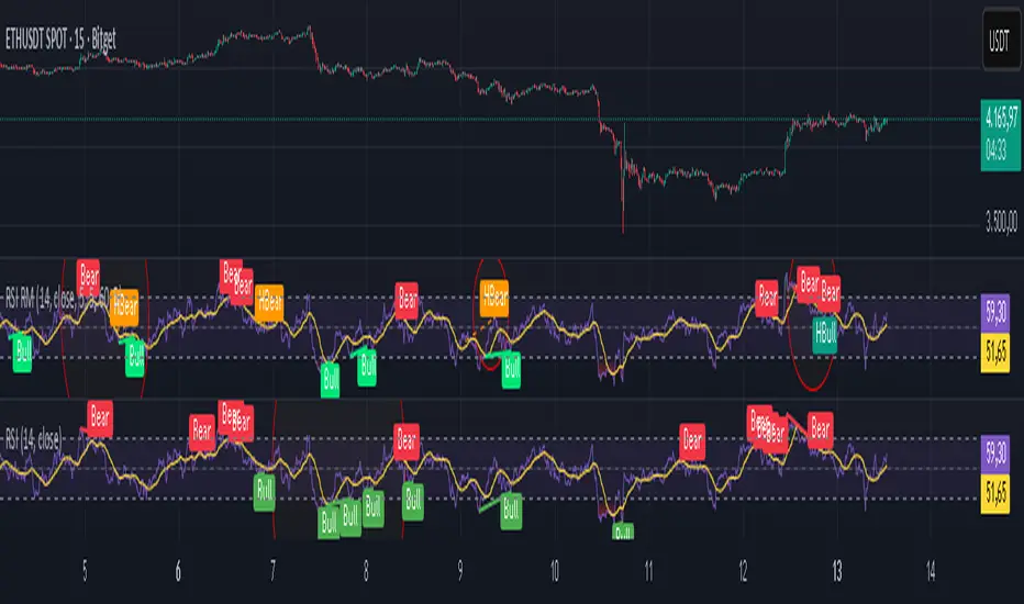
Gamma Exposure Levels by OMG (Oh My Gamma)OMG (Oh My Gamma) - Daily GEX Levels
An operational framework for Gamma analysis with daily data.
Indicator's Purpose & Demo Data
This indicator plots key strategic levels derived from Gamma Exposure (GEX) analysis. It showcases the operational logic of OhMyGamma analytical engine.
IMPORTANT: The levels plotted by this public script are based on a past date's snapshot for demonstration purposes. They are not valid for live trading and will not update automatically.
The real edge comes from using the fresh data structure provided daily.
How to Read the Levels
This indicator is designed to provide actionable intelligence, not just data. Here's how to read it:
The Levels: Each line represents a key strategic zone (Zero Gamma, Call/Put Walls, etc.) where a market reaction is statistically probable due to dealer hedging flows.
Line Thickness = Strategic Importance: The thickness of each line directly corresponds to its strategic rating. Thicker, solid lines represent higher-conviction zones.
Labels & Tooltips: Hover over a level's label on your chart to see its full description, confluences, and strategic rating.
Pro Tip: The Power of Confluence
This indicator is not a standalone "system". It's an institutional-grade intelligence layer. Its predictive power increases exponentially when used to find confluence with your own analysis.
The highest-probability trades occur when a key Gamma level aligns with:
Price Action: Key support/resistance zones, order blocks, or liquidity pools.
Volumetric Indicators: High/Low Volume Nodes (HVN/LVN) from Volume Profile, VWAP, and Anchored VWAP.
Use these levels to confirm your setups and gain the conviction to act.
How to Get the Daily Updated Script
This indicator requires a new Pine Script code each day to load the current session's data.
To get the daily updated code feel free to visit www.ohmygamma.com
Feedback & Suggestions
This tool is built for the community. Suggestions for improvements and new features are highly welcome and help the project evolve. Feel free to get in touch via the contact form on the website.
Disclaimer: This tool is for informational and educational purposes only. Trading involves significant risk. The authors assume no responsibility for any trading decisions.

ATAI Volume Pressure Analyzer V 1.0 — Pure Up/DownATAI Volume Pressure Analyzer V 1.0 — Pure Up/Down
Overview
Volume is a foundational tool for understanding the supply–demand balance. Classic charts show only total volume and don’t tell us what portion came from buying (Up) versus selling (Down). The ATAI Volume Pressure Analyzer fills that gap. Built on Pine Script v6, it scans a lower timeframe to estimate Up/Down volume for each host‑timeframe candle, and presents “volume pressure” in a compact HUD table that’s comparable across symbols and timeframes.
1) Architecture & Global Settings
Global Period (P, bars)
A single global input P defines the computation window. All measures—host‑TF volume moving averages and the half‑window segment sums—use this length. Default: 55.
Timeframe Handling
The core of the indicator is estimating Up/Down volume using lower‑timeframe data. You can set a custom lower timeframe, or rely on auto‑selection:
◉ Second charts → 1S
◉ Intraday → 1 minute
◉ Daily → 5 minutes
◉ Otherwise → 60 minutes
Lower TFs give more precise estimates but shorter history; higher TFs approximate buy/sell splits but provide longer history. As a rule of thumb, scan thin symbols at 5–15m, and liquid symbols at 1m.
2) Up/Down Volume & Derived Series
The script uses TradingView’s library function tvta.requestUpAndDownVolume(lowerTf) to obtain three values:
◉ Up volume (buyers)
◉ Down volume (sellers)
◉ Delta (Up − Down)
From these we define:
◉ TF_buy = |Up volume|
◉ TF_sell = |Down volume|
◉ TF_tot = TF_buy + TF_sell
◉ TF_delta = TF_buy − TF_sell
A positive TF_delta indicates buyer dominance; a negative value indicates selling pressure. To smooth noise, simple moving averages of TF_buy and TF_sell are computed over P and used as baselines.
3) Key Performance Indicators (KPIs)
Half‑window segmentation
To track momentum shifts, the P‑bar window is split in half:
◉ C→B: the older half
◉ B→A: the newer half (toward the current bar)
For each half, the script sums buy, sell, and delta. Comparing the two halves reveals strengthening/weakening pressure. Example: if AtoB_delta < CtoB_delta, recent buying pressure has faded.
[ 4) HUD (Table) Display /i]
Colors & Appearance
Two main color inputs define the theme: a primary color and a negative color (used when Δ is negative). The panel background uses a translucent version of the primary color; borders use the solid primary color. Text defaults to the primary color and flips to the negative color when a block’s Δ is negative.
Layout
The HUD is a 4×5 table updated on the last bar of each candle:
◉ Row 1 (Meta): indicator name, P length, lower TF, host TF
◉ Row 2 (Host TF): current ↑Buy, ↓Sell, ΔDelta; plus Σ total and SMA(↑/↓)
◉ Row 3 (Segments): C→B and B→A blocks with ↑/↓/Δ
◉ Rows 4–5: reserved for advanced modules (Wings, α/β, OB/OS, Top
5) Advanced Modules
5.1 Wings
“Wings” visualize volume‑driven movement over C→B (left wing) and B→A (right wing) with top/bottom lines and a filled band. Slopes are ATR‑per‑bar normalized for cross‑symbol/TF comparability and converted to angles (degrees). Coloring mirrors HUD sign logic with a near‑zero threshold (default ~3°):
◉ Both lines rising → blue (bullish)
◉ Both falling → red (bearish)
◉ Mixed/near‑zero → gray
Left wing reflects the origin of the recent move; right wing reflects the current state.
5.2 α / β at Point B
We compute the oriented angle between the two wings at the midpoint B:
β is the bottom‑arc angle; α = 360° − β is the top‑arc angle.
◉ Large α (>180°) or small β (<180°) flags meaningful imbalance.
◉ Intuition: large α suggests potential selling pressure; small β implies fragile support. HUD cells highlight these conditions.
5.3 OB/OS Spike
OverBought/OverSold (OB/OS) labels appear when directional volume spikes align with a 7‑oscillator vote (RSI, Stoch, %R, CCI, MFI, DeMarker, StochRSI).
◉ OB label (red): unusually high sell volume + enough OB votes
◉ OS label (teal): unusually high buy volume + enough OS votes
Minimum votes and sync window are user‑configurable; dotted connectors can link labels to the candle wick.
5.4 Top3 Volume Peaks
Within the P window the script ranks the top three BUY peaks (B1–B3) and top three SELL peaks (S1–S3).
◉ B1 and S1 are drawn as horizontal resistance (at B1 High) and support (at S1 Low) zones with adjustable thickness (ticks/percent/ATR).
◉ The HUD dedicates six cells to show ↑/↓/Δ for each rank, and prints the exact High (B1) and Low (S1) inline in their cells.
6) Reading the HUD — A Quick Checklist
◉ Meta: Confirm P and both timeframes (host & lower).
◉ Host TF block: Compare current ↑/↓/Δ against their SMAs.
◉ Segments: Contrast C→B vs B→A deltas to gauge momentum change.
◉ Wings: Right‑wing color/angle = now; left wing = recent origin.
◉ α / β: Look for α > 180° or β < 180° as imbalance cues.
◉ OB/OS: Note labels, color (red/teal), and the vote count.
◉Top3: Keep B1 (resistance) and S1 (support) on your radar.
Use these together to sketch scenarios and invalidation levels; never rely on a single signal in isolation.
[ 7) Example Highlights (What the table conveys) /i]
◉ Row 1 shows the indicator name, the analysis length P (default 55), and both TFs used for computation and display.
◉ B1 / S1 blocks summarize each side’s peak within the window, with Δ indicating buyer/seller dominance at that peak and inline price (B1 High / S1 Low) for actionable levels.
◉ Angle cells for each wing report the top/bottom line angles vs. the horizontal, reflecting the directional posture.
◉ Ranks B2/B3 and S2/S3 extend context beyond the top peak on each side.
◉ α / β cells quantify the orientation gap at B; changes reflect shifting buyer/seller influence on trend strength.
Together these visuals often reveal whether the “wings” resemble a strong, upward‑tilted arm supported by buyer volume—but always corroborate with your broader toolkit
8) Practical Tips & Tuning
◉ Choose P by market structure. For daily charts, 34–89 bars often works well.
◉ Lower TF choice: Thin symbols → 5–15m; liquid symbols → 1m.
◉ Near‑zero angle: In noisy markets, consider 5–7° instead of 3°.
◉ OB/OS votes: Daily charts often work with 3–4 votes; lower TFs may prefer 4–5.
◉ Zone thickness: Tie B1/S1 zone thickness to ATR so it scales with volatility.
◉ Colors: Feel free to theme the primary/negative colors; keep Δ<0 mapped to the negative color for readability.
Combine with price action: Use this indicator alongside structure, trendlines, and other tools for stronger decisions.
Technical Notes
Pine Script v6.
◉ Up/Down split via TradingView/ta library call requestUpAndDownVolume(lowerTf).
◉ HUD‑first design; drawings for Wings/αβ/OBOS/Top3 align with the same sign/threshold logic used in the table.
Disclaimer: This indicator is provided solely for educational and analytical purposes. It does not constitute financial advice, nor is it a recommendation to buy or sell any security. Always conduct your own research and use multiple tools before making trading decisions.
Tide Tracker ZonesTide Tracker Zones – Advanced Trend & Pullback Visualizer
Overview
Tide Tracker Zones is a sophisticated trading tool designed for traders who require clarity, precision, and actionable insights in real time. The indicator converts price action into dynamic trend zones, allowing users to instantly recognize market direction, potential reversals, and low-risk entry opportunities. By visualizing the market in this way, traders can focus on execution rather than deciphering complex charts.
Unlike static indicators, Tide Tracker Zones adapts to market volatility, providing a clear picture of bullish and bearish pressure across multiple timeframes. Its visual design, including color-coded trend zones, a prominent guide line, and carefully placed signals, ensures that market behavior is easy to interpret, making it suitable for scalping, swing trading, and longer-term strategies alike.
How It Works
The indicator relies on dynamic upper and lower bands derived from recent price ranges and a configurable multiplier. These bands expand during volatile periods and contract when price action stabilizes, creating flexible zones that reflect the dominant market tide.
A guide line tracks the active band, serving as a continuous reference for trend direction. Unlike traditional moving averages, the guide line does not clutter the chart but instead provides a subtle, intuitive indication of whether the market is in a bullish or bearish phase. Background shading reinforces this trend visually, highlighting bullish zones in one color and bearish zones in another, so the prevailing market flow is immediately clear.
The system continuously evaluates price relative to the bands to determine trend direction and detect potential reversals. When price crosses a band and flips the trend, the guide line updates, and signals are generated, providing traders with actionable information without overwhelming the chart.
Signals and Pullbacks
Tide Tracker Zones offers visual cues that make entry points more obvious and less speculative. Trend reversal arrows are plotted when the market changes direction: BUY arrows indicate a shift from bearish to bullish, and SELL arrows indicate a shift from bullish to bearish.
The indicator also highlights first pullbacks within an active trend. These pullback dots mark low-risk opportunities to enter a trend in progress, filtered to ensure that only the most relevant signals are displayed. The system uses ATR-based spacing to place arrows and dots vertically on the chart, preventing visual clutter and ensuring readability even during periods of high volatility.
Color-coded zones enhance situational awareness. Bullish zones are displayed in a customizable orange, while bearish zones are shown in green. Transparency is dynamically adjusted to maintain chart clarity while still providing a clear indication of trend strength.
Strategy Integration
Tide Tracker Zones can be used effectively for both trend-following and pullback strategies. Traders may enter positions in the direction of the guide line and colored zone, using trend reversal arrows for confirmation. First pullback dots offer tactical entries with reduced risk, allowing traders to enter a trend after a brief retracement.
Stop-loss levels can be placed just beyond the opposing trend zone, while take-profit targets may be determined using the width of the bands to account for market volatility. The indicator adapts seamlessly across multiple timeframes. Higher timeframes provide context and filter noise, while lower timeframes allow traders to refine entry timing. This makes it a versatile tool for scalping, swing trading, or longer-term positions.
Advanced Techniques
For traders seeking greater precision, Tide Tracker Zones can be combined with volume or momentum indicators to validate signals. Observing the sequence of trend arrows and pullback dots allows users to develop a systematic approach to entries and exits. Monitoring the width and behavior of the bands over time can also provide insights into periods of expanding or contracting volatility, helping traders anticipate market shifts.
Adjustments to the spread length and multiplier allow the indicator to be tuned for different assets and market conditions. By understanding the interaction between the guide line, trend zones, and pullback signals, traders can create a robust framework for decision-making, reducing guesswork and improving consistency.
Why Use Tide Tracker Zones
Tide Tracker Zones provides instant clarity and actionable insight in any market. Its dynamic zones and guide line give a clear visual understanding of trend direction, while trend reversal arrows and pullback dots highlight potential entry points. Unlike traditional indicators, it adapts to volatility and changing conditions, making it reliable across multiple asset classes and timeframes.
By combining trend detection, pullback analysis, and intuitive visual guidance, Tide Tracker Zones equips traders with a complete framework for disciplined, confident trading, transforming complex price action into a visual map of opportunity.
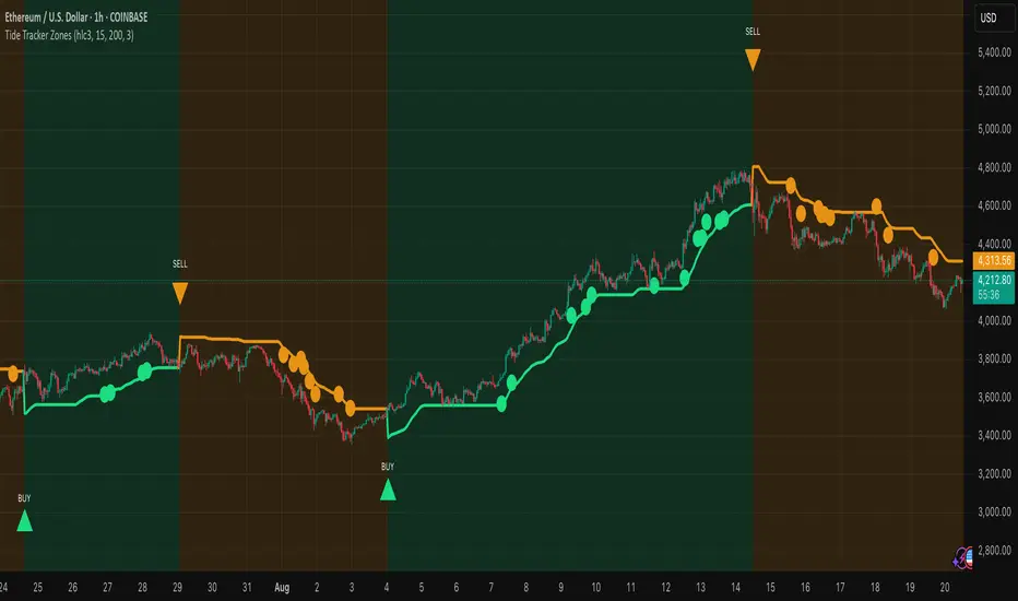
Multi-TF Trend Table (Configurable)1) What this tool does (in one minute)
A compact, multi‑timeframe dashboard that stacks eight timeframes and tells you:
Trend (fast MA vs slow MA)
Where price sits relative to those MAs
How far price is from the fast MA in ATR terms
MA slope (rising, falling, flat)
Stochastic %K (with overbought/oversold heat)
MACD momentum (up or down)
A single score (0%–100%) per timeframe
Alignment tick when trend, structure, slope and momentum all agree
Use it to:
Frame bias top‑down (M→W→D→…→15m)
Time entries on your execution timeframe when the higher‑TF stack is aligned
Avoid counter‑trend traps when the table is mixed
2) Table anatomy (each column explained)
The table renders 9 columns × 8 rows (one row per timeframe label you define).
TF — The label you chose for that row (e.g., Month, Week, 4H). Cosmetic; helps you read the stack.
Trend — Arrow from fast MA vs slow MA: ↑ if fastMA > slowMA (up‑trend), ↓ otherwise (down‑trend). Cell is green for up, red for down.
Price Pos — One‑character structure cue:
🔼 if price is above both fast and slow MAs (bullish structure)
🔽 if price is below both (bearish structure)
– otherwise (between MAs / mixed)
MA Dist — Distance of price from the fast MA measured in ATR multiples:
XS < S < M < L < XL according to your thresholds (see §3.3). Useful for judging stretch/mean‑reversion risk and stop sizing.
MA Slope — The fast MA one‑bar slope:
↑ if fastMA - fastMA > 0
↓ if < 0
→ if = 0
Stoch %K — Rounded %K value (default 14‑1‑3). Background highlights when it aligns with the trend:
Green heat when trend up and %K ≤ oversold
Red heat when trend down and %K ≥ overbought Tooltip shows K and D values precisely.
Trend % — Composite score (0–100%), the dashboard’s confidence for that timeframe:
+20 if trendUp (fast>slow)
+20 if fast MA slope > 0
+20 if MACD up (signal definition in §2.8)
+20 if price above fast MA
+20 if price above slow MA
Background colours:
≥80 lime (strong alignment)
≥60 green (good)
≥40 orange (mixed)
<40 grey (weak/contrary)
MACD — 🟢 if EMA(12)−EMA(26) > its EMA(9), else 🔴. It’s a simple “momentum up/down” proxy.
Align — ✔ when everything is in gear for that trend direction:
For up: trendUp and price above both MAs and slope>0 and MACD up
For down: trendDown and price below both MAs and slope<0 and MACD down Tooltip spells this out.
3) Settings & how to tune them
3.1 Timeframes (TF1–TF8)
Inputs: TF1..TF8 hold the resolution strings used by request.security().
Defaults: M, W, D, 720, 480, 240, 60, 15 with display labels Month, Week, Day, 12H, 8H, 4H, 1H, 15m.
Tips
Keep a top‑down funnel (e.g., Month→Week→Day→H4→H1→M15) so you can cascade bias into entries.
If you scalp, consider D, 240, 120, 60, 30, 15, 5, 1.
Crypto weekends: consider 2D in place of W to reflect continuous trading.
3.2 Moving Average (MA) group
Type: EMA, SMA, WMA, RMA, HMA. Changes both fast & slow MA computations everywhere.
Fast Length: default 20. Shorten for snappier trend/slope & tighter “price above fast” signals.
Slow Length: default 200. Controls the structural trend and part of the score.
When to change
Swing FX/equities: EMA 20/200 is a solid baseline.
Mean‑reversion style: consider SMA 20/100 so trend flips slower.
Crypto/indices momentum: HMA 21 / EMA 200 will read slope more responsively.
3.3 ATR / Distance group
ATR Length: default 14; longer makes distance less jumpy.
XS/S/M/L thresholds: define the labels in column MA Dist. They are compared to |close − fastMA| / ATR.
Defaults: XS 0.25×, S 0.75×, M 1.5×, L 2.5×; anything ≥L is XL.
Usage
Entries late in a move often occur at L/XL; consider waiting for a pullback unless you are trading breakouts.
For stops, an initial SL around 0.75–1.5 ATR from fast MA often sits behind nearby noise; use your plan.
3.4 Stochastic group
%K Length / Smoothing / %D Smoothing: defaults 14 / 1 / 3.
Overbought / Oversold: defaults 70 / 30 (adjust to 80/20 for trendier assets).
Heat logic (column Stoch %K): highlights when a pullback aligns with the dominant trend (oversold in an uptrend, overbought in a downtrend).
3.5 View
Full Screen Table Mode: centers and enlarges the table (position.middle_center). Great for clean screenshots or multi‑monitor setups.
4) Signal logic (how each datapoint is computed)
Per‑TF data (via a single request.security()):
fastMA, slowMA → based on your MA Type and lengths
%K, %D → Stoch(High,Low,Close,kLen) smoothed by kSmooth, then %D smoothed by dSmooth
close, ATR(atrLen) → for structure and distance
MACD up → (EMA12−EMA26) > EMA9(EMA12−EMA26)
fastMA_prev → yesterday/previous‑bar fast MA for slope
TrendUp → fastMA > slowMA
Price Position → compares close to both MAs
MA Distance Label → thresholds on abs(close − fastMA)/ATR
Slope → fastMA − fastMA
Score (0–100) → sum of the five 20‑point checks listed in §2.7
Align tick → conjunction of trend, price vs both MAs, slope and MACD (see §2.9)
Important behaviour
HTF values are sampled at the execution chart’s bar close using Pine v6 defaults (no lookahead). So the daily row updates only when a daily bar actually closes.
5) How to trade with it (playbooks)
The table is a framework. Entries/exits still follow your plan (e.g., S/D zones, price action, risk rules). Use the table to know when to be aggressive vs patient.
Playbook A — Trend continuation (pullback entry)
Look for Align ✔ on your anchor TFs (e.g., Week+Day both ≥80 and green, Trend ↑, MACD 🟢).
On your execution TF (e.g., H1/H4), wait for Stoch heat with the trend (oversold in uptrend or overbought in downtrend), and MA Dist not at XL.
Enter on your trigger (break of pullback high/low, engulfing, retest of fast MA, or S/D first touch per your plan).
Risk: consider ATR‑based SL beyond structure; size so 0.25–0.5% account risk fits your rules.
Trail or scale at M/L distances or when score deteriorates (<60).
Playbook B — Breakout with confirmation
Mixed stack turns into broad green: Trend % jumps to ≥80 on Day and H4; MACD flips 🟢.
Price Pos shows 🔼 across H4/H1 (above both MAs). Slope arrows ↑.
Enter on the first clean base‑break with volume/impulse; avoid if MA Dist already XL.
Playbook C — Mean‑reversion fade (advanced)
Use only when higher TFs are not aligned and the row you trade shows XL distance against the higher‑TF context. Take quick targets back to fast MA. Lower win‑rate, faster management.
Playbook D — Top‑down filter for Supply/Demand strategy
Trade first retests only in the direction where anchor TFs (Week/Day) have Align ✔ and Trend % ≥60. Skip counter‑trend zones when the stack is red/green against you.
6) Reading examples
Strong bullish stack
Week: ↑, 🔼, S/M, slope ↑, %K=32 (green heat), Trend 100%, MACD 🟢, Align ✔
Day: ↑, 🔼, XS/S, slope ↑, %K=45, Trend 80%, MACD 🟢, Align ✔
Action: Look for H4/H1 pullback into demand or fast MA; buy continuation.
Late‑stage thrust
H1: ↑, 🔼, XL, slope ↑, %K=88
Day/H4: only 60–80%
Action: Likely overextended on H1; wait for mean reversion or multi‑TF alignment before chasing.
Bearish transition
Day flips from 60%→40%, Trend ↓, MACD turns 🔴, Price Pos “–” (between MAs)
Action: Stand aside for longs; watch for lower‑high + Align ✔ on H4/H1 to join shorts.
7) Practical tips & pitfalls
HTF closure: Don’t assume a daily row changed mid‑day; it won’t settle until the daily bar closes. For intraday anticipation, watch H4/H1 rows.
MA Type consistency: Changing MA Type changes slope/structure everywhere. If you compare screenshots, keep the same type.
ATR thresholds: Calibrate per asset class. FX may suit defaults; indices/crypto might need wider S/M/L.
Score ≠ signal: 100% does not mean “must buy now.” It means the environment is favourable. Still execute your trigger.
Mixed stacks: When rows disagree, reduce size or skip. The tool is telling you the market lacks consensus.
8) Customisation ideas
Timeframe presets: Save layouts (e.g., Swing, Intraday, Scalper) as indicator templates in TradingView.
Alternative momentum: Replace the MACD condition with RSI(>50/<50) if desired (would require code edit).
Alerts: You can add alert conditions for (a) Align ✔ changes, (b) Trend % crossing 60/80, (c) Stoch heat events. (Not shipped in this script, but easy to add.)
9) FAQ
Q: Why do I sometimes see a dash in Price Pos? A: Price is between fast and slow MAs. Structure is mixed; seek clarity before acting.
Q: Does it repaint? A: No, higher‑TF values update on the close of their own bars (standard request.security behaviour without lookahead). Intra‑bar they can fluctuate; decisions should be made at your bar close per your plan.
Q: Which columns matter most? A: For trend‑following: Trend, Price Pos, Slope, MACD, then Stoch heat for entries. The Score summarises, and Align enforces discipline.
Q: How do I integrate with ATR‑based risk? A: Use the MA Dist label to avoid chasing at extremes and to size stops in ATR terms (e.g., SL behind structure at ~1–1.5 ATR).

Kio IQ [TradingIQ]Introducing: “Kio IQ ”
Kio IQ is an all-in-one trading indicator that brings momentum, trend strength, multi-timeframe analysis, trend divergences, pullbacks, early trend shift signals, and trend exhaustion signals together in one clear view.
🔶 The Philosophy of Kio IQ
Markets move in trends—and capturing them reliably is the key to consistency in trading. Without a tool to see the bigger picture, it’s easy to mistake a pullback for a breakout, a fakeout for the real deal, or random market noise as a meaningful price move.
Kio IQ cuts through that random market noise—scanning multiple timeframes, analyzing short, medium, and long-term momentum, and telling you on the spot whether a move is strong, weak, a trap, or simply a small move within a larger trend.
With Kio IQ, price action reveals its next move.
You’ll instantly see:
Which way it’s pushing — up, down, or stuck in the middle.
How hard it’s pushing — from fading weakness to full-blown strength.
When the gears are shifting — early warnings, explosive moves, smart pullbacks, or signs it’s running out of steam.
🔶 Why This Matters
Markets move in phases—sometimes they’re powering in one direction, sometimes they’re slowing down, and sometimes they’re reversing.
Knowing which phase you’re in can help you:
Avoid chasing a move that’s about to run out of steam.
Jump on a move when it’s just getting started.
Spot pullbacks inside a bigger trend (good for entries).
See when different timeframes are all pointing the same way.
🔶 What Kio IQ Shows You
Simple color-coded phases: “Strong Up,” “Up,” “Weak Up,” “Weak Down,” “Down,” “Strong Down.”
Clear visual signals
Full Shift: Strong momentum in one direction.
Half Shift: Momentum is building but not full power yet.
Pullback Shift: A small move against the trend that may be ending.
Early Scout / Lookout: First hints of a possible shift.
Exhaustion: Momentum is very stretched and may slow down.
Divergences: When price moves one way but momentum moves the opposite way—often a warning of a change.
Multi-Timeframe Table: See the trend strength for multiple timeframes (5m, current, 30m, 4h, 1D, and optional 1W/1M) all in one place.
Trend Strength %: A single number that tells you how strong the trend is across all timeframes.
Optional meters: A “momentum bar” and “trend strength gauge” for quick checks.
🔶 How It Works Behind the Scenes
Kio IQ measures price movement in different “speeds”:
Slow view: Big picture trend.
Medium view: The main engine for detecting the current phase.
Fast view: Catches recent changes in momentum.
Super-fast view: Finds tiny pullbacks inside the bigger move.
It compares these views to decide whether the market is strong up, weak up, weak down, strong down, or in between. Then it blends data from multiple timeframes so you see the whole picture, not just the current chart.
🔶 What You’ll See on the Chart
🔷 Full Shift Oscillator (FSO)
The image above highlights the Full Shift Oscillator (FSO).
The FSO is the cornerstone of Kio IQ, delivering mid-term momentum analysis. Using a proprietary formula, it captures momentum on a smooth, balanced scale — responsive enough to avoid lag, yet stable enough to prevent excessive noise or false signals.
The Key Upside Level for the FSO is +20, while the Key Downside Level is -20.
The image above shows the FSO above +20 and below -20, and the corresponding price movement.
FSML above +20 confirms sustained upside momentum — the market is being driven by consistent, broad-based buying pressure, not just a price spike.
FSML below -20 confirms sustained downside momentum — sellers are firmly in control across the market.
We do not chase the first sudden price move. Entries are only considered when the market demonstrates persistence, not impulse.
🔷 Half Shift Oscillator (HSO)
The image above highlights the Half Shift Oscillator (HSO).
The HSO is the FSO’s wingman — faster, more reactive, and designed to catch the earliest signs of strength, weakness, or momentum shifts.
While HSO reacts first, it is not a standalone confirmation of a major momentum change or trade-worthy strength.
Using the same proprietary formula as the FSO but scaled down, the HSO delivers smooth, balanced short-term momentum analysis. It is more responsive than the FSO, serving as the scout that spots potential setups before the main signal confirms.
The Key Upside Level for the FSO is +4, while the Key Downside Level is -4.
🔷 PlayBook Strategy: Shift Sync
Shift Sync is a momentum alignment play that triggers when short-term and mid-term momentum lock into the same direction, signaling strong directional control.
🔹 UpShift Sync – Bullish Alignment
HSO > +4 – Short-term momentum is firmly bullish.
FSO > +20 – Mid-term momentum confirms the bullish bias.
When both thresholds are met, buyers are in control and price is primed for continuation higher.
🔹 DownShift Sync – Bearish Alignment
HSO < -4 – Short-term momentum is firmly bearish.
FSO < -20 – Mid-term momentum confirms the bearish bias.
When both thresholds are met, sellers dominate and price is primed for continuation lower.
Execution:
Look for an entry opportunity in the direction of the alignment when conditions are met.
Avoid choppy conditions where alignment is frequently lost.
Why It Works
Think of the market as a tug-of-war between traders on different timeframes. Short-term traders (captured by the HSO) are quick movers — scalpers, intraday players, and algos hunting immediate edge. Mid-term traders (captured by the FSO) are swing traders, funds, and institutions who move slower but carry more weight.
Most of the time, these groups pull in opposite directions, creating chop and fakeouts. But when they suddenly lean the same way, the rope gets yanked hard in one direction. That’s when momentum has the highest chance to drive price further with minimal resistance.
Shift Sync works because it isolates those rare moments when multiple market “tribes” agree on direction — and when they do, price doesn’t just move, it flies.
Best Market Conditions
Shift Sync works best when the higher timeframe trend (daily, weekly, or monthly) is moving in the same direction as the alignment. This higher timeframe confluence increases follow-through potential and reduces the likelihood of false moves.
The image above shows an example of an UpShift Sync signal where the momentum table shows that the 1D momentum is bullish.
The image above shows bonus confluence, where the 1M and 1W momentum are also bullish.
The image above shows an example of a DownShift Sync signal where the momentum table shows that the 1D momentum is bearish. Bonus confluence also exists, where the 1W and 1M chart are also bearish.
Common Mistakes
Chasing late signals – Avoid entering if the Shift Sync trigger has been active for a long time. Instead, wait for a Shift Sync Pullback to look for opportunities to join in the direction of the trend.
Ignoring higher timeframe bias – Taking Shift Sync setups against the daily, weekly, or monthly trend reduces follow-through potential and increases the risk of a failed move.
🔷 Micro Shift Oscillator (MSO)
The image above highlights the Micro Shift Oscillator (MSO)
The MSO is the finishing touch to the FSO and HSO — the fastest and most reactive of the three. It’s built to spot pullback opportunities when the FSO and HSO are aligned, helping traders join strong price moves at the right time.
The MSO may reveal the earliest signs of a momentum shift, but that’s not its primary role. Its purpose is to identify retracement and pullback opportunities within the overarching trend, allowing traders to join the move while momentum remains intact.
🔷 Playbook Strategy: Shift Sync Pullback
Key Levels:
MSO Upside Trigger: +3
MSO Downside Trigger: -3
🔹 UpShift Pullback
Momentum Confirmation:
FSO > +20 – Mid-term momentum is strongly bullish.
HSO > +4 – Short-term momentum confirms alignment with the FSO.
Pullback Trigger:
MSO ≤ -3 – Signals a short-term retracement within the ongoing bullish trend and marks the earliest re-entry opportunity.
Entry Zone:
The blue arrow on the top chart shows where momentum remains intact while price pulls back into a zone primed for a move higher.
Setup Validity: Both FSO and HSO must remain above their bullish thresholds during the pullback.
Invalid Example:
If either the FSO or HSO drop below their bullish thresholds, momentum alignment breaks. No trade is taken.
🔹 DownShift Pullback
Momentum Confirmation:
FSO < -20 – Mid-term momentum is strongly bearish.
HSO < -4 – Short-term momentum aligns with the FSO, confirming seller dominance.
Pullback Trigger:
MSO ≥ +3 – Indicates a short-term retracement against the bearish trend, pointing to possible short-entry opportunities.
Entry Zone:
The purple arrow on the top chart marks valid pullback conditions — all three oscillators meet their bearish thresholds, and price is positioned to continue lower.
Setup Validity: Both FSO and HSO must remain below their bearish thresholds during the pullback.
Invalid Example:
If either oscillator rises above the bearish threshold, momentum alignment is lost and the MSO signal is ignored.
Why It Works
Even in strong trends, price rarely moves in a straight line. Supply and demand dynamics naturally create retracements as traders take profits, bet on reversals, or hedge positions.
While many momentum traders fear these pullbacks, they’re often the fuel for the next leg of the move — offering a “second chance” to join the trend at a more favorable price.
The Shift Sync Pullback pinpoints moments when both short-term (HSO) and mid-term (FSO) momentum remain firmly aligned, even as price moves temporarily against the trend. This alignment suggests the retracement is a pause, not a reversal.
By entering during a controlled pullback, traders often secure better entries, tighter stops, and stronger follow-through potential when the trend resumes.
Best Market Conditions:
Works best when the higher timeframe (daily, weekly, or monthly) is trending in the same direction as the pullback setup.
Consistent momentum is ideal — avoid erratic, news-driven chop.
Following a recent breakout (Gate Breaker setup) when momentum is still fresh.
Common Mistakes
Ignoring threshold breaks – Entering when either HSO or FSO dips through their momentum threshold often leads to taking trades in weakening trends.
Trading against higher timeframe bias – A pullback against the daily or weekly trend is more likely to fail; use higher timeframe confluence as a filter.
🔷 Macro Shift Oscillator (MaSO)
The chart above shows the MaSO in isolation.
While the MaSO is not part of any active Kio IQ playbook strategies, it delivers the clearest view of the prevailing macro trend.
MaSO > 0 – Macro trend is bullish. Readings above +4 signal extreme bullish conditions.
MaSO < 0 – Macro trend is bearish. Readings below -4 signal extreme bearish conditions.
Use the MaSO for context, not entries — it frames the environment in which all other signals occur
🔷 Shift Gates – Kio IQ Momentum Barriers
The image above shows UpShift Gates.
UpShift Gates mark the highest price reached during periods when the FSO is above +20 — moments when mid-term momentum is firmly bullish and buyers are in control.
UpShift Gates are upside breakout levels — key swing highs formed before a pullback during periods of strong bullish momentum. When price reclaims an UpShift Gate with momentum confirmation, it signals a potential continuation of the uptrend.
The image above shows DownShift Gates.
DownShift Gates Mark The Lowest Price Reached During Periods When The FSO Is Below -20 — Moments When Mid-Term Momentum Is Firmly Bearish And Sellers Are In Control.
DownShift Gates are downside breakout levels — key swing lows formed before an upside pullback during periods of strong bearish momentum. When price reclaims a DownShift Gate with momentum confirmation, it signals a potential continuation of the downtrend.
🔷 Playbook Strategy: Gate Breakers
Core Rule:
Long signal when price decisively closes beyond an UpGate (for longs) or DownGate (for shorts). The breakout must show commitment — no wick-only tests.
🔹 UpGate Breaker (UpGate)
Trigger: Price closes above the UpShift Gate level.
Bonus Confluence: MaSO > 0 at the moment of the break — confirms that the macro trend bias is in favor of the breakout.
Invalidation: Avoid taking the signal if the gate level forms part of a DownShift Rift (bearish divergence) — this signals underlying weakness despite the break.
The chart above shows valid UpGate Breakers.
The chart above shows an invalidated UpGate Breaker setup.
🔹 DownGate Breaker (DownGate)
Trigger: Price closes below the DownShift Gate level.
Bonus Confluence: MaSO < 0 at the moment of the break — confirms that the macro trend bias is in favor of the breakdown.
Invalidation: Avoid taking the trade if the gate level forms part of an UpShift Rift (bullish divergence) — this signals underlying strength despite the break.
The chart above shows a valid DownGate Breaker.
Why It Works
Key swing levels like Shift Gates attract a high concentration of resting orders — stop losses from traders caught on the wrong side and breakout orders from momentum traders waiting for confirmation.
When price decisively clears a gate with a strong close, these orders trigger in quick succession, creating a burst of directional momentum.
Adding the MaSO filter ensures you’re breaking gates with the prevailing macro bias, improving the odds that the move will continue rather than stall.
The divergence-based invalidation rule (Rift filter) prevents entries when underlying momentum is moving in the opposite direction, helping avoid “fake breakouts” that trap traders.
Best Market Conditions:
Works best in markets with clear trend structure and visible Shift Gates (not during chop).
Strongest when higher timeframe (1D, 1W, 1M) momentum aligns with the breakout direction.
MaSO > 0 for bullish breakouts, MaSO < 0 for bearish breakouts
Most reliable after a period of consolidation near the gate, where pressure builds before the break.
Common Mistakes
Trading wick-only tests – A breakout without a decisive candle close beyond the gate often fails.
Ignoring MaSO bias – Taking a break in the opposite macro direction greatly reduces follow-through odds.
Skipping the Rift filter – Entering when the gate forms part of a divergence setup exposes you to higher reversal risk.
Chasing extended moves – If price is already far beyond the gate by the time you see it, risk/reward is poor; wait for the next setup or a retest.
🔷 Shift Rifts - Kio IQ Divergences
This chart shows an UpShift Rift — a bullish divergence where price action and momentum part ways, signaling a potential trend reversal or acceleration.
Setup:
Price Action: Price is marking lower lows, indicating short-term weakness.
FSO Reading: The Full Shift Oscillator (FSO) is marking higher lows over the same period, showing underlying momentum strengthening despite falling prices.
The rift between price and the FSO suggests selling pressure is losing force while buyers quietly regain control.
When confirmed by broader trend alignment in Kio IQ’s multi-timeframe momentum table, the UpShift Rift becomes a setup for a bullish move.
This chart shows a DownShift Rift — a bearish divergence where price action and momentum split, signaling a potential downside reversal.
Setup:
Price Action: Price is marking higher highs, suggesting continued strength on the surface.
FSO Reading: The Full Shift Oscillator (FSO) is marking lower highs over the same period, revealing weakening momentum beneath the price advance.
The rift between price and momentum signals that buying pressure is fading, even as price makes new highs. This disconnect often precedes a momentum shift in favor of sellers.
When aligned with multi-timeframe bearish signals in Kio IQ’s momentum table, the DownShift Rift becomes a strong setup for downside continuation or reversal.
🔷 Playbook Strategy: Rift Reversal
The Rift Reversal is a divergence-based reversal play that signals when momentum is fading and an trend reversal is likely. It’s designed to catch early turning points before the broader market catches on.
Trader’s Note:
This strategy is not intended for beginners — it requires confidence in reading divergence and trusting momentum shifts even when price action still appears weak. Best suited for traders experienced in managing reversals, as entries often occur before the broader market confirms the move.
🔹 UpRift Reversal
Core Setup:
Price Action – Forms a lower low.
Momentum Rift – The FSO forms a higher low, signaling bullish divergence and weakening selling pressure.
Trigger:
A confirmed UpRift Reversal signal is printed when:
Bullish Divergence is detected — price makes a new low, but the oscillator fails to confirm.
Momentum begins turning up from the divergence low (marked on chart as ⇝)
The image above shows a valid UpRift Reversal play.
🔹 DownRift Reversal
Core Setup:
Price Action – Forms a higher high.
Momentum Rift – The FSO forms a lower high, signaling bearish divergence and weakening buying pressure.
Trigger
A confirmed DownRift Reversal signal is printed when:
Bearish Divergence is detected — price makes a new high, but the oscillator fails to confirm.
Momentum begins turning down from the divergence high (marked on chart as ⇝).
Why It Works
Shift Rifts work because momentum often fades before a price reverses.
Price is the final scoreboard — it reflects what has already happened. Momentum, on the other hand, is a leading indicator of pressure. When the FSO begins to move in the opposite direction of price, it signals that the dominant side in the market is losing steam, even if the scoreboard hasn’t flipped yet.
In an UpShift Rift, sellers keep pushing price lower, but each push has less force — buyers are quietly building pressure under the surface.
In a DownShift Rift, buyers keep marking new highs, but they’re spending more effort for less result — sellers are starting to take control.
These disconnects happen because large participants often scale into or out of positions gradually, creating momentum shifts before price reflects it. Shift Rifts capture those turning points early.
Best Market Conditions:
Best in markets that have been trending strongly but are starting to show signs of exhaustion.
Works well after a prolonged move into key support/resistance, where large players may take profits or reverse positions.
Higher win potential when the Rift aligns with higher timeframe momentum bias in Kio IQ’s multi-timeframe table.
Common Mistakes
Forcing Rifts in choppy markets – In sideways chop, small oscillations can look like divergences but lack conviction.
Ignoring multi-timeframe bias – Trading an UpShift Rift when higher timeframes are strongly bearish (or vice versa) reduces follow-through odds.
Entering too early – Divergences can extend before reversing; wait for momentum to confirm a turn (⇝) before making a trading decision.
Confusing normal pullbacks with Rifts – Not every dip in momentum is a divergence; the Rift requires a clear and opposing trend between price and FSO.
🔷 Shift Count – Momentum Stage Tracker
Purpose:
Shift Count measures how far a bullish or bearish push has progressed, from its first spark to potential exhaustion.
It tracks momentum in defined steps so traders can instantly gauge whether a move is just starting, picking up steam, fully extended, or at risk of reversing.
How It Works
Bullish Momentum:
Start (1–2) → New momentum emerging, early entry window.
Acceleration (3–4) → Momentum in full swing, best for holding or adding to a position.
Extreme Bullish Momentum / Final Stages (5) → Watch for signs of reversal or take partial profits.
Exhaust – Can only occur after 5 is reached, signaling that the rally may be losing steam.
Bearish Momentum:
Start (-1 to -2) → New selling pressure emerging.
Acceleration (-3 to -4) → Bear trend accelerating.
Extreme Bearish Momentum / Final Stages (-5) → Watch for reversal or scale out.
Exhaust – Can only occur after -5 is reached, signaling that the sell-off may be running out of force.
The chart above shows a full 5-UpShift count.
The chart above shows a full 5-DownShift count.
Why It’s Useful
Markets often move in momentum “steps” before reversing or taking a breather.
Shift Count makes these steps visible, helping traders:
Spot the early stages of a potential move.
Identify when a move is picking up steam.
Identify when a move is mature and vulnerable to reversal.
Combine with other Kio IQ strategies for better-timed entries and exits.
Why This Works
It’s visually obvious where you are in the momentum cycle without overthinking.
You can build rules like:
Only enter in Start phase when higher timeframe agrees.
Manage positions aggressively once in Acceleration phase.
Be ready to exit or fade in Exhaust phase.
Best Market Conditions
Trending markets where pullbacks are shallow.
Works best when combined with Shift Sync Pullback or Gate Breaker triggers to confirm timing.
Higher timeframe direction confluence.
Common Mistakes
Treating Exhaust as always a reversal — sometimes strong markets push past 5/-5 multiple times.
Ignoring higher timeframe bias — a “Start” on a 1-minute chart against a strong daily trend is much riskier.
🔷 Playbook Strategy: Exhaust Flip
Core idea: When Shift Count reaches 5 (or -5) and then prints Exhaust, momentum has likely climaxed, whether temporarily or leading to a full reversal. We take the first qualified signal against the prior move.
Trader’s Note:
This strategy is not intended for beginners — it requires confidence in trusting momentum shifts even when price action still appears strong. Best suited for traders experienced in managing reversals, as entries often occur before the broader market confirms the move.
🔹 UpExhaust Flip (fade a bullish run)
Setup:
Shift Count hits 5, then an Exhaust print occurs.
Invalidation
The local high is broken to the upside.
The chart above explains the UpExhaust Flip strategy in greater detail.
🔹 DownExhaust Flip (fade a bearish run)
Setup:
Shift Count hits -5, then an Exhaust print occurs.
Invalidation
The local low is broken to the downside.
The chart above explains the DownExhaust Flip strategy in greater detail.
Bonus Confluence (optional, not required)
Rift assist: An UpShift Rift (for longs) or DownShift Rift (for shorts) near Exhaust strengthens the flip.
MaSO context: Neutral or opposite-leaning MaSO helps. Avoid flips straight against a strong MaSO bias unless you have a structure break.
Why It Works
Exhaust marks climax behavior: the prior side has pushed hard, then failed to extend after meeting significant pushback. Liquidity gets thin at the edges; aggressive profit-taking meets early contrarians. A small confirmation (micro structure break or HSO turn) is often enough to flip the tape for a snapback.
Best Market Conditions
After extended, one-sided runs (multiple Shift Count steps without meaningful pullbacks).
Near Shift Gates or obvious swing extremes where trapped orders cluster.
When higher-timeframe momentum is neutral or softening (you’re fading the last thrust of a decisive move, not a fresh trend).
Common Mistakes
Fading too early: Taking the trade at 5 without waiting for the Exhaust.
Fading freight trains: Fighting a fresh Shift Sync in the same direction right after Exhaust (often just a pause).
No structure reference: Entering without a clear micro swing to anchor risk.
🔷 MTF Shift Table
The MTF Shift Table table provides a compact, multi-timeframe view of market momentum shifts. Each cell represents the current shift count within a given timeframe, while the classification label indicates whether momentum is strong, weak, or normal.
The chart above further outlines the MTF Shift Table.
Why It Works
Markets rarely move in a perfectly linear fashion — momentum develops, stalls, and transitions at different speeds across different timeframes. This table allows you to:
See momentum alignment at a glance – If multiple higher and lower timeframes show a sustained shift count in the same direction, the move has greater structural support.
Spot divergences early – A shorter timeframe reversing against a longer-term sustained count can warn of potential pullbacks or trend exhaustion before price confirms.
Identify “momentum stacking” opportunities – When shift counts escalate across timeframes in sequence, it often signals a stronger and more durable move.
Avoid false enthusiasm – A single timeframe spike without agreement from other periods may be noise rather than genuine momentum.
The Trend Score provides a concise, at-a-glance evaluation of an asset’s directional strength across multiple timeframes. It distills complex momentum and Shift data into a single, easy-to-read metric, allowing traders to quickly determine whether the prevailing conditions favor bullish or bearish continuation. The Trend Scale scales from -100 to 100.
How to Use It in Practice
Trend Confirmation – Confirm that your intended trade direction is backed by multiple timeframes maintaining consistent momentum.
Risk Timing – Reduce position size or take partial profits when lower timeframes begin shifting against the dominant momentum classification.
Multi-timeframe Confluence – Combine with other system signals (e.g., FSO, HSO) for higher-probability entries.
This table effectively turns a complex multi-timeframe read into a single, glanceable heatmap of momentum structure, enabling quicker and more confident decision-making.
The MTF Shift Table is the confluence backbone of every playbook strategy for Kio IQ.
🔷 Momentum Meter
The Momentum Meter is a composite gauge built from three of Kio IQ’s core momentum engines:
HSO – Short-term momentum scout
FSO – Mid-term momentum backbone
MaSO – Macro trend context
By combining these three readings, the meter provides the most strict and lagging momentum classification in Kio IQ.
It only flips direction when a composite score of all three oscillators reach defined thresholds, filtering out short-lived counter-moves and false starts.
Why It Works
Many momentum tools flip too quickly — reacting to short-lived spikes that don’t represent real directional commitment. The Momentum Meter avoids this by requiring alignment across short, mid, and macro momentum engines before it shifts bias.
This triple-confirmation rule filters out noise, catching only those moments when traders of all speeds — scalpers, swing traders, and long-term participants — are leaning in the same direction. When that happens, price movement tends to be more sustained and less prone to immediate reversal.
In other words, the Momentum Meter doesn’t just tell you “momentum looks good” — it tells you momentum looks good to everyone who matters, across all horizons.
How It Works
Blue = All three engines align bullish.
Pink = All three engines align bearish.
The meter ignores smaller pullbacks or temporary oscillations that might flip the faster indicators — it waits for total alignment before changing state.
Because of this strict confirmation requirement, the Momentum Meter reacts slower but delivers higher-conviction shifts.
How to Interpret Readings
Blue (Bullish Alignment):
Sustained buying pressure across short, mid, and macro views. Often marks the “full confirmation” stage of a move.
Pink (Bearish Alignment):
Sustained selling pressure across all views. Confirms sellers are in control.
Practical Uses
Trend Followers – Use as a “stay-in” confirmation once a position is already open.
Swing Traders – Great for filtering out low-conviction setups; if the Momentum Meter disagrees with your intended direction, conditions aren’t fully aligned.
Confluence and Direction Filter – The Momentum Meter can be used as a form of confluence i.e. blue = longs only, pink = shorts only.
Limitations
Will always turn after the faster oscillators (HSO/MSO). This is intentional.
Works best in trending markets — in choppy conditions it may lag shifts significantly.
Should be used as a bias filter, not a standalone entry signal.
🔷 Trend Strength Meter
The Trend Strength Meter is a compact visual gauge that scores the current trend’s strength on a scale from -5 to +5:
+5 = Extremely strong bullish trend
0 = Neutral, no clear trend
-5 = Extremely strong bearish trend
This is an optional tool in Kio IQ — designed for quick reference rather than as a primary trading trigger.
Why it works
Single-indicator trend reads can be misleading — they might look strong on one metric while quietly weakening on another. The Trend Strength Meter solves this by blending multiple inputs (momentum alignment, structure persistence, and multi-timeframe data) into one composite score.
This matters because trend health isn’t just about direction — it’s about persistence. A +5 or -5 score means the market is not only trending but holding that trend with structural support across multiple timeframes.
By tracking both direction and staying power, the Trend Strength Meter flags when a move is at risk of fading before price action fully confirms it — giving you a head start on adjusting your position or taking profits.
How It Works
The Trend Strength Meter evaluates multiple market inputs — including momentum alignment, price structure, and persistence — to assign a numeric value representing how firmly the current move is holding.
The scoring logic:
Positive values indicate bullish conditions.
Negative values indicate bearish conditions.
Higher magnitude (closer to ±5) = stronger conviction in that direction.
Values near zero suggest the market is in a transition or range.
How to Interpret Readings
+4 to +5 (Strong Up) – Trend is well-established, often with multi-timeframe agreement.
+1 to +3 (Up) – Bullish bias present, but not at maximum conviction.
0 (Neutral) – No dominant trend; could be consolidation or pre-shift phase.
-1 to -3 (Down) – Bearish bias present but moderate.
-4 to -5 (Strong Down) – Trend is firmly bearish, with consistent downside momentum.
Why It Works
A single timeframe or momentum reading can give a false sense of trend health.
The Trend Strength Meter aggregates multiple layers of market data into one simplified score, making it easy to see whether a move has the underlying support to continue — or whether it’s more likely to stall.
Because the score considers both direction and persistence, it can flag when a move is losing strength even before price structure fully shifts.
🔷 Kio IQ – Supplemental Playbook Strategies
These phases are part of the Kio IQ Playbook—situational tools that can help you anticipate potential momentum changes.
While they can be useful for planning and tactical adjustments, they are not primary trade triggers and should be treated as early, lower-conviction cues.
🔹 1. Scouting Phase (Light Early Cue)
Purpose: Provide the earliest possible hint that momentum may be shifting.
Upshift Trigger: FSO crosses above the 0 line.
Downshift Trigger: FSO crosses below the 0 line.
Why It Works
The 0 line in the Full Shift Oscillator (FSO) acts as a neutral momentum boundary.
When the FSO moves above 0, it suggests that medium-term momentum has shifted to bullish territory.
When it moves below 0, it suggests that medium-term momentum has shifted to bearish territory.
This crossover is often the first measurable sign of a momentum reversal or acceleration, well before slower indicators confirm it.
Think of it as "momentum poking its head above water"—you’re spotting the change before it becomes obvious on price alone.
Best Use
Works best when confirmed later by Lookout Phase or other primary Kio IQ signals.
Ideal for scouting in anticipation of potential opportunities.
Helpful when monitoring multiple assets and you want a quick filter for shifts worth watching.
Can act as a trade trigger when the MTF Shift Table shows confluence (i.e., UpShift Scouting Signal + Bullish MTF Table + High Trend Strength Score).
Common Mistakes
Acting on Scouting Phase signals against the MTF Shift Table as a stand-alone trade trigger. Without higher timeframe alignment or additional confirmation, many Scouting Phase crossovers can fade quickly or reverse, leading to premature entries.
Ignoring market context
A bullish Scouting Phase in a strong downtrend can easily fail.
Always check higher timeframe trend alignment.
Overreacting to noise: On lower timeframes, small fluctuations can create false scouting signals.
Best Practices
Filter with trend: Only act on Scouting Phases that align with the dominant higher timeframe trend.
Watch volatility: In low-volatility conditions, false scouting triggers are more likely.
🔹 2. Lookout Phase (Early Momentum Alert)
Purpose:
The Lookout Phase signals an early alert that momentum is potentially strengthening in a given direction. It’s more meaningful than the Scouting Phase, but still considered a preliminary cue.
Triggers:
Upshift: FSO crosses above the HSO.
Downshift: FSO crosses below the HSO.
Why It Works:
The Lookout Phase is designed to identify moments when mid-term momentum (FSO) overtakes short-term momentum (HSO). Since the FSO is smoother and reacts more gradually, its crossover of the faster-reacting HSO can indicate a shift from short-lived fluctuations to a more sustained directional move.
This makes it a valuable early read on momentum transitions—especially when supported by higher-timeframe context.
Best Practices:
Always check the MTF Shift Table for higher-timeframe alignment before acting on a Lookout Phase signal.
Look for confluence with the Momentum Meter
Treat Lookout Phase entries as probing positions—small, exploratory trades that can be scaled into if follow-through develops.
Common Mistakes:
Treating Lookout Phase signals as a definitive trade trigger without context
Entering solely on a Lookout Phase crossover, without considering the MTF Shift Table or broader market structure, can result in chasing short-lived momentum bursts that fail to follow through.
Ignoring prevailing higher-timeframe momentum
Trading a Lookout Phase signal that is counter to the dominant trend or higher-timeframe bias increases the risk of whipsaws and false moves.
🔶 Summary
Kio IQ is an all-in-one trading indicator that combines momentum, trend strength, multi-timeframe analysis, divergences, pullbacks, and exhaustion alerts into a clear, structured view. It helps traders cut through market noise by showing whether a move is strong, weak, a trap, or simply part of a larger trend. With tools like the Full Shift Oscillator, Multi-Timeframe Shift Table, Shift Gates, and Rift Divergences, Kio IQ simplifies complex market behavior into easy-to-read signals. It’s designed to help traders spot early shifts, align with momentum, and recognize when trends are building or losing steam—all in one place.

Information-Geometric Market DynamicsInformation-Geometric Market Dynamics
The Information Field: A Geometric Approach to Market Dynamics
By: DskyzInvestments
Foreword: Beyond the Shadows on the Wall
If you have traded for any length of time, you know " the feeling ." It is the frustration of a perfect setup that fails, the whipsaw that stops you out just before the real move, the nagging sense that the chart is telling you only half the story. For decades, technical analysis has relied on interpreting the shadows—the patterns left behind by price. We draw lines on these shadows, apply indicators to them, and hope they reveal the future.
But what if we could stop looking at the shadows and, instead, analyze the object casting them?
This script introduces a new paradigm for market analysis: Information-Geometric Market Dynamics (IGMD) . The core premise of IGMD is that the price chart is merely a one-dimensional projection of a much richer, higher-dimensional reality—an " information field " generated by the collective actions and beliefs of all market participants.
This is not just another collection of indicators. It is a unified framework for measuring the geometry of the market's information field—its memory, its complexity, its uncertainty, its causal flows—and making high-probability decisions based on that deeper reality. By fusing advanced mathematical and informational concepts, IGMD provides a multi-faceted lens through which to view market behavior, moving beyond simple price action into the very structure of market information itself.
Prepare to move beyond the flatland of the price chart. Welcome to the information field.
The IGMD Framework: A Multi-Kernel Approach
What is a Kernel? The Heart of Transformation
In mathematics and data science, a kernel is a powerful and elegant concept. At its core, a kernel is a function that takes complex, often inscrutable data and transforms it into a more useful format. Think of it as a specialized lens or a mathematical "probe." You cannot directly measure abstract concepts like "market memory" or "trend quality" by looking at a price number. First, you must process the raw price data through a specific mathematical machine—a kernel—that is designed to output a measurement of that specific property. Kernels operate by performing a sort of "similarity test," projecting data into a higher-dimensional space where hidden patterns and relationships become visible and measurable.
Why do creators use them? We use kernels to extract features —meaningful pieces of information—that are not explicitly present in the raw data. They are the essential tools for moving beyond surface-level analysis into the very DNA of market behavior. A simple moving average can tell you the average price; a suite of well-chosen kernels can tell you about the character of the price action itself.
The Alchemist's Challenge: The Art of Fusion
Using a single kernel is a challenge. Using five distinct, computationally demanding mathematical engines in unison is an immense undertaking. The true difficulty—and artistry—lies not just in using one kernel, but in fusing the outputs of many . Each kernel provides a different perspective, and they can often give conflicting signals. One kernel might detect a strong trend, while another signals rising chaos and uncertainty. The IGMD script's greatest strength is its ability to act as this alchemist, synthesizing these disparate viewpoints through a weighted fusion process to produce a single, coherent picture of the market's state. It required countless hours of testing and calibration to balance the influence of these five distinct analytical engines so they work in harmony rather than cacophony.
The Five Kernels of Market Dynamics
The IGMD script is built upon a foundation of five distinct kernels, each chosen to probe a unique and critical dimension of the market's information field.
1. The Wavelet Kernel (The "Microscope")
What it is: The Wavelet Kernel is a signal processing function designed to decompose a signal into different frequency scales. Unlike a Fourier Transform that analyzes the entire signal at once, the wavelet slides across the data, providing information about both what frequencies are present and when they occurred.
The Kernels I Use:
Haar Kernel: The simplest wavelet, a square-wave shape defined by the coefficients . It excels at detecting sharp, sudden changes.
Daubechies 2 (db2) Kernel: A more complex and smoother wavelet shape that provides a better balance for analyzing the nuanced ebb and flow of typical market trends.
How it Works in the Script: This kernel is applied iteratively. It first separates the finest "noise" (detail d1) from the first level of trend (approximation a1). It then takes the trend a1 and repeats the process, extracting the next level of cycle (d2) and trend (a2), and so on. This hierarchical decomposition allows us to separate short-term noise from the long-term market "thesis."
2. The Hurst Exponent Kernel (The "Memory Gauge")
What it is: The Hurst Exponent is derived from a statistical analysis kernel that measures the "long-term memory" or persistence of a time series. It is the definitive measure of whether a series is trending (H > 0.5), mean-reverting (H < 0.5), or random (H = 0.5).
How it Works in the Script: The script employs a method based on Rescaled Range (R/S) analysis. It calculates the average range of price movements over increasingly larger time lags (m1, m2, m4, m8...). The slope of the line plotting log(range) vs. log(lag) is the Hurst Exponent. Applying this complex statistical analysis not to the raw price, but to the clean, wavelet-decomposed trend lines, is a key innovation of IGMD.
3. The Fractal Dimension Kernel (The "Complexity Compass")
What it is: This kernel measures the geometric complexity or "jaggedness" of a price path, based on the principles of fractal geometry. A straight line has a dimension of 1; a chaotic, space-filling line approaches a dimension of 2.
How it Works in the Script: We use a version based on Ehlers' Fractal Dimension Index (FDI). It calculates the rate of price change over a full lookback period (N3) and compares it to the sum of the rates of change over the two halves of that period (N1 + N2). The formula d = (log(N1 + N2) - log(N3)) / log(2) quantifies how much "longer" and more convoluted the price path was than a simple straight line. This kernel is our primary filter for tradeable (low complexity) vs. untradeable (high complexity) conditions.
4. The Shannon Entropy Kernel (The "Uncertainty Meter")
What it is: This kernel comes from Information Theory and provides the purest mathematical measure of information, surprise, or uncertainty within a system. It is not a measure of volatility; a market moving predictably up by 10 points every bar has high volatility but zero entropy .
How it Works in the Script: The script normalizes price returns by the ATR, categorizes them into a discrete number of "bins" over a lookback window, and forms a probability distribution. The Shannon Entropy H = -Σ(p_i * log(p_i)) is calculated from this distribution. A low H means returns are predictable. A high H means returns are chaotic. This kernel is our ultimate gauge of market conviction.
5. The Transfer Entropy Kernel (The "Causality Probe")
What it is: This is by far the most advanced and computationally intensive kernel in the script. Transfer Entropy is a non-parametric measure of directed information flow between two time series. It moves beyond correlation to ask: "Does knowing the past of Volume genuinely reduce our uncertainty about the future of Price?"
How it Works in the Script: To make this work, the script discretizes both price returns and the chosen "driver" (e.g., OBV) into three states: "up," "down," or "neutral." It then builds complex conditional probability tables to measure the flow of information in both directions. The Net Transfer Entropy (TE Driver→Price minus TE Price→Driver) gives us a direct measure of causality . A positive score means the driver is leading price, confirming the validity of the move. This is a profound leap beyond traditional indicator analysis.
Chapter 3: Fusion & Interpretation - The Field Score & Dashboard
Each kernel is a specialist providing a piece of the puzzle. The Field Score is where they are fused into a single, comprehensive reading. It's a weighted sum of the normalized scores from all five kernels, producing a single number from -1 (maximum bearish information field) to +1 (maximum bullish information field). This is the ultimate "at-a-glance" metric for the market's net state, and it is interpreted through the dashboard.
The Dashboard: Your Mission Control
Field Score & Regime: The master metric and its plain-English interpretation ("Uptrend Field", "Downtrend Field", "Transitional").
Kernel Readouts (Wave Align, H(w), FDI, etc.): The live scores of each individual kernel. This allows you to see why the Field Score is what it is. A high Field Score with all components in agreement (all green or red) is a state of High Coherence and represents a high-quality setup.
Market Context: Standard metrics like RSI and Volume for additional confluence.
Signals: The raw and adjusted confluence counts and the final, calculated probability scores for potential long and short entries.
Pattern: Shows the dominant candlestick pattern detected within the currently forming APEX range box and its calculated confidence percentage.
Chapter 4: Mastering the Controls - The Inputs Menu
Every parameter is a lever to fine-tune the IGMD engine.
📊 Wavelet Transform: Kernel ( Haar for sharp moves, db2 for smooth trends) and Scales (depth of analysis) let you tune the script's core microscope to your asset's personality.
📈 Hurst Exponent: The Window determines if you're assessing short-term or long-term market memory.
🔍 Fractal Dimension & ⚡ Entropy Volatility: Adjust the lookback windows to make these kernels more or less sensitive to recent price action. Always keep "Normalize by ATR" enabled for Entropy for consistent results.
🔄 Transfer Entropy: Driver lets you choose what causal force to measure (e.g., OBV, Volume, or even an external symbol like VIX). The throttle setting is a crucial performance tool, allowing you to balance precision with script speed.
⚡ Field Fusion • Weights: This is where you can customize the model's "brain." Increase the weights for the kernels that best align with your trading philosophy (e.g., w_hurst for trend followers, w_fdi for chop avoiders).
📊 Signal Engine: Mode offers presets from Conservative to Aggressive . Min Confluence sets your evidence threshold. Dynamic Confluence is a powerful feature that automatically adapts this threshold to the market regime.
🎨 Visuals & 📏 Support/Resistance: These inputs give you full control over the chart's appearance, allowing you to toggle every visual element for a setup that is as clean or as data-rich as you desire.
Chapter 5: Reading the Battlefield - On-Chart Visuals
Pattern Boxes (The Large Rectangles): These are not simple range boxes. They appear when the Field Score crosses a significance threshold, signaling a potential ignition point.
Color: The color reflects the dominant candlestick pattern that has occurred within that box's duration (e.g., green for Bull Engulf).
Label: Displays the dominant pattern, its duration in bars, and a calculated Confidence % based on field strength and pattern clarity.
Bar Pattern Boxes (The Small Boxes): If enabled, these highlight individual, significant candlestick patterns ( BE for Bull Engulf, H for Hammer) on a bar-by-bar basis.
Signal Markers (▲ and ▼): These appear only when the Signal Engine's criteria are all met. The number is the calculated Probability Score .
RR Rails (Dashed Lines): When a signal appears, these lines automatically plot the Entry, Stop Loss (based on ATR), and two Take Profit targets (based on Risk/Reward ratios). They dynamically break and disappear as price touches each level.
Support & Resistance Lines: Plots of the highest high ( Resistance ) and lowest low ( Support ) over a lookback, providing key structural levels.
Chapter 6: Development Philosophy & A Final Word
One single question: " What is the market really doing? " It represents a triumph of complexity, blending concepts from signal processing, chaos theory, and information theory into a cohesive framework. It is offered for educational and analytical purposes and does not constitute financial advice. Its goal is to elevate your analysis from interpreting flat shadows to measuring the rich, geometric reality of the market's information field.
As the great mathematician Benoit Mandelbrot , father of fractal geometry, noted:
"Clouds are not spheres, mountains are not cones, coastlines are not circles, and bark is not smooth, nor does lightning travel in a straight line."
Neither does the market. IGMD is a tool designed to navigate that beautiful, complex, and fractal reality.
— Dskyz, Trade with insight. Trade with anticipation.

Xcalibur Signals & Alerts [AlgoXcalibur]An advanced trend-following algorithm forged to empower retail traders with an edge.
Xcalibur Signals & Alerts is a sophisticated, multi-layered algorithm designed to consistently deliver real-time trend signals—without clutter or unnecessary complexity. The system combines refined trend-following logic with breakout detection, flat-market filtration, false signal failsafes, take profit cues, live alerts, and more — all in a visually simple, easy-to-use indicator built for all assets, timeframes, and market conditions.
🧠 Algorithm Logic
Xcalibur Signals & Alerts operates on a systematic framework that evaluates multiple technical dimensions in harmony—directional alignment, momentum confirmation, relative strength, volume bias, breakout detection, Fibonacci calculations, and more. Rather than reacting to isolated triggers, it filters every opportunity through a multi-layered confirmation engine. It doesn’t just react to every move—it evaluates them. This cohesive approach ensures that each signal results from aligned conditions—not arbitrary thresholds. By combining structural awareness with adaptive filtering, Xcalibur maintains clarity and consistency across a wide range of market environments—delivering actionable signals without unnecessary noise or lag.
⚙️ User-Adjustable Features
• Adjustable Sensitivity:
Choose from 5 pre-tuned Signal Trigger Settings and 3 dynamic Confirmation Filter Modes to tailor the system to your trading style, asset, and timeframe. Candle color reflects the active trigger condition, while an adaptive cyan line displays the selected Confirmation Filter—blocking signals until the filter threshold is crossed.
• Directional Stability Filter: When enabled, this filter uses mean-reversion calculations to determine directional bias and block unreliable signals during choppy, indecisive price action. A magenta line represents this filter threshold and provides higher-confidence signals during periods of low directional conviction.
• Pullback Allowance Filter:
When enabled, this unique filter uses Fibonacci ratios to deliberately block signals from temporary pullbacks during strong trend periods. A green (uptrend) or red (downtrend) line marks the active pullback allowance zone.
• False Signal Failsafe
:
Two selectable modes:
Simple — Cancels the signal if price breaks the signal candle’s high or low.
Advanced — Requires both a price break and opposing momentum confirmation.
When triggered, the system plots a white “X” signal, turns candles gray, disables the background color, sends an alert (if enabled), and enters standby mode until a valid trend condition re-emerges.
• Reaction Zones:
Identifies probable reversal or breakout zones based on recent price action patterns. A yellow line appears when active, with a yellow caution flag plotted if the price reaches this critical area.
• Take-Profit Cues
: Automatically detects potential trend exhaustion using price action structure and momentum shifts. When triggered, a visual “TP” marker is plotted—advising traders to manage profits or prepare for a possible reversal.
• Trailing Stop:
Plots a dynamic, percentage-based trailing stop or trailing take-profit using your selected input. Adjust it to suit your risk tolerance and asset.
• Multi-Timeframe Monitor
: Displays real-time trend direction across 1m, 2m, 5m, 15m, 1H, 4H, and 1D timeframes in a compact, easy-to-read table.
• Alert System
:
Receive desktop and/or mobile alerts for:
* New trend signals
* Failsafe triggers
* 9:00 AM Morning Greeting messages with auto re-arming confirmation
(Alerts are limited to 9:00 AM – 4:00 PM Eastern Time)
• SuperCandles
: Highlights strong momentum moves with a stunning and easily recognizable glow effect.
• Color-Coded Candles & Background
: Candles reflect the current trigger condition, while the background tint tracks the most recent trend—enhancing situational awareness.
*All input settings include tooltips to guide users through setup and interpretation.
⚔️ Not Just Another Signal Tool
Xcalibur Signals & Alerts was built from the ground up to empower retail traders with access to a cohesive, structured algorithmic system—one that reflects the kind of awareness, discipline, and market adaptability found in professional-grade algorithms.
This is not another oversensitive or under-responsive signal indicator that is limited to one specific type of market condition or trader. It does not utilize hyperactive triggers, rely on lagging crossover logic, or need infinitely adjustable and complex sensitivity settings. Instead of cluttered visuals to interpret, this indicator delivers a simple, easy-to-use tool—prioritizing clarity and usability without compromising on depth and sophistication.
Whether the market is trending, breaking out, or moving sideways, Xcalibur adapts—prioritizing trend stability, directional integrity, and visual clarity from one signal to the next.
⚠️ While the Xcalibur Signals & Alerts algorithm is immune to human emotion, you are not. Be mindful not to fall victim to costly emotions that can manipulate your judgment, and understand the unpredictable and complex nature of trading. No algorithm, strategy, or technique can deliver perfect accuracy, and Xcalibur Signals & Alerts is no exception. While AlgoXcalibur strives to be as accurate as possible, incorrect signals can and will occur. Xcalibur Signals & Alerts is a tool, not a guarantee. Users are fully responsible for making their own trading decisions, implementing proper risk management, and always trading responsibly.
🛡️ Wield Xcalibur as a standalone weapon or use it alongside other tools.
🔐 To get access or learn more, visit the Author’s Instructions section.

Volume Engulfing DetectorThis indicator is built to detect powerful shifts in market participation by analyzing volume surges during directional candles — not traditional "engulfing" patterns based on candle body structure, but volume-driven dominance by buyers or sellers.
Instead of relying on the classic visual engulfing pattern, it flags situations where a bullish or bearish candle prints with significantly higher volume than its predecessor, and where that volume also surpasses key benchmarks from previous opposing moves.
This approach is designed to capture institutional activity, smart money footprints, or hidden accumulation/distribution, which often manifest as volume spikes even in the absence of textbook candlestick formations.
🚦 Key Features
✅ 1. Volume-Based Engulfing Detection
The script identifies candles where:
A bullish candle's volume exceeds the previous candle’s total volume and the previous candle was bearish (and vice versa for bearish engulfing).
Additionally, the bullish engulfing volume must also be greater than the volume of the last bearish engulfing (and vice versa).
This helps filter out false engulfing signals and only highlights the ones with significant participation or conviction.
🔷 Plotted with: Vol↑Eng (Green label below candle)
🔻 Plotted with: Vol↓Eng (Red label above candle)
✅ 2. High-Volume Rejection Markers (Non-Engulfing)
Sometimes a candle doesn’t engulf the previous one, but the volume is so dominant that it may still indicate a powerful reversal or failed breakout. This indicator flags those too:
If a bullish candle has volume higher than any bearish engulfing volume seen today, it’s marked as a potential buy-side absorption.
If a bearish candle has volume higher than any bullish engulfing volume today, it may be a sign of sell-side rejection.
🟢 Plotted with: Vol↑Big (Lime triangle up)
🔴 Plotted with: Vol↓Big (Maroon triangle down)
⏰ Daily Reset & Filtering
All volume comparisons are done within the current trading day, so each day's context is treated independently.
The first candle of the day is ignored, preventing skewed signals due to overnight gaps or opening volatility.
🔔 Alerts Included
You can set alerts on:
Bullish or bearish volume-engulfing candles.
High-volume rejection candles.
This ensures you’re notified in real time when the market shows signs of strong accumulation or distribution, even if you're not actively monitoring the chart.
💡 Use Cases
Day Traders: Identify potential intraday reversals or trend initiations with volume confirmation.
Swing Traders: Use engulfing and high-volume patterns to time entries after pullbacks or breakouts.
Volume Analysts: Study how price responds when volume exceeds critical historical thresholds.
Tape Readers: Get a visual clue of where smart money might be stepping in based on volume surges.
📌 Final Thoughts
This indicator filters out noise and focuses on volume-dominant price actions, giving you a cleaner and more actionable view of the market. Use it to complement your existing strategy, particularly when looking for high-conviction turning points on the chart.
Whether you're trading equities, indices, or futures — this tool brings volume context to price action in a simple and visual way.

NoNoiseMA & SlopeHappy trade,
This is a noise-reduced moving average — let's call it the No-Noise MA. A MA where false breakout price action should have little to no impact, while the main trend remains fully represented. In comparison to previous MAs this one's trend appear more linear, and sideways price actions becomes easier to detect thanks to it's unique two filter stages.
In short, the No-Noise-MA (Noise-Reduced Moving Average) is calculated as the cumulative sum of the slopes derived from the center line of the last x pivot points. Let’s break it down step by step:
Pivot Detection:
A pivot algorithm (an adapted variant of the Bilson-Gann-Count method) identifies consecutive pivot points (high, low, high, low, etc.) in the close price series. Let's call this set of Pivots S.
Center Line Calculation:
Out of the set S the last x pivots are used to compute a center line (linear regression line). Always when a new pivot is confirmed, the oldest pivot in the queue is removed, and the new pivot is added.
Slope Extraction:
The center line is defined by its equation shown in the image below
Image 1
Cumulative Slope Sum:
As shown in the image 1 the slope is a series with values around zero. The No-Noise-MA is then just the cumulative sum of the slope series and a correction term. A correction term is needed otherwise the No-Noise-MA would run away over time from the original close price. The correction term is just the deviation between close price and cumulative slope sum multiply with a factor around 0.01 added to the No-Noise-MA.
Noise Reduction:
The goal of noise reduction is done by two filter stages. First Filter is the reduction of the input values. As shown above not all bars close prices are use, instead it uses just the pivot points delivered by the Bilson-Gann-Count method. Favorable the Bilson-Gann-Count method delivers the Pivot points in most cases much faster as other Pivot methods. Already after two bars a new Pivot is confirmed. This takes out all ups and downs between two consecutive Pivots. This first filter stage is legit because all price action in between is hedged by the Pivots.
The second filter stage is the done by the length of the center line. As more pivots are used to calculate the center line as smoother the slope becomes. Out liners just gets less impact if the base is bigger. So the number of involved Pivots has the same meaning as the lengths in any other MA.
Comparison with usual MAs:
For a comparison with other MAs this script also calculate the average lengths of the center line, shown in the upper right chart. So choose for example SMA and set the length parameter to the average length of the center line. As shown in the following image 2.
Image 2
This way both MAs have the same data base and can be objectively compared.
Trend detection:
The slope of the center line can be used for trend confirmation. A slope bigger then zero is an up trend while a slope smaller then zero is a down trend. And side way price action is indicated when the slope is around zero within a certain threshold.
Image 3
One hint should be mentioned here. The side way section gets indicated much later. About the number of bars as the center line is long. Before that there are just up or down trend predicted. In the image 2 you see the slope is firstly tin and as more bars past by the slope becomes more thick. This should indicate the point where no side way predictions will happens anymore.
Variation of calculation
In the settings menu you can find the setting "Include last close to center line". With this activated the center line is calculated with the last pivots and the last close price. The last close price is assumed as a pivot too. This gives the slope a more early reaction to volatile price action. But also brings back some noise.
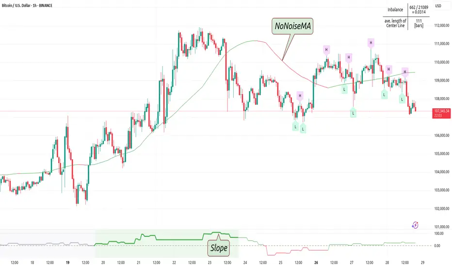
CandelaCharts - Turtle Soup Model📝 Overview
The ICT Turtle Soup Model indicator is a precision-engineered tool designed to identify high-probability reversal setups based on ICT’s renowned Turtle Soup strategy.
The Turtle Soup Model is a classic reversal setup that exploits false breakouts beyond previous swing highs or lows. It targets areas where retail traders are trapped into breakout trades, only for the price to reverse sharply in the opposite direction.
Price briefly breaks a previous high (for short setups) or low (for long setups), triggering stop orders and pulling in breakout traders. Once that liquidity is taken, smart money reverses price back inside the range, creating a high-probability fade setup.
📦 Features
Liquidity Levels: Projects forward-looking liquidity levels after a Turtle Soup model is formed, highlighting potential price targets. These projected zones act as magnet levels—areas where price is likely to reach based on the liquidity draw narrative. This allows traders to manage exits and partials with more precision.
Market Structure Shift (MSS): Confirms reversal strength by detecting a bullish or bearish MSS after a sweep. Acts as a secondary confirmation to filter out weak setups.
Custom TF Pairing: Choose your own combination of entry timeframe and context timeframe. For example, trade 5m setups inside a 1h HTF bias — perfect for aligning microstructure with macro intent.
HTF & LTF PD Arrays: Displays HTF PD Arrays (e.g., Fair Value Gaps, Inversion Fair Value Gaps) to serve as confluence zones.
History: Review and backtest past Turtle Soup setups directly on the chart. Toggle historical models on/off to study model behavior across different market conditions.
Killzone Filter: Limit signals to specific trading sessions or time blocks (e.g., New York AM, London, Asia, etc). Avoid signals in low-liquidity or choppy environments.
Standard Deviation: Calculates and projects four levels of standard deviation from the point of model confirmation. These zones help identify overextended moves, mean-reversion opportunities, and confluence with liquidity or PD arrays.
Dashboard: The dashboard displays the active model type, remaining time of the HTF candle, current bias, asset name, and date—providing real-time context and signal clarity at a glance.
⚙️ Settings
Core
Status: Filter models based on status
Bias: Controls what model type will be displayed, bullish or bearish
Fractal: Controls the timeframe pairing that will be used
High Probability Models: Detects and plots only the high-probability models
Sweeps
Sweep: Shows the sweep that forms a model
I-sweep: Controls the visibility of invalidated sweeps
D-purge: Plots the double purge sweeps
S-area: Highlights the sweep area
Liquidity
Liquidity: Displays the liquidity levels that belong to the model
MSS
MSS: Displays the Market Structure Shift for a model
History
History: Controls the number of past models displayed on the chart
Filters
Asia: Filter models based on Asia Killzone hours
London: Filter models based on London Killzone hours
NY AM: Filter models based on NY AM Killzone hours
NY Launch: Filter models based on NY Launch Killzone hours
NY PM: Filter models based on NY PM Killzone hours
Custom: Filter models based on user Custom hours
HTF
Candles: Controls the number of HTF candles that will be visible on the chart
Candles T: Displays the model’s third timeframe candle, which serves as a confirmation of directional bias
NY Open: Display True Day Open line
Offset: Controls the distance of HTF from the current chart
Space: Controls the space between HTF candles
Size: Controls the size of HTF candles
PD Array: Displays ICT PD Arrays
CE Line: Style the equilibrium line of PD Array
Border: Style the border of the PD Array
LTF
H/L Line: Displays on the LTF chart the High and Low of each HTF candle
O/C Line: Displays on the LTF chart the Open and Close of each HTF candle
PD Array: Displays ICT PD Arrays
CE Line: Style the equilibrium line of PD Array
Border: Style the border of the PD Array
Standard Deviation
StDev: Controls standard deviation of available levels
Labels: Controls the size of standard deviation levels
Lines: Controls the line widths and color of standard deviation levels
Dashboard
Panel: Display information about the current model
💡 Framework
The Turtle Soup Model is designed to detect and interpret false breakout patterns by analyzing key price action components, each playing a vital role in identifying liquidity traps and generating actionable reversal signals.
The model incorporates the following timeframe pairing:
15s - 5m - 15m
1m - 5m - 1H
2m - 15m - 2H
3m - 30m - 3H
5m - 60m - 4H
15m - 1H - 8H
30m - 3H - 12H
1H - 4H - 1D
4H - 1D - 1W
1D - 1W - 1M
1W - 1M - 6M
1M - 6M - 12M
Below are the key components that make up the model:
Sweep
D-purge
MSS
Liquidity
Standard Deviation
HTF & LTF PD Arrays
The Turtle Soup Model operates through a defined lifecycle that identifies its current state and determines the validity of a trade opportunity.
The model's lifecycle includes the following statuses:
Formation (grey)
Invalidation (red)
Pre-Invalidation (purple)
Success (green)
By incorporating the phases of Formation, Invalidation, and Success, traders can effectively manage risk, optimize position handling, and capitalize on the high-probability opportunities presented by the Turtle Soup Model.
⚡️ Showcase
Introducing the Turtle Soup Model — a powerful trading tool engineered to detect high-probability false breakout reversals. This indicator helps you pinpoint liquidity sweeps, confirm market structure shifts, and identify precise entry and exit points, enabling more confident, informed, and timely trading decisions.
LTF PD Array
LTF PD Arrays are essential for model formation—a valid Turtle Soup setup will only trigger if a qualifying LTF PD Array is present near the sweep zone.
HTF PD Array
HTF PD Arrays provide macro-level context and are used to validate the direction and strength of the potential reversal.
Timeframe Alignment
In the Turtle Soup trading model, timeframe alignment is an essential structural component. The model relies on multi-timeframe context to identify high-probability reversal setups based on failed breakouts.
High-Probability Model
A high-probability setup forms when key elements align: a Sweep, Market Structure Shift (MSS), LTF and HTF PD Arrays.
Killzone Filters
Filter Turtle Soup Models based on key market sessions: Asia, London, New York AM, New York Launch, and New York PM . This allows you to focus on high-liquidity periods where smart money activity is most likely to occur, improving both the quality and timing of your trade setups.
Unlock your trading edge with the Turtle Soup Model — your go-to tool for sharper insights, smarter decisions, and more confident execution in the markets.
🚨 Alerts
This script offers alert options for all model types. The alerts need to be set up manually from TradingView.
Bearish Model
A bearish model alert is triggered when a model forms, signaling a high sweep, MS,S and LTF PD Array.
Bullish Model
A bullish model alert is triggered when a model forms, signaling a low sweep, MSS and LTF PD Array.
⚠️ Disclaimer
These tools are exclusively available on the TradingView platform.
Our charting tools are intended solely for informational and educational purposes and should not be regarded as financial, investment, or trading advice. They are not designed to predict market movements or offer specific recommendations. Users should be aware that past performance is not indicative of future results and should not rely on these tools for financial decisions. By using these charting tools, the purchaser agrees that the seller and creator hold no responsibility for any decisions made based on information provided by the tools. The purchaser assumes full responsibility and liability for any actions taken and their consequences, including potential financial losses or investment outcomes that may result from the use of these products.
By purchasing, the customer acknowledges and accepts that neither the seller nor the creator is liable for any undesired outcomes stemming from the development, sale, or use of these products. Additionally, the purchaser agrees to indemnify the seller from any liability. If invited through the Friends and Family Program, the purchaser understands that any provided discount code applies only to the initial purchase of Candela's subscription. The purchaser is responsible for canceling or requesting cancellation of their subscription if they choose not to continue at the full retail price. In the event the purchaser no longer wishes to use the products, they must unsubscribe from the membership service, if applicable.
We do not offer reimbursements, refunds, or chargebacks. Once these Terms are accepted at the time of purchase, no reimbursements, refunds, or chargebacks will be issued under any circumstances.
By continuing to use these charting tools, the user confirms their understanding and acceptance of these Terms as outlined in this disclaimer.
Keltner Channels with Custom Signals
Keltner Channels with Custom Signals
This advanced indicator enhances the classic Keltner Channels by combining them with a suite of customizable trading signals and visual tools, designed to assist traders in identifying potential entry and exit points. Built for TradingView’s Pine Script v6, it overlays three key lines—upper band, basis line (moving average), and lower band—calculated using a user-defined source (default: close), length (default: 20), and multiplier (default: 2.0). Traders can choose between Exponential Moving Average (EMA) or Simple Moving Average (SMA) for the basis line and select from three volatility band styles: Average True Range (ATR), True Range, or Range, with an adjustable ATR length (default: 10).
The script generates distinct signals based on price action:
BUY Signals: Triggered when the close exceeds the upper band on a bullish candle (close > open), marked with a green "BUY" label.
SELL Signals: Triggered when the close falls below the lower band on a bearish candle (close < open), marked with a red "SELL" label.
Annessione (ANN) Signals: Specialized conditions for both BUY and SELL, activated when the current candle’s size exceeds the previous candle’s, with additional midpoint and directional checks. These are plotted with cyan labels and include dynamic stop-loss (SL) lines.
Equal Candle Signals: Highlighted with yellow crosses when the current and previous candles are of equal size, meeting specific conditions post-BUY/SELL signals.
Midline Markers: Green (BUY) and red (SELL) crosses appear on the basis line when initial signals occur.
Customization is a core feature: users can adjust label text, colors, and distances (in pips) for all signals, tailoring the display to their preferences. The stop-loss lines for ANN signals are particularly robust—drawn above highs (BUY) or below lows (SELL) with a configurable pip offset (default: 50), styled as solid, dotted, or dashed in red, and interrupted when price hits the SL or crosses the basis line. Alerts are included for all signal types, ensuring traders never miss a key moment.
Ideal for technical traders, this indicator blends Keltner Channel analysis with actionable, visually intuitive signals, offering flexibility and precision in one powerful package.

Sideways Scalper Peak and BottomUnderstanding the Indicator
This indicator is designed to identify potential peaks (tops) and bottoms (bottoms) within a market, which can be particularly useful in a sideways or range-bound market where price oscillates between support and resistance levels without a clear trend. Here's how it works:
RSI (Relative Strength Index): Measures the speed and change of price movements to identify overbought (above 70) and oversold (below 30) conditions. In a sideways market, RSI can help signal when the price might be due for a reversal within its range.
Moving Averages (MAs): The Fast MA and Slow MA provide a sense of the short-term and longer-term average price movements. In a sideways market, these can help confirm if the price is at the upper or lower extremes of its range.
Volume Spike: Looks for significant increases in trading volume, which might indicate a stronger move or a potential reversal point when combined with other conditions.
Divergence: RSI divergence occurs when the price makes a new high or low, but the RSI does not, suggesting momentum is weakening, which can be a precursor to a reversal.
How to Use in a Sideways Market
Identify the Range: First, visually identify the upper resistance and lower support levels of the sideways market on your chart. This indicator can help you spot these levels more precisely by signaling potential peaks and bottoms.
Peak Signal :
When to Look: When the price approaches the upper part of the range.
Conditions: The indicator will give a 'Peak' signal when:
RSI is over 70, indicating overbought conditions.
There's bearish divergence (price makes a higher high, but RSI doesn't).
Volume spikes, suggesting strong selling interest.
Price is above both Fast MA and Slow MA, indicating it's at a potentially high point in the range.
Action: This signal suggests that the price might be at or near the top of its range and could reverse downwards. A trader might consider selling or shorting here, expecting the price to move towards the lower part of the range.
Bottom Signal:
When to Look: When the price approaches the lower part of the range.
Conditions: The indicator will give a 'Bottom' signal when:
RSI is below 30, indicating oversold conditions.
There's bullish divergence (price makes a lower low, but RSI doesn't).
Volume spikes, suggesting strong buying interest.
Price is below both Fast MA and Slow MA, indicating it's at a potentially low point in the range.
Action: This signal suggests that the price might be at or near the bottom of its range and could reverse upwards. A trader might consider buying here, expecting the price to move towards the upper part of the range.
Confirmation: In a sideways market, false signals can occur due to the lack of a strong trend. Always look for confirmation:
Volume Confirmation: A significant volume spike can add confidence to the signal.
Price Action: Look for price action like candlestick patterns (e.g., doji, engulfing patterns) that confirm the reversal.
Time Frame: Consider using this indicator on multiple time frames. A signal on a shorter time frame (like 15m or 1h) might be confirmed by similar conditions on a longer time frame (4h or daily).
Risk Management: Since this is designed for scalping in a sideways market:
Set Tight Stop-Losses: Due to the quick nature of reversals in range-bound markets, place stop-losses close to your entry to minimize loss.
Take Profit Levels: Set profit targets near the opposite end of the range or use a trailing stop to capture as much of the move as possible before it reverses again.
Practice: Before trading with real money, practice with this indicator on historical data or in a paper trading environment to understand how it behaves in different sideways market scenarios.
Key Points for New Traders
Patience: Wait for all conditions to align before taking a trade. Sideways markets require patience as the price might hover around these levels for a while.
Not All Signals Are Equal: Sometimes, even with all conditions met, the market might not reverse immediately. Look for additional context or confirmation.
Continuous Learning: Understand that this indicator, like any tool, isn't foolproof. Learn from each trade, whether it's a win or a loss, and adjust your strategy accordingly.
By following these guidelines
Enigma Liquidity Concept
Enigma Liquidity Concept
Empowering Traders with Multi-Timeframe Analysis and Dynamic Fibonacci Insights
Overview
The Enigma Liquidity Concept is an advanced indicator designed to bridge multi-timeframe price action with Fibonacci retracements. It provides traders with high-probability buy and sell signals by combining higher time frame market direction and lower time frame precision entries. Whether you're a scalper, day trader, or swing trader, this tool offers actionable insights to refine your entries and exits.
What Makes It Unique?
Multi-Timeframe Signal Synchronization:
Higher time frame bullish or bearish engulfing patterns are used to define the directional bias.
Lower time frame retracements are analyzed for potential entry opportunities.
Dynamic Fibonacci Layouts:
Automatically plots Fibonacci retracement levels for the most recent higher time frame signal.
Ensures a clean chart by avoiding clutter from historical signals.
Actionable Buy and Sell Signals:
Sell Signal: When the higher time frame is bearish and the price on the lower time frame retraces above the 50% Fibonacci level before forming a bearish candle.
Buy Signal: When the higher time frame is bullish and the price on the lower time frame retraces below the 50% Fibonacci level before forming a bullish candle.
Customizable Fibonacci Visuals:
Full control over Fibonacci levels, line styles, and background shading to tailor the chart to your preferences.
Integrated Alerts:
Real-time alerts for buy and sell signals on the lower time frame.
Alerts for bullish and bearish signals on the higher time frame.
How It Works
Higher Time Frame Analysis:
The indicator identifies bullish and bearish engulfing patterns to detect key reversals or continuation points.
Fibonacci retracement levels are calculated and plotted dynamically for the most recent signal:
Bullish Signal: 100% starts at the low, 0% at the high.
Bearish Signal: 100% starts at the high, 0% at the low.
Lower Time Frame Execution:
Monitors retracements relative to the higher time frame Fibonacci levels.
Provides visual and alert-based buy/sell signals when conditions align for a high-probability entry.
How to Use It
Setup:
Select your higher and lower time frames in the settings.
Customize Fibonacci levels, line styles, and background visuals for clarity.
Trade Execution:
Use the higher time frame signals to determine directional bias.
Watch for actionable buy/sell signals on the lower time frame:
Enter short trades on red triangle sell signals.
Enter long trades on green triangle buy signals.
Alerts:
Enable alerts for real-time notifications of buy/sell signals on lower time frames and higher time frame directional changes.
Concepts Underlying the Calculations
Engulfing Patterns: Represent key reversals or continuations in price action, making them reliable for defining directional bias on higher time frames.
Fibonacci Retracements: Fibonacci levels are used to identify critical zones for potential price reactions during retracements.
Multi-Timeframe Analysis: Combines the strength of higher time frame trends with the precision of lower time frame signals to enhance trades.
Important Notes
This indicator is best used in conjunction with your existing trading strategy and risk management plan.
It does not repaint signals and ensures clarity by displaying Fibonacci levels only for the most recent signal.
Ideal For:
Swing traders, day traders, and scalpers looking to optimize entries and exits with Fibonacci retracements.
Traders who prefer clean charts with actionable insights and customizable visuals.
