Triple Average True Range Channel Definition: By ADAM HAYES from Investopedia -- Updated Jul 8, 2019
The average true range (ATR) is a technical analysis indicator that measures market volatility by decomposing the entire range of an asset price for that period. Specifically, ATR is a measure of volatility introduced by market technician J. Welles Wilder Jr. in his book, "New Concepts in Technical Trading Systems."
The true range indicator is taken as the greatest of the following: current high less the current low; the absolute value of the current high less the previous close; and the absolute value of the current low less the previous close. The average true range is then a moving average, generally using 14 days, of the true ranges.
I've added a channel perspective from a certain % from the Slow Average Length that user will have to configure depending of resolution and the markets instruments they chose...
Also a fill is used to easily point out when a high distance between a fast and a slow volatility analysis is occurring.
Which is also denotated with a shaped label...
Share and comment my work :)
Recherche dans les scripts pour "range"
Session RangesThis is session range indicator with CLEAN code and CLEAR data presentation. There are other range indicators available but when I looked I found them unreliable or making too much screen clutter. WIth mine you can have 3 ranges on screen, measure to bodies or wickes, customise the period, (set your timezone), colours, labels and all that good stuff...
I'm very happy to share it with everyone (and publishing is a great way to archive my code) but ultimately this indicator is by me, for me. Whilst i added a few bells and whistles for everyone this indicator is precisely designed to:
Show me EASILY see what happened in the Asia session and whether we are breaking out with MINIMAL screen clutter. I only use the 3, 15 and 60 - it won't work on the 1, 5, 120 etc because I dont need it to. How I use it is below.
LOSS2PROFIT_Market_RangeFor Breakout Trading..(range trader)
Investor , monthly trader ,weekly trader and daily trader(everyone can use it)..
It show market own range which is created by market/price (not by calculation)..
This are the important decision point which is made by traders(all style)..
Depend upon time frame , most important thing is market opening and market closing..
Entry through market high and market low (important support n resistance)..
Use it wisely according to your strategy.. (logic always works and trust your strategy)
Keep on back testing...
(until you get , what you want)

Eagle Eye Indicator [B]Indicator version with three different modes, Range/Range Additive/Range Normalized.
Colorscheme is the same as the original overlay Project Eagle Eye

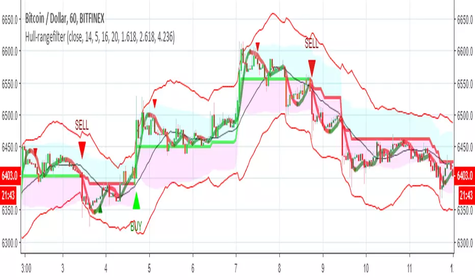
Hull-rangefilterMix of XAvi range filter and Hull fib , seems to be nice hybrid
alerts inside for both systems
for each coin isuugets to optimise the Hull length or the range (now set to 5) and then to test it
Donchian Channel with Range AdditionA Donchian Channel with additional zones at places where its range is smaller than a set amount of atr. Thus it kind of combines with Keltner Channel qualities. Purpose is to set a stop loss wide enough to avoid shaking out of a position. The example chart shows a Philips day chart, where I opened position on 16 juli at 37,50 and set the stop loss at low border level 35,60, on 23 juli was an earnings rapport, the wick of the candle shows that quotes went very low, obviously smart traders had to fill a huge order and hunted for stops, triggering my stop closing the position. next days quotes went a lot better, so I missed the fun. The Donchian Channel was too narrow because quotes had ranged in the previous weeks. If I had placed my stop on the additional low, setting it 5 atr below the high border, my stop would have been safe.

Renko Price Bars Overlay// Shows the price renko bars (or range bars) instead of the PERIOD renko
// bars that are integrated into Trading View. The normal renko bars that
// Trading View offers only consider the drawing of a new brick when the
// price closes above or below the required brick size. This can produce
// misleading charts since depending on the time interval of a chart, new
// bricks may or may not be drawn. True price renko bars will draw a new
// brick immediately upon the price exceeding the next target brick size.
// When running this script in "Traditional" mode, the painting of the
// brick overlay band is INDEPENDENT of the chart interval. If price
// exceeds the required target price for the next brick, the band is
// updated immediately, instead of waiting for the price bar on the chart
// interval to close first. The brick starting anchor point will attempt
// to be a "nice number" at a round interval for the chart ticker. For
// example, if viewing EURUSD with the box size equal to 50 ticks/pips,
// the open and close prices will take the form of 1.2100, 1.2150, 1.2200,
// 1.2250, and so on. This is the same behavior as the normal traditional
// Renko bars in Trading View and other major trading platforms such as
// Meta Trader.
// Use the tick size in traditional mode to specify the block size, in
// ticks. This may give interesting results in FOREX pairs... as the tick
// size in Trading View may be 0.00001 instead of the normal pip size of
// 0.0001, so a 10 pip block size may be '100', and not the expected '10'.
// FOREX futures should work in the manner expected, a 10 pip block size
// will indeed equal 0.0010.
// The "ATR" mode functions differently than the Trading View built in
// version. The block size is updated each time the range is exceeded.
// In Trading View, when using the ATR mode, the ATR is the last ATR
// value calculated on the ENTIRE data interval, and is applied to all
// past data. You can see this when you press the '+' sign of the ticker
// in the top left of the chart window and you will see the brick size
// as a constant, the brick size is not a function of the ever changing
// ATR value of the price action. The block size of this script is not
// updated for each price candle (i.e. each 1HR on a 1HR chart), instead
// it is updated only when the price thresholds are exceeded requiring a
// the band to be updated. At that point the current ATR is considered
// and the brick size is updated.
// Options exist to show the current high and low of the brick, and to
// show the required levels that the price must exceed to draw a new
// brick and update the band.
Please leave comments if you notice any bugs or would like any new features added. I don't find much use for plotting the H/L of the current renko candle, but I have seen some request it in the past.
Cheers.
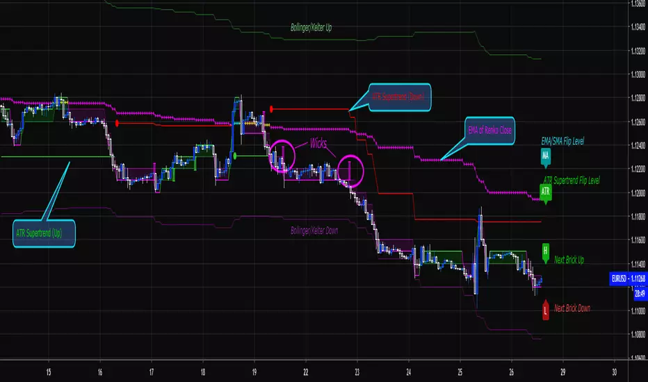
Wideboy - Wide Ranging DaysHighlights wide ranging days with a circle underneath them.
A wide ranging day is defined as where it's true range is greater than twice (configurable by changing input K) the average true range of the preceding 15 days. (Configured by changing the ATR lookback input)
Enjoy!
Forex session - Opening Range- Jayy fixed updatedOpening Range (OR) for Forex 24 hour regular session. This is not for regular market day sessions addressed in a separate script.
This script fixes four issues:
syntax error when code compiles
messed up opening range the day after a holiday Monday
flaky plotting of the opening range and targets that required page reloading
TradingView problems with starting forex session at 1700 hours EST/EDT when using certain securities eg FX_IDC currently (Jan 2017)
Additions in his code are more options for trading range
Time compensation option for some securities that incorrectly start sessions at 1200 hrs instead of 1700 hrs NY time
- this glitch is likely temporary but present when this script update was created
More opening range time period choices
Opening Range Targets:
Opening Range Targets as per Leaf_West
Targets are set at 127% , 162%, 200 %, 262 %, 362%, 423%, 685%, 1109% and 1794% and this can be traded intraday using methods described here charts-by-leaf.com I also have some Leaf West PDFs that describe how the targets are set and how they are traded. There are others that use opening range.
The Time Session Glitch and the Fix:
The script will correctly default to 1700 hrs to 1700hrs EDT/EST session for FXCM.
Strangely some securities appear to erroneously start their session at 1200 hrs ie. My guess is that they are somehow tied to GMT+0 instead of New York time (GMT+5). See this for yourself by selecting EURUSD using the FXCM exchange (FX:EURUSD) and then EURUSD from the IDC exchange (FX_IDC:EURUSD). The FX-IDC session opening range starts 5 hours
before it actually should at 1700 hrs EDT/EST. To correct for this I have implemented an automatic fix (default) and a user selected "5 hour time shift adjust. ment needed on some securities".
There is also a 4 hour time shift button which might be necessary when New York reverts from Eastern Standard Time
to Eastern Daylight Time (1 hour difference) in March (and then back again in November). In the default auto adjust mode you will need to select the 1 hour time shift. That is if this glitch still exists at that time.
I have looked at other scripts, other than my own and where the script is available, that need to use information about the opening bar and all have the same time shift issue
What are the choices for Opening Range?
The dialogue box offers the standard TradingView options.
Also where you see Pick Opening Range 1 to 12 hours , SET TO 0 To USE LINE ABOVE TO DETERMINE OR LENGTH
As the note says a number other than 0 will override the standard options from the line above
The dialogue box below in offers choices by hours 1 to 12. A number greater than 12 will still only give
720 minutes (12 hours) for the length of Opening Range.
What sessions within the FOREX time-frame are available?
The default is 1700 hours to 1700 hours EST/EDT
Check any one (only one) of the time periods to change the opening range period to suit.
New York opens at 8:00 am to 5:00 pm EST (EDT)
Tokyo opens at 7:00 pm to 4:00 am EST (EDT)
Sydney opens at 5:00 pm to 2:00 am EST (EDT)
London opens at 3:00 am to 12:00 noon EST (EDT)
There is a build your own session (click the button to select)
The two lines for inputting session times are almost identical except that the second line starts the be the same as each other.
The default for the build your own session is 2200 hours to 2200 hours. As of the time of publishing this plots EURUSD FX-IDC just right. The GMT+5 and GMT+4 do not apply to this selection.
See my comments above on this strange aberration.
The script originated from work done by Chris Moody. It has changed significantly but there are remnants of that script lurking within.
Script is free to all - that way you can see what is inside
Cheers Jayy

Market Meanness Index-Price ChangesThis is the Market Mean index. It is used to identify if the market is really trending or if it is range bound(random). In theory, a random sample will be mean reverting 75% of the time. This indicator checks to see what how much the market is mean reverting and converts it to a percentage. If the index is around 75 or higher than the price curve of the market is range bound and there is no trend from a statistical standpoint. If the index is below 75 this means the price curve of the market is in fact trending in a direction as the market is not reverting as much as it should if it were truly following a random/range bound price curve.

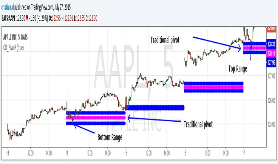
Pivot Range Pivot BossMy first attempt to code something. It's Mark Fischer concept of Pivot Range from his book Logical Trader.
The strategy for using it is actually from Frank Ochoa's book Secrets of a Pivot Boss. Pivot Range is the "meat of the matket" and "the heart beat of the market" according to him.
Besides using the actual pivots the strategy is based on the relationships between 2 day pivot ranges.
Higher Value - Bulish
Overlapping Higher - Moderate Bulish
Lower Value- Bearish
Overlapping Lower - Moderate Bearish
Unchanged - Sideways/Breakout
Outside - Sideways
Inside - Breakout
New Indicator!!! Opening Range_V1Plots the Opening Range for the First Hour for Stocks and Forex. Option to Plot the first 30 Minutes Opening Range, or Both. See first Post for Specifics.

Chainbey Ai - Swing High/Low Range📈 Chainbey Ai – Swing High / Swing Low Range
Chainbey Ai – Swing High / Swing Low Range is a clean and powerful market-structure indicator designed to automatically identify key swing levels and visualize the active price range on any chart.
This tool helps traders clearly see where price is reacting, consolidating, or preparing for a breakout.
🔹 What This Indicator Does
✔ Automatically detects the latest confirmed Swing High
✔ Automatically detects the latest confirmed Swing Low
✔ Draws horizontal levels for both swings
✔ Labels levels clearly as “Swing High” and “Swing Low”
✔ Highlights the range between swings using a background fill
✔ Updates dynamically as new market structure forms
🔹 Why It’s Useful
Identify support & resistance without manual drawing
Visualize consolidation zones instantly
Spot breakout and fake-out areas faster
Ideal for range trading, breakout trading, and trend confirmation
Works perfectly with price action, volume, and order-flow concepts
🔹 Best Use Cases
Crypto (Spot & Futures)
Forex
Indices
Commodities (Gold, Silver, Oil)
Timeframes: Works on all timeframes (especially strong on 15M, 30M, 1H)
🔹 How to Trade With It
Buy bias when price holds above Swing Low inside the range
Sell bias when price rejects from Swing High
Breakout confirmation when price closes strongly outside the range
Combine with volume, momentum, or liquidity concepts for higher accuracy
🔹 Customization
Adjust Swing Length to control sensitivity
Enable/disable range background fill
Customize colors and transparency
Extend swing levels to the right for forward guidance
⚠️ Disclaimer
This indicator is a technical analysis tool, not financial advice.
Always manage risk and confirm signals with your own strategy.
🔗 Built by Chainbey Ai
Smart Structure • Clean Levels • Clear Ranges 🚀

Opening Range BoxOPENING RANGE BOX + LEVELS (RTH)
OVERVIEW
This indicator draws the Opening Range for the U.S. Regular Trading Hours session starting at 9:30 AM New York time. It plots the Opening Range High, Low, and Midpoint, and can extend those levels for the rest of the session. It also displays the Opening Range size in points and ticks.
WHAT IT DRAWS
• Opening Range box for the first N minutes of RTH (ex: 5, 10, 15)
• OR High (ORH)
• OR Low (ORL)
• OR Midline (midpoint of ORH/ORL)
• Opening Range value label (range in points + ticks)
KEY FEATURES
• Time-anchored drawings (bar_time) so levels stay accurate on any intraday timeframe
• Configurable Opening Range length in minutes
• Configurable box fill/border colors
• Independent styling for OR High / OR Low / Midline (color, width, line style)
• Line extension modes:
Line extension modes
- To RTH Close
- Right Forever
- For N Minutes
- None
Optional label placement to the LEFT of the Opening Range so it doesn’t block new candles
Option to keep previous sessions’ Opening Ranges visible for context
BEST FOR
• Futures: ES / NQ / MNQ (and other RTH-based products)
• Intraday stocks and ETFs
• OR breakout, rejection/fade, and mean reversion workflows
NOTES
• Intended for intraday charts
• Opening Range is calculated strictly inside the selected time window (no extra bars)
• Session is America/New_York, 09:30–16:00

ATR Bands (MA Distance)ATR Bands (MA Distance) plots volatility-based bands at a multiple of ATR away from a selected moving average.
Unlike percentage envelopes or standard deviation bands, this indicator measures distance from the moving average using ATR, representing the market’s normal “breathing range” rather than statistical probability.
Key Features
The center line is a selectable moving average (EMA, SMA, RMA/Wilder, or WMA).
Upper and lower bands are calculated as:
Moving Average ± ATR × Multiplier
Band width automatically adapts to changing market volatility.
Designed for consistent use across different markets and timeframes without parameter re-optimization.
Non-repainting: all values are calculated only from confirmed historical bars.
Intended Use
ATR Bands (MA Distance) is best used as a context and preparation tool , not as a direct entry or exit signal.
Typical use cases include:
Identifying areas where price is extended relative to its recent volatility.
Visualizing normal vs. stretched price distance from the moving average.
Supporting range-based analysis or trade preparation when combined with other indicators (e.g., oscillators).
Important Notes / How NOT to Use
This indicator does NOT generate buy or sell signals by itself .
Touching or crossing a band does not imply an automatic reversal.
In strong trending markets, price may stay outside the bands for extended periods.
ATR Bands should not be interpreted as overbought/oversold levels on their own.
This indicator does NOT repaint. Once a bar is closed, its values will not change.
For best results:
Use ATR Bands as a preparation zone, then wait for confirmation from your own entry logic.
Disable or ignore band-based mean-reversion ideas during strong trend conditions.
Concept Summary (Short)
ATR Bands (MA Distance) visualize how far price has moved from its moving average in terms of volatility, without repainting and without relying on percentage deviation or statistical assumptions.
Optional Short Description (Preview)
Volatility-based, non-repainting ATR bands plotted at a distance from a moving average.
Designed for market context and trade preparation — not standalone signals.

Opening Range Breakout + VWAP + Volume [ORB Strategy]A complete Opening Range Breakout (ORB) strategy with optional VWAP and volume confirmation filters for day trading futures, stocks, and indices.
█ FEATURES
- Configurable Opening Range duration (5-60 minutes)
- VWAP filter — only take longs above VWAP, shorts below
- Volume confirmation — require relative volume (RVOL) spike on breakout
- Adjustable trading time window with timezone support
- Visual OR high/low levels with glow effect
- Real-time dashboard showing filter status and session state
- 6 built-in alerts for signals and filter rejections
- 5 color themes (Supernova, Nebula Core, Aurora Borealis, Ice Giant, Solar Flare)
█ HOW IT WORKS
1. Marks the high/low of the Opening Range after market open
2. Generates BUY signal when price breaks above OR high (with optional filters)
3. Generates SELL signal when price breaks below OR low (with optional filters)
4. Failed breakouts (rejected by filters) shown as small markers
█ FILTER COMBINATIONS
Toggle filters independently:
- ORB only — classic breakout signals
- ORB + VWAP — directional bias confirmation
- ORB + Volume — momentum confirmation
- ORB + VWAP + Volume — maximum filter (recommended)
█ RECOMMENDED USE
- Best on 5-15 minute charts
- Optimized for NQ, MNQ, ES, MES futures
- Works on stocks and indices
- Ideal for 9:30-11:00 AM ET session trading
█ INPUTS
Opening Range: duration, line visibility, extension
Session: start time, trade window, timezone
Filters: VWAP toggle, volume toggle, RVOL threshold
Display: signal size, dashboard position/size, theme
DM for access

Elite Monday Range V3- ProfessionalElite Monday Range V3 - Advanced Institutional Bias & Analysis
Overview
The Elite Monday Range V3 is a high-performance decision-support tool designed for traders who utilize the "Weekly Open" and "Monday's Range" as their primary benchmark for the trading week. Unlike standard range indicators, this script employs an advanced Multi-Asset Analysis Engine to determine the weekly bias with institutional-grade precision.
It doesn't just draw lines; it analyzes Previous Week's Close (PWC), Monday's Candle Structures (Price Action), and Internal Liquidity to provide a definitive "Directional Bias" and "Confidence Score."
Key Features
Smart Multi-Asset Detection: Automatically detects if you are trading Forex, Crypto, or Indices and adjusts its internal logic and strategy suggestions accordingly.
Institutional Bias Engine: Calculates a Confidence Score (from -4 to +4) based on 4 critical criteria:
Price vs. Previous Week Close: Checks if the bulls or bears are maintaining momentum from the prior week.
Monday Candle Analysis: Automatically identifies Pin Bars (Liquidity Grabs) or Strong Engulfing movements.
Price vs. Monday Midpoint (Equilibrium): The ultimate pivot point for weekly trend direction.
Price vs. Weekly Open: Tracks the "true" opening sentiment.
Liquidity Hunt Signals (Judas Swing): Visual alerts for LIQ BUY and LIQ SELL when price sweeps Monday's extremes and returns inside the range—a classic sign of institutional manipulation before a trend.
Symmetric Expansion Levels: Projects +50%, +100%, -50%, and -100% extensions of the Monday range to identify high-probability Take Profit (TP) and reversal zones.
Dynamic Professional Dashboard: A sleek, real-time table on your chart that summarizes Asset Type, Weekly Bias, Candle Info, and the Confidence Score.
Force Overlay Technology: Ensures all lines and labels remain visible and crisp on the top layer, above candles and other indicators.
How to Trade with the Elite Dashboard
Check the "Net Weekly Bias": Look for STRONG BULL or STRONG BEAR.
Verify Confidence Score: A score of 3 or 4 (or -3/-4 for shorts) indicates high-probability conditions.
Identify Entry: If the Bias is "STRONG BULL," wait for a retest of the Monday Mid (MID) or Monday High (MON H).
Confirm with Liquidity: Look for a LIQ BUY signal near the Monday Low for the highest-quality "A+ Setup."
Target: Use the Expansion Levels (+50% / +100%) as your primary targets for the week.
Technical Settings
Lookback Weeks: Choose exactly how many historical weeks to display to keep your chart clean.
Customizable Colors: Fully adjustable colors for Monday ranges and expansion projections.
Line Width: User-defined thickness for professional visual clarity.

EMA RANGEEMA RANGE
EMA RANGE is a simple, price-focused indicator that plots an Exponential Moving Average (EMA) with a dynamic ATR-based range above and below it. The ATR bands adapt to market volatility, helping traders visualize normal price movement and identify potential expansion or compression zones.
🔹 Features
Customizable EMA length
ATR range bands plotted above and below the EMA
Adjustable ATR length and multiplier
Toggle to enable or disable ATR ranges
Fully customizable colors and line thickness from the Style tab
🔹 How It Works
The EMA serves as the central trend reference.
The Average True Range (ATR) measures volatility.
Upper and lower bands are calculated as:
EMA ± (ATR × Multiplier)
When price remains inside the range, conditions are considered normal. Moves outside the range may signal increased volatility, momentum expansion, or potential breakout conditions.
🔹 Best Use Cases
Trend continuation and pullback analysis
Volatility-based risk framing
Dynamic support and resistance visualization
Works on any market and timeframe
EMA RANGE is designed to stay clean, responsive, and easy to interpret—making it suitable for both discretionary and systematic traders.

Market Session Terrain Monitor v1.0Summary
Market Session Terrain Monitor helps traders understand where the market is within its normal intraday behavior, not where it should go. It is a decision-support tool designed to reduce late entries, over-trading, and narrative bias by grounding intraday analysis in historical session statistics.
Purpose
Market Session Terrain Monitor provides statistical context for intraday market movement by analyzing how much each major trading session typically moves, how much it has moved so far, and what market state the current session inherits from previous sessions.
The indicator is designed to answer one core question:
Is the current session early, normal, or already expanded relative to its historical behavior?
This indicator does not predict direction and does not generate buy or sell signals. It is intended as a context and state-awareness tool to support independent, structure-based decision making.
Sessions Analyzed
The trading day is divided into three independent sessions, defined in UTC time:
• Asia
• London
• New York
Each session is analyzed separately using its own historical data. No session is assumed to control or predict the behavior of another.
Session Range
For each session, the indicator measures the session range, defined as the session high minus the session low. This captures how much the market actually moved during that session, regardless of direction.
P90 Expansion Benchmark
For each session, the indicator calculates a P90 expansion benchmark.
• P90 represents the range that only about ten percent of historical sessions exceed
• It reflects a large but repeatable expansion, not an extreme outlier
• It is used as a normalization reference so sessions with different volatility characteristics can be compared on equal terms
The P90 values are displayed in the table header in price units, such as USD, as a reference for scale.
Percent of P90
Current and previous session ranges are expressed as a percentage of that session’s own P90.
This shows:
• How much of a statistically large session has already been used
• Whether the session is still early, behaving normally, or approaching expansion
Rolling Comparative Table
The table displays three rows, ordered by time and anchored to the current active session:
• Current · Session
• Previous · Session
• Previous-2 · Session
Each row shows:
• Session name
• Session range in price units
• Session range as a percentage of that session’s P90
This rolling layout provides context about the market state inherited by the current session without implying causality.
How to Use the Indicator
The indicator helps with:
• Identifying whether a session is early or late in its statistical range
• Avoiding entries when a session is already stretched
• Recognizing compression versus expansion regimes
• Understanding the market state the current session inherits
The indicator does not:
• Predict direction
• Forecast highs or lows
• Assume that one session determines the next
Directional decisions should come from price structure, execution rules, and risk management.
Design Philosophy
• Range first, direction second
• State awareness over narrative
• Statistical normalization instead of absolute numbers
• Comparative, not predictive
The indicator intentionally avoids estimating remaining range or subtracting previous session movement, as those approaches introduce bias and false causality.
Suitable Markets
• Gold and silver
• Forex pairs
• Indices
• Other liquid instruments with clear session behavior

Volatility High/Low Projection (PHOD / PLOD)AP Capital – Volatility + High/Low Projection
This indicator is designed to identify high-probability intraday turning points by combining daily range statistics, session behaviour, and volatility context into a single clean framework.
It is built for index, forex, and metals traders who want structure, not noise.
🔹 Core Features
1️⃣ Potential High of Day (PHOD) & Potential Low of Day (PLOD)
The indicator highlights likely intraday extremes based on:
Session timing (Asia, London, New York)
Current day volatility vs historical averages
Prior day expansion or compression behaviour
Each level is displayed with:
A clear label (PHOD / PLOD)
A forward-extending box acting as a live Point of Interest (POI)
Automatic invalidation when price breaks the zone
2️⃣ Volatility & Range Context (Info Panel)
A compact information panel in the top-right corner provides real-time context without cluttering the chart:
20-Day Average Range
% of the average range already used today
Range status (NORMAL / EXHAUSTED)
Average session ranges for:
Asia
London
New York
This allows traders to immediately assess whether price is:
Early in the day with room to trend
Statistically stretched and prone to reversal
Over-extended where breakout chasing is risky
3️⃣ Session-Aware Logic
The model respects how markets behave across the trading day:
Asia favours accumulation and potential lows
London provides expansion
New York often delivers distribution or exhaustion
This prevents random high/low marking and focuses only on structurally meaningful levels.
🧠 How to Use
Use PHOD / PLOD boxes as reaction zones, not blind entries
Combine with your own confirmation (structure break, momentum, volume, EMA reclaim, etc.)
Avoid chasing trades when the Range Status = EXHAUSTED
Particularly effective on 15m – 1h timeframes
⚠️ Important Notes
This indicator does not repaint
It is contextual, not a buy/sell signal generator
Best used as part of a complete trading plan
📈 Suitable Markets
XAUUSD (Gold)
Indices (NASDAQ, S&P 500, DAX)
Major FX pairs
📌 Disclaimer
This indicator is for educational and analytical purposes only.
It does not constitute financial advice. Trading involves risk.

Opening Range Breakout with VWAP & RSI ConfirmationThis indicator identifies breakout trading opportunities based on the Opening Range Breakout (ORB) strategy combined with intraday VWAP and higher timeframe RSI confirmation.
Opening Range: Calculates the high, low, and midpoint of the first 15 or 30 minutes (configurable) after your specified market open time.
Intraday VWAP: A volume-weighted average price calculated manually and reset daily, tracking price action throughout the trading day.
RSI Confirmation: Uses RSI from a user-selected higher timeframe (1H, 4H, or Daily) to confirm signals.
Buy Signal: Triggered when VWAP breaks above the Opening Range High AND the RSI is below or equal to the buy threshold (default 30).
Sell Signal: Triggered when VWAP breaks below the Opening Range Low AND the RSI is above or equal to the sell threshold (default 70).
Visuals: Plots Opening Range levels and VWAP on the chart with clear buy/sell markers and optional labels showing RSI values.
Alerts: Provides alert conditions for buy and sell signals to facilitate timely trading decisions.
This tool helps traders capture momentum breakouts while filtering trades based on momentum strength indicated by RSI.

Session Ranges Pro+Session Range Zones – Professional Edition
OVERVIEW
Professional visualization of the classic opening-range / Initial Balance concept across Asian, London, and Regular (US) sessions.
Displays the high/low of the user-defined opening window as thick, hierarchical filled zones with optional Fibonacci and standard-deviation extensions plus full alerting.
CONCEPT BACKGROUND
Using the high and low of the first 30–60 minutes of a session as key support/resistance is public-domain knowledge that has been standard in institutional trading for decades (Initial Balance, Opening Range, Session Range, etc.).
On TradingView the same principle was popularized under the name “Defining / DealingRange / DR/IDR” by TheMas7er and others.
IMPLEMENTATION & VALUE ADDED
This indicator follows the established, public-domain range-calculation methodology but has been completely rewritten with the following original enhancements:
• Clean, filled High / Mid / Low zones for instant visual hierarchy
• Intuitive Asian / London / Regular session labelling and fully custom timing
• Comprehensive dynamic & static Fibonacci and 50%/100% standard-deviation extensions
• Alert conditions on every zone, midline, opening level, and extension line
• Modern, modular code architecture using arrays and custom drawing functions
• No repainting, lightweight performance on any intraday timeframe
HOW TO USE
Apply to 1–15 min charts. Select desired sessions and formation period (30 or 60 min typical).
Shaded zones serve as primary support/resistance; extensions provide measured-move targets.
CREDIT & TRANSPARENCY
Core methodology: public domain (Initial Balance / Opening Range / Session Range).
Early TradingView popularization of the DR/IDR naming and feature set: TheMas7er **(with thanks to community contributors like bmsitiaan and trading-guide for refinements)**.
**Utilizes PineCoders' VisibleChart library for optimized chart rendering.**
This script uses the same foundational principle and logical input options but is an independent implementation. All visual presentation, zone system, multi-session handling, extension systems, alerting framework, and underlying code structure are original.
DISCLAIMER
For educational and informational purposes only. Not financial advice. Past performance is no guarantee of future results. Test thoroughly on your instruments and timeframes.

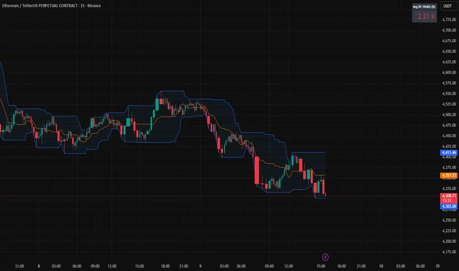
Donchian Channels + Avg Width % DashboardMeasures the average percentage width between the Donchian Channel’s upper and lower bands over a chosen period.
It quantifies how much the market has been moving relative to price — a direct gauge of realized volatility.
When the average width is small, price is range-bound and unlikely to reach fixed TP targets; when it expands, volatility is sufficient for trend or breakout trades.
Based on how fast your strategy is, set your TP% below the average percentage of the Band Width.