SVDThis indicator aims to compare between two charts if trader isn't sure which one is more active and powerful, it does NOT show entries or help your chart analysis directly.
The main features of this indicator is to show vitality and range of any given chart.
Volatility: it calculates the average profit of every swing in the range and the final result will be the chart volatility, which indicate how profitable this chart is.
Range: it calculates the profit of the whole range compared to the total price. (E.g. range bottom is 0.1 and range top is 0.2 the range will be 100%)
Extra: indicator shows the total direction of the chart in term of (STRONG UPTREND, UPTREND, SIDEWAYS, DOWNTREND, STRONG DOWNTREND), if you got (Somthing_wrong) please contact me.
How to use: apply the indicator on different charts that you have chosen and the higher (volatility & range) the more profitable the chart is.
inputs:
Lookback length: how long the range is (how many candles are included).
How intense should the Swing be: how many candles should be counted as a confirmation complete swing.
Show counted Swings: if checked as true, will show the swings counted in the volatility calculation.
For any notes on the indicator to be edited, or for another indicator ideas please comment.
Recherche dans les scripts pour "range"

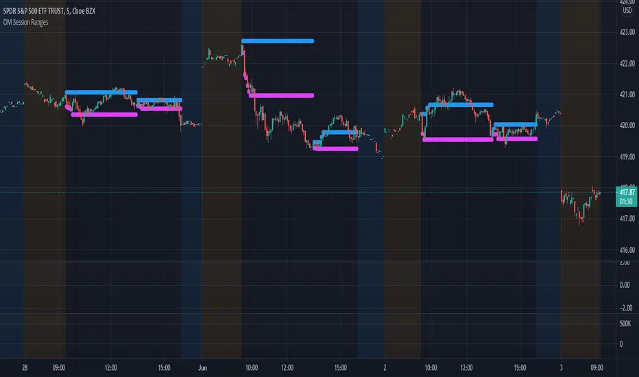
OM Session RangesThis indicator was created to assist in generating the morning and afternoon ranges as defined by Options Millionaire's strategy.
Morning range is determined by identifying the high and low from open to 10:05.
Afternoon range is determined by identifying the high and low from 13:30 to 14:05.
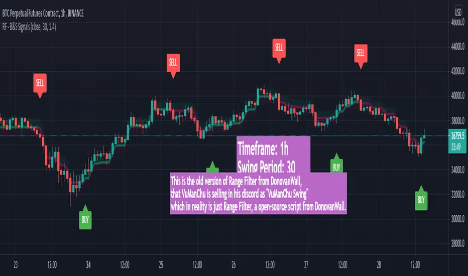
VuManChu Swing FreeThis is the old version of Range Filter from DonovanWall, that VuManChu is selling in his discord as "VuManChu Swing" which in reality is just Range Filter, a open-source script from DonovanWall.
Safe Scalpy Stop Loss. Percentage from price visualizer.This is my first script I have published so bear with me.
I have thrown this together so you can easily see on the chart where -0.5%, -1% and -2% would be from the last candle close. I also replicated these to show positive values in case you are shorting.
I have also added a custom value setting so you can set the line at whatever percentage value you like and included an adjustable recent higher high and higher low finder to help create a recent range as it seems to work well in tandem for scalping range based price movement.
You can turn all these things on and off in the settings on the style checkboxes.
I felt the need to make this because I like to scalp trade with leverage like a total degen from time to time. Often the setups happen very quickly. It is difficult to calculate where to set a stop loss in a hurry so I keep a fixed account size/lev and just vary the position percentage size based on the percentage of the stop loss from the current price.
Sometimes when switching from a lower volatility chart to high volatility one it is easy to get caught out by quickly entering a scalp trade only to find you made your position way too big or you shouldn't have entered at all. You thought it was only moving 0.2% per candle instead of 3%. Whoops. Rekt.
This indicator is all about trying to help me avoid that with a visual clue to back up the bad maths I do quickly in my head.
I often hide it and only show it when I'm ready to enter a position to double check my SL and entry are set in a sensible area.
I thought I would publish it in case someone else finds such a simple tool handy.
Apologies if there is already something out there that does this job. I couldn't find it.
See you all on the moon.

Trend Type Indicator by BobRivera990Usage:
The purpose of this indicator is to programmatically determine the type of price trend using technical analysis tools.
You can do a quick check on the asset’s higher and lower time frames. For example, if you are trading on an H1 chart, you can check the m5 chart to ensure that the trend is in the same direction and similarly check the H4 chart to ensure that the higher time frame price is also moving in the same direction.
If multiple time frame charts confirm a similar trend, then it is considered a very strong trend and ideal for Trend trading.
Remarks:
By default, the last status is related to 8 periods before the latest closing price.
Related definitions:
The three basic types of trends are up, down, and sideways.
1. Uptrend
An uptrend describes the price movement of a financial asset when the overall direction is upward. The uptrend is composed of higher swing lows and higher swing highs.
Some market participants ("long" trend traders) only choose to trade during uptrends.
2. Downtrend
A downtrend refers to the price action of a security that moves lower in price as it fluctuates over time.
The downtrend is composed of lower swing lows and lower swing highs.
3. Sideways
A sideways trend is the horizontal price movement that occurs when the forces of supply and demand are nearly equal. This typically occurs during a period of consolidation before the price continues a prior trend or reverses into a new trend.
How it works:
Step 1: Sideways Trend Detection
In this step we want to distinguish the sideways trend from uptrend and downtrend. For this purpose, we use two common technical analysis tools: ATR and ADX
1. Average True Range (ATR)
The average true range (ATR) is a technical analysis indicator that measures market volatility.
We also use a 20-period moving average of the ATR.
When the ATR is below the average of its last 20-periods, it means that the rate of price volatility has decreased and we conclude that the current trend is sideways
2. Average Directional Index (ADX)
The average directional index (ADX) is a technical analysis indicator used by some traders to determine the strength of a trend.
The trend has strength when ADX is above 25.
So when the ADX is less than or equal to 25, there is no strong trend, and we conclude that the current type of trend is sideways.
Step 2: Detect uptrend from downtrend
If it turns out that the current price trend is not sideways, then it is either uptrend or downtrend.
For this purpose, we use plus and minus directional Indicators (+ DI & -DI).
A general interpretation would be that during a strong trend, when +DI is higher than -DI, it is an uptrend. When -DI is higher than +DI, it is a downtrend.
Parameters:
"Use ATR …" ________________________// Use Average True Range (ATR) to detect Sideways Movements
"ATR Length"_______________________ // length of the Average True Range (ATR) used to detect Sideways Movements
"ATR Moving Average Type" ___________// Type of the moving average of the ATR used to detect Sideways Movements
"ATR MA Length" ____________________// length of the moving average of the ATR used to detect Sideways Movements
"Use ADX ..."_______________________ // Use Average Directional Index (ADX) to detect Sideways Movements
"ADX Smoothing”____________________// length of the Average Directional Index (ADX) used to detect Sideways Movements
"DI Length"_________________________// length of the Plus and Minus Directional Indicators (+DI & -DI) used to determine the direction of the trend
"ADX Limit" ________________________// A level of ADX used as the boundary between Trend Market and Sideways Market
"Smoothing Factor"__________________// Factor used for smoothing the oscillator
"Lag"______________________________// lag used to match indicator and chart
Resources:
www.investopedia.com

Volatility Index of Range Verification█ OVERVIEW
This is a volatility indicator created by extending concepts from Tushar Chande's Range Action Verification Index (RAVI).
█ CONCEPTS
This indicator constructs range of the RAVI indicator. It uses this range to build a histogram that represents how fast the range is changing, or a measure of volatility. A line is then constructed, either from a moving average or standard deviation depending on the settings that can serve as an action trigger.
█ INPUTS
• Fast MA Period: the period of the quickest moving average that is used to build the RAVI indicator line
• Slow MA Period: the period of the slowest moving average that is used to build the RAVI indicator line
• MA Type: the type of moving average to use, either Simple or Exponential
• Price Source: the type of price source to use; close, high, low, hlc3, etc.
• Lookback Period: how far back to construct the minimum and maximum of the range
• Standard Range: the standard range of the indicator. a smaller range will exaggerate differences in the columns, and vice-versa
• Volatility Period: the period used for the trigger line moving average
• Std. Deviation Mode?: Whether the trigger line will plot using a moving average or a multiple of Standard Deviation.
• Deviation Multiplier: How many deviations to use if the trigger line is in Std. Deviation Mode
PB Opening Bar RangesPB Opening Bar Ranges identifies the high and low ranges of those market opens and is to be used as an overall strategy with PB Market Opens.
This is different to indicators out there as it is specific to the Market Opens strategy
This indicator identifies opening range for any time frame.
You can use it to trade out of opening ranges after Gold Pit Opens and Stock exchange opens.
For best results, do the following
Gold use the 5 minute time frame
Forex and Currency futures 10 minute time frame.
Indexes use the 15 minute time frame.
This will be available to lease, please private message us to find out more

Kalihari_Brothers_ORBEasy to use ORB(Opening Range Breakout)..
Multiple Time frame (15minute,30minute,60minute ) and special strategy 12 PM 15min ORB...
Opening Range depend upon time frame market makes own high and low..
Whenever price breaks high of Opening Range make long position and simultaneously whenever price breaks low of Opening Range make short position..

Triple Average True Range Channel Definition: By ADAM HAYES from Investopedia -- Updated Jul 8, 2019
The average true range (ATR) is a technical analysis indicator that measures market volatility by decomposing the entire range of an asset price for that period. Specifically, ATR is a measure of volatility introduced by market technician J. Welles Wilder Jr. in his book, "New Concepts in Technical Trading Systems."
The true range indicator is taken as the greatest of the following: current high less the current low; the absolute value of the current high less the previous close; and the absolute value of the current low less the previous close. The average true range is then a moving average, generally using 14 days, of the true ranges.
I've added a channel perspective from a certain % from the Slow Average Length that user will have to configure depending of resolution and the markets instruments they chose...
Also a fill is used to easily point out when a high distance between a fast and a slow volatility analysis is occurring.
Which is also denotated with a shaped label...
Share and comment my work :)
Session RangesThis is session range indicator with CLEAN code and CLEAR data presentation. There are other range indicators available but when I looked I found them unreliable or making too much screen clutter. WIth mine you can have 3 ranges on screen, measure to bodies or wickes, customise the period, (set your timezone), colours, labels and all that good stuff...
I'm very happy to share it with everyone (and publishing is a great way to archive my code) but ultimately this indicator is by me, for me. Whilst i added a few bells and whistles for everyone this indicator is precisely designed to:
Show me EASILY see what happened in the Asia session and whether we are breaking out with MINIMAL screen clutter. I only use the 3, 15 and 60 - it won't work on the 1, 5, 120 etc because I dont need it to. How I use it is below.
LOSS2PROFIT_Market_RangeFor Breakout Trading..(range trader)
Investor , monthly trader ,weekly trader and daily trader(everyone can use it)..
It show market own range which is created by market/price (not by calculation)..
This are the important decision point which is made by traders(all style)..
Depend upon time frame , most important thing is market opening and market closing..
Entry through market high and market low (important support n resistance)..
Use it wisely according to your strategy.. (logic always works and trust your strategy)
Keep on back testing...
(until you get , what you want)

Eagle Eye Indicator [B]Indicator version with three different modes, Range/Range Additive/Range Normalized.
Colorscheme is the same as the original overlay Project Eagle Eye

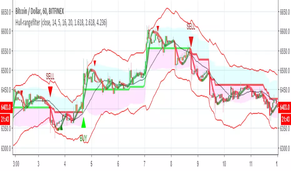
Hull-rangefilterMix of XAvi range filter and Hull fib , seems to be nice hybrid
alerts inside for both systems
for each coin isuugets to optimise the Hull length or the range (now set to 5) and then to test it
Donchian Channel with Range AdditionA Donchian Channel with additional zones at places where its range is smaller than a set amount of atr. Thus it kind of combines with Keltner Channel qualities. Purpose is to set a stop loss wide enough to avoid shaking out of a position. The example chart shows a Philips day chart, where I opened position on 16 juli at 37,50 and set the stop loss at low border level 35,60, on 23 juli was an earnings rapport, the wick of the candle shows that quotes went very low, obviously smart traders had to fill a huge order and hunted for stops, triggering my stop closing the position. next days quotes went a lot better, so I missed the fun. The Donchian Channel was too narrow because quotes had ranged in the previous weeks. If I had placed my stop on the additional low, setting it 5 atr below the high border, my stop would have been safe.

Renko Price Bars Overlay// Shows the price renko bars (or range bars) instead of the PERIOD renko
// bars that are integrated into Trading View. The normal renko bars that
// Trading View offers only consider the drawing of a new brick when the
// price closes above or below the required brick size. This can produce
// misleading charts since depending on the time interval of a chart, new
// bricks may or may not be drawn. True price renko bars will draw a new
// brick immediately upon the price exceeding the next target brick size.
// When running this script in "Traditional" mode, the painting of the
// brick overlay band is INDEPENDENT of the chart interval. If price
// exceeds the required target price for the next brick, the band is
// updated immediately, instead of waiting for the price bar on the chart
// interval to close first. The brick starting anchor point will attempt
// to be a "nice number" at a round interval for the chart ticker. For
// example, if viewing EURUSD with the box size equal to 50 ticks/pips,
// the open and close prices will take the form of 1.2100, 1.2150, 1.2200,
// 1.2250, and so on. This is the same behavior as the normal traditional
// Renko bars in Trading View and other major trading platforms such as
// Meta Trader.
// Use the tick size in traditional mode to specify the block size, in
// ticks. This may give interesting results in FOREX pairs... as the tick
// size in Trading View may be 0.00001 instead of the normal pip size of
// 0.0001, so a 10 pip block size may be '100', and not the expected '10'.
// FOREX futures should work in the manner expected, a 10 pip block size
// will indeed equal 0.0010.
// The "ATR" mode functions differently than the Trading View built in
// version. The block size is updated each time the range is exceeded.
// In Trading View, when using the ATR mode, the ATR is the last ATR
// value calculated on the ENTIRE data interval, and is applied to all
// past data. You can see this when you press the '+' sign of the ticker
// in the top left of the chart window and you will see the brick size
// as a constant, the brick size is not a function of the ever changing
// ATR value of the price action. The block size of this script is not
// updated for each price candle (i.e. each 1HR on a 1HR chart), instead
// it is updated only when the price thresholds are exceeded requiring a
// the band to be updated. At that point the current ATR is considered
// and the brick size is updated.
// Options exist to show the current high and low of the brick, and to
// show the required levels that the price must exceed to draw a new
// brick and update the band.
Please leave comments if you notice any bugs or would like any new features added. I don't find much use for plotting the H/L of the current renko candle, but I have seen some request it in the past.
Cheers.
Wideboy - Wide Ranging DaysHighlights wide ranging days with a circle underneath them.
A wide ranging day is defined as where it's true range is greater than twice (configurable by changing input K) the average true range of the preceding 15 days. (Configured by changing the ATR lookback input)
Enjoy!
Forex session - Opening Range- Jayy fixed updatedOpening Range (OR) for Forex 24 hour regular session. This is not for regular market day sessions addressed in a separate script.
This script fixes four issues:
syntax error when code compiles
messed up opening range the day after a holiday Monday
flaky plotting of the opening range and targets that required page reloading
TradingView problems with starting forex session at 1700 hours EST/EDT when using certain securities eg FX_IDC currently (Jan 2017)
Additions in his code are more options for trading range
Time compensation option for some securities that incorrectly start sessions at 1200 hrs instead of 1700 hrs NY time
- this glitch is likely temporary but present when this script update was created
More opening range time period choices
Opening Range Targets:
Opening Range Targets as per Leaf_West
Targets are set at 127% , 162%, 200 %, 262 %, 362%, 423%, 685%, 1109% and 1794% and this can be traded intraday using methods described here charts-by-leaf.com I also have some Leaf West PDFs that describe how the targets are set and how they are traded. There are others that use opening range.
The Time Session Glitch and the Fix:
The script will correctly default to 1700 hrs to 1700hrs EDT/EST session for FXCM.
Strangely some securities appear to erroneously start their session at 1200 hrs ie. My guess is that they are somehow tied to GMT+0 instead of New York time (GMT+5). See this for yourself by selecting EURUSD using the FXCM exchange (FX:EURUSD) and then EURUSD from the IDC exchange (FX_IDC:EURUSD). The FX-IDC session opening range starts 5 hours
before it actually should at 1700 hrs EDT/EST. To correct for this I have implemented an automatic fix (default) and a user selected "5 hour time shift adjust. ment needed on some securities".
There is also a 4 hour time shift button which might be necessary when New York reverts from Eastern Standard Time
to Eastern Daylight Time (1 hour difference) in March (and then back again in November). In the default auto adjust mode you will need to select the 1 hour time shift. That is if this glitch still exists at that time.
I have looked at other scripts, other than my own and where the script is available, that need to use information about the opening bar and all have the same time shift issue
What are the choices for Opening Range?
The dialogue box offers the standard TradingView options.
Also where you see Pick Opening Range 1 to 12 hours , SET TO 0 To USE LINE ABOVE TO DETERMINE OR LENGTH
As the note says a number other than 0 will override the standard options from the line above
The dialogue box below in offers choices by hours 1 to 12. A number greater than 12 will still only give
720 minutes (12 hours) for the length of Opening Range.
What sessions within the FOREX time-frame are available?
The default is 1700 hours to 1700 hours EST/EDT
Check any one (only one) of the time periods to change the opening range period to suit.
New York opens at 8:00 am to 5:00 pm EST (EDT)
Tokyo opens at 7:00 pm to 4:00 am EST (EDT)
Sydney opens at 5:00 pm to 2:00 am EST (EDT)
London opens at 3:00 am to 12:00 noon EST (EDT)
There is a build your own session (click the button to select)
The two lines for inputting session times are almost identical except that the second line starts the be the same as each other.
The default for the build your own session is 2200 hours to 2200 hours. As of the time of publishing this plots EURUSD FX-IDC just right. The GMT+5 and GMT+4 do not apply to this selection.
See my comments above on this strange aberration.
The script originated from work done by Chris Moody. It has changed significantly but there are remnants of that script lurking within.
Script is free to all - that way you can see what is inside
Cheers Jayy

Market Meanness Index-Price ChangesThis is the Market Mean index. It is used to identify if the market is really trending or if it is range bound(random). In theory, a random sample will be mean reverting 75% of the time. This indicator checks to see what how much the market is mean reverting and converts it to a percentage. If the index is around 75 or higher than the price curve of the market is range bound and there is no trend from a statistical standpoint. If the index is below 75 this means the price curve of the market is in fact trending in a direction as the market is not reverting as much as it should if it were truly following a random/range bound price curve.

New Indicator!!! Opening Range_V1Plots the Opening Range for the First Hour for Stocks and Forex. Option to Plot the first 30 Minutes Opening Range, or Both. See first Post for Specifics.

SMC Range Box + HTF Matrix [AMD] # SMC Range Box + HTF Matrix
## Overview
**SMC Range Matrix** is a comprehensive Smart Money Concepts (SMC) indicator designed for ICT/SMC traders. It combines multi-timeframe range analysis with advanced Fair Value Gap detection, Inverted FVG tracking, Volume Imbalance zones, and AMD (Accumulation-Manipulation-Distribution) phase detection — all in one powerful tool.
---
## 🔥 Key Features
### 📦 Multi-Timeframe Range Boxes
- Display **1H, 4H, and Daily** candle ranges as visual boxes
- Up to **5 boxes per timeframe** for historical context
- **Bullish/Bearish color coding** based on candle direction
- **Time labels** showing when each range started
- **Range size display** in pips/points
- **Sweep markers** when previous highs/lows are taken
### 📊 Fair Value Gaps (FVG)
- **Auto Threshold Filter** — Only shows significant FVGs, filters out noise
- **Multi-Timeframe Support** — Display FVGs from any timeframe on your current chart
- **Smart Mitigation** — FVGs automatically removed when filled (customizable fill %)
- **Near Price Filter** — Only shows FVGs within X ATR of current price
- **Bullish & Bearish FVG** detection with customizable colors
### 🔄 Inverted Fair Value Gaps (IFVG)
- **Automatic IFVG Detection** — When price closes through an FVG, it converts to IFVG
- **Role Reversal Logic**:
- Bullish FVG → Price closes below → Becomes **Bearish IFVG** (Resistance)
- Bearish FVG → Price closes above → Becomes **Bullish IFVG** (Support)
- **Consequent Encroachment (CE) Line** — 50% level marked for optimal entry (ICT concept)
- **IFVG Invalidation** — Automatically removes IFVG when broken
### 📈 Volume Imbalance (VI)
- Detects gaps between consecutive candle bodies
- **Auto-removal** when mitigated
- Separate color settings for bullish/bearish VI
### ⚖️ Equilibrium Lines
- **50% level** of each range box
- Dynamic color based on price position (support/resistance)
- Helps identify premium/discount zones
### 🎯 AMD Phase Detection
- **Accumulation** — Tight range, consolidation phase
- **Manipulation** — Liquidity sweep with rejection
- **Distribution** — Strong directional move
- Labels displayed on each range box
---
## 🎨 Customization
### Theme Presets
- **Ocean** — Cool blue tones
- **Forest** — Natural green shades
- **Monochrome** — Clean grayscale
- **Neon** — Vibrant colors
- **Custom** — Full color control
### Fully Customizable
- Individual colors for each timeframe
- Border width and styles
- Label sizes and visibility toggles
- FVG/VI transparency and borders
---
## ⚙️ Settings Guide
### FVG Settings
| Setting | Description |
|---------|-------------|
| FVG Timeframe | Leave blank for current TF, or select specific timeframe |
| Auto Threshold | Filters insignificant FVGs based on bar movement % |
| Fill % to Remove | FVG removed when filled by this percentage (default 50%) |
| Near Price Filter | Only show FVGs within X ATR from current price |
| Show CE Line | Display 50% Consequent Encroachment line on IFVGs |
### Range Box Settings
| Setting | Description |
|---------|-------------|
| Boxes to Show | Number of historical boxes (1-5) per timeframe |
| Show Sweep Markers | Highlight when previous high/low is swept |
| Show Time Label | Display start time of each range |
---
## 📖 How to Use
### For ICT/SMC Trading:
1. **Identify the range** — Use 4H or Daily boxes to see the current dealing range
2. **Watch for FVGs** — These are potential entry zones
3. **Monitor IFVG formation** — When FVG fails, it becomes support/resistance
4. **Use CE level** — 50% of IFVG is optimal entry per ICT methodology
5. **Check AMD phase** — Understand current market phase before entry
### For Liquidity Trading:
1. Look for **sweep markers** on range boxes
2. Wait for **manipulation phase** detection
3. Enter on **IFVG retest** at CE level
4. Target opposite side of the range
---
## 🔔 Best Practices
- Use **4H boxes** for swing trading context
- Use **1H boxes** for intraday entries
- Enable **Auto Threshold** to reduce FVG clutter
- Set **Fill % to 50-70%** based on your trading style
- Combine with your own bias analysis (HTF trend, news, etc.)
---
## ⚠️ Disclaimer
This indicator is for educational purposes only. It does not constitute financial advice. Always do your own analysis and manage your risk properly. Past performance does not guarantee future results.
---
## 📝 Release Notes
**v8**
- Added LuxAlgo-style FVG detection with Auto Threshold
- Added Multi-Timeframe FVG support
- Improved IFVG logic — proper inversion detection
- Added Consequent Encroachment (CE) line for IFVGs
- Fixed fill tracking to not interfere with inversion
- Added Volume Imbalance detection
- Added AMD phase detection
- Multiple theme presets
---
## 💬 Feedback
If you find this indicator helpful, please leave a like and comment! Your feedback helps improve future versions.
**Tags:** #SMC #ICT #FVG #IFVG #SmartMoney #OrderFlow #LiquiditySweep #AMD #PriceAction #InstitutionalTrading

Price Range AnalyzerPrice Range Analyzer - 365-Day Market Context
Get instant market perspective with key price metrics calculated from daily timeframe data, regardless of your current chart interval.
📊 KEY FEATURES:
- 365-Day High/Low with percentage distance from current price
- Range Position indicator (0-100%) with color-coded zones
- Comparison vs 365-day average price
- ATR-based volatility assessment
- Automatic adaptation for new assets (uses available data)
- Clean, professional table (top-left position)
- Optional visual lines on chart
🎯 WHAT IT SHOWS:
1. 365D High - Highest price in period + % below current
2. 365D Low - Lowest price in period + % above current
3. Range Position - Where price sits in the range:
• 🟢 Very Low (0-20%): Strong buy zone
• 🟢 Low (20-40%): Bullish territory
• 🟡 Mid (40-60%): Neutral zone
• 🟠 High (60-80%): Bearish territory
• 🔴 Very High (80-100%): Strong sell zone
4. vs 365D Average - Distance from mean (reversion signal)
5. Volatility - ATR as % of price (Low/Medium/High)
💡 USE CASES:
- Quick assessment of support/resistance zones
- Identify overbought/oversold conditions
- Mean reversion trading opportunities
- Risk assessment via volatility levels
- Works on ALL timeframes (always uses daily data)
- Perfect for new listings (auto-adjusts to available history)
⚙️ SETTINGS:
- Adjustable lookback period (30-730 days)
- Toggle high/low/average lines on chart
- White background optimized table
Clean, simple, actionable. Know exactly where you stand in the bigger picture at a glance.

Opening Range SetupOpening Range Setup
Track the opening range and identify high-probability breakout setups with precision.
What It Does
This indicator identifies the high and low price range during the first X minutes of the trading
session (5, 15, 30, or 60 minutes) and projects these levels throughout the day. The opening
range acts as dynamic support and resistance, providing key reference points for intraday
trading decisions.
Key Features
✓ Customizable Range Period - Choose from 5, 15, 30, or 60-minute opening ranges
✓ Extension Levels - Display multiples of the range size (0.5x, 1x, 1.5x, 2x) as profit targets
✓ Breakout Detection - Automatically highlights the first candle that breaks above/below the
range
✓ Moving Average Filter - Built-in SMA/EMA trend filter to avoid counter-trend trades
✓ Visual Clarity - Clean box fills, labels, and customizable line styles
✓ Multiple Themes - Dark, Light, Bull/Bear, and Custom color schemes
How to Use
- Long Setup: Wait for price to break above OR High (preferably with price above MA)
- Short Setup: Wait for price to break below OR Low (preferably with price below MA)
- Range Trading: Use OR High/Low as fade levels when price stays within range
- Targets: Use extension levels for profit-taking zones
Settings
- Configurable session time (default: 9:30 AM - 4:00 PM NY)
- Toggle individual lines, fills, and breakout highlights
- Optional MA trend filter with adjustable length and type
Perfect for day traders looking for structured, rule-based setups on futures, stocks, and forex.
---
License: Mozilla Public License 2.0

Opening Range Breakout (ORB) with Dual Timezones + Auto-OffOpening Range (Dual TZ) + Auto-Off (Clean)
This indicator plots a clean Opening Range Box (ORB) with ORH/ORL levels and a midline, built for traders who want structure without clutter.
The main feature is Dual Timezone support, meaning you can run two separate Opening Ranges in parallel (TZ1 + TZ2) on the same chart — ideal if you track multiple market opens (e.g., NY + London) from one workspace.
Key Features
• Dual ORB sessions (TZ1 + TZ2)
• Customization of both timezones, ORB principles (that suits you the best)
• Run two independent opening range sessions simultaneously
• Each has its own range calculation, box, ORH/ORL lines, labels, fill, and midline
• Clean output (no targets, no breakout signals)
• Focused on the core OR structure only
• Great for discretionary trading and level-based execution
• Separate Auto-Off for TZ1 and TZ2
• Automatically removes ALL drawings after a user-defined time (minutes after OR end)
• Helps keep charts clean during the rest of the day
• TZ1 and TZ2 can be disabled on different timers
• Historical toggle
• If Show Historical Data = OFF, the script deletes previous session drawings at the next session start
• If ON, prior sessions remain visible
What’s Drawn
• Opening Range box (high/low during session)
• ORH (Opening Range High) line + label
• ORL (Opening Range Low) line + label
• Midline (average of ORH/ORL)
• Highlight fill between ORH/ORL
Typical Use Cases
• Track NY ORB + London ORB at the same time
• Use ORH/ORL as intraday support/resistance anchors
• Keep your chart clean with Auto-Off after your active trading window
Notes
• Works best on the 1/5 minute timeframes (the OR is session-based).
• If both sessions overlap, drawings may overlap as well — that’s expected since both ORBs are active simultaneously.
