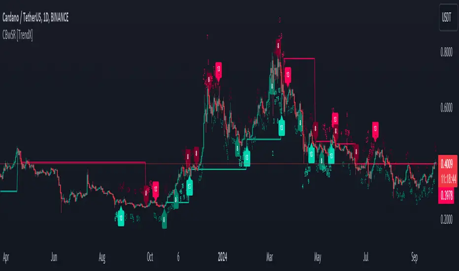
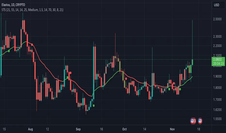
Consecutive Beta with Dynamic Support Resistance [TrendX_]The Consecutive Beta with Dynamic Support Resistance indicator is tailored to harness trend momentum, recognize top & bottom reversals, and leverage dynamic support and resistance levels. This indicator introduces a new approach by combining the concepts of beta, consecutive counting mechanisms, and the supertrend structure, making it a fresh tool for understanding market trends and patterns.
💎 KEY FEATURES
Candle’s Relative Valuation Using Beta: The core of the TrendX indicator lies in using beta to gauge volatility. Beta serves as a measure of how an asset moves relative to the broader market, helping traders understand whether the asset is more or less volatile in different market conditions.
Counting Techniques for Momentum & Reversals: By employing counting techniques to reach a significant threshold, the indicator can measure trend momentum and spot top/bottom reversals.
Dynamic Support & Resistance: This feature relies on consecutive beta counting to dynamically adapt support and resistance levels. These levels are key in predicting potential entry and exit points following the general trend direction.
⚙️ USAGES
Initial Start and Distance: Customize the initial start point and distance for better control over trading strategies. For instance, starting at 1 and using an even distance of 2 will yield odd consecutive counting series;
Phase 1 Completion for Reversal Strategies: This initial phase focuses on identifying short-term reversals;
Phase 2 Completion for Support/Resistance: A support level forms after completing two bullish phases, while a resistance level forms after completing two bearish phases. This structure helps in clarifying trend directions when breakout these key levels.
🔎 BREAKDOWN
Phase 1:
The indicator counts consecutive candles that show a higher Beta than in previous periods over a given length. The completion of countings only succeed when the whole series is uninterruptedly counted, or else countings will be canceled. This strict adherence to consecutive counts serves to ensure that only strong, sustained momentum is recognized and also helps filter out noise, weak signals and establish the initial direction catalyst, setting up for further trend analysis.
Phase 2:
After Phase 1 ends, the Phase 2 counting mechanism begins. This phase focuses on bottom reversals through consecutive higher beta candles, and top reversals by counting lower beta candles. At this stage, interuptions will not cancel the counting process. The ability to continue counting in Phase 2 allows for a broader perspective on market behavior. Even if individual candles do not consistently meet the criteria for consecutive counts, the cumulative effect of higher or lower beta readings over time provides valuable insights into market sentiment and trend direction.
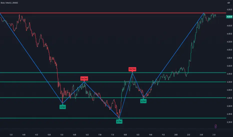
Dynamic Support & Resistance:
After Phase 2 completion, if the average of high, low, and close surpasses both recent support and resistance levels from Phase 2, an uptrend is confirmed, which the support level is displayed. If it drops below these levels, a downtrend is indicated, where resistance is displayed instead of support. The result is displayed through a colored supertrend-line (teal for uptrend, red for downtrend).
DISCLAIMER
This indicator is not financial advice, it can only help traders make better decisions. There are many factors and uncertainties that can affect the outcome of any endeavor, and no one can guarantee or predict with certainty what will occur. Therefore, one should always exercise caution and judgment when making decisions based on past performance.
Indicateur Pine Script®