TradingIQ - Nova IQIntroducing "Nova IQ" by TradingIQ
Nova IQ is an exclusive Trading IQ algorithm designed for extended price move scalping. It spots overextended micro price moves and bets against them. In this way, Nova IQ functions similarly to a reversion strategy.
Nova IQ analyzes historical and real-time price data to construct a dynamic trading system adaptable to various asset and timeframe combinations.
Philosophy of Nova IQ
Nova IQ integrates AI with the concept of central-value reversion scalping. On lower timeframes, prices may overextend for small periods of time - which Nova IQ looks to bet against. In this sense, Nova IQ scalps against small, extended price moves on lower timeframes.
Nova IQ is designed to work straight out of the box. In fact, its simplicity requires just one user setting, making it incredibly straightforward to manage.
Use HTF (used to apply a higher timeframe trade filter) is the only setting that controls how Nova IQ works.
Traders don’t have to spend hours adjusting settings and trying to find what works best - Nova IQ handles this on its own.
Key Features of Nova IQ
Self-Learning Market Scalping
Employs AI and IQ Technology to scalp micro price overextensions.
AI-Generated Trading Signals
Provides scalping signals derived from self-learning algorithms.
Comprehensive Trading System
Offers clear entry and exit labels.
Performance Tracking
Records and presents trading performance data, easily accessible for user analysis.
Higher Timeframe Filter
Allows users to implement a higher timeframe trading filter.
Long and Short Trading Capabilities
Supports both long and short positions to trade various market conditions.
Nova Oscillator (NOSC)
The Nova IQ Oscillator (NOSC) is an exclusive self-learning oscillator developed by Trading IQ. Using IQ Technology, the NOSC functions as an all-in-one oscillator for evaluating price overextensions.
Nova Bands (NBANDS)
The Nova Bands (NBANDS) are based on a proprietary calculation and serve as a custom two-layer smoothing filter that uses exponential decay. These bands adaptively smooth prices to identify potential trend retracement opportunities.
How It Works
Nova IQ operates on a simple heuristic: scalp long during micro downside overextensions and short during micro upside overextensions.
What constitutes an "overextension" is defined by IQ Technology, TradingIQ's proprietary AI algorithm. For Nova IQ, this algorithm evaluates the typical extent of micro overextensions before a reversal occurs. By learning from these patterns, Nova IQ adapts to identify and trade future overextensions in a consistent manner.
In essence, Nova IQ learns from price movements within scalping timeframes to pinpoint price areas for capitalizing on the reversal of an overextension.
As a trading system, Nova IQ enters all positions using market orders at the bar’s close. Each trade is exited with a profit-taking limit order and a stop-loss order. Thanks to its self-learning capability, Nova IQ determines the most suitable profit target and stop-loss levels, eliminating the need for the user to adjust any settings.
What classifies as a tradable overextension?
For Nova IQ, tradable overextensions are not manually set but are learned by the system. Nova IQ utilizes NOSC to identify and classify micro overextensions. By analyzing multiple variations of NOSC, along with its consistency in signaling overextensions and its tendency to remain in extreme zones, Nova IQ dynamically adjusts NOSC to determine what constitutes overextension territory for the indicator.
When NOSC reaches the downside overextension zone, long trades become eligible for entry. Conversely, when NOSC reaches the upside overextension zone, short trades become eligible for entry.
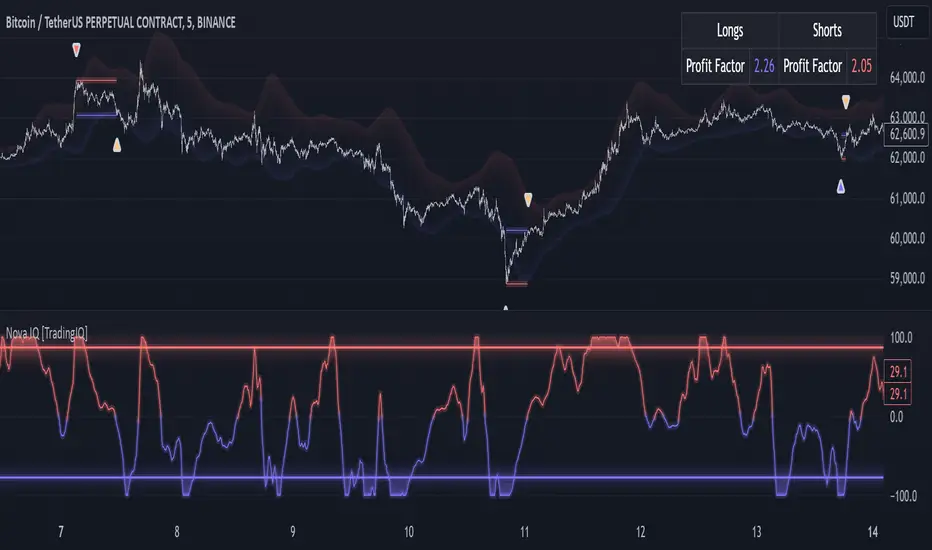
The image above illustrates NOSC and explains the corresponding overextension zones
The blue lower line represents the Downside Overextension Zone.
The red upper line represents the Upside Overextension Zone.
Any area between the two deviation points is not considered a tradable price overextension.
When either of the overextension zones are breached, Nova IQ will get to work at determining a trade opportunity.
The image above shows a long position being entered after the Downside Overextension Zone was reached.
The blue line on the price scale shows the AI-calculated profit target for the scalp position. The redline shows the AI-calculated stop loss for the scalp position.
Blue arrows indicate that the strategy entered a long position at the highlighted price level.
Yellow arrows indicate a position was closed.
You can also hover over the trade labels to get more information about the trade—such as the entry price and exit price.
The image above depicts a short position being entered after the Upside Overextension Zone was breached.
The blue line on the price scale shows the AI-calculated profit target for the scalp position. The redline shows the AI-calculated stop loss for the scalp position.
Red arrows indicate that the strategy entered a short position at the highlighted price level.
Yellow arrows indicate that NOVA IQ exited a position.
Long Entry: Blue Arrow
Short Entry: Red Arrow
Closed Trade: Yellow Arrow
Nova Bands
The Nova Bands (NBANDS) are based on a proprietary calculation and serve as a custom two-layer smoothing filter that uses exponential decay and cosine factors.
These bands adaptively smooth the price to identify potential trend retracement opportunities.
The image above illustrates how to interpret NBANDS. While NOSC focuses on identifying micro overextensions, NBANDS is designed to capture larger price overextensions. As a result, the two indicators complement each other well and can be effectively used together to identify a broader range of price overextensions in the market.
While the Nova Bands are not part of the core heuristic and do not use IQ technology, they provide valuable insights for discretionary traders looking to refine their strategies.
Use HTF (Use Higher Timeframe) Setting
Nova IQ has only one setting that controls its functionality.
“Use HTF” controls whether the AI uses a higher timeframe trading filter. This setting can be true or false. If true, the trader must select the higher timeframe to implement.
No Higher TF Filter
Nova IQ operates with standard aggression when the higher timeframe setting is turned off. In this mode, it exclusively learns from the price data of the current chart, allowing it to trade more aggressively without the influence of a higher timeframe filter.
Higher TF Filter
Nova IQ demonstrates reduced aggression when the "Use HTF" (Higher Timeframe) setting is enabled. In this mode, Nova IQ learns from both the current chart's data and the selected higher timeframe data, factoring in the higher timeframe trend when seeking scalping opportunities. As a result, trading opportunities only arise when both the higher timeframe and the chart's timeframe simultaneously display overextensions, making this mode more selective in its entries.
In this mode, Nova IQ calculates NOSC on the higher timeframe, learns from the corresponding price data, and applies the same rules to NOSC as it does for the current chart's timeframe. This ensures that Nova IQ consistently evaluates overextensions across both timeframes, maintaining its trading logic while incorporating higher timeframe insights.
AI Direction
The AI Direction setting controls the trade direction Nova IQ is allowed to take.
“Trade Longs” allows for long trades.
“Trade Shorts” allows for short trades.
Verifying Nova IQ’s Effectiveness
Nova IQ automatically tracks its performance and displays the profit factor for the long strategy and the short strategy it uses. This information can be found in a table located in the top-right corner of your chart showing the long strategy profit factor and the short strategy profit factor.
The image above shows the long strategy profit factor and the short strategy profit factor for Nova IQ.
A profit factor greater than 1 indicates a strategy profitably traded historical price data.
A profit factor less than 1 indicates a strategy unprofitably traded historical price data.
A profit factor equal to 1 indicates a strategy did not lose or gain money when trading historical price data.
Using Nova IQ
While Nova IQ is a full-fledged trading system with entries and exits - it was designed for the manual trader to take its trading signals and analysis indications to greater heights, offering numerous applications beyond its built-in trading system.
The hallmark feature of Nova IQ is its to ignore noise and only generate signals during tradable overextensions.
The best way to identify overextensions with Nova IQ is with NOSC.
NOSC is naturally adept at identifying micro overextensions. While it can be interpreted in a manner similar to traditional oscillators like RSI or Stochastic, NOSC’s underlying calculation and self-learning capabilities make it significantly more advanced and useful than conventional oscillators.
Additionally, manual traders can benefit from using NBANDS. Although NBANDS aren't a core component of Nova IQ's guiding heuristic, they can be valuable for manual trading. Prices rarely extend beyond these bands, and it's uncommon for prices to consistently trade outside of them.
NBANDS do not incorporate IQ Technology; however, when combined with NOSC, traders can identify strong double-confluence opportunities.
Recherche dans les scripts pour "scalping"
HTF Candle Projection by @TATraderSid(The Journal App Team)HTF Candle Projection Indicator
Overview
A professional multi-timeframe analysis tool that projects Higher Timeframe (HTF) candles onto lower timeframe charts with real-time countdown timer and optional zone highlights.
Key Features
📊 HTF Candle Projection
Visual HTF Candles: Projects last 2-3 HTF candles as transparent boxes with wicks
Color Coding: Green for bullish, red for bearish candles
Configurable Offset: Positions candles to the right of current price action
Clean Design: Minimal chart clutter with professional appearance
⏰ Real-Time Timer Box
Live Countdown: Shows time remaining until next HTF candle close (MM:SS format)
Symbol Display: Current trading pair (e.g., BTCUSDT)
Timeframe Model: Shows current TF to HTF relationship (e.g., 15m–60m)
HTF Bias: Real-time bullish/bearish/neutral bias indication
Top-Right Position: Fixed position that doesn't interfere with chart analysis
🎯 Optional Features
Session Zones: Previous day high/low shaded areas
HTF Levels: Optional HTF high/low reference lines (disabled by default)
Risk/Reward Framework: Structure for manual trade planning
Settings
Main Configuration
Higher Timeframe: Select HTF (default: 60 minutes)
Number of HTF Candles: Display 1-5 historical candles
Offset Bars: Distance from current price action
Show Timer Box: Toggle countdown timer display
Show Session Zones: Optional support/resistance zones
Display Options
Show HTF Levels: Toggle HTF high/low reference lines
Color Customization: Bullish/bearish candle colors
Transparency Settings: Adjustable candle body transparency
Best Use Cases
Multi-Timeframe Analysis
Scalping: Use 5m/15m charts with 1H/4H HTF candles
Swing Trading: Use 1H/4H charts with daily/weekly HTF candles
Trend Confirmation: Align lower TF entries with HTF direction
Timing Entries
HTF Candle Closes: Time entries around HTF candle completions
Bias Changes: Monitor HTF bias shifts for trend changes
Support/Resistance: Use projected HTF levels for key zones
Technical Specifications
Pine Script v6: Latest TradingView scripting version
Real-Time Updates: Uses request.security() for precise HTF data
Performance Optimized: Efficient rendering with minimal resource usage
Cross-Timeframe Compatible: Works on all timeframe combinations
Installation & Usage
Add indicator to chart
Select desired Higher Timeframe
Adjust number of candles and offset
Enable timer box for countdown functionality
Optionally enable session zones and HTF levels
Recommended Settings
For Scalping: 15m chart with 60m HTF, 3 candles, 10 bar offset
For Swing Trading: 1H chart with 240m HTF, 2 candles, 15 bar offset
For Position Trading: 4H chart with 1D HTF, 3 candles, 20 bar offset
Perfect for traders who need precise multi-timeframe analysis with professional visual presentation and real-time timing information.
Scalp Sense AI# Scalp Sense AI (No Repaint)
**Adaptive trend & reversal detector with an AI-driven score, multi-timeframe confirmations, robust volume filters, and a purpose-built Scalping Mode.**
Signals are generated **only on bar close** (no repaint), include structured alert payloads for webhooks, and come with optional ATR-based TP/SL visualization for study and validation.
---
## What it is (in one paragraph)
**Scalp Sense AI** combines classic market structure (DI/ADX, EMA, SMA, Keltner, ATR) with a continuous **AI Score** that fuses RSI normalization, EMA distance (in ATR units), and DI edge into a single, volatility-aware signal. It adaptively gates **trend** and **reversal** entries, applies **HTF confirmation** without lookahead, and enforces **guard rails** (e.g., strong-trend reversal blocking) unless a high-confidence AI override and volume confirmation are present. **Scalping Mode** compresses reaction times and adds micro price-action cues (wick rejections, micro-EMA crosses, small engulfing) to surface more—but disciplined—opportunities.
---
## Non-Repainting Design
* All signals, markers, state, and alerts are computed **after bar close** using `barstate.isconfirmed`.
* HTF data are requested with `lookahead_off`.
* No “future-peeking” constructs are used.
* Result: signals do **not** change after the candle closes.
---
## How the engine works (pipeline overview)
1. **Base metrics**
* **RSI**, **EMA**, **ATR** (+ ATR SMA for regime/volatility), **SMA long & short**, **Keltner** (EMA ± ATR×mult).
* **Manual DI/ADX** for fine control (DM+, DM−, true range smoothing).
2. **Volatility regime**
* Compares ATR to its SMA and scales thresholds by √(ATR/ATR\_SMA) → robust “high\_vol” gating.
3. **Volume & flow**
* **Volume Z-score**, **OBV slope**, and **MFI** (all computed manually) to confirm impulses and filter weak reversals.
4. **Higher-Timeframe confirmation (optional)**
* Imports HTF **PDI/MDI/ADX** and **SMA** (no lookahead) to require alignment when enabled.
5. **AI Score**
* Weighted fusion of **RSI (normalized around 0)**, **EMA distance (in ATR)**, and **DI edge**.
* Smoothed; then its **mean (μ)** and **volatility (σ)** are estimated to form **adaptive bands** (hi/lo), with optional **hysteresis**.
* **Debounce** (M in N bars) avoids flicker; **bias state** persists until truly invalidated.
6. **Signal logic**
* **Trend entries** require AI bias + trend confirmations (DI/ADX/SMA, HTF if enabled), volatility OK, and **anti-breakout** filter.
* **Reversal entries** come in **core**, **early**, and **scalp** flavors (progressively more frequent), guarded by strong-trend blocks that an **AI+volume+ADX-cooling override** can bypass.
7. **Scalping Mode**
* Adaptive parameter contraction (shorter lengths), gentler guards, micro-patterns (wick/engulf/micro-EMA cross), and reduced cooldown to increase high-quality opportunities.
8. **Cooldown & state**
* One signal per side after a configurable spacing in bars; internal “last direction” avoids clustering.
9. **Visualization & alerts**
* **Triangles** for trend, **circles** for reversals (offset by ATR to avoid overlap).
* **Single-line alert payload** (BUY/SELL, reason, AI, volZ, ADX) ready for webhooks.
---
## Signals & visualization
* **Trend Long/Short** → triangle markers (above/below) when:
* AI bias aligns with trend confirmations (DI edge, ADX above threshold, price vs long SMA, optional HTF alignment).
* Volatility regime agrees; **anti-breakout** prevents entries exactly at lookback highs/lows.
* **Reversal Long/Short** → circular markers when:
* **Core**: AI near “loose” band, OBV/MFI/volZ supportive, ADX cooling, DI spread relaxed, PA confirms (crosses/div).
* **Early**: anticipatory patterns (Keltner exhaustion, simple RSI “quasi-divergence”).
* **Scalp**: micro-EMA cross, wick rejection, mini-engulfing, with relaxed guards but AI/volume still in the loop.
* **Markers appear only on the bar that actually emitted the signal** (no repaint); offsets use ATR so shapes don’t overlap.
---
## Alerts (ready for webhooks)
Enable “**Any alert() function call**” and you’ll receive compact, single-line payloads once per bar:
```
action=BUY;reason=reversal-early;ai=0.1375;volZ=0.82;adx=27.5
action=SELL;reason=trend;ai=-0.2210;volZ=0.43;adx=31.9
```
* `action`: BUY / SELL
* `reason`: `trend` | `reversal-core` | `reversal-early` | `reversal-scalp`
* `ai`: current smoothed AI Score at signal bar
* `volZ`: volume Z-score
* `adx`: current ADX
---
## Inputs (exhaustive)
### 1) Core Inputs
* **RSI Length (Base)** (`rsi_length_base`, int)
Base RSI lookback. Shorter = more reactive; longer = smoother.
* **RSI Overbought Threshold** (`rsi_overbought`, int)
Informational for context; RSI is used normalized in the AI fusion.
* **RSI Oversold Threshold** (`rsi_oversold`, int)
Informational; complements visual context.
* **EMA Length (Base)** (`ema_length_base`, int)
Primary adaptive mean; also used for Keltner mid and distance metric.
* **ATR Length (Base)** (`atr_length_base`, int)
Volatility unit for Keltner, SL/TP (debug), and regime detection.
* **ATR SMA Length** (`atr_sma_len`, int)
Smooth baseline for ATR regime; supports “high\_vol” logic.
* **ATR Multiplier Base** (`atr_mult_base`, float)
Scales volatility gating (sqrt-scaled); higher = tighter high-vol requirement.
* **Disable Volatility Filter** (`disable_volatility_check`, bool)
Bypass volatility gating if true.
* **Price Change Period (bars)** (`price_change_period_base`, int)
Simple momentum check (+/−% over N bars) used in trend validation.
* **Base Cooldown Bars Between Signals** (`signal_cooldown_base`, int ≥ 0)
Minimum bars to wait between signals (per side).
* **Trend Confirmation Bars** (`trend_confirm_bars`, int ≥ 1)
Require persistence above/below long SMA for this many bars.
* **Use Higher Timeframe Confirmation** (`use_higher_tf`, bool)
Turn on/off HTF alignment (no repaint).
* **Higher Timeframe for Confirmation** (`higher_tf`, timeframe)
E.g., “60” to confirm M15 with H1; used for HTF PDI/MDI/ADX and SMA.
* **TP as ATR Multiple** (`tp_atr_mult`, float)
For **visual debug** only (drawn after entries); not an order manager.
* **SL as ATR Multiple** (`sl_atr_mult`, float)
For visual debug only.
* **Enable Scalping Mode** (`scalping_mode`, bool)
Compresses lengths/thresholds, unlocks micro-PA modules, reduces cooldown.
* **Show Debug Lines** (`show_debug`, bool)
Plots AI bands, DI/ADX, EMA/SMA, Keltner, vol metrics, and TP/SL (debug).
### 2) AI Score & Thresholds
* **AI Score Smooth Len** (`ai_len`, int)
EMA smoothing over the raw fusion.
* **AI Volatility Window** (`ai_sigma_len`, int)
Window to estimate AI mean (μ) and standard deviation (σ).
* **K High (sigma)** (`ai_k_hi`, float)
Upper band width (σ multiplier) for strong threshold.
* **K Low (sigma)** (`ai_k_lo`, float)
Lower band width (σ multiplier) for loose threshold.
* **Debounce Window (bars)** (`ai_debounce_m`, int ≥ 1)
Rolling window length used by the confirm counter.
* **Min Bars>Thr in Window** (`ai_debounce_n`, int ≥ 1)
Minimum confirmations inside the debounce window to validate a state.
* **Use Hysteresis Thresholds** (`ai_hysteresis`, bool)
Requires crossing back past a looser band to exit bias → fewer whipsaws.
* **Weight DI Edge (0–1)** (`ai_weight_di`, float)
Importance of DI edge within the fusion.
* **Weight EMA Dist (0–1)** (`ai_weight_ema`, float)
Importance of EMA distance (in ATR units).
* **Weight RSI Norm (0–1)** (`ai_weight_rsi`, float)
Importance of normalized RSI.
* **Sensitivity (0–1)** (`sensitivity`, float)
Contracts/expands bands (higher = more sensitive).
### 3) Volume Filters
* **Volume MA Length** (`vol_ma_len`, int)
Baseline for volume Z-score.
* **Volume Z-Score Window** (`vol_z_len`, int)
Std-dev window for Z-score; larger = fewer volume “spikes”.
* **Reversal: Min Volume Z for confirm** (`vol_rev_min_z`, float)
Minimum Z required to validate reversals (adaptively relaxed in scalping).
* **OBV Slope Lookback** (`obv_slope_len`, int)
Rising/falling OBV over this window supports bull/bear confirmations.
* **MFI Length** (`mfi_len`, int)
Money Flow Index lookback (manual calculation).
### 4) Filters (Breakout / ADX / Reversal)
* **Enable Breakout Filter** (`enable_breakout_fil`, bool)
Avoid trend entries at lookback highs/lows.
* **Breakout Lookback Bars** (`breakout_lookback`, int ≥ 1)
Window for the anti-breakout guard.
* **Base ADX Length** (`adx_length_base`, int)
Lookback for DI/ADX smoothing (also adapted in Scalping Mode).
* **Base ADX Threshold** (`adx_threshold_base`, float)
Minimum ADX to validate trend context (scaled in Scalping Mode).
* **Enable Reversal Filter** (`enable_rev_filter`, bool)
Master switch for reversal logic.
* **Max ADX for Reversal** (`rev_adx_max`, float)
Hard cap: above this ADX, reversals are blocked (unless overridden by AI if allowed in Guards).
### 5) Reversal Guard (regime protection & overrides)
* **Strong Trend: ADX add-above Thr** (`guard_adx_add`, float)
Extra ADX above `adx_threshold` to mark “strong” trend.
* **Strong Trend: min DI spread** (`guard_spread_min`, float)
Minimum DI separation to consider a trend “dominant”.
* **Require ADX drop from window max (%)** (`guard_adx_drop_min_pct`, float 0–1)
ADX must drop at least this fraction from its window maximum to consider “cooling”.
* **Regime Window (bars)** (`guard_regime_len`, int ≥ 10)
Window over which ADX max is measured for the “cooling” check.
* **EMA Slope Lookback** (`guard_slope_len`, int ≥ 2)
EMA slope horizon used alongside Keltner for strong-trend identification.
* **Keltner Mult (ATR)** (`guard_kc_mult`, float)
Keltner width for strong trend bands and exhaustion checks.
* **HTF Reversal Block Mode** (`htf_block_mode`, string: `Off` | `On` | `AI-controlled`)
* `Off`: never block by HTF.
* `On`: block reversals whenever HTF is strong.
* `AI-controlled`: block **unless** AI+volume+ADX-cooling override criteria are met.
* **AI-controlled: allow AI override** (`ai_htf_override`, bool)
Enables the override mechanism in `AI-controlled` mode.
* **AI override multiplier (vs band\_hi)** (`ai_override_mult`, float)
Strength needed beyond the high band to count as “strong AI”.
* **AI override: min bars beyond strong thr** (`ai_override_min_bars`, int ≥ 1)
Debounce on the override itself.
### 6) Markers
* **Reversal Circle ATR Offset** (`rev_marker_offset_atr`, float ≥ 0)
Vertical offset for reversal circles; trend triangles use a separate (internal) offset.
### 7) Scalping Mode Tuning
* **Reversal aggressiveness (0–1)** (`scalp_rev_aggr`, float)
Higher = looser guards and stronger AI sensitivity.
* **Wick: body multiple (bull/bear)** (`scalp_wick_body_mult`, float)
Wick must be at least this multiple of body to count as rejection.
* **Wick: ATR multiple (min)** (`scalp_wick_atr_mult`, float)
Minimal wick length in ATR units.
* **Micro EMA factor (vs EMA base)** (`scalp_ema_fast_factor`, float 0.2–0.9)
Fast EMA length = base EMA × factor (rounded/int).
* **Relax breakout filter in scalping** (`scalp_breakout_relax`, bool)
Lets more trend entries through in scalping context.
### 8) ICT-style SMA (bases)
* **ICT SMA Long Length (Base)** (`sma_long_len_base`, int)
Long-term baseline for regime/trend.
* **ICT SMA Short1 Length (Base)** (`sma_short1_len_base`, int)
Short baseline for price-action crosses.
* **ICT SMA Short2 Length (Base)** (`sma_short2_len_base`, int)
Companion short baseline used in PA cross checks.
> **Adaptive “effective” values:** When **Scalping Mode** is ON, the script internally shortens multiple lengths (RSI/EMA/ATR/ADX/μσ windows, SMAs) and gently relaxes guards (ADX drop %, DI spread, volume Z, override thresholds), reduces cooldown/confirm bars, and optionally relaxes the breakout filter—so you get **more frequent but still curated** signals.
---
## Plots & debug (optional)
* DI+/DI−, ADX (curr + HTF), EMA, long SMA, Keltner up/down (when strong), AI Score, AI mean, AI bands (hi/lo; low plots only when hysteresis is on), Volume MA and Z-score, and ATR-based TP/SL guide (after entries).
* These are **study aids**; the indicator does not manage trades.
---
## Recommended use
* **Timeframes**:
* Scalping Mode: M1–M15.
* Standard Mode: M15–H1 (or higher).
* **Markets**: Designed for liquid FX, indices, metals, and large-cap crypto.
* **Chart type**: Standard candles recommended (Heikin-Ashi alters inputs and hence signals).
* **Alerts**: Use “Any alert() function call”. Parse the key/value payloads server-side.
---
## Good to know
* **Why some alerts don’t draw shapes retroactively**: markers are drawn **only on** the bar that emitted the signal (no repaint by design).
* **Why a reversal didn’t fire**: strong-trend guards + HTF block may have been active; check ADX, DI spread, Keltner position, EMA slope, and whether AI override criteria were met.
* **Too many / too few signals**: tune **Scalping Mode**, `signal_cooldown_base`, AI bands (`ai_k_hi/lo`, `sensitivity`), volume Z (`vol_rev_min_z`), and guards (`rev_adx_max`, `guard_*`).
---
## Disclaimer
This is an **indicator**, not a strategy or an execution system. It does not place, modify, or manage orders. Markets carry risk—validate on historical data and demo before any live decisions. No performance claims are made.
---
### Version
**Scalp Sense AI v11.5** — Adaptive AI bands with hysteresis/debounce, HTF no-lookahead confirmations, guarded reversal logic with AI override, full volume suite (Z, OBV slope, MFI), anti-breakout filter, and a dedicated Scalping Mode with micro-PA cues.
Crypto Scanner
🚀 Crypto Scanner: Intelligent TradingView Indicator & Screener for Crypto Trading
Description: Discover the Crypto indicator & screener, an Intelligent TradingView indicator for spotting reversals in the top 50 cryptos. Spot Bitcoin & altcoin reversals with real-time buy/sell signals, alerts & strategies for day trading, scalping & swing trading.
________________________________________
🔥 Catch Crypto Reversals with the Crypto Scanner
Looking for the perfect crypto trade setup? The Crypto Scanner, a leading TradingView indicator and screener, helps traders catch bullish and bearish reversals across the top 50 cryptocurrencies (Bitcoin, Ethereum, Solana, XRP, Binance Coin, and more). Unlike lagging tools such as moving averages, this crypto trading strategy delivers real-time buy/sell signals for early entries and bigger profits.
It’s more than just an indicator – it’s a crypto market scanner that works 24/7, detecting reversal candlestick patterns, support/resistance zones, and momentum shifts before the crowd.
________________________________________
📊 What is the Crypto Scanner & screener?
The Crypto Scanner is a powerful TradingView crypto tool built for scalpers, day traders, and swing traders. It scans the top 50 altcoins by market cap, spotting high-probability reversal setups across all timeframes – from 1-minute scalping charts to long-term swing trades.
This tool saves time by automating crypto market analysis, helping you trade smarter, whether you’re focusing on Bitcoin, Ethereum, or fast-moving altcoins.
________________________________________
⚙️ How the Crypto Scanner Works
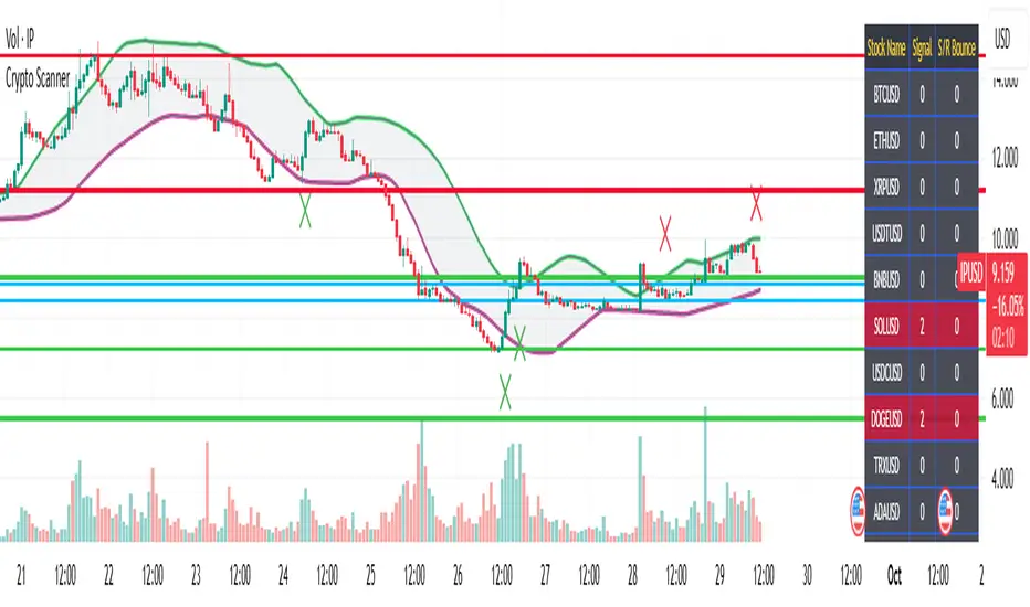
1. Group 1 & Group 2 Coins: Scans two predefined groups :
Group 1: Top 25 coins by market cap.
Group 2: Next 25 coins by market cap.
Displays Group 1 signals by default in a table, with green (1) for buying pressure and red (2) for selling pressure.
2. Next Steps: When a coin shows a green or red signal, open its chart via TradingView’s symbol search. Look for:
Green X below a candle for bullish signals.
Red X above a candle for bearish signals.
Enter trades when price moves above the Green X candle’s close (buy) or below the Red X candle’s close (sell), with a stop loss at the previous candle’s close.
3. Profit Targets: Aim for 2%–7% gains. If price exits the cloud area, hold until it re-enters or an opposite signal appears. Exit if stop loss is hit.
4. Signal Significance: Detects 50+ candlestick patterns (e.g., hammer, doji) after prolonged trends, confirming reversals with price action near support/resistance levels—earlier than moving average crossovers for higher profits.
5. Color-Coded Table: Shows real-time signals:
✅ Green (1): Bullish reversal (buy).
❌ Red (2): Bearish reversal (sell).
6. Support/Resistance Validation: Automatically plots key levels to confirm signals.
________________________________________
🚨 Important Disclaimer
The Crypto Scanner is not designed to catch every market move.
If price moves slowly or the specific candlestick patterns do not form during extreme downtrends or extreme uptrends, the scanner may miss the reversal.
Missing a move does not make you poorer — instead, focus on the trades that the scanner does catch.
Ride those profitable waves and let the missed opportunities go. The goal is consistency, not chasing every candle.
________________________________________
🎯 Crypto Trading Strategies: Scalping, Day Trading & Swing Trading
The Crypto Scanner isn’t just an indicator – it supports multiple strategies:
Scalping: Quick in-and-out trades with small stop losses.
Day Trading: Catch intraday reversals on Bitcoin & altcoins.
Swing Trading: Identify longer-term reversal points for higher profits.
Whether you scalp 1-minute charts or swing trade daily setups, the scanner adapts to your style.
________________________________________
🎯 Trading Rules for Success
Stop Loss :
Bullish reversal: Set at the close of the candle before the Green X.
Bearish reversal: Set at the close of the candle before the Red X.
Profit Targets:
Exit at the next support/resistance level.
Hold if price exits the cloud and continues strongly until it re-enters or an opposite signal appears.
________________________________________
📈 Maximize Profits with Smart Risk Management
Big wins trump high accuracy. The Crypto Scanner’s early signals let you enter trades before the crowd, boosting profit potential. Even with a 35% win rate, one winning trade can offset multiple small losses due to high-reward setups. Failed reversals may hit stop losses, but the scanner’s design ensures winners outweigh losers.
________________________________________
🚀 Why Traders Choose Our TradingView Crypto Indicator
• 🔎 Scans Top 50 Cryptos: Bitcoin, Ethereum, Solana, Binance Coin, XRP, Dogecoin & more.
• ⚡ Instant Buy/Sell Signals: No more chart-hopping.
• 🕯 50+ Candlestick Patterns: Advanced reversal recognition.
• 📋 Real-Time Screener Table: See all crypto signals at a glance.
• 🔔 Automated Alerts: Get notifications for 50 coins with a single setup.
• 🛡 Auto Support/Resistance Levels: Validates reversals with key price zones.
• ⏱ All Timeframes Supported: Works on scalping (1m/5m) and higher (daily/weekly) charts.
________________________________________
🌍 Why Trade Crypto?
One of the biggest advantages of trading cryptocurrencies is that the crypto market never sleeps. Unlike stocks and forex, crypto runs 24 hours a day, 7 days a week — even on weekends and public holidays. This means you can trade Bitcoin, Ethereum, and altcoins anytime, anywhere without being restricted by exchange opening hours. The continuous market gives more opportunities for scalping, day trading, and swing trading, making crypto one of the most flexible and exciting markets for active traders.
✅ Benefits for Bitcoin & Altcoin Traders
• Saves time by automating crypto analysis
• Works for Bitcoin signals, Ethereum signals, and altcoin signals
• Provides early entries for maximum profit potential
• Ideal for day trading crypto, swing trading, and scalping strategies
• Seamlessly integrates into TradingView
________________________________________
📌 Key Notes
• Pre-Coded Coin List: Includes the top 50 coins, updated periodically.
• Customizable: Contact us for versions with 50, 100, or custom watchlists.
• TradingView Integration: Seamlessly works within TradingView.
________________________________________
🔍 Perfect for Crypto Traders
• Spot traders seeking fast crypto reversal signals.
• Scalpers, intraday, and swing traders.
• TradingView users wanting advanced crypto trading tools.
________________________________________
🚀 Trade Smarter with the Crypto Scanner
Dominate the crypto market with the Crypto Scanner on TradingView. Catch reversals in the top 50 coins and boost your profits. Don’t miss out!
👉 Start trading smarter – activate the Crypto Scanner on TradingView today!
BUY & SELL Dynamic DCA StrategyOverview
The BUY & SELL Dynamic DCA Strategy is a versatile Pine Script indicator designed for traders seeking a robust Dollar Cost Averaging (DCA) approach to manage both long and short positions across various market conditions and timeframes. This innovative tool combines breakout-based level initiation with a dynamic volatility adjustment, enabling traders to enter positions at optimal DCA points, average them strategically, and manage risk with adjustable stop-loss and take-profit levels. Ideal for scalping on short timeframes (1-minute, 5-minute) or swing trading on longer ones (15-minute, 1-hour, 4-hour).
Purpose and Originality
The "BUY & SELL Dynamic DCA Strategy" stands out by integrating several trading concepts into a cohesive, trader-friendly system. While it leverages familiar elements like breakout points and ATR (Average True Range), its originality lies in:
Dynamic Volatility Adjustment: A custom volatility factor, derived from a capped ATR calculation, dynamically scales DCA entry, averaging, and stop-loss levels. This ensures the strategy adapts to market conditions, tightening in low volatility for scalping and widening in high volatility for swing trading.
Dual-Direction DCA: Supports both buy (long) entries on pullbacks and sell (short) entries on rallies, with tailored averaging and exit strategies for each.
Timeframe Versatility: Adjusts its sensitivity based on the chart timeframe, making it suitable for rapid scalping or longer-term trend riding without requiring manual recalibration.
This unique synthesis justifies its publication as a invite-only script, offering a practical tool that enhances traditional DCA methods with adaptive precision.
How It Works
The indicator operates through a multi-step process designed to optimize entry, averaging, and exit points:
1. Initial Level Setting:
Utilizes high and low threshold (calculated over a user-defined period) to establish initial DCA entry levels. If no threshold is detected, it defaults to the previous bar’s price, ensuring immediate applicability.
2. Dynamic DCA Entry:
Entry levels are adjusted using a proprietary volatility factor, which scales the distance from the current price. Long entries trigger when the price falls below this level, while short entries trigger when the price rises above it, with a volume confirmation filter to reduce noise.
3. Averaging Mechanism:
A secondary level (Averaging Level) allows traders to add to their position when the price moves further against the trade (down for longs, up for shorts). This level is also volatility-adjusted, providing a structured cost-reduction strategy.
4. Risk and Reward Management:
A Final Stop-Loss (Final SL) is set farther out, calculated as a multiple of the volatility-adjusted risk distance, offering protection after averaging.
Take-Profit (TP) levels are determined using a user-defined risk-to-reward ratio, ensuring a balanced exit strategy tailored to market movement.
5. Performance Tracking:
A real-time win/loss table in the top-right corner records trade outcomes, with wins and losses color-coded based on the trade direction (green/red for long, red/green for short), aiding performance evaluation.
Features
1. Dual-Mode Operation : Facilitates both long entries on price dips and short entries on price surges, adaptable to bullish and bearish markets.
2. Volatility-Adaptive Levels: Employs a custom ATR-based adjustment to scale entry, averaging, and stop-loss levels, enhancing responsiveness across timeframes.
3. Visual Tools: Features dashed lines and labels for DCA Entry (green for long, red for short), Final SL (red), and TP (cyan), with debug labels for entries and averages.
4. Timeframe Flexibility: Automatically adjusts threshold periods and volatility factors based on the chart timeframe (1m, 5m, 15m, 1h, 4h), optimizing for scalping or swing trading.
5. Customizable Parameters: Allows fine-tuning of period, DCA factors, and visibility options.
Settings
Base Length (default: 10): Base period for pivot calculations, scaled by timeframe (e.g., 10 becomes 20 on 5m).
Type: 'Wicks' (high/low) or 'Body' (open/close) for price-based levels.
RR Ratio (default: 1.2): Risk-to-reward ratio for TP calculation.
DCA Entry Factor (default: 1.0): Multiplier for volatility-adjusted DCA entry distance.
Avg Level Factor (default: 2.0): Multiplier for averaging level distance.
Final SL Factor (default: 3.0): Multiplier for final stop-loss distance.
SL Type: 'Close' or 'High/Low' for stop-loss evaluation.
Show DCA Entry, Show Avg Level, Show Final SL: Toggle visibility of respective lines.
Show Win/Loss Table: Enable/disable performance tracking.
Line Style: Select 'Solid', 'Dashed', or 'Dotted'.
Usage Instructions
1. Application:
Add the "BUY & SELL Dynamic DCA Strategy - JOAT" via the Pine Editor or community scripts on TradingView.
2. Configuration:
Scalping (1m, 5m): Set Base Length to 5-10, use a low DCA Entry Factor (0.5-1.0) for tight entries, and a Final SL Factor of 2.0-3.0.
Swing Trading (15m, 1h, 4h): Increase Base Length to 15-20, use a higher DCA Entry Factor (1.0-2.0), and set Final SL Factor to 3.0-4.0 for wider stops.
Enable visual elements and adjust Line Style as preferred.
3. Signal Interpretation:
Long Trade: A green dashed "DCA Entry" line below the price triggers a "Long Entry" label on crossover down.
Short Trade: A red dashed "DCA Entry" line above the price triggers a "Short Entry" label on crossover up.
Averaging: A yellow "Avg" label (long) or magenta "Avg" label (short) appears at the respective averaging level.
Exits: TP (cyan) for wins, Final SL (red) for losses, tracked in the win/loss table.
Trade Management:
Scalping: Use 1m/5m for quick trades, averaging as price moves against you.
Swing Trading: Use 15m/1h/4h to capture trends, averaging for cost adjustment.
Manually adjust position size for averaging based on risk tolerance.
5. Performance Monitoring:
The top-right table updates with wins (green/red) and losses (red/green) per trade type, helping assess strategy effectiveness.
Limitations
Manual Averaging: Requires manual position size adjustment at the Averaging Level; automation is not included.
Timeframe Sensitivity: May require parameter tuning for optimal performance across 1m to 4h.
No Trend Filter: Sideways markets may generate noise; adding a trend indicator could enhance accuracy (future development).
Initialization Delay: First trade may be delayed until a pivot is detected, using the current price as a fallback.
Originality Justification
The custom volAdj method, which caps ATR at a percentage of price and scales it by timeframe, offering a unique volatility adjustment not found in standard indicators.
The dual-direction DCA with averaging, combining long and short strategies with volatility-modulated levels, providing a comprehensive trading framework.
The timeframe-adaptive design, automatically adjusting pivot periods and volatility factors, making it a versatile tool across scalping and swing trading.

HilalimSBHilalimSB A Wedding Gift 🌙
HilalimSB - Revealing the Secrets of the Trend
HilalimSB is a powerful indicator designed to help investors analyze market trends and optimize trading strategies. Designed to uncover the secrets at the heart of the trend, HilalimSB stands out with its unique features and impressive algorithm.
Hilalim Algorithm and Fixed ATR Value:
HilalimSB is equipped with a special algorithm called "Hilalim" to detect market trends. This algorithm can delve into the depths of price movements to determine the direction of the trend and provide users with the ability to predict future price movements. Additionally, HilalimSB uses its own fixed Average True Range (ATR) value. ATR is an indicator that measures price movement volatility and is often used to determine the strength of a trend. The fixed ATR value of HilalimSB has been tested over long periods and its reliability has been proven. This allows users to interpret the signals provided by the indicator more reliably.
ATR Calculation Steps
1.True Range Calculation:
+ The True Range (TR) is the greatest of the following three values:
1. Current high minus current low
2. Current high minus previous close (absolute value)
3. Current low minus previous close (absolute value)
2.Average True Range (ATR) Calculation:
-The initial ATR value is calculated as the average of the TR values over a specified period
(typically 14 periods).
-For subsequent periods, the ATR is calculated using the following formula:
ATRt=(ATRt−1×(n−1)+TRt)/n
Where:
+ ATRt is the ATR for the current period,
+ ATRt−1 is the ATR for the previous period,
+ TRt is the True Range for the current period,
+ n is the number of periods.
Pine Script to Calculate ATR with User-Defined Length and Multiplier
Here is the Pine Script code for calculating the ATR with user-defined X length and Y multiplier:
//@version=5
indicator("Custom ATR", overlay=false)
// User-defined inputs
X = input.int(14, minval=1, title="ATR Period (X)")
Y = input.float(1.0, title="ATR Multiplier (Y)")
// True Range calculation
TR1 = high - low
TR2 = math.abs(high - close )
TR3 = math.abs(low - close )
TR = math.max(TR1, math.max(TR2, TR3))
// ATR calculation
ATR = ta.rma(TR, X)
// Apply multiplier
customATR = ATR * Y
// Plot the ATR value
plot(customATR, title="Custom ATR", color=color.blue, linewidth=2)
This code can be added as a new Pine Script indicator in TradingView, allowing users to calculate and display the ATR on the chart according to their specified parameters.
HilalimSB's Distinction from Other ATR Indicators
HilalimSB emerges with its unique Average True Range (ATR) value, presenting itself to users. Equipped with a proprietary ATR algorithm, this indicator is released in a non-editable form for users. After meticulous testing across various instruments with predetermined period and multiplier values, it is made available for use.
ATR is acknowledged as a critical calculation tool in the financial sector. The ATR calculation process of HilalimSB is conducted as a result of various research efforts and concrete data-based computations. Therefore, the HilalimSB indicator is published with its proprietary ATR values, unavailable for modification.
The ATR period and multiplier values provided by HilalimSB constitute the fundamental logic of a trading strategy. This unique feature aids investors in making informed decisions.
Visual Aesthetics and Clear Charts:
HilalimSB provides a user-friendly interface with clear and impressive graphics. Trend changes are highlighted with vibrant colors and are visually easy to understand. You can choose colors based on eye comfort, allowing you to personalize your trading screen for a more enjoyable experience. While offering a flexible approach tailored to users' needs, HilalimSB also promises an aesthetic and professional experience.
Strong Signals and Buy/Sell Indicators:
After completing test operations, HilalimSB produces data at various time intervals. However, we would like to emphasize to users that based on our studies, it provides the best signals in 1-hour chart data. HilalimSB produces strong signals to identify trend reversals. Buy or sell points are clearly indicated, allowing users to develop and implement trading strategies based on these signals.
For example, let's imagine you wanted to open a position on BTC on 2023.11.02. You are aware that you need to calculate which of the buying or selling transactions would be more profitable. You need support from various indicators to open a position. Based on the analysis and calculations it has made from the data it contains, HilalimSB would have detected that the graph is more suitable for a selling position, and by producing a sell signal at the most ideal selling point at 08:00 on 2023.11.02 (UTC+3 Istanbul), it would have informed you of the direction the graph would follow, allowing you to benefit positively from a 2.56% decline.
Technology and Innovation:
HilalimSB aims to enhance the trading experience using the latest technology. With its innovative approach, it enables users to discover market opportunities and support their decisions. Thus, investors can make more informed and successful trades. Real-Time Data Analysis: HilalimSB analyzes market data in real-time and identifies updated trends instantly. This allows users to make more informed trading decisions by staying informed of the latest market developments. Continuous Update and Improvement: HilalimSB is constantly updated and improved. New features are added and existing ones are enhanced based on user feedback and market changes. Thus, HilalimSB always aims to provide the latest technology and the best user experience.
Social Order and Intrinsic Motivation:
Negative trends such as widespread illegal gambling and uncontrolled risk-taking can have adverse financial effects on society. The primary goal of HilalimSB is to counteract these negative trends by guiding and encouraging users with data-driven analysis and calculable investment systems. This allows investors to trade more consciously and safely.

Tensor Market Analysis Engine (TMAE)# Tensor Market Analysis Engine (TMAE)
## Advanced Multi-Dimensional Mathematical Analysis System
*Where Quantum Mathematics Meets Market Structure*
---
## 🎓 THEORETICAL FOUNDATION
The Tensor Market Analysis Engine represents a revolutionary synthesis of three cutting-edge mathematical frameworks that have never before been combined for comprehensive market analysis. This indicator transcends traditional technical analysis by implementing advanced mathematical concepts from quantum mechanics, information theory, and fractal geometry.
### 🌊 Multi-Dimensional Volatility with Jump Detection
**Hawkes Process Implementation:**
The TMAE employs a sophisticated Hawkes process approximation for detecting self-exciting market jumps. Unlike traditional volatility measures that treat price movements as independent events, the Hawkes process recognizes that market shocks cluster and exhibit memory effects.
**Mathematical Foundation:**
```
Intensity λ(t) = μ + Σ α(t - Tᵢ)
```
Where market jumps at times Tᵢ increase the probability of future jumps through the decay function α, controlled by the Hawkes Decay parameter (0.5-0.99).
**Mahalanobis Distance Calculation:**
The engine calculates volatility jumps using multi-dimensional Mahalanobis distance across up to 5 volatility dimensions:
- **Dimension 1:** Price volatility (standard deviation of returns)
- **Dimension 2:** Volume volatility (normalized volume fluctuations)
- **Dimension 3:** Range volatility (high-low spread variations)
- **Dimension 4:** Correlation volatility (price-volume relationship changes)
- **Dimension 5:** Microstructure volatility (intrabar positioning analysis)
This creates a volatility state vector that captures market behavior impossible to detect with traditional single-dimensional approaches.
### 📐 Hurst Exponent Regime Detection
**Fractal Market Hypothesis Integration:**
The TMAE implements advanced Rescaled Range (R/S) analysis to calculate the Hurst exponent in real-time, providing dynamic regime classification:
- **H > 0.6:** Trending (persistent) markets - momentum strategies optimal
- **H < 0.4:** Mean-reverting (anti-persistent) markets - contrarian strategies optimal
- **H ≈ 0.5:** Random walk markets - breakout strategies preferred
**Adaptive R/S Analysis:**
Unlike static implementations, the TMAE uses adaptive windowing that adjusts to market conditions:
```
H = log(R/S) / log(n)
```
Where R is the range of cumulative deviations and S is the standard deviation over period n.
**Dynamic Regime Classification:**
The system employs hysteresis to prevent regime flipping, requiring sustained Hurst values before regime changes are confirmed. This prevents false signals during transitional periods.
### 🔄 Transfer Entropy Analysis
**Information Flow Quantification:**
Transfer entropy measures the directional flow of information between price and volume, revealing lead-lag relationships that indicate future price movements:
```
TE(X→Y) = Σ p(yₜ₊₁, yₜ, xₜ) log
```
**Causality Detection:**
- **Volume → Price:** Indicates accumulation/distribution phases
- **Price → Volume:** Suggests retail participation or momentum chasing
- **Balanced Flow:** Market equilibrium or transition periods
The system analyzes multiple lag periods (2-20 bars) to capture both immediate and structural information flows.
---
## 🔧 COMPREHENSIVE INPUT SYSTEM
### Core Parameters Group
**Primary Analysis Window (10-100, Default: 50)**
The fundamental lookback period affecting all calculations. Optimization by timeframe:
- **1-5 minute charts:** 20-30 (rapid adaptation to micro-movements)
- **15 minute-1 hour:** 30-50 (balanced responsiveness and stability)
- **4 hour-daily:** 50-100 (smooth signals, reduced noise)
- **Asset-specific:** Cryptocurrency 20-35, Stocks 35-50, Forex 40-60
**Signal Sensitivity (0.1-2.0, Default: 0.7)**
Master control affecting all threshold calculations:
- **Conservative (0.3-0.6):** High-quality signals only, fewer false positives
- **Balanced (0.7-1.0):** Optimal risk-reward ratio for most trading styles
- **Aggressive (1.1-2.0):** Maximum signal frequency, requires careful filtering
**Signal Generation Mode:**
- **Aggressive:** Any component signals (highest frequency)
- **Confluence:** 2+ components agree (balanced approach)
- **Conservative:** All 3 components align (highest quality)
### Volatility Jump Detection Group
**Volatility Dimensions (2-5, Default: 3)**
Determines the mathematical space complexity:
- **2D:** Price + Volume volatility (suitable for clean markets)
- **3D:** + Range volatility (optimal for most conditions)
- **4D:** + Correlation volatility (advanced multi-asset analysis)
- **5D:** + Microstructure volatility (maximum sensitivity)
**Jump Detection Threshold (1.5-4.0σ, Default: 3.0σ)**
Standard deviations required for volatility jump classification:
- **Cryptocurrency:** 2.0-2.5σ (naturally volatile)
- **Stock Indices:** 2.5-3.0σ (moderate volatility)
- **Forex Major Pairs:** 3.0-3.5σ (typically stable)
- **Commodities:** 2.0-3.0σ (varies by commodity)
**Jump Clustering Decay (0.5-0.99, Default: 0.85)**
Hawkes process memory parameter:
- **0.5-0.7:** Fast decay (jumps treated as independent)
- **0.8-0.9:** Moderate clustering (realistic market behavior)
- **0.95-0.99:** Strong clustering (crisis/event-driven markets)
### Hurst Exponent Analysis Group
**Calculation Method Options:**
- **Classic R/S:** Original Rescaled Range (fast, simple)
- **Adaptive R/S:** Dynamic windowing (recommended for trading)
- **DFA:** Detrended Fluctuation Analysis (best for noisy data)
**Trending Threshold (0.55-0.8, Default: 0.60)**
Hurst value defining persistent market behavior:
- **0.55-0.60:** Weak trend persistence
- **0.65-0.70:** Clear trending behavior
- **0.75-0.80:** Strong momentum regimes
**Mean Reversion Threshold (0.2-0.45, Default: 0.40)**
Hurst value defining anti-persistent behavior:
- **0.35-0.45:** Weak mean reversion
- **0.25-0.35:** Clear ranging behavior
- **0.15-0.25:** Strong reversion tendency
### Transfer Entropy Parameters Group
**Information Flow Analysis:**
- **Price-Volume:** Classic flow analysis for accumulation/distribution
- **Price-Volatility:** Risk flow analysis for sentiment shifts
- **Multi-Timeframe:** Cross-timeframe causality detection
**Maximum Lag (2-20, Default: 5)**
Causality detection window:
- **2-5 bars:** Immediate causality (scalping)
- **5-10 bars:** Short-term flow (day trading)
- **10-20 bars:** Structural flow (swing trading)
**Significance Threshold (0.05-0.3, Default: 0.15)**
Minimum entropy for signal generation:
- **0.05-0.10:** Detect subtle information flows
- **0.10-0.20:** Clear causality only
- **0.20-0.30:** Very strong flows only
---
## 🎨 ADVANCED VISUAL SYSTEM
### Tensor Volatility Field Visualization
**Five-Layer Resonance Bands:**
The tensor field creates dynamic support/resistance zones that expand and contract based on mathematical field strength:
- **Core Layer (Purple):** Primary tensor field with highest intensity
- **Layer 2 (Neutral):** Secondary mathematical resonance
- **Layer 3 (Info Blue):** Tertiary harmonic frequencies
- **Layer 4 (Warning Gold):** Outer field boundaries
- **Layer 5 (Success Green):** Maximum field extension
**Field Strength Calculation:**
```
Field Strength = min(3.0, Mahalanobis Distance × Tensor Intensity)
```
The field amplitude adjusts to ATR and mathematical distance, creating dynamic zones that respond to market volatility.
**Radiation Line Network:**
During active tensor states, the system projects directional radiation lines showing field energy distribution:
- **8 Directional Rays:** Complete angular coverage
- **Tapering Segments:** Progressive transparency for natural visual flow
- **Pulse Effects:** Enhanced visualization during volatility jumps
### Dimensional Portal System
**Portal Mathematics:**
Dimensional portals visualize regime transitions using category theory principles:
- **Green Portals (◉):** Trending regime detection (appear below price for support)
- **Red Portals (◎):** Mean-reverting regime (appear above price for resistance)
- **Yellow Portals (○):** Random walk regime (neutral positioning)
**Tensor Trail Effects:**
Each portal generates 8 trailing particles showing mathematical momentum:
- **Large Particles (●):** Strong mathematical signal
- **Medium Particles (◦):** Moderate signal strength
- **Small Particles (·):** Weak signal continuation
- **Micro Particles (˙):** Signal dissipation
### Information Flow Streams
**Particle Stream Visualization:**
Transfer entropy creates flowing particle streams indicating information direction:
- **Upward Streams:** Volume leading price (accumulation phases)
- **Downward Streams:** Price leading volume (distribution phases)
- **Stream Density:** Proportional to information flow strength
**15-Particle Evolution:**
Each stream contains 15 particles with progressive sizing and transparency, creating natural flow visualization that makes information transfer immediately apparent.
### Fractal Matrix Grid System
**Multi-Timeframe Fractal Levels:**
The system calculates and displays fractal highs/lows across five Fibonacci periods:
- **8-Period:** Short-term fractal structure
- **13-Period:** Intermediate-term patterns
- **21-Period:** Primary swing levels
- **34-Period:** Major structural levels
- **55-Period:** Long-term fractal boundaries
**Triple-Layer Visualization:**
Each fractal level uses three-layer rendering:
- **Shadow Layer:** Widest, darkest foundation (width 5)
- **Glow Layer:** Medium white core line (width 3)
- **Tensor Layer:** Dotted mathematical overlay (width 1)
**Intelligent Labeling System:**
Smart spacing prevents label overlap using ATR-based minimum distances. Labels include:
- **Fractal Period:** Time-based identification
- **Topological Class:** Mathematical complexity rating (0, I, II, III)
- **Price Level:** Exact fractal price
- **Mahalanobis Distance:** Current mathematical field strength
- **Hurst Exponent:** Current regime classification
- **Anomaly Indicators:** Visual strength representations (○ ◐ ● ⚡)
### Wick Pressure Analysis
**Rejection Level Mathematics:**
The system analyzes candle wick patterns to project future pressure zones:
- **Upper Wick Analysis:** Identifies selling pressure and resistance zones
- **Lower Wick Analysis:** Identifies buying pressure and support zones
- **Pressure Projection:** Extends lines forward based on mathematical probability
**Multi-Layer Glow Effects:**
Wick pressure lines use progressive transparency (1-8 layers) creating natural glow effects that make pressure zones immediately visible without cluttering the chart.
### Enhanced Regime Background
**Dynamic Intensity Mapping:**
Background colors reflect mathematical regime strength:
- **Deep Transparency (98% alpha):** Subtle regime indication
- **Pulse Intensity:** Based on regime strength calculation
- **Color Coding:** Green (trending), Red (mean-reverting), Neutral (random)
**Smoothing Integration:**
Regime changes incorporate 10-bar smoothing to prevent background flicker while maintaining responsiveness to genuine regime shifts.
### Color Scheme System
**Six Professional Themes:**
- **Dark (Default):** Professional trading environment optimization
- **Light:** High ambient light conditions
- **Classic:** Traditional technical analysis appearance
- **Neon:** High-contrast visibility for active trading
- **Neutral:** Minimal distraction focus
- **Bright:** Maximum visibility for complex setups
Each theme maintains mathematical accuracy while optimizing visual clarity for different trading environments and personal preferences.
---
## 📊 INSTITUTIONAL-GRADE DASHBOARD
### Tensor Field Status Section
**Field Strength Display:**
Real-time Mahalanobis distance calculation with dynamic emoji indicators:
- **⚡ (Lightning):** Extreme field strength (>1.5× threshold)
- **● (Solid Circle):** Strong field activity (>1.0× threshold)
- **○ (Open Circle):** Normal field state
**Signal Quality Rating:**
Democratic algorithm assessment:
- **ELITE:** All 3 components aligned (highest probability)
- **STRONG:** 2 components aligned (good probability)
- **GOOD:** 1 component active (moderate probability)
- **WEAK:** No clear component signals
**Threshold and Anomaly Monitoring:**
- **Threshold Display:** Current mathematical threshold setting
- **Anomaly Level (0-100%):** Combined volatility and volume spike measurement
- **>70%:** High anomaly (red warning)
- **30-70%:** Moderate anomaly (orange caution)
- **<30%:** Normal conditions (green confirmation)
### Tensor State Analysis Section
**Mathematical State Classification:**
- **↑ BULL (Tensor State +1):** Trending regime with bullish bias
- **↓ BEAR (Tensor State -1):** Mean-reverting regime with bearish bias
- **◈ SUPER (Tensor State 0):** Random walk regime (neutral)
**Visual State Gauge:**
Five-circle progression showing tensor field polarity:
- **🟢🟢🟢⚪⚪:** Strong bullish mathematical alignment
- **⚪⚪🟡⚪⚪:** Neutral/transitional state
- **⚪⚪🔴🔴🔴:** Strong bearish mathematical alignment
**Trend Direction and Phase Analysis:**
- **📈 BULL / 📉 BEAR / ➡️ NEUTRAL:** Primary trend classification
- **🌪️ CHAOS:** Extreme information flow (>2.0 flow strength)
- **⚡ ACTIVE:** Strong information flow (1.0-2.0 flow strength)
- **😴 CALM:** Low information flow (<1.0 flow strength)
### Trading Signals Section
**Real-Time Signal Status:**
- **🟢 ACTIVE / ⚪ INACTIVE:** Long signal availability
- **🔴 ACTIVE / ⚪ INACTIVE:** Short signal availability
- **Components (X/3):** Active algorithmic components
- **Mode Display:** Current signal generation mode
**Signal Strength Visualization:**
Color-coded component count:
- **Green:** 3/3 components (maximum confidence)
- **Aqua:** 2/3 components (good confidence)
- **Orange:** 1/3 components (moderate confidence)
- **Gray:** 0/3 components (no signals)
### Performance Metrics Section
**Win Rate Monitoring:**
Estimated win rates based on signal quality with emoji indicators:
- **🔥 (Fire):** ≥60% estimated win rate
- **👍 (Thumbs Up):** 45-59% estimated win rate
- **⚠️ (Warning):** <45% estimated win rate
**Mathematical Metrics:**
- **Hurst Exponent:** Real-time fractal dimension (0.000-1.000)
- **Information Flow:** Volume/price leading indicators
- **📊 VOL:** Volume leading price (accumulation/distribution)
- **💰 PRICE:** Price leading volume (momentum/speculation)
- **➖ NONE:** Balanced information flow
- **Volatility Classification:**
- **🔥 HIGH:** Above 1.5× jump threshold
- **📊 NORM:** Normal volatility range
- **😴 LOW:** Below 0.5× jump threshold
### Market Structure Section (Large Dashboard)
**Regime Classification:**
- **📈 TREND:** Hurst >0.6, momentum strategies optimal
- **🔄 REVERT:** Hurst <0.4, contrarian strategies optimal
- **🎲 RANDOM:** Hurst ≈0.5, breakout strategies preferred
**Mathematical Field Analysis:**
- **Dimensions:** Current volatility space complexity (2D-5D)
- **Hawkes λ (Lambda):** Self-exciting jump intensity (0.00-1.00)
- **Jump Status:** 🚨 JUMP (active) / ✅ NORM (normal)
### Settings Summary Section (Large Dashboard)
**Active Configuration Display:**
- **Sensitivity:** Current master sensitivity setting
- **Lookback:** Primary analysis window
- **Theme:** Active color scheme
- **Method:** Hurst calculation method (Classic R/S, Adaptive R/S, DFA)
**Dashboard Sizing Options:**
- **Small:** Essential metrics only (mobile/small screens)
- **Normal:** Balanced information density (standard desktop)
- **Large:** Maximum detail (multi-monitor setups)
**Position Options:**
- **Top Right:** Standard placement (avoids price action)
- **Top Left:** Wide chart optimization
- **Bottom Right:** Recent price focus (scalping)
- **Bottom Left:** Maximum price visibility (swing trading)
---
## 🎯 SIGNAL GENERATION LOGIC
### Multi-Component Convergence System
**Component Signal Architecture:**
The TMAE generates signals through sophisticated component analysis rather than simple threshold crossing:
**Volatility Component:**
- **Jump Detection:** Mahalanobis distance threshold breach
- **Hawkes Intensity:** Self-exciting process activation (>0.2)
- **Multi-dimensional:** Considers all volatility dimensions simultaneously
**Hurst Regime Component:**
- **Trending Markets:** Price above SMA-20 with positive momentum
- **Mean-Reverting Markets:** Price at Bollinger Band extremes
- **Random Markets:** Bollinger squeeze breakouts with directional confirmation
**Transfer Entropy Component:**
- **Volume Leadership:** Information flow from volume to price
- **Volume Spike:** Volume 110%+ above 20-period average
- **Flow Significance:** Above entropy threshold with directional bias
### Democratic Signal Weighting
**Signal Mode Implementation:**
- **Aggressive Mode:** Any single component triggers signal
- **Confluence Mode:** Minimum 2 components must agree
- **Conservative Mode:** All 3 components must align
**Momentum Confirmation:**
All signals require momentum confirmation:
- **Long Signals:** RSI >50 AND price >EMA-9
- **Short Signals:** RSI <50 AND price 0.6):**
- **Increase Sensitivity:** Catch momentum continuation
- **Lower Mean Reversion Threshold:** Avoid counter-trend signals
- **Emphasize Volume Leadership:** Institutional accumulation/distribution
- **Tensor Field Focus:** Use expansion for trend continuation
- **Signal Mode:** Aggressive or Confluence for trend following
**Range-Bound Markets (Hurst <0.4):**
- **Decrease Sensitivity:** Avoid false breakouts
- **Lower Trending Threshold:** Quick regime recognition
- **Focus on Price Leadership:** Retail sentiment extremes
- **Fractal Grid Emphasis:** Support/resistance trading
- **Signal Mode:** Conservative for high-probability reversals
**Volatile Markets (High Jump Frequency):**
- **Increase Hawkes Decay:** Recognize event clustering
- **Higher Jump Threshold:** Avoid noise signals
- **Maximum Dimensions:** Capture full volatility complexity
- **Reduce Position Sizing:** Risk management adaptation
- **Enhanced Visuals:** Maximum information for rapid decisions
**Low Volatility Markets (Low Jump Frequency):**
- **Decrease Jump Threshold:** Capture subtle movements
- **Lower Hawkes Decay:** Treat moves as independent
- **Reduce Dimensions:** Simplify analysis
- **Increase Position Sizing:** Capitalize on compressed volatility
- **Minimal Visuals:** Reduce distraction in quiet markets
---
## 🚀 ADVANCED TRADING STRATEGIES
### The Mathematical Convergence Method
**Entry Protocol:**
1. **Fractal Grid Approach:** Monitor price approaching significant fractal levels
2. **Tensor Field Confirmation:** Verify field expansion supporting direction
3. **Portal Signal:** Wait for dimensional portal appearance
4. **ELITE/STRONG Quality:** Only trade highest quality mathematical signals
5. **Component Consensus:** Confirm 2+ components agree in Confluence mode
**Example Implementation:**
- Price approaching 21-period fractal high
- Tensor field expanding upward (bullish mathematical alignment)
- Green portal appears below price (trending regime confirmation)
- ELITE quality signal with 3/3 components active
- Enter long position with stop below fractal level
**Risk Management:**
- **Stop Placement:** Below/above fractal level that generated signal
- **Position Sizing:** Based on Mahalanobis distance (higher distance = smaller size)
- **Profit Targets:** Next fractal level or tensor field resistance
### The Regime Transition Strategy
**Regime Change Detection:**
1. **Monitor Hurst Exponent:** Watch for persistent moves above/below thresholds
2. **Portal Color Change:** Regime transitions show different portal colors
3. **Background Intensity:** Increasing regime background intensity
4. **Mathematical Confirmation:** Wait for regime confirmation (hysteresis)
**Trading Implementation:**
- **Trending Transitions:** Trade momentum breakouts, follow trend
- **Mean Reversion Transitions:** Trade range boundaries, fade extremes
- **Random Transitions:** Trade breakouts with tight stops
**Advanced Techniques:**
- **Multi-Timeframe:** Confirm regime on higher timeframe
- **Early Entry:** Enter on regime transition rather than confirmation
- **Regime Strength:** Larger positions during strong regime signals
### The Information Flow Momentum Strategy
**Flow Detection Protocol:**
1. **Monitor Transfer Entropy:** Watch for significant information flow shifts
2. **Volume Leadership:** Strong edge when volume leads price
3. **Flow Acceleration:** Increasing flow strength indicates momentum
4. **Directional Confirmation:** Ensure flow aligns with intended trade direction
**Entry Signals:**
- **Volume → Price Flow:** Enter during accumulation/distribution phases
- **Price → Volume Flow:** Enter on momentum confirmation breaks
- **Flow Reversal:** Counter-trend entries when flow reverses
**Optimization:**
- **Scalping:** Use immediate flow detection (2-5 bar lag)
- **Swing Trading:** Use structural flow (10-20 bar lag)
- **Multi-Asset:** Compare flow between correlated assets
### The Tensor Field Expansion Strategy
**Field Mathematics:**
The tensor field expansion indicates mathematical pressure building in market structure:
**Expansion Phases:**
1. **Compression:** Field contracts, volatility decreases
2. **Tension Building:** Mathematical pressure accumulates
3. **Expansion:** Field expands rapidly with directional movement
4. **Resolution:** Field stabilizes at new equilibrium
**Trading Applications:**
- **Compression Trading:** Prepare for breakout during field contraction
- **Expansion Following:** Trade direction of field expansion
- **Reversion Trading:** Fade extreme field expansion
- **Multi-Dimensional:** Consider all field layers for confirmation
### The Hawkes Process Event Strategy
**Self-Exciting Jump Trading:**
Understanding that market shocks cluster and create follow-on opportunities:
**Jump Sequence Analysis:**
1. **Initial Jump:** First volatility jump detected
2. **Clustering Phase:** Hawkes intensity remains elevated
3. **Follow-On Opportunities:** Additional jumps more likely
4. **Decay Period:** Intensity gradually decreases
**Implementation:**
- **Jump Confirmation:** Wait for mathematical jump confirmation
- **Direction Assessment:** Use other components for direction
- **Clustering Trades:** Trade subsequent moves during high intensity
- **Decay Exit:** Exit positions as Hawkes intensity decays
### The Fractal Confluence System
**Multi-Timeframe Fractal Analysis:**
Combining fractal levels across different periods for high-probability zones:
**Confluence Zones:**
- **Double Confluence:** 2 fractal levels align
- **Triple Confluence:** 3+ fractal levels cluster
- **Mathematical Confirmation:** Tensor field supports the level
- **Information Flow:** Transfer entropy confirms direction
**Trading Protocol:**
1. **Identify Confluence:** Find 2+ fractal levels within 1 ATR
2. **Mathematical Support:** Verify tensor field alignment
3. **Signal Quality:** Wait for STRONG or ELITE signal
4. **Risk Definition:** Use fractal level for stop placement
5. **Profit Targeting:** Next major fractal confluence zone
---
## ⚠️ COMPREHENSIVE RISK MANAGEMENT
### Mathematical Position Sizing
**Mahalanobis Distance Integration:**
Position size should inversely correlate with mathematical field strength:
```
Position Size = Base Size × (Threshold / Mahalanobis Distance)
```
**Risk Scaling Matrix:**
- **Low Field Strength (<2.0):** Standard position sizing
- **Moderate Field Strength (2.0-3.0):** 75% position sizing
- **High Field Strength (3.0-4.0):** 50% position sizing
- **Extreme Field Strength (>4.0):** 25% position sizing or no trade
### Signal Quality Risk Adjustment
**Quality-Based Position Sizing:**
- **ELITE Signals:** 100% of planned position size
- **STRONG Signals:** 75% of planned position size
- **GOOD Signals:** 50% of planned position size
- **WEAK Signals:** No position or paper trading only
**Component Agreement Scaling:**
- **3/3 Components:** Full position size
- **2/3 Components:** 75% position size
- **1/3 Components:** 50% position size or skip trade
### Regime-Adaptive Risk Management
**Trending Market Risk:**
- **Wider Stops:** Allow for trend continuation
- **Trend Following:** Trade with regime direction
- **Higher Position Size:** Trend probability advantage
- **Momentum Stops:** Trail stops based on momentum indicators
**Mean-Reverting Market Risk:**
- **Tighter Stops:** Quick exits on trend continuation
- **Contrarian Positioning:** Trade against extremes
- **Smaller Position Size:** Higher reversal failure rate
- **Level-Based Stops:** Use fractal levels for stops
**Random Market Risk:**
- **Breakout Focus:** Trade only clear breakouts
- **Tight Initial Stops:** Quick exit if breakout fails
- **Reduced Frequency:** Skip marginal setups
- **Range-Based Targets:** Profit targets at range boundaries
### Volatility-Adaptive Risk Controls
**High Volatility Periods:**
- **Reduced Position Size:** Account for wider price swings
- **Wider Stops:** Avoid noise-based exits
- **Lower Frequency:** Skip marginal setups
- **Faster Exits:** Take profits more quickly
**Low Volatility Periods:**
- **Standard Position Size:** Normal risk parameters
- **Tighter Stops:** Take advantage of compressed ranges
- **Higher Frequency:** Trade more setups
- **Extended Targets:** Allow for compressed volatility expansion
### Multi-Timeframe Risk Alignment
**Higher Timeframe Trend:**
- **With Trend:** Standard or increased position size
- **Against Trend:** Reduced position size or skip
- **Neutral Trend:** Standard position size with tight management
**Risk Hierarchy:**
1. **Primary:** Current timeframe signal quality
2. **Secondary:** Higher timeframe trend alignment
3. **Tertiary:** Mathematical field strength
4. **Quaternary:** Market regime classification
---
## 📚 EDUCATIONAL VALUE AND MATHEMATICAL CONCEPTS
### Advanced Mathematical Concepts
**Tensor Analysis in Markets:**
The TMAE introduces traders to tensor analysis, a branch of mathematics typically reserved for physics and advanced engineering. Tensors provide a framework for understanding multi-dimensional market relationships that scalar and vector analysis cannot capture.
**Information Theory Applications:**
Transfer entropy implementation teaches traders about information flow in markets, a concept from information theory that quantifies directional causality between variables. This provides intuition about market microstructure and participant behavior.
**Fractal Geometry in Trading:**
The Hurst exponent calculation exposes traders to fractal geometry concepts, helping understand that markets exhibit self-similar patterns across multiple timeframes. This mathematical insight transforms how traders view market structure.
**Stochastic Process Theory:**
The Hawkes process implementation introduces concepts from stochastic process theory, specifically self-exciting point processes. This provides mathematical framework for understanding why market events cluster and exhibit memory effects.
### Learning Progressive Complexity
**Beginner Mathematical Concepts:**
- **Volatility Dimensions:** Understanding multi-dimensional analysis
- **Regime Classification:** Learning market personality types
- **Signal Democracy:** Algorithmic consensus building
- **Visual Mathematics:** Interpreting mathematical concepts visually
**Intermediate Mathematical Applications:**
- **Mahalanobis Distance:** Statistical distance in multi-dimensional space
- **Rescaled Range Analysis:** Fractal dimension measurement
- **Information Entropy:** Quantifying uncertainty and causality
- **Field Theory:** Understanding mathematical fields in market context
**Advanced Mathematical Integration:**
- **Tensor Field Dynamics:** Multi-dimensional market force analysis
- **Stochastic Self-Excitation:** Event clustering and memory effects
- **Categorical Composition:** Mathematical signal combination theory
- **Topological Market Analysis:** Understanding market shape and connectivity
### Practical Mathematical Intuition
**Developing Market Mathematics Intuition:**
The TMAE serves as a bridge between abstract mathematical concepts and practical trading applications. Traders develop intuitive understanding of:
- **How markets exhibit mathematical structure beneath apparent randomness**
- **Why multi-dimensional analysis reveals patterns invisible to single-variable approaches**
- **How information flows through markets in measurable, predictable ways**
- **Why mathematical models provide probabilistic edges rather than certainties**
---
## 🔬 IMPLEMENTATION AND OPTIMIZATION
### Getting Started Protocol
**Phase 1: Observation (Week 1)**
1. **Apply with defaults:** Use standard settings on your primary trading timeframe
2. **Study visual elements:** Learn to interpret tensor fields, portals, and streams
3. **Monitor dashboard:** Observe how metrics change with market conditions
4. **No trading:** Focus entirely on pattern recognition and understanding
**Phase 2: Pattern Recognition (Week 2-3)**
1. **Identify signal patterns:** Note what market conditions produce different signal qualities
2. **Regime correlation:** Observe how Hurst regimes affect signal performance
3. **Visual confirmation:** Learn to read tensor field expansion and portal signals
4. **Component analysis:** Understand which components drive signals in different markets
**Phase 3: Parameter Optimization (Week 4-5)**
1. **Asset-specific tuning:** Adjust parameters for your specific trading instrument
2. **Timeframe optimization:** Fine-tune for your preferred trading timeframe
3. **Sensitivity adjustment:** Balance signal frequency with quality
4. **Visual customization:** Optimize colors and intensity for your trading environment
**Phase 4: Live Implementation (Week 6+)**
1. **Paper trading:** Test signals with hypothetical trades
2. **Small position sizing:** Begin with minimal risk during learning phase
3. **Performance tracking:** Monitor actual vs. expected signal performance
4. **Continuous optimization:** Refine settings based on real performance data
### Performance Monitoring System
**Signal Quality Tracking:**
- **ELITE Signal Win Rate:** Track highest quality signals separately
- **Component Performance:** Monitor which components provide best signals
- **Regime Performance:** Analyze performance across different market regimes
- **Timeframe Analysis:** Compare performance across different session times
**Mathematical Metric Correlation:**
- **Field Strength vs. Performance:** Higher field strength should correlate with better performance
- **Component Agreement vs. Win Rate:** More component agreement should improve win rates
- **Regime Alignment vs. Success:** Trading with mathematical regime should outperform
### Continuous Optimization Process
**Monthly Review Protocol:**
1. **Performance Analysis:** Review win rates, profit factors, and maximum drawdown
2. **Parameter Assessment:** Evaluate if current settings remain optimal
3. **Market Adaptation:** Adjust for changes in market character or volatility
4. **Component Weighting:** Consider if certain components should receive more/less emphasis
**Quarterly Deep Analysis:**
1. **Mathematical Model Validation:** Verify that mathematical relationships remain valid
2. **Regime Distribution:** Analyze time spent in different market regimes
3. **Signal Evolution:** Track how signal characteristics change over time
4. **Correlation Analysis:** Monitor correlations between different mathematical components
---
## 🌟 UNIQUE INNOVATIONS AND CONTRIBUTIONS
### Revolutionary Mathematical Integration
**First-Ever Implementations:**
1. **Multi-Dimensional Volatility Tensor:** First indicator to implement true tensor analysis for market volatility
2. **Real-Time Hawkes Process:** First trading implementation of self-exciting point processes
3. **Transfer Entropy Trading Signals:** First practical application of information theory for trade generation
4. **Democratic Component Voting:** First algorithmic consensus system for signal generation
5. **Fractal-Projected Signal Quality:** First system to predict signal quality at future price levels
### Advanced Visualization Innovations
**Mathematical Visualization Breakthroughs:**
- **Tensor Field Radiation:** Visual representation of mathematical field energy
- **Dimensional Portal System:** Category theory visualization for regime transitions
- **Information Flow Streams:** Real-time visual display of market information transfer
- **Multi-Layer Fractal Grid:** Intelligent spacing and projection system
- **Regime Intensity Mapping:** Dynamic background showing mathematical regime strength
### Practical Trading Innovations
**Trading System Advances:**
- **Quality-Weighted Signal Generation:** Signals rated by mathematical confidence
- **Regime-Adaptive Strategy Selection:** Automatic strategy optimization based on market personality
- **Anti-Spam Signal Protection:** Mathematical prevention of signal clustering
- **Component Performance Tracking:** Real-time monitoring of algorithmic component success
- **Field-Strength Position Sizing:** Mathematical volatility integration for risk management
---
## ⚖️ RESPONSIBLE USAGE AND LIMITATIONS
### Mathematical Model Limitations
**Understanding Model Boundaries:**
While the TMAE implements sophisticated mathematical concepts, traders must understand fundamental limitations:
- **Markets Are Not Purely Mathematical:** Human psychology, news events, and fundamental factors create unpredictable elements
- **Past Performance Limitations:** Mathematical relationships that worked historically may not persist indefinitely
- **Model Risk:** Complex models can fail during unprecedented market conditions
- **Overfitting Potential:** Highly optimized parameters may not generalize to future market conditions
### Proper Implementation Guidelines
**Risk Management Requirements:**
- **Never Risk More Than 2% Per Trade:** Regardless of signal quality
- **Diversification Mandatory:** Don't rely solely on mathematical signals
- **Position Sizing Discipline:** Use mathematical field strength for sizing, not confidence
- **Stop Loss Non-Negotiable:** Every trade must have predefined risk parameters
**Realistic Expectations:**
- **Mathematical Edge, Not Certainty:** The indicator provides probabilistic advantages, not guaranteed outcomes
- **Learning Curve Required:** Complex mathematical concepts require time to master
- **Market Adaptation Necessary:** Parameters must evolve with changing market conditions
- **Continuous Education Important:** Understanding underlying mathematics improves application
### Ethical Trading Considerations
**Market Impact Awareness:**
- **Information Asymmetry:** Advanced mathematical analysis may provide advantages over other market participants
- **Position Size Responsibility:** Large positions based on mathematical signals can impact market structure
- **Sharing Knowledge:** Consider educational contributions to trading community
- **Fair Market Participation:** Use mathematical advantages responsibly within market framework
### Professional Development Path
**Skill Development Sequence:**
1. **Basic Mathematical Literacy:** Understand fundamental concepts before advanced application
2. **Risk Management Mastery:** Develop disciplined risk control before relying on complex signals
3. **Market Psychology Understanding:** Combine mathematical analysis with behavioral market insights
4. **Continuous Learning:** Stay updated on mathematical finance developments and market evolution
---
## 🔮 CONCLUSION
The Tensor Market Analysis Engine represents a quantum leap forward in technical analysis, successfully bridging the gap between advanced pure mathematics and practical trading applications. By integrating multi-dimensional volatility analysis, fractal market theory, and information flow dynamics, the TMAE reveals market structure invisible to conventional analysis while maintaining visual clarity and practical usability.
### Mathematical Innovation Legacy
This indicator establishes new paradigms in technical analysis:
- **Tensor analysis for market volatility understanding**
- **Stochastic self-excitation for event clustering prediction**
- **Information theory for causality-based trade generation**
- **Democratic algorithmic consensus for signal quality enhancement**
- **Mathematical field visualization for intuitive market understanding**
### Practical Trading Revolution
Beyond mathematical innovation, the TMAE transforms practical trading:
- **Quality-rated signals replace binary buy/sell decisions**
- **Regime-adaptive strategies automatically optimize for market personality**
- **Multi-dimensional risk management integrates mathematical volatility measures**
- **Visual mathematical concepts make complex analysis immediately interpretable**
- **Educational value creates lasting improvement in trading understanding**
### Future-Proof Design
The mathematical foundations ensure lasting relevance:
- **Universal mathematical principles transcend market evolution**
- **Multi-dimensional analysis adapts to new market structures**
- **Regime detection automatically adjusts to changing market personalities**
- **Component democracy allows for future algorithmic additions**
- **Mathematical visualization scales with increasing market complexity**
### Commitment to Excellence
The TMAE represents more than an indicator—it embodies a philosophy of bringing rigorous mathematical analysis to trading while maintaining practical utility and visual elegance. Every component, from the multi-dimensional tensor fields to the democratic signal generation, reflects a commitment to mathematical accuracy, trading practicality, and educational value.
### Trading with Mathematical Precision
In an era where markets grow increasingly complex and computational, the TMAE provides traders with mathematical tools previously available only to institutional quantitative research teams. Yet unlike academic mathematical models, the TMAE translates complex concepts into intuitive visual representations and practical trading signals.
By combining the mathematical rigor of tensor analysis, the statistical power of multi-dimensional volatility modeling, and the information-theoretic insights of transfer entropy, traders gain unprecedented insight into market structure and dynamics.
### Final Perspective
Markets, like nature, exhibit profound mathematical beauty beneath apparent chaos. The Tensor Market Analysis Engine serves as a mathematical lens that reveals this hidden order, transforming how traders perceive and interact with market structure.
Through mathematical precision, visual elegance, and practical utility, the TMAE empowers traders to see beyond the noise and trade with the confidence that comes from understanding the mathematical principles governing market behavior.
Trade with mathematical insight. Trade with the power of tensors. Trade with the TMAE.
*"In mathematics, you don't understand things. You just get used to them." - John von Neumann*
*With the TMAE, mathematical market understanding becomes not just possible, but intuitive.*
— Dskyz, Trade with insight. Trade with anticipation.

Green*DiamondGreen*Diamond (GD1)
Unleash Dynamic Trading Signals with Volatility and Momentum
Overview
GreenDiamond is a versatile overlay indicator designed for traders seeking actionable buy and sell signals across various markets and timeframes. Combining Volatility Bands (VB) bands, Consolidation Detection, MACD, RSI, and a unique Ribbon Wave, it highlights high-probability setups while filtering out noise. With customizable signals like Green-Yellow Buy, Pullback Sell, and Inverse Pullback Buy, plus vibrant candle and volume visuals, GreenDiamond adapts to your trading style—whether you’re scalping, day trading, or swing trading.
Key Features
Volatility Bands (VB): Plots dynamic upper and lower bands to identify breakouts or reversals, with toggleable buy/sell signals outside consolidation zones.
Consolidation Detection: Marks low-range periods to avoid choppy markets, ensuring signals fire during trending conditions.
MACD Signals: Offers flexible buy/sell conditions (e.g., cross above signal, above zero, histogram up) with RSI divergence integration for precision.
RSI Filter: Enhances signals with customizable levels (midline, oversold/overbought) and bullish divergence detection.
Ribbon Wave: Visualizes trend strength using three EMAs, colored by MACD and RSI for intuitive momentum cues.
Custom Signals: Includes Green-Yellow Buy, Pullback Sell, and Inverse Pullback Buy, with limits on consecutive signals to prevent overtrading.
Candle & Volume Styling: Blends MACD/RSI colors on candles and scales volume bars to highlight momentum spikes.
Alerts: Set up alerts for VB signals, MACD crosses, Green*Diamond signals, and custom conditions to stay on top of opportunities.
How It Works
Green*Diamond integrates multiple indicators to generate signals:
Volatility Bands: Calculates bands using a pivot SMA and standard deviation. Buy signals trigger on crossovers above the lower band, sell signals on crossunders below the upper band (if enabled).
Consolidation Filter: Suppresses signals when candle ranges are below a threshold, keeping you out of flat markets.
MACD & RSI: Combines MACD conditions (e.g., cross above signal) with RSI filters (e.g., above midline) and optional volume spikes for robust signals.
Custom Logic: Green-Yellow Buy uses MACD bullishness, Pullback Sell targets retracements, and Inverse Pullback Buy catches reversals after downmoves—all filtered to avoid consolidation.
Visuals: Ribbon Wave shows trend direction, candles blend momentum colors, and volume bars scale dynamically to confirm signals.
Settings
Volatility Bands Settings:
VB Lookback Period (20): Adjust to 10–15 for faster markets (e.g., 1-minute scalping) or 25–30 for daily charts.
Upper/Lower Band Multiplier (1.0): Increase to 1.5–2.0 for wider bands in volatile stocks like AEHL; decrease to 0.5 for calmer markets.
Show Volatility Bands: Toggle off to reduce chart clutter.
Use VB Signals: Enable for breakout-focused trades; disable to focus on Green*Diamond signals.
Consolidation Settings:
Consolidation Lookback (14): Set to 5–10 for small caps (e.g., AEHL) to catch quick consolidations; 20 for higher timeframes.
Range Threshold (0.5): Lower to 0.3 for stricter filtering in choppy markets; raise to 0.7 for looser signals.
MACD Settings:
Fast/Slow Length (12/26): Shorten to 8/21 for scalping; extend to 15/34 for swing trading.
Signal Smoothing (9): Reduce to 5 for faster signals; increase to 12 for smoother trends.
Buy/Sell Signal Options: Choose “Cross Above Signal” for classic MACD; “Histogram Up” for momentum plays.
Use RSI Div + MACD Cross: Enable for high-probability reversal signals.
RSI Settings:
RSI Period (14): Drop to 10 for 1-minute charts; raise to 20 for daily.
Filter Level (50): Set to 55 for stricter buys; 45 for sells.
Overbought/Oversold (70/30): Tighten to 65/35 for small caps; widen to 75/25 for indices.
RSI Buy/Sell Options: Select “Bullish Divergence” for reversals; “Cross Above Oversold” for momentum.
Color Settings:
Adjust bullish/bearish colors for visibility (e.g., brighter green/red for dark themes).
Border Thickness (1): Increase to 2–3 for clearer candle outlines.
Volume Settings:
Volume Average Length (20): Shorten to 10 for scalping; extend to 30 for swing trades.
Volume Multiplier (2.0): Raise to 3.0 for AEHL’s volume surges; lower to 1.5 for steady stocks.
Bar Height (10%): Increase to 15% for prominent bars; decrease to 5% to reduce clutter.
Ribbon Settings:
EMA Periods (10/20/30): Tighten to 5/10/15 for scalping; widen to 20/40/60 for trends.
Color by MACD/RSI: Disable for simpler visuals; enable for dynamic momentum cues.
Gradient Fill: Toggle on for trend clarity; off for minimalism.
Custom Signals:
Enable Green-Yellow Buy: Use for momentum confirmation; limit to 1–2 signals to avoid spam.
Pullback/Inverse Pullback % (50): Set to 30–40% for small caps; 60–70% for indices.
Max Buy Signals (1): Increase to 2–3 for active markets; keep at 1 for discipline.
Tips and Tricks
Scalping Small Caps (e.g., AEHL):
Use 1-minute charts with VB Lookback = 10, Consolidation Lookback = 5, and Volume Multiplier = 3.0 to catch $0.10–$0.20 moves.
Enable Green-Yellow Buy and Inverse Pullback Buy for quick entries; disable VB Signals to focus on Green*Diamond logic.
Pair with SMC+ green boxes (if you use them) for reversal confirmation.
Day Trading:
Try 5-minute charts with MACD Fast/Slow = 8/21 and RSI Period = 10.
Enable RSI Divergence + MACD Cross for high-probability setups; set Max Buy Signals = 2.
Watch for volume bars turning yellow to confirm entries.
Swing Trading:
Use daily charts with VB Lookback = 30, Ribbon EMAs = 20/40/60.
Enable Pullback Sell (60%) to exit after rallies; disable RSI Color for cleaner candles.
Check Ribbon Wave gradient for trend strength—bright green signals strong bulls.
Avoiding Noise:
Increase Consolidation Threshold to 0.7 on volatile days to skip false breakouts.
Disable Ribbon Wave or Volume Bars if the chart feels crowded.
Limit Max Buy Signals to 1 for disciplined trading.
Alert Setup:
In TradingView’s Alerts panel, select:
“GD Buy Signal” for standard entries.
“RSI Div + MACD Cross Buy” for reversals.
“VB Buy Signal” for breakout plays.
Set to “Once Per Bar Close” for confirmed signals; “Once Per Bar” for scalping.
Backtesting:
Replay on small caps ( Float < 5M, Price $0.50–$5) to test signals.
Focus on “GD Buy Signal” with yellow volume bars and green Ribbon Wave.
Avoid signals during gray consolidation squares unless paired with RSI Divergence.
Usage Notes
Markets: Works on stocks, forex, crypto, and indices. Best for volatile assets (e.g., small-cap stocks, BTCUSD).
Timeframes: Scalping (1–5 minutes), day trading (15–60 minutes), or swing trading (daily). Adjust settings per timeframe.
Risk Management: Combine with stop-losses (e.g., 1% risk, $0.05 below AEHL entry) and take-profits (3–5%).
Customization: Tweak inputs to match your strategy—experiment in replay to find your sweet spot.
Disclaimer
Green*Diamond is a technical tool to assist with trade identification, not a guarantee of profits. Trading involves risks, and past performance doesn’t predict future results. Always conduct your own analysis, manage risk, and test settings before live trading.
Feedback
Love Green*Diamond? Found a killer setup?

Trident Institutional ULTIMATE — SMC + Liquidity + Order FlowTrident INST PRO
Short Description
Institutional-grade Smart Money indicator that blends Market Structure (BOS/CHoCH), Liquidity Sweeps, Order Flow (VWAP, Delta, POC) and true Multi-Timeframe alignment. Repaint-safe, bot-ready alerts, advanced risk & trailing engine. Perfect for scalping, day trading and swing trading.
Full Description
What is it?
Trident Institutional ULTIMATE is a repaint-safe trading system that merges Smart Money Concepts, Liquidity Engineering, and Order Flow with True-MTF confirmation. It produces clean BUY/SELL and STRONG BUY/SELL signals with risk, R:R and trailing baked in.
Core Features
Market Structure: BOS / CHoCH detection, swing highs/lows, trend state
Liquidity Engine: Equal highs/lows, buy-side & sell-side sweeps, zones
Order Flow: Volume Delta, VWAP (session/week/month), approximate POC
True-MTF: 5-TF alignment (lower → higher) with lookahead_off (no repaint)
Momentum Stack: RSI (OB/OS + 50-line), MACD (histogram), ADX (trend strength)
Premium Signals: BUY / SELL and STRONG BUY / STRONG SELL (sweep + volume)
Risk Tools: ATR-based SL/TP, dynamic position sizing, live R:R, trailing stop (ATR / PrevBar)
Performance Panel: Win Rate, Profit Factor, Avg R/Trade, commissions, regime (Spot/Futures)
Licensing: Access-Key gate (DEMO = only STRONG signals, PRO = all features)
Signal Logic (Confluence)
A trade signal requires Structure + Momentum + Trend + MTF confluence:
BUY
Structure bullish (BOS/CHoCH or 50/200 EMA golden cross)
Momentum bullish (MACD>Signal & Histogram>0 and/or RSI>50 or OS exit)
Trend filter (Supertrend long, ADX≥threshold)
MTF alignment (≥4/5 TFs)
Optional: 1H MACD positive
STRONG BUY = BUY + Liquidity sweep below + volume spike
SELL / STRONG SELL are symmetric in the opposite direction.
Risk & Trailing
Stops/Targets: ATR-based SL, TP = max(ATR, min-R:R)
Presets: Scalper / Day / Swing / Pro (adaptive to ATR%)
Trailing: Activates after X-R profit; method = ATR or Previous Bar high/low
Commissions: Spot 0.20%, Futures 0.06% (editable in code)
Regime Badge: Auto Spot vs Futures by ATR%
Best Timeframes
Scalping: 1m–5m (Preset: Scalper)
Intraday: 15m–1h (Preset: Day)
Swing: 4h–1D (Preset: Swing)
How to Use
Add the indicator to your chart.
Choose your Preset (Scalper/Day/Swing/Pro).
Trade only when MTF score and ADX confirm the direction.
Prefer STRONG signals (liquidity sweep + volume) for cleaner entries.
Use the built-in SL/TP/Trailing and monitor R:R on the panel.
Tip: In ranging/low-ADX markets, restrict to STRONG signals only.
Alerts (Bot-Ready)
Set alerts on: BUY, SELL, STRONG BUY, STRONG SELL (Confirmed or Early).
Webhook JSON example:
{
"tag": "TRIDENT_PRO",
"action": "buy",
"strength": "strong",
"symbol": "{{ticker}}",
"price": {{close}},
"time": "{{timenow}}",
"interval": "{{interval}}",
"strategy": "Trident Institutional Pro"
}
Inputs (Highlights)
Signal Mode: Confirmed close (no-repaint) / Early Preview
Timeframes: 5 user-selectable TFs for MTF score
Volume/Flow: VWAP reset (Session/Week/Month), Delta, POC approx
Risk: Account size, risk %, min R:R, trailing method & activation (R)
Display: Compact institutional dashboard, label cooldown, performance mode
Licensing: Access Key (Demo limits to STRONG signals)
Access
This is an Invite-Only script.
For PRO access send your TradingView username via profile link or DM after subscribing.
Changelog — v1.6
Added Mini-Backtest (WinRate / PF / Avg-R over last N trades)
Risk Presets (Scalper/Day/Swing/Pro) + adaptive ATR tuning
Advanced Trailing (ATR / PrevBar, R-based activation)
True-MTF internals refactored (lookahead_off)
Licensing: DEMO = STRONG signals only; PRO = all signals & features
Performance mode, color-blind themes, UI polish
Disclaimer
For educational purposes only. Not financial advice. Past performance does not guarantee future results. Always manage risk.
Tags
smartmoney, smc, orderflow, bos, choch, liquidity, vwap, mtf, adx, macd, rsi,
scalping, daytrading, swingtrading, automation, bot, no-repaint

ICT Turtle Soup (Riz)The ICT Turtle Soup Complete System is an advanced implementation of the Inner Circle Trader's interpretation of the classic Turtle Soup pattern, designed to identify and trade liquidity sweeps at key market levels. This strategy capitalizes on the systematic stop-loss hunting behavior of institutional traders by detecting when price temporarily breaches significant support/resistance levels to trigger retail stop-losses, then quickly reverses direction.
Core Trading Logic
Liquidity Sweep Detection Method
The strategy monitors five critical liquidity pools where retail traders commonly place stop-loss orders:
⦁ Yesterday's High/Low: Previous daily session extremes
⦁ Daily High/Low: Rolling 20-day period extremes
⦁ 4-Hour High/Low: 30-period extremes on 4H timeframe
⦁ 1-Hour High/Low: 50-period extremes on hourly timeframe
⦁ Recent High/Low: Current timeframe extremes (20-40 bars based on trading mode)
Entry Signal Generation Process
Buy Signal (Sell-Side Liquidity Sweep):
1. Price penetrates below a key support level by a minimum threshold (5-15 ticks depending on signal quality settings)
2. The penetration bar must show strong rejection with at least 30-50% of the candle's range closing back above the swept level
3. Multi-timeframe confirmation checks for structure shift on lower timeframe (break of recent swing high)
4. Confluence scoring system evaluates 7 factors, requiring minimum 3 confirmations:
⦁ Liquidity sweep detected (weighted 2x)
⦁ Higher timeframe bullish market structure
⦁ Lower timeframe bullish break of structure
⦁ Bullish Fair Value Gap presence
⦁ Bullish Order Block formation
⦁ ICT Kill Zone timing alignment
Sell Signal (Buy-Side Liquidity Sweep):
Mirror opposite of buy signal logic, detecting sweeps above resistance levels with bearish rejection.
Risk Management & Position Sizing
Stop Loss Placement:
⦁ Calculated using ATR (Average True Range) multiplied by an adaptive factor
⦁ Base multipliers: Scalping (1.0x), Day Trading (1.5x), Swing Trading (2.0x)
⦁ Further adjusted by signal quality: Conservative (-20%), Balanced (0%), Aggressive (+20%)
⦁ Positioned beyond the liquidity sweep point to avoid re-sweeping
Take Profit Targets:
⦁ TP1: 2.0R (Risk-Reward ratio)
⦁ TP2: 3.5R
⦁ TP3: 5.0R
⦁ All levels rounded to tick precision for accurate order placement
Advanced Features & Filters
Multi-Timeframe Structure Analysis
The system performs top-down analysis across three timeframes:
⦁ Higher Timeframe (HTF): Determines primary trend bias
⦁ Medium Timeframe (MTF): Confirms intermediate structure
⦁ Lower Timeframe (LTF): Identifies precise entry triggers
ICT Kill Zones
Incorporates time-based filtering for optimal trading sessions:
⦁ Asian Session (8PM-12AM UTC)
⦁ London Session (2AM-5AM UTC)
⦁ New York Session (7AM-10AM UTC)
⦁ London Close (10AM-12PM UTC)
Smart Money Concepts Integration
⦁ Fair Value Gaps (FVG): Identifies and displays price inefficiencies that act as magnets
⦁ Order Blocks: Marks institutional accumulation/distribution zones
⦁ Mitigation Detection: Automatically removes FVGs and Order Blocks when price fills them
⦁ Duplicate Sweep Prevention: 10-bar lookback prevents multiple signals at same level
Adaptive Trading Modes
Three pre-configured modes automatically adjust all parameters:
⦁ Scalping: Tight stops, quick targets, 15-minute to 1-hour focus
⦁ Day Trading: Balanced approach, 4-hour to daily analysis
⦁ Swing Trading: Wide stops, extended targets, daily to weekly perspective
⦁ Custom Mode: Full manual control of all parameters
Signal Quality Management
⦁ Conservative: Requires 5/7 confluence factors, tighter sweep threshold (5 ticks), 50% minimum rejection
⦁ Balanced: Standard 3/7 confluence, moderate threshold (10 ticks), 30% rejection
⦁ Aggressive: Only 2/7 confluence needed, wider threshold (15 ticks), 20% rejection
Visual Components & Dashboard
Real-Time Information Panel
Displays current market conditions including:
⦁ Active trading mode and quality settings
⦁ Timeframe configuration (HTF/MTF/LTF)
⦁ Market bias from higher timeframes
⦁ Current kill zone status
⦁ Liquidity sweep detection status
⦁ Confluence scoring for both directions
⦁ Risk parameters and targets
Trade Visualization
⦁ Entry, stop-loss, and three take-profit levels with precise price labels
⦁ Automatic cleanup when targets are hit or new signals appear
⦁ Maximum of one active setup displayed for chart clarity
⦁ Color-coded boxes for Fair Value Gaps and Order Blocks
How to Use This Indicator
Recommended Timeframes
⦁ Scalping Mode: 1-minute to 5-minute charts
⦁ Day Trading Mode: 5-minute to 15-minute charts
⦁ Swing Trading Mode: 1-hour to 4-hour charts
Optimal Market Conditions
⦁ Works best in ranging or trending markets with clear support/resistance levels
⦁ Most effective during high-liquidity sessions (London/New York overlap)
⦁ Avoid using during major news events unless specifically targeting news-driven sweeps
Signal Interpretation
1. Wait for triangle signal (up/down) with confluence score
2. Verify the swept level shown in the dashboard
3. Confirm risk-reward ratios match your trading plan
4. Enter at market or set limit order at indicated entry level
5. Place stop-loss and take-profit orders at displayed levels
Customization Tips
⦁ Adjust Signal Quality based on market volatility (Conservative for volatile, Aggressive for quiet)
⦁ Modify sweep threshold if getting too many/few signals
⦁ Toggle individual liquidity levels based on their relevance to your timeframe
⦁ Use Kill Zone filter for session-specific trading
Risk Disclaimer
This indicator identifies potential trade setups based on liquidity sweep patterns but does not guarantee profitable outcomes. Past performance does not indicate future results. Always use proper risk management and never risk more than you can afford to lose. The indicator should be used as part of a comprehensive trading plan that includes your own analysis and risk tolerance assessment.
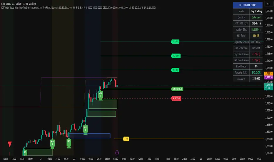
HMA V1 – Hull ATR SuperTrend with HTF Gate (Optimized for ES & NOverview
HMA V1 is a directional trend-following indicator designed for ES and NQ futures, combining a Hull ATR-based SuperTrend system with a Higher Timeframe HMA gate to filter entries. It can also be used on major indices and liquid stocks, but accuracy will be lower compared to ES/NQ optimization.
The indicator generates Buy and Sell signals based on the alignment of short-term price action with the higher timeframe trend filter. The logic is tuned for both scalping (more frequent signals, lower win rate) and day trading (fewer signals, higher win rate).
⸻
Signal Logic
1. Base Trend Engine:
• Uses an ATR-based Hull Moving Average (HMA) to dynamically calculate upper and lower bands for trend detection.
• Price crossing above the upper band in an uptrend = potential Buy trigger.
• Price crossing below the lower band in a downtrend = potential Sell trigger.
2. HTF HMA Gate Filter:
• All signals must pass a Higher Timeframe HMA check to confirm the broader trend direction.
• This acts as a noise filter, reducing false signals in choppy conditions.
3. Timeframe Behavior:
• Long Signals:
• Works best on 15m for day trading (higher win rate).
• 5m gives more scalping opportunities but with more false signals.
• If you want to trade longs, uncheck “Lock Long Signals to Specific Timeframe” for flexibility.
• Short Signals:
• Currently only coded to appear on 5m timeframe (bug to be fixed in future versions).
4. Partial Profit Logic (optional):
• Although not enforced in this version, the system is often used with partial profit-taking at fixed % targets and moving stops to breakeven after P1.
⸻
Best Use Practices:
• ES/NQ Futures: Best performance and most accurate filtering.
• Other Indices/Stocks: Usable but expect lower accuracy; re-tune ATR/HMA parameters for better results.
• Scalping: Use 5m for quicker entries, accept more noise.
• Day Trading: Use 15m for fewer, higher-probability setups.
• Always combine with your own market structure and higher timeframe bias for best results.
⸻
Known Bugs / Limitations:
• Long signal lock is sometimes overly restrictive — uncheck the “Lock Long Signals to Specific Timeframe” option to see more entries.
• Short signals currently only appear on the 5m timeframe.
Daily Short-Term Levels & Pivots with BOS/CHoCHDaily Short-Term Levels & Pivots with BOS/CHoCH
OverviewThis indicator combines essential tools for short-term and long-term traders, integrating Daily Short-Term Levels (NDCP), Pivots, and detection of Break of Structure (BOS) and Change of Character (CHoCH). Designed for TradingView, it’s ideal for scalping, day trading, and market structure analysis across any timeframe. It provides clear visualization of key levels, pivots, and structural patterns, with customizable settings to suit various trading styles.
Key Features
1. Daily Short-Term Levels (NDCP)
Purpose: Displays support and resistance levels based on the daily open, calculated as bullish and bearish percentages.
Levels: Up to 10 bullish levels (L+1 to L+10) and 10 bearish levels (L-1 to L-10), with configurable percentages (default: 0.236% to 2.618%).
Daily Open: A line marking the daily open price, with an option to display its value.
Customization:
Enable/disable levels and daily open.
Adjust colors, line thickness, and style (solid, dashed, dotted).
Position labels (Left, Right, Center) with adjustable offsets.
Show levels on all timeframes or only on daily and higher.
2. Pivots
Purpose: Identifies significant highs and lows (pivots) on the chart, useful for spotting reversal or continuation points.
Visualization: Green triangles (highs) and red triangles (lows) mark pivot points.
Customization:
Enable/disable pivot visualization.
Adjust the number of left and right bars to define pivots (default: 5 bars).
Change triangle colors.
3. Break of Structure (BOS) and Change of Character (CHoCH)
Purpose: Detects Break of Structure (BOS) and Change of Character (CHoCH) based on pivots, aiding in trend identification and reversals.
Visualization:
Resistance (green) and support (red) lines drawn from the latest pivots.
Labels for "BOS" (trend continuation), "CHoCH" (trend reversal), and "CD" (cross detected).
Historical CHoCH lines (optional, dotted) to track past structural changes.
Customization:
Enable/disable BOS/CHoCH and historical CHoCH lines.
Adjust colors and thickness for lines and labels.
Configure pivot sensitivity for BOS/CHoCH detection.
Indicator Settings
General Settings
Enable Daily Short-Term Levels: Toggle daily open-based levels.
Enable Pivots: Show triangles for significant highs/lows.
Enable BOS and CHoCH: Activate detection of structural breaks and reversals.
Daily Short-Term Levels
Show Daily Levels: Enable/disable bullish and bearish level lines.
Enable on All Timeframes: Display levels on intraday timeframes (e.g., 1M, 5M).
Text Color: Set the color for level labels.
Daily Open: Options to show the open line, its value, color, thickness, and style.
Label Alignment: Left (near daily open), Right (chart edge), or Center, with adjustable offsets.
Bullish/Bearish Levels: Configure percentages (0.236% to 2.618%), colors, line thickness, style, and value visibility.
Pivots and BOS/CHoCH
Pivot Colors: Green for highs, red for lows.
Left/Right Bars: Define pivot sensitivity (number of bars without breaking the high/low).
Show BOS: Enable labels for structural breaks.
Show Historical CHoCH Lines: Display dotted lines for past CHoCH events.
Colors and Thickness: Customize support, resistance, BOS, CHoCH lines, and "CD" labels.
How to Use
Add to Chart:
Search for "Daily Short-Term Levels & Pivots with BOS/CHoCH" in TradingView’s indicators and add it.
Initial Setup:
By default, daily levels, pivots, and BOS/CHoCH are enabled.
Adjust level percentages, colors, and styles to match your strategy.
Interpretation:
Daily Levels: Use bullish (L+1 to L+10) and bearish (L-1 to L-10) levels as support/resistance zones for entries, exits, or stops.
Pivots: Triangles mark key reversal or continuation points. Use them to confirm trends or identify high-probability zones.
BOS/CHoCH:
BOS: Indicates trend continuation (bullish if breaking a support, bearish if breaking a resistance).
CHoCH: Signals a potential trend reversal (bullish to bearish or vice versa).
CD: Confirms a pivot level cross, marking the start of a BOS or CHoCH.
Timeframes:
Ideal for scalping (1M, 5M) with "Enable on All Timeframes" activated.
Effective on higher timeframes (4H, D) for structural analysis.
Customization:
Adjust pivot bars (left_bars, right_bars) for more/less sensitivity.
Configure label offsets to avoid clutter on detailed charts.
Notes and Recommendations
Scalping: Use low timeframes (1M, 5M) with "Enable on All Timeframes" for visible daily levels. Set left_bars/right_bars to lower values (3-5) for faster pivots.
Swing Trading: On higher timeframes (4H, D), daily levels and BOS/CHoCH help identify key trend zones.
Avoid Clutter: If labels overlap, adjust offset_etiquetas, offset_derecha, or offset_centro, or select "Right" or "Center" alignment.
Testing: Experiment with percentage settings and styles to suit your market (Forex, stocks, crypto, etc.).
Limitations: On very low timeframes, pivots may be sensitive to noise. Increase left_bars/right_bars for more robust pivots.
Acknowledgments
Developed with passion for the TradingView community. I hope this indicator enhances your technical analysis! Feel free to leave feedback or contact me with suggestions or issues.
Happy trading!
Langlands-Operadic Möbius Vortex (LOMV)Langlands-Operadic Möbius Vortex (LOMV)
Where Pure Mathematics Meets Market Reality
A Revolutionary Synthesis of Number Theory, Category Theory, and Market Dynamics
🎓 THEORETICAL FOUNDATION
The Langlands-Operadic Möbius Vortex represents a groundbreaking fusion of three profound mathematical frameworks that have never before been combined for market analysis:
The Langlands Program: Harmonic Analysis in Markets
Developed by Robert Langlands (Fields Medal recipient), the Langlands Program creates bridges between number theory, algebraic geometry, and harmonic analysis. In our indicator:
L-Function Implementation:
- Utilizes the Möbius function μ(n) for weighted price analysis
- Applies Riemann zeta function convergence principles
- Calculates quantum harmonic resonance between -2 and +2
- Measures deep mathematical patterns invisible to traditional analysis
The L-Function core calculation employs:
L_sum = Σ(return_val × μ(n) × n^(-s))
Where s is the critical strip parameter (0.5-2.5), controlling mathematical precision and signal smoothness.
Operadic Composition Theory: Multi-Strategy Democracy
Category theory and operads provide the mathematical framework for composing multiple trading strategies into a unified signal. This isn't simple averaging - it's mathematical composition using:
Strategy Composition Arity (2-5 strategies):
- Momentum analysis via RSI transformation
- Mean reversion through Bollinger Band mathematics
- Order Flow Polarity Index (revolutionary T3-smoothed volume analysis)
- Trend detection using Directional Movement
- Higher timeframe momentum confirmation
Agreement Threshold System: Democratic voting where strategies must reach consensus before signal generation. This prevents false signals during market uncertainty.
Möbius Function: Number Theory in Action
The Möbius function μ(n) forms the mathematical backbone:
- μ(n) = 1 if n is a square-free positive integer with even number of prime factors
- μ(n) = -1 if n is a square-free positive integer with odd number of prime factors
- μ(n) = 0 if n has a squared prime factor
This creates oscillating weights that reveal hidden market periodicities and harmonic structures.
🔧 COMPREHENSIVE INPUT SYSTEM
Langlands Program Parameters
Modular Level N (5-50, default 30):
Primary lookback for quantum harmonic analysis. Optimized by timeframe:
- Scalping (1-5min): 15-25
- Day Trading (15min-1H): 25-35
- Swing Trading (4H-1D): 35-50
- Asset-specific: Crypto 15-25, Stocks 30-40, Forex 35-45
L-Function Critical Strip (0.5-2.5, default 1.5):
Controls Riemann zeta convergence precision:
- Higher values: More stable, smoother signals
- Lower values: More reactive, catches quick moves
- High frequency: 0.8-1.2, Medium: 1.3-1.7, Low: 1.8-2.3
Frobenius Trace Period (5-50, default 21):
Galois representation lookback for price-volume correlation:
- Measures harmonic relationships in market flows
- Scalping: 8-15, Day Trading: 18-25, Swing: 25-40
HTF Multi-Scale Analysis:
Higher timeframe context prevents trading against major trends:
- Provides market bias and filters signals
- Improves win rates by 15-25% through trend alignment
Operadic Composition Parameters
Strategy Composition Arity (2-5, default 4):
Number of algorithms composed for final signal:
- Conservative: 4-5 strategies (higher confidence)
- Moderate: 3-4 strategies (balanced approach)
- Aggressive: 2-3 strategies (more frequent signals)
Category Agreement Threshold (2-5, default 3):
Democratic voting minimum for signal generation:
- Higher agreement: Fewer but higher quality signals
- Lower agreement: More signals, potential false positives
Swiss-Cheese Mixing (0.1-0.5, default 0.382):
Golden ratio φ⁻¹ based blending of trend factors:
- 0.382 is φ⁻¹, optimal for natural market fractals
- Higher values: Stronger trend following
- Lower values: More contrarian signals
OFPI Configuration:
- OFPI Length (5-30, default 14): Order Flow calculation period
- T3 Smoothing (3-10, default 5): Advanced exponential smoothing
- T3 Volume Factor (0.5-1.0, default 0.7): Smoothing aggressiveness control
Unified Scoring System
Component Weights (sum ≈ 1.0):
- L-Function Weight (0.1-0.5, default 0.3): Mathematical harmony emphasis
- Galois Rank Weight (0.1-0.5, default 0.2): Market structure complexity
- Operadic Weight (0.1-0.5, default 0.3): Multi-strategy consensus
- Correspondence Weight (0.1-0.5, default 0.2): Theory-practice alignment
Signal Threshold (0.5-10.0, default 5.0):
Quality filter producing:
- 8.0+: EXCEPTIONAL signals only
- 6.0-7.9: STRONG signals
- 4.0-5.9: MODERATE signals
- 2.0-3.9: WEAK signals
🎨 ADVANCED VISUAL SYSTEM
Multi-Dimensional Quantum Aura Bands
Five-layer resonance field showing market energy:
- Colors: Theme-matched gradients (Quantum purple, Holographic cyan, etc.)
- Expansion: Dynamic based on score intensity and volatility
- Function: Multi-timeframe support/resistance zones
Morphism Flow Portals
Category theory visualization showing market topology:
- Green/Cyan Portals: Bullish mathematical flow
- Red/Orange Portals: Bearish mathematical flow
- Size/Intensity: Proportional to signal strength
- Recursion Depth (1-8): Nested patterns for flow evolution
Fractal Grid System
Dynamic support/resistance with projected L-Scores:
- Multiple Timeframes: 10, 20, 30, 40, 50-period highs/lows
- Smart Spacing: Prevents level overlap using ATR-based minimum distance
- Projections: Estimated signal scores when price reaches levels
- Usage: Precise entry/exit timing with mathematical confirmation
Wick Pressure Analysis
Rejection level prediction using candle mathematics:
- Upper Wicks: Selling pressure zones (purple/red lines)
- Lower Wicks: Buying pressure zones (purple/green lines)
- Glow Intensity (1-8): Visual emphasis and line reach
- Application: Confluence with fractal grid creates high-probability zones
Regime Intensity Heatmap
Background coloring showing market energy:
- Black/Dark: Low activity, range-bound markets
- Purple Glow: Building momentum and trend development
- Bright Purple: High activity, strong directional moves
- Calculation: Combines trend, momentum, volatility, and score intensity
Six Professional Themes
- Quantum: Purple/violet for general trading and mathematical focus
- Holographic: Cyan/magenta optimized for cryptocurrency markets
- Crystalline: Blue/turquoise for conservative, stability-focused trading
- Plasma: Gold/magenta for high-energy volatility trading
- Cosmic Neon: Bright neon colors for maximum visibility and aggressive trading
📊 INSTITUTIONAL-GRADE DASHBOARD
Unified AI Score Section
- Total Score (-10 to +10): Primary decision metric
- >5: Strong bullish signals
- <-5: Strong bearish signals
- Quality ratings: EXCEPTIONAL > STRONG > MODERATE > WEAK
- Component Analysis: Individual L-Function, Galois, Operadic, and Correspondence contributions
Order Flow Analysis
Revolutionary OFPI integration:
- OFPI Value (-100% to +100%): Real buying vs selling pressure
- Visual Gauge: Horizontal bar chart showing flow intensity
- Momentum Status: SHIFTING, ACCELERATING, STRONG, MODERATE, or WEAK
- Trading Application: Flow shifts often precede major moves
Signal Performance Tracking
- Win Rate Monitoring: Real-time success percentage with emoji indicators
- Signal Count: Total signals generated for frequency analysis
- Current Position: LONG, SHORT, or NONE with P&L tracking
- Volatility Regime: HIGH, MEDIUM, or LOW classification
Market Structure Analysis
- Möbius Field Strength: Mathematical field oscillation intensity
- CHAOTIC: High complexity, use wider stops
- STRONG: Active field, normal position sizing
- MODERATE: Balanced conditions
- WEAK: Low activity, consider smaller positions
- HTF Trend: Higher timeframe bias (BULL/BEAR/NEUTRAL)
- Strategy Agreement: Multi-algorithm consensus level
Position Management
When in trades, displays:
- Entry Price: Original signal price
- Current P&L: Real-time percentage with risk level assessment
- Duration: Bars in trade for timing analysis
- Risk Level: HIGH/MEDIUM/LOW based on current exposure
🚀 SIGNAL GENERATION LOGIC
Balanced Long/Short Architecture
The indicator generates signals through multiple convergent pathways:
Long Entry Conditions:
- Score threshold breach with algorithmic agreement
- Strong bullish order flow (OFPI > 0.15) with positive composite signal
- Bullish pattern recognition with mathematical confirmation
- HTF trend alignment with momentum shifting
- Extreme bullish OFPI (>0.3) with any positive score
Short Entry Conditions:
- Score threshold breach with bearish agreement
- Strong bearish order flow (OFPI < -0.15) with negative composite signal
- Bearish pattern recognition with mathematical confirmation
- HTF trend alignment with momentum shifting
- Extreme bearish OFPI (<-0.3) with any negative score
Exit Logic:
- Score deterioration below continuation threshold
- Signal quality degradation
- Opposing order flow acceleration
- 10-bar minimum between signals prevents overtrading
⚙️ OPTIMIZATION GUIDELINES
Asset-Specific Settings
Cryptocurrency Trading:
- Modular Level: 15-25 (capture volatility)
- L-Function Precision: 0.8-1.3 (reactive to price swings)
- OFPI Length: 10-20 (fast correlation shifts)
- Cascade Levels: 5-7, Theme: Holographic
Stock Index Trading:
- Modular Level: 25-35 (balanced trending)
- L-Function Precision: 1.5-1.8 (stable patterns)
- OFPI Length: 14-20 (standard correlation)
- Cascade Levels: 4-5, Theme: Quantum
Forex Trading:
- Modular Level: 35-45 (smooth trends)
- L-Function Precision: 1.6-2.1 (high smoothing)
- OFPI Length: 18-25 (disable volume amplification)
- Cascade Levels: 3-4, Theme: Crystalline
Timeframe Optimization
Scalping (1-5 minute charts):
- Reduce all lookback parameters by 30-40%
- Increase L-Function precision for noise reduction
- Enable all visual elements for maximum information
- Use Small dashboard to save screen space
Day Trading (15 minute - 1 hour):
- Use default parameters as starting point
- Adjust based on market volatility
- Normal dashboard provides optimal information density
- Focus on OFPI momentum shifts for entries
Swing Trading (4 hour - Daily):
- Increase lookback parameters by 30-50%
- Higher L-Function precision for stability
- Large dashboard for comprehensive analysis
- Emphasize HTF trend alignment
🏆 ADVANCED TRADING STRATEGIES
The Mathematical Confluence Method
1. Wait for Fractal Grid level approach
2. Confirm with projected L-Score > threshold
3. Verify OFPI alignment with direction
4. Enter on portal signal with quality ≥ STRONG
5. Exit on score deterioration or opposing flow
The Regime Trading System
1. Monitor Aether Flow background intensity
2. Trade aggressively during bright purple periods
3. Reduce position size during dark periods
4. Use Möbius Field strength for stop placement
5. Align with HTF trend for maximum probability
The OFPI Momentum Strategy
1. Watch for momentum shifting detection
2. Confirm with accelerating flow in direction
3. Enter on immediate portal signal
4. Scale out at Fibonacci levels
5. Exit on flow deceleration or reversal
⚠️ RISK MANAGEMENT INTEGRATION
Mathematical Position Sizing
- Use Galois Rank for volatility-adjusted sizing
- Möbius Field strength determines stop width
- Fractal Dimension guides maximum exposure
- OFPI momentum affects entry timing
Signal Quality Filtering
- Trade only STRONG or EXCEPTIONAL quality signals
- Increase position size with higher agreement levels
- Reduce risk during CHAOTIC Möbius field periods
- Respect HTF trend alignment for directional bias
🔬 DEVELOPMENT JOURNEY
Creating the LOMV was an extraordinary mathematical undertaking that pushed the boundaries of what's possible in technical analysis. This indicator almost didn't happen. The theoretical complexity nearly proved insurmountable.
The Mathematical Challenge
Implementing the Langlands Program required deep research into:
- Number theory and the Möbius function
- Riemann zeta function convergence properties
- L-function analytical continuation
- Galois representations in finite fields
The mathematical literature spans decades of pure mathematics research, requiring translation from abstract theory to practical market application.
The Computational Complexity
Operadic composition theory demanded:
- Category theory implementation in Pine Script
- Multi-dimensional array management for strategy composition
- Real-time democratic voting algorithms
- Performance optimization for complex calculations
The Integration Breakthrough
Bringing together three disparate mathematical frameworks required:
- Novel approaches to signal weighting and combination
- Revolutionary Order Flow Polarity Index development
- Advanced T3 smoothing implementation
- Balanced signal generation preventing directional bias
Months of intensive research culminated in breakthrough moments when the mathematics finally aligned with market reality. The result is an indicator that reveals market structure invisible to conventional analysis while maintaining practical trading utility.
🎯 PRACTICAL IMPLEMENTATION
Getting Started
1. Apply indicator with default settings
2. Select appropriate theme for your markets
3. Observe dashboard metrics during different market conditions
4. Practice signal identification without trading
5. Gradually adjust parameters based on observations
Signal Confirmation Process
- Never trade on score alone - verify quality rating
- Confirm OFPI alignment with intended direction
- Check fractal grid level proximity for timing
- Ensure Möbius field strength supports position size
- Validate against HTF trend for bias confirmation
Performance Monitoring
- Track win rate in dashboard for strategy assessment
- Monitor component contributions for optimization
- Adjust threshold based on desired signal frequency
- Document performance across different market regimes
🌟 UNIQUE INNOVATIONS
1. First Integration of Langlands Program mathematics with practical trading
2. Revolutionary OFPI with T3 smoothing and momentum detection
3. Operadic Composition using category theory for signal democracy
4. Dynamic Fractal Grid with projected L-Score calculations
5. Multi-Dimensional Visualization through morphism flow portals
6. Regime-Adaptive Background showing market energy intensity
7. Balanced Signal Generation preventing directional bias
8. Professional Dashboard with institutional-grade metrics
📚 EDUCATIONAL VALUE
The LOMV serves as both a practical trading tool and an educational gateway to advanced mathematics. Traders gain exposure to:
- Pure mathematics applications in markets
- Category theory and operadic composition
- Number theory through Möbius function implementation
- Harmonic analysis via L-function calculations
- Advanced signal processing through T3 smoothing
⚖️ RESPONSIBLE USAGE
This indicator represents advanced mathematical research applied to market analysis. While the underlying mathematics are rigorously implemented, markets remain inherently unpredictable.
Key Principles:
- Use as part of comprehensive trading strategy
- Implement proper risk management at all times
- Backtest thoroughly before live implementation
- Understand that past performance does not guarantee future results
- Never risk more than you can afford to lose
The mathematics reveal deep market structure, but successful trading requires discipline, patience, and sound risk management beyond any indicator.
🔮 CONCLUSION
The Langlands-Operadic Möbius Vortex represents a quantum leap forward in technical analysis, bringing PhD-level pure mathematics to practical trading while maintaining visual elegance and usability.
From the harmonic analysis of the Langlands Program to the democratic composition of operadic theory, from the number-theoretic precision of the Möbius function to the revolutionary Order Flow Polarity Index, every component works in mathematical harmony to reveal the hidden order within market chaos.
This is more than an indicator - it's a mathematical lens that transforms how you see and understand market structure.
Trade with mathematical precision. Trade with the LOMV.
*"Mathematics is the language with which God has written the universe." - Galileo Galilei*
*In markets, as in nature, profound mathematical beauty underlies apparent chaos. The LOMV reveals this hidden order.*
— Dskyz, Trade with insight. Trade with anticipation.

Emperor RSI CandleDescription:
The Emperor RSI Candle is a real-time, non-lagging trading indicator that colors candles based on RSI (Relative Strength Index) levels. It offers instant visual feedback on market momentum, making it easy to identify trend strength, overbought/oversold zones, and potential reversals with precision.
Unlike traditional RSI indicators, which display RSI values in a separate panel, Emperor RSI Candle integrates RSI signals directly into the candles, providing a cleaner, more intuitive charting experience. Its multi-timeframe RSI box shows RSI values across different timeframes, offering confluence confirmation for better trade decisions.
🔥 Emperor RSI Candle is original because it includes a multi-timeframe RSI box that displays RSI values from:
1 min → Monthly timeframes simultaneously.
📊 How this is unique:
Traders can instantly compare RSI values across different timeframes.
This helps them spot confluence and divergences, which is not possible with standard RSI indicators.
The multi-timeframe confluence feature makes the indicator highly effective for both short-term and long-term traders.
🚀 What the script does:
Real-time candle coloring based on RSI levels.
Multi-timeframe RSI box for confluence insights.
Customizable RSI settings for adaptability.
How it benefits traders:
Instant visual feedback for momentum and reversals.
No lag signals for precise trading decisions.
Flexible customization for different trading styles.
Unique visual signals:
Green, red, parrot green, and blue candles → Clearly indicating bullish/bearish momentum and overbought/oversold zones.
Multi-timeframe RSI box → For cross-timeframe confluence.
⚡️ 🔥 UNIQUE FEATURES 🔥:
✅ Multi-Timeframe RSI Box:
Displays RSI values from 1 min to monthly timeframes, helping traders confirm confluence across different timeframes.
✅ Fully Customizable RSI Levels & Display:
Modify RSI thresholds, source, and appearance to fit your trading style.
✅ Dynamic Candle Borders for Weak Signals:
Green border → Weak bullishness (RSI between 50-60).
Red border → Weak bearishness (RSI between 40-50).
✅ Lag-Free, Real-Time Accuracy:
No repainting or delay—instant visual signals for accurate decisions.
✅ Scalable for Any Trading Style:
Perfect for both intraday scalping and positional trading.
📊 🔥 HOW IT WORKS 🔥:
The indicator dynamically colors candles based on RSI values, providing real-time visual signals:
🟢 Above 60 RSI → Green candle:
Indicates bullish momentum, signaling potential upward continuation.
🟩 Above 80 RSI → Parrot green candle:
Overbought zone → Possible reversal or profit booking.
🟥 Below 40 RSI → Red candle:
Signals bearish momentum, indicating potential downward continuation.
🔵 Below 20 RSI → Blue candle:
Oversold zone → Possible reversal opportunity.
🔲 Neutral candles:
50-60 RSI → Green border: Weak bullishness.
40-50 RSI → Red border: Weak bearishness.
📊 🔥 MULTI-TIMEFRAME RSI BOX 🔥:
The Emperor RSI Candle includes an RSI box displaying multi-timeframe RSI values from 1 min to monthly. This provides:
✅ Confluence confirmation:
Compare RSI across multiple timeframes to strengthen trade conviction.
✅ Spot divergences:
Identify hidden trends by comparing smaller and larger timeframes.
✅ Validate trade entries/exits:
Use higher timeframe RSI to confirm smaller timeframe signals
⚙️ 🔥 HOW TO USE IT 🔥:
To maximize the accuracy and clarity of Emperor RSI Candle, follow these steps:
🔧 STEP 1: Chart Settings Configuration
Go to Chart Settings → Symbols
Uncheck the following options:
Body
Borders
Wick
✅ This ensures that only the Emperor Candle colors are visible, making the signals clear and distinct.
🔧 STEP 2: Style Settings for Emperor Candle
After applying the Emperor RSI Candle:
Go to Settings → Style tab
Wick section:
Select Color 2 and Color 3 → Set Opacity to 100%.
Border section:
Select Color 2 and Color 3 → Set Opacity to 100%.
✅ This ensures the candles display with full visibility and accurate colors.
⚙️ 🔥 CUSTOMIZATION OPTIONS 🔥:
Emperor RSI Candle offers full flexibility to match your trading style:
✅ RSI Length:
Modify the period used for RSI calculation (default: 10).
✅ Top & Bottom Levels:
Adjust the overbought (default: 80) and oversold (default: 20) thresholds.
✅ Intermediate Levels:
Up Level: Default: 60 → Bullish RSI threshold.
Down Level: Default: 40 → Bearish RSI threshold.
Mid Level: Default: 50 → Neutral zone.
✅ RSI Source:
Select the price source for RSI calculation (Close, Open, High, Low).
✅ RSI Period:
Customize the RSI calculation period (default: 10).
✅ Font Size:
Adjust the RSI box font size for better visibility.
✅ Box Position:
Choose where to display the RSI box:
Top Left / Top Center / Top Right
Bottom Left / Bottom Center / Bottom Right
💡 🔥 HOW IT IMPROVES TRADING 🔥:
✅ Clear trend identification:
Instantly recognize bullish, bearish, or neutral conditions through candle colors.
✅ Precise entries and exits:
Spot overbought and oversold zones with visual clarity.
✅ Multi-timeframe confirmation:
Validate trades with RSI confluence across multiple timeframes.
✅ No lag, real-time accuracy:
Immediate visual signals for faster and more reliable trade decisions.
✅ Customizable settings:
Tailor the indicator to fit your trading strategy and preferences.
✅ Works for all trading styles:
Suitable for scalping, day trading, and swing trading.
🔥How Traders Can Use Emperor RSI Candle for Trading:
🟢 Green Candles (Above 60 RSI) → Bullish Momentum:
Indicates strong upward movement → Ideal for long entries.
Traders can hold until RSI approaches 80 for profit booking.
🟥 Red Candles (Below 40 RSI) → Bearish Momentum:
Signals strong downward movement → Ideal for short trades.
Traders can exit or book profits near RSI 20.
2. Spotting Overbought and Oversold Zones for Reversals:
🟩 Parrot Green Candles (Above 80 RSI) → Overbought Zone:
Indicates potential for reversals or profit booking.
Traders can tighten stop-losses or exit positions.
🔵 Blue Candles (Below 20 RSI) → Oversold Zone:
Signals a potential reversal opportunity.
Traders can look for buy signals with confluence confirmation.
3. Catching Weak Bullish and Bearish Trends with Border Colors:
🟢 Green Border (RSI 50-60) → Weak Bullishness:
Indicates mild upward momentum.
Traders can consider cautious long entries.
🔴 Red Border (RSI 40-50) → Weak Bearishness:
Indicates mild downward pressure.
Traders can consider cautious short entries.
4. Using the RSI Multi-Timeframe Box for Confluence:
✅ Displays RSI values from 1 min to monthly timeframes.
Usage:
Confluence confirmation:
Multiple timeframes showing bullish RSI → Strong uptrend → Reliable buy signals.
Multiple timeframes showing bearish RSI → Strong downtrend → Reliable sell signals.
Spotting divergences:
If lower timeframes are bullish but higher timeframes are bearish, it indicates a potential reversal.
5. Customization Tips for Different Trading Styles:
✅ For Scalping:
Use a smaller RSI period (9-10) for faster signals.
Check the multi-timeframe RSI box to confirm signals quickly.
✅ For Swing Trading:
Use the default RSI period (14-15) for more accurate signals.
Focus on higher timeframes (1 hr, 4 hr, daily) for stronger trend confirmation.

Triad Trade MatrixOverview
Triad Trade Matrix is an advanced multi-strategy indicator built using Pine Script v5. It is designed to simultaneously track and display key trading metrics for three distinct trading styles on a single chart:
Swing Trading (Swing Supreme):
This mode captures longer-term trends and is designed for trades that typically span several days. It uses customizable depth and deviation parameters to determine swing signals.
Day Trading (Day Blaze):
This mode focuses on intraday price movements. It generates signals that are intended to be executed within a single trading session. The parameters for depth and deviation are tuned to capture more frequent, shorter-term moves.
Scalping (Scalp Surge):
This mode is designed for very short-term trades where quick entries and exits are key. It uses more sensitive parameters to detect rapid price movements suitable for scalping strategies.
Each trading style is represented by its own merged table that displays real-time metrics. The tables update automatically as new trading signals are generated.
Key Features
Multi-Style Tracking:
Swing Supreme (Large): For swing trading; uses a purple theme.
Day Blaze (Medium): For day trading; uses an orange theme.
Scalp Surge (Small): For scalping; uses a green theme.
Real-Time Metrics:
Each table displays key trade metrics including:
Entry Price: The price at which the trade was entered.
Exit Price: The price at which the previous trade was exited.
Position Size: Calculated as the account size divided by the entry price.
Direction: Indicates whether the trade is “Up” (long) or “Down” (short).
Time: The time when the trade was executed (formatted to hours and minutes).
Wins/Losses: The cumulative number of winning and losing trades.
Current Price & PnL: The current price on the chart and the profit/loss computed relative to the entry price.
Duration: The number of bars that the trade has been open.
History Column: A merged summary column that shows the most recent trade’s details (entry, exit, and result).
Customizability:
Column Visibility: Users can toggle individual columns (Ticker, Timeframe, Entry, Exit, etc.) on or off according to their preference.
Appearance Settings: You can customize the table border width, frame color, header background, and text colors.
History Toggle: The merged history column can be enabled or disabled.
Chart Markers: There is an option to show or hide chart markers (labels and lines) that indicate trade entries and exits on the chart.
Trade History Management:
The indicator maintains a rolling history (up to three recent trades per trading style) and displays the latest summary in the merged table.
This history column provides a quick reference to recent performance.
How It Works
Signal Generation & Trade Metrics
Trade Entry/Exit Calculation:
For each trading style, the indicator uses built-in functions (such as ta.lowestbars and ta.highestbars) to analyze price movements. Based on a customizable "depth" and "deviation" parameter, it determines the point of entry for a trade.
Swing Supreme: Uses larger depth/deviation values to capture swing trends.
Day Blaze: Uses intermediate values for intraday moves.
Scalp Surge: Uses tighter parameters to pick up rapid price changes.
Metrics Update:
When a new trade signal is generated (i.e., when the trade entry price is updated), the indicator calculates:
The current PnL as the difference between the current price and the entry price (or vice versa, depending on the trade direction).
The duration as the number of bars since the trade was opened.
The position size using the formula: accountSize / entryPrice.
History Recording:
Each time a new trade is triggered (i.e., when the entry price is updated), a summary string is created (showing entry, exit, and win/loss status) and appended to the corresponding trade history array. The merged table then displays the latest summary from this history.
Table Display
Merged Table Structure:
Each trading style (Swing Supreme, Day Blaze, and Scalp Surge) is represented by a table that has 15 columns. The columns are:
Trade Type (e.g., Swing Supreme)
Ticker
Timeframe
Entry Price
Exit Price
Position Size
Direction
Time of Entry
Account Size
Wins
Losses
Current Price
Current PnL
Duration (in bars)
History (the latest trade summary)
User Customization:
Through the settings panel, users can choose which columns to display.
If a column is toggled off, its cells will remain blank, allowing traders to focus on the metrics that matter most to them.
Appearance & Themes:
The table headers and cell backgrounds are customizable via color inputs. The trading style names are color-coded:
Swing Supreme (Large): Uses a purple theme.
Day Blaze (Medium): Uses an orange theme.
Scalp Surge (Small): Uses a green theme.
How to Use the Indicator
Add the Indicator to Your Chart:
Once published, add "Triad Trade Matrix" to your TradingView chart.
Configure the Settings:
Adjust the Account Size to match your trading capital.
Use the Depth and Deviation inputs for each trading style to fine-tune the signal sensitivity.
Toggle the Chart Markers on if you want visual entry/exit markers on the chart.
Customize which columns are visible via the column visibility toggles.
Enable or disable the History Column to show the merged trade history in the table.
Adjust the appearance settings (colors, border width, etc.) to suit your chart background and preferences.
Interpret the Tables:
Swing Supreme:
This table shows metrics for swing trades.
Look for changes in entry price, PnL, and trade duration to monitor longer-term moves.
Day Blaze:
This table tracks day trading activity.It will update more frequently, reflecting intraday trends.
Scalp Surge:
This table is dedicated to scalping signals.Use it to see quick entry/exit data and rapid profit/loss changes.
The History column (if enabled) gives you a snapshot of the most recent trade (e.g., "E:123.45 X:124.00 Up Win").
Use allerts:
The indicator includes alert condition for new trade entries(both long and short)for each trading style.
Summary:
Triad Trade Matrix provides an robust,multi-dimensional view of your trading performance across swing trading, day trading, and scalping.
Best to be used whith my other indicators
True low high
Vma Ext_Adv_CustomTbl
This indicator is ideal for traders who wish to monitor multiple trading styles simultaneously, with a clear, technical, and real-time display of performance metrics.
Happy Trading!

PowerStrike Pro V3Purpose of the Script
"PowerStrike Pro V3" is a custom indicator designed to generate high-accuracy buy/sell signals by combining multiple technical analysis tools. This script is optimized for trend-following, scalping, and support/resistance strategies. It integrates popular indicators such as RSI, Supertrend, Bollinger Bands, and dynamic support/resistance levels to provide traders with reliable signals.
Components of the Script and How It Works
The script combines the following key components, each contributing to the total signal strength based on user-defined weights. Below is a detailed explanation of how each component works and how it contributes to the overall score:
1. RSI (Relative Strength Index)
How It Works:
RSI identifies overbought (above 70) and oversold (below 30) conditions in the market.
The script uses RSI values to measure the strength of the trend and generate buy/sell signals.
When RSI is in the oversold zone, it strengthens buy signals. When in the overbought zone, it strengthens sell signals.
Contribution to Total Score:
RSI's contribution is calculated based on its strength in the oversold or overbought zones.
The final contribution is weighted by the user-defined "RSI Weight" and added to the total score.
2. Support and Resistance Levels
How It Works:
The script dynamically calculates recent peaks (resistance) and valleys (support) using a user-defined lookback period.
These levels are plotted on the chart as dynamic support and resistance lines.
The proximity of the price to these levels strengthens the signals.
Contribution to Total Score:
If the price is near a support level, it increases the strength of buy signals.
If the price is near a resistance level, it increases the strength of sell signals.
The contribution is weighted by the "Support/Resistance Weight" and added to the total score.
3. Supertrend Indicator
How It Works:
Supertrend uses ATR (Average True Range) and a multiplier to determine the trend direction.
The script uses Supertrend's direction changes as a filter for buy/sell signals.
When Supertrend is in an uptrend, it strengthens buy signals. When in a downtrend, it strengthens sell signals.
Contribution to Total Score:
Supertrend's contribution is weighted by the "Supertrend Weight" and added to the total score.
4. Bollinger Bands
How It Works:
Bollinger Bands measure price volatility and identify potential support/resistance levels.
The script generates buy signals when the price crosses above the lower band and sell signals when it crosses below the upper band.
Contribution to Total Score:
A crossover above the lower band increases the strength of buy signals.
A crossover below the upper band increases the strength of sell signals.
The contribution is weighted by the "Bollinger Bands Weight" and added to the total score.
5. Order Book Data
How It Works:
The script analyzes bid/ask volumes from the order book to assess market depth.
High bid volume near support levels strengthens buy signals.
High ask volume near resistance levels strengthens sell signals.
Contribution to Total Score:
Order book data is weighted by the "Order Book Weight" and added to the total score.
Signal Types and Their Meaning
The script generates two types of signals:
Weak Signals:
Weak signals indicate the early stages of a trend or minor corrections.
These are represented by small green (buy) or red (sell) triangles on the chart.
Weak signals are suitable for low-risk trades or scalping strategies.
Strong Signals:
Strong signals indicate the continuation of a trend or significant reversal points.
These are represented by larger green (buy) or red (sell) arrows on the chart.
Strong signals are suitable for higher-risk, higher-reward trades.
Total Score Calculation
The script calculates the total buy and sell scores by combining the weighted contributions of all components. The formula for the total score is as follows:
Copy
Total Buy Score = (RSI Buy Strength * RSI Weight) + (Support Strength * Support/Resistance Weight) + (Supertrend Buy Strength * Supertrend Weight) + (Bollinger Buy Strength * Bollinger Weight) + (Order Book Buy Strength * Order Book Weight)
Total Sell Score = (RSI Sell Strength * RSI Weight) + (Resistance Strength * Support/Resistance Weight) + (Supertrend Sell Strength * Supertrend Weight) + (Bollinger Sell Strength * Bollinger Weight) + (Order Book Sell Strength * Order Book Weight)
The total score is then compared to user-defined thresholds to generate weak or strong signals. For example:
A total buy score above 80% generates a weak buy signal.
A total buy score above 85% generates a strong buy signal.
Recommended Strategies
Trend Following: Use strong signals to trade in the direction of the main trend.
Scalping: Use weak signals to capture short-term price movements.
Support/Resistance Trading: Use the dynamically plotted support and resistance levels to identify reversal points.
How to Use the Script
Weight Settings:
Adjust the weights for each component (RSI, Supertrend, Bollinger Bands, etc.) in the script settings to customize the signal strength calculation.
Signal Thresholds:
Set the thresholds for weak and strong signals (e.g., 80% for weak signals, 85% for strong signals).
Chart Visualization:
The script automatically plots buy/sell signals on the chart. Use these signals in conjunction with your trading strategy.
Unique Features of the Script
Dynamic Weighting: Each component's contribution to the total score can be customized using user-defined weights.
Integrated Support/Resistance: The script dynamically calculates and plots support/resistance levels, enhancing signal accuracy.
Order Book Analysis: The inclusion of order book data provides additional confirmation for signals.
Final Notes
While "PowerStrike Pro V3" combines multiple indicators to generate reliable signals, no indicator guarantees 100% accuracy. Always use proper risk management and combine this script with other analysis tools for the best results

OnChart - SuiteThe Motivation Behind OnChart Suite
In the dynamic world of trading, the ability to interpret market trends and make timely decisions is paramount. OnChart Suite was developed to empower traders by offering a comprehensive suite of tools that combine advanced analysis with intuitive user experience. The goal is to support traders in navigating complex market environments, helping them refine their strategies and gain a deeper understanding of price movements.
█ Key Features
🤖 ApexAlphaClouds: Identifies potential price rejections or breakthroughs by analyzing dynamic price ranges.
🔢 Matrix Algo: Offers multi-timeframe trend sentiment analysis using key market indicators.
🎯 CandleSniper: Detects key decision points based on phase calculation and Fibonacci levels.
🧲 MagnetZone Horizon: Highlights strategic price zones that can act as smart FVGs.
🟢 NeonZenith: Combines trend analysis with decision points and Fibonacci targets.
█ How These Tools Work Together
OnChart Suite integrates each of these powerful tools to provide traders with a comprehensive analysis framework. By combining the ApexAlphaClouds for price movement intuition, the Matrix Algo for trend sentiment, the CandleSniper for decision points, the MagnetZone Horizon for strategic price zones, and the NeonZenith for trend and target analysis, traders can develop robust trading strategies. This integration ensures that traders have access to multiple perspectives on market conditions, enhancing their ability to make calculated decisions.
█ Detailed Feature Explanations:
--------------🤖 ApexAlphaClouds --------------
How the Tool Can Help Traders
The `ApexAlphaClouds` indicator is designed to assist traders by identifying dynamic price ranges where the market tends to consolidate, which are critical for making informed trading decisions. The tool uses an ML algorithm to analyze high-price data over a set period and determines key levels on the chart, which are visualized as "clouds." These clouds represent potential support and resistance areas, where price action is likely to pause, reverse, or experience increased volatility.
The primary benefit for traders is the ability to identify these key zones in real-time, allowing them to anticipate potential market movements and plan trades accordingly. For example, if a trader sees that price is approaching a cloud boundary, they might expect a reversal or a breakout, depending on the broader market context. This can be particularly useful in range-bound markets or when looking for potential entry and exit points in trending markets.
How Traders Can Use the Indicator
Identifying Support and Resistance:
The clouds plotted by the `ApexAlphaClouds` indicator can be used to identify dynamic support and resistance levels. Traders can watch how the price reacts when it enters these clouds. If the price bounces off a lower cloud, it may suggest support, while a rejection from an upper could indicate resistance.
Trend Reversals and Continuations:
The indicator's middle cloud can help identify potential trend reversals. If price moves through the middle cloud and continues in the same direction, it could indicate a trend continuation. Conversely, if price reverses within the middle cloud, it might signal a potential trend reversal.
Volatility and Breakouts:
The distance between the upper and lower clouds can give traders an idea of market volatility. Narrow clouds suggest low volatility, which may precede a breakout, while wide clouds indicate higher volatility, where prices might oscillate within the range.
Settings Input and Their Effects
’ApexAlphaClouds` (Toggle) -This setting allows the trader to enable or disable the `ApexAlphaClouds` indicator on their chart.
Effect: When enabled, the clouds representing dynamic price ranges will be displayed on the chart. Disabling this will hide the indicator’s outputs.
Target Area Size - This setting determines the number of bars (length) the algorithm considers when collecting high prices for clustering.
Effect: A larger value will make the indicator consider a broader historical range, potentially smoothing out the clouds and identifying longer-term price ranges. A smaller value will focus on more recent price action, which might be useful for short-term trading strategies.
Accuracy - This setting specifies the number of groups that the algorithm will try to identify within the selected data range.
Effect: A higher value increases the number of identified clusters, making the indicator more sensitive to minor fluctuations in price. This can be useful for traders looking to identify multiple potential reversal points. A lower value will focus on the most prominent price clusters, which may be more relevant for long-term analysis.
Maximum Calibration - This setting controls the maximum number of iterations the machine learning algorithm will perform to find the optimal clusters.
Effect: Increasing allows the algorithm more time to refine the clusters, potentially leading to more accurate and stable clouds. However, it may also increase the computation time. Decreasing this value may speed up the process but could result in less accurate clustering.
Wide Range Calibration - This setting determines the maximum number of bars the algorithm will consider when applying the clustering.
Effect: A larger value allows the algorithm to analyse a wider range of historical data, which can help identify significant long-term price ranges. A smaller value will limit the analysis to more recent data, which might be preferable for traders focused on short-term movements.
Smoothing Factor - This setting applies a smoothing function to the clouds, reducing noise and making the price ranges more visually consistent.
Effect :A higher smoothing factor will produce smoother, more consistent clouds, which might be beneficial in volatile markets to avoid false signals. A lower smoothing factor will make the clouds more responsive to recent price changes, which could be useful for scalping or short-term trading strategies.
Usage Scenarios
Scalping:
Traders using short-term strategies might set Accuracy to a smaller value and reduce the Smoothing Factor to make the clouds more responsive to recent price action. This helps in identifying quick reversal points.
Swing Trading:
Swing traders could use a larger Target Area Size and increase Accuracy to identify key price ranges that have held over longer periods. Adjusting Wide Range Calibration to a higher value allows them to consider broader historical trends.
Trend Following:
By observing how price interacts with the clouds, trend-following traders can look for breakouts or breakdowns from the clouds to confirm entry points in the direction of the trend.
Volatility Management:
Traders can monitor the width of the clouds to gauge market volatility and adjust their strategies accordingly, tightening stops in narrow cloud ranges or widening them in broader ranges.
Conclusion
The `ApexAlphaClouds` indicator is a powerful tool for traders looking to analyze price action with a focus on dynamic price ranges. By understanding and utilizing the settings, traders can customize the indicator to fit their specific trading strategies, whether they are scalping, swing trading, or trend following. The key is to adjust the inputs based on the market context and trading goals, using the clouds as a visual guide to anticipate market movements and make informed decisions.
--------------🔢 Matrix Algo --------------
Matrix Algo is a multi-timeframe (MTF) tool designed to provide traders with a comprehensive view of market conditions across different timeframes using a combination of popular technical indicators. The indicator aggregates data from RSI, MACD, and Bollinger Bands across multiple timeframes, presenting this information in a matrix format to help traders make informed decisions based on a complete market overview. This allows traders to quickly assess the overall market sentiment and trend direction without having to manually check each indicator on different timeframes. By offering a bird’s-eye view of the market conditions.
How Traders Can Use Matrix Algo?
Identify Trends and Reversals: By analysing the matrix, traders can identify whether the market is bullish, bearish, or in consolidation across different timeframes.
Confirm Signals: The Matrix Algo can confirm signals from other trading strategies by providing additional context from multiple indicators across several timeframes.
Settings:
Toggle individual timeframes - (Monthly, Weekly, 3D, Daily, 4h, etc.) to include or exclude from the matrix.
Effect: The matrix displays whether the market conditions are favorable (green) or unfavorable (red) for each indicator and timeframe combination. This color-coded information helps traders quickly assess the market situation.
--------------🎯 CandleSniper --------------
Overview:
The CandleSniper indicator is designed to identify potential turning points in the market by combining various technical analysis tools. It leverages a combination of the MACD indicator, advanced phase analysis technique, and Fibonacci levels to highlight moments where price action may be reversing. This helps traders spot divergence opportunities and set potential target levels.
Explanation
MACD Divergence with Phase Analysis:
The indicator leverages the MACD (Moving Average Convergence Divergence) to identify divergences, which can indicate potential reversal points in the market. The MACD is computed using standard short and long lengths, along with a signal line.
An advanced phase analysis technique is employed to measure the difference between price and its moving averages, enabling the identification of cyclical turning points in the market
A potential bullish decision point is identified when the MACD line crosses above the signal line during a cyclical turning point. Conversely, a potential bearish decision point is identified when the MACD line crosses below the signal line during a cyclical turning point.
Fibonacci Levels for Targeting:
The indicator calculates Fibonacci extension levels based on recent price swings to provide target levels for potential price movements.
For a bullish setup, the indicator identifies levels above the current price as potential targets, while for a bearish setup, it identifies levels below the current price.
Fib Filter Line:
The Fib Filter Line is represented in purple for bullish turning points and white for bearish turning points. These lines serve as additional filters to help traders identify stronger, more reliable turning points in the market. Designed for those who prefer a more conservative approach, the Fib Filter Line offers an extra layer of confirmation based on price movements, allowing traders to filter out weaker signals and focus on more significant market shifts.
Inputs and Settings:
lookbackPeriod: Defines the period over which the indicator looks back to calculate the Fibonacci levels. Adjusting this setting can change the sensitivity of the decision points.
Dimmer and DimmerPeriod: These settings control the smoothing applied to the price data before the phase calculation. They help in reducing noise and ensuring that only significant price movements are considered for decision points.
How to Use:
Traders can use the CandleSniper indicator to identify potential decision points by observing the color changes on the bars and the plotted Fibonacci levels:
🟢 Bullish Decision Points:
When the indicator detects a bullish divergence, it highlights the bars in purple and plots potential upward Fibonacci levels as targets.
🔴 Bearish Decision Points:
When a bearish divergence is detected, the indicator highlights the bars in white and plots downward Fibonacci levels as targets.
These decision points can help traders identify when the market might be ready for a reversal or continuation or even use as a start point from where the trader can start his own analysis
Combining with Other Tools
The CandleSniper indicator can be combined with other OnChart tools to create a comprehensive trading framework:
🔢 Matrix Algo:
Use Matrix Algo to assess the overall market sentiment across multiple timeframes, then apply CandleSniper for pinpointing specific entry or exit points.
🤖 ApexAlphaClouds:
Overlay ApexAlphaClouds to visualise dynamic price ranges, using CandleSniper to identify decision points within these ranges.
This combination allows traders to develop a robust trading strategy that considers broader market trends and specific price action signal intuition.
--------------🧲 MagnetZone Horizon --------------
Overview:
The MagnetZone Horizon indicator is a specialized tool designed to identify potential gaps between two significant changes in the Average True Range (ATR). These gaps, calculated dynamically, serve as areas where the price might react, often acting as smart Fair Value Gaps (FVG). By highlighting these zones, traders can gain insights into where the market might find support, resistance, or potential reversal points.
How Traders Can Use This Indicator:
Identifying Smart Fair Value Gaps:
The MagnetZone Horizon indicator helps traders locate gaps between ATR shifts that are likely to act as significant decision points. These gaps can indicate areas where price corrections or consolidations might occur, providing opportunities for strategic entries or exits.
Adaptive Support and Resistance:
The levels calculated by the indicator adjust according to market volatility, offering dynamic support and resistance zones. These zones are particularly useful in identifying potential reversals or continuation patterns.
Volatility-Based Trading:
Since the indicator bases its calculations on ATR, it inherently adjusts to market conditions, allowing traders to align their strategies with the current level of volatility. This adaptability makes it suitable for both trending and range-bound markets.
Settings and Their Impact:
MagnetZone Horizon (Enable/Disable): This toggle allows traders to activate or deactivate the visualization of the MagnetZone Horizon on their charts.
Factor: This setting multiplies the ATR to scale the detected gaps. A higher factor results in broader zones, which might capture more significant market movements, while a lower factor creates tighter zones for more precise analysis.
Factor=5
Factor=7
Division: This setting works in conjunction with the Factor to further refine the gap calculations. Adjusting the Division setting allows traders to fine-tune how sensitive the indicator is to ATR changes, which can help in pinpointing more precise smart FVGs.
Use Cases:
Gap Trading:
Traders can use the identified gaps as potential areas to enter or exit trades, particularly if the price approaches these smart FVGs. The idea is to capitalize on the likelihood that the market will react to these gaps.
Reversal Identification:
The zones marked by the MagnetZone Horizon can indicate potential reversal points, especially in volatile markets where significant ATR changes suggest a shift in market sentiment.
Trend Continuation or Rejection:
By monitoring how the price interacts with these dynamically calculated zones, traders can assess whether a trend is likely to continue or reverse, aiding in more informed trading decisions.
The MagnetZone Horizon indicator is particularly useful for traders looking to identify significant gaps in market activity that are influenced by volatility. These smart FVGs provide a deeper understanding of where the market might react, offering a valuable tool for enhancing trading strategies and adds another strategic piece to the puzzle in the OnChart Suite.
--------------🟢NeonZenith Indicator--------------
Overview:
NeonZenith is a tool designed to provide traders with a better understanding of market trends and potential decision points by utilising multiple elements, including EMAs and Fibonacci levels. This indicator identifies key structures in recent price movements, helping traders recognize potential trend shifts and generate target levels for their trading strategies. Additionally, NeonZenith incorporates elements from the ApexAlphaCloud to enhance the interpretation of market sentiment, particularly regarding price rejections or breakthroughs.
Key Features:
Trend Direction Identification:
NeonZenith uses EMAs to help traders gauge the overall trend direction. By analysing the relationship between different EMAs, the tool highlights potential points where trends may strengthen or reverse, offering decision points for traders to consider in their strategies.
Decision Points:
The tool generates decision points based on EMA interactions, providing traders with crucial levels that may indicate potential market entries or exits. These decision points are derived from the intersection of EMAs, which are known for their reliability in identifying trend shifts.
Fibonacci Target Levels:
Based on the identified price structures, NeonZenith calculates Fibonacci levels that serve as potential target areas. These levels help traders set realistic goals for their trades, whether they are looking to take profits or manage risks effectively.
ApexAlphaCloud Integration:
The tool integrates a middle cloud from the ApexAlphaCloud, which helps traders anticipate potential price rejections or breakthroughs. This cloud provides additional context to the trend analysis, enhancing traders' ability to gauge the market's sentiment and make them think about potential price movements.
Settings:
Left and Right Border Width:
These settings control the lookback period for identifying significant price structures. By adjusting these parameters, traders can fine-tune the sensitivity of the indicator to recent price movements.
Fibonacci Calculation:
The tool calculates Fibonacci levels based on recent lows and highs, offering multiple targets for both long and short positions. These targets include various levels that traders can use to plan their entry, take-profit, and stop-loss orders.
Plotting and Visualization:
NeonZenith provides clear visual cues on the chart, including shapes and labels to mark significant decision points and target areas. These visual elements help traders quickly interpret the information provided by the indicator and apply it to their trading strategies.
How to Use NeonZenith:
Trend Identification:
Use the tool to identify the current trend direction by observing the interaction between the EMAs ,the flag sign and triangle, flag represent general trend changes and the triangle represents minor and inside trend changes.
Fibonacci Levels:
Use the generated Fibonacci levels to set target areas for your trades. These levels can guide you in deciding where to take profits or place stop-loss orders.
Sentiment Gauge:
Utilise the middle cloud from the ApexAlphaCloud to assess potential price rejections or breakthroughs. This feature provides additional insight into the strength of the current trend and helps you anticipate possible market reversals.
Conclusion:
NeonZenith is a versatile and simple tool designed to support traders in understanding market trends, identifying decision points, and setting realistic targets based on Fibonacci levels. Its integration with the ApexAlphaCloud enhances the tool's ability to provide a comprehensive view of market sentiment, making it a valuable addition to any trader's toolkit.

Auto Trend Lines Breakouts and Bounces Signals and AlertsAuto Trend Lines Breakout with Confirmation Bounce Signals and Alerts
This indicator draws trend lines automatically based on the 2 pivot points, which are calculated based on the specified number of bars (length), which is of course customizable. The indicator then shows you when these trend lines get touched (potential bounce) or “almost touched” (Yes! The script can do that as well!) by the current price of the instrument or broken and then confirmed by the “after break come back touch” – classic! Everything is shown on the chart, and for everything - alarms can be set up with just a few clicks!
Now there are 2 modes here (you can hide all signals as well and just use the trend lines):
1) Current/recent trend lines only: will only show 2 current upper/lower trend lines as well as previous 2 for reference.
2) All time (historical) trend lines: will show 2 current upper/lower trend lines as well as the historical lines from the past and these lines are often very respected by the price!
Besides that, you can set the indicator to show you exactly what you want: Just the trend lines touches/bounces, breaks with confirmation touches/bounces or BOTH.
In addition to that, you can set the indicator to only show you these touches/bounces and breaks with additional confirmations, only if confirmed by :
- Moving Average (customizable length): LONG signals based off the trend lines will only be shown if above EMA, SHORT if below.
- Signals where the candle color confirms the direction of the trade, but the candle type is opposite (like a green colored bearish hammer for example) will be avoided (such candles can be very uncertain/deceptive)
- Signals where the signal candle is doji will be avoided (uncertain)
- Signals will only be shown if supported by the trend line slope (for example, with this feature turned on, if there is an upper line trend line, but the line is actually above, touching the top of the candles and the price touches/crosses it or it gets broken – there will be no signal as even though the trend line is an upper line above candles, it’s slope is positive (going up), if the slope would be down, like a classical down/bearish trend line and the price touches/bounces off it or the line gets broken, only then the indicator will show the signal/alert.
- OFFSET: this one is really cool! With this feature you can hunt these conditions when the price comes very near the trend line, but never touches it. With this setting turned on, with a correct offset amount – you will be able to catch these! You will need to play around with the offset amount, depending on the timeframe/instrument, be quick-n-easy!
The indicator also includes Round Number lines on the chart, which are customizable for any instrument. As you know round numbers are appreciated by the price and can be very nicely used with this indicator looking for combos or using trend lines for signals, while round numbers as partial profit price targets or stop-loss areas.
Important economic events are also shown on the chart as red vertical lines (during these events, volatility can suddenly spike, so it’s best to stay away from trading!)
This is a very powerful indicator with plenty of customizations to find the best approaches, can be used for any instrument and on any timeframe! Awesome for scalping and could be used with swing trading as well! Enjoy!
To add the alerts
-Right-click anywhere on the TradingView chart
-Click on Add alert
-Condition: Auto Trend Lines Breakout with Confirmation Bounce Signals and Alerts
-Alert name: DO NOT TOUCH THIS
-Hit “Create”
-Note: If you change ANY Settings within the indicator – you must DELETE the current alert and create a new one per steps above, otherwise it will continue triggering alerts per old Settings!
A few strategies how this indicator can be used (these were actually tested and showed awesome results!):
1) Bounce Scalping: Simply hunting bounces off the trend lines. Often the price will slightly cross the trend line and then immediately bounces from it for nice little price move, which is great for scalping or if you for example take 2/3s off the position and leave the remaining, often with such bounces – the price may reverse from the trend line and go in the opposite direction considerably.
2) Break-Bounce-Confirm: this is the “Breaks with Confirmation Bounce” option of the script which fully automates the classical trend lines break confirmation, where the trend line is broken (which could be a fake out), so you wait for a touch/bounce of that trend line back from the initial break and open the position right there or wait and see if after the touch/bounce back, the price once again goes into the direction of the break.
For stop-loss and take-profit areas, you can use:
1) Pivots (these are marked with red and green crosses on the chart), which are used to draw the actual trend lines.
2) The actual trend lines themselves (if one gets broken + confirmation, you can set your stop-loss if that same line gets broken again in the opposite direction | similar for take-profit, you can take profit or partial profit at next trend line on the chart if the price reaches it.
3) Use the Round Numbers included, for example: use the closest round number as a visual soft stop-loss and the furthest one away as a visual soft take-profit.
You can try combining this indicator with divergence, stochastic, Bollinger bands, pretty much anything!
If you wish to try this out for a week or so – please reach out and I will give you access.

[ADOL_]Trend Break Pro ARVIS BOTENG) Trend Break Pro Version : ARVIS BOT
It automatically draws trend lines and signals signals based on sophisticated standards.
It is an indicator that can be used as a tool for trading. from scalping
It was made as an all-round player that can even use the swing.
It contains all the signals of a breakout of the basic trend line,
By applying a new logic, signals that are faster than the breakout point of the basic trend line and
I made it to produce a better value while catching the signal of the press.
principle)
Basic trendline features:
It reflects the concepts of HH and LL.
Trendlines are created using the basic construction method, connecting highs and highs and lows and lows.
The 3 candles prior to the breakout of the trend line are the triggers to create a ready-to-prepare base signal.
What is HH? It is an abbreviation of Higher High, which means to raise the high.
What is LL? An abbreviation of Lower Low, which means to lower the low.
Features of the new core logic:
This is a quick way to find a reversal of a trend, taking into account candle patterns, volume, and moving averages.
The candle pattern that is reversed when the trading volume increases and then disappears is processed by subdividing and digitizing the pattern.
generate a signal. At the turning point of the trend, it triggers a long and short reversal signal.
For trading volume, obv was utilized. Overlaid elements allow you to find signals that are slightly faster than the trend line.
What is obv? OBV = An abbreviation of On Balance Volume. It is a secondary indicator showing the cumulative total of trading volume.
The background is a notation of the section where the trend is reversing.
option)
The degree of freedom to set options according to scalping, single stroke, swing, and bot implementation is given.
A volatility warning notification has been included. The function of TD setup is included.
You can set the range of candles as an option. The backtesting value is printed.
The backtesting value is calculated as the average of the opening and closing prices.
Volatility warnings are displayed in yellow.
TD Setup: Numbers floating on the candle, in ascending and descending order (=sequence) from 1 to 9.
The reason for writing up to 9 is based on statistics, and the more fundamental principle is the theory of the Fibonacci sequence.
The Fibonacci sequence is the number in the golden ratio that makes up nature, 1.1.2.3.5.8.13.21.34.55.89...
The sum of the nth and n+1th numbers becomes n+2th.
A note on odds of winning. Even if the win rate is 33%, if the profit-loss stop-loss ratio is 3 to 1, the profit exceeds 2, so cumulative profits are generated.
In other words, it is decided by considering both the win rate and profit/loss ratio, not just the win rate. The logic of a short stop loss and a long profit trend is reflected.
time frame)
Applicable to any timeframe.
Scalping: 1 minute, 3 minute, 5 minute / Danta: 15 minute, 1 hour / Swing: 4 hour, daily
Recommended time frame: 3, 15 minutes
alarm)
Various alert functions are available. based on the alert signal
When trading, various signals help to set specific conditions.
- Basic long and short alerts
- Volatility warning alert
- Filtered long and short alerts
- Long and short alerts occur Next peak alerts
- Uptrend line, downtrend line breakout alert
- Alerts about bot start and end when bot is running
- Filtered uptrend line, downtrend line breakout alert
- Alerts for rising and falling 1 setup and rising and falling 9 setups respectively
trading method)
1. For the trend line breakout signal, when the signal overlaps more than 3 times, the breakout probability increases.
It reflects the concept below.
One touch of support/resistance: The first touch sees longs at support and shorts at resistance.
2 touches of support/resistance line: Confirm the position once more in the stage of building support/resistance line (compacting). We see longs at support and shorts at resistance.
3 touches of the ground/resistance line: This is a section with a high possibility of both directions.
Support/resistance line 4 (over) touch: Used as a breakout reference line. When breaking through, short at support and long at resistance.
When the support/resistance line breaks through the closing price, support becomes resistance and resistance becomes support.
2. Trade support/resistance lines using the trend line breakout and signal as an important reference bar.
example)
3-1. Entry criteria/stop loss criteria (when trading hands and bots)
- entry criteria; Follow the signal.
- Stop loss criteria;
Use fixed stop loss: Set 1% fixed stop loss section from signal generation. (% is set individually)
Use Candle Stop Loss: Set a stop loss when the low or high point of the signal generating bar collapses.
Use flow stop loss: Set the stop loss considering the flow of the wave.
3-2. Entry criteria/stop loss criteria (in case of signal-based bot trading)
- Approach with a low magnification (more than 10 times is not recommended) to prevent the risk of liquidation of the largest drop,
There is an opposite signal after entering without setting stop loss separately.
4. Note
You are solely responsible for any trading decisions you make.
5. How to use
It is set to be available only to invited users. When invited,
Tap Add Indicator to Favorites at the bottom of the indicator.
If you click the indicator at the top of the chart screen and look at the left tab, there is a Favorites tab.
Add an indicator by clicking the indicator name in the Favorites tab.
KOR) Trend Break Pro버전 : ARVIS BOT ; 아비스 봇 입니다.
추세선을 자동으로 작도해주며, 정교화된 기준으로 시그널을
발생시켜 매매에 도구로써 활용가능한 지표입니다. 스캘핑부터
스윙까지 활용가능한 올라운드 플레이어로 만들어졌습니다.
기본 추세선 돌파의 시그널들을 모두 포함하고 있으며,
새로운 로직을 적용하여 기본 추세선 돌파시점보다 빠른 신호와
눌림의 신호까지 잡아내면서, 더 나은 값을 산출하도록 만들었습니다.
원리)
기본 추세선 기능 :
HH와 LL의 개념을 반영합니다.
추세선은 고점과 고점, 저점과 저점을 잇는 기본 작도 방법으로 만들어집니다.
추세선 돌파의 3개 이전 캔들부터 신호발생으로 준비를 기본 시그널을 만듭니다.
HH란 ? Higher High의 약자로 고점을 높인다는 의미입니다.
LL란? Lower Low의 약자로 저점을 낮춘다는 의미입니다.
새로운 핵심적인 로직의 기능 :
추세의 반전을 빠르게 찾기 위한 방법으로 캔들패턴, 거래량, 이평선을 고려하여 만들어졌습니다.
거래량이 증가하다가 소멸하는 시점에서 반전되는 캔들패턴을 세분화하고 수치화하여 가공된
신호를 발생시킵니다. 추세의 전환자리에서 롱과 숏의 전환 신호를 발생시키도록 합니다.
거래량에는 obv가 활용되었습니다. 중첩된 요소들을 통해 추세선보다 조금 더 빠른 신호를 찾을 수 있습니다.
obv란 ? OBV = On Blance Volume의 약자로 거래량의 누적합계를 나타내는 보조지표 입니다.
배경은 추세가 전환되는 구간의 표기입니다.
옵션)
스캘핑과 단타, 스윙, 봇의 구현에 맞게 옵션을 설정할 수 있는 자유도를 부여하였습니다.
변동성 경고 알림이 포함되었습니다. TD셋업의 기능이 포함되었습니다.
캔들의 범위를 옵션으로 설정할 수 있습니다. 백테스팅 값이 출력됩니다.
백테스팅 값은 시가와 종가의 평균값으로 산출됩니다.
변동성경고는 yellow 컬러로 표기됩니다.
TD셋업 : 캔들위에 플로팅 되는 숫자로 1~9까지의 오름차순, 내림차순 (=시퀀스)으로 구성됩니다.
9까지 쓰는 이유는 통계기반, 좀 더 근본적인 원리는 피보나치 수열의 이론이 반영되어 있습니다.
피보나치 수열이란 자연을 이루는 황금비율의 숫자로 1.1.2.3.5.8.13.21.34.55.89...
n번째와 n+1번째 숫자의 합이 n+2번째가 됩니다.
원리 예시)
승률에 관한 참고사항. 승률이 33퍼센트의 승률이어도 3대 1의 익절 손절 비율이면 이익이 2를 넘어가니까 누적수익이 발생합니다.
즉, 승률과 손익비를 모두 고려해서 결정하는 것이지, 승률만 봐서는 안됩니다.
손절은 짧게, 수익은 추세대로 길게의 로직이 반영되어 있습니다.
타임프레임)
모든 시간프레임에 적용 가능합니다.
스캘핑 : 1분봉, 3분봉, 5분봉 / 단타 : 15분봉, 1시간봉 / 스윙 : 4시간봉, 일봉
추천타임프레임 : 3, 15분봉
5분봉)
15분봉)
4시간봉)
알람)
다양한 얼러트 기능을 사용할 수 있습니다. 얼러트 신호를 기반으로
매매시 다양한 신호는 구체적 조건 설정에 도움이 됩니다.
- 기본 롱,숏 얼러트
- 변동성 경고 얼러트
- 필터링된 롱,숏 얼러트
- 롱,숏 얼러트 발생 다음봉 얼러트
- 상승추세선, 하락추세선 돌파 얼러트
- 봇구동시 봇의 시작과 종료에 관한 얼러트
- 필터링된 상승추세선, 하락추세선 돌파 얼러트
- 상승,하락1셋업과 상승,하락9셋업 각각에 대한 얼러트
매매방법)
1. 추세선 돌파신호는 신호가 3번이상 중첩될시 돌파확률이 상승합니다.
아래 개념을 반영합니다.
지지/저항선 1터치 : 첫번째 터치에는 지지선에서 롱을, 저항선에서 숏을 봅니다.
지지/저항선 2터치 : 지지/저항선 구축(다지기)의 단계로 한번 더 자리를 확인합니다. 지지선에서 롱을, 저항선에서 숏을 봅니다.
지/저항선의 3터치 : 양방향의 가능성이 높은 구간입니다.
지지/저항선4(이상)터치 : 돌파기준선으로 사용합니다. 돌파할 때, 지지선에서 숏을, 저항선에서 롱을 칩니다.
지지/저항선이 종가로 뚫리면 지지는 저항이 되고, 저항은 지지가 됩니다.
2. 추세선돌파와 시그널이 발생한 봉을 중요한 기준봉으로 활용하여 지지/저항선 매매를 합니다.
예시)
3-1. 진입기준/손절기준(손,봇 매매시)
- 진입기준; 시그널을 따릅니다.
- 손절기준;
고정손절가 이용 : 시그널 발생으로부터 1% 고정 손절가 구간을 설정합니다.(%는 개별로 설정)
캔들손절가 이용 : 시그널 발생봉의 저점이나 고점이 무너지면 손절을 설정합니다.
흐름손절가 이용 : 파동의 흐름을 고려하여 손절을 설정합니다.
3-2. 진입기준/손절기준(신호기반 봇 매매시)
- 저배율(10배이상은 권장하지 않습니다)로 접근해 최대낙폭의 청산위험을 예방하며,
손절가를 따로 설정하지 않고 진입후 반대신호가 뜰때마다 스위칭을 합니다.
4. 참고
귀하가 내리는 모든 거래 결정은 전적으로 귀하의 책임입니다.
5. 사용방법
초대된 사용자만 사용할 수 있도록 설정이 되어있습니다. 초대를 받을 경우,
지표 하단의 즐겨찾기에 인디케이터 넣기를 누릅니다.
차트화면 상단에 지표를 눌러서 왼쪽탭에 보면 즐겨찾기 탭이 있습니다.
즐겨찾기 탭에서 지표이름을 눌러서 지표를 추가합니다.
fmfm1 ⚙️ Description:
The Smart Dynamic Targets & Multi-Timeframe Levels System is an advanced all-in-one technical indicator designed for price action traders and smart money enthusiasts.
It combines target projection, breakout detection, fair value gaps (FVG), RSI flow analysis, and multi-timeframe (HTF) key levels in a single visual framework.
The indicator dynamically identifies support and resistance breaks, then automatically calculates up to three bullish and bearish target levels (T1, T2, T3). It also marks Fair Value Gaps and shows a compact RSI flow table for intraday confirmation.
🧩 Main Components:
Buy & Sell Signals:
Triggered when price breaks major support or resistance levels.
Labels appear as:
🟩 “BUY / شراء” when resistance is broken.
🟥 “SELL / بيع” when support is broken.
Dynamic Target Zones (T1, T2, T3):
Calculated automatically using percentage-based distance from support or resistance.
Up Targets (⬆ T1, T2, T3) show possible bullish price extensions.
Down Targets (⬇ T1, T2, T3) represent bearish objectives after breakdowns.
Fair Value Gaps (FVG):
Detects both bullish and bearish imbalance zones.
Plots transparent boxes on chart (supply/demand voids) with border coloring.
Mini RSI-Flow Table:
Displays RSI value (momentum) and Flow Direction (🟢 bullish / 🔴 bearish / ⚪ neutral).
Very small 2×2 table, customizable position (top-right, bottom-left, etc.).
Color background reflects RSI zones:
Green: RSI > 56 (bullish momentum)
Red: RSI < 44 (bearish pressure)
Gray: neutral zone
Multi-Timeframe Key Levels (HTF Levels):
Draws previous session’s Highs, Lows, Open, and Midlines from higher timeframes:
Daily, Weekly, Monthly, Quarterly, Yearly
Each timeframe can be toggled independently with its own:
Color
Line style (solid/dashed/dotted)
Width
Midline = average of High & Low.
Open line and Average line are optional for cleaner charts.
📈 How It Works:
The script continuously monitors support/resistance breakouts.
When a breakout occurs:
It generates a Buy/Sell signal.
It projects three target levels (T1–T3) based on predefined percentage distances.
Optionally, it identifies Fair Value Gaps to confirm imbalance zones.
At the same time, the RSI-Flow table helps confirm momentum direction.
The HTF Levels help locate price within the broader structure (e.g., near monthly highs).
💡 How to Use:
Wait for a Buy (⬆) or Sell (⬇) label on chart.
Confirm momentum with RSI-Flow Table:
🟢 = bullish flow (prefer Buy)
🔴 = bearish flow (prefer Sell)
Check FVG zones for confluence (imbalances often get filled).
Use T1–T3 levels as dynamic profit-taking targets.
Refer to HTF lines (daily/weekly/monthly) as strong support/resistance for potential reversals.
⚡ Performance & Features:
Combines price structure, momentum, and liquidity levels.
Automatically adapts to market movement and session change.
Clean visual layout despite heavy functionality.
Compatible with all timeframes and all markets (Forex, Crypto, Stocks, Indices).
Highly optimized to reduce label/line overload.
⚠️ Notes & Recommendations:
Use in conjunction with volume or confirmation indicators for best accuracy.
FVG and RSI-Flow are contextual tools, not standalone signals.
For scalping, use lower TFs (5m–15m); for swing trades, use 4H–Daily charts.
Avoid overlapping multiple instances of the same script to prevent label clutter.
هل ترغب أن أضيف أيضًا قسم جاهز للوصف (Description) بصيغة يمكن نسخها مباشرة إلى حقل وصف المؤشر في TradingView (مختصر ومهني بالإنجليزية)؟
مثل النص الذي يظهر في صفحة نشر المؤشر العامة؟
أنت قلت:
اريده في ترين فيو
قال ChatGPT:
ممتاز 👌
إليك الآن الوصف الاحترافي الجاهز بصيغة خاصة لصفحة TradingView (يمكنك نسخه مباشرة إلى خانة "Description" عند نشر المؤشر هناك).
النص مصاغ باحتراف ليتناسب مع معايير TradingView ويُظهر المؤشر كمنتج قوي وفريد.
📄 TradingView Description (copy this):
Smart Dynamic Targets & Multi-Timeframe Levels System
The Smart Dynamic Targets & Multi-Timeframe Levels System is an advanced all-in-one trading indicator that combines price action, targets, momentum, and institutional zones into a single clean framework.
It automatically identifies Buy/Sell breakouts, calculates 3 dynamic profit targets (T1–T3), detects Fair Value Gaps (FVG), and overlays multi-timeframe key levels (Daily, Weekly, Monthly, etc.) — all while showing a compact RSI Flow table for momentum confirmation.
🧩 Key Features:
🔹 Smart Buy/Sell signals based on support & resistance structure.
🔹 Dynamic Targets (T1–T3) for both bullish and bearish scenarios.
🔹 Fair Value Gap (FVG) zones to identify institutional imbalances.
🔹 Mini RSI Flow Table showing current momentum direction.
🔹 Multi-Timeframe Levels: Daily, Weekly, Monthly, Quarterly, and Yearly highs/lows.
🔹 Clean visual layout and fully customizable display options.
⚙️ How to Use:
Wait for a BUY or SELL signal to appear.
Confirm direction using the RSI Flow color (🟢 bullish / 🔴 bearish).
Use FVG zones for confluence and entry refinement.
Take profits at T1–T3 or around key higher-timeframe levels.
Combine with volume or trend confirmation indicators for best results.
⚡ Recommended Timeframes:
Scalping: 5m – 15m
Swing Trading: 1H – 4H – Daily
⚠️ Notes:
This indicator is designed for advanced traders who follow structure, liquidity, and smart money concepts.
It does not repaint, but users should always confirm signals with broader context and proper risk manageme

Key Liquidity Advanced Multi-Timeframe Suite═══════════════════════════════════════
KEY LIQUIDITY ADVANCED MULTI-TIMEFRAME SUITE
═══════════════════════════════════════
A professional-grade indicator focused on identifying institutional liquidity levels across multiple timeframes, combined with order flow analysis and market structure tools.
───────────────────────────────────────
WHAT THIS INDICATOR DOES
───────────────────────────────────────
This tool specializes in multi-timeframe liquidity analysis with the following components:
- Multi-Timeframe Liquidity Levels - Track swing highs/lows on HTF (Higher Timeframe), LTF (Lower Timeframe), and CTF (Current Timeframe)
- Order Blocks - Identify institutional accumulation and distribution zones
- Premium/Discount Zones - Show price distribution relative to swing ranges
- Market Structure Breaks - Highlight significant trend changes
- Trading Sessions - Display major market session boundaries (Optional)
───────────────────────────────────────
HOW IT WORKS
───────────────────────────────────────
MULTI-TIMEFRAME LIQUIDITY SYSTEM:
The indicator uses a three-tier liquidity detection system:
1. HTF (Higher Timeframe) Liquidity:
- Default: 4H timeframe (configurable to Daily, Weekly)
- Identifies major institutional levels
- Uses pivot detection with adjustable left/right bar parameters
- Color-coded: Green for highs, Red for lows
2. LTF (Lower Timeframe) Liquidity:
- Default: 1H timeframe (configurable)
- Provides precision entry/exit levels
- Color-coded: Blue for highs, Orange for lows
3. CTF (Current Timeframe) Liquidity:
- Optional feature for chart timeframe levels
- Color-coded: Purple for highs, Pink for lows
Calculation Method:
- Uses standard pivot high/low detection algorithm
- Configurable sensitivity via left bars (lookback) and right bars (confirmation)
- Levels automatically removed when price sweeps through them (mitigation)
- Optional display of mitigated levels with reduced opacity
ORDER BLOCKS:
Detection Logic:
- Bullish OB: Last bearish candle before significant bullish move
- Bearish OB: Last bullish candle before significant bearish move
- Uses swing length parameter to identify structural breaks
- Strength visualization showing buying vs selling pressure
Visual Elements:
- Split-colored boxes showing institutional sentiment
- Upper half: Bullish strength (teal)
- Lower half: Bearish strength (red)
- Labels positioned at center with institutional markers
Violation Detection:
- Configurable: Wick-based or Close-based
- Automatically removes broken order blocks
- Optional overlap hiding to keep chart clean
PREMIUM/DISCOUNT ZONES:
Zone Structure:
- Premium Zone: Upper 5% of swing range (institutional selling area)
- Equilibrium: Middle 5% representing fair value
- Discount Zone: Lower 5% of swing range (institutional buying area)
The zones dynamically update based on trailing swing extremes and adapt to current market structure.
MARKET STRUCTURE BREAKS (MSB):
Identifies when price breaks through significant swing points:
- Bearish MSB: Price closes below swing low
- Bullish MSB: Price closes above swing high
- Labels appear only on trend direction changes
- Horizontal lines extend from break point
TRADING SESSIONS (Optional):
Displays time-based session boxes for:
- Asian Session (Tokyo + Sydney combined)
- London Session
- New York Session
Features:
- Customizable session times and time zones
- Session high/low tracking
- Overlap detection showing when multiple sessions are active
- Fully configurable colors and display options
───────────────────────────────────────
HOW TO USE
───────────────────────────────────────
MASTER TOGGLE CONTROLS:
Use these to enable/disable major features:
- Key Liquidity Levels (Main feature)
- Premium/Discount Zones
- Order Blocks
- Market Structure Breaks
- Trading Sessions
MULTI-TIMEFRAME LIQUIDITY STRATEGY:
Conservative Approach:
1. Wait for HTF liquidity sweep (4H or Daily level)
2. Look for LTF confirmation (1H level hold)
3. Enter when order block forms at discount (bullish) or premium (bearish)
Aggressive Approach:
1. Trade LTF liquidity sweeps in direction of HTF trend
2. Use order blocks for entry refinement
3. Target next LTF or HTF liquidity level
Range Trading:
1. Identify premium and discount zones
2. Buy at discount, sell at premium
3. Use equilibrium as profit target or re-entry
ORDER BLOCK TRADING:
Entry Method:
1. Wait for order block formation (after structure break)
2. Enter on first return to order block zone
3. Place stop beyond the order block
Strength Analysis:
- Wider bullish section = stronger institutional buying
- Wider bearish section = more selling pressure
- Use this to gauge conviction
Violation:
- Order block broken = setup invalidated
- Look for next order block in continuation
MARKET STRUCTURE TRADING:
MSB signals potential trend change:
- Bearish MSB + Bearish OB = short opportunity
- Bullish MSB + Bullish OB = long opportunity
- Wait for retest of broken level for confirmation
───────────────────────────────────────
CONFIGURATION GUIDE
───────────────────────────────────────
KEY LIQUIDITY SETTINGS:
Pivot Detection:
- Left Bars (Default: 15): Lookback period for pivot identification
- Right Bars (Default: 5): Confirmation period
- Higher values = fewer, more significant levels
- Lower values = more frequent, sensitive levels
Timeframe Selection:
- HTF: Recommended 4H, 1D, or 1W for swing trading
- LTF: Recommended 1H or 4H for day trading
- CTF: Use for scalping on current chart timeframe
Display Options:
- Display Limit: Maximum number of levels shown per timeframe
- Extension: Short/Current/Max - how far lines extend
- Line Width: Visual prominence (1-5)
- Text Size: Label size adjustment
Mitigation:
- Remove: Delete levels when swept (cleaner chart)
- Show: Keep swept levels visible with reduced opacity
ORDER BLOCKS SETTINGS:
Core Parameters:
- Swing Length (Default: 8): Sensitivity for structure detection
- Show Last X (Default: 4): Number of active blocks displayed
- Violation Check: Choose Wick or Close-based invalidation
- Hide Overlap: Remove overlapping blocks for clarity
PREMIUM/DISCOUNT ZONES:
- Swing Detection Length (Default: 50): Range calculation period
- Longer period = broader zones, more stable
- Shorter period = tighter zones, more reactive
TRADING SESSIONS:
Time Configuration:
- Adjust session times for your timezone
- Use IANA timezone database format recommended
- Days to Show: Historical session display (0-10)
Visualization:
- Session boxes with colored backgrounds
- Optional high/low lines within each session
- Optional open/close lines
- Overlap highlighting when sessions coincide
───────────────────────────────────────
ALERT SYSTEM
───────────────────────────────────────
Available Alerts:
- HTF High Liquidity Hit
- HTF Low Liquidity Hit
Alert Configuration:
1. Enable HTF Liquidity Alerts in settings
2. Select specific alert types (High/Low)
3. Create TradingView alert with "Any alert() function call"
4. Alerts fire once per bar when liquidity is swept
Alert Message Format:
- Event type and description
- Timeframe information
- Current price
- Timestamp
───────────────────────────────────────
RECOMMENDED TIMEFRAME COMBINATIONS
───────────────────────────────────────
Swing Trading:
- Chart: 4H or 1D
- HTF Liquidity: 1D or 1W
- LTF Liquidity: 4H or 1D
Day Trading:
- Chart: 15m or 1H
- HTF Liquidity: 4H or 1D
- LTF Liquidity: 1H or 4H
Scalping:
- Chart: 5m or 15m
- HTF Liquidity: 1H or 4H
- LTF Liquidity: 15m or 1H
- Enable CTF Liquidity
───────────────────────────────────────
PERFORMANCE NOTES
───────────────────────────────────────
This indicator is optimized for performance:
- Uses max_bars_back declarations to limit lookback
- Conditional execution based on toggle settings
- Efficient array management for drawing objects
- Recommended for intraday timeframes only
- Sessions feature requires intraday timeframes
───────────────────────────────────────
EDUCATIONAL DISCLAIMER
───────────────────────────────────────
This indicator identifies areas where institutional orders may be positioned based on historical price action. It uses standard technical analysis techniques:
- Pivot point detection for liquidity levels
- Swing analysis for market structure
- Volume-weighted order block strength
- Time-based session filtering
The indicator does not predict future price movements. Always combine with your own analysis, risk management, and trading plan.
───────────────────────────────────────
USAGE DISCLAIMER
───────────────────────────────────────
This tool is for educational and analytical purposes. Past performance does not guarantee future results. Trading involves substantial risk of loss. Always conduct your own due diligence and never risk more than you can afford to lose.

Trendly Signals📈 Trendly Signals - Multi- Mode Signal Engine for Smarter Entries
This is my first attempt at creating an indicator to support newer traders - especially those who don’t have much screen time or charting experience - by offering clearer, easier-to-follow buy/sell signals. Trendly Signals is built on the solid foundation of Trend Indicator A- V2 by DZIV , which provided reliable trend visualization.
Trendly stands for Trend-Friendly - a name chosen to reflect its goal: making trend-based trading more approachable, intuitive, and practical. Built on the solid foundation of Trend Indicator A-V2 by DZIV (credited), Trendly Signals takes the original concept much further, transforming it into a full-featured signal engine designed for real- world trading decisions. It introduces actionable entry/exit signals, dynamic filtering, and user-friendly customization - features that aim to make trading more intuitive and practical for those who want clarity and confidence without spending hours on chart analysis.
🔍 Signal Modes Explained
You can choose between two main signal engines depending on your trading style:
🧠 Pulse Mode
• Uses raw trend flips to generate frequent signals
• Best suited for active traders who want more entries and faster feedback
🧘 Zen Mode
• Applies multiple filters (RSI, MACD slope, candle structure, and higher timeframe trend alignment)
• Designed for those who prefer fewer, higher-conviction trades
✨ One of the most powerful upgrades in Trendly Signals is the ability to view both Pulse and Zen modes together on the same chart.
This lets you compare aggressive vs conservative signals in real time - a feature not available in the original script and rarely found in other free-to-use indicators. It’s especially helpful for learning how different strategies behave under various market conditions.
🧭 Trade Mode (Experimental)
This optional feature spaces out signals based on your preferred trading style:
• Scalping: tighter spacing, more signals
• Swing: moderate spacing
• HODL: wider spacing, fewer signals
It also adjusts cooldown periods and minimum price movement thresholds to help reduce noise and avoid overtrading.
⚠️ Note: Trade Mode currently works only with Zen signals. Pulse signals are focused on raw trend flips and are not filtered through Trade Mode logic.
📊 Built- In Backtest Table
Want to see how it performs? The backtest table displays:
• Total trade count
• Win rate
• Signal engine used (Pulse or Zen)
This helps you quickly evaluate performance across different timeframes and modes - no external tools needed.
🎨 Customization Tips
Make the signals work for you:
1. Choose your mode: Pulse for frequent signals, Zen for filtered entries
2. Set your trading style: Trade Mode adapts signal spacing for scalping, swing, or long- term holding
3. Adjust filters: Use cooldown bars, minimum price movement, and signal repetition settings to fine- tune your entries
4. Pick your visuals: Choose between triangle or label styles, and customize signal colours for better clarity
________________________________________
⚠️ Important Notes
• Chart Type: Standard candles are recommended for the most realistic signal behaviour, but the signals also work fine with other chart types like Heiken Ashi or Renko
• Clean Chart: For best results, apply Trendly Signals on a chart without overlapping indicators
• Credit: Original concept by DZIV (Trend Indicator A- V2) . This version builds on it with new logic, multi- mode signal engines, and adaptive filtering
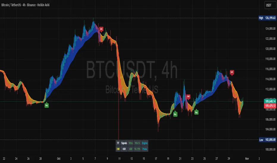
Multi-Timeframe Precision SignalsMulti-Timeframe Precision Signals - Description
Indicator Overview:
Multi-Timeframe Precision Signals is a non-repainting technical analysis indicator that uses adaptive moving averages across multiple timeframes to generate precise trading signals. Designed for active traders and scalpers, it provides clear entry/exit points with configurable alert options.
Key Features:
Non-Repainting Signals: Configurable delay ensures signals don't change after formation
Multi-Timeframe Analysis: Primary + alternate resolution for confirmation
12 MA Types: SMMA, EMA, ALMA, HullMA, LSMA, and 8 other variants
Visual Alerts: Clear buy/sell triangles on chart
Real-Time Alerts: Separate buy/sell alert conditions
Scalping-Friendly: Fast signals suitable for short-term trading
Customizable Settings: Adjustable parameters for any trading style
Technical Specifications:
Signal Type: Non-repainting crossover/crossunder
Default Settings: 8-period MA, 3x alternate resolution
Alert Options: Price, webhook, email, and push notifications
Compatibility: All markets and timeframes
Ideal For:
Scalping: Fast, precise signals for short-term trades
Day Trading: Multi-timeframe confirmation for intraday moves
Swing Trading: Reliable signals across higher timeframes
All Markets: Forex, stocks, crypto, indices
Usage Notes:
Apply to your preferred chart and enable alerts for real-time notifications. The non-repainting feature ensures signals remain stable once formed. Adjust MA period and type based on your trading timeframe and volatility preferences.
Risk Disclosure:
This indicator is for educational purposes only. Past performance doesn't guarantee future results. Trading involves substantial risk. Test thoroughly in demo accounts before live trading.
