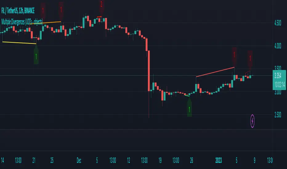
Multiple Divergences (UDTs - objects) - Educational█ OVERVIEW
This script highlights the usage of User-defined Types (UDTs) and objects , and bullish /bearish divergences.
Pivotpoints are used to find divergences, the result of this script will be different against other public multiple divergences scripts.
FOR Pine Script™ CODERS
Besides the information found in CONCEPTS , the comments in the script will, hopefully ), guide you through my thought process.
█ CONCEPTS
The main principle of this script are bullish /bearish divergences, this with 3 different oscillators ( RSI , CCI , MFI )
If you want to know more about divergences, have a look at some Education and Research idea's .
On every bar, an object HLs is made, containing bar_index , high , low , and 2 bool variables ( isPh , isPl ).
On every bar, an object Osc is made, containing bar_index , o (oscillator value), and 2 bool variables ( isPh , isPl ).
If a pivothigh (ph ) is found, isPh will be true on that bar, false otherwise.
If a pivotlow (pl) is found, isPl will be true on that bar, false otherwise.
These objects are added to an array, with limited size.
If a ph is found, the script draws a testline from that ph to every previous ph , found in the array.
Then every high in between these 2 points are checked if they don't pierce the testline .
If the testline isn't broken, the Reg_Div_Piv() function will give 4 values, 1 check (not pierced) variable and the 4 points of the line.
The testline is deleted.
Once a positive check is found, the script will perform the same, but now with the Osc objects.
The script will ONLY compare Osc pivots which are maximum 1 bar away from the high/low pivot .
If everything is confirmed, a line is drawn, visible on the chart.
█ REMARKS
A label will be visible with a number, this is the amount of divergences found with the according oscillator .
EXAMPLE
Div with RSI and CCI -> 2
Div with MFI alone -> 1
Div with RSI and CCI and MFI -> 3
...
Divergences should only be used when confirmed, this is after bar close .
As an aid, lines that are not confirmed will be dotted , if confirmed, they will be solid .
The divergence check start when a ph/pl is found, after which oscillator pivot are checked.
Optionally the same can be done, when a oscillator pivot is found and then check the ph/pl ,
this should give more results, although it can make the script slower.
█ SETTINGS
Left - amount of bars at the left which needs to be lower/higher
Right - amount of bars at the right which needs to be lower/higher
Max values - maximum values in array of objects
3 oscillator settings with
• ON/OFF
• Length
• color bullish divergence
• color bearish divergence
Have FUN !
Recherche dans les scripts pour "the script"
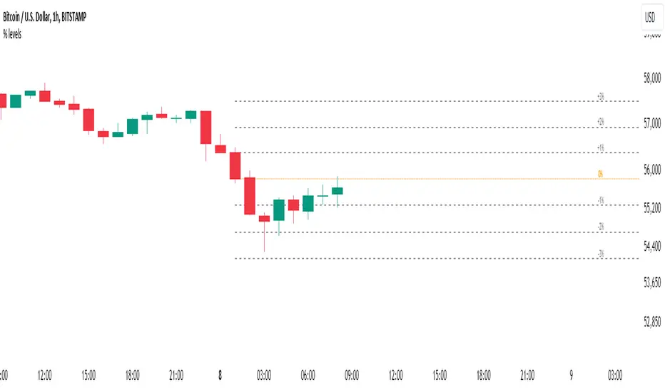
Percent Levels From Previous CloseThis indicator plots on the chart +/- 1% / 2% / 3% ranges based on the previous day's close levels.
Disclaimer :
Success in trading is all about following your trading strategy and indicators should fit into your own strategy, and not be traded purely on.
This script is for informational and educational purposes only. Use of the script does not constitute professional and / or financial advice. You are solely responsible for evaluating the outcome of the script and the risks associated with using the script. In exchange for the use of the script, you agree not to hold monpotejulien TradingView user responsible for any possible claims for damages arising out of any decisions you make based on the use of the script.
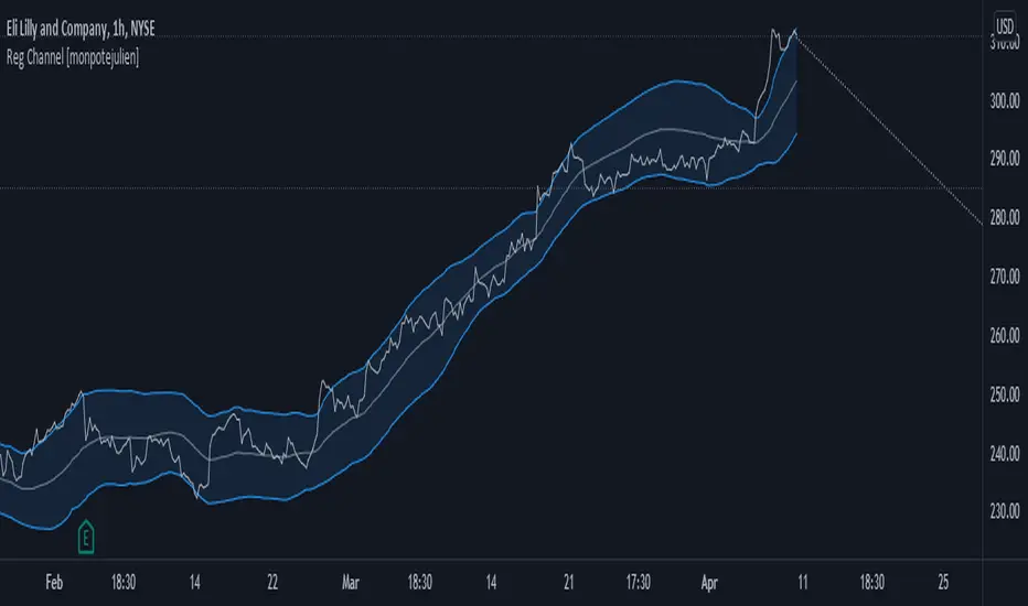
Regression Channel with projectionEXPERIMENTAL:
Auto adjusting regressive channel with projection.
Linear regression is a linear approach to modeling the relationship between a dependent variable and one or more independent variables.
In linear regression , the relationships are modeled using linear predictor functions whose unknown model parameters are estimated from the data.
Disclaimer :
Success in trading is all about following your trading strategy and indicators should fit into your own strategy, and not be traded purely on.
This script is for informational and educational purposes only. Use of the script does not constitute professional and / or financial advice. You are solely responsible for evaluating the outcome of the script and the risks associated with using the script. In exchange for the use of the script, you agree not to hold monpotejulien TradingView user responsible for any possible claims for damages arising out of any decisions you make based on the use of the script.
ZigZag Channel with projection forecastThis indicator is created on top of existing Zigzag indicator .
The projection channel starts at the end of the last ZigZag line.
Disclaimer
Success in trading is all about following your trading strategy and indicators should fit into your own strategy, and not be traded purely on.
This script is for informational and educational purposes only. Use of the script does not constitute professional and / or financial advice. You are solely responsible for evaluating the outcome of the script and the risks associated with using the script. In exchange for the use of the script, you agree not to hold monpotejulien TradingView user responsible for any possible claims for damages arising out of any decisions you make based on the use of the script.

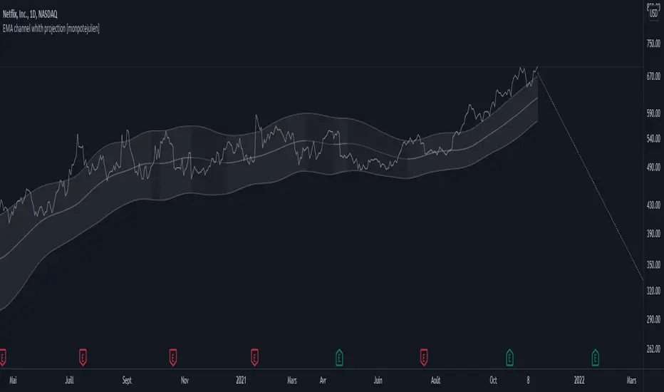
EMA channel with projection forecastExponential Moving Average Channel with projection forecast.
Riding a bull run is almost always riding an EMA value.
This indicator plots displaced EMA values guggesting possible sell targets.
Disclaimer
Success in trading is all about following your trading strategy and indicators should fit into your own strategy, and not be traded purely on.
This script is for informational and educational purposes only. Use of the script does not constitute professional and / or financial advice. You are solely responsible for evaluating the outcome of the script and the risks associated with using the script. In exchange for the use of the script, you agree not to hold monpotejulien TradingView user responsible for any possible claims for damages arising out of any decisions you make based on the use of the script.
[CLX][#04] Progress BarsFully customizable progress bars. 🚥
Functions:
- f_pbar() - 2 color, single argument version
- f_bar_theme() - multi color, array version
A detailed description will follow in the next few days.
Feel free to contribute for an extended version. 😊 Still in development.
We hope you enjoy it! 🎉
CRYPTOLINX - jango_blockchained 😊👍
Disclaimer:
Trading success is all about following your trading strategy and the indicators should fit within your trading strategy, and not to be traded upon solely.
The script is for informational and educational purposes only. Use of the script does not constitute professional and/or financial advice. You alone have the sole responsibility of evaluating the script output and risks associated with the use of the script. In exchange for using the script, you agree not to hold cryptolinx TradingView user liable for any possible claim for damages arising from any decision you make based on use of the script.
TradeChartist Trend Splitter ™TradeChartist Trend Splitter is a visual Trend spotting script based on two simple models fused together - Dynamic Volatility Bands and Dynamic Mean Bands. The fusion of these two models based on user defined parameters of length, Volatility Risk and Mean Bands type, along with optional Trend Splitter color bars and Trend background split will make it visually engaging for any trader to understand the price action.
===================================================================================================================
Trend Splitter User Manual
========================
Trend Splitter settings has option to enable and disable the Volatility Bands and also the Mean Bands.
Under each heading, user can adjust the parameters to suit the trading style, based on time-frame traded.
Volatility Bands track the price action based on volatility trend lookback (Default - 55, MIn - 5, Max - 337) and also uses a Detector plot based on user defined risk (Default is 2.618, Min - 0.618, Max - 5) to continuously track the price action.
Mean Bands track the Mean values of the price action based on TradeChartist's original Mean Reversion Model based on one of 4 time tested Fib Lengths (Default - 55, Options - 55, 89, 144, 233, 337) and detects the price testing of Mean using Orange touchpoints.
Using Price Action in relation to both Volatility Bands and the Mean Bands, the script creates Mean Bands filtered Trend splits that plot Bull or Bear Trend background.
The Mean Bands Filter can be disabled for Trend Splits by just disabling Mean Bands from the settings. Also the option to display Trend Split background can also be enabled or disabled from the settings.
The settings also includes a useful feature to enable or disable coloured price bars using one of 3 colour themes.
Users can create alerts for Price testing mean, Bull and Bear trends using Long or Short from Trend Splitter's Alert Condition.
The indicator doesn't repaint even though a potential repaint warning appears when creating alerts. This can be confirmed by doing bar replay with vertical lines at various lines and trend change zones to get confidence using the indicator. The vertical lines will stay in the same place on both current time and when running a bar replay.
===================================================================================================================
Example Charts
1. 5m chart of BINANCE:AXSUSDTPERP using Trend Splitter (144, 2.618, Normal, 55) and TradeChartist Momentum Drift Oscillator (144 with Drift Visualizer). The Trend Splitter and MDO combo work brilliantly on Lower Time Frames and even on 15s/30s charts with MDO length of 144.
Best Practice - Always wait for a very long trend (over 337 bars on both MDO and Trend Splitter before taking a reverse trend trade at either Exhaustion or Super OB/OS zones of MDO) when using very low time-frames.
2. 5m chart of NYSE:PLTR using Trend Splitter (144, 3.618, Normal, 55) connected to TradeChartist Fib Master to plot Automatic Fibs. Just use Trend Identifier of Trend Splitter from Fib Master signal dropdown from settings, having both scripts active on chart.
3. Daily chart of OANDA:XAUUSD using Trend Splitter (using only Mean Bands - Weighted/144) to spot areas of support and resistance at Mean Bands.
Best Practice - Mean Bands can also act as confirmation indicator when used with other Trading View Indicators like RSI, Stohastic, Bollinger Bands etc.
4. Daily chart of COINBASE:ETHUSD using Trend Splitter (55, 0.618, Weighted, 55) connected to TradeChartist Plug and Trade to show Trend Splitter based Entries with Targets and Past Performance to assess the settings parameters in Trend Splitter. Just use Trend Identifier of Trend Splitter from Plug and Trade signal dropdown from settings, having both scripts active on chart.
===================================================================================================================
Best Practice: Test with different settings first using Paper Trades before trading with real money
===================================================================================================================

TradeChartist Intensity Pro™TradeChartist Intensity Pro is a visual indicator that comes with 5 Visual Themes and Auto-fibs feature that helps traders with Entry/Exit and levels confirmation based on where the price is, in relation to the Orange Price Equilibrium line and the 5 zones of Bull/Bear limits that fade into the top or bottom outer space.
™TradeChartist Intensity is an original Mean Reversion Model that requires no user input and Intensity Pro incorporates User adjustable Auto-Fibs and manual Fibonacci retracement feature and plots customisable Fib levels along with prices.
======================================================================================
Intensity Pro Features
Orange Mean Equilibrium Line
Bull and Bear Intensity Bands
5 Visual Themes
Trend based Bar Colours
Auto Fibonacci Levels
Custom Auto-Fib Levels
Fibonacci Levels based on Days or Bars Lookback
Current Fib Level label
High and Low Plots
Take Profit Bars
======================================================================================
Example Charts:
1. 4hr BTC-USDT
2. SPX Daily
3. EUR-USD 1hr
======================================================================================
Best Practice: Test with different settings first using Paper Trades before trading with real money
======================================================================================
This is not a free to use indicator. Get in touch with me (PM me directly if you would like trial access to test the indicator)
Premium Scripts - Trial access and Information
Trial access offered on all Premium scripts.
PM me directly to request trial access to the scripts or for more information.
======================================================================================
Snake Trend PremiumThis is an improved version of my original open source snake trend script.
I made this script to reference the current market environment while working on the lower time frames. It combines 8 slow moving averages to calculate the strength of the market trend. It will color the center of the line based on those results. The purpose of it is to visualise a bunch of sma lines into 1 line, it will make it much more organised and gives visual clarity instead of chaos. Do not use this script.
How the snake calculates trend strength for color:
1. It will check for each SMA line if it increased or decreased in value compared to previous candle.
2. An increase means +1 a decrease means -1
3. It will count those numbers to get a strength value ranging from -8 to 8
4. Each specific number is color coded and it will plot that color into the center of the snake based on the color theme selected in config
Configuration:
Show MA Lines = Ability to show the hidden lines used for calculation
5 Color Themes = Includes 5 color themes for the snake of which one based on the original, this is so the user can decide which color theme is most clear.
Plot Snake on other timeframe ? = Ability to plot the visual snake on the timeframe you want instead of current, this will not change the calculation and is only visual.
Use Current Timeframe MACD ? = Chose if you want to use a custom timeframe for MACD (outer skin of the snake line), below that are the standard MACD settings
Use Current Timeframe rsiMFI ? = Chose if you want to use a custom timeframe for rsiMFI (inner skin of the snake line)
Static SMA Length ? = The amount of candles the SMA uses to calculates it's value, standard SMA settings
Timeframe in Minutes SMA 1 = The timeframe line 1 uses (these timeframes are very important as they decide the trend strength calculation which is the backbone of the script. Below that are settings for all the other SMA's
SMA length input changes all lines at once.
The script will get published in 2 ways:
A simple version that will display the trend strength indicator as bars (no overlay)
A version which displays the strength as colors and includes a skin to see if higher or lower TF MACD and rsiMFI are in the negative or positive
Disclaimer:
Never enter a trade purely based on the indicator as it is a trend visualisation but not a good entry trigger.

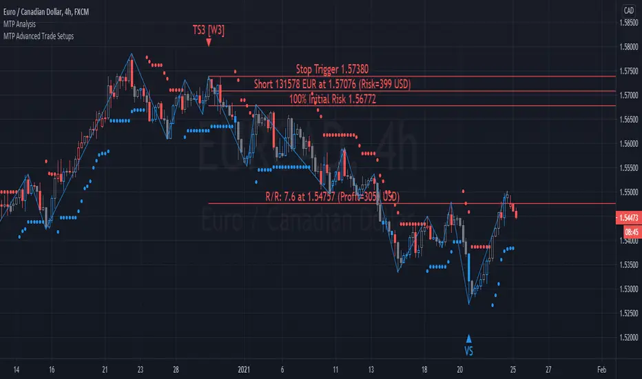
MTP Advanced Trade SetupsThe MTP Advanced Trade setup script contains the Wave 3 variation of MTPredictor automatic trade setups, TS1(W3), TS3(W3), TS4(W3) as well as the Volume Spike (VS) setup.
The TS1(W3), TS3(W3), TS4(W3) trade setups are designed to catch the end of a Wave (2) correction, with the aim of trading the Wave (3) swing. The Wave (3) swing is usually the strongest and longest swing in a completed 5 wave sequence. Whereas, the VS (Volume Spike) setup is designed to identify high volume spikes, with the aim of finding “fake-outs” at levels of DP support/resistance. This is usually where the “professional money” enters the market to produce a sharp swing in the opposite direction. For more detail of the MTP DP level, please visit the publication of the MTP Decision Point (DP) script.
Entry triggers triggers are provided by our MTP coloured reversal bars that are part of our MTP Analysis Script. The triggers are Blue for a potential Buy, Red for a potential Sell, and Grey for Neutral. Please note, these are only relevant at (or up to 5 bars after) the potential trade setup. Please see the MTP Analysis Script for more information.
Targets for the setups are automatically shown for each setup as part of the Trade Analysis. Position Sizing is included in the Analysis as well.
Please remember that although MTPredictor has automatic setups, we do not suggest that you just follow these blindly as if it were a black box mechanical system, judgement is needed in filtering the automatic setups, particularly with respect a clear larger degree trend. Each Trader must take responsibility for deciding on whether their own Analysis is clear and fits in with their own (personal and unique) Trading Plan.
There is a risk in Trading and Investing. Losses can and will unfold.
The script is available as an “invite-only” script, as part of the MTPredictor suite of tools on Trading View.
To obtain access, please go to the web page in our signature that appears below.
MTP Trade SetupsThe MTP Trade setups script contain the standard MTPredictor automatic trade setups, TS1, TS2, TS3, TS4 and DP.
The TS1, TS2, TS3, TS4 trade setups are based around the ABC correction of varying degrees, and as such, are designed to catch the end of a correction in a continuing trend. Whereas the DP is a trend termination setup at our MTP DP level on oscillator divergence. We define the trend by using Support / Resistance areas on the higher time frame chart using our MTP DP levels. For more detail of the MTP DP Levels, please visit the publication of the MTP DP script.
Entry triggers triggers are provided by our MTP coloured reversal bars that are part of our MTP Analysis Script. The triggers are Blue for a potential Buy, Red for a potential Sell, and Grey for Neutral. Please note, these are only relevant at (or up to 5 bars after) the potential trade setup. Please see our MTP Analysis Script for more information.
Targets for the setups are automatically shown for each setup as part of the Trade Analysis. Position Sizing is included in the Analysis as well.
Please remember that although MTPredictor has automatic setups, we do not suggest that you just follow these blindly as if it were a black box mechanical system, judgement is needed in filtering the automatic setups, particularly with respect a clear larger degree trend. Each Trader must take responsibility for deciding on whether their own Analysis is clear and fits in with their own (personal and unique) Trading Plan.
There is a risk in Trading and Investing. Losses can and will unfold.
The script is available as an “invite-only” script, as part of the MTPredictor suite of tools on Trading View.
To obtain access, please go to the web page in our signature that appears below.

Machine Learning / Longs [Experimental]Hello Traders/Programmers,
For long time I thought that if it's possible to make a script that has own memory and criterias in Pine. it would learn and find patterns as images according to given criterias. after we have arrays of strings, lines, labels I tried and made this experimental script. The script works only for Long positions.
Now lets look at how it works:
On each candle it creates an image of last 8 candles. before the image is created it finds highest/lowest levels of 8 candles, and creates a string with the lengths 64 (8 * 8). and for each square, it checks if it contains wick, green or red body, green or red body with wicks. see the following picture:
Each square gets the value:
0: nothing in it
1: only wick in it
2: only red body in it
3. only green body in it
4: red body and wick in it
5: green body and wick in it
And then it checks if price went up equal or higher than user-defined profit. if yes then it adds the image to the memory/array. and I call this part as Learning Part.
what I mean by image is:
if there is 1 or more element in the memory, it creates image for current 8 candles and checks the memory if there is a similar images. If the image has similarity higher than user-defined similarty level then if show the label "Matched" and similarity rate and the image in the memory. if it find any with the similarity rate is equal/greater than user-defined level then it stop searching more.
As an example matched image:
and then price increased and you got the profit :)
Options:
Period: if there is possible profit higher than user-defined minimum profit in that period, it checks the images from 2. to X. bars.
Min Profit: you need to set the minimum expected profit accordingly. for example in 1m chart don't enter %10 as min profit :)
Similarity Rate: as told above, you can set minimum similarity rate, higher similarity rate means better results but if you set higher rates, number of images will decrease. set it wisely :)
Max Memory Size: you can set number of images (that gives the profit equal/higher than you set) to be saved that in memory
Change Bar Color: optionally it can change bar colors if current image is found in the memory
Current version of the script doesn't check if the price reach the minimum profit target, so no statistics.
This is completely experimental work and I made it for fun. No one or no script can predict the future. and you should not try to predict the future.
P.S. it starts searching on last bar, it doesn't check historical bars. if you want you should check it in replay mode :)
if you get calculation time out error then hide/unhide the script. ;)
Enjoy!

TradeChartist Essential MTF Screener™TradeChartist Essential MTF Screener is an adaptive and powerful multi time frame screener toolkit for several essential trading indicators like RSI, Stochastic, CCI, MACD, 15 different Moving Averages, Heikin Ashi Trend and Net Volume, which can be visualised as a singular Indicator plot or as MTF Screener blocks showing absolute or trend-based colour coded Bull/Bear Strength along with real-time indicator value labels.
===================================================================================================================
™𝗧𝗿𝗮𝗱𝗲𝗖𝗵𝗮𝗿𝘁𝗶𝘀𝘁 𝗘𝘀𝘀𝗲𝗻𝘁𝗶𝗮𝗹 𝗠𝗧𝗙 𝗦𝗰𝗿𝗲𝗲𝗻𝗲𝗿 𝗨𝘀𝗲𝗿 𝗠𝗮𝗻𝘂𝗮𝗹
====================================================
MTF Screener can be used as a singular Time Frame screener plot or as colour coded screener blocks with several Time Frames (based on Time Frame Multiplier inputs) and based on user preference of the indicator such as RSI, Stoch, CCI, MACD, one of 15 Moving Averages, Heikin Ashi Trend or Net Volume from the 𝐈𝐧𝐝𝐢𝐜𝐚𝐭𝐨𝐫 𝐓𝐲𝐩𝐞 dropdown.
For RSI, Stoch, MACD and Moving Averages, Source price is required from the Sᴏᴜʀᴄᴇ dropdown (default - close). Sᴍᴏᴏᴛʜɪɴɢ input can be used to smooth the plot.
RSI, CCI and Stoch lengths are 14 as default and each of them have Uᴘᴘᴇʀ Bᴀɴᴅ and Lᴏᴡᴇʀ Bᴀɴᴅ inputs, which decides the colour of the screener block.
MACD has 3 inputs namely - Fᴀsᴛ Lᴇɴɢᴛʜ , Sʟᴏᴡ Lᴇɴɢᴛʜ and Sᴍᴏᴏᴛʜɪɴɢ and the default is the classic settings (12,26,9). Type of MA used can be chosen from under 𝟰. 𝗠𝗼𝘃𝗶𝗻𝗴 𝗔𝘃𝗲𝗿𝗮𝗴𝗲 section of the indicator settings. For classic MACD, use EMA which is default.
Moving Average has two inputs namely - MA ᴛʏᴘᴇ (which allows one of 15 Moving Averages) and MA Lᴇɴɢᴛʜ (default - 55).
Heikin Ashi Trend and Net Volume do not need any inputs.
===================================================================================================================
𝗠𝗧𝗙 𝗦𝗰𝗿𝗲𝗲𝗻𝗲𝗿 𝗕𝗹𝗼𝗰𝗸𝘀
Screener blocks are plotted as default and each row represents a specific Time Frame based on the Time Frame Multiplier (Default - 11 TF Multipliers from 1 to 2 in steps of 0.1) entered by the user in the 𝗦𝗰𝗿𝗲𝗲𝗻𝗲𝗿 𝗣𝗹𝗼𝘁𝘀 section. There are 11 maximum rows or Time Frame Multipliers that can be displayed. For example, if the user wants just 4 timeframes say, 1hr, 2hr , 4hr and Daily on a 1hr chart, the user should enter 4 in 𝐍𝐮𝐦𝐛𝐞𝐫 𝐨𝐟 𝐌𝐓𝐅 𝐒𝐜𝐫𝐞𝐞𝐧𝐞𝐫𝐬 input box and enter 1, 2, 4 and 24 in the Time-Frame Multiplier input boxes.
The Screener block colour can be changed from the settings. Each Screener row will have the data labels displayed in real-time as default ( Aʟʟᴏᴡ Rᴇᴘᴀɪɴᴛɪɴɢ (Cᴜʀʀᴇɴᴛ HTF Dᴀᴛᴀ) ). Disabling this will have Higher Time Frame data lag based on previous HTF close. Real-time data is recommended for live prices/data as it helps see the current dynamic.
Hᴇɪᴋɪɴ Asʜɪ Sᴄʀᴇᴇɴᴇʀ plots data based on Heikin Ashi chart on normal candle/bar chart.
Tʀᴇɴᴅ Bᴀsᴇᴅ Sᴄʀᴇᴇɴᴇʀ (ʀsɪ, sᴛᴏᴄʜ, ᴄᴄɪ) plots color coded screener blocks based on Upper and Lower bands input from the user. The colors change only when the upper/lower band is breached for the first time since the opposite band breach.
The MTF Screener blocks can be used visually on price chart by just moving the MTF Screener to main chart with the default Separate Screener Pane - Default under Lᴀʙᴇʟs Dɪsᴘʟᴀʏ Tʏᴘᴇ to keep the labels on chart. Having separate scales for security price and MTF Screener makes it possible to view the screener blocks on main chart.
Screener overlaid on Price Chart disables the MTF screener blocks but shows the MTF labels on price chart.
MTF Screener block colours can be changed from Screener Blocks colour settings and the Screener Label colour can be changed from Screener Label Colour settings.
===================================================================================================================
𝗦𝗰𝗿𝗲𝗲𝗻𝗲𝗿 𝗜𝗻𝗱𝗶𝗰𝗮𝘁𝗼𝗿 𝗣𝗹𝗼𝘁
Screener Indicator Plot is a singular plot of the user preferred timeframe multiplier (entered in Iɴᴅɪᴄᴀᴛᴏʀ Pʟᴏᴛ Tɪᴍᴇғʀᴀᴍᴇ Mᴜʟᴛɪᴘʟɪᴇʀ input box) of the Essential Indicator selected by the user.
To display the indicator plot, enable Dɪsᴘʟᴀʏ Iɴᴅɪᴄᴀᴛᴏʀ Pʟᴏᴛ (ᴅɪsᴀʙʟᴇs sᴄʀᴇᴇɴᴇʀ) . For example, if the selected plot is RSI, this displays RSI of the chosen Time Frame Multiplier along with the MTF Screener Labels without the blocks.
Screener Indicator Plot colours can be changed from Indicator/Screener Label colour settings and the Label colour can be changed from Lᴀʙᴇʟ Cᴏʟᴏᴜʀ (ғᴏʀ ɪɴᴅɪᴄᴀᴛᴏʀ ᴘʟᴏᴛ) .
The example chart below shows the use of both MTF Screener Blocks and Screener Indicator Plots of various essential indicators.
===================================================================================================================
Note: ™TradeChartist Essential MTF Screener is not a Signal generator and doesnt always reflect the trend when using MTF Screener blocks. Using relatively higher Time Frame Multipliers can cause late trade entries on chart time frame. The Screener and labels help visualize the values and the relative trend where sensible using colour codes. Users must devise personal techniques to exploit and use this tool to suit their trading needs.
===================================================================================================================
Example Charts
1. BTC-USDT 1hr chart using multiple MTF Screeners
2. BTC-USDT 1hr chart using Net Volume Indicator Plot and MACD MTF Screener on chart.
3. BTC-USDT 4hr chart using Daily Heikin Ashi Trend plotted on the main chart + Daily RSI indicator plot on a separate MTF Screener pane connected to ™TradeChartist Plotter to display Divergences on Price chart.
4. BTC-USDT 4 hr chart as above example, connected to ™TradeChartist FibMaster to plot Auto Fibs and display Bull/Bear Zones based on RSI 60/40 breakout trends.
5. BTC-USDT 4 hr chart with 20 period Weekly Hull MA plotted on Main chart with 4hr, Daily and 3D 20 period Hull MA value labels with Daily MACD Indicator Plot with 1hr, 4hr and 12 hr MACD real-time value labels.
===================================================================================================================
Best Practice: Test with different settings first using Paper Trades before trading with real money
===================================================================================================================
This is not a free to use indicator. Get in touch with me (PM me directly if you would like trial access to test the indicator)
Premium Scripts - Trial access and Information
Trial access offered on all Premium scripts.
PM me directly to request trial access to the scripts or for more information.
===================================================================================================================

TradeChartist Plotter™TradeChartist Plotter is an extremely useful and adaptive indicator that connects to any oscillator to plot highs and lows, Divergences and also Bull and Bear Zones based on the Oscillator and user input to filter zones. When plotted as normal or Heikin Ashi price bars/candles, the divergences can be plotted on price bars and in addition ™TradeChartist MA Visualizer can be plotted and used to filter trade zones derived from the Oscillator connected.
===================================================================================================================
™𝗧𝗿𝗮𝗱𝗲𝗖𝗵𝗮𝗿𝘁𝗶𝘀𝘁 𝗣𝗹𝗼𝘁𝘁𝗲𝗿 𝗨𝘀𝗲𝗿 𝗠𝗮𝗻𝘂𝗮𝗹
===================================
To connect an oscillator to ™TradeChartist Plotter, follow the steps below.
From the ╔═══ 𝗣𝗹𝘂𝗴 𝗢𝘀𝗰𝗶𝗹𝗹𝗮𝘁𝗼𝗿 ═══ 🔌 dropdown, choose the Oscillator plot which is active on the chart.
Choose the Oscillator Smoothing factor if smoothing is not available on the original oscillator plot by using the Osᴄɪʟʟᴀᴛᴏʀ Sᴍᴏᴏᴛʜɪɴɢ input box.
Enter Upper and Lower Bands for the Oscillator plot that helps detect Highs/Lows, Divergences, Trade Zones etc. by using the Uᴘᴘᴇʀ Bᴀɴᴅ and Lᴏᴡᴇʀ Bᴀɴᴅ input boxes. For example, for oscillators like RSI, bands can be 60/40 or 70/30 or even 50/50 to help filter highs/lows on Oscillator and the main price chart based on Oscillator values above Upper Band and Oscillator values below Lower Band.
Osᴄɪʟʟᴀᴛᴏʀ Bᴀsᴇ Lɪɴᴇ is required especially for Oscillators that don't have 0 as its base line. For example, RSI, Stochastic etc. oscillate between 0 and 100. For Oscillators like these, a base line value is really useful on ™TradeChartist Plotter especially to detect Divergences, Highs/Lows, Trade Zones and even to plot the Oscillator as a Histogram or Area plot.
Pʟᴏᴛ Bᴀsᴇ Lɪɴᴇ ᴀɴᴅ Bᴀɴᴅs plots base line and the bands if Oscillator plot is chosen.
There are three plot types under Pʟᴏᴛ Tʏᴘᴇ and they are
══ Plot Oscillator - This option plots the connected Oscillator
══ Plot Price Candles - This option plots price candles and if overlaid on main chart, Highs/Lows, Divergences etc can be visualized along with ™TradeChartist MA Visualizer if enabled.
══ Plot Price Bars - This option plots price bars and if overlaid on main chart, Highs/Lows, Divergences etc can be visualized along with ™TradeChartist MA Visualizer if enabled.
Pʟᴏᴛ HA Cᴀɴᴅʟᴇs/Bᴀʀs plots Heikin Ashi candles/bars. It doesn't affect the Oscillator plot or in anyway alter the Oscillator plot.
Pʟᴏᴛ Sᴛʏʟᴇ dropdown has three types of styles - Line, Histogram and Area plot styles for the Oscillator plot.
Pʟᴏᴛ Pʀɪᴄᴇ Hɪɢʜs ᴀɴᴅ Lᴏᴡs plots the price highs and price lows corresponding to the Bull and Bear zones of the Oscillator connected.
===================================================================================================================
╔═════════ 𝗠𝗔 𝗩𝗶𝘀𝘂𝗮𝗹𝗶𝘇𝗲𝗿 ═════════╗
MA Visualizer is a powerful and very useful original ™TradeChartist visual method to plot Moving Averages of the close price of the security for user specified look back period in a visually appealing style in the form of colour coded bands. MA Visualizer not only helps the trader spot the price action of the security relative to the moving average, but also paints a visual picture of the trend strength, which must be seen and used on chart to appreciate its elegance. One of 15 different types of Moving Averages can be used to visualize the price action.
Activate 𝗠𝗔 𝗩𝗶𝘀𝘂𝗮𝗹𝗶𝘇𝗲𝗿 and choose the MA type from MA Vɪsᴜᴀʟɪᴢᴇʀ Tʏᴘᴇ dropdown and entering the lookback period in MA Vɪsᴜᴀʟɪᴢᴇʀ ᴘᴇʀɪᴏᴅ input box.
MA Visualizer colour theme can be be changed from MA Vɪsᴜᴀʟɪᴢᴇʀ Cᴏʟᴏʀ Sᴄʜᴇᴍᴇ dropdown.
The faster of the two set of bands that form the MA Visualizer reacts to price action faster and can be clearly seen from its change of colour from Bull Colour to Bear Colour or vice-versa earlier than the slower set of bands. The fill colour between the bands also helps the user stay in a trade or exit a trade based on other confirmators.
Enabling Dᴀᴢᴢʟɪɴɢ Vɪsᴜᴀʟɪᴢᴇʀ makes the Visualizer dazzle. Uncheck this option for normal view of MA Visualizer.
𝐔𝐬𝐞 𝐌𝐀 𝐕𝐢𝐬𝐮𝐚𝐥𝐢𝐳𝐞𝐫 𝐚𝐬 𝐓𝐫𝐚𝐝𝐞 𝐅𝐢𝐥𝐭𝐞𝐫 filters the trade zones based on MA Visualizer's trend agreeing with the Oscillator trend. Fɪʟᴛᴇʀ Eᴀʀʟʏ Vɪsᴜᴀʟɪᴢᴇʀ Bʀᴇᴀᴋᴏᴜᴛs filters the trades based on faster MA Visualizer plot's trend.
Also, enabling Pʟᴏᴛᴛᴇʀ Bᴀᴄᴋɢʀᴏᴜɴᴅ Fɪʟʟ under 𝗨𝘀𝗲𝗳𝘂𝗹 𝗘𝘅𝘁𝗿𝗮𝘀 helps detect the trade zones with or without the MA Visualizer filter enabled.
===================================================================================================================
╔═══════ 𝗗𝗶𝘃𝗲𝗿𝗴𝗲𝗻𝗰𝗲𝘀 ═══════╗
Plotter detects both Regular and Hidden Bullish (in a Bear Zone) and Bearish Divergences (in a Bull Zone) at every occurence based on the Oscillator connected. This can be filtered by the use of filtering by Upper and Lower Band values in the Oscillator section. Divergences can also be plotted on price bars based on Pʟᴏᴛ Tʏᴘᴇ .
To plot divergences, enable 𝗗𝗶𝘃𝗲𝗿𝗴𝗲𝗻𝗰𝗲𝘀, Sʜᴏᴡ Rᴇɢᴜʟᴀʀ Dɪᴠᴇʀɢᴇɴᴄᴇs and Sʜᴏᴡ Hɪᴅᴅᴇɴ Dɪᴠᴇʀɢᴇɴᴄᴇs .
Users can further filter Divergences by entering the number of bars to the right in Rɪɢʜᴛ ʙᴀʀs ғᴏʀ Pɪᴠᴏᴛ Cᴏɴғɪʀᴍᴀᴛɪᴏɴ input box to confirm the Price Pivot (for Regular divergences) and Oscillator Pivot (for Hidden Divergences).
Note: Divergences can not be traded at every instance or as a standalone indicator. It just indicates a possibility of strength exhaustion and should not be trusted during a trending market. Higher smoothing (done sensibly) also filters divergences. Divergence can be a strong confirmator once a reversal is detected. For example, using MA Visualizer can help confirm a divergence and vice-versa to identify the trend changes. This means that the confirmations may happen after a few bars since the divergence in agreement with the MA Visualizers trend change.
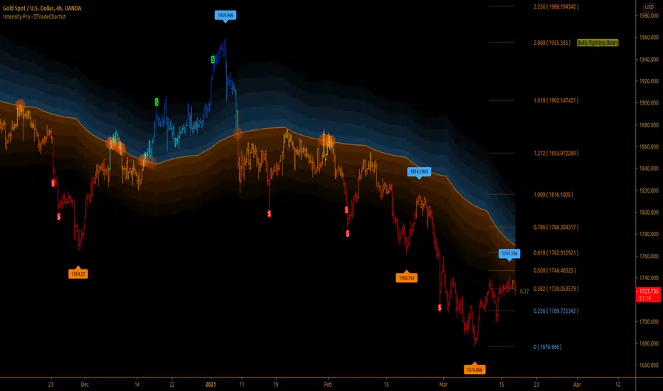
The example chart of 4hr BTC-USDT chart shows the Divergences filtered by use of RSI 60/40 bands, MA Visualizer and Regression channel trends. It is important to note that the trend intensity colour on the plot and bars (if bar colour option is enabled) will help detect if the Divergence would hold.
===================================================================================================================
╔═══════ 𝗨𝘀𝗲𝗳𝘂𝗹 𝗘𝘅𝘁𝗿𝗮𝘀 ═══════╗
Pʟᴏᴛᴛᴇʀ Bᴀᴄᴋɢʀᴏᴜɴᴅ Fɪʟʟ - Plots background fill based on Bull and Bear Zones based on the Oscillator connected and the filters used.
Plotter offers two vibrant Colour Themes, namely Chilli and Flame , which can be opted from Pʟᴏᴛᴛᴇʀ Tʜᴇᴍᴇ dropdown. These themes also offer the option to plot the trend intensity on the price bars as bar colours by enabling Cᴏʟᴏᴜʀ Bᴀʀs . Bar colors can also be inverted using Iɴᴠᴇʀᴛ Bᴀʀ Cᴏʟᴏᴜʀ option.
Users can also choose to use the Simple theme and choose preferred colours from Sɪᴍᴘʟᴇ Tʜᴇᴍᴇ ʙᴜʟʟ Cᴏʟᴏᴜʀ and Sɪᴍᴘʟᴇ Tʜᴇᴍᴇ ʙᴇᴀʀ Cᴏʟᴏᴜʀ colour input.
Note : The indicator does not repaint and can be confidently used for alerts and trade entries without worrying about plots disappearing after bar close.
===================================================================================================================
Example Charts
1. EUR-USD 15m chart with 3 Plotters on chart, 1 with ™TradeChartist MDO , 1 on main chart and 1 HA Bar chart showing various ways of plotting highs/lows, divergences and Trade zones using 55 period LSMA MA Visualizer.
2. XAU-USD 15m chart with Chande Momentum Oscillator connector to Plotter with 200 period SMA Visualizer used as Trade Filter.
3. LINK-USDT 1hr chart with ™TradeChartist Risk Meter connected to Plotter with 144 period Hull MA Visualizer as Trade filter on Main chart with Divergences plotted based on Risk Meter Volatility Risk Oscillator.
4. Example 3 above with Plotter's Trend Identifier connected to ™TradeChartist Plug and Trade as Oscillatory Signal with Past performance and trades plotted.
===================================================================================================================
Best Practice: Test with different settings first using Paper Trades before trading with real money
===================================================================================================================
This is not a free to use indicator. Get in touch with me (PM me directly if you would like trial access to test the indicator)
Premium Scripts - Trial access and Information
Trial access offered on all Premium scripts.
PM me directly to request trial access to the scripts or for more information.
===================================================================================================================

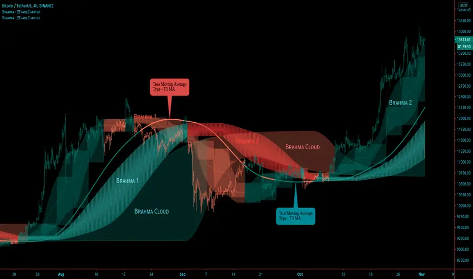
BRAHMA - Better Remodelled Adaptive Holistic Moving Average™𝗧𝗿𝗮𝗱𝗲𝗖𝗵𝗮𝗿𝘁𝗶𝘀𝘁 𝗕𝗥𝗔𝗛𝗠𝗔 (Better Remodelled Adaptive Holistic Moving Average) is an exceptionally versatile Moving Average, that can adapt, expand and transform into a better Moving Average system that consists of BRAHMA bands and BRAHMA steps, both emanating from a singular plot based on the source price and the lookback length. The system also consists of BRAHMA cloud which is based on the source price, the lookback length, the step length and the cloud factor. In addition to using the source price directly, the indicator offers 15 different Moving Average types that can be used on the source price for BRAHMA system to adapt to, offering several possibilities to visualize and trade the price action.
===================================================================================================================
™𝗧𝗿𝗮𝗱𝗲𝗖𝗵𝗮𝗿𝘁𝗶𝘀𝘁 𝗕𝗥𝗔𝗛𝗠𝗔 𝗨𝘀𝗲𝗿 𝗠𝗮𝗻𝘂𝗮𝗹
=====================================
Like any other moving average system, the source price and the lookback length determines the dynamic of BRAHMA . Source price can be selected from Sᴏᴜʀᴄᴇ dropdown and the lookback length can be enetered in the Bʀᴀʜᴍᴀ Lᴇɴɢᴛʜ input box. MA ᴛʏᴘᴇ dropdown is used to choose the type of moving average for BRAHMA to adapt to. To use the source price directly, Use Source must be selected from the dropdown.
In addition to this usual requirement, Bʀᴀʜᴍᴀ Wɪᴅᴛʜ and Bʀᴀʜᴍᴀ Sᴛᴇᴘ Lᴇɴɢᴛʜ are required to make BRAHMA moving average system complete, based on risk and reward expectations of the user.
===================================================================================================================
BRAHMA Bands and Steps
The Bands and the Steps are integral part of the BRAHMA system. When the Bʀᴀʜᴍᴀ Wɪᴅᴛʜ and Bʀᴀʜᴍᴀ Sᴛᴇᴘ Lᴇɴɢᴛʜ values are 1, the bands and steps lie dormant inside BRAHMA and they emanate from the main plot as the values are increased.
Bʀᴀʜᴍᴀ Wɪᴅᴛʜ impacts the Bands Mean line + expands or contracts the bands and Bʀᴀʜᴍᴀ Sᴛᴇᴘ Lᴇɴɢᴛʜ transforms the dormant step system (on minimum value of 1) from inside the BRAHMA bands into a powerful step/block like structure that helps find support/resistance levels and displays Bull and Bear zones based on price action in relation to the BRAHMA bands and BRAHMA steps .
Dɪsᴘʟᴀʏ Bʀᴀʜᴍᴀ Sᴛᴇᴘs plots the steps
Dɪsᴘʟᴀʏ Bʀᴀʜᴍᴀ Bᴀɴᴅs plots the bands
Enabling Cᴏʟᴏᴜʀ Bᴀʀs with Bands and Steps displayed will plot the Bull and Bear Zones on price bars and this dynamic is very different from the colouring of the bars based on the cloud as a standalone plot.
===================================================================================================================
BRAHMA Cloud
The cloud is a very useful part of this system and helps see the price action with the help of volatility of Bulls/Bears based on the lookback length, step length and the cloud factor. Price above or below the cloud helps visualize the strength of the trend along with the height/thickness of the cloud. Thinning of the cloud can signal reversals and can be used with another confirmator.
Cʟᴏᴜᴅ Fᴀᴄᴛᴏʀ (1 - 10) affects the cloud dynamic and can be changed to suit personal risk strategy and trade frequency. Cloud sensitivity is also affected by the Bʀᴀʜᴍᴀ Lᴇɴɢᴛʜ . Cloud can be used on its own with really low lookback length (even length of 1 works well).
Dɪsᴘʟᴀʏ Bʀᴀʜᴍᴀ Cʟᴏᴜᴅ plots the cloud
Enabling Bʀᴀʜᴍᴀ Cᴏʟᴏᴜʀ Bᴀʀs with Cloud displayed as the only standalone component of the indicator will plot the Bull and Bear Zones and this dynamic is very different from the colouring of the bars based on the Bands and Steps on chart. When the price enters the cloud from below after or during a period of downtrend will start painting Bull colour and when the price enters the cloud from above after or during a period of uptrend will start painting Bear colour on the price bars.
===================================================================================================================
BRAHMA Colour Scheme
The colours of the plots and fills can be changed based on user preference from the indicator settings.
There are three Themes to choose from Bʀᴀʜᴍᴀ Cᴏʟᴏᴜʀ Bᴀʀs Tʜᴇᴍᴇ (Simple, Chilli and Flame) dropdown to colour the price bars.
Enabling Bʀᴀʜᴍᴀ Cᴏʟᴏᴜʀ Bᴀʀs with Simple Theme colours the price bars based on Bull and Bear zones as explained in the sections above. Chilli and Flame themes colour the price bars with trend intensity for every bar based on the source price and lookback length.
===================================================================================================================
Alerts
Alerts can be created for Long and Short entries by using Once Per Bar Close as Alert Frequency. Entries are generated on Real time bars. It is recommended to wait for bar close before taking a position based on Trade Entries.
The indicator does not repaint and can be confidently used for alerts and trade entries without worrying about signals disappearing.
™TradeChartist BRAHMA can also be connected to ™TradeChartist Plug and Trade using 𝗕𝗥𝗔𝗛𝗠𝗔 𝗧𝗿𝗲𝗻𝗱 𝗜𝗱𝗲𝗻𝘁𝗶𝗳𝗶𝗲𝗿 as Oscillatory Signal to generate entries along with Targets, Stop Loss plots etc. Target and Stop Loss alerts can be created using Plug and Trade's Alerts system.
===================================================================================================================
Example Charts
1. The 15m chart below demonstrates how a Simple Moving Average can be transformed from a noisy pretty much untradeable MA plot to meaningful Moving Average Trade System using BRAHMA by adjusting the Width and the Step Length.
2. GBP-USD 1hr chart using 34 period Zero-Lag EMA with 21 width and 24 step length (24 hrs in a Daily candle - This helps choose length for HTF based levels)
3. NIFTY 1hr chart using 21 period TEMA (Triple Exponential MA) with 21 width and 24 step length.
4. XAU-USD Daily chart using 89 period TEMA with 24 width and 12 step length, enabling Chilli Theme based colour bars.
5. LINK-USDT 1hr chart using 21 period Hull MA with 24 width, 24 step length and cloud factor of 2 visualised using colour bars on cloud as standalone plot.
===================================================================================================================
Best Practice: Test with different settings first using Paper Trades before trading with real money
===================================================================================================================
This is not a free to use indicator. Get in touch with me (PM me directly if you would like trial access to test the indicator)
Premium Scripts - Trial access and Information
Trial access offered on all Premium scripts.
PM me directly to request trial access to the scripts or for more information.
===================================================================================================================
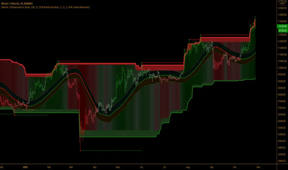
TradeChartist Drifter™𝗧𝗿𝗮𝗱𝗲𝗖𝗵𝗮𝗿𝘁𝗶𝘀𝘁 𝗗𝗿𝗶𝗳𝘁𝗲𝗿 is an adeptly designed, functional and a visual indicator that plots trend-following Support and Resistance walls by employing the concepts of Trend-based Support and Resistance, Momentum and Volatility, based on user defined lookback length, and includes three extremely useful Visualizers - Drift Bands Visualizer , Drift Strength Visualizer and Drifter AutoFibs Visualizer to help visualize the Price action in relation to the Support and Resistance Walls.
===================================================================================================================
™𝗧𝗿𝗮𝗱𝗲𝗖𝗵𝗮𝗿𝘁𝗶𝘀𝘁 𝗗𝗿𝗶𝗳𝘁𝗲𝗿 𝗨𝘀𝗲𝗿 𝗠𝗮𝗻𝘂𝗮𝗹
===================================
Concept of Drift
™TradeChartist Drifter combines concepts of Trend-based Support and Resistance, Momentum and Volatility to plot continuous Drifter Support and Resistance Walls that encloses the price action ( Drift ) within it (If the source price is price candle/bar based price like open,close,high,low,hl2,hl3 or ohlc4). In fact, these walls are generated by the price action ( Drift ) itself and helps the user see the price trend clearly as price makes higher highs/lows and lower highs/lows.
The Drifter walls are based on the user defined lookback length which can be changed in the Lᴇɴɢᴛʜ ғᴏʀ Dʀɪғᴛᴇʀ Wᴀʟʟs input box.
Drifter walls can be viewed or hidden by enabling or disabling 𝐒𝐡𝐨𝐰 𝐃𝐫𝐢𝐟𝐭𝐞𝐫 𝐖𝐚𝐥𝐥𝐬 .
Price Highs and Lows breaching the Drifter Walls can be viewed or hidden by enabling or disabling Sʜᴏᴡ Dʀɪғᴛᴇʀ Hɪɢʜs ᴀɴᴅ Lᴏᴡs .
Understanding and Visualizing ( Drift ) is important as it helps traders see the price action clearly. Price Volatility, Trend and Momentum are dependent on the period they are analysed. In order to visualize the drift, the user must enter the number of bars lookback in the Dʀɪғᴛ Lᴏᴏᴋʙᴀᴄᴋ input box.
===================================================================================================================
Three Types of Visualizers
One of the three types of Visualizers can be selected from Vɪsᴜᴀʟɪᴢᴇʀ Tʏᴘᴇ dropdown.
Drifter AutoFibs Visualizer is dependent on the Lᴇɴɢᴛʜ ғᴏʀ Dʀɪғᴛᴇʀ Wᴀʟʟs only as it fills the Drifter with Automatic Fibonacci Levels based on the distance between the Drifter Walls.
Drift Strength Visualizer is dependent on the Dʀɪғᴛ Lᴏᴏᴋʙᴀᴄᴋ only as it detects the Drift Strength based on Drift length. This Visualizer detects the Bull and the Bear zones based on the lookback. This helps visualize the Trend and Momentum clearly as the zones are filled with user selected theme based Bull and Bear colours.
Drift Bands Visualizer plots Drift Bands based on either Average True Range (ATR) or Standard Deviation along with the Bull or Bear Trend clearly shown using the color of the Mean or Basis line of the Drift Bands.
===================================================================================================================
╔═════════ 𝗗𝗿𝗶𝗳𝘁 𝗕𝗮𝗻𝗱𝘀 ══════════╗
Drift Bands are based on either ATR or Standard Deviation and consists of an Upper Band, a Lower Bands and a Mean or Basis Line. Drift Bands are extremely effective and highly useful in spotting the trend as the breakout from the upper or the lower band signals a change in the Drift based on the Dʀɪғᴛ Lᴏᴏᴋʙᴀᴄᴋ .
Note: The Mean or the Basis line of the Drift Bands depends only on the Dʀɪғᴛ Lᴏᴏᴋʙᴀᴄᴋ and Sᴏᴜʀᴄᴇ price. To plot Drift Bands based on external source, enable Usᴇ Sᴏᴜʀᴄᴇ Pʀɪᴄᴇ . The Width of the Bands is affected by ATR or Standard Deviation, based on the user preference.
ATR based Drift Bands
To plot ATR based Drift bands, enable 𝐀𝐓𝐑 𝐁𝐚𝐧𝐝𝐬 - Uɴᴄʜᴇᴄᴋ ғᴏʀ Sᴛᴀɴᴅᴀʀᴅ Dᴇᴠɪᴀᴛɪᴏɴ . ATR period is automatic. The ATR factor or the ATR multiplier can be changed in ATR Mᴜʟᴛɪᴘʟɪᴇʀ (ғᴏʀ ᴀᴛʀ ʙᴀsᴇᴅ ʙᴀɴᴅs (Default - 1, Min - 0.5, Max - 3). Higher ATR multiplier increases the width of the Drift Bands.
Note: In most cases, higher ATR multiplier of 2 or 3 increases Risk, but also results in increased Gains.
Standard Deviation based Drift Bands
To plot Standard Deviation bases Drift Bands, disable 𝐀𝐓𝐑 𝐁𝐚𝐧𝐝𝐬 - Uɴᴄʜᴇᴄᴋ ғᴏʀ Sᴛᴀɴᴅᴀʀᴅ Dᴇᴠɪᴀᴛɪᴏɴ . Both Sᴛᴀɴᴅᴀʀᴅ Dᴇᴠɪᴀᴛɪᴏɴ Lᴇɴɢᴛʜ (Default - 55, Min - 13) and Sᴛᴀɴᴅᴀʀᴅ Dᴇᴠɪᴀᴛɪᴏɴ Mᴜʟᴛɪᴘʟɪᴇʀ (Default - 1, Min - 0.236, Max - 2) affect the width of the Bands. Higher Standard Deviation Multiplier increases the Volatility of the Drift Bands.
Note: In most cases, higher Standard Deviation multiplier increases Risk, but also results in increased Gains.
Tip : To plot Bull and Bear Drift Zones, enable 𝐃𝐫𝐢𝐟𝐭 𝐙𝐨𝐧𝐞𝐬 𝐁𝐚𝐜𝐤𝐠𝐫𝐨𝐮𝐧𝐝 𝐅𝐢𝐥𝐥 and this can be used as Trade zones as this will be in sync with the trend colour of Mean line of the Drift Bands.
===================================================================================================================
╔═══════ 𝗗𝗿𝗶𝗳𝘁𝗲𝗿 𝗔𝗲𝘀𝘁𝗵𝗲𝘁𝗶𝗰𝘀 ═══════╗
There are two themes (Chilli and Flame) to choose from for the colour schemes of Drifter under 𝗗𝗿𝗶𝗳𝘁𝗲𝗿 𝗧𝗵𝗲𝗺𝗲 dropdown.
Dʀɪғᴛᴇʀ Bᴀᴄᴋɢʀᴏᴜɴᴅ Fɪʟʟ plots Bull and Bear strength based background fill between the Drifter walls. This is disabled for Drifter AutoFibs Visualizer .
There are two types of background fills namely, Mean Reversion and Trend Following and can be selected from Bᴀᴄᴋɢʀᴏᴜɴᴅ Fɪʟʟ Tʏᴘᴇ dropdown.
Enabling Dʀɪғᴛᴇʀ Cᴏʟᴏᴜʀ Bᴀʀs paints the price bars with the Drifter background fill.
Note: Trend Following fill is dependent on Dʀɪғᴛ Lᴏᴏᴋʙᴀᴄᴋ .
===================================================================================================================
Alerts
Alerts can be created for Long and Short entries by using Once Per Bar Close as Alert Frequency. Entries are generated on Real time bars based on Drift Bands Breakout conditions. It is recommended to wait for bar close before taking a position based on Drift Bands Trade Entries.
The indicator does not repaint and can be confidently used for alerts and trade entries without worrying about signals disappearing.
™TradeChartist Drifter can also be connected to ™TradeChartist Plug and Trade using 𝗗𝗿𝗶𝗳𝘁𝗲𝗿 𝗧𝗿𝗲𝗻𝗱 𝗜𝗱𝗲𝗻𝘁𝗶𝗳𝗶𝗲𝗿 as Oscillatory Signal to generate entries along with Targets, Stop Loss plots etc. Target and Stop Loss alerts can be created using Plug and Trade's Alerts system.
===================================================================================================================
There are several combinations of settings that can be tested on the security traded based on timeframe and risk/reward expectations. The indicator can be used for trade entries with various Drift Bands settings. Following are a few examples using the Drifter.
===================================================================================================================
Example Charts
1. SPX 1hr chart using Drifter AutoFibs Visualizer based on 100 period lookback for Drifter Walls.
2. SPX 1hr chart using Drift Strength Visualizer based on 100 period Drift Lookback.
3. SPX 1hr chart using 100 period ATR (Multiplier - 1) based Drift Bands Visualizer with Drift Zones Background Fill.
4. SPX 1hr chart using 50 period ATR (Multiplier - 1) based Drift Bands Visualizer with Drift Zones Background Fill.
5. SPX 1hr chart using 50 period Standard Deviation (Length - 21, Multiplier - 2) based Drift Bands Visualizer with Drift Zones Background Fill.
6. EUR-USD 1hr chart using 34 period ATR (Multiplier - 3) based Drift Bands Visualizer with Drift Zones Background Fill.
7. BTC-USD 5m chart using 34 period ATR (Multiplier - 3) based Drift Bands Visualizer connected to ™TradeChartist Intensity Equilibrium Line.
8. BTC-USD 5m chart using 34 period ATR (Multiplier - 3) based Drift Bands Visualizer connected to ™TradeChartist Intensity Equilibrium Line + Connected to ™TradeChartist Plug and Trade
===================================================================================================================
Best Practice: Test with different settings first using Paper Trades before trading with real money
===================================================================================================================
This is not a free to use indicator. Get in touch with me (PM me directly if you would like trial access to test the indicator)
Premium Scripts - Trial access and Information
Trial access offered on all Premium scripts.
PM me directly to request trial access to the scripts or for more information.
===================================================================================================================