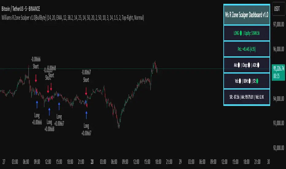
stelaraX - Williams %RstelaraX – Williams %R
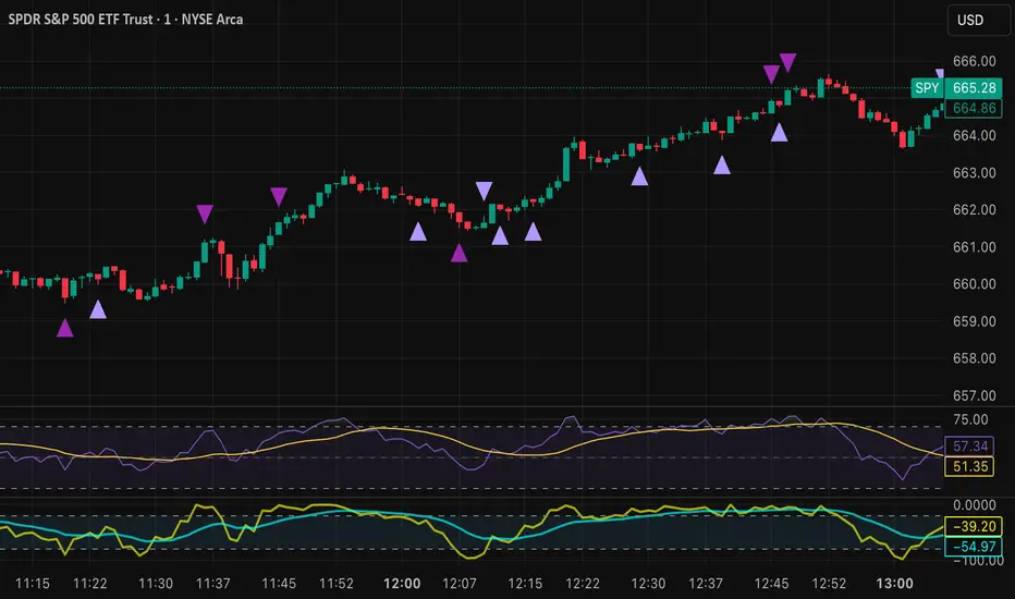
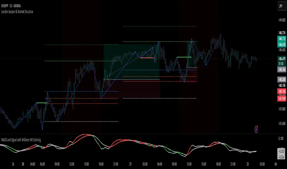
stelaraX – Williams %R is a momentum oscillator designed to identify overbought and oversold market conditions. It measures the position of the current close relative to the highest high and lowest low over a defined lookback period and reacts quickly to changes in market momentum.
This indicator is part of the stelaraX ecosystem, focused on clean technical analysis and AI-supported chart evaluation
stelarax.com
Core logic
Williams %R is calculated over a user-defined period and oscillates between 0 and -100.
Key characteristics include:
* values near 0 indicate overbought conditions
* values near -100 indicate oversold conditions
* the -50 level acts as a momentum midpoint
When Williams %R moves above the overbought threshold, bullish momentum may be stretched. When it moves below the oversold threshold, bearish momentum may be stretched.
Visualization
The script plots:
* the Williams %R line in a separate indicator pane
* a configurable overbought level
* a configurable oversold level
* a midline at -50 for directional context
The area between the overbought and oversold levels is visually highlighted, making extreme momentum conditions easy to identify.
Use case
This indicator is intended for:
* identifying overbought and oversold market conditions
* spotting potential momentum reversals
* confirming short-term trend exhaustion
* divergence analysis between price and momentum
* timing entries and exits in ranging or trending markets
For traders who want to combine classical oscillators with modern AI-driven chart analysis, additional tools and insights are available at stelarax.com
Disclaimer
This indicator is provided for educational and technical analysis purposes only and does not constitute financial advice or trading recommendations. All trading decisions and risk management remain the responsibility of the user.
Indicateur Pine Script®