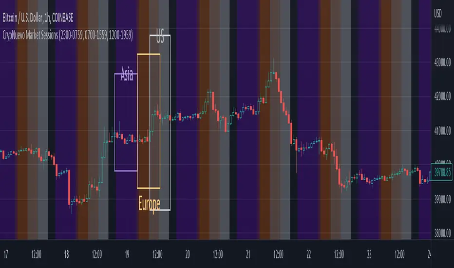
CrypNuevo Market SessionsExperimental script showing a different background color per market session. The session hours and colors can be customized. Note that the session hours can overlap.
Based on a thread by CrypNuevo on Twitter.
Sentiment
TPO Profile with Day StatFirst of all I want to Thank @noop42 for creating this wonderful Market Profile chart in Pine script
I have made some changes to this scripts
This Script can auto calculate the TPO Size for NSE Symbols and MCX Crude oil.
This Script Will only calculate the TPO's for visible range only so that the script use less heap size.
I have added some of the day Statistics to enhance your visualization.
Limitations of this Script
Currently This Script can Plot Market Profile Chart only for Historical Data.
It Can only Plot Market Profile Charts in 30-Mins Time Frame only so that you can't use it for Composite Profile Analysis.
To plot Market Profile Chart in Real Time and Historical please use "Market Profile With TPO by Drother"

timing marketIntraday time cycle . it is valid for nifty and banknifty .just add this on daily basis . ignore previous day data

FOMC & CPI DatesThis indicator plots vertical lines at the scheduled times of US Federal Reserve's FOMC Meeting Dates.
Data is based on U.S. Federal Open Market Committee (FOMC) Meeting Minutes

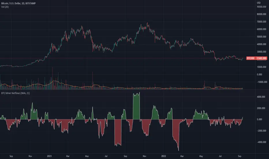
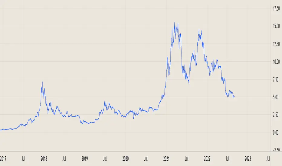
BTC Miner Netflows with smoothingBTC Miner Netflows with smoothing - shows the difference between Miner Inflow and Miner Outflow.
Miner income, sales as well as holdings, are generally considered to have a huge market impact, by analyzing miner Netflows, users can gauge if overall miners are accumulating or selling; high positive values point to accumulation, while negative numbers indicate net selling.
Data queried from IntoTheBlock.
Relative Perfomance IndexHello Traders.
Lets keep it simple..
1. Take the major pairs that have USD in them and watch their change over a specific timeframe.
2. Now lets sort these changes of each pair from the most positive to the most negative.
Good, I see you have some ideas already.
This is exactly what this indicator does. You will visualize the biggest change in pairs of the timeframe of your choice and from this you can decide on pairs that you want to trade.
RSI+ by Wilson (alt)Extension of the excellent RSI+ script by Wilsonlibero. I tweaked the parameters to better fit crypto markets, and I added a few more visuals, such as midline, overbought/oversold threshold lines and areas, background coloration depending on RSI trend above or below midline, and a few other tweaks especially colors (fixed the transp parameter deprecation for example). The color theme is by default more optimized for dark mode charts, but all colors can be configured, and all drawings can be enabled/disabled/tweaked in the parameters.
I'm just giving back to the community since I could modify this script only because it was open-source. If you like this script, please don't give me any credit, but please show some love to the original author Wilsonlibero:
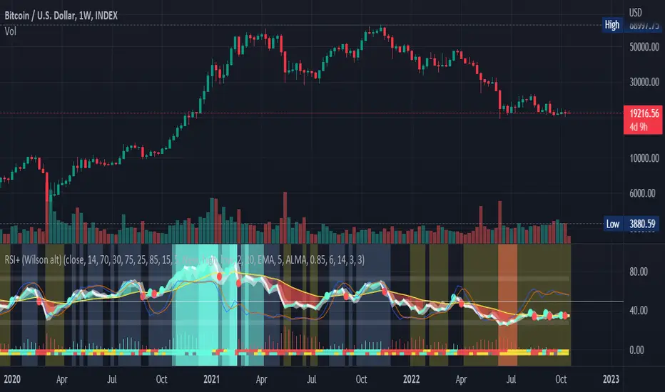
RSI mid partition color changeWhen RSI is above 50 our default bias is on buy side and when below 50 our bias is on sell side.
Therefore created 2 zones for easy identification.
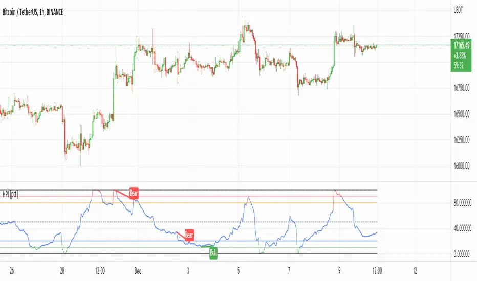
HPI for crypto [ptt]The Herrick Payoff Index is designed to show the amount of money flowing into or out of a futures contract.
This indicator uses open interest (from Binance PERP like this BTCUSDTPERP_OI) from during its calculations, therefore, the pairs being analyzed must contain open interest data on Binance.
The indicator only works with USDT pairs! Like RVNUSDT, BTCUSDT... does not work with USD pairs!
The indicator works in two mode.
Index mode - when the values moving 0-100
In this case, if the value below 10, it shows the money is flowing out of the futures contract and near the local bottom. If the value above 90, it shows the money is flowing into the futures contract and near the local top.
(The two trigger can be modified, the default is low:10 and high:90)
Oscillator mode - when the values moving around the origo (0)
In this case, if the value above 0 (green), it shows the money is flowing into the futures contract, this is bullish
If the value below 0 (red), it shows the money is flowing out of the futures contract, this is bearish
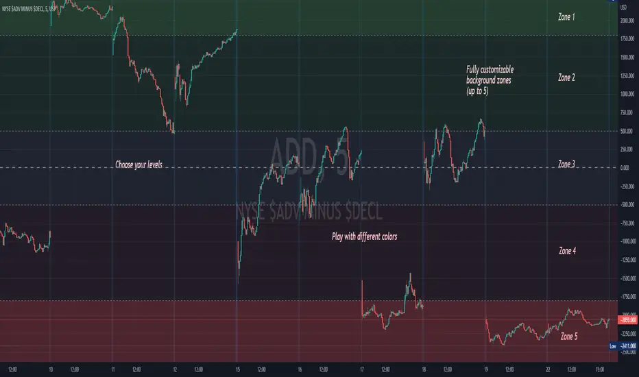
Background ZonesThis script provides up to 5 zones to apply background colors. This is especially useful for applying to indices such as USI:TICK , USI:ADD , and USI:VOLD , where certain levels provides significant meaning to market sentiment and directions. This script will give you the visual cue to help with your trading.
All levels and colors are fully customizable.
Enjoy~!!
Example:
VIX - SKEW DivergenceThe CBOE VIX is a well-known index representing market expectations for volatility over the next 30 days.
The CBOE SKEW is an index reflecting the perceived tail risk over the next 30 days.
When the SKEW rises over a certain level (~140/150), that means investors are hedging their exposure with options, because they are worried about an incoming market crash or a "black swan". If that happens when the VIX is very low and apparently there is no uncertainty, this can warn of a sudden change in direction of the market. You will see for yourself that an increasing divergence often anticipates a sharp fall of leading stock indexes, usually within two to four months.
This is probably not very relevant for the short-term trader but mid/long-term traders and market analysts may find it useful to clearly visualize the extent of the distance between the VIX and the SKEW. For that reason, I wrote this highly customizable script with which you can plot the two indexes and fill the space within them with a color gradient to highlight the maximum and minimum divergence. Additionally, you can fill the beneath VIX area with four different colors. It is also possible to plot the divergence value itself, so if you want you can draw trendlines and support/resistance levels on it.
Please note that the divergence per se doesn't predict anything and it's meant to be used synergistically with other technical analysis tools.
More informations here:
www.cboe.com
www.cboe.com

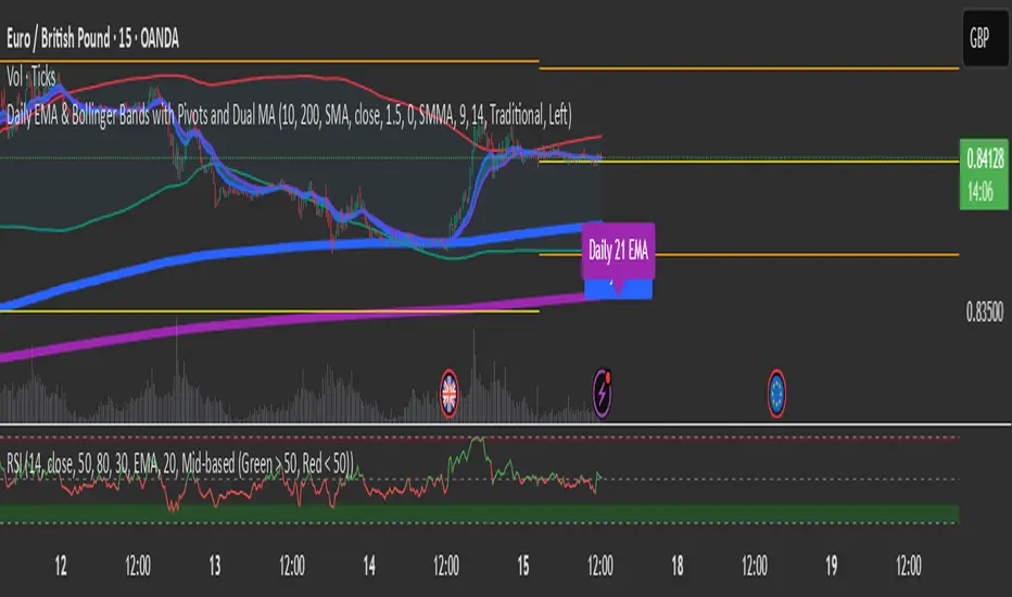
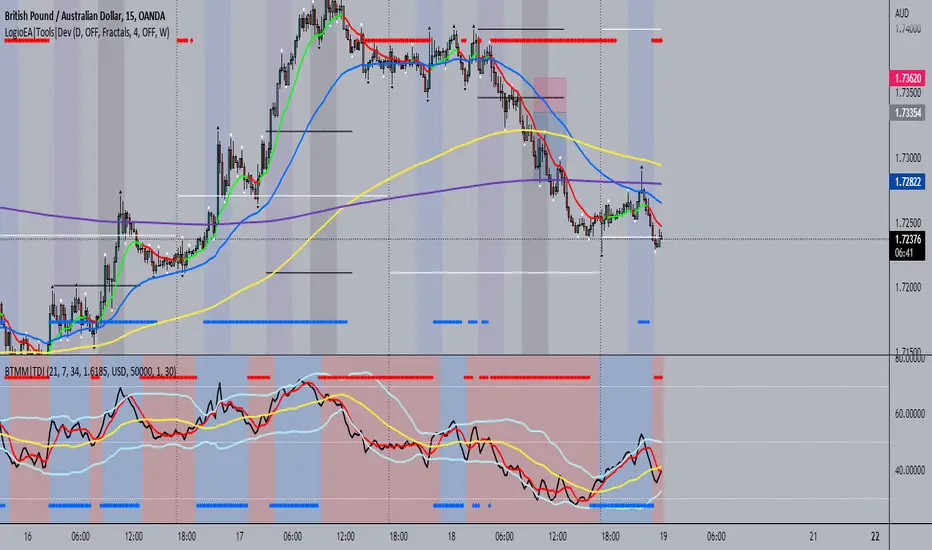
BTMM|TDIThis is the trader's dynamic index inspired by Steve Mauro's BTMM strategy.
In addition to the RSI, Trendline, Baseline, Volatility Bands I have also included additional trend biases that are painted in the background to provide more confluence when the markets break out in either direction.
For convenience, a position size calculator is included for all users to quickly calculate lot sizes on forex pairs with difference account balance currencies. The calculator works accurately on forex pairs. DO NOT USE for crypto or indices as some brokers have unique contract sizes that could not be fully incorporated into the tool.
There is also data table that displays historical values of the RSI, Trendline, Baseline, and an EMA vs Price scoring procedure that covers the current candle (t0) and up to 3 candles back. The table is meant to provide a snapshot view of either bullish or bearish dominance that can be deciphered with a quick glance.
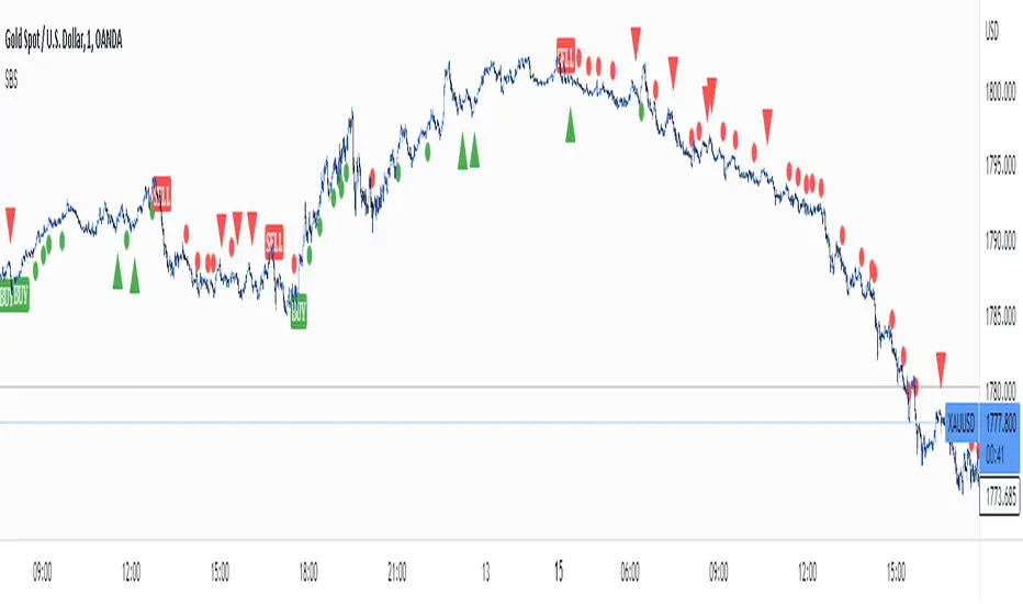
Simple Buy and Sell SignalsThis is a Simple Indicator which shows buy and sell signals based on MACD and SSL channel.
It is not a Holy Grail Indicator. It shows a lot of false signals when the market is Consolidation Zone.
So don't use this indicator to place trades based on signals given by the indicator.
Use this as a confluence along with your technical analysis
On lower timeframes there are a lot of signals so to eliminate false signals , get a signal on higher timeframe and place a trade in the direction of the trend on lower timeframe.
Hope you'll find this helpful. Enjoy👍.
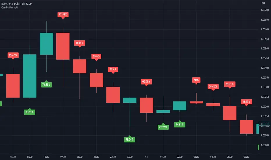
Candle StrengthIt is hard to know which party plays a vital role in the candle. Sometimes we see a red candle/ Seller's candle very weak, but still, the market continues. Here, I tried to figure out how much strength buyers/sellers possess in their respective candles.
The idea is simply to measure the area between high and low and then calculate the opposite party's oppression by calculating the wick's area.
This script is more like a tool, and hence I do not suggest using this as an independent strategy. However, combining it with other analyses and strategies will surely bear fruitful results.
I, in the future, will come up with strategies and more tools like this.
So, follow me to keep getting updates.
Thanks.