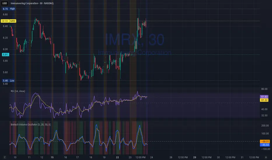
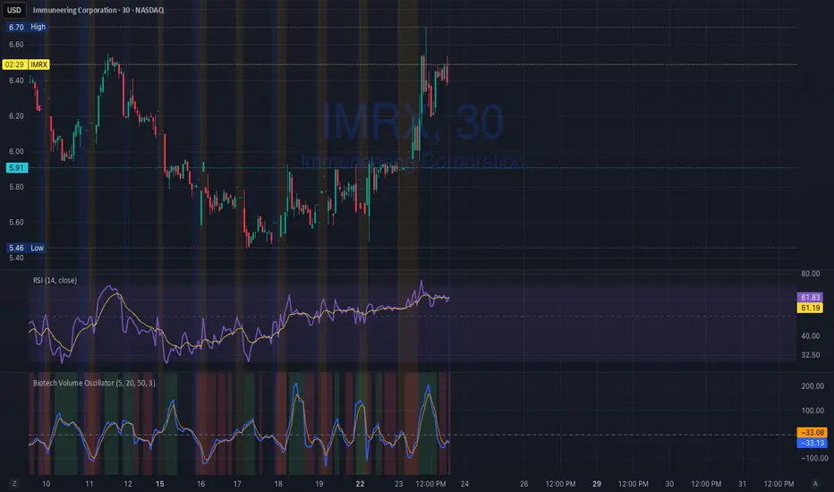
Biotech Volume Oscillator1️⃣ What This Indicator Is (In One Sentence)
It tells you whether people are actually showing up to trade the stock, or if price is just drifting around on low interest.
That’s it.
It does not predict price.
It tells you whether a move is real or fragile.
2️⃣ What the Lines Mean
You see two lines:
🔵 Blue Line = Live Participation
Fast
Reacts immediately
Shows what traders are doing right now
Think:
“Is anyone actually trading this candle?”
🟠 Orange Line = Accepted Participation
Slower
Smoothed
Shows what the market has decided is normal
Think:
“Is this level of activity sticking?”
3️⃣ What the Numbers Mean (Very Important)
The numbers are percentages vs normal volume for this stock.
Around 0
Volume is normal
Nothing special happening
+10 to +25
Healthy interest
Traders are paying attention
Moves can continue
Above +25
Abnormal participation
News, hype, or institutions involved
Moves here tend to be fast
Below –20
Participation drying up
Drift, chop, fake breakouts
Below –30
Nobody is home
Price can move, but it’s fragile
Breakouts usually fail
4️⃣ How to Use It (Step-by-Step)
Step 1: Ignore Price for a Second
Look only at the oscillator.
Ask:
“Is this above zero or below zero?”
Step 2: Look at Direction
Rising oscillator → interest increasing
Falling oscillator → interest fading
Step 3: Compare Blue vs Orange
✅ Good / Healthy
Blue above orange
Both rising
→ New participation is entering
⚠️ Warning
Price rising
Blue flat or falling
Orange flat
→ Float, not conviction
🚨 Distribution
Blue rolls over from high levels
Orange follows
Price still looks “fine”
→ Selling into strength
X-volume
Volume Smart Support & Resistance Levels Indicator Overview
Volume Stronghold Finder is a next-generation volume-based support and resistance indicator that moves beyond simple price-level plotting. It intelligently identifies high-density volume clusters and evaluates their strength to pinpoint the most significant support and resistance zones in any market. By combining multi-timeframe volume analysis with adaptive market state detection, it provides dynamic, context-aware key levels that evolve with market conditions.
Core Innovation: From Static Lines to Dynamic Zones
Traditional support/resistance tools draw fixed lines based on price extremes or moving averages. Volume Stronghold Finder revolutionizes this approach by:
Volume-Based Zone Identification:
Detects Points of Control (POC), Value Area High (VAH), and Value Area Low (VAL) from higher timeframe volume profiles
Automatically clusters nearby POCs into cohesive “stronghold” zones using adaptive thresholds
Differentiates between random price touches and genuine volume-backed levels
Intelligent Stronghold Scoring System:
Cluster Density: How many POCs form the zone (scale 0–50)
Volume Concentration: Relative volume accumulation within the zone (scale 0–50)
Time Relevance: Recency and persistence of the zone (scale 0–15)
Market State Adjustment: Zones are re-evaluated in real-time based on current volatility (Low/Ranging/High)
Adaptive Market-State Logic:
Low Volatility Markets: Uses tighter clustering thresholds to identify precise, narrow zones
High Volatility Markets: Employs wider thresholds and ATR-adjusted buffers to filter out noise
Trending vs. Ranging: Adjusts confirmation logic between trend-following (SMA) and mean-reversion (ATR) approaches
Key Features
🎯 Smart Zone Detection: Automatically groups nearby volume peaks into meaningful support/resistance zones instead of scattered lines
📊 Strength Scoring: Each zone is scored 0–100—focus only on high-score “strongholds” (e.g., >70)
📈 Market-State Adaptive: Zone significance and width adjust dynamically to current volatility
📍 Nearest-Zone Tracking: Continuously monitors the closest stronghold above and below price for potential reactions
⚡ Breakout/Breakdown Alerts: Flags when price moves beyond the highest or lowest historical stronghold
🎨 Visual Clarity: High-score zones are highlighted with bold backgrounds; lower-score zones are subtle
How It Works – A Practical Example
The indicator analyzes volume distribution from a higher timeframe (e.g., 1-hour) to find POC/VAH/VAL levels
It clusters nearby levels (within an adaptive threshold) into a single “Volume Stronghold”
Each stronghold receives a score—e.g., a zone with 3 POCs, high relative volume, and recent formation may score 85/100
As price approaches a stronghold, the indicator calculates:
Distance to the zone in ATR terms
Whether the zone has been tested recently
Likelihood of reaction based on zone score and market state
Strategic Applications
Support/Resistance Trading: Enter near high-score strongholds with confirming price action
Breakout Confirmation: A break above a 90+ score stronghold signals a stronger trend shift
Risk Management: Place stops beyond high-score zones—they’re more likely to hold or repel price
Market Context: Understand whether price is inside a congestion zone (between strongholds) or in a clean trend
Parameter Groups
Volume Profile Settings: Pivot length, profile rows, value area percentage
Stronghold Detection: Clustering sensitivity, history length, minimum score display
Market State Settings: ATR, Bollinger Band, momentum parameters for regime detection
Visual Controls: Zone colors, line styles, score-based filtering

Biotech Volume Oscillator
This oscillator is percentage-based, not raw volume.
Key Levels (Rules of Thumb)
Above +25 → abnormal participation (real interest)
+10 to +25 → constructive, but not decisive
Around 0 → drift / float
Below –25 → participation drying up
These levels work well for:
Small-cap biotech
Catalyst setups
Pre-data ramps
How You’d Use This With RSI (Your Exact Setup)
Bullish / Valid Move
RSI above 50
RSI purple > yellow
Biotech Volume Osc above +10 and rising
➡️ Move has sponsorship
Fake / Suspect Move
Price up
RSI flat or diverging
Volume Osc near 0 or falling
➡️ Float + headline + thin liquidity
Distribution Signal (Very Useful)
Price makes higher high
RSI fails to confirm
Volume Osc rolls over from +25
➡️ Selling into strength
➡️ Excellent context for sell orders like your 7.75
Volume Profile Lite [JOAT]
Volume Profile Lite — Simplified Volume-at-Price Analysis
Volume Profile Lite creates a histogram showing volume distribution across price levels using a proprietary lightweight calculation method. It identifies the Point of Control (POC), Value Area High, and Value Area Low—key concepts from auction market theory—in an optimized, easy-to-read format that won't slow down your charts.
Why This Script is Protected
This script is published as closed-source to protect the proprietary volume distribution algorithm and the optimized Value Area calculation methodology from unauthorized republishing. The specific implementation of volume allocation across price rows, the buy/sell volume separation logic, and the efficient POC detection system represents original work that provides a unique lightweight alternative to standard volume profile implementations.
What Makes This Indicator Unique
Unlike heavy volume profile indicators that can slow down charts, Volume Profile Lite:
Uses an optimized algorithm designed for performance
Separates buying and selling volume for additional insight
Provides clean visual presentation without chart clutter
Includes extending reference lines for key levels
Features a dashboard with price position relative to POC
What This Indicator Does
Distributes volume across price rows to create a visual profile histogram
Identifies the Point of Control (highest volume price level)
Calculates Value Area (where specified percentage of volume traded)
Separates buying and selling volume for each price level
Extends key levels as reference lines on the chart
Highlights the POC row with a distinct border
Core Methodology
The indicator uses a proprietary approach to volume-at-price analysis:
Price Row Division — The lookback range is divided into configurable price rows (default: 24 rows)
Volume Distribution — Each bar's volume is allocated to the price rows it touches. If a bar spans multiple rows, volume is distributed proportionally.
Buy/Sell Separation — Volume is classified based on bar direction (close >= open = buying volume, close < open = selling volume)
POC Detection — The row with maximum accumulated volume is identified as the Point of Control
Value Area Calculation — Starting from POC, expands outward (alternating up and down) until target volume percentage is captured
Key Concepts Explained
Point of Control (POC) — The price level with the highest volume concentration. Often acts as a magnet for price and represents "fair value" for the analyzed period. Price tends to return to POC.
Value Area High (VAH) — Upper boundary of the value area zone. Acts as resistance when price is below, support when price is above.
Value Area Low (VAL) — Lower boundary of the value area zone. Acts as support when price is above, resistance when price is below.
Value Area — Price range containing specified percentage (default 70%) of total volume. This is where most trading activity occurred.
Visual Features
Volume Histogram — Horizontal bars showing volume at each price level
Buy/Sell Coloring — Green portions show buying volume, red shows selling volume
POC Highlight — The POC row has a distinct orange border and fill
POC Line — Horizontal line extending from POC (optional extension to right)
Value Area Lines — Dashed blue lines at VAH and VAL
Value Area Fill — Subtle blue fill between VAH and VAL
Color Scheme
Up Volume Color — Default: #26A69A (teal) — Buying volume
Down Volume Color — Default: #EF5350 (red) — Selling volume
POC Color — Default: #FF9800 (orange) — Point of Control
Value Area Color — Default: #2196F3 (blue) — VAH/VAL lines and fill
Dashboard Information
The on-chart table (bottom-right corner) displays:
POC price level
Value Area High price level
Value Area Low price level
Current price position relative to POC (ABOVE POC, BELOW POC, or AT POC)
Distance from current price to POC as percentage
Inputs Overview
Calculation Settings:
Lookback Period — Number of bars to analyze (default: 100, range: 20-500)
Number of Rows — Price level divisions for the profile (default: 24, range: 10-50)
Value Area % — Percentage of volume for value area calculation (default: 70%, range: 50-90%)
Visual Settings:
Up/Down Volume Colors — Customizable buy/sell colors
POC Color — Point of Control highlighting
Value Area Color — VAH/VAL line and fill color
Profile Width — Visual width of histogram in bars (default: 30, range: 10-100)
Show POC Line — Toggle POC horizontal line
Show Value Area — Toggle VAH/VAL lines and fill
Show Dashboard — Toggle the information table
Extend Lines — Project POC and VA lines further right
How to Use It
For Support/Resistance:
Use POC as a potential support/resistance reference point
Price often gravitates back to POC (mean reversion)
VAH acts as resistance when approaching from below
VAL acts as support when approaching from above
For Trend Analysis:
Price above POC suggests bullish control
Price below POC suggests bearish control
Breaking out of Value Area often leads to trending moves
Returning to Value Area suggests failed breakout
For Entry/Exit:
Enter longs near VAL with stops below
Enter shorts near VAH with stops above
Target POC for mean-reversion trades
Use POC as a trailing stop reference in trends
Alerts Available
VPL Cross Above POC — Price crosses above Point of Control
VPL Cross Below POC — Price crosses below Point of Control
VPL Cross Above VAH — Price breaks above Value Area High
VPL Cross Below VAL — Price breaks below Value Area Low
Best Practices
Use longer lookback periods for more significant levels
Increase row count for more precise level identification
POC from higher timeframes is more significant
Combine with other indicators for confirmation
This indicator is provided for educational purposes. It does not constitute financial advice. Past performance does not guarantee future results. Always conduct your own analysis and use proper risk management before making trading decisions.
— Made with passion by officialjackofalltrades

PowerWave Oscillator Suite [BOSWaves]PowerWave Oscillator Suite - Multi-Dimensional Momentum & Trend Oscillator with Adaptive Divergence Insight
Overview
PowerWave Oscillator Suite is a cutting-edge analytical toolkit designed to provide traders with a sophisticated understanding of momentum, trend strength, and divergence behavior in financial markets. Unlike conventional oscillators that rely solely on price-based calculations, PowerWave combines adaptive, multi-dimensional computation engines with advanced visualization tools and divergence detection systems. The suite offers a unique blend of trend-following, mean-reversion, and contrarian trading insights, allowing users to analyze markets from multiple angles simultaneously. Each module within the suite has been designed to offer precision, clarity, and adaptability, ensuring that traders of all levels - from novice to professional - can extract actionable intelligence without unnecessary chart clutter or signal ambiguity.
PowerWave Oscillator Suite focuses on three primary trading paradigms: momentum measurement, volume-based filtering, and smoothed trend oscillation. These paradigms are accessible via three core modules - Aroon Oscillator, Adaptive Volume Filter, and HyperSmooth Oscillator - each equipped with advanced smoothing, dynamic source selection, reduced-lag computation, and divergence detection, offering a comprehensive approach to market analysis. By leveraging the full capabilities of this toolkit, traders can identify market turning points, confirm trend strength, detect hidden divergences, and refine entries and exits, all within a single integrated framework.
Configuration Panel and Customization Options
At the heart of PowerWave is a robust configuration panel that allows users to tailor the suite to their individual trading preferences and market conditions. The first level of customization is the Module Selection, allowing users to toggle between the Aroon Oscillator, Adaptive Volume Filter, or HyperSmooth Oscillator. Each module is designed with a distinct analytical purpose:
Aroon Oscillator : Measures trend strength and provides early signals for trend reversals or continuation.
Adaptive Volume Filter : Uses volume-based filtering to highlight momentum shifts, smoothing out noise from price fluctuations.
HyperSmooth Oscillator : Delivers finely smoothed oscillations, designed to capture micro-trend shifts and acceleration patterns.
Users can enhance the responsiveness and filtering behavior of each module via the Enhancement Level setting, a numeric input that applies a series of multi-stage exponential smoothing layers, ensuring signals are robust against market noise without introducing excessive lag. Additionally, the Source Type option allows traders to determine the price input methodology - ranging from adaptive combinations of open, high, low, and close values to more traditional sources - granting flexibility to align the indicator with preferred strategies or asset characteristics.
Engineered Visual Intelligence and Module-Specific Color Systems
PowerWave employs purpose-built, module-specific color systems that are tightly integrated with each oscillator’s underlying computation model. Rather than treating color as a cosmetic layer, the suite uses color as an informational channel, encoding state, momentum bias, and structural context directly into the visual output.
Each module operates with a dedicated color logic aligned to its analytical role:
The Aroon Oscillator uses polarity-driven gradients to express time-based trend dominance and directional strength.
The Adaptive Volume Filter applies contrasting color states to distinguish expanding versus contracting volume pressure.
The HyperSmooth Oscillator utilizes a dynamic HSV-based color spectrum that continuously maps momentum acceleration and deceleration into the oscillator line itself.
These color systems are reinforced through coordinated visual elements, including bar coloring, background state highlighting, histogram fills, and cross-condition shading. Users can further tune visual intensity and emphasis through enhanced mode and opacity controls, allowing the same engineered color logic to be amplified or subdued depending on chart density and personal workflow.
By designing color behavior as an extension of the calculation engine - rather than an arbitrary styling choice - PowerWave ensures that visual cues remain consistent, data-driven, and immediately interpretable across assets, timeframes, and market regimes.
Dynamic Source and Zero-Lag Computation
A defining characteristic of PowerWave Oscillator Suite is its Dynamic Source Calculation engine, which adjusts the input price series according to the trader’s chosen source type and enhancement level. This system ensures that signals are computed from a refined, noise-filtered base, enhancing reliability across asset classes and timeframes. Each stage of the multi-level smoothing hierarchy incrementally reduces erratic price fluctuations while preserving meaningful structural movement, allowing traders to differentiate between minor price noise and genuine momentum shifts.
Complementing this is the Adaptive Reduced-Lag Filter, a highly specialized algorithm that minimizes lag inherent in traditional moving averages or oscillators. This filter uses a gain-optimized EMA structure that continuously self-adjusts based on recent price dynamics, providing traders with fast yet reliable signals. By incorporating zero-lag calculations, PowerWave ensures that trend reversals and momentum inflections are detected in near real-time, allowing for earlier entries, faster confirmations, and more accurate exits. The reduced-lag filter also dynamically adjusts its internal gain coefficients, minimizing error while accounting for varying market volatility.
Aroon Oscillator Module
The Aroon Oscillator module within PowerWave is designed to quantify trend strength and identify emerging directional shifts. Utilizing a dual-period calculation, the module compares the relative timing of recent highs and lows, producing a normalized oscillation that reflects the market’s current momentum. Advanced zero-lag filtering ensures that even minor reversals or trend accelerations are captured with minimal delay, while additional smoothing can be applied via the configuration panel to match the trader’s preferred sensitivity.
The module includes trend and mean-reversion signal detection:
Trend Signals : Generated when the oscillator crosses the zero line, indicating potential trend continuation or initiation.
Reversion Signals : Triggered by crossovers between the oscillator and its internal signal line, highlighting potential pullbacks or temporary counter-trend behavior.
Visual overlays, including bar coloring and gradient plots, highlight bullish and bearish momentum zones, making it immediately apparent whether the market is in a trending or consolidating state. By combining trend and reversion insights with divergence detection, traders gain a multi-layered understanding of market structure, allowing for well-timed entries and exits.
Use Case:
Use the Aroon Oscillator when your primary objective is identifying real trend shifts early and staying aligned with structure. This model excels in markets transitioning from consolidation into expansion, where timing matters more than micro-entries. Zero-line crosses define directional regime changes, while signal-line crossovers expose mean-reversion pullbacks within a dominant trend. Divergences here are high-quality because Aroon measures time-based strength, not just price movement - making this ideal for swing traders and intraday trend followers who want confirmation before committing size.
Adaptive Volume Filter Module
The Adaptive Volume Filter takes a fundamentally different approach, analyzing volume-driven market behavior. By transforming price inputs with volume-weighted calculations and applying an adaptive multi-stage smoothing engine, this module emphasizes genuine buying and selling pressure while suppressing noise caused by small, indecisive bars.
Key features include:
Dynamic Thresholding : Traders can set threshold levels to define oversold or overbought regions based on relative volume patterns.
Multi-tiered Signal Generation : Local trend signals identify moderate momentum shifts, while oversold/overbought conditions trigger stronger trade opportunities.
Volume-Cycle Adaptation : The filter adapts to cyclical volume patterns, ensuring that signals remain valid during periods of high or low market participation.
This module is particularly effective for spotting institutional accumulation/distribution, validating trends, and detecting early inflection points where price action alone might be misleading.
Use Case:
Select the Adaptive Volume Filter when you want to validate price movement with participation, not guess momentum in a vacuum. This oscillator shines during breakouts, distribution phases, and deceptive price moves where volume tells the real story. Overbought and oversold zones highlight statistically stretched volume conditions, while the adaptive smoothing engine filters short-term noise caused by small, indecisive bars. This is the model you use to confirm whether a move is being supported or starved - making it lethal for spotting exhaustion, fake breakouts, and accumulation/distribution zones.
HyperSmooth Oscillator Module
The HyperSmooth Oscillator represents the most sophisticated module in the suite, combining adaptive smoothing, dual-cycle EMA differentiation, and volatility-normalized scaling. It calculates momentum by comparing fast and slow EMA cycles of a dynamically smoothed price series and then normalizes this difference using ATR-based volatility adjustments. This ensures that the oscillator is sensitive to micro-momentum changes while remaining robust against extreme volatility spikes.
Additional innovations in this module include:
Hyper-smoothing and acceleration detection : Captures micro-trend shifts and identifies momentum acceleration or deceleration, providing early insight into potential trend reversals.
Dynamic color mapping : Uses HSV-based gradient calculations to indicate the intensity and direction of momentum, enhancing immediate visual interpretation.
Threshold-based cross-validation : Ensures that only meaningful crossovers are flagged as buy or sell signals, reducing false positives in noisy markets.
Combined, these mechanisms give traders access to both subtle and strong market moves, allowing nuanced position sizing and timing strategies.
Use Case:
Use HyperSmooth when you need speed, sensitivity, and volatility-aware momentum detection. This model is built for fast markets, aggressive entries, and momentum continuation plays where standard oscillators lag. By normalizing momentum with ATR and dynamically adjusting signal thresholds, HyperSmooth filters weak crosses and only reacts when momentum actually matters. Color-shifted acceleration highlights when force is increasing or decaying, making this the go-to mode for scalpers and momentum traders hunting explosive continuation or sharp reversals with minimal delay.
Enhanced Divergence Detection System
PowerWave includes a robust divergence detection engine, capable of identifying regular and hidden bullish and bearish divergences across all modules. Divergences are detected by analyzing oscillator pivots against corresponding price highs and lows, ensuring that traders can spot structural weaknesses or strengths in trend continuation.
Key enhancements include:
Pivot-based analysis with lookback control : Allows customization of sensitivity to short-term vs. long-term divergences.
Priority system : Regular divergences are highlighted first, while hidden divergences are only displayed if no regular divergence is present, reducing chart clutter.
Visual representation : Divergences are drawn on both the oscillator and price chart using solid or dashed lines with opacity gradients, enabling clear interpretation of potential reversal zones.
This system equips traders to anticipate trend exhaustion points, early reversals, and high-probability pullbacks, a critical advantage in both trending and range-bound markets.
Visualization and Chart Interpretation
Every module in PowerWave is accompanied by enhanced visual aids, including histogram fills, line overlays, bar coloring, and shape-based trade markers. These features provide instant clarity on:
Trend direction : Bullish vs. bearish zones are highlighted via gradient fills and bar color overlays.
Signal strength : Minor, regular, and strong trade setups are distinguished using shape markers (triangles, circles, diamonds).
Momentum confirmation : Histogram fills indicate whether the oscillator is accelerating or decelerating relative to its signal line.
By integrating these visualizations, PowerWave transforms complex calculations into immediately actionable chart insights, enabling both manual and automated strategies to be executed with confidence.
General Use Cases and Trading Applications
Trend-following : Combine oscillator zero-line crossovers with divergence confirmation for disciplined entries.
Counter-trend trading : Utilize hidden divergence signals to identify potential reversal points before visible trend exhaustion.
Volume-sensitive trades : Adaptive Volume Filter highlights accumulation/distribution phases, providing context for institutional participation.
Scalping and swing strategies : HyperSmooth Oscillator captures micro-momentum changes, ideal for both short-term scalping and multi-day swing trades.
The suite is designed for flexibility and adaptability, allowing traders to integrate multiple modules, fine-tune parameters, and create customized signals aligned with personal strategies or specific market conditions.
Final Notes
PowerWave Oscillator Suite is designed as an analytical decision-support system. It provides structured market insight based on historical price and volume behavior and does not constitute predictive or outcome-guaranteed functionality. Its core design philosophy emphasizes clarity, adaptability, and risk-aware decision-making. Every calculation, filter, and visual cue is intended to provide insight, not guarantees. Traders are encouraged to combine the suite’s outputs with proper risk management, contextual market awareness, and disciplined strategy execution.
Risk Disclaimer
This indicator is provided for educational and informational purposes only and does not constitute financial advice. Trading involves significant risk, and past performance is not indicative of future results. Users are responsible for their own analysis, risk management, and execution decisions.


Rolling Cumulative Volume Delta (N bars)Rolling CVD, not anchored to a date and reset after anchor+period reached

VOLD RatioThis indicator calculates the ratio between NYSE Up Volume and Down Volume (USI:UVOL / USI:DVOL).
It helps assess market participation and short-term buying vs. selling pressure.
Higher values indicate dominant buying volume, while lower values suggest increasing selling pressure.
Useful as a breadth and confirmation tool alongside index price action.

Market Pressure Delta ProMarket Pressure Delta Pro is an analytical indicator designed to quantify the hidden "Determination" behind every price move. While traditional indicators focus on where the price is, this engine focuses on the conviction behind the move. It operates on the theory of Institutional Exhaustion. It observes the balance of power during the formation of a trend to determine if a move is backed by genuine intent or if it is merely a low-conviction spike.

Money VolThe indicator displays the trading volume in monetary terms and its ratio to the average trading volume over 100 periods. It highlights volumes that are 2x, 5x, 10x, or less than 2x the average.
Индикатор показывает объем торгов в денежном выражении, отношение к среднему объему торгов за 100 периодов, подсвечивает х2, х5, х10 и меньше более чем х2

Volume OscillatorDescription
The Volume Oscillator measures the momentum of trading volume by calculating the percentage difference between a fast and a slow Simple Moving Average (SMA) of daily volume. It helps traders identify periods of increasing or decreasing market participation, often signaling potential trend strength or exhaustion.
Key Features:
Adaptive to Trading Session:
Automatically adjusts SMA periods based on the actual trading session length (default: 8.5 hours for FTSEMIB, customizable for any market — e.g., 6.5h for US stocks, 24h for crypto).
Fast & Slow SMAs:
Compares a short-term SMA (default 10 days) with a longer-term SMA (default 25 days) of volume.
Oscillator Formula:
100 × (Fast SMA / Slow SMA - 1)
→ Positive values = increasing volume momentum (bullish)
→ Negative values = decreasing volume momentum (bearish)
Signal Line (optional):
A moving average of the oscillator (default 7 days) for smoother trend identification and crossover signals.
Overbought/Oversold Levels:
User-defined horizontal lines (default +40 / -40) to highlight extreme volume conditions.
Customizable Colors:
Change the oscillator and signal line colors to match your chart style.
How to Interpret:
Bullish Conditions:
Oscillator crosses above the zero line
Oscillator crosses above the signal line
Readings near or above +40 may indicate strong buying pressure (watch for possible exhaustion if too extreme)
Bearish Conditions:
Oscillator crosses below the zero line
Oscillator crosses below the signal line
Readings near or below -40 may indicate selling pressure or capitulation
Divergences:
Look for divergences between price and the Volume Oscillator (e.g., price makes new highs but oscillator fails to confirm with higher highs) — a classic sign of weakening momentum.
Best Use Cases:
Indices (FTSEMIB, DAX, CAC, SPX, etc.), stocks and futures with defined trading hours, crypto (set session duration to 24 hours).
Works well on intraday (e.g., 15m, 30m, 1h) and daily charts.
Customization Tips:
- Shorten fast/slow lengths for faster signals (more noise)
- Lengthen them for smoother, longer-term analysis
- Adjust session duration for non-standard market hours
- Enable/disable the signal line in the settings
Note: Volume data quality can vary by symbol and exchange. Always combine this indicator with price action and other tools. Use proper risk management.

Volume ROC (smoothed)Description
The Volume ROC (Rate of Change) indicator is designed to measure the momentum of trading volume over a user-defined period, adjusted for the trading session length of the symbol (e.g., 8.5 hours for the FTSEMIB index). This makes it particularly useful for intraday charts where standard daily calculations might not align with actual trading days.
By focusing on volume changes rather than price, it helps identify potential shifts in market participation, such as accumulation, distribution, or unusual activity that could precede price movements.
How It Works:
Session Adjustment:
The indicator calculates the number of candles per trading day based on the input session duration (in hours) and the chart's timeframe. This ensures that the ROC and other calculations are based on "trading days" rather than calendar days, making it adaptable to markets with non-standard hours like European indices (e.g., FTSEMIB).
Daily Data Fetch:
It retrieves daily high, low, close, and volume data using "request.security" to ensure consistency across timeframes.
ROC Calculation:
The Rate of Change (ROC) is computed on volume using "ta.change" over the specified length (in days), multiplied by the candles-per-day factor for timeframe independence. By chosing the subtraction method instead of the division method we avoid distortions of the ROC below the zero line (method ok for timespans inferior to two years).
Smoothing with SMA:
A Simple Moving Average (SMA) is applied to the ROC to reduce noise and highlight trends in volume momentum.
Standard Deviation Bands:
The standard deviation of the smoothed ROC is calculated over a lookback period. Bands are plotted at +2σ (overbought) and -2σ (oversold) to provide context for extreme volume changes, similar to Bollinger Bands but applied to volume ROC.
Key Plots:
SMA Line (Orange): The smoothed ROC value. Positive values indicate increasing volume momentum; negative values suggest decreasing momentum.
Zero Line (Black Dotted): A reference line at 0, separating positive and negative ROC territories.
+2σ Band (Red Dotted): Upper overbought threshold. Crossings above this may signal excessive buying volume.
-2σ Band (Green Dotted): Lower oversold threshold. Dips below this could indicate capitulation or low interest.
Usage and Interpretation:
Trend Confirmation:
Use the SMA crossing above/below zero to confirm price trends with volume backing. For example, a rising price with positive Volume ROC suggests strong conviction.
Divergences:
Look for divergences between price and Volume ROC (e.g., price making new highs but ROC weakening), which can signal reversals.
Overbought/Oversold Signals:
The ±2σ bands act as dynamic levels. Volume ROC spiking above +2σ might precede pullbacks, while below -2σ could indicate buying opportunities.
Best Applied To:
European indices (like FTSEMIB or DAX), stocks, or futures with defined session hours. Test on intraday (e.g., 2h) and combine with price-based indicators like RSI or MACD for confluence.
Customization:
Adjust the ROC/SMA lengths for sensitivity (shorter for scalping, longer for swings). The STDEV lookback affects band width—longer periods create smoother bands.
Limitations:
Volume data can be noisy in low-liquidity symbols. This indicator assumes consistent session lengths; irregular holidays may affect accuracy. Always backtest and use with risk management.
This indicator is original and built for educational/trading purposes.
DTR + ATR + OR + VWAP PRO (Merged Model)This indicator combined
Day Trading Range
ATR
VWAP
Open Rang for the selected time frame

BT Session VP & VolatilityBT Session VP v0.6 is a professional-grade Session Volume Profile designed for futures, index, and intraday traders who need clean, accurate session structure without clutter.
This tool builds a true volume distribution for each trading session using lower-timeframe data, detects high- and low-volume nodes, and tracks a dynamic Point of Control (POC) to help traders identify balance, acceptance, and trend conditions in real time.
• Index futures, session-based crypto trading
• Intraday equity index trading
• Momentum scalping with session context
• Auction market theory workflows
Features
• True session-based volume profile (RTH or ETH)
• Futures-correct ETH handling (18:00–17:00 session)
• Hard session fencing — no volume bleed between sessions
• Lower-timeframe volume aggregation for accuracy
• Dynamic Point of Control (POC) tracking
• High Volume Nodes (HVN) and Low Volume Nodes (LVN)
• Live session and prior session profiles
• Optional volatility-weighted volume
• Fully customizable colors, opacity, and labels
**Volatility-Weighted Volume** is an optional feature that adjusts how volume contributes to the session profile based on current market volatility.
Instead of treating all volume equally, BT Session VP can weight volume more heavily during periods of expansion and less during periods of compression.
When volatility weighting is enabled:
• If volatility is above its recent average, volume is amplified; below volume is dampened
• The strength of this effect is controlled by a user-defined multiplier
• Volatility weighting does not change price levels, Iit does not introduce signals or repainting. It only affects how volume contributes to the distribution
• The feature can be disabled at any time for a traditional volume profile
The Point of Control is calculated dynamically as the session evolves.
• If the POC remains stable for N bars, the market is considered balanced
• If the POC shifts upward, it reflects bullish acceptance
• If the POC shifts downward, it reflects bearish acceptance
• POC color changes automatically based on these conditions
This allows traders to quickly distinguish between balance, rotation, and trend days.
• HVN represent price levels where the market previously accepted value
• LVN represent areas of rejection or inefficiency
Nodes are filtered using:
• Local dominance logic
• Minimum separation (prevents clustering)
These levels often act as:
• Support / resistance
• Acceptance or rejection zones
• Rotation targets during balance
How traders use BT Session VP
• Identify balance vs trend days early
• Use POC direction to confirm market regime
• Trade rotations between HVNs during balance
• Fade LVNs during rejection
• Use prior session nodes as reaction levels
• Combine with momentum tools for confirmation
This indicator is designed to provide context , not signals.
It works best when combined with execution tools, order flow, or momentum confirmation.

VWAP Multi-Timeframe Pro═══════════════════════════════════════════════════════════════════════════════
VWAP Multi-Timeframe Pro - 6 VWAP + Dynamic Levels - Alphaomega18
📝 COMPLETE DESCRIPTION
═══════════════════════════════════════════════════════════════════════════════
🎯 THE MOST COMPLETE VWAP INDICATOR ON THE MARKETPLACE
VWAP Multi-Timeframe Pro simultaneously displays 6 different VWAPs (Asia/London/NY Sessions + Daily/Weekly/Monthly) with key price levels and intelligent dynamic color for complete institutional market vision.
Designed for professional traders: futures, forex, crypto, stocks. Compatible all timeframes.
🔥 WHY THIS INDICATOR IS UNIQUE
Other VWAP indicators display 1 or 2 VWAPs maximum.
**VWAP MTF Pro gives you EVERYTHING in one indicator:**
✅ **6 Simultaneous VWAPs**: Asia, London, NY, Daily, Weekly, Monthly
✅ **3 Key Price Levels**: Previous VWAP, Daily Open, Previous Close
✅ **Dynamic Color**: GREEN line if price above, RED if below
✅ **Standard Deviation Bands**: ±1σ, ±2σ, ±3σ for extreme deviations
✅ **10 Configurable Alerts**: Crossovers and extreme zones
✅ **100% Customizable**: Colors, styles, selective display
One indicator = Complete 24/7 institutional flow vision!
📊 THE 6 DISPLAYED VWAPS
🔷 **1. VWAP ASIA SESSION** (Yellow default)
→ Customizable Asian session (00:00-08:00 default)
→ Visible only during Asia session
→ Identifies key Asian trading levels
🔷 **2. VWAP LONDON SESSION** (Cyan default)
→ European session (08:00-16:00 default)
→ Visible only during London session
→ Captures European institutional flow
🔷 **3. VWAP NY SESSION** (Orange default)
→ American session (15:30-22:00 default)
→ Visible only during NY session
→ Highest volume of the day
🔷 **4. VWAP DAILY** (Blue default)
→ Full day VWAP
→ Most important level for day traders
→ Major support/resistance
🔷 **5. VWAP WEEKLY** (Purple default)
→ Weekly VWAP
→ Medium-term trend
→ Key level for swing traders
🔷 **6. VWAP MONTHLY** (Fuchsia default)
→ Monthly VWAP
→ Long-term vision
→ Major institutional levels
📍 3 ESSENTIAL PRICE LEVELS (NEW)
🔷 **PREVIOUS DAY VWAP CLOSE** (Dashed line - Dynamic color!)
**The Revolutionary Feature:**
→ Displays previous day's VWAP Daily close
→ **GREEN line** when price ABOVE = Bullish signal ✅
→ **RED line** when price BELOW = Bearish signal ❌
→ Changes color in real-time at crossover!
**Why it's powerful:**
```
If you're trading LONG and line is GREEN:
→ You're on right side of market
→ Institutions are with you
→ Hold trade with confidence
If line turns RED:
→ EXIT immediately
→ Momentum has changed
→ Institutions selling now
```
🔷 **DAILY OPEN** (White dotted default)
→ Current day's opening price
→ Major psychological level
→ Intraday support/resistance
🔷 **PREVIOUS DAY CLOSE** (Purple dotted default)
→ Previous day's close
→ Gap analysis (up/down/none)
→ Critical institutional level
📏 STANDARD DEVIATION BANDS
**3 Bands on each side of VWAP:**
→ ±1σ (68% of distribution)
→ ±2σ (95% of distribution)
→ ±3σ (99.7% of distribution)
**VWAP selection for bands:**
Choose from: Asia / London / NY / Daily / Weekly / Monthly
**Usage:**
```
Price reaches +3σ:
→ Extreme overbought
→ Reversal or consolidation likely
→ Take LONG profits or prepare SHORT
Price reaches -3σ:
→ Extreme oversold
→ Reversal or consolidation likely
→ Take SHORT profits or prepare LONG
Price between ±1σ:
→ "Normal" zone
→ Trading range
→ Wait for breakout
```
🎯 REAL USE CASES
📌 **CASE 1: MNQ Day Trading with Dynamic Color**
**Morning Setup:**
```
08:00 - Market opens
→ Price at 16,300
→ Prev Day VWAP Close at 16,250
→ Line = GREEN ✅ (price above)
→ Signal: Bullish sentiment confirmed
Action: Look for LONG setups only
Avoid: SHORT trades against trend
```
**Momentum Change:**
```
10:30 - Price drops rapidly
→ Price drops to 16,240
→ Line turns RED ❗
→ Signal: Momentum changed!
Action: EXIT LONG positions immediately
Look for: SHORT setups now
```
**Result:**
→ You stay on right side of market permanently
→ No fighting institutions
→ Profits maximized, losses minimized
📌 **CASE 2: Gap Analysis with Daily Open + Prev Close**
**Gap UP:**
```
Daily Open (white): 16,320
Prev Day Close (purple): 16,280
Gap = +40 points
Analysis:
→ Bullish gap
→ If VWAP prev line = GREEN = Continuation
→ If price retests Prev Close (purple) and bounces = LONG entry
```
**Gap DOWN:**
```
Daily Open (white): 16,240
Prev Day Close (purple): 16,280
Gap = -40 points
Analysis:
→ Bearish gap
→ If VWAP prev line = RED = Continuation
→ If price rallies to Prev Close (purple) and rejects = SHORT entry
```
📌 **CASE 3: Multi-Timeframe Confirmation**
**LONG Setup Maximum Conviction:**
```
✅ Price > VWAP Monthly (fuchsia) → Long-term bullish trend
✅ Price > VWAP Weekly (purple) → Medium-term bullish trend
✅ Price > VWAP Daily (blue) → Short-term bullish trend
✅ Prev Day VWAP = GREEN → Today's momentum bullish
✅ Price > Daily Open (white) → Positive opening
Signal: ALL timeframes aligned LONG!
Action: LONG entry with strong conviction
Stop: Below VWAP Daily
```
**SHORT Setup Maximum Conviction:**
```
✅ Price < VWAP Monthly (fuchsia) → Long-term bearish trend
✅ Price < VWAP Weekly (purple) → Medium-term bearish trend
✅ Price < VWAP Daily (blue) → Short-term bearish trend
✅ Prev Day VWAP = RED → Today's momentum bearish
✅ Price < Daily Open (white) → Negative opening
Signal: ALL timeframes aligned SHORT!
Action: SHORT entry with strong conviction
Stop: Above VWAP Daily
```
📌 **CASE 4: Session Trading (London/NY Overlap)**
**15:30 - NY Session Opens:**
```
Before 15:30:
→ Price in VWAP London (cyan)
→ Consolidation, range
15:30 - NY opens:
→ VWAP NY (orange) appears
→ Volume explodes
→ Price breaks above VWAP Daily (blue)
→ Prev Day VWAP = GREEN ✅
Action:
→ LONG entry on breakout
→ Stop below VWAP Daily
→ Target +3σ upper band
```
⚙️ COMPLETE CUSTOMIZATION
🎨 **EACH VWAP IS CONFIGURABLE:**
**For each VWAP (6 groups):**
→ Show/Hide (On/Off)
→ Customizable color
→ Line thickness (1-5)
**Asia/London/NY Sessions:**
→ Configurable start/end hours
→ Adapt to your timezone
→ Customize per market
**Forex Example:**
```
Asia: 00:00-08:00 (Tokyo)
London: 08:00-16:00 (London)
NY: 13:00-20:00 (New York)
```
**US Futures Example:**
```
Asia: 18:00-02:00 (overnight)
London: 02:00-08:30
NY: 08:30-15:00 (RTH)
```
🎨 **PREVIOUS DAY VWAP - Dynamic Color:**
→ **Dynamic Color (Green/Red)**: On/Off
• ON = Line changes color (GREEN/RED)
• OFF = Fixed color
→ **Color Above**: Color when price above (default: Green)
→ **Color Below**: Color when price below (default: Red)
→ **Static Color**: If Dynamic Color OFF (default: White)
→ **Line Width**: Thickness (1-5)
→ **Line Style**: Solid / Dashed / Dotted
🎨 **DAILY PRICE LEVELS:**
**Daily Open:**
→ Show/Hide
→ Color (default: White)
→ Thickness
→ Style (Solid/Dashed/Dotted)
**Previous Day Close:**
→ Show/Hide
→ Color (default: Purple/Fuchsia)
→ Thickness
→ Style (Solid/Dashed/Dotted)
📏 **STANDARD DEVIATION BANDS:**
→ **Show Bands**: On/Off
→ **Bands Timeframe**: Choose VWAP (Asia/London/NY/Daily/Weekly/Monthly)
→ **Standard Deviation 1/2/3**: σ values (default: 1.0 / 2.0 / 3.0)
→ **Upper Colors**: Customizable
→ **Lower Colors**: Customizable
👁️ **DISPLAY:**
→ **Show Labels**: Display price labels (On/Off)
→ **Label Size**: Tiny / Small / Normal / Large
🔔 COMPLETE ALERTS (10 ALERTS)
**VWAP Daily Crossovers:**
1. Price > VWAP Daily
2. Price < VWAP Daily
**Extreme Bands:**
3. Price reaches +3σ
4. Price reaches -3σ
**Previous Day VWAP:**
5. Price > Previous Day VWAP
6. Price < Previous Day VWAP
**Daily Open:**
7. Price > Daily Open
8. Price < Daily Open
**Previous Day Close:**
9. Price > Previous Close
10. Price < Previous Close
💡 MARKETS AND TIMEFRAMES
✅ **ALL markets compatible:**
• Futures (ES, NQ, YM, RTY, MNQ, MES, etc.)
• Forex (EUR/USD, GBP/USD, USD/JPY, etc.)
• Crypto (BTC, ETH, altcoins - 24/7)
• Stocks (Tesla, Apple, Nvidia, etc.)
• Indices (S&P 500, Nasdaq, Dow Jones)
• Commodities (Gold, Oil, etc.)
✅ **All timeframes:**
• Scalping: 1min, 5min
• Day Trading: 15min, 30min, 1H ⭐ (optimal!)
• Swing Trading: 4H, Daily
• Position Trading: Weekly
Note: More reliable with real volume data
→ TradingView Premium recommended for tick data
🏆 UNIQUE ADVANTAGES
✅ **6 Simultaneous VWAPs**: Complete multi-timeframe vision
✅ **Dynamic color**: GREEN/RED for instant vision
✅ **3 Price levels**: Prev VWAP + Open + Prev Close
✅ **Standard deviation bands**: ±3σ for extreme zones
✅ **Customizable sessions**: Asia/London/NY adaptable
✅ **10 alerts**: All key crossovers
✅ **100% customizable**: Colors, styles, display
✅ **Automatic labels**: Real-time price display
✅ **Optimized code**: Light, fast, no lag
✅ **No repaint**: Reliable and stable signals
📊 RECOMMENDED CONFIGURATION
**For MNQ/ES Day Trading (15min):**
```
═══ VWAP Sessions ═══
Asia: ✅ ON (Yellow)
London: ✅ ON (Cyan)
NY: ✅ ON (Orange)
═══ VWAP Timeframes ═══
Daily: ✅ ON (Blue)
Weekly: ✅ ON (Purple)
Monthly: ❌ OFF (too long-term)
═══ Previous Day VWAP ═══
Show: ✅ ON
Dynamic Color: ✅ ON (CRITICAL!)
Color Above: Green
Color Below: Red
Width: 2-3
═══ Daily Price Levels ═══
Daily Open: ✅ ON (White dotted)
Prev Day Close: ✅ ON (Purple dotted)
═══ Bands ═══
Show Bands: ✅ ON
Timeframe: Daily
σ: 1.0 / 2.0 / 3.0
═══ Display ═══
Labels: ✅ ON
Size: Small
```
**For Scalping (1-5min):**
```
Sessions: Asia/London/NY by hour
Daily/Weekly: ON
Monthly: OFF
Prev Day VWAP: ON with Dynamic Color
Bands: Daily, ±2σ max
Labels: Small or Tiny
```
**For Swing Trading (4H-Daily):**
```
Sessions: OFF (not relevant)
Daily: ON
Weekly: ON
Monthly: ON
Prev Day VWAP: ON
Bands: Weekly, ±3σ
Labels: Normal or Large
```
🎓 QUICK USAGE GUIDE
**Simple Rules for Day Traders:**
1. **Prev VWAP Line Color = Day Direction**
→ GREEN = Trade LONG only
→ RED = Trade SHORT only
2. **Price above ALL VWAPs = Maximum bullish**
→ Look for LONG setups only
→ No SHORT counter-trend
3. **Price below ALL VWAPs = Maximum bearish**
→ Look for SHORT setups only
→ No LONG counter-trend
4. **Price between VWAPs = Neutral zone**
→ Wait for clear breakout
→ Range-bound, careful scalp
5. **±3σ bands = Extreme zones**
→ Take profits
→ Or wait for reversal
💪 TRADER PSYCHOLOGY
**What this indicator solves:**
❌ "I don't know if trend continues"
→ Check prev VWAP line color: GREEN = continues
❌ "I take profits too early from fear"
→ As long as line GREEN, hold LONG with confidence
❌ "I hold my losses too long"
→ Line turns RED? EXIT immediately!
❌ "I trade counter-trend"
→ 6 VWAPs visible = Impossible to mistake direction
❌ "I don't know where to put stop"
→ Stop below VWAP Daily for LONG, above for SHORT
**Result:**
✅ Increased confidence
✅ Reinforced discipline
✅ Maximized profits
✅ Trading with institutions
🔗 PERFECT COMPLEMENT
**Combine VWAP MTF Pro with:**
• **Order Flow Signals** → Institutional absorptions (💎▲🚀)
• **Order Flow CVD** → Real-time order flow
• **Fair Value Gaps** → Inefficiency zones
• **Market Profile** → POC/VPOC
**VWAP MTF Pro** = Institutional price levels
**Order Flow** = Flow confirmation
→ Complete trading system!
⚠️ DISCLAIMER
Technical indicators are decision support tools. No indicator guarantees profits. Always use:
• Appropriate risk management
• Stop loss on every trade
• Proper position sizing
• Demo account testing first
VWAP MTF Pro improves your analysis but doesn't replace a complete strategy with money management.
🚀 INSTALLATION
1. Copy the Pine Script code
2. Open Pine Editor in TradingView
3. Paste the code
4. Click "Add to Chart"
5. Indicator displays on chart (overlay)
6. Configure parameters to your preferences
7. Activate desired alerts
8. Trade with complete institutional vision!
💡 PRO TIP
**The Golden VWAP Rule:**
"NEVER trade against ALL aligned VWAPs"
If Monthly + Weekly + Daily ALL point down:
→ Bearish market on ALL timeframes
→ Trade SHORT only
→ No LONG = Suicide
If Monthly + Weekly + Daily ALL point up:
→ Bullish market on ALL timeframes
→ Trade LONG only
→ No SHORT = Lost money
This simple rule can **save your account**!
📞 CONTACT AND SUPPORT
Created by Alphaomega18
For questions, bugs or suggestions:
Find my other indicators:
• Order Flow Signals (institutional signals)
• Order Flow Dashboard (CVD oscillator)
• Order Flow CVD Simple (trend vision)
• Fair Value Gap Detector
• Volume & Volatility Crisis Detector

Order Flow Pro - CVD - Alphaomega18═══════════════════════════════════════════════════════════════════════════════
ORDER FLOW CVD SIMPLE - TRADINGVIEW PUBLICATION
Created by Alphaomega18
═══════════════════════════════════════════════════════════════════════════════
📝 COMPLETE DESCRIPTION
═══════════════════════════════════════════════════════════════════════════════
🎯 FOLLOW INSTITUTIONAL TREND AT A GLANCE
Order Flow CVD is an ultra-simple and ultra-effective indicator that displays CVD (Cumulative Volume Delta) with a colored fill zone to instantly identify order flow trend.
No complexity, no clutter: just 2 lines and 1 colored zone to know if you should HOLD or EXIT your trade.
🔥 THE GOLDEN RULE OF TRADING
The secret of professional traders:
→ "Let your winners run, cut your losses"
But how do you know WHEN to hold and WHEN to exit?
**The answer: CVD (Cumulative Volume Delta)**
As long as institutional flow goes your way, HOLD the trade.
As soon as flow changes, EXIT.
This is exactly what this indicator does: it shows you the flow in real-time with ultra-clear visualization.
📊 HOW IT WORKS
🔷 **2 SIMPLE LINES**
**WHITE Line** = CVD (Cumulative Volume Delta)
→ Cumulative sum of volume delta
→ Rises when buying > selling
→ Falls when selling > buying
**YELLOW Line** = CVD Moving Average (20 periods default)
→ Smooths CVD to see trend
→ Filters noise
→ Reference for trend
🔷 **COLORED FILL ZONE**
🟢 **GREEN ZONE** = White CVD ABOVE yellow CVD
→ BULLISH trend
→ Institutions are BUYING
→ HOLD your LONG trades
→ Avoid SHORT
🔴 **RED ZONE** = White CVD BELOW yellow CVD
→ BEARISH trend
→ Institutions are SELLING
→ HOLD your SHORT trades
→ Avoid LONG
⚡ **CROSSOVER** = Zone changes color
→ Trend change
→ Exit or reverse position
→ Clear and sharp signal
🎯 USAGE RULES
📌 **RULE #1: HOLD A LONG TRADE**
You're in a LONG:
→ ✅ As long as ZONE IS GREEN → HOLD
→ ❌ As soon as ZONE TURNS RED → EXIT
Real example:
```
LONG entry: 16,500
Zone stays green for 2 hours
Price climbs to 16,650 (+150 points)
Zone turns red → EXIT
You pocket +150 points instead of giving back 50 points!
```
📌 **RULE #2: HOLD A SHORT TRADE**
You're in a SHORT:
→ ✅ As long as ZONE IS RED → HOLD
→ ❌ As soon as ZONE TURNS GREEN → EXIT
Real example:
```
SHORT entry: 16,500
Zone stays red for 1 hour
Price drops to 16,350 (-150 points)
Zone turns green → EXIT
You pocket +150 points!
```
📌 **RULE #3: DON'T ENTER COUNTER-TREND**
Green zone visible:
→ ❌ Do NOT enter SHORT
→ ✅ Look for LONG setups only
Red zone visible:
→ ❌ Do NOT enter LONG
→ ✅ Look for SHORT setups only
📌 **RULE #4: CROSSOVERS = CHANGE**
White CVD crosses yellow CVD:
→ Zone changes color
→ Institutional flow reverses
→ Exit or reverse position
💡 REAL USE CASES
📊 **CASE 1: MNQ Scalping 5min**
Setup:
→ Price breaks resistance
→ CVD zone is GREEN
→ You enter LONG
Management:
→ Price rises, pulls back, rises again
→ Zone STAYS GREEN → You hold
→ +30 points, +40 points, +50 points...
→ Zone turns RED → You exit at +52 points
Without CVD:
→ You would have exited at +15 points out of fear
→ You lose 37 points of gain!
📊 **CASE 2: ES Day Trading 15min**
Setup:
→ Price in range
→ CVD zone RED for 1 hour
→ Price touches top of range
→ You enter SHORT
Management:
→ Zone STAYS RED during decline
→ Price makes -20 points, -30 points, -40 points
→ Zone turns GREEN → You exit at +42 points
Without CVD:
→ You would have exited at +20 points (fear)
→ Or held too long and gave back gains
📊 **CASE 3: Avoid Losing Trade**
Perfect technical setup:
→ Triangle breakout
→ Supportive VWAP
→ FVG below
BUT... CVD zone is RED!
Decision:
→ You DON'T ENTER LONG
→ Price rises 10 points then collapses -30 points
→ Losing trade avoided thanks to CVD!
⚙️ CUSTOMIZABLE PARAMETERS
🔧 **CVD Moving Average Length** (default: 20)
→ Yellow moving average length
→ Shorter (10-15) = More reactive, more signals
→ Longer (30-50) = Smoother, fewer false signals
Recommendations by style:
• Scalping (1-5min): 10-15
• Day Trading (15min-1H): 20 (default)
• Swing Trading (4H-Daily): 30-50
🎨 **Show Fill Between CVD and MA** (On/Off)
→ Show/hide colored zone
→ OFF = Just 2 lines
→ ON = Lines + green/red zone
🎨 **Bullish Fill Color** (Customizable)
→ Bullish zone color
→ Default: Transparent green (80%)
→ Change to blue, cyan, or other
🎨 **Bearish Fill Color** (Customizable)
→ Bearish zone color
→ Default: Transparent red (80%)
→ Change to orange, pink, or other
💡 **Transparency Tip:**
→ 90% transparent = Very subtle
→ 80% transparent = Balanced (recommended)
→ 60% transparent = Well visible
→ 40% transparent = Very visible
📊 RECOMMENDED CONFIGURATIONS
**Scalping (1-5min) - Reactive**
```
CVD MA Length: 10
Show Fill: ✅ ON
Bullish Color: Green 70% transparent
Bearish Color: Red 70% transparent
```
**Day Trading (15min-1H) - Balanced** ⭐
```
CVD MA Length: 20
Show Fill: ✅ ON
Bullish Color: Green 80% transparent
Bearish Color: Red 80% transparent
```
**Swing Trading (4H-Daily) - Smooth**
```
CVD MA Length: 30
Show Fill: ✅ ON
Bullish Color: Green 85% transparent
Bearish Color: Red 85% transparent
```
**Minimalist - Lines only**
```
CVD MA Length: 20
Show Fill: ❌ OFF
(Just white and yellow, no zone)
```
💡 MARKETS AND TIMEFRAMES
✅ **ALL markets compatible:**
• Futures (ES, NQ, YM, RTY, MNQ, MES, etc.)
• Forex (EUR/USD, GBP/USD, USD/JPY, etc.)
• Crypto (BTC, ETH, altcoins)
• Stocks (Tesla, Apple, Nvidia, etc.)
• Indices (S&P 500, Nasdaq, Dow Jones)
✅ **All timeframes:**
• Scalping: 1min, 5min
• Day Trading: 15min, 30min, 1H ⭐ (optimal!)
• Swing Trading: 4H, Daily
Note: More reliable with real volume data
→ TradingView Premium recommended
🏆 UNIQUE ADVANTAGES
✅ **Ultimate simplicity**: 2 lines, 1 zone, 1 rule
✅ **Instant vision**: Green = hold LONG, Red = hold SHORT
✅ **Hold trades longer**: Maximize your gains
✅ **Avoid counter-trend**: Don't trade against flow
✅ **Customizable**: Colors and transparency of choice
✅ **Ultra-light**: Optimized code, no lag
✅ **No repaint**: Reliable signals
✅ **Works everywhere**: All markets, all TF
🎓 QUICK INTERPRETATION
**When zone is GREEN:**
→ Institutions buying
→ Bullish momentum
→ Hold LONG, avoid SHORT
→ Look for buy setups
**When zone is RED:**
→ Institutions selling
→ Bearish momentum
→ Hold SHORT, avoid LONG
→ Look for sell setups
**When zone CHANGES color:**
→ Institutional flow reverses
→ Trend changes
→ EXIT position
→ Or reverse if new setup
**White line volatile:**
→ White CVD zigzags a lot
→ Market indecisive or range
→ Wait for clear zone before trade
💪 TRADER PSYCHOLOGY
What THIS indicator solves:
❌ "I'm afraid, I exit too early" → Green/red zone says WHEN to exit
❌ "I hold my losses too long" → Zone changes = EXIT
❌ "I trade counter-trend" → Zone tells which direction to trade
❌ "I don't know if trend continues" → Green/red zone = answer
Result:
✅ You hold your gains longer
✅ You exit at right time
✅ You avoid counter-trend trades
✅ You trade with institutions
🔗 PERFECT COMPLEMENT
Use with:
• **Order Flow Signals** → Precise signals (💎▲🚀)
• **VWAP** → Institutional price levels
• **Fair Value Gaps** → Inefficiency zones
• **Market Profile** → POC/VPOC
**CVD Simple** tells you WHEN to hold/exit
**Technical analysis** tells you WHERE to enter
⚠️ DISCLAIMER
Technical indicators are decision support tools. No indicator guarantees profits. Always use:
• Appropriate risk management
• Stop loss on every trade
• Proper position sizing
• Demo account testing first
Order Flow CVD improves your trade management but doesn't replace a complete strategy.
🚀 INSTALLATION
1. Copy the Pine Script code
2. Open Pine Editor in TradingView
3. Paste the code
4. Click "Add to Chart"
5. Indicator displays in separate pane (below)
6. Configure colors to your preferences
7. Apply golden rule: Green = LONG, Red = SHORT!
💡 PRO TIP
**CVD Discipline:**
Create this mental rule:
→ "I NEVER exit a position until zone changes color"
This simple discipline will:
✅ Multiply your gains (you hold longer)
✅ Reduce your losses (you exit when flow changes)
✅ Eliminate emotional exits
✅ Align you with institutions
📞 CONTACT AND SUPPORT
Created by Alphaomega18
For questions, bugs or suggestions:
Find my other indicators:
• Order Flow Signals (precise signals on chart)
• Order Flow Dashboard (CVD oscillator + pressures)
• VWAP Multi-Timeframe Pro
• Fair Value Gap Detector

Price Contraction / Expansion1. Introduction
The Price Contraction / Expansion indicator highlights areas of market compression and volatility release by analyzing candle body size and volume behavior. It provides a fast, color-coded visualization to identify potential breakout zones, accumulation phases, or exhaustion movements.
This tool helps traders recognize when price action is tightening before a volatility expansion — a common precursor to strong directional moves.
2. Key Features
Dynamic body analysis: Compares each candle’s body size with a moving average to detect contraction (small bodies) and expansion (large bodies).
Volume confirmation: Measures whether volume is unusually high or low compared to its recent average, helping filter false breaks.
Color-coded system for clarity:
Yellow: Contraction with high volume (potential accumulation or strong activity).
Blue: Contraction with normal volume or expansion with low volume (neutral/reduced participation).
Green: Expansion in bullish candle (buyer dominance).
Red: Expansion in bearish candle (seller dominance).
Customizable parameters: Adjust body and volume averaging periods and thresholds to fit different market conditions or timeframes.
3. How to Use
Identify contraction zones: Look for blue or yellow bars to locate areas of price compression — these often precede breakouts or large movements.
Wait for expansion confirmation: A shift to green or red bars with increasing volume indicates that volatility is expanding and momentum is building.
Combine with context: Use this indicator alongside trend tools, liquidity zones, or moving averages to confirm directional bias and filter noise.
Adapt thresholds: In highly volatile markets, increase the “Threshold multiplier” to reduce false contraction signals.
This indicator is most effective for traders who focus on volatility behavior, market structure, and timing potential breakout opportunities.

Session Relative VolumeSession Relative Volume is an advanced intraday futures volume indicator that analyzes volume separately for Asia, London, and New York sessions - something standard relative volume tools can’t do.
Instead of aggregating the entire day’s volume, the indicator compares current volume to historical averages for the same session and time of day, allowing you to spot true volume strength and meaningful spikes, especially around session opens.
Background
Relative volume helps traders spot unusual activity: high volume often signals institutional participation and trending days, while low volume suggests weak commitment and possible mean reversion. In futures markets, sessions ( Asia, London, New York ) must be analyzed separately, but TradingView’s Relative Volume in Time aggregates the entire day, masking session-specific behavior - especially during the New York open. Since volume can vary by more than 20× between sessions, standard averages struggle to identify meaningful volume spikes when trader conviction matters most.
Indicator Description
The “Session Relative Volume” indicator solves these problems by calculating historical average volume specific to each session and time of day, and comparing current volume against those benchmarks. It offers four display modes and fully customizable session times
Altogether, it provides traders with a powerful tool for analyzing intraday futures volume, helping to better assess market participation, trader conviction, and overall market conditions - ultimately supporting improved trading decisions.
Parameters
Mode – display mode:
R-VOL: Relative cumulative session-specific volume at time
VOL CUM: Cumulative session volume at time compared to historical average cumulative session-specific volume
VOL AVG: Average session intrabar volume at time compared to historical average session-specific intrabar volume
VOL: Individual bars volume, highlighting (solid color) unusual spikes
Lookback period – number of days used for calculating historical average session volume at time
MA Len – length of the moving average, representing average bar volume within a session based on previous periods (different from historical cumulative volume!). Used only in VOL and VOL AVG modes
MA Thresh – deviation from moving average, used to detect bar volume spikes (bar volume > K × moving average)
Start Time – End Time and Time Zone parameters for each session. The time zone must be set using TradingView’s format (e.g., GMT+1).

Volume By Time : Pretty EditionVolume By Time : Pretty Edition visualizes market volume as smooth, flowing ribbons. Bullish volume is shown in green, bearish in kinda fuchsia, with layered transparency for depth. Overlaps are subtly blended, and smoothed waves highlight trends and intensity. A zero line marks equilibrium, helping traders quickly see momentum shifts and volume distribution over time.

BTC ETF Average Inflow Cost BasisConcept
Since the historic launch of Bitcoin Spot ETFs on January 11, 2024, institutional flows have become a major driver of price action. This indicator aims to visualize the aggregate Cost Basis (average entry price) of the major Bitcoin ETFs relative to the underlying asset.
It serves as an on-chain proxy for institutional positioning, helping traders identify critical support levels where ETF inflows have historically concentrated.
How it Works
The script aggregates daily volume data from the top Bitcoin ETFs (IBIT, FBTC, ARKB, GBTC, BITB) and compares it against the Bitcoin price (BTCUSDT).
ETF Cost Basis (Pink Line):
This is calculated as a Cumulative Volume-Weighted Average Price (VWAP), anchored specifically to the ETF launch date (Jan 11, 2024).
Formula: It accumulates (BTC Price * Total ETF Volume) and divides it by the Cumulative Total ETF Volume.
This creates a dynamic level representing the "breakeven" price for the aggregate volume traded through these funds.
True Market Mean (Gray Line):
This represents the simple cumulative average of the Bitcoin price since the ETF launch date. It acts as a neutral baseline for the post-ETF market era.
How to Use
Institutional Support: The Cost Basis line often acts as a strong dynamic support level during corrections. When price revisits this level, it suggests the market is returning to the average institutional entry price.
Trend Filter:
Price > Cost Basis: The market is in a net profit state relative to ETF flows (Bullish/Trend continuation).
Price < Cost Basis: The market is in a net loss state (Bearish/Capitulation risk).
Confluence: The intersection of the Cost Basis and the True Market Mean can signal pivotal moments of trend reset.
Features
Data Aggregation: Pulls data from 5 major ETFs via request.security without repainting (using closed bars).
Dashboard: Includes a table in the top-right corner displaying real-time values for Price, Cost Basis, and Market Mean.
Customization: You can toggle individual ETF Moving Averages in the settings (disabled by default due to price scale differences between BTC and ETF shares).
Disclaimer
This tool is for educational purposes only and attempts to estimate institutional cost basis using volume proxies. It does not represent financial advice.

Buy / Sell Volume + % (Classic + Pressure)Buy / Sell Volume % (Classic + Pressure)
Overview
Buy / Sell Volume (Classic + Pressure) is a volume decomposition and dominance indicator designed to help traders understand how trading volume is distributed between buying and selling pressure on each candle.
Instead of treating volume as a single number, this indicator splits total volume into estimated Buy Volume and Sell Volume, visualizes them symmetrically, and summarizes dominance using a compact on-chart dashboard.
The indicator is intended as a context and confirmation tool, not a trade signal generator.
Core Concepts
1. Buy / Sell Volume Decomposition
The indicator estimates buying and selling activity based on the position of the close within the candle’s high–low range:
Closes near the high → more buying pressure
Closes near the low → more selling pressure
Middle closes → balanced activity
This provides a clear visual view of demand vs supply on every bar.
2. Dual Calculation Modes
🔹 Classic Mode (Default)
Uses pure candle-range logic
Buy Volume + Sell Volume = Total Volume (exact conservation)
No smoothing or directional bias
Values closely match traditional volume behavior
Best for:
Structural analysis
Accumulation / distribution studies
Comparing against raw volume
🔹 Pressure Mode
Introduces a directional bias:
Bullish candles slightly favor buy volume
Bearish candles slightly favor sell volume
Optional EMA smoothing reduces noise
Still volume-conserving (Buy + Sell = Total Volume)
Best for:
Identifying dominance
Trend continuation confirmation
Absorption vs initiative activity
Visual Elements
Volume Bars
Buy Volume plotted above zero
Sell Volume plotted below zero
Optional Total Volume Envelope for context
Color by Dominance
Bright colors when one side dominates
Faded colors when dominance is weak
Helps instantly identify:
Accumulation
Distribution
Absorption
Dashboard (Optional)
A compact dashboard displays:
Buy %
Sell %
Dominance State
BUY DOM
SELL DOM
BALANCED
The dashboard can be toggled ON/OFF and switched between Normal and Compact size to suit multi-pane layouts.
How to Use This Indicator
This indicator works best as a confirmation layer, not a standalone system.
Common Use Cases
Confirming breakouts or breakdowns
Spotting accumulation or distribution near key levels
Identifying absorption during consolidations
Filtering false price moves
Examples
Price rising + strong Buy % → constructive demand
Price rising + strong Sell % → possible distribution
Flat price + balanced volume → absorption / compression
What This Indicator Is NOT
❌ Not true order-flow or bid/ask data
❌ Not a buy/sell signal generator
❌ Not predictive on its own
All calculations are candle-based estimations, designed for context and insight, not execution timing.
Best Use
Works on all timeframes
Most reliable on liquid instruments
Especially useful when combined with:
Support / resistance
Trend structure
Market regime or breadth indicators
Summary
Buy / Sell Volume (Classic + Pressure) helps traders go beyond raw volume by visualizing who is in control of each candle, how strong that control is, and whether volume behavior supports price action.
Used correctly, it can significantly improve trade selectivity, confidence, and risk awareness.

Raeinex Momentum Liquidity IndexEntry arrow signals with volumetric momentum (buying and selling pressure) and the possibility to use all entry signals as liquidity area for price retest.

Pulsar Heatmap CVD/OBV [by Oberlunar]Pulsar Heatmap CVD/OBV by Oberlunar is a non-repainting order-flow-like indicator designed to support fast, practical decisions—especially for day trading and scalping. It blends OBV and CVD into a structured heatmap with three lanes (OBV, CVD, and a blended COMBO) and splits each lane into two halves: flow pressure and price reaction (PriceΔ) . All values are normalised into the same range, so the intensity of each component is easy to compare at a glance.
In a simple sense, Pulsar Heatmap aims to provide a clean, integrated order-flow view: one framework that turns well-known volume concepts into a clearer read of market pressure and response. Personally, it feels like the kind of tool I would have always wanted on my chart, because it brings familiar information together into a more organic picture that is easier to use in real time.
Visually, the indicator is built around three main elements: the heatmap lanes , a pulsing triangle HUD , and a timed dashboard table . Under the hood, it follows a clear hierarchy: a Bias layer (directional context with a confidence percentage), a strict Signal layer (triggered only when full alignment occurs, with optional confirmation and stickiness), and optional timing logic based on ROC + Acceleration to validate impulses and highlight potential Exhaustion or Absorption regimes. With the option "Safe Mode" enabled, calculations update only on confirmed bars, so signals remain stable and do not repaint.
Optionally, the script can also print signal arrows/labels on the main chart only when a real Signal triggers (not when you only have Bias). To keep the chart clean, the same-direction label is not repeated unless the next signal appears at a more advantageous price than the previous one (for shorts: a higher price; for longs: a lower price). If the direction flips (SHORT → LONG or LONG → SHORT), label printing is re-enabled immediately.
What makes Pulsar Heatmap feel different is that it doesn’t leave you with two separate lines and a lot of guesswork. It organises the information into a readable decision map: pressure , response , agreement , disagreement , impulse , and timing . It was built with scalping in mind, but it’s not limited to scalping: the structure is useful whenever you want context first, and a strict trigger only when alignment is truly present.
Clean Trend Alignment (Ideal Continuation)
A “best case” scenario where flow and price response agree across lanes, so the system produces a high-confidence direction and a clean trigger. Show the heatmap with consistent colouring, the Bias band strong, and a confirmed signal/bias.
Setup 1 — Long Signal (Clean Alignment + Impulse)
In this example, Pulsar Heatmap transitions into a clear long setup when the system prints a LONG SIGNAL . The key idea is simple: the indicator does not enter on “bias” alone. It waits for full alignment across the internal lanes, optionally reinforced by the ROC/Acceleration impulse layer, and only then does it confirm a signal on a closed bar (Safe Mode).
What to highlight on the screenshot
The LONG SIGNAL label: this is the only moment the setup is considered “triggered”.
The LONG BIAS % label: this is context (direction + confidence), not the trigger.
The Triangle HUD : it visually summarises which component is driving the move (OBV/CVD/COMBO weight).
The Timed Table : show that Exhaustion is OFF while impulse metrics are supportive ( dynROC U and dynACC U positive).
If present, the Absorption state (e.g., ABS_LONG + “tight range”): it often appears during compression before expansion, and it adds context to why the breakout can accelerate.
How to read this long setup
Context : Bias is long (even if the % is not huge yet), and the system is not showing exhaustion.
Trigger : A LONG SIGNAL appears only after full alignment (with confirmation bars). If dynamic gating is enabled, the signal is valid only when the impulse agrees.
Quality checks : Positive dynROC and dynACC support the timing; absence of exhaustion reduces the risk of “late entry”. Absorption/tight range can indicate a “pressure build-up” phase.
Practical scalping execution (simple rule set)
Entry timing: consider the entry only on (or immediately after) the confirmed LONG SIGNAL candle.
Risk idea: invalidate the setup if the signal flips, or if price falls back into the compression/range that preceded the move (common absorption-breakout logic).
Exit clue: if Exhaustion turns ON or impulse weakens (acceleration flips), treat it as a warning to reduce exposure or take profit.
Setup 2 — Short Signal After Compression (Absorption → Release)
In this screenshot the short trade idea is not coming from “red candles” alone, but from a very specific sequence: the heatmap shows a shift into bearish alignment, the system prints a SHORT SIGNAL , and the timed module confirms that the market was in a tight range while sell pressure started to dominate.
What this image is really showing
You have a SHORT SIGNAL label on the chart: this is the trigger moment (not the bias).
The context reads SHORT BIAS 18% : it’s supportive, but the execution decision is driven by the signal.
The table shows Absorption = SHORT with a tight range (Range % is low): this often means price was compressed while one side kept applying pressure.
dyn metrics are negative ( dynROC U < 0 and dynACC U < 0): the impulse is coherent with the short direction, so the move is not just “random drift.”
How to read the heatmap here
Earlier, the lanes are mixed (more “two-sided”), then near the signal, the heatmap becomes decisively bearish. That change matters: it tells you the market stopped being balanced and started leaning in one direction with better internal coherence.
Why is this short “high quality” in scalping terms
Compression first : absorption/tight range means the market was storing energy.
Alignment next : the signal appears when the internal lanes agree.
Impulse last : negative ROC + negative acceleration support a real downside push, reducing the odds of a weak, slow fade.
Simple ensure-you-don’t-overtrade rule
Treat the SHORT SIGNAL as the only “go” moment. If you only see bias without signal, or the heatmap stays mixed/disagreeing, it’s usually a lower-quality scalp environment.
Disagreement Zone (Mixed Votes, Higher Risk) — A Practical Exit Area
In this screenshot, Pulsar Heatmap is clearly warning that the market is no longer “one-sided”. You can still see a directional context ( SHORT BIAS 11% ), but the key message is the DISAGREE tag: the reminder that the internal votes are split and the flow/price components are no longer moving in a clean, coherent way.
What this means in a trend continuation is very practical: a Disagreement Zone is often a good EXIT area . When you are already in a short trend, this is the moment where continuation becomes less reliable and where the market can start rotating, stalling, or snapping back.
Why it works as an exit trigger
In a healthy continuation, the lanes tend to stay aligned. Here they don’t: one or more halves contradict the dominant direction.
That loss of coherence typically shows up before the chart becomes obvious, so it can act as an early warning.
For scalping, this is where risk/reward often deteriorates: spreads, noise, and whipsaws increase exactly when the indicator starts disagreeing.
How to use it in a simple way
If you are already short , treat DISAGREE as a signal to take profit, tighten the stop, or scale out .
Avoid adding to the position inside disagreement: even if bias remains short, the internal structure is not “clean” enough to justify aggressive continuation entries.
If later the heatmap returns to full alignment and a new SHORT SIGNAL appears (ideally at a better price), then the continuation becomes actionable again.
“DISAGREE during a short continuation: coherence breaks down. In practice, this is often an exit/scale-out zone, not a fresh entry zone.”
Setup 3 — Neutral State (Stand-By Zone, No Trade Yet)
In the following screenshot, Pulsar Heatmap is doing something very important: it is clearly saying NEUTRAL 0% . Even if, visually, price could “look” like it might resume upward, the indicator is not providing a directional edge yet. This is a classic stand-by condition: the market is transitioning, and the internal components are not aligned enough to justify a directional scalp.
“Neutral 0%: mixed votes and no dominant driver. Even if the price looks promising, Pulsar stays in stand-by until bias rebuilds and a confirmed signal appears.”
What to highlight on the screenshot
The centre label NEUTRAL 0% : this is the key message—no bias strength worth following.
The heatmap is mixed/transitioning: lanes are not consistently one colour, meaning votes are not coherent.
The triangle HUD sits close to the centre: it visually reflects “no dominant driver” right now.
The table can still show background context (e.g., Absorption with a tight range), but that does not override neutrality: it’s information, not a trigger.
How to interpret “Neutral” in practice
When the indicator is neutral, it means the system sees a balance between pressure and reaction (or conflicting components), so direction is statistically less reliable. In scalping terms, this is usually where spreads and noise can eat you alive if you force entries.
Why this is still useful (even without a trade)
Neutral is not “nothing”—it is a filter. It prevents you from trading when the signal quality is low, and it forces the workflow to be clean: wait for Bias to build, then wait for a confirmed Signal , and only then treat it as a real setup.
What you wait for next
If the market turns bullish again, you want to see heatmap alignment returning and eventually a confirmed LONG SIGNAL —however, in the following examples, the heatmap does not follow the trade completely (unlike the previous generated long signal). Thus, a long entry is very risky.
If the market rolls over, you want the opposite: bearish alignment and a confirmed SHORT SIGNAL . Until one of these happens, Neutral = stand-by .
Setup 4 — Impulse + Exhaustion (Late-Stage Move, Don’t Chase)
In this screenshot, you’re basically seeing a “timing warning” configuration. Price prints a sharp bearish extension, but Pulsar Heatmap is not presenting it as a clean continuation setup: the center read is NEUTRAL 0% , while the timed engine shows both Absorption = SHORT and Exhaustion = SHORT . That combination often means: the downside pressure was real, but the move is already in a late/fragile phase (good for managing an existing short, not for opening a new one).
How to read it (practical scalping logic)
Absorption SHORT = there was compression/tight action with persistent bearish pressure building under the surface.
Exhaustion SHORT = the impulse is “spent” or destabilising (acceleration signature is no longer healthy for continuation entries).
Neutral 0% on the main HUD = the system is not granting directional confidence anymore, even if the last candles look aggressive.
Translation: if you were already short, this zone is often for taking profit / tightening risk . If you are not in, it’s usually a wait-for-reset moment.
Possible mean reversions in yellow
Those yellow tiles are the indicator’s “caution prints” (the same colour family used to express DISAGREE ). They appear when the internal structure becomes mixed —i.e., some halves/lanes are not supporting the dominant direction cleanly (or a divergence-style conflict is detected). In practice, they often mark the transition from clean pressure to noisy/late pressure , which is exactly where chasing entries tends to be punished.
How to use them
In a trend continuation, yellow tiles are a strong hint to stop adding and to manage risk more defensively (or treat the phase as “risky trend reversion”).
When they show up near an extension candle (like here), they often signal that the move is shifting into a less stable regime—better for protecting profits than for initiating new entries.
Stepping back for a moment, OBV (On-Balance Volume) and CVD (Cumulative Volume Delta) are both classic tools for studying volume flow, but they differ in what they measure. OBV tracks cumulative volume using price direction: it adds volume on up closes and subtracts it on down closes. CVD tracks the net difference between buying and selling pressure, aiming to reflect the effective push from buyers versus sellers. Both describe the "force behind price" , but from different angles.
OBV is the more traditional approach. It increases when the market closes higher and decreases when it closes lower, so it often works well as a trend-support and divergence tool: if price rises while OBV falls, that mismatch can suggest weakness beneath the move. Because it relies on the close-to-close direction, OBV naturally aligns with trend confirmation across bars.
CVD , instead, is about the ongoing battle between buyers and sellers. Conceptually, it accumulates the net delta between aggressive buying and aggressive selling over time. Positive values tend to indicate stronger buying pressure; negative values indicate stronger selling pressure. Its focus is the tug-of-war itself—who is pushing, rather than simply whether the bar ended up closing up or down.
The practical differences are straightforward. OBV uses the closing direction to assign the full volume, so it tends to be more connected to the overall trend structure. CVD is usually more sensitive to shifts in pressure and can react faster when the market changes character. OBV is commonly used to confirm trends and highlight divergences; CVD is commonly used to spot early pressure changes and moments where one side starts to dominate.
This is also why combining them inside one normalised framework can be so effective. You are not relying on a single volume interpretation. You are pairing a trend-confirmation view (OBV) with a pressure-sensitive view (CVD), and you are making them comparable in a shared scale so agreement and divergence become immediately visible. When they agree, conviction is clearer. When they diverge, you often see important information—hesitation, absorption, or pressure that the price is not fully accepting.
👁️ by Oberlunar ⭐
