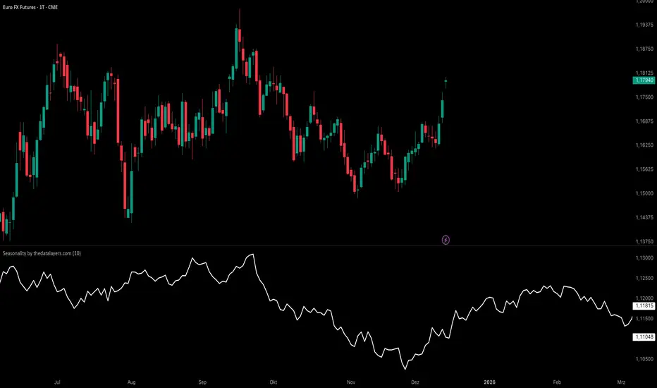
Seasonality by thedatalayers.comThe Seasonality Indicator calculates the average historical performance of the currently selected asset by analyzing a user-defined number of past years (e.g., the last 10 years).
The number of years included in the calculation can be adjusted directly in the settings panel.
Based on this historical window, the indicator creates an average seasonal curve, which represents how the market typically behaved during each part of the year.
This averaged curve acts as a forecast for the upcoming months, highlighting periods where the market has shown a consistent tendency in the past.
Traders can use this seasonal projection to identify times of higher statistical likelihood for upward or downward movement.
The indicator works especially well when combined with the Seasonality Analysis Tool, which helps identify specific historical windows and strengthens overall seasonal decision-making.
This indicator must be used exclusively on the daily timeframe, as all calculations are based on daily candle data.
Other timeframes will not display accurate seasonal structures.
The Seasonality Indicator provides a clear, data-driven view of recurring annual patterns and allows traders to better understand when historical tendencies may influence future price action.
Statistics
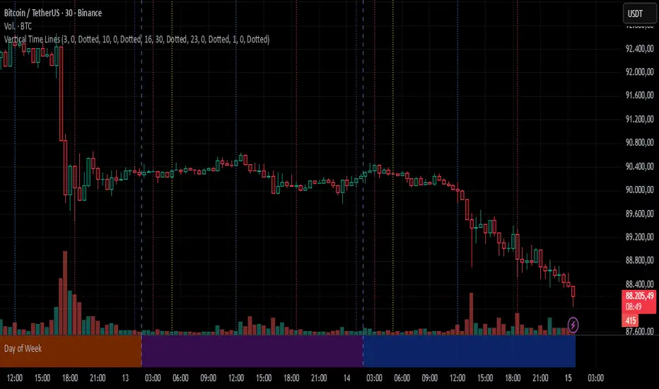
Vertical Time LinesVertical Time Lines is an indicator that draws vertical lines at specific times of each day on the price chart.
⚙️ Main Features
Up to 5 independent time lines
Precise hour and minute editing (HH:MM)
Individual enable/disable option per line
Customizable line color and style
Works on any asset and any timeframe
📝 Note
Due to Pine Script limitations, the lines are drawn using UTC time, not the time zone configured on the chart.
Lines are generated only when a candle exists exactly at the configured minute. If candles for the specified hours and minutes are not visible on the chart, the lines will not be displayed.
Z-Score & StatsThis is an advanced indicator that measures price deviation from its mean using statistical z-scores, combined with multiple analytical features for trading signals.
Core Functionality-
Z-Score Calculation Engine:
The indicator uses a custom standardization function that calculates how many standard deviations the current price is from its rolling mean. Unlike simple moving averages, this provides a normalized view of price extremes. The calculation maintains a sliding window of data points, efficiently updating mean and variance values as new data arrives while removing old data points. This approach handles missing values gracefully and uses sample variance (rather than population variance) for more accurate statistical measurements.
Statistical Zones & Visual Framework:
The indicator creates a visual representation of statistical probability zones:
±1 Standard Deviation: Encompasses about 68% of normal price behavior (green zone)
±2 Standard Deviations: Covers approximately 95% of price movements (orange zone)
±3 Standard Deviations: Represents 99.7% probability range (red zone)
±3.5 and ±4 Thresholds: Extreme outlier levels that trigger special alerts
The z-score line changes color dynamically based on which zone it occupies, making it easy to identify the current market extremity at a glance.
Advanced Features:
Volume Contraction Analysis
The script monitors volume patterns to identify periods of reduced trading activity. It compares current volume against a moving average and flags when volume drops below a specified threshold (default 70%). Volume contraction often precedes significant price moves and is factored into the optimal entry detection system.
Momentum-Based Direction Model:
Rather than just showing current z-score levels, the indicator projects where the z-score is likely to move based on recent momentum. It calculates the rate of change in the z-score and extrapolates forward for a specified number of bars. This creates a directional arrow that indicates whether conditions are bullish (negative z-score with upward momentum) or bearish (positive z-score with downward momentum).
Divergence Detection System:
The script automatically identifies four types of divergences between price action and z-score behavior :-
Regular Bullish Divergence: Price makes lower lows while z-score makes higher lows, suggesting weakening downward pressure
Regular Bearish Divergence: Price makes higher highs while z-score makes lower highs, indicating exhaustion in the uptrend
Hidden Bullish Divergence: Price makes higher lows while z-score makes lower lows, confirming trend continuation in an uptrend
Hidden Bearish Divergence: Price makes lower highs while z-score makes higher highs, confirming downtrend continuation
The system uses pivot detection with configurable lookback periods and distance requirements, then draws connecting lines and labels directly on the chart when divergences occur.
Yearly Statistics Tracking:
The indicator maintains historical records of maximum z-score deviations over yearly periods (configurable bar count). This provides context by showing whether current extremes are unusual compared to typical annual ranges. The average yearly maximum helps traders understand if the current market is exhibiting normal volatility or exceptional conditions.
Mean Reversion Probability:
Based on the current z-score magnitude, the indicator calculates and displays the statistical probability that price will revert toward the mean. Higher absolute z-scores indicate stronger mean reversion probabilities, ranging from 38% at ±0.5 standard deviations to 99.7% at ±3 standard deviations.
Comprehensive Statistics Table:
A customizable on-chart table displays real-time statistics including:
Current z-score value with directional indicator
Predicted z-score based on momentum
Current year's maximum absolute z-score
Historical average yearly maximum
Mean reversion probability percentage
Zone status classification (Normal, Moderate, High, Extreme)
Directional bias (Bullish, Bearish, Neutral)
Active divergence status
Volume contraction status with ratio
Optimal setup detection (combining extreme z-scores with volume contraction)
Optimal Entry Setup Detection:
The most sophisticated feature identifies high-probability trading setups by combining multiple factors. An "Optimal Long" signal triggers when z-score reaches -3.5 or below AND volume is contracted. An "Optimal Short" signal appears when z-score exceeds +3.5 AND volume is contracted. This combination suggests extreme price deviation occurring on low volume, often preceding strong reversals.
Alert System:
The script includes a unified alert mechanism that triggers when z-score crosses specific thresholds:
Crossing above/below ±3.5 standard deviations (extreme levels)
Crossing above/below ±4 standard deviations (critical levels)
Alerts fire once per bar with confirmation (previous bar must be on opposite side of threshold) to avoid false signals.
Practical Application:
This indicator is designed for mean reversion traders who seek statistically significant price extremes. The combination of z-score measurement, volume analysis, momentum projection, and divergence detection creates a multi-layered confirmation system. Traders can use extreme z-scores as potential reversal zones, while the direction model and divergence signals help time entries more precisely. The volume contraction filter adds an additional layer of confluence, identifying moments when reduced participation may precede explosive moves back toward the mean.
Chart Attached: NSE GMR Airports, EoD 12/12/25
DISCLAIMER: This information is provided for educational purposes only and should not be considered financial, investment, or trading advice.Happy Trading


Session Trader - Optimal Hours📊 Overview
Never miss the best trading hours again! This indicator provides a comprehensive, real-time session tracker that shows you EXACTLY when to trade crypto and when to stay out of the market. Automatically converts all times to your local timezone, highlights the current active session, and shows what's coming next.
Perfect for crypto traders who want to maximize profits by trading during high-liquidity, high-volume sessions while avoiding choppy, low-liquidity periods that lead to losses.
✨ Key Features
🎯 Real-Time Session Tracking
LIVE indicator shows which session is currently active with bright highlighting
NEXT UP feature highlights the upcoming session when between trading periods
Smart header displays current status at a glance
Real-time countdown timers for every session (opens/closes)
📍 6 Critical Trading Sessions Covered
✅ BEST TRADING SESSIONS (Green):
London Open (07:00-09:00 UTC) - High volatility kickoff, institutional orders
London-NY Overlap (13:30-15:30 UTC) - THE BEST period! Maximum liquidity & volume
NY Momentum (15:30-18:00 UTC) - Strong trending moves, continuation plays
❌ AVOID TRADING SESSIONS (Red):
4. Pre-Asia Quiet (21:00-00:00 UTC) - Low liquidity, erratic moves, wide spreads
5. Asia Lunch (03:30-05:00 UTC) - Choppy markets, whipsaws, unreliable patterns
6. Post-US Drift (20:00-21:00 UTC) - Market slows, unpredictable behavior
🌍 Automatic Timezone Conversion
Times display in YOUR chart timezone - no manual conversion needed!
Works in Berlin, New York, Tokyo, Sydney, or anywhere in the world
Switch between 12-hour and 24-hour formats
🎨 Visual Clarity
Active TRADE sessions = Bright green background, impossible to miss
Active AVOID sessions = Bright red background, clear warning
NEXT UP session = Orange highlight when between sessions
Inactive sessions = Faded gray, stays out of your way
Color-coded status column with clear ✓ TRADE or ✗ AVOID indicators
⚙️ Fully Customizable
9 table positions (top-left, top-right, bottom-center, etc.)
6 text sizes (tiny to huge) for any screen size
Toggle individual sessions on/off
Show/hide descriptions for cleaner view
Custom colors for each session type
Countdown timer toggle
🔔 Built-In Alerts
Automatic alerts when TRADE sessions start
Alerts when AVOID sessions begin (so you don't enter bad conditions)
Customizable per session
📖 How To Use
Basic Setup:
Add indicator to any crypto chart (BTC, ETH, etc.)
Times automatically convert to your chart's timezone
Watch the header - shows current session or next upcoming
Look for bright colors:
🟢 Bright green = TRADE NOW
🔴 Bright red = AVOID NOW
🟠 Orange = NEXT UP (coming soon)
Trading Strategy:
Focus on GREEN sessions (London Open, London-NY Overlap, NY Momentum)
Avoid RED sessions (Pre-Asia Quiet, Asia Lunch, Post-US Drift)
Prepare for ORANGE sessions (next up - get ready!)
Use countdown timers to plan entries/exits perfectly
Pro Tips:
London-NY Overlap is the BEST - highest volume, tightest spreads, cleanest trends
First 30 minutes of London can have quick reversals - use caution
NY Momentum is perfect for riding trends with trailing stops
NEVER trade during Asia Lunch - choppy, unpredictable, costs you money
Post-US Drift looks tempting but often leads to whipsaws
🔧 Indicator Settings
Display Options:
Table Position: Choose from 9 positions on your chart
Text Size: Auto, Tiny, Small, Normal, Large, Huge
Time Format: 12-hour (AM/PM) or 24-hour format
Show Countdown: Toggle real-time countdown timers
Show Description: Toggle detailed session descriptions
Highlight Next Session: Orange highlight for upcoming session
Session Toggles:
Enable/disable any of the 6 sessions individually:
London Open
London-NY Overlap
NY Momentum
Pre-Asia Quiet
Asia Lunch
Post-US Drift
Color Customization:
Active TRADE session color (default: bright green)
Active AVOID session color (default: bright red)
NEXT UP session color (default: orange)
Inactive session color (default: faded gray)
Alerts:
Individual alert toggles for each session
Alerts fire when sessions start (not every bar)
Includes context in alert message
📊 Session Details
🟢 London Open (07:00-09:00 UTC)
Status: TRADE ✓
Characteristics:
London opens with high volatility as European traders enter
Major institutional orders create significant price movements
Perfect for breakout and trend-following strategies
Watch for quick reversals in first 30 minutes
Good liquidity and volume
🟢 London-NY Overlap (13:30-15:30 UTC)
Status: TRADE ✓
THE BEST TRADING PERIOD!
Maximum liquidity as London & NY markets overlap
Institutional volume peaks, creating clean trends
Reliable technical setups, tightest spreads
Best execution quality
Focus on momentum and breakout trades
🟢 NY Momentum (15:30-18:00 UTC)
Status: TRADE ✓
Characteristics:
Strong directional moves as US market dominates
Trending behavior ideal for position trades
Continuation patterns highly reliable
Major news impact is highest during this period
Use trailing stops to ride trends effectively
🔴 Pre-Asia Quiet (21:00-00:00 UTC)
Status: AVOID ✗
WARNING:
Pre-Asian session with minimal liquidity
Thin order books cause erratic price action
Fake breakouts and stop-hunting common
Wide spreads increase trading costs
High risk, low reward - wait for better conditions
🔴 Asia Lunch (03:30-05:00 UTC)
Status: AVOID ✗
WARNING:
Asian lunch break creates choppy, directionless markets
Low volume leads to whipsaws and false signals
Market makers widen spreads significantly
Technical patterns unreliable
Not worth the risk - take a break!
🔴 Post-US Drift (20:00-21:00 UTC)
Status: AVOID ✗
WARNING:
Post-US session as major markets close
Liquidity dries up, causing unpredictable moves
High slippage risk
Market enters consolidation before Asian open
Better to wait for next quality session
🎯 Who Is This For?
Perfect for:
✅ Crypto day traders who want to maximize profits by timing the markets
✅ Scalpers who need high liquidity and tight spreads
✅ Swing traders who want to enter during optimal conditions
✅ Beginners who need clear guidance on when to trade
✅ Anyone tired of choppy sessions that eat away profits
Ideal Markets:
Bitcoin (BTC/USD, BTC/USDT)
Ethereum (ETH/USD, ETH/USDT)
Major altcoins (SOL, XRP, ADA, etc.)
Any 24/7 crypto market
💡 Why Session Timing Matters
Trading crypto during low-liquidity sessions is one of the biggest mistakes traders make:
❌ Trading during bad sessions causes:
Wider spreads (higher costs per trade)
Choppy, unpredictable price action
Fake breakouts and stop-hunting
Poor trade execution and slippage
Emotional frustration and overtrading
✅ Trading during optimal sessions gives you:
Tight spreads (lower costs)
Clean, trending price action
Reliable technical patterns
Better execution quality
Higher win rates and confidence
The difference between a profitable trader and a losing trader is often WHEN they trade, not HOW they trade.
🚀 Technical Details
Version: Pine Script v6
Type: Overlay indicator (table display)
Repainting: Non-repainting (all times are fixed to session schedules)
Updates: Real-time on every bar
Performance: Lightweight, no lag
Compatibility: Works on any timeframe (1m to 1D+)
📈 Best Practices
Plan your trading schedule around GREEN sessions
Set alerts for session starts so you never miss opportunities
Use the countdown to prepare entries/exits in advance
Combine with your strategy - this indicator tells you WHEN, your strategy tells you WHAT
Respect the RED sessions - discipline is profit
Keep descriptions ON when learning, turn OFF for cleaner charts later
🔄 Updates & Support
This indicator is actively maintained. Future updates may include:
Session volume statistics
Historical session performance tracking
Additional regional sessions
More customization options

Lot Size Panel Lite Multi (@JP7FX)Lot Size Panel Lite Multi is a fast, no-nonsense risk and position sizing tool built for active traders who need answers immediately.
This indicator removes all chart clutter and focuses on one thing only. Correct lot size based on your stop loss and risk.
It is designed for scalpers, day traders, and funded account traders who do not want complex menus or slow workflows.
What it does
Calculates precise lot size from stop loss and risk
Supports percentage risk or fixed cash risk
Works across Forex, Gold, Crypto, Index/CFD, and Stocks
Displays results in a clean on-chart panel
Supports multiple accounts at once
Key features
Risk first layout. Stop loss and risk inputs are at the top
Multi account support with A1 enabled by default
Per account currency handling with automatic FX conversion
Manual FX fallback option when TradingView rates are unavailable
Customisable panel colours and layout
Movable panel with multiple screen positions
How to use
Select your Asset Type
Enter your Stop Loss in pips
Choose Risk mode
Percent uses account balance
Cash risks a fixed amount
Set your account balance and currency
Read the calculated lot size instantly
Index and CFD users
For Index and Stock instruments, set the “value per pip per 1 lot” to match your broker.
Example:
If 1 lot equals $10 per point, enter 10
Who this is for
Traders who execute fast and want zero friction
Prop firm traders managing multiple accounts
Traders who want correct risk every trade without thinking
This is the Lite version of the JP7FX lot sizing tools.
It strips everything back to speed, clarity, and accuracy.
Trade smart.
JP7FX

RO H1 Signal CandleMarks specific H1 signal candles based on Bucharest (RO) time.
Designed for clean backtesting and time-based analysis.
Displays a small marker on selected hourly candles only.

USDT Market Cap Change [Alpha Extract]A sophisticated stablecoin market analysis tool that tracks USDT market capitalization changes across daily and 60-day periods with statistical normalization and gradient intensity visualization. Utilizing z-score methodology for overbought/oversold detection and dynamic color gradients reflecting change magnitude, this indicator delivers institutional-grade market liquidity assessment through stablecoin flow analysis. The system's dual-timeframe approach combined with statistical normalization provides comprehensive market sentiment measurement based on capital inflows and outflows from the dominant stablecoin.
🔶 Advanced Market Cap Tracking Framework
Implements daily USDT market capitalization monitoring with dual-period change calculations measuring both 1-day and 60-day net capital flows. The system retrieves real-time CRYPTOCAP:USDT data on daily timeframe resolution, calculating absolute dollar changes to quantify stablecoin supply expansion or contraction as primary market liquidity indicator.
// Core Market Cap Analysis
USDT = request.security("CRYPTOCAP:USDT", "D", close)
USDT_60D_Change = USDT - USDT
USDT_1D_Change = USDT - USDT
🔶 Dynamic Gradient Intensity System
Features sophisticated color gradient engine that intensifies visual representation based on change magnitude relative to recent extremes. The system normalizes current 60-day change against configurable lookback period maximum, applying gradient strength calculation to transition colors from neutral tones through progressively intense blues (negative) or reds (positive) based on flow direction and magnitude.
🔶 Statistical Z-Score Normalization Engine
Implements comprehensive z-score calculation framework that normalizes 60-day market cap changes using rolling mean and standard deviation for objective overbought/oversold determination. The system applies statistical normalization over configurable periods, enabling cross-temporal comparison and threshold-based regime identification independent of absolute market cap levels.
// Z-Score Normalization
Change_Mean = ta.sma(USDT_60D_Change, Normalization_Length)
Change_StdDev = ta.stdev(USDT_60D_Change, Normalization_Length)
Z_Score = Change_StdDev > 0 ? (USDT_60D_Change - Change_Mean) / Change_StdDev : 0.0
🔶 Multi-Tier Threshold Detection System
Provides four-level regime classification including standard overbought (+1.5σ), standard oversold (-1.5σ), extreme overbought (+2.5σ), and extreme oversold (-2.5σ) thresholds with configurable adjustment. The system identifies market liquidity extremes when stablecoin inflows or outflows reach statistically significant levels, indicating potential market turning points or trend exhaustion.
🔶 Dual-Timeframe Flow Visualization
Features layered area plots displaying both 60-day strategic flows and 1-day tactical movements with distinct color coding for instant flow direction assessment. The system overlays short-term daily changes on longer-term 60-day trends, enabling traders to identify divergences between tactical and strategic capital flows into or out of stablecoin reserves.
🔶 Gradient Color Psychology Framework
Implements intuitive color scheme where red gradients indicate capital inflow (bullish for crypto as USDT supply expands for buying) and blue gradients show capital outflow (bearish as USDT is redeemed). The intensity progression from pale to vivid colors communicates flow magnitude, with extreme colors signaling statistically significant liquidity events requiring attention.
🔶 Background Zone Highlighting System
Provides subtle background coloring when z-score breaches overbought or oversold thresholds, creating visual alerts without obscuring primary data. The system applies translucent red backgrounds during overbought conditions and blue during oversold states, enabling instant regime recognition across chart timeframes.
🔶 Configurable Normalization Architecture
Features adjustable gradient lookback and statistical normalization periods enabling optimization across different market cycles and trading timeframes. The system allows traders to calibrate sensitivity by modifying the window used for maximum change detection (gradient) and mean/standard deviation calculation (z-score), adapting to volatile or stable market regimes.
🔶 Market Liquidity Interpretation Framework
Tracks USDT supply changes as proxy for overall cryptocurrency market liquidity conditions, where expanding market cap indicates fresh capital entering crypto markets and contracting cap suggests capital flight. The system provides leading indicator properties as large stablecoin inflows often precede major market rallies while outflows may signal distribution phases.
🔶 Why Choose USDT Market Cap Change ?
This indicator delivers sophisticated stablecoin flow analysis through statistical normalization and gradient visualization of USDT market capitalization changes. Unlike traditional market sentiment indicators that rely on price action alone, this tool measures actual capital flows through the dominant stablecoin, providing objective assessment of market liquidity conditions. The combination of dual-timeframe tracking, z-score normalization for overbought/oversold detection, and intensity-based gradient coloring makes it essential for traders seeking macro-level market assessment and regime change detection across cryptocurrency markets. The indicator excels at identifying liquidity extremes that often precede major market reversals or trend accelerations.

Magical Thirteen Turns - The Greedy SnakeThe number 9 appears:
Meaning: Warning signal. The rise may encounter resistance and a cautious pullback is about to begin.
Operation: Consider reducing your holdings (selling a portion) to lock in profits and avoid experiencing wild fluctuations.
The number 13 appears:
Meaning: Strong sell signal. The upward momentum is likely to be exhausted, which is also known as "bull exhaustion".
Operation: It is recommended to liquidate your positions or significantly reduce them. Short sell (if you are trading contracts).

CFO Y+QOperating Cash Flow (CFO) – Annual + Quarterly
This indicator plots a company’s Operating Cash Flow (CFO) for both Annual (FY) and Quarterly (FQ) reporting periods in a single pane. CFO represents the net cash generated (or used) by the firm’s core operations during the period, as reported in the cash flow statement.
How to read it:
Positive CFO generally indicates the business is generating cash from operations.
Negative CFO may indicate cash burn from operations, often due to operating losses or adverse working-capital movements.
Viewing FY and FQ together helps you compare long-term operating cash generation with shorter-term quarterly volatility.
Scaling:
The indicator includes an optional scaling setting (Raw / Millions / Billions / Auto) to improve readability. In Auto mode, both series are displayed using the same scale for consistent comparison.

Sideways Zone Breakout 📘 Sideways Zone Breakout – Indicator Description
Sideways Zone Breakout is a visual market-structure indicator designed to identify low-volatility consolidation zones and highlight potential breakout opportunities when price exits these zones.
This indicator focuses on detecting periods where price trades within a tight range, often referred to as sideways or consolidation phases, and visually marks these zones directly on the chart for clarity.
🔍 Core Concept
Markets often spend time moving sideways before making a directional move.
This indicator aims to:
Detect price compression
Visually highlight the sideways zone
Signal when price breaks above or below the zone boundaries
Instead of predicting direction, it simply reacts to range expansion after consolidation.
⚙️ How the Indicator Works
1️⃣ Sideways Zone Detection
The indicator looks back over a user-defined number of candles
It calculates the highest high and lowest low within that window
If the total price range remains within a defined percentage of the current price, the market is considered sideways
This helps filter out trending and highly volatile conditions.
2️⃣ Visual Zone Representation
When a sideways condition is detected:
A clear price zone is drawn between the recent high and low
The zone is displayed using a soft gradient fill for better visibility
Outer borders are added to enhance zone clarity without cluttering the chart
This makes consolidation areas easy to spot at a glance.
3️⃣ Breakout Identification
Once a sideways zone is active:
A bullish breakout is marked when price closes above the upper boundary
A bearish breakout is marked when price closes below the lower boundary
Directional arrows and labels are plotted directly on the chart to indicate these events.
📊 Visual Elements Included
Sideways consolidation zones with gradient fill
Upper and lower zone boundaries
Buy and Sell arrows on breakout
Optional text labels for clear interpretation
All visuals are designed to remain lightweight and readable on any chart theme.
🔧 User Inputs
Sideways Lookback (candles): Controls how many past candles are used to define the range
Max Range % (tightness): Determines how tight the range must be to qualify as sideways
Adjusting these inputs allows users to adapt the indicator to different instruments and timeframes.
📈 Usage Guidelines
Can be applied to any market or timeframe
Works well as a context or confirmation tool
Best used alongside volume, trend, or risk management tools
Signals should be validated with proper trade planning
⚠️ Disclaimer
This indicator is provided as open-source for educational and analytical purposes only.
It does not generate trade recommendations or guarantee outcomes.
Market conditions vary, and users are responsible for their own trading decisions.

Cash Conversion Ratio (CFO / Net Income)This indicator measures how effectively a company converts its accounting profits into cash generated from core operations. It is calculated as:
Cash Conversion Ratio = Operating Cash Flow (CFO) ÷ Net Income
A value around 1.0 (or 100%) generally indicates strong earnings quality, meaning reported profits are broadly supported by operating cash inflows. Values above 1.0 suggest operating cash flow exceeds net income, while values below 1.0 may indicate weaker cash conversion, often due to working-capital changes (e.g., receivables, inventory) or other timing effects. Negative or near-zero net income can make the ratio volatile or less interpretable.

FxAST LiteWave Universal Profiles (intraday / swing)FxAST Lite Wave — Universal (Profiles)
This strategy is intended for educational and analytical use.
Derivative works must retain attribution and license terms.
_____________________________________________________________________________
Overview
FxAST Lite Wave is a rule-based trend participation strategy designed to adapt across multiple markets and timeframes using a simple profile switch.
Rather than attempting to predict reversals or tops and bottoms, the strategy focuses on identifying continuation opportunities once directional alignment and market participation are already present.
Its purpose is to provide a structured, repeatable framework for studying trend behavior and managing trades within established directional moves.
_______________________________________________________________________________
How It Works
FxAST Lite Wave evaluates market conditions using a layered confirmation process that includes:
• Directional bias
• Trend alignment
• Momentum participation
• Volatility suitability
• Market regime awareness
Trades are only considered when these conditions align, helping to reduce low-quality signals and overtrading during unfavorable environments.
Two built-in profiles are provided:
Intraday — designed for shorter-term participation
Swing — designed for higher-timeframe continuation
_______________________________________________________________________________
Core Concepts (Plain English)
Direction
Identifies which side of the market is currently in control.
This answers:
“Is pressure aligned for continuation?”
_______________________________________________________________________________
Momentum
Confirms that price is moving with intent rather than drifting or stalling.
This answers:
“Is participation present?”
_______________________________________________________________________________
Regime
Filters out unfavorable conditions such as congestion, compression, or low-energy chop.
This answers:
“Is this a tradable environment?”
_______________________________________________________________________________
Continuation Focus
Entries are designed to occur after alignmen t, not at arbitrary turning points.
The strategy favors:
• Pullbacks within trend
• Momentum resumption
• Sustained directional movement
_______________________________________________________________________________
Risk & Trade Management
FxAST Lite Wave includes structured trade management logic:
• Volatility-aware initial risk
• Optional partial profit taking
• Optional breakeven and trailing behavior
• Optional time-based exits
• Optional equity-based position sizing
A built-in on-chart Backtesting HUB displays live performance statistics for transparency and review.
_______________________________________________________________________________
Philosophy
FxAST Lite Wave is intentionally not a signal-spamming strategy .
It is designed to:
• Reduce decision fatigue
• Encourage rule-based consistency
• Support disciplined execution
If you need:
precise entries → use price action
precise exits → use structure
system context → use Lite Wave
_______________________________________________________________________________
Disclaimer
This strategy is provided for educational and analytical purposes only and does not constitute financial advice. Trading involves risk, and users are responsible for their own decisions. responsible for their own decisions.

Pair Creation🙏🏻 The one and only pair construction tech you need, unlike others:
Applies one consistent operation to all the data features (not only prices). Then, the script outputs these, so you can apply other calculations on these outputs.
calculates a very fast and native volatility based hedge ratio, that also takes into account point value (think SPY vs ES) so you can easily use it in position sizing
Has built-in forward pricing aka cost of carry model , so you can de-drift pairs from cost of carry, discover spot price of oil based on futures, and ofc find arbitrage opportunities
Also allows to make a pair as a product of 2 series, useful for triangular arbitrage
This script can make a pair in 2 ways:
Ratio, by dividing leg 1 by leg 2
Product, by multiplying leg 1 by leg 2
The real mathematically right way to construct a pair is a ratio/product (Spreads are in fact = 2 legged portfolio, but I ain't told ya that ok). Why? Because a pair of 2 entities has a mathematically unique beauty, it allows direct comparisons and relationship analysis, smth you can't do directly with 3 and more components.
Multiplication (think inversions like (EURUSD -> USDEUR), and use cases for triangular arbitrage) is useful sometimes too.
...
Quickguide:
First, "Legs" are pair components: make a pair of related assets. Don’t be guided exclusively by clustering, cointegrations, mutual information etc. Common sense and exogenous info can easily made them all Forward pricing model: is useful when u work with spot vs futures pairs. Otherwise: put financing, storage and yield all on zeros, this way u will turn it off and have a pure ratio/product of 2 legs.
Look at the 2 numbers on the script’s status line: the first one would always be 1), and the second one is a variable.
First number (always 1) is multiplier for your position size on leg 1
The second number is the multiplier for your position size on leg 2 in the opposite direction.
If both legs are related, trading your sizes with these multipliers makes you do statistical arbitrage -> trading ~ volatility in risk free mode, while the relationship between the assets is still in place.
Also guys srsly, nobody ‘ever’ made a universal law that somewhy somehow for whatever secret conspiracy reason one shall only trade pairs in mean reverting style xd. You can do whatever you want:
Tilt hedge ratio significantly based on relative strength of legs
Trade the pair in momentum style
Ignore hedge ratio all together
And more and more, the limit is your imagination, e.g.:
Anticipate hedge ratio changes based on exogenous info and act accordingly
Scalp a pair just like any other asset
Make a pair out of 2 pairs
Like I mean it, whatever you desire
About forward pricing model:
It’s applied only to leg 2;
Direct: takes spot price and finds out implied futures price
Inverse: takes futures price and finds out implied spot price (try on oil)
Pls read online how to choose parameters, it’s open access reliable info
About the hedge ratio I use:
You prolly noticed the way I prefer to use inferred volumes vs the “real” ones. In pairs it’s especially meaningful, because real volumes lose sense in pair creation. And while volumes are closely tied to volatility, the inferred volumes ‘Are’ volatility irl (and later can be converted to currency space by using point value, allowing direct comparisons symbol vs symbol).
This hedge ratio is a good example of how discovering the real nature of entities beats making 100s of inventions, why domain knowledge and proper feature engineering beats difficult bulky models, neural networks etc. How simple data understanding & operations on it is all you need.
This script simply does this:
Takes inferred volume delta of both assets, makes a ratio, normalizes it by tick sizes and points values of both legs, calculates a typical value of this series.
That’s it, no step 2, we’re done. No Kalman filters, no TLS regression, no vine copulas, or whatever new fancy keywords you can come up with etc.
...
^^ comparing real ES prices vs theoretical ones by forward-pricing model. Financing: 0.04, yield 0.0175
^^ EURUSD, 6E futures with theoretical futures price calculated with interest rate differential 0.02 (4% USD - 2% EUR interest rates)
^^4 different pairs (RTY/ES, YM/ES, NQ/ES, ES/ZN) each with different plot style (pick one you like in script's Style settings)
^^ YM/RTY pair, each plot represents ratio of different features: ratio of prices, ratio of inferred volume deltas, ratio of inferred volumes, ratio of inferred tick counts (also can be turned on/off in Style settings)
...
How can u upgrade it and make a step forward yourself:
On tradingview missing values are automatically fixed by backfilling, and this never becomes a thing until you hit high frequency data. You can do better and use Kalman filter for filling missing values.
Script contains the functions I use everywhere to calculate inferred volume delta, inferred volume, and inferred tick count.
...
∞

Trinity Real Move Detector DashboardRelease Notes (critical)
1. This code "will" require tweaks for different timeframes to the multiplier, do not assume the data in the table is accurate, cross check it with the Trinity Real Move Detector or another ATR tool, to validate the values in the table and ensure you have set the correct values.
2. I mention this below. But please understand that pine code has a limitation in the number of security calls (40 request.security() calls per script). This code is on the limit of that threshold and I would encourage developers to see if they can find a way around this to improve the script and release further updates.
What do we have...
The Trinity Real Move Detector Dashboard is a powerful TradingView indicator designed to scan multiple assets at once and show when each one has genuine short-term volatility "energy" — the kind that makes directional options trades (especially 0DTE or short-dated) have a high probability of follow-through, and can be used for swing trading as well. It combines a simple ATR-based volatility filter with a SuperTrend-style bias to tell you not only if the market is "awake" but also in which direction the momentum is leaning.
At its core, the indicator calculates the current ATR on your chosen timeframe and compares it to a user-defined percentage of the asset's daily ATR. When the short-term ATR spikes above that threshold, it signals "enough energy" — meaning the underlying is moving with real force rather than choppy noise. The SuperTrend logic then determines bullish or bearish bias, so the status shows "BULLISH ENERGY" (green) or "BEARISH ENERGY" (red) when energy is on, or "WAIT" when it's not. It also counts how many bars the energy has been active and shows the current ATR vs threshold for quick visual confirmation.
The dashboard displays all this in a clean table with columns for Symbol, Multiplier, Current ATR, Threshold, Status, Bars Active, and Bias (UP/DOWN). It's perfect for 3-minute charts but works on any timeframe — just adjust the multiplier based on the hints in the settings.
Editing symbols and multipliers is straightforward and user-friendly. In the indicator settings, you'll see numbered inputs like "1. Symbol - NVDA" and "1. Multiplier". To change an asset, simply type the new ticker in the symbol field (e.g., replace "NVDA" with "TSLA", "AVGO", or "ADAUSD"). You can also adjust the multiplier for each asset individually in the corresponding "Multiplier" field to make it more or less sensitive — lower numbers give more signals, higher numbers give stricter, higher-quality ones. This lets you customize the dashboard to your watchlist without any coding. For example, if you switch to a 4-hour chart or a slower-moving stock like AVGO, you may need to raise the multiplier (e.g., to 0.3–0.4) to avoid false "bullish" signals during minor bounces in a larger downtrend.
One important note about the multiplier and timeframes: the default values are optimized for fast intraday charts (like 3-minute or 5-minute). On higher timeframes (15-minute, 1-hour, 4-hour, or daily), the SuperTrend bias can be too sensitive with low multipliers (1.0 default in the code), leading to situations like the AVGO 4-hour example — where price is clearly downtrending, but the dashboard shows "BULLISH ENERGY" because the tight bands flip on small bounces. To fix this, you need to manually increase the multiplier for that asset (or all assets) in the settings. For 4-hour or daily charts, 0.25–0.35 is often better to match smoother SuperTrend indicators like Trinity. Always test on your timeframe and asset — crypto usually needs slightly lower multipliers than stocks due to higher volatility.
TradingView has a hard limit of 40 request.security() calls per script. Each asset in the dashboard requires several calls (current ATR, daily ATR, SuperTrend components, etc.), so with the full ATR-based bias, you can safely monitor about 6–8 assets before hitting the limit. Adding more symbols increases the number of calls and will trigger the "too many securities" error. This is a platform restriction to prevent excessive server load, and there's no official way around it in a single script. Some advanced coders use tricks like caching or lower-timeframe requests to squeeze in a few more, but for reliability, sticking to 6–8 assets is recommended. If you need more, the common workaround is to create two separate indicators (e.g., one for stocks, one for crypto) and add both to the same chart.
Overall, this dashboard gives you a professional-grade multi-asset scanner that filters out low-energy noise and highlights real momentum opportunities across stocks and crypto — all in one glance. It's especially valuable for options traders who want to avoid theta decay on weak moves and only strike when the market has true fuel. By tweaking the per-symbol multipliers in the settings, you can perfectly adapt it to any timeframe or asset behavior, avoiding issues like the AVGO false bullish signal on higher timeframes.

Kairos QX Indicator [v1.7]What’s New in v1.7?
Streak Analytics (Dashboard Expansion):
The dashboard now tracks Winning and Losing Streaks.
Max Consec. (TP / SL): Displays the highest number of wins and losses that occurred in a row (e.g., 5 / 3).
Avg Consec. (TP / SL): Calculates the average length of your winning and losing streaks (e.g., 2.4 / 1.8).
Updated Default "settings" for MNQ 5 MIN Candles
Full Script Description
This script is a professional-grade Mean Reversion & Trend Following Engine designed for automated execution. It acts as a bridge between discretionary chart analysis and algorithmic trading, allowing you to backtest complex ideas visually and then automate them via alerts without writing code.
1. Core Logic: The "Flip Switch" Strategy
Standard Mode (Mean Reversion):
The script identifies "exhaustion" points where price pierces the Bollinger Bands.
It bets on a reversal (e.g., Price > Upper Band = Short).
Inverse Mode (Trend Following - Default):
With the "Inverse Trades" box checked, the logic flips.
It identifies "breakout" points where price pierces the bands.
It bets on continuation (e.g., Price > Upper Band = Long).
2. Advanced Automation & Safety Features
This system is built to drive trading bots (like TradersPost or 3Commas) safely:
State-Aware Execution: It tracks its own trades (in_trade state). It will never fire a duplicate "Open" signal if a trade is already active, preventing accidental pyramiding.
No Trade Zone (Force Close): You can define a specific time window (default 15:10–17:00). If a trade is open when this time hits, the script immediately triggers a Close Alert, preventing overnight holds.
Signal Cooldown: Configurable "Signals to Skip" allows you to force a cooldown period after a trade closes to avoid over-trading in choppy conditions.
3. Real-Time Analytics Dashboard
The on-chart table provides a transparent, real-time backtest of your settings:
Equity Calculator: You can set a dollar value per point (e.g., $2 for MNQ). The dashboard calculates your estimated Net Profit/Loss based on the total points gained.
Streak Analysis: Shows both the Maximum and Average number of consecutive wins and losses, helping you understand the psychological difficulty of trading the strategy.
Data Integrity: It automatically detects "N/A" trades (candles that hit both SL and TP) and excludes them from the Win Rate calculation to ensure realistic statistics.
4. Modular "Recipe" Building
The strategy is highly customizable via the settings menu (no coding required). You can filter the Bollinger Band trigger with 10 different indicators:
Supported Filters: RSI, Stochastic, CCI, Williams %R, MFI, CMO, Fisher Transform, Ultimate Oscillator, and ROC.
Logic: All selected filters must agree with the main trigger for a trade to fire.
5. Visual Projection Engine
Glowing Outcomes: The script draws exact TP (Green) and SL (Red) boxes for past trades. These boxes glow to indicate the result, allowing for rapid visual verification of the strategy's performance.
Force Close Markers: Special gray markers appear on the chart where a trade was forced to close due to the "No Trade Zone" time limit.

Straight Regression Line + Normalized Slope (Adaptive Length)Find the regression line of available candles.
It will print the slope and the normalized slope

Kairos QX Indicator [v1.6]This script, Kairos QX , is a sophisticated, highly customizable trading engine designed for automated execution. It serves as a bridge between discretionary charting and algorithmic trading, allowing you to visually backtest complex ideas and then automate them via alerts.
Its core logic is built on Mean Reversion, but it features a powerful "Inverse Mode" that instantly transforms it into a Trend Following system.
1. The Core Strategy: Mean Reversion (Default)
By default, the script operates on the principle that price eventually returns to an average value after an extreme move.
Logic: It fades the move.
Short Signal: Price pierces the Upper Bollinger Band (overbought) + optional confluence filters (e.g., RSI > 70). The bet is that price will revert down.
Long Signal: Price pierces the Lower Bollinger Band (oversold) + optional confluence filters. The bet is that price will revert up.
2. The "Inverse Mode": Trend Following (Flip Switch)
The script includes a unique Inverse Trades checkbox that flips the entire logic engine. This allows you to adapt to market conditions where price isn't reverting but is instead "running" hard.
Logic: It rides the breakout.
Short Signal becomes Long: When price pierces the Upper Bollinger Band, instead of shorting (expecting a drop), the script enters Long (expecting the trend to blast through and continue higher).
Long Signal becomes Short: When price pierces the Lower Bollinger Band, the script enters Short, betting on a trend continuation downward.
Why this matters: If your backtest shows a failing Mean Reversion strategy (e.g., a "F" grade), flipping this switch can instantly invert those losses into wins by aligning with the trend instead of fighting it.
3. Built for Automation & Safety
The script is engineered to safely drive third-party auto-trading bots (like TradersPost, 3Commas, or PineConnector) without manual intervention.
State-Aware Execution: The script tracks its own trade state. It will never fire a duplicate "Open" signal if a trade is already active, preventing accidental double-entries.
No Trade Zone (Force Close): You can set a specific time window (e.g., 15:55 PM) where the script automatically triggers a Close Alert for any open position. This protects you from holding day trades overnight or through major news events.
Signal Cooldown: To prevent over-trading in choppy markets, you can set the script to ignore the next 1-5 signals after a trade finishes, forcing it to wait for a fresh setup.
4. Modular "Recipe" Building
You don't need to know code to change the strategy. The settings menu allows you to mix and match 10 different indicators as confluence filters.
Example Recipe: "Only take a Mean Reversion Long if: Price is below the Bollinger Band AND RSI is < 30 AND MFI is < 20."
If you check the boxes, the script enforces the rules. If you uncheck them, they are ignored.
5. Visual Projection Dashboard
The script doesn't just print arrows; it performs a real-time visual backtest on the chart.
Glowing Projections: It draws the exact Take Profit (Green) and Stop Loss (Red) boxes for historical trades. These boxes glow to indicate if the trade won or lost.
Data Integrity: It automatically detects and isolates "N/A" trades—candles so volatile that they hit both your SL and TP in the same bar—excluding them from your win rate to keep your data realistic.
Live Grading: A dashboard in the corner grades your current settings (A-F) based on their performance over the last 1,000 to 40,000 bars.

Recovery Adaptive Optimizer [Starbots]Recovery Adaptive Optimizer is a high-performance, on-chart parameter optimization engine designed specifically for the Recovery Adaptive Strategy.
It enables professional traders and quantitative researchers to systematically evaluate thousands of parameter combinations directly within Pine Script, without relying on external tools.
The optimizer performs a full simulation of the strategy logic, replicating adaptive position sizing, dynamic take-profit expansion, and loss-streak behavior with precision.
🧠 Optimization Methodology
The optimizer executes a multi-configuration simulation grid in parallel, where each configuration represents a unique combination of:
Base Take-Profit (%)
Take-Profit Factor
Stop-Loss (%)
Position Size Factor
Volatility Filter (On / Off)
Flat-Market Filter (On / Off)
Trend Filter (On / Off)
Each configuration is evaluated using the same execution logic as the strategy:
Single-position model
Loss-streak-based scaling
Step-capped progression
Bar-confirmed entries and exits
Commission-aware equity accounting
This allows precise comparative analysis across high-volatility market conditions, where parameter sensitivity and expansion behavior are most relevant.
Optional features include:
Higher-timeframe signal evaluation
Volatility-conditioned execution
Flat-market exclusion
EMA trend alignment (manual toggle)
All filters can be evaluated independently across the optimization grid.
📊 Performance Metrics & Ranking
Each configuration is evaluated using multiple institutional-grade metrics:
Net Profit (%)
Maximum Drawdown (%)
Win Rate
Trade Count
Equity Curve Peak-to-Valley 'Drawdown'
Configurations are ranked using a score metric:
Score = Profit % ÷ Max Drawdown %
This allows rapid identification of parameter sets that balance performance efficiency and capital utilization.
🏆 Automated Best-Case Selection
At the end of the historical data window, the optimizer additionally identifies and displays:
🏆 Best Configuration by Net Profit
🛡️ Best Configuration by Lowest Drawdown
🎯 Best Configuration by Win Rate (with optional minimum profitability threshold)
Top-ranked configurations are displayed via ranked comparison table (Top 5 or Top 15 results)
🧩 Intended Use
This optimizer is designed for:
Professional traders
Systematic strategy developers
Quantitative research
Parameter tuning for volatile markets
Strategy calibration across different instruments and timeframes
It provides a structured, transparent environment for identifying robust parameter clusters rather than single isolated results.

Recovery Adaptive Strategy [Starbots]🔁 Recovery Adaptive Strategy
Recovery Adaptive Strategy is an advanced, single-position trading strategy designed for professional traders who require adaptive exposure control, dynamic profit targeting, and rule-based recovery mechanics in high-volatility market environments.
The strategy applies a structured loss-streak framework where position sizing and take-profit objectives evolve systematically based on prior trade outcomes, while maintaining strict one-position execution at all times.
🧠 Strategic Framework
This strategy is built around a controlled adaptive execution model:
Only one position is active at any time
Each closed trade directly influences the parameters of the next entry
After a losing trade:
Position size scales according to a defined factor
Take-profit expands proportionally using a configurable multiplier
After a winning trade:
All parameters reset to their base configuration
Scaling progression is capped via a configurable maximum step limit
The methodology is designed to efficiently capitalize on expansion phases, volatility impulses, and directional inefficiencies, making it particularly suitable for high-volatility instruments and regimes.
⚙️ Adaptive Position Management
Position Sizing Modes
Percentage of Equity
Fixed Base Currency Amount (USDT / USD / EUR, etc.)
Each subsequent step applies a configurable size multiplier, enabling precise control over exposure progression across loss streaks.
🎯Dynamic Take-Profit Scaling
Take-profit levels increase automatically with each scaling step
A dedicated TP multiplier allows fine-tuning of profit expansion behavior
All targets are recalculated and updated dynamically while positions are open
Execution Control
Single-position logic (no grid, no concurrent hedging)
Optional forced exit and full reset upon reaching the maximum scaling step
Bar-confirmed execution to avoid signal repainting
📈 Signal Generation & Market Filters
The strategy supports multiple professional-grade entry models, selectable via settings:
MACD (12,26,9)
DMI (14)
RSI (70 / 30)
Stochastic (14,3,3)
Bollinger Bands + RSI
Market Structure (BOS / CHoCH)
Additional execution layers include:
Higher-timeframe signal evaluation
Volatility-based trade filtering
EMA trend alignment
Flat-market detection (optional)
The strategy is optimized for active, volatile markets, where price expansion and follow-through are frequent.
📊 Institutional-Style Analytics & Visualization
Integrated analytics provide full transparency into strategy behavior:
Adaptive Scaling Table
Position size per step
Take-profit expansion per step
Loss-streak hit distribution
On-Chart Execution Labels
Equity Usage Overview
Monthly & Yearly Performance Calendar
Backtest vs. Leverage Projection Dashboard
All dashboards and visual components are optional and configurable.
🧩 Intended Use
This strategy is designed for:
Advanced discretionary traders
Systematic traders
Quantitative research and optimization
High-volatility instruments and environments
It emphasizes structure, adaptability, and execution discipline, rather than static position sizing or fixed targets.

NQ Market DNA: ML ScorerNQ Market DNA: ML Scorer — Indicator Description
NQ Market DNA: ML Scorer is a session-structure and machine-learning scoring tool designed specifically for Nasdaq futures (NQ/MNQ). It converts the market’s overnight behavior into a single, probability-style score (0–100%) and a clear directional bias for the upcoming New York session.
This script is not a generic “trend indicator.” It is a rules-based implementation of a machine-learning model whose feature set and weightings were built and calibrated in Python using historical session data. The Pine Script version is the real-time execution layer: it measures the live session structure, applies the model weights, and displays the result on-chart.
________________________________________
What the indicator plots
1) Session Boxes (Structure Map)
The indicator draws three session ranges using boxes and a midline:
• Asia Session (20:00–02:00 NY time by default)
• London Session (02:00–08:00 NY time by default)
• New York Session (08:00–16:00 NY time by default)
Each session box:
• Expands in real time as highs/lows develop
• Includes a dotted midline (session midpoint)
• “Locks” its final values once the session ends
2) Extension Levels (Target Interaction)
When Asia or London ends, the script projects high and low extension lines forward into the day. These lines extend until one of the following happens:
• Price trades back through the level (a touch/cross condition), or
• The script reaches the hard stop at 16:00 (end of NY session)
This makes it easy to visually track whether later sessions respect or invalidate prior-session extremes.
________________________________________
The ML scoring concept
Output: “Probability of High First” (0–100%)
The model’s output is a normalized score intended to behave like a probability. Practically:
• Score ≥ 50% → Bullish bias (“London High First”)
• Score < 50% → Bearish bias (“London Low First”)
The score is produced by summing weighted session features. If a feature is bullish, it contributes its weight; if bearish, it contributes zero. The weights approximately sum to ~100, so the final score naturally maps into a 0–100 range.
Bias coloring
The on-chart score cell uses a risk-style color gradient:
• Strong Bullish (typically > 75): green
• Neutral / mixed (around 40–75): orange
• Bearish / weak (below ~40): red
________________________________________
Features used by the model (and why they matter)
The ML scorer is driven by session positioning, trend, and volatility. Your Python research determined the relative importance of each feature; the largest weights reflect the strongest historical explanatory power.
Primary drivers (most important)
1. NY Open Location (Weight ~63.73%)
Checks whether the NY session opens above or below the London midpoint.
This is treated as the dominant structural signal because it captures whether NY is opening in the “upper half” or “lower half” of London’s range.
2. London Trend (Weight ~28.09%)
London close vs London open (bullish if close > open).
This represents whether London printed a directional push versus chop.
3. London Outcome / Structure (Weight ~4.21%)
Classifies London relative to Asia:
o “High-only sweep” (bullish structure) if London breaks Asia high without breaking Asia low
This is a proxy for one-sided liquidity behavior rather than symmetric volatility.
Minor factors (smaller weights, but still additive)
4. London Volatility (Weight ~1.11%)
London range relative to its own rolling average (lookback-controlled).
Used as a contextual amplifier: higher-than-normal London range can support continuation.
5. Asia Volatility (Weight ~1.05%)
Asia range relative to its rolling average.
Helps distinguish “quiet overnight” vs “expanded overnight,” which can change the day’s tendency.
6. Asia Trend (Weight ~1.00%)
Asia close vs Asia open.
A light directional context input.
7. London Open Location vs Asia Mid (Weight ~0.81%)
Whether London opens above/below the Asia midpoint.
Helps quantify early handoff positioning.
________________________________________
How to read the table
The table is designed to be a compact decision panel:
• ML PREDICTOR: the score (%) for the current day once NY has opened
• NY Bias: bullish or bearish interpretation based on the 50 threshold
• Top Drivers: shows the state of the highest-weighted features (NY location, London trend, structure)
• Minor Factors: a condensed read on volatility context (e.g., “High Vol” vs “Mixed/Low”)
This layout lets you quickly understand not only the bias, but what caused it.
________________________________________
Best-practice usage notes
• This tool is intended to be used as a context engine, not a standalone entry signal.
• It is most effective when combined with your execution framework (levels, risk model, confirmations, etc.).
• Because it relies on session boundaries, chart symbol and market hours must match the intended instrument (NQ futures) for the cleanest behavior.
________________________________________
Critical disclaimer and settings warning
IMPORTANT — DO NOT CHANGE SETTINGS.
This indicator’s machine-learning weights and feature calibration were derived in Python from historical data under a specific configuration (session windows, timezone, and feature definitions). Changing any inputs—especially session times, timezone, rolling windows, or ML feature weights—can materially invalidate the model’s expected behavior and may produce misleading outputs.
Use with caution.
This script is provided for educational and informational purposes only and does not constitute financial advice. Futures trading involves substantial risk and is not suitable for all traders. Past performance and historical patterns do not guarantee future results. You are solely responsible for any trading decisions and risk management.
If you ever re-train or re-calibrate the model in Python, update the weights only by replacing them with the new Python-derived values as a complete set—do not “tune” them manually.

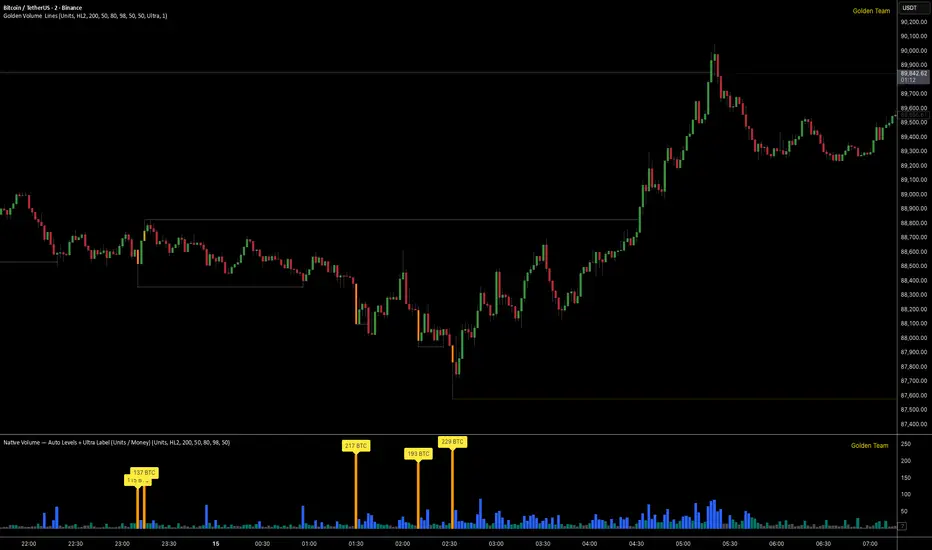
Golden Volume Lines📌 Golden Volume — Lines (Golden Team)
Golden Volume — Lines is an advanced volume-based indicator that detects Ultra High Volume candles using a statistical percentile model, then automatically draws and tracks key price levels derived from those candles.
The indicator highlights where real market interest and liquidity appear and shows how price reacts when those levels are broken.
🔍 How It Works
Volume Measurement
Choose between:
Units (raw volume)
Money (Volume × Average Price)
Average price can be calculated using HL2 or OHLC4.
Percentile-Based Classification
Volume is classified into:
Medium
High
Ultra High Volume
Thresholds are calculated using a rolling percentile window.
Ultra Volume candles are colored orange.
Dynamic High & Low Levels
For every Ultra Volume candle:
A High and Low dotted line is drawn.
Lines extend to the right until price breaks them.
Smart Line Break Detection (Wick-Based)
A line is considered broken when price wicks through it.
When a break occurs:
🟧 Orange line → broken by an Ultra Volume candle
⚪ White line → broken by a normal candle
The line stops exactly at the breaking candle.
🔔 Alerts
Alert on Ultra High Volume candles
Alert when a High or Low line is broken
Separate alerts for:
Break by Ultra Volume candle
Break by Normal candle
🎯 Use Cases
Breakout & continuation confirmation
Liquidity sweep detection
Volume-validated support & resistance
Market reaction after extreme participation
⚙️ Key Inputs
Volume display mode (Units / Money)
Percentile thresholds
Lookback window size
Maximum number of active Ultra levels
Optional dynamic alerts
⚠️ Disclaimer
This indicator is a volume and market structure tool, not a standalone trading system.
Always use proper risk management and additional confirmation.
ShayanFx XAU M5 This indicator starts working at 8 am New York market time and you have 3 hours to get signals from it.
We enter a trade on any candle that gives a signal. We place the stop loss behind the same candle and take a reward of 2.
We are not allowed to take more than 2 trades during the day. If the first trade is closed with profit, we will not open another trade, but if the first trade is closed with loss, we are allowed to take another signal.
