HTF Candle Overlay – Multi-Timeframe Visualization ToolThis indicator overlays true Higher Timeframe (HTF) candlesticks directly onto any lower timeframe chart, allowing you to see the larger market structure while trading on precise execution timeframes such as 1-minute, 3-minute, or 5-minute.
Instead of constantly switching chart timeframes, you can now see both higher and lower timeframe price action at the same time. Each HTF candle is drawn as a large transparent candlestick with full upper and lower wicks, perfectly aligned in both time and price.
This makes it easy to identify:
- Trend direction from the higher timeframe
- Key support and resistance zones inside each HTF candle
- Liquidity sweeps and rejections across timeframes
- Optimal entries on lower timeframes with higher-timeframe confirmation
Key Features
- Displays true Higher Timeframe candles on any lower timeframe
- Clear transparent candle bodies for unobstructed price visibility
- Full upper and lower wicks
- Non-repainting confirmed candles
- Optional live display of the currently forming HTF candle
- Accurate time-based alignment
- Lightweight and optimized for performance
Who This Indicator Is For
- Scalpers who want higher-timeframe bias
- Day traders using multi-timeframe confirmation
- Smart Money / ICT traders monitoring HTF structure
- Anyone who wants clean multi-timeframe clarity without chart switching
How To Use
- Apply the indicator to any chart.
- Select your preferred Higher Timeframe (HTF) in the settings.
- Use your lower timeframe for entries while respecting HTF structure and direction.
- This tool helps you trade with the bigger picture in view while executing with precision on lower timeframes.
Recherche dans les scripts pour "Candlestick"

VolumeTimeVolumeTime BY ADELALMZYAD
Analysis of Japanese Candlesticks and Price Action with Trading Volume
A technical approach combining candlestick patterns and price behavior with volume data to identify real market strength and institutional activity.

Trend CandlesThis shows candlesticks that only follow the trend. So it will make it easier to know where the trend is going.
Turning Point IndicatorIntroduction
This is a powerful technical analysis indicator designed to detect divergences between multiple technical indicators and price. It can monitor up to 10 different technical indicators simultaneously, helping traders identify potential price reversal signals. Key Features
Multi-Indicator Support: Simultaneously detect divergences across multiple indicators, including MACD, RSI, Stochastics, CCI, Momentum, OBV, VW-MACD, CMF, and MFI.
Dual Divergence Type: Supports both regular and hidden divergences.
Smart Filtering: Set a minimum number of divergences to filter out weak signals.
Visual Display: Clearly displays divergence locations and related indicators using connecting lines and labels.
Flexible Configuration: Supports a variety of display options and color customization.
Core Features: Divergence Detection
Regular Divergence: When prices reach new highs/lows but indicators haven't confirmed them, it signals a possible trend reversal.
Hidden Divergence: When prices pull back but indicators show a trend continuation, it signals a possible trend continuation.
How to Use:
Add Indicator: Apply the script to a chart.
Configure Parameters: Adjust parameters such as the pivot point period and the maximum number of candlesticks to detect as needed.
Select Indicator: Enable or disable divergence detection for specific technical indicators in the settings.
Watch Signal: Displays a signal on the chart when a sufficient number of divergences are detected. Connecting Lines and Labels
Parameter Description
Pivot Point Period: Defaults to 5, used to identify highs and lows
Minimum Divergences: Defaults to 1, sets the minimum number of divergences required to trigger a signal
Maximum Pivot Points: Defaults to 10, limits the detection range
Maximum Candlesticks Detected: Defaults to 100, controls the number of candlesticks detected forward
Signal Interpretation
Bottom Label (upward arrow): Positive divergence, a possible buy signal
Top Label (downward arrow): Negative divergence, a possible sell signal
Connecting Line Color:
Cyan: Positive regular divergence
Purple: Negative regular divergence
Green: Positive hidden divergence
Red: Negative hidden divergence
Usable Scenarios
Trend Reversal Point Identification
Entry and Exit Timing
Multi-Time Frame Analysis
Risk Management and Stop-Loss Setting
Notes
Divergence signals should be used in conjunction with other analysis methods.
It is recommended to use them on longer time frames for better accuracy.
Setting an appropriate minimum number of divergences can reduce false signals.
Indicator sensitivity may vary under different market conditions.
[DEM] Heikin Ashi Barcolors Heikin Ashi Barcolors is designed to apply smoothed Heikin Ashi calculations to regular candlestick charts and color the price bars based on the resulting Heikin Ashi trend direction to reduce market noise and provide clearer visual trend identification. The indicator first applies EMA smoothing to the standard OHLC values, then calculates Heikin Ashi values using the traditional formulas (averaged close, modified open based on previous values, and adjusted high/low), and applies an additional layer of EMA smoothing to the Heikin Ashi results. The bars are colored teal when the smoothed Heikin Ashi close is above the smoothed Heikin Ashi open (indicating bullish conditions) and red when the close is below the open (indicating bearish conditions), effectively transforming the visual appearance of regular candlesticks to reflect the smoother, trend-following characteristics of Heikin Ashi methodology while maintaining the original price structure.
Kairi Trend Oscillator [T3][T69]📌 Overview
The Kairi Trend Oscillator is a Japanese-inspired hybrid oscillator combining Heikin-Ashi trend clarity with the Kairi (乖離率) indicator — a measure of price deviation from a moving average. This dual-layer system gives you both trend direction and trend strength/health, designed to highlight trend maturity and avoid overextended entries.
✨ Features
Heikin-Ashi or normal candlestick input modes
Multiple moving average options: SMA, EMA, DEMA, VWMA, and Kijun
Visual color-coded trend zones: overbought, oversold, healthy, weak, and reversal conditions
Full Kairi column plot with dynamic coloring
Adaptive logic for trend detection (linear regression or Heikin-Ashi structure)
Built-in reversal detection based on divergence between Kairi and trend direction
⚙️ How to Use
Choose Candle Type: Select Heiken Ashi or Normal Candlesticks via the Candle Mode dropdown.
Select Source: Choose open, high, low, or close as the input for Kairi computation.
Set MA Type & Length: Configure the moving average mode and its length under Moving Average Settings.
Interpret the Plot:
Green/Red bars: Show Kairi oscillator values above/below 0
Background color: Shows current trend (green = uptrend, red = downtrend)
Candle color overlays:
🟩 Teal = Overextended Bulls
🟥 Maroon = Overextended Bears
✅ Green = Healthy Uptrend
🔻 Red = Healthy Downtrend
🟨 Light tones = Weak trends
🔄 Blue/Fuchsia = Possible reversal detected
🔧 Configuration
Inputs:
Candle Mode: Heiken Ashi or Normal Candle Sticks
Source: Open, High, Low, Close
MA Mode: SMA, EMA, DEMA, VWMA, or Kijun
MA Length: Default is 29
🧪 Advanced Tips
Use Heikin-Ashi mode for better trend smoothing.
Kairi divergence (e.g., bullish Kairi in a downtrend) may signal upcoming reversal — watch for blue or fuchsia bars.
Combine with momentum indicators (e.g. RSI or MACD) for confluence-based setups.
For mean reversion strategies, fade extreme Kairi readings (> ±5%).
⚠️ Limitations
Not suited for ranging markets without trend.
Kairi extremes may remain elevated in strong trends — avoid early counter-trend entries.
Reversal logic is not a confirmation signal; use with caution.
📌 Disclaimer
This script is educational and illustrative. Always backtest thoroughly before using in live markets.

Candle Range Theory (CRT) indicator📌 Indicator Name: Candle Range Theory (CRT) indicator
This indicator detects potential bullish and bearish reversal setups based on specific candlestick price action behavior. It is designed to highlight moments when the market may be rejecting extremes and preparing to reverse direction — but only after confirmation with the closing price.
🔍 How It Works:
Bullish Setup (Long Signal):
The previous candle is bearish (closes lower than it opens).
The current candle makes a lower low than the previous one.
The current candle closes above the previous candle’s close.
Bearish Setup (Short Signal):
The previous candle is bullish (closes higher than it opens).
The current candle makes a higher high than the previous one.
The current candle closes below the previous candle’s close.
Signals are only triggered after the bar is fully closed, to avoid premature entries.
🔔 The script includes alert conditions for both long and short setups so you can receive notifications instantly.
🎥 Inspiration:
The idea for this indicator came from the excellent educational content presented in this video:
"How to Read Candlesticks Like a Pro"
We highly recommend watching it to better understand the price action principles behind this signal.
Power of Three FractalsIntroducing Power of Three Fractals—an advanced, all-in-one TradingView toolkit designed to bring higher timeframe context directly onto your primary chart. This isn't just another candle overlay; it's a sophisticated analytical suite built for the serious price action trader. Developed with the core principles of "smart money" concepts, this indicator helps you see the market in a new dimension.
Key Features:
Floating Candlestick Display:
Forget cluttered chart backgrounds. Power of Three Fractals displays your chosen higher timeframe candles as a clean, stylized series of candlesticks in a dedicated space on the right side of your chart, allowing you to analyze HTF structure without losing focus on live price action.
Intelligent Adaptive Timeframe:
This is a game-changer. If you set the indicator to show 4H candles but switch your main chart to the Daily, it won't produce an error. Instead, it automatically adapts, recognizing the invalid selection and seamlessly switching to display the next logical timeframe (e.g., Weekly candles). This provides a flawless analytical experience as you move through timeframes.
Precision High/Low Anchors:
Dotted Lines: Instantly see which lower timeframe (LTF) candle created the high and low of the current HTF candle. This is perfect for visualizing manipulation wicks and the true Power of Three delivery.
Solid Lines: Automatically identify the absolute highest high and lowest low across the entire displayed range of HTF candles. The script then draws a solid line back to the exact LTF candle that formed these critical points, defining your true trading range. This feature intelligently hides itself if the current candle is making the high/low to avoid unnecessary clutter.
Automated Liquidity Sweep Detection:
This powerful, built-in algorithm automatically identifies one of the most critical price action events: a liquidity sweep. When a newer HTF candle takes the low of the oldest displayed candle and then closes back above it, the indicator instantly alerts you.
It draws a dashed line from the initial low to the end of the range and places a bold 'x' marker below the specific candle that performed the sweep, giving you a clear, unmissable signal of this key market event.
Integrated HTF Countdown Timer:
Stay perfectly in sync with the market. A clean, floating timer in the bottom-right corner displays a live countdown to the close of your selected higher timeframe candle, complete with a header so you always know which timeframe you're tracking.
Fully Customizable Aesthetics:
Tailor the indicator to your personal chart theme. You have full control over the colors of bullish/bearish candles, wicks, and all connecting lines, allowing for a seamless visual integration.
Who Is This Indicator For?
The Power of Three Fractals indicator is built for the discerning trader who understands that context is key. It is ideal for:
Day Traders & Scalpers needing constant awareness of higher timeframe control.
Swing Traders looking to time entries based on HTF structure and LTF shifts.
Price Action & "Smart Money Concept" Traders who utilize concepts like liquidity sweeps, order blocks, and fractals.
What You Get:
Access to the Power of Three Fractals indicator on TradingView.
All future updates, bug fixes, and feature enhancements.
Stop trading in the dark. Elevate your analysis, gain a critical edge, and make more informed trading decisions with the Power of Three Fractals indicator.
Disclaimer: The Power of Three Fractals is an analytical tool and should not be considered financial advice or a signal service. All trading involves risk, and past performance is not indicative of future results. Please use this tool as part of a comprehensive trading plan with proper risk management.

MTF 5 Big Candles [RanaAlgo]Overview
This Pine Script indicator displays multiple timeframe (MTF) candlesticks from 5 different timeframes on your current chart. It helps traders quickly assess higher timeframe price action without switching charts.
Key Features
5 Customizable Timeframes
Displays candles from user-selected timeframes (e.g., 15m, 30m, 1H, 4H, Daily).
Each candle is offset to avoid clutter.
Visual Customization
Adjustable spacing, width, and colors for bullish/bearish candles.
Option to show/hide wicks, OHLC labels, and price guide lines.
Clear Price Reference
Dotted guide lines extend from the current price to the MTF candles for easy comparison.
OHLC labels (optional) show exact price levels.
and u can also check the remainig time of candles ..
Usefulness
✅ Multi-Timeframe Analysis – Compare trends across different timeframes at a glance.
✅ Avoid Chart Switching – See higher timeframe structure while trading lower TFs.
✅ Identify Key Levels – Spot support/resistance from higher timeframe candles.
✅ Customizable Layout – Adjust spacing and styling to fit your trading style.
Best For
Swing & position traders analyzing multiple timeframes.
Day traders looking for confluence from higher TFs.
Traders who prefer visual candlestick patterns over plain lines.
This script is particularly useful for confirming trends, spotting reversals, and aligning entries with higher timeframe structure.

Vector Candles [v6 Optimized + EMA]
Vector Candles represent an innovative technical analysis approach that transforms traditional candlestick charting by integrating volume dynamics, color-coded momentum, and multi-dimensional market insights. Unlike standard candlesticks that merely display price movement, Vector Candles encode additional market information through sophisticated color and volume algorithms.
Key Features:
-Dynamic Volume-Based Coloring: Candles change color based on trading volume intensity
-Volume Categories:
High Volume (Lime/Red): Significant market activity (200%+- Vol of Previous 10 Candles)
Above Average Volume (Blue/Fuchsia): Moderate market momentum (150%+- Vol of Previous 10 Candles).
Normal Volume (Gray Scales): Standard market conditions.
Stopping Volume Candles - Typically Pinbar/Doji candles. Stops volume in the current direction of delivery & can help forecast impending reversals or end to the current trend.
-Integrated EMA (Exponential Moving Average) Option:
-Customizable EMA Length (Default: 50 periods) (I use 33)
Configurable EMA Source (e.g., close price)
Optional EMA Overlay for Trend Confirmation

MarketLuminaMarketLumina: A Comprehensive Technical Analysis Tool
MarketLumina is a technical analysis indicator crafted by a team of traders and developers in Germany. Built for TradingView’s Pine Script, it integrates trend visualization, signal generation, and real-time market insights to provide a multifaceted view of market conditions. This tool is designed to support traders in analyzing trends, spotting potential reversals, and evaluating market dynamics across various timeframes.
The best way to get started with MarketLumina is to take your time exploring its wide range of features. Dive in, experiment, and find the 2-3 tools that feel just right for you. Whether you’re a day trader looking for quick signals, a swing trader tracking trends, or an investor watching the bigger picture, MarketLumina lets you pick and choose what works best. Over time, you’ll craft your own unique trading strategy, perfectly tailored to your goals, preferences, and risk tolerance.
Key Features
Fibonacci Trend-Cloud
Displays market direction through Fibonacci-weighted moving averages. The cloud’s color—green (bullish), red (bearish), or yellow (caution)—reflects prevailing conditions, while its width indicates trend intensity.
Advanced Signal System
Generates signals derived from RSI, momentum, volume, money flow, volatility, price action, divergences, specific cloud-interactions, divergences and historical data. Signal categories include strong reversals, potential reversals, short-term tops/bottoms, strong trend, oversold/overbought conditions, exit signals, and money flow strategy triggers.
LuminaPulse – Real-Time Market Insight
A proprietary module that delivers real-time market analysis through a dashboard of six progress bars, each tailored to the symbol and timeframe using a machine learning approach. It screens historical data—key levels, consolidation zones, volatility spikes, and past price reactions—to optimize insights.
Support & Resistance Zones
Highlights critical price levels using volume-weighted historical data and price-action pivot points.
Candlestick-Overlay
Applies color coding to candlesticks—green (bullish), red (bearish), yellow (caution)—to emphasize signal-relevant bars.
Usage Instructions
MarketLumina is intended as a component of a broader analytical framework.
Below are general guidelines for its application:
Multi-Timeframe Analysis
Align signals with trends on higher timeframes for context.
LuminaPulse Interpretation
Evaluate confluence across trend strength, momentum, money flow, and volume to assess market conditions. Additionally, monitor squeeze conditions for potential breakout signals and volatility to gauge market activity.
Trend-Cloud Context
Use the Fibonacci Trend-Cloud’s direction and width as a filter for signal relevance.
Usage Instructions for MarketLumina’s Advanced Signal System
The Advanced Signal System is a core component of MarketLumina, designed to empower traders by generating a variety of signals derived from RSI, momentum, volume, money flow, volatility, divergences, price action, and more. These signals are organized into distinct categories to help you identify key market conditions and uncover potential trading opportunities.
Below is a comprehensive guide to each signal category, including descriptions, interpretations, and practical applications to enhance your trading decisions:
Strong Reversals
Reversal Signals are generated using a complex price action and volatility algorithm, pinpointing significant potential turning points in the market with elevated confidence.
How to Use:
Look for these signals near critical support or resistance levels, especially when supported by the Fibonacci Trend-Cloud or LuminaPulse metrics.
Treat them as powerful reversal cues when they align with overarching market trends or follow prolonged price movements.
Interpretation:
A bullish Reversal signal flags a strong probability of an upward reversal, often in oversold conditions, suggesting a shift to bullish momentum.
A bearish Reversal signal points to a likely downward reversal, typically in overbought scenarios, indicating bearish potential.
Their reliability increases with confluence factors like divergences or a notable shift in money flow.
Potential Reversals
These signals flag possible trend continuation after a pullback based on price action, RSI thresholds and specific trend-cloud interaction, offering early insights with moderate certainty compared to strong reversals.
How to Use:
Use them as preliminary alerts for potential reversals of a pullback continuing its trend, particularly near support or resistance zones.
Validate their strength with additional tools like the Trend-Cloud thickness or LuminaPulse to gauge reliability.
Interpretation:
Bullish potential reversals hint at the onset of an upward move, while bearish ones suggest a downward continuation may be brewing.
Ideal for spotting early opportunities, these signals gain credibility when paired with confirming indicators.
Short-Term Tops/Bottoms
These signals mark temporary price extremes, identifying short-term tops or bottoms within a trend, driven by Multi-RSI algorithms.
How to Use:
In trending markets, leverage these signals to anticipate brief pullbacks or corrections within the dominant direction.
In range-bound markets, use them to pinpoint reversal points within the established range.
Interpretation:
A short-term top indicates a temporary possible high, offering opportunities to lock in profits or brace for a dip.
A short-term bottom suggests a fleeting low, signaling a potential bounce or recovery within the larger trend.
Oversold/Overbought Conditions
This category highlights extreme market states with oversold/overbought conditions, derived from RSI and price action.
How to Use:
In strong trends, these signals affirm the likelihood of potential temporary exhaustion.
In weaker trends, they signal potential exhaustion and could early indicate reversals.
Interpretation:
Oversold signals in strong trends could mark a short-term break or slower trend continuation and should not be interpreted as a reversal signal.
Strong Trend
These signals flag possible trend continuation based on six key metrics—RSI, Money Flow, Momentum, and more—align to confirm robust momentum.
How to Use:
In strong trends, these signals affirm the likelihood of a continuation.
Interpretation:
Strong trend signals could be interpreted as a confirmation of the bullish movement and a possible continuation.
Money Flow Strategy Triggers
Built on money flow analysis, these signals track capital inflows and outflows on multiple timeframes to reveal shifts in buying or selling pressure, offering a window into market sentiment.
How to Use:
Deploy these triggers to refine entry or exit timing, especially when they sync with other signals and the Trend-Cloud’s direction.
Pair them with LuminaPulse’s Money Flow, Momentum and volume sentiment for a deeper understanding of market participation.
Interpretation:
Positive money flow triggers indicate rising buying pressure, often a precursor to upward price action.
Negative money flow triggers signal increasing selling pressure, potentially foreshadowing a downturn.
Their value shines when diverging from price action, exposing hidden strength or weakness in the market.
Usage Instructions for LuminaPulse
LuminaPulse is a standout feature of MarketLumina, delivering real-time insights into market conditions through a sophisticated, machine-learning-driven approach. It analyzes historical data unique to each symbol and timeframe—examining past key levels, consolidation zones, volatility spikes, and price reactions—to create a dashboard of six progress bars.
These bars represent the strength of critical market factors:
Money Flow
Momentum
Volume
Strength (Trend Strength)
Squeeze
Volatility
Each bar is color-coded—green for bullish conditions, red for bearish—and its fill level reflects the factor’s strength relative to historical patterns. A fully loaded bar suggests a high likelihood of a notable price reaction, based on how the market has responded to similar conditions in the past. What makes LuminaPulse unique is its ability to tailor these insights to the specific symbol and timeframe, going beyond raw metrics to show their historical significance.
Additionally, each bar features a "Ghost-Progress" overlay, marking the highest strength level reached in the current trend. This allows you to see whether the current strength is nearing or retreating from recent peaks, adding depth to your analysis.
How to Use LuminaPulse
LuminaPulse is a confirmation tool, not a standalone signal generator. It shines when paired with other MarketLumina features, like the Fibonacci Trend-Cloud or Advanced Signal System, as part of a broader trading strategy.
Here’s how to apply it effectively:
Seek Confluence
Check for alignment across multiple bars. For example, if Money Flow, Momentum, and Volume are all green and highly filled, it could indicate strong bullish potential.
Spot Divergences
Look for mismatches between price action and the bars. If price rises but Momentum weakens, it might hint at a fading trend.
Monitor Squeeze: A fully loaded Squeeze bar signals consolidation and potential volatility ahead. Use other tools to predict the breakout direction.
Assess Volatility: The Volatility bar sets the context—high levels suggest bigger price swings, while low levels indicate a calmer market.
Interpreting Each Progress Bar
1. Money Flow
Measures the strength of money flowing into or out of the market, compared to historical thresholds, key-levels and past price reactions, using a machine learning approach, tailored to the symbol and timeframe. It’s not just the raw money flow index—it’s the likelihood of a price move based on historical similar money flow movements.
How to Use:
Look for a fully loaded bar alongside a strong Momentum bar near key levels or signals.
Watch for a bar switching colors (e.g., red to green) with a robust Momentum bar for potential trend shifts.
Treat it as the fuel behind price moves, not the absolute flow level.
Interpretation:
A fully loaded green bar suggests strong buying pressure; a red bar indicates selling pressure.
Divergence (e.g., price up, Money Flow down) can signal an impending reversal—confirm with other tools.
2. Momentum
Gauges the strength and direction of price momentum, factoring in historical key levels, volatility, and past reactions, optimized by a machine learning approach, tailored to the symbol and timeframe. It reflects momentum’s strength and potential impact, not just its current state.
How to Use:
Pair a fully loaded bar with a strong Money Flow bar near signals or key levels.
A switching bar (e.g., bearish to bullish) with a solid Money Flow bar may hint at a trend change.
View it as the driving force behind price momentum.
Interpretation:
A fully loaded green bar signals powerful upward momentum; a red bar shows downward force.
Divergence from price action (e.g., price down, Momentum up) can be a reversal clue—verify with confluence.
3. Volume
Shows whether volume is pushing price up or down, based on historical patterns and key levels near the current price, tailored to the symbol and timeframe.
How to Use:
Look for a bar over 50% filled, aligned with Money Flow and Momentum, near signals or key levels.
Combine a strong bar with a fully loaded Squeeze bar for breakout potential.
See it as the muscle behind buying or selling pressure.
Interpretation:
A green bar over 50% suggests volume supports upward moves; a red bar indicates downward pressure.
Alignment with other bars near support/resistance can confirm breakouts or rejections.
4. Strength (Trend Strength)
Focuses on the current trend’s robustness, comparing it to historical price movements, trend direction, and volatility. It helps spot pullbacks or early trend-shift warnings.
How to Use:
Watch for a fully loaded bar opposite your trade, paired with weakening Money Flow or Momentum, as an exit cue.
For reversals, confirm a fully loaded bar with at least two other aligned bars.
Use it to gauge the power of short-term price action.
Interpretation:
A fully loaded bar with supporting bars confirms trend strength.
A dropping bar as price tests key levels may signal a pullback or shift—check support/resistance.
5. Squeeze
Highlights consolidation and building pressure from buyers and sellers, suggesting a big move ahead. Its color reflects the trend but isn’t a reliable directional guide.
How to Use:
A fully loaded bar signals an imminent breakout—use other indicators for direction.
Pair with strong Strength and Volume for timing confirmation.
Treat it as a timing tool, not a directional one.
Interpretation:
A fully loaded bar means a significant move is likely, but not where it’s headed.
Use it to prepare for action, not to predict the outcome—direction comes from confluence.
6. Volatility
Measures current volatility relative to historical levels, using a machine learning approach to analyze past volatility and duration patterns specific to the symbol and timeframe. A calm bar might still appear during big swings if that’s normal for the asset or a calm bar could appear after a big move if it's normal for the asset to show single volatility spikes with consolidation afterwards.
How to Use:
Use a high Volatility bar (fully loaded) to favor short-term trades; a low bar (empty) suggests a quieter market.
Pair with Squeeze to anticipate breakout strength.
Adjust your strategy based on the market’s activity level.
Interpretation:
A fully loaded bar signals high volatility and bigger swings; an empty bar indicates low volatility and smaller moves.
Context is key—high volatility for one symbol might be calm for another, based on its history.
Key Features of LuminaPulse
Tailored Insights: Each bar’s strength is customized to the symbol and timeframe’s historical behavior, making it uniquely relevant.
Ghost-Progress: See the peak strength in the current trend, helping you judge if conditions are peaking or fading.
Individual-Adapting Edge: Algorithms adapt to historical data, ensuring insights reflect past reactions, not just current values.
Important Notes
LuminaPulse is a complex, unique tool designed to enhance your analysis, not dictate trades. Its strength lies in its historical context and real-time adaptability, but it’s most effective when combined with other MarketLumina features and your own strategy.
Illustrative Scenarios
Trend Continuation Example
Picture a market where momentum is steadily building. The Fibonacci Trend-Cloud turns red across both the primary and higher timeframes, reflecting a strong bearish direction. As this trend takes shape, reversal or strategy-based signals begin to line up with the cloud’s downward tilt, hinting at sustained weakness. Short-term bottoms and tops might start forming, offering clues about the trend’s rhythm, while a widening cloud could suggest growing confidence in the move. This setup showcases how the indicator can highlight a trend gathering steam, with multiple features reinforcing the direction.
Reversal Example
Imagine a market that’s been rising but approaches a key support zone. Suddenly, strong reversal signals flash on the chart, catching attention near this critical level. Price action starts to stabilize or reject, while LuminaPulse metrics show a subtle uptick in momentum or a shift in volume sentiment. As the market tests this zone, opposing signals fade, and the potential for a downward turn becomes clearer. This scenario illustrates how the indicator’s signals and metrics can converge to spotlight a possible shift in direction.
Pullback Analysis Example
Consider a strong bullish trend unfolding on the higher timeframe, painting a broad picture of upward movement. Zooming into the lower timeframe, a brief retracement emerges, pulling price back toward a support level. Here, strategy-based or reversal signals might pop up, marking this as a key area to watch. LuminaPulse could reveal a slowdown in downward momentum or a tightening of trend strength, suggesting the retracement might be running out of energy. This example demonstrates how the indicator can help dissect a pullback, revealing opportunities within an ongoing trend.
Range-Bound Market Example
Envision a market stuck in a sideways drift, with the Fibonacci Trend-Cloud narrowing and turning yellow—a sign of consolidation. Reversal signals begin appearing near support and resistance zones, hinting at potential bounces within the range. LuminaPulse metrics might spike, showing bursts of volatility or squeeze conditions building up. As price nears these boundaries, the chance of a breakout looms, with retests of the zones offering further clarity. These examples show how MarketLumina’s features—like the cloud’s color and width, signal alignments, and LuminaPulse shifts—can work together to illuminate market dynamics. Whether it’s a trend gaining traction, a reversal brewing, a pullback pausing, or a range tightening, the indicator provides visual and analytical cues to explore. By watching how these elements evolve, you can get a feel for the market’s rhythm and sharpen your understanding of what to look for in different situations.
Legal Notices
MarketLumina is a technical analysis tool, not a substitute for professional financial advice.
Trading carries inherent risks; past performance does not guarantee future outcomes.
All content is provided for educational purposes only and does not constitute trading recommendations. Users bear full responsibility for their trading decisions and are urged to prioritize robust risk management.

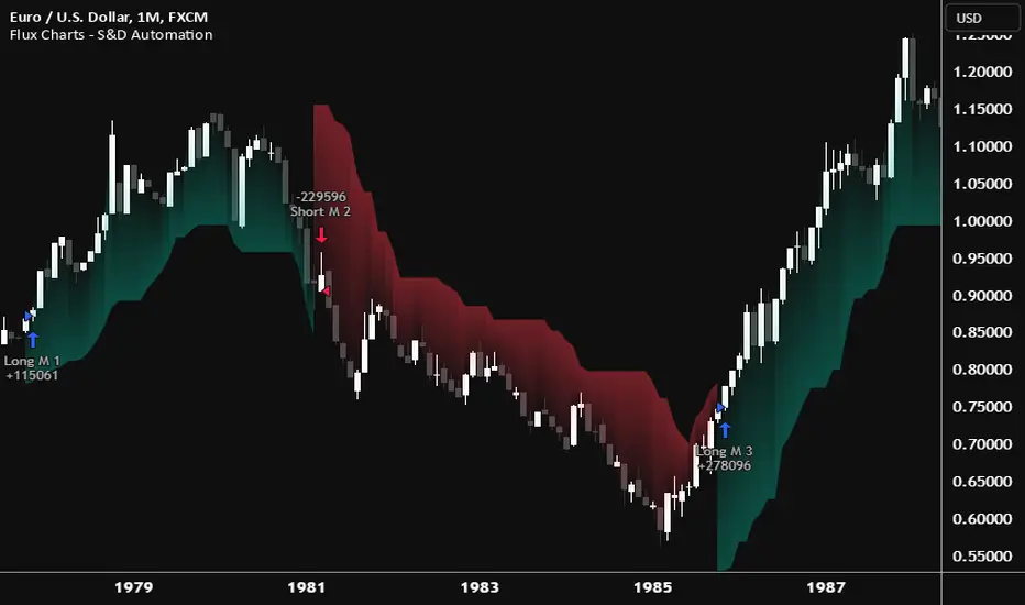
Flux Charts - S&D Automation💎 GENERAL OVERVIEW
The MTF Supply & Demand Zones (S&D) Automation is a powerful and versatile tool designed to help traders rigorously test their trading strategies against historical market data. With various advanced settings, traders can fine-tune their strategies, assess performance, and identify key improvements before deploying in live trading environments. This tool offers a wide range of configurable settings, explained within this write-up.
Features of the new S&D Automation:
Step By Step : Configure your strategy step by step, which will allow you to have OR & AND logic in your strategies.
Highly Configurable : Offers multiple parameters for fine-tuning trade entry and exit conditions.
Multi-Timeframe Analysis : Allows traders to analyze multiple timeframes simultaneously for enhanced accuracy.
Provides advanced stop-loss, take-profit, and break-even settings.
Incorporates Supply & Demand Zone conditions, with settings like Sensitivity, Zone Invalidation, Minimum Zone Width & Minimum Zone Length settings for refined strategy execution.
🚩 UNIQUENESS
The S&D Automation stands out from conventional backtesting tools due to its unparalleled flexibility, precision, and advanced trading logic integration. Key factors that make it unique include:
✅ Comprehensive Strategy Customization – Unlike traditional backtesters that offer basic entry and exit conditions, S&D Automation provides a highly detailed parameter set, allowing traders to fine-tune their strategies with precision.
✅ Multi-Timeframe Supply & Demand Zones – This is the first-ever tool that allows traders to backtest Supply & Demand zones on multiple timeframes.
✅ Customizable Take-Profit Conditions – Offers various methods to set take-profit exits, including using core features from Supply & Demand Zones, and fixed exits like ATR, % change or price change, enabling traders to tailor their exit strategies to specific market behaviors.
✅ Customizable Stop-Loss Conditions – Provides several ways to set up stop losses, including using concepts from Supply & Demand Zones and trailing stops or fixed exits like ATR, % change or price change, allowing for dynamic risk management tailored to individual strategies.
✅ Integration of External Indicators – Allows the inclusion of other indicators or data sources from TradingView for creating strategy conditions, enabling traders to enhance their strategies with additional insights and data points.
By integrating these advanced features, S&D Automation ensures that traders can rigorously test and optimize their strategies with great accuracy and efficiency.
📌 HOW DOES IT WORK ?
The first setting you will want to set it the pyramiding setting. This setting controls the number of simultaneous trades in the same direction allowed in the strategy. For example, if you set it to 1, only one trade can be active in any time, and the second trade will not be entered unless the first one is exited. If it is set to 2, the script will handle both of them at the same time. Note that you should enter the same value to this pyramiding setting, and the pyramiding setting in the "Properties" tab of the script for this to work.
You can enable and set a backtesting window that will limit the entries to between the start date & end date.
Then, you can enter your desired settings for Supply & Demand Zones. You can also enable and set up to 3 timeframes, which you can use later on when customizing your strategies enter / exit conditions.
Entry Conditions
From the "Long Conditions" or the "Short Conditions" groups, you can set your position entry conditions. For settings like "initial capital" or "order size", you can open the "Properties" tab, where these are handled.
The S&D Automation can use the following conditions for entry conditions :
1. Demand Zone
Detection: Triggered when a Demand Zone forms or is detected
Retest: Triggered when price retests a Demand Zone. A retest is confirmed when a candle enters a Demand Zone and closes outside of it.
2nd Retest: Triggered when price retests a Demand Zone for the second time. A retest is confirmed when a candle enters a Demand Zone and closes outside of it.
3rd Retest: Triggered when price retests a Demand Zone for the third time. A retest is confirmed when a candle enters a Demand Zone and closes outside of it.
Retracement: Triggered when price touches a Demand Zone
Break: Triggered when a Demand Zone is invalidated by candle close or wick, depending on the user's input.
2. Supply Zone
Detection: Triggered when a Supply Zone forms or is detected
Retest: Triggered when price retests a Supply Zone. A retest is confirmed when a candle enters a Supply Zone and closes outside of it.
2nd Retest: Triggered when price retests a Supply Zone for the second time. A retest is confirmed when a candle enters a Supply Zone and closes outside of it.
3rd Retest: Triggered when price retests a Supply Zone for the third time. A retest is confirmed when a candle enters a Supply Zone and closes outside of it.
Retracement: Triggered when price touches a Supply Zone
Break: Triggered when a Supply Zone is invalidated by candle close or wick, depending on the user's input.
3. Any Zone
Detection: Triggered when any Supply or Demand Zone forms or is detected
Retest: Triggered when price retests any Supply or Demand Zone. A retest is confirmed when a candle enters any Supply or Demand Zone and closes outside of it.
2nd Retest: Triggered when price retests any Supply or Demand Zone for the second time. A retest is confirmed when a candle enters any Supply or Demand Zone and closes outside of it.
3rd Retest: Triggered when price retests any Supply or Demand Zone for the third time. A retest is confirmed when a candle enters any Supply or Demand Zone and closes outside of it.
Retracement: Triggered when price touches any Supply or Demand Zone
Break: Triggered when any Supply or Demand Zone is invalidated by candle close or wick, depending on the user's input.
🕒 TIMEFRAME CONDITIONS
The S&D Automation supports Multi-Timeframe (MTF) features, just like the Supply & Demand indicator. When setting an entry condition, you can also choose the timeframe.
To set up MTF conditions, navigate to the 'Timeframes' section in the settings, select your desired timeframes, and enable them. You can choose up to three timeframes.
Once you've selected your timeframes, you can use them in your strategy. When setting long and short entry/exit conditions, you can choose from Timeframe 1, Timeframe 2, or Timeframe 3.
External Conditions
Users can use external indicators on the chart to set entry conditions.
The second dropdown in the external condition settings allows you to choose a conditional operator to compare external outputs. Available options include:
Less Than or Equal To: <=
Less Than: <
Equal To: =
Greater Than: >
Greater Than or Equal To: >=
The position entry conditions work like this ;
Each side has 5 S&D Zone conditions and 1 Source condition. Each condition can be enabled or disabled using the checkbox on the left side of them.
The next selection is the alert type, which you can select between "Detection", "Retest", "Retracement" or "Break".
You can select which timeframe this condition should work on from Timeframe 1, 2, or 3. If you select "Any Timeframe", the condition will work for all timeframes.
Lastly select the step of this condition from 1 to 6.
The Source Condition
The last condition on each side is a source condition that is different from the others. Using this condition, you can create your own logic using other indicators' outputs on your chart. For example, suppose that you have an EMA indicator in your chart. You can have the source condition to something like "EMA > high".
The Step System
Each condition has a step number, and conditions are in topological order based on them.
The conditions are executed step by step. This means the condition with step 2 cannot be executed before the condition with step 1 is executed.
Conditions with the same step numbers have "OR" logic. This means that if you have 2 conditions with step 3, the condition with step 4 can trigger after only one of the step 3 conditions is executed.
➕ OTHER ENTRY FEATURES
The S&D Automation allows traders to choose when to execute trades and when not to execute trades.
1. Only Take Trades
This setting lets users specify the time period when their strategy can open or execute trades.
2. Don't Take Trades
This setting lets users specify time periods when their strategy can't open or execute trades.
↩️ EXIT CONDITIONS
1. Exit on Opposite Signal
When enabled, a long position will close when short entry conditions are met, and a short position will close when long entry conditions are met.
2. Exit on Session End
When enabled, positions will be closed at the end of the trading session.
📈 TAKE PROFIT CONDITIONS
There are several methods available for setting take profit exits and conditions.
1. Entry Condition TP
Users can use entry conditions as triggers for take-profit exits. This setting can be found under the long and short exit conditions.
2. Fixed TP
Users can set a fixed TP for exits. This setting can be found under the long and short exit conditions. Users can choose between the following:
Price: This method triggers a TP exit when price reaches a specified level. For example, if you set the Price TP to 10 and buy NASDAQ:TSLA at $190, the trade will automatically exit when the price reaches $200 ($190 + $10).
Ticks: This method triggers a TP exit when price moves a specified number of ticks.
Percentage (%): This method triggers a TP exit when price moves a specified percentage.
ATR: This method triggers a TP exit based on a specified multiple of the Average True Range (ATR).
📉 STOP LOSS CONDITIONS
There are several methods available for setting stop-loss exits and conditions.
1. Entry Condition SL
Users can use entry conditions as triggers for stop-loss exits. This setting can be found under the long and short exit conditions.
2. Fixed SL
Users can set a fixed SL for exits. This setting can be found under the long and short exit conditions. Users can choose between the following:
Price: This method triggers a SL exit when price reaches a specified level. For example, if you set the Price SL to 10 and buy NASDAQ:TSLA at $200, the trade will automatically exit when the price reaches $190 ($200 - $10).
Ticks: This method triggers a SL exit when price moves a specified number of ticks.
Percentage (%): This method triggers a SL exit when price moves a specified percentage.
ATR: This method triggers a SL exit based on a specified multiple of the Average True Range (ATR).
3. Trailing Stop
An explanation & example for the trailing stop feature is present on the write-up within the next section.
Exit conditions have the same logic of constructing conditions like the entry ones. You can construct a Take-Profit Condition & a Stop-Loss Condition. Note that the Take-Profit condition will only work if the position is in profit, regardless of if it's triggered or not. The same applies for the Stop-Loss condition, meaning that it will only work if the position is in loss.
You can also set a Fixed TP & Fixed SL based on the price movement after the position is entered. You have options like "Price", "Ticks", "%", or "Average True Range". For example, you can set a Fixed TP like "5%", and the position will be entered once it moves 5% up in a long position.
Trailing Stop
For the Fixed SL, you also have a "Trailing" stop option, for which you can set its activation level as well. The Trailing stop activation level and its value are expressed in ticks. Check this scenario for an example :
We have a ticker with a tick value of $1. Our Trailing Stop is set to 10 ticks, and the activation level is set to 30 ticks.
We buy 1 contract when the price is $100.
When the price becomes $110, we are in $10 (10 ticks) profit and the trailing stop is now activated.
The current price our stop's on is $110 - $30 (30 ticks), which is the level of $80.
The trailing stop will only move if the price moves up the highest high the price has been after we entered the position.
Let's suppose that price moves up $40 right after our trailing stop is activated. The price will now be $150, and our trailing stop will sit on $150 - $30 (30 ticks) = $120.
If the price is down the $120 level, our stop loss will be triggered.
There is also a "Hard SL" option designed for a backup stop-loss when trailing stops are enabled. You can enable & set this option and if the price goes down before our trailing stop even activates, the position will be exited.
You can also move stop-loss to the break-even (entry price of the position) after a certain profit is achieved using the last setting of the exit conditions. Note that for this to work, you must have a Fixed SL set-up.
➕ OTHER EXIT FEATURES
1. Move Stop Loss to Breakeven
This setting allows the strategy to automatically move the SL to Breakeven (BE) when the position is in profit by a certain amount. Users can choose between the following:
Price: This method moves the SL to BE when price reaches a specified level.
Ticks: This method moves the SL to BE when price moves a specified number of ticks.
Percentage (%): This method moves the SL to BE when price moves a specified percentage.
ATR: This method moves the SL to BE when price moves a specified multiple of the Average True Range (ATR).
Example Entry Scenario
To give an example , check this scenario; out conditions are :
LONG CONDITIONS
Demand Zone Detection, Step 1
Supply Zone Retest, Step 2
Demand Zone Break, Step 2
open > close, Step 3
First, the strategy needs to detect a Demand Zone Detection in order to start working.
After it's detected, now it's looking for either a Supply Zone Retest, or a Demand Zone Break to proceed to the next step, the reason for this is that they both have the same step number.
After one of them is detected, the strategy will consistently check candlesticks for the condition open > close. If a bullish candlestick occurs, a long position will be entered.
⏰ ALERTS
This indicator uses TradingView's strategy alert system. All entries and exits will be sent as an alert if configured. It's possible to further customize these alerts to your liking. For more information check TradingView's strategy alert customization page : www.tradingview.com
⚙️ SETTINGS
1. Backtesting Settings
Pyramiding: Controls the number of simultaneous trades allowed in the strategy. This setting must have the same value that is entered on the script's properties tab on the settings pane.
Enable Custom Backtesting Period: Restricts backtesting to a specific date range.
Start & End Time Configuration: Define precise start and end dates for historical analysis.
2. General Configuration
Detection Method: There are two detection methods you can choose from for identifying Supply & Demand Zones. Both methods aim to identify key areas where price is likely to react, but they do so using different approaches. Traders can choose the method that aligns with their trading style and time horizon.
Sensitivity: The Sensitivity setting allows traders to adjust how aggressively the script identifies supply and demand zones when using the Momentum Detection Method. This setting directly impacts the threshold for detecting zones when using the momentum detection method.
Zone Invalidation: The Zone Invalidation setting determines how supply and demand zones are invalidated.
Wick -> A zone is invalidated if a candle’s wick goes below a demand zone or above a supply zone.
Close -> A zone is invalidated if a candle closes below a demand zone or above a supply zone.
Zone Visibility Range: The Zone Visibility Range setting controls how far from the current price supply and demand zones are displayed on the chart. It helps traders focus on relevant zones while avoiding clutter from distant or less impactful areas.
Minimum Zone Width: The Minimum Zone Width setting defines the smallest size a supply or demand zone must have to be displayed on the chart. It uses the Average True Range (ATR) as a reference to ensure zones are proportionate to current market volatility.
Minimum Zone Length: The Minimum Zone Length setting determines the minimum number of bars a supply or demand zone must span to be displayed on the chart. This setting helps filter out short-lived or insignificant zones, ensuring only meaningful areas of supply or demand are highlighted.
3. Multi-Timeframe Analysis
Enable Up to Three Timeframes: Select and analyze trades across multiple timeframes.
4. Entry Conditions for Long & Short Trades
Multiple Conditions (1-6): Configure up to six independent conditions per trade direction.
Condition Types: Options include Detection, Retest, 2nd Retest, 3rd Retest, Retracement, and Break.
Timeframe Specification: Choose between "Any Timeframe", "Timeframe 1", "Timeframe 2", or "Timeframe 3".
Trade Execution Filters: Restrict trades within specific trading sessions.
5. Exit Conditions for Long & Short Trades
Exit on Opposite Signal: Automatically exit trades upon opposite trade conditions.
Exit on Session End: Closes all positions at the end of the trading session.
Multiple Take-Profit (TP) and Stop-Loss (SL) Configurations:
TP/SL based on % move, ATR, Ticks, or Fixed Price.
Hard SL option for additional risk control.
Move SL to BE (Break Even) after a certain profit threshold.
Change Candle Color When 5 EMA Not ConnectedThis custom TradingView indicator changes the color of candlesticks to yellow whenever the 5-period Exponential Moving Average (EMA) is not "connected" to the current candle.
How It Works:
The 5 EMA is calculated based on the closing prices of the last 5 candles.
A candle is considered "not connected" to the EMA if:
The high and low of the current candle are both either above or below the 5 EMA, implying a significant deviation from the EMA.
When this condition is met, the candle color is changed to yellow to highlight this disconnection.
The default behavior of the script is to not display the 5 EMA line, keeping the chart uncluttered while focusing on the candlestick colors.
Usage:
This indicator is useful for scalping or short-term trading strategies, as it helps identify when the price has moved significantly away from the 5 EMA. A yellow candle could signal potential overextension or a possible reversal if the price is far from the EMA. Traders can use this as part of their risk management or entry/exit decision-making process.
Customization:
The indicator doesn't display the 5 EMA line, but you can modify the script to show it if needed by uncommenting the plot(ema5) line.
You can adjust the period of the EMA by modifying the ema5 period in the code, though the default setting is 5 periods.

Structure Pilot Vision [Wang Indicators]Built and refined with Dave Teaches, the HTF Vision Pro supercharges the trader, providing them with the tools to approach price with a layered analysis.
Providing the trader the instruments to put on the spotlight significant zones to anticipate price deliveries
HTF CANDLE VISION
Displays up to 3 series of HTF Candles
Shows candlesticks from a higher time frame (e.g., daily, 4-hour, weekly) on a lower time frame chart (e.g., 1-hour, 15-minute). This allows traders to simultaneously observe both short-term and long-term market dynamics.
Customizable Time Frames: Users can select any higher time frame to overlay on the current chart. Common time frames include daily, weekly, and monthly candles, but other custom time frames can also be used.
Color Coding: The HTF candles are color-coded for easy differentiation from the lower time frame candles. Users can customize colors to suit their preferences.
Open, High, Low, Close (OHLC) Representation: The indicator displays the full candlestick pattern for the chosen HTF, including the open, high, low, and close values. This helps traders easily identify key price levels and trends.
Settings :
Number of candles
Space between the chart and the HTF candles
Space between candles sets
Size : from Tiny (2x regular candle size) to Large (x8 regular candle size)
Space between candles
Colors of candles, borders and wicks
Incorporating a Higher Time Frame (HTF) candle into your Lower Time Frame (LTF) chart can be immensely beneficial for traders looking to enhance their analysis and decision-making process.
Use Cases for HTF Candles on LTF Charts:
Trend Confirmation:
Use Case: A trader might be looking at a 15-minute chart (LTF) but wants to confirm if the short-term trends align with the daily trend (HTF). Plotting a daily candle on the 15-minute chart helps visualize whether the short-term movements are part of a broader, longer-term trend.
Support and Resistance Identification:
Use Case: By plotting a weekly candle on a daily chart, traders can quickly identify levels that have acted as significant support or resistance in the past on the higher time frame, which might not be as visible or influential on the daily chart alone.
Entry and Exit Points Enhancement:
Use Case: When preparing to enter a trade based on a 1-hour chart, overlaying a 4-hour candle can provide insights into potential reversal points or continuation patterns that are more significant on the higher time frame, thus refining entry and exit strategies.
Volatility and Breakout Analysis:
Use Case: Seeing how a single HTF candle (like a monthly candle on a weekly chart) closes can give traders an idea of the market's volatility or the strength behind breakouts. A long wick on the HTF candle might suggest a rejected breakout or a potential reversal.
Risk Management:
Use Case: Using an HTF candle can help set more informed stop-loss levels. For instance, if a trader uses a 4-hour candle on a 1-hour chart, they might place their stop-loss just beyond the low of the HTF candle, assuming this represents a significant level of support or resistance.
Contextual Trading Decisions:
Use Case: For scalpers or day traders, understanding where the current price action sits within the context of a higher timeframe can lead to better decision-making. For instance, trading within an HTF consolidation range might suggest less aggressive moves, while being near the top or bottom of such a range might indicate potential for larger movements.
Market Sentiment Analysis:
Use Case: The color (red for bearish, green for bullish) and size of the HTF candle can give a quick visual cue of the market sentiment over that period, helping traders assess whether they are going with or against the broader market flow.
Swing Trading:
Use Case: Swing traders might plot a weekly candle on a daily chart to align their trades with the direction of the weekly trend, ensuring they're not fighting the broader market momentum.
Educational and Visual Reference:
Use Case: For educational purposes, having an HTF candle overlay can serve as a visual reminder for students or new traders about how price movements on different time frames can influence each other, aiding in teaching concepts like "the trend is your friend."
Wang use cases :
The way it is intended to be used is as follow
If you trade the 1 min chart and have a set of 5 min HTF candles plotted on your charts it could be used as follow :
As long as the 5 min keep providing close below the last 5 min candle if you're short you're safe ... if the 5 min candle stop closing below the last ones and start giving up-close you should consider closing your trade
Another use of HTF Candle is to find fractals responsible (up or down internal mouv before the breakout that creates a new zone). This fractal acts as supply and demand zone responsible for maintening the trend or for a reversal.
See examples below :
These fractals are interesting zones because they often cause the price to react, so following a flip in the fractal, you can take a short in bearish zones and a long in bullish zones. Fractals are easier to detect thanks to the HTF candles function, and allow you to enter positions with greater confidence. They can be used in the same way as the 70%, 50% and 30% interest zones, or they can be used simultaneously.
Use with zones :
▫️ VERTICAL BARS VISION ▫️
The vertical bars provide a view of market fractality: on a low time frame chart, they show the size of a candle in a higher time frame, and thus give a better understanding of the price fractality essential to the strategy we use.
Example :
For your information, when you modify data in the vertical bars or HTF candles parameters, the two are synchronized automatically.
The Vertical HTF Candle Closures Indicator is a simple yet effective tool that helps traders visually track the closing times of higher time frame (HTF) candles (such as 4H, 1H, 15M) on a lower time frame chart (e.g., 1-minute).
This feature plots vertical lines on the chart at the exact closure time of each selected HTF, allowing traders to quickly recognize key moments when the HTF candles close, or better yet when we trade above / below the last one and reverse ''sweepy sweepy'' .
Its more like a vertical and more micro visualisation than the HTF Candles.
Wang usage :
its a great tool to be able to reverse engineer what's in a HTFcandle precisely its a good combination with HTF candle projections to train the eyes of the traders about Whats is inside a candle that formed on the higher time frame
Limitation & know issues :
The chart may become cluttered with too many lines if multiple time frames are selected. Adjusting the line style or disabling certain time frames can help reduce visual noise.
On low time frame (<30s), some bar may notshow exactly on time (e.g : in 10sec timeframe, the 15min bar can be displayed at 01:15:10 instead of 01:15:00).
Because of the data provider and the interpreter of Trading View, if there is not data for a candle, Trading view just "skip" the candle. Sometime, those skip are on the candle that goes to 15min, 1 hour or 4 hour. As this is a Trading View issue. There is pretty much nothing we can do.
Some users may experience vertical bars at 1am, 5am, 9am ... instead of 0am, 4am, 8am ... That is because of the difference between the Timezone set on the chart and the timezone of the market they trade. Vertical bar will always refer to the symbol displayed
Buy&Sell Hollow CandlesThe Hollow Candles Script is a type of candlestick analysis script designed to highlight the following:
Purpose of the Script: This script provides the user with buy and sell signals based on candlesticks that show an upward or downward reversal.
Mechanism of the Script: When a hollow (unfilled) red candle appears, it signals a potential entry, provided that this candle is at a low point, following a series of red candles with higher volume than previous days. Similarly, it gives a sell signal when a green candle appears at a peak with high sell volume surpassing that of prior days. However, the appearance of these candles alone should not prompt an immediate buy or sell; you should wait for a confirming candle to validate the signal.
Sideways Movement Caution: If these signals appear during a sideways or flat trend, it is not advisable to proceed with buying or selling.
Chart Insights: The chart demonstrates certain buy and sell operations along with some non-ideal signals where decision-making should be based on fundamental analytical experience.

Dynamic Linear CandlesDynamic Linear Candles is a unique and versatile indicator that reimagines traditional candlestick patterns by integrating customizable moving averages directly into candle structures. This dynamic approach smooths the appearance of candlesticks to better highlight trends and suppress minor market noise, allowing traders to focus on essential price movements.
Key Features:
1. Dynamic Candle Smoothing: Choose between popular smoothing types (SMA, EMA, WMA, HMA) to apply directly to each candle’s Open, High, Low, and Close values. This adaptive smoothing reveals hidden trends by refining price action into simplified, flowing candles, ideal for spotting subtle changes in market sentiment.
2. Signal Line Overlay: The signal line provides an additional layer of trend confirmation. Select from SMA, EMA, WMA, or HMA smoothing to match your trading style. The line dynamically changes color based on the price’s relative position, helping traders quickly identify bullish or bearish shifts.
3. Enhanced Candle Visualization: Candles adjust in color and opacity based on bullish or bearish trends, providing immediate visual cues about market momentum. The customized color and opacity settings allow for clearer distinction, especially in noisy markets.
Why This Combination?
This script is more than just an aesthetic adjustment; it’s a purposeful combination of moving averages and candle smoothing designed to enhance readability and actionable insights. Traditional candles often suffer from excessive noise in volatile markets, and this mashup addresses that by creating a smooth, flowing chart that adapts to the underlying trend. The Signal Line adds confirmation, acting as a filter for potential entries and exits. Together, these elements serve as a concise toolset for traders aiming to capture trend-based opportunities with clarity and precision.

BTC 5 min SHBHilalimSB A Wedding Gift 🌙
What is HilalimSB🌙?
First of all, as mentioned in the title, HilalimSB is a wedding gift.
HilalimSB - Revealing the Secrets of the Trend
HilalimSB is a powerful indicator designed to help investors analyze market trends and optimize trading strategies. Designed to uncover the secrets at the heart of the trend, HilalimSB stands out with its unique features and impressive algorithm.
Hilalim Algorithm and Fixed ATR Value:
HilalimSB is equipped with a special algorithm called "Hilalim" to detect market trends. This algorithm can delve into the depths of price movements to determine the direction of the trend and provide users with the ability to predict future price movements. Additionally, HilalimSB uses its own fixed Average True Range (ATR) value. ATR is an indicator that measures price movement volatility and is often used to determine the strength of a trend. The fixed ATR value of HilalimSB has been tested over long periods and its reliability has been proven. This allows users to interpret the signals provided by the indicator more reliably.
ATR Calculation Steps
1.True Range Calculation:
+ The True Range (TR) is the greatest of the following three values:
1. Current high minus current low
2. Current high minus previous close (absolute value)
3. Current low minus previous close (absolute value)
2.Average True Range (ATR) Calculation:
-The initial ATR value is calculated as the average of the TR values over a specified period
(typically 14 periods).
-For subsequent periods, the ATR is calculated using the following formula:
ATRt=(ATRt−1×(n−1)+TRt)/n
Where:
+ ATRt is the ATR for the current period,
+ ATRt−1 is the ATR for the previous period,
+ TRt is the True Range for the current period,
+ n is the number of periods.
Pine Script to Calculate ATR with User-Defined Length and Multiplier
Here is the Pine Script code for calculating the ATR with user-defined X length and Y multiplier:
//@version=5
indicator("Custom ATR", overlay=false)
// User-defined inputs
X = input.int(14, minval=1, title="ATR Period (X)")
Y = input.float(1.0, title="ATR Multiplier (Y)")
// True Range calculation
TR1 = high - low
TR2 = math.abs(high - close )
TR3 = math.abs(low - close )
TR = math.max(TR1, math.max(TR2, TR3))
// ATR calculation
ATR = ta.rma(TR, X)
// Apply multiplier
customATR = ATR * Y
// Plot the ATR value
plot(customATR, title="Custom ATR", color=color.blue, linewidth=2)
This code can be added as a new Pine Script indicator in TradingView, allowing users to calculate and display the ATR on the chart according to their specified parameters.
HilalimSB's Distinction from Other ATR Indicators
HilalimSB emerges with its unique Average True Range (ATR) value, presenting itself to users. Equipped with a proprietary ATR algorithm, this indicator is released in a non-editable form for users. After meticulous testing across various instruments with predetermined period and multiplier values, it is made available for use.
ATR is acknowledged as a critical calculation tool in the financial sector. The ATR calculation process of HilalimSB is conducted as a result of various research efforts and concrete data-based computations. Therefore, the HilalimSB indicator is published with its proprietary ATR values, unavailable for modification.
The ATR period and multiplier values provided by HilalimSB constitute the fundamental logic of a trading strategy. This unique feature aids investors in making informed decisions.
Visual Aesthetics and Clear Charts:
HilalimSB provides a user-friendly interface with clear and impressive graphics. Trend changes are highlighted with vibrant colors and are visually easy to understand. You can choose colors based on eye comfort, allowing you to personalize your trading screen for a more enjoyable experience. While offering a flexible approach tailored to users' needs, HilalimSB also promises an aesthetic and professional experience.
Strong Signals and Buy/Sell Indicators:
After completing test operations, HilalimSB produces data at various time intervals. However, we would like to emphasize to users that based on our studies, it provides the best signals in 1-hour chart data. HilalimSB produces strong signals to identify trend reversals. Buy or sell points are clearly indicated, allowing users to develop and implement trading strategies based on these signals.
For example, let's imagine you wanted to open a position on BTC on 2023.11.02. You are aware that you need to calculate which of the buying or selling transactions would be more profitable. You need support from various indicators to open a position. Based on the analysis and calculations it has made from the data it contains, HilalimSB would have detected that the graph is more suitable for a selling position, and by producing a sell signal at the most ideal selling point at 08:00 on 2023.11.02 (UTC+3 Istanbul), it would have informed you of the direction the graph would follow, allowing you to benefit positively from a 2.56% decline.
Technology and Innovation:
HilalimSB aims to enhance the trading experience using the latest technology. With its innovative approach, it enables users to discover market opportunities and support their decisions. Thus, investors can make more informed and successful trades. Real-Time Data Analysis: HilalimSB analyzes market data in real-time and identifies updated trends instantly. This allows users to make more informed trading decisions by staying informed of the latest market developments. Continuous Update and Improvement: HilalimSB is constantly updated and improved. New features are added and existing ones are enhanced based on user feedback and market changes. Thus, HilalimSB always aims to provide the latest technology and the best user experience.
Social Order and Intrinsic Motivation:
Negative trends such as widespread illegal gambling and uncontrolled risk-taking can have adverse financial effects on society. The primary goal of HilalimSB is to counteract these negative trends by guiding and encouraging users with data-driven analysis and calculable investment systems. This allows investors to trade more consciously and safely.
What is BTC 5 min ☆SHB Strategy🌙?
BTC 5 min ☆SHB Strategy is a strategy supported by the HilalimSB algorithm created by the creator of HilalimSB. It automatically opens trades based on the data it receives, maintaining trades with its uniquely defined take profit and stop loss levels, and automatically closes trades when necessary. It stands out in the TradingView world with its unique take profit and stop loss markings. BTC 5 min ☆SHB Strategy is close to users' initiatives and is a strategy suitable for 5-minute trades and scalp operations developed on BTC.
What does the BTC 5 min ☆SHB Strategy target?
The primary goal of BTC 5 min ☆SHB Strategy is to close trades made by traders in short timeframes as profitably as possible and to determine the most effective trading points in low time periods, considering the commission rates of various brokerage firms. BTC 5 min ☆SHB Strategy is one of the rare profitable strategies released in short timeframes, with its useful interface, in addition to existing strategies in the markets. After extensive backtesting over a long period and achieving above-average success, BTC 5 min ☆SHB Strategy was decided to be released. Following the completion of test procedures under market conditions, it was presented to users with the unique visual effects of ☆SB.
BTC 5 min ☆SHB Strategy and Heikin Ashi
BTC 5 min ☆SHB Strategy produces data in Heikin-Ashi chart types, but since Heikin-Ashi chart types have their own calculation method, BTC 5 min ☆SHB Strategy has been published in a way that cannot produce data in this chart type due to BTC 5 min ☆SHB Strategy's ideology of appealing to all types of users, and any confusion that may arise is prevented in this way. Heikin-Ashi chart types, especially in short time intervals, carry significant risks considering the unique calculation methods involved. Thus, the possibility of being misled by the coder and causing financial losses has been completely eliminated. After the necessary conditions determined by the creator of BTC 5 min ☆SHB are met, BTC 5 min ☆SHB Heikin-Ashi will be shared exclusively with invited users only, upon request, to users who request an invitation.
Key Features:
+HilalimSHB Algorithm: This algorithm uses a dynamic ATR-based trend-following mechanism to identify the current market trend. The strategy detects trend reversals and takes positions accordingly.
+Heikin Ashi Compatibility: The strategy is optimized to work only with standard candlestick charts and automatically deactivates when Heikin Ashi charts are in use, preventing false signals.
+Advanced Chart Enhancements: The strategy offers clear graphical markers for buy/sell signals. Candlesticks are automatically colored based on trend direction, making market trends easier to follow.
Strategy Parameters:
+Take Profit (%): Defines the target price level for closing a position and automates profit-taking. The fixed value is set at 2%.
+Stop Loss (%): Specifies the stop-loss level to limit losses. The fixed value is set at 3%.
The shared image is a 5-minute chart of BTCUSDC.P with a fixed take profit value of 2% and a fixed stop loss value of 3%. The trades are opened with a commission rate of 0.063% set for the USDT trading pair on Binance.🌙
MidnightQuant Buy/Exit SignalsThe MidnightQuant Indicator is a sophisticated trend-following tool designed for traders seeking an edge in market analysis through a multi-symbol, multi-timeframe approach. Built on an enhanced Supertrend algorithm, this indicator goes beyond traditional trend-following methods by integrating advanced features that cater to both novice and experienced traders. Its unique design provides comprehensive market insights, empowering traders to make informed decisions with confidence.
Keep in mind that it was tested mainly with higher timeframes, 4H, 1D, 1W.
Overview:
MidnightQuant is specifically engineered to simplify the complexity of market analysis by monitoring and analyzing multiple currency pairs simultaneously. It combines trend detection, reversal signals, and a user-friendly dashboard to present a holistic view of market conditions. Whether you're trading a single asset or managing a portfolio, MidnightQuant delivers actionable insights in real-time.
Key Features:
Multi-Symbol Trend Analysis:
MidnightQuant's most distinguishing feature is its ability to track and analyze up to ten different currency pairs simultaneously. Unlike traditional indicators that focus on a single asset, this multi-symbol capability provides a broader view of market dynamics, allowing traders to identify correlations and divergences across various pairs. This is particularly useful for traders who want to confirm the strength of a trend across different markets before making a trading decision.
Enhanced Supertrend Algorithm:
At the core of MidnightQuant lies an optimized Supertrend algorithm that has been fine-tuned for both accuracy and responsiveness. The algorithm calculates trend directions by factoring in average true range (ATR) data, which helps in identifying significant price movements while filtering out market noise. This results in more reliable trend detection and fewer false signals, making it a powerful tool for trend-following strategies.
Intuitive Dashboard Display:
The MidnightQuant dashboard is designed to centralize critical information, making it accessible at a glance. It displays four key columns: Potential Reversals, Confirmed Reversals, Bullish Trends, and Bearish Trends. Each column provides a quick summary of the current market state for all tracked symbols, allowing traders to see where potential opportunities lie. This streamlined presentation reduces the need for constant chart monitoring and helps traders focus on the most promising setups.
Visual Signals and Candlestick Integration:
MidnightQuant enhances chart readability by incorporating visual signals directly on the price chart. Buy and sell signals are clearly marked at points where trend reversals are detected, providing immediate entry and exit cues. Additionally, the indicator color-codes candlesticks according to the current trend direction—purple for bullish and light lavender for bearish—enabling traders to instantly gauge market sentiment.
Customizable Alerts:
The indicator includes flexible alert conditions that can be customized according to your trading preferences. Alerts are triggered for trend direction changes, providing timely notifications for potential buy or sell opportunities. This feature is invaluable for traders who need to stay informed of market movements even when they are not actively monitoring their charts.
Trend Reversal Detection:
One of MidnightQuant's core functionalities is its ability to detect and signal trend reversals. The indicator monitors changes in the trend direction with precision, helping traders to identify potential turning points in the market. This feature is particularly useful for swing traders and those who aim to capitalize on shifts in market momentum.
Customizable Settings:
The indicator comes with various settings that allow traders to tailor it to their specific needs. From selecting which symbols to track to adjusting the sensitivity of the Supertrend algorithm, users have full control over how the indicator behaves. This customization ensures that MidnightQuant can be adapted to different trading styles and strategies.
How It Works:
MidnightQuant uses a proprietary calculation based on the Supertrend algorithm, which leverages ATR to dynamically adjust to market volatility. The indicator tracks the midpoint of each trading range and applies a factor that defines the threshold for trend changes. When the closing price crosses this threshold, a new trend is identified, and corresponding signals are generated.
The multi-symbol feature is powered by the request.security function, which allows MidnightQuant to pull in data from multiple symbols and timeframes. This data is then processed through the Supertrend algorithm to determine the trend direction for each symbol, which is subsequently displayed on the dashboard.
The indicator also includes a built-in dashboard that provides a summarized view of market conditions, including potential and confirmed reversals, as well as current trend directions. This dashboard updates in real-time, giving traders a continuously updated snapshot of market sentiment across multiple assets.
Use Cases:
Swing Traders: The trend reversal detection and real-time alerts help swing traders identify potential entry and exit points, making it easier to capitalize on market swings.

MFX Ultimate Scalper [Mohs Mayfair]MFX Ultimate Scalper is an all-in-one indicator that incorporates 5+ unique components designed for interoperability & confluence with one another to provide a powerful trend following & reversal detection experience.
Users can create various ways to utilize the indicator's features together such as looking for periods of price exhaustion in the market alongside strong reversal signals appearing or getting real-time divergence signals alongside a shift in volume with the volume overlay setting in the market to predict upcoming trends.
The indicator's confirmation feature integrates customizable moving averages and the Volume Weighted Average Price (VWAP), providing additional layers of insight. Traders can fine-tune moving averages to track trend reversals and retracements with precision, while the VWAP offers valuable insights into price and volume dynamics, aiding in the assessment of market sentiment and trends.
This indicator is described as an ”Ultimate Scalper” as it's made up of many different components that can create a systematic approach to analyzing markets alone, however, the indicator also can serve as a great secondary piece to a user's primary analysis.
⨭ FEATURES
Below we describe each component of MFX Ultimate Scalper in order of each's significance for the most confluent analysis possible.
➟ Heat Zones - indicating the relative intensity of price movement, with widening zones suggesting increased volatility and potential trading opportunities.
➟ Exhaustion Signals - Small triangles on the upper or lower heat band zones represent high frequency points that indicate possible reversals or a warning signal to upcoming larger reversal signals. Discerning instances of heightened buying or selling pressure, delineating zones of market saturation and depletion using the historical strength or weakness of a stock or market based on the closing prices of a recent trading period.
➟ Reversal Signals - Kalman filter and Hull trend indicators can reveal trend reversals by dynamically adapting to market conditions and providing timely signals based on smoothed price movements.
➟ Volume Overlay - Upon calculating the relative close of candles, this option allows a coloured overlay upon candles to help confirm volume changes in the market. When price of a closed candle is greater than then open price, the bar will print with a green overlay,
Generally, we recommend using these features in order from first to last, however it is always most productive to ensure you find further confluence alongside any signal that is generated using general market structure and analysis (such as drawing independent supply and demand zones for eg).
⨭ USAGE GUIDE
In the images below, we can see 3 points of interest to a user analyzing MFX Ultimate Scalper based on various different behaviors.
In the circled areas of interest price moves into a one of the heat zones and begins to print a small green or red triangle either above or below the candlestick structure - green = looking for buys and a possible bullish reversal & red = looking for sells and a possible bearish reversal.
As price begins to print these pre reversal points of exhaustion within these heat zones we can begin looking at the market.
This can be used independently or when wanting to perhaps increase the amount of confirmations we can look to apply the reversal confirmation setting, as per below:
What makes this signal particularly more of interest opposed to other reversal signals without the confirmation toggle applied that may not play out right away is the Kalman filter and Hull trend indicator begins to show a clear trend reversal. We can see that it may print the BUY or SELL label a few candles after the initial Small triangles in the upper or lower heat band zones however can be used as a more conservative point of trade entry.
This is a great example above showing how the momentum indicator that measures the magnitude of recent price changes to analyze overbought or oversold conditions (red and green triangles in the heat zone bands) can sometimes print multiple entries. We suggest that if you are looking to increase the accuracy of the signals we found moving to a higher time frame after more than 3 of these indicators have printed, helps.
It is a great indication that price may be looking to reverse and the pressure occurring and that the market could easily reverse in these conditions.
The candles that follow with the confirmation toggle setting means that you could move into a position a little later into the new trend reversal or retracement but also ensures that there is an extra level of confirmation that one is beginning or has begun.
The volume overlay setting is a fantastic tool to use when wanting to confirm your entries for trade and print a clear example in volume shift in the market - the greater the green candle, the greater the buying momentum. The greater the red candle, the greater the selling momentum,
This analysis combined gave us a further indication of a larger reversal which played out with no lag at all as all reversal signals are predictive separate from the Volume Overlay itself, which can be used as a further trend following approach alongside signals & custom hull trend alongside specific moving average confirmations.
In the image above we can see 3 possible setups and 3 different ways each using individual options.
Working left to right, the first setup adheres to:
➟PRICE IN THE BUY ZONE
➟GREEN BUY TRIANGLE REVERSAL
➟GREEN CANDLE VOLUME CHANGE
➟NO BLUE TREND LABEL CONFIRMATION
When scalping a position using the above signals we would aim for 10-15 pips which we can see here, with no drawdown was able to close and hit our suggested take profit within approximately an hour even though the confirmation trend reversal did not print on the chart
Setup two is another BUY signal and adheres to:
➟PRICE IN THE BUY ZONE
➟GREEN BUY TRIANGLE PRINTED
➟BLUE CONFIRMATION PRINTED
➟WAIT FOR THE NEXT CANDLE TO CLOSE
➟TAKE A BUY
This time we have a clear price exhaustion with the candles closing within the heat zones, just the first buy zone. The confirmation reversal trend prints soon after and although we do not have any confirmation on the volume change overlay we can infer that given they were printed very shortly prior to this confirmation and the preliminary Scalpers green triangles had also shown, the trade confirmation is still valid.
You could perhaps place your stop loss at the base of the reversal blue buy label and then set a 1:2 ratio or perhaps simply stick to the 10-15 pips.
With our final example the confirmations are:
➟PRICE IN THE SELL ZONE
➟RED SELL TRIANGLE REVERSAL
➟THE RED TREND CONFIRMATION LABEL
WAS TOO MANY CANDLES AWAY
TO CONSIDER THE TRADE
The volume indicator printing over an engulfing bearish candle whilst also being within our heat zone exhaustion sell area shows a shift in volume and momentum - as calculated, the open price of the candle is greater than that of the closed previous one thus showing RED overlay of the candle.
In order to better experience the volume overlay option we suggest changing your settings on tradingview by clicking the chart screen settings > symbol and changing the body and wicks of the candlesticks to grey.
We can potentially determine at certain points when to 'filter out' reversal signals or to just consider them merely indications of local tops/bottoms opposed to significant tops/bottoms.
Analyzing the reversal confirmation option is useful to consider a trend potentially coming to an end. We recommend studying the outlined chart above & the list of indications at each shaded area to develop a deep understanding of how to navigate varying market conditions & spot various points of confluence during reversals.
⨭CONCLUSION & ACCESS
This indicator is an extremely comprehensive approach to a variety of volume and volatility based tools predominantly that allows users to further develop a systematic approach to trading and can be paired alongside other forms of technical analysis.
Although we believe this indicator to be useful, it's critical to understand that past performance is not necessarily indicative of future results and there are many more factors that go into being a profitable trader.
You can see the Author's instructions below to get instant access to MFX Ultimate Scalper by Mohs Mayfair

TradesAI - Elite (Premium)This is an all-inclusive, premium indicator that focuses mainly on price action analysis, a form of looking at raw price data and market structure to analyze and capture areas of interest where price could react.
This indicator is a perfect trading companion that saves you a lot of time in trading price action. Some of the popular methods that use price action analysis are "Smart Money Concepts (SMC)", "Inner Circle Trader (ICT)", and "Institutional Trading".
🔶 POWERFUL TOOLS
The indicator combines three main tools as a trading suite:
Trendlines
Market Structure Breakouts (MSB)
Order Blocks (OBs) and Reversal Order Blocks (ROBs)
These 3 main tools are interconnected together. Below we go over each, and then explain how and why they are brought in together. Please also note that the indicator's settings have tooltips next to most of them, with more detailed information.
🔶 TRENDLINES
This indicator automatically draws the most relevant Trendlines from pivot high/pivot low (based on the defined settings) as origins, while keeping track of candle closes across these Trendlines to adjust or invalidate accordingly.
The indicator will draw all possible Trendlines up to the maximum allowed by TradingView's PineScript. It uses a bullish pivot high candle to draw downtrends, and a bearish pivot low candle to draw uptrends. The algorithm will draw the most suitable active Trendlines from those origin points.
The indicator takes the origin point as the first point of the Trendline, then starts looking for the immediate next same-type candle (bullish to bullish or bearish to bearish), to draw the Trendline between the origin candle and this newer candle.
An uptrend is a ray connecting two bearish candles, as long as the second candle has a Low higher than the low of the origin (first) candle. A downtrend is a ray connecting two bullish candles, as long as the second candle has a high lower than the high of the origin (first) candle.
Upon drawing, the indicator then starts monitoring and adjusting this Trendline, by keeping the origin always the same but changing the second point. The goal is to keep reducing the slope of the Trendline till it is at 0 degrees (horizontal line). That then makes the Trendline "final". Note that you have the option to keep all Trendlines or just show the final, in the settings.
So, the algorithm has three states for the Trendlines:
Initial: not tested, meaning price hasn't yet broken through it and closed a candle beyond it, to cause a re-adjustment of this Trendline.
Broken: a candle hard closed (opened and closed) across it but still, the direction of the trend is maintained with a new Trendline from the same origin – could be replaced (or kept on the chart as a "backside", which is what we call a broken Trendline to be tested from the opposite side) with a new Trendline from the same origin, to the newest candle that caused the break to happen, as then it becomes the new second point of that Trendline.
Final: a candle hard closed (opened and closed) across it and can't draw a new Trendline from the same origin maintaining the direction of the trend (so an uptrend becomes a downtrend or a downtrend becomes an uptrend at this point, which is not allowed). This marks the end of the Trendline adjustment for that origin.
To summarize the Trendlines algorithm, imagine starting from a candle and drawing the Trendline, then keep re-adjusting it to make its slope less and less, till it becomes a horizontal line. That's the final state.
Here is a step-by-step scenario to demonstrate the algorithm:
Notice how first an Uptrend (green ray) is drawn between point A origin pivot (picked by our smart algorithm) and point B, both marked by green arrows:
Uptrend then turned into backside (where it flips from diagonal support to resistance where liquidity potentially resides):
Then a new uptrend is drawn from the same point A origin pivot to a new point B matching the filters in settings.
Finally, it turns also into a backside and is considered final because no more uptrends could be drawn from the same point A origin point.
Unlike traditional Trendline tools, this indicator takes into account numerous rules for each candlestick to determine valid support and resistance levels, which act as liquidity zones.
Unlike conventional Trendline tools, this indicator allows the user to define the pivot point left and right length to capture the proper ones as origins, then automatically recognizes and extends lines from them as liquidity zones where a reaction is expected. Moreover, the indicator monitors those Trendlines in real-time to switch them from buying to selling zones, and vice-versa, as the price structure changes.
Features
Log vs. Linear scale switch to show different Trendlines accordingly. When updating the Trendlines, or deciding whether Touches/Hard Closes are met, it makes a difference.
Ability to show all forms of Trendlines, final Trendlines or just backside Trendlines.
Why is it used?
For experienced traders, it offers the advantage of time efficiency, while new traders can bypass the steep learning curve of drawing Trendlines manually, which could practically be drawn between any two candlesticks on the chart (many variations).
🔶 MARKET STRUCTURE BREAKOUT (MSB)
The Market Structure Breakouts (MSB) tool is a trading tool that detects specific patterns on trading charts and provides ‘take profit’ regions based on the extended direction of the identified pattern. A breakout is a potential trading opportunity that presents itself when an asset's price moves away from a zone of accumulation (i.e. above a resistance level or below a support level) on increasing volume. The most famous form of market structure breakout is double/triple tops/bottoms, or what is referred to as W or M breakouts.
See this example below of how our MSB smart algorithm picked the local bottom of INDEX:BTCUSD
Here is a step-by-step scenario to demonstrate the algorithm:
First, the algorithm picks the pivot points according to our Machine Learning (ML) model, which uses Average True Range (ATR) and Moving Averages of various types to decide. It will then signal a Market Structure Breakout (MSB):
You may either short (sell) this MSB towards the targets (dotted green lines) and/or buy (long) at the targets (dotted green lines). Usually, these targets provide scalp moves, according to our model, but they may also act as strong reversal points on the chart.
Unlike standard indicators, the MSB tool identifies patterns that may not appear in every time frame due to specific conditions that need to be met, including Average True Range (ATR) and Moving Averages at the time of creation. Once these patterns are identified, the tool gives ‘take profit’ regions in the direction of the trading pattern and even allows for trading in the opposite direction (contrarian/counter-trend scalps) once those regions are reached. A confirmed breakout has the potential to drive the price to these specific targets, calculated based on our Machine Learning (ML) model. The Targets are the measured moves placed from the breakout point.
Features
Log vs. Linear scale switch to show different MSBs accordingly based on the ratios.
Detects trading patterns with specific conditions.
Ability to specify how sensitive the pivot points are for capturing market structure breakouts.
Provides take profit regions in the extended direction of the pattern.
Allows for versatile trading styles by permitting trades in the opposite direction (contrarian or counter-trend) once the take profit region is reached.
Highlights 2 levels of interest for potential trade initiation (or as targets of the MSB move).
🔶 ORDER BLOCK (OB) and REVERSAL ORDER BLOCK (ROB)
Before diving deeper into OBs and ROBs, you may consider the following chart for a general understanding of price ladders, and how they break. This is a bearish price ladder leaving Lower Lows and Lower Highs after an initial Low and High (L->H->LL->LH). Bullish ladders are the opposite (H->L->HH->HL).
In this bearish ladder case, notice the numbers representing the highs made (being lower). While this is a clean structure, markets don't always create such clean ladders, but you may switch to a higher timeframe to see it in a clearer form (usually, you will be able to spot it there).
In SMC or ICT concepts, the "Break Of Structure (BOS)" is pretty much creating a new lower low (LL) for the bearish ladder (and the creation of a higher high (HH) for the bullish ladder). By doing so, markets are grabbing liquidity below these levels and could either continue the ladder or stop/flip it. This gives you the context of how the ladder prints.
Price usually ends the ladder with a "Change of Character (CHoCH)", which represents a BOS (to grab liquidity) followed by an aggressive move in the opposite direction, which could lead the market to close the gaps and balance out. It is considered a good practice to then target liquidity in the opposite direction when a CHoCH happens, meaning for a bearish ladder you may target the pivots marked by 3, 2 and 1 at the top (start of the ladder).
Now we move to Order Blocks (OBs) and Reversal Order Blocks (ROBs). Think of them as sniper zones or micro ladders inside the bigger ladder/structure.
Order Blocks are usually used as zones of support and resistance on a trading chart where liquidity is present, or what some traders call "potential institutional interest zones". Order Blocks can be observed at the beginning of these strong moves of BOS or the CHoCH, leaving behind a zone (one or more candles) to be revisited later to balance the market. Therefore, these are interesting levels to place Limit/Market orders (sell the peaks or buy the valleys) instead of doing so at the swing highs or swing lows of the ladder (where BOS or CHoCH happened). The idea here is that the price could go deep into the ladder's step (peak or valley), and by doing so, it usually goes to these zones.
A bullish Order Block (Valley-OB) is the last bearish candle of a downtrend before a sequence of bullish candles (thus forming a "Valley"). A bearish Order Block (Peak-OB) is the last bullish candle of an uptrend before a sequence of bearish candles (thus forming a "Peak"). Our indicator captures the full range zones of the OB meaning not only the last candle but the sequence of same-type candles immediately next to it, which creates a zone, thus the name "OB/ROB Zone". Not only does the tool mark those levels on the chart, but it also has a smart tracking algorithm to remove the appropriate levels dynamically. It will monitor, candle by candle, what is happening to all the OBs/ROBs, and update them according to how they are being tested/visited (eg. weak testing being a touch, and strong testing being a touch of the same colour candle).
Bullish Valley-OB:
Bearish Peak-OB:
The indicator follows our concept of "Zone Activation" to determine whether to mark zones with dashed or solid lines.
If we take a bearish Peak-OB as an example, notice how it first gets drawn with a dashed red line (as the algorithm monitors how far the price moved away from the zone):
As price moves away (distance based on our Machin Learning (ML) model), it turns into solid lines:
Some people prefer to enter market orders or limit (pending) orders close to the zone, while others wait for it to hit. You may wait for these zones to turn into solid lines (meaning that the price made a decent move away from it before revisiting it). It depends on your trading strategy.
When Order Block (OB) zones break instead of holding the ladder, they turn into what we call Reversal Order Blocks (ROB); our algorithm of flipping these zones where price could react from the other side of the OB. Our algorithm monitor and highlight the most suitable ones to trade, based on +30 conditions and variables by our Machine Learning (ML) models. Examples of ROBs in the SMC or ICT trading community are a "Breaker Block", a "Mitigation Block" or a "Unicorn Setup". However, our algorithm filters the zones based on many factors such as ratios of price movement before, inside and after these zones, along with many other factors.
The algorithm monitors the ratios of how price moved into and away from the OB/ROB, as well as the type of move happening, to then filter the ones that are considered of high probability to break/not do a reaction.
A bullish Valley-OB (green) turns into a bearish Valley-ROB (neon red) where you may short (sell), while a bearish Peak-OB (red) turns into a bullish Peak-ROB (neon green) where you may long (buy).
Example of a bullish Valley-OB that turned into a bearish Valley-ROB:
Features
Log vs. Linear scale switch to show OBs/ROBs accordingly based on the ratios and the price action around these zones (before and after creation).
Uses our Machine Learning (ML) model to determine relevant Order Blocks (OBs) to show or hide based on price action.
Considers distribution and accumulation candles to find relevant Order Blocks.
Various types of triggers to mark those Order Blocks and their zones: breakout, close, hard close (open and close) or full close (low, high, open and close).
Monitors the 1:1 expansion of price from key areas of interest, which would change the importance of the zones through our concept of “Zone Activation”.
Allows for customization in the settings to display different types of Order Blocks (e.g., tested or untested).
Marking and invalidating levels based on many variables, including single or multiple candle zones, touching/closing beyond specific levels, weak/strong testing criteria, price tolerance % (near a level), and many more.
Provides color-coded visual representation for easier interpretation.
Why is it used?
Order Blocks (OB) and Reversal Order Blocks (ROB) represent the building blocks of price ladders, in conjunction with Swing Highs and Swing Lows. By identifying where liquidity is potentially present, they become common targets for big market players. Additionally, they provide clear invalidation points based on various types of candle closes, such as hard closes or simply a candle close.
One strategy that could be used is to open positions at these OB or ROB Levels as long as the chart maintains the trend (ladder), for a potentially higher win rate (or against it for a quick scalp). Be mindful of the breaking of a ladder or the building of a new one. A ladder breaks with a hard close (open and close) of a candle across the closest two levels; a ladder builds by not breaking back down across the levels it has tested. By definition, strong ladders will have a few untested levels and come back to wick them but still retain the structure of the laddering direction (trending with Lower Lows + Lower Highs or Higher Lows + Higher Highs).
🔶 COMBINING ALL TOOLS
In summary, Trendlines could be great tools to give you a general context of whether the price is laddering up or down. Once you spot the ladder, your goal is to either trade in its direction (not to go against the trend) or to counter-trend trade (contrarian). To do so, you could use the MSB tool to spot these BOS/CHoCH. And to give you more precise entries, you may rely on the OB/ROB zones which usually mesh over the ladder, to provide a sniper entry!
🔶 RISK DISCLAIMER
Trading is risky, and most day traders lose money. The risk of loss in trading can be substantial. Decisions to buy, sell, hold or trade in securities, commodities and other investments involve risk and are best made based on the advice of qualified financial professionals. Past performance does not guarantee future results. All content is to be considered hypothetical, selected after the fact, in order to demonstrate our product and should not be construed as financial advice. You should therefore carefully consider whether such trading is suitable for you in light of your financial condition.
Trendlines [TradesAI]What is it?
This indicator allows the user to pick any Candle (preferably a Pivot, for better results) to draw the most relevant Trendlines from it as Origin, while keeping track of candle closes across these Trendlines to adjust or invalidate accordingly.
It allows for up to 2 Origins to be picked on chart. Remember to pick a Bullish candle to draw Downtrends, and a Bearish candle to draw Uptrends. The algorithm will draw the most suitable Active Trendlines from those Origin points.
How does it do it?
The indicator takes the Origin point as the first point of the Trendline, then starts looking for the immediate next same-type candle (Bullish to Bullish or Bearish to Bearish), to draw the Trendline between the Origin candle and this newer candle.
An Uptrend is a ray connecting two Bearish candles, as long as the second candle has a Low higher than the Low of the Origin (first) candle. A Downtrend is a ray connecting two Bullish candles, as long as the second candle has a High lower than the High of the Origin (first) candle.
Upon drawing, the indicator then starts monitoring and adjusting this Trendline, by keeping the Origin always the same, but changing the second point. The goal is to keep reducing the slope of the Trendline till it is at 0 degrees (horizontal line). That then makes the Trendline "Final".
So, the algorithm has 3 States for the Trendlines:
Initial: not tested, meaning price hasn't yet broken through it and closed a candle beyond it, to cause a re-adjustment of this Trendline.
Broken: candle Hard Closed (its Open and Close) across it but still the direction of the Trend is maintained with a new Trendline from the same Origin – could be replaced (or kept on chart as "Backside", which is what we call a Broken Trendline to be tested from the opposite side) with a new Trendline from the same Origin, to the newest candle that caused the break to happen, as then it becomes the new second point of that trendline.
Final: candle Hard Closed across it and can't draw a new Trendline from the same Origin maintaining the direction of the Trend (so an uptrend becomes a downtrend or a downtrend becomes an uptrend at this point, which is not allowed). This marks the end of Trendline adjustment for that Origin.
To summarize the algorithm, imagine starting from a candle and drawing the trendline, then keep re-adjusting it to make its slope less and less, till it becomes a horizontal line. That's the final state.
Unlike traditional trendline tools, this indicator takes into account numerous rules for each candlestick to determine valid support and resistance levels, which act as Liquidity Zones.
What does it do differently?
Unlike conventional trendline tools, this indicator allows the user to pick the Pivot point as Origin, then automatically recognizes and extends lines from them as Liquidity Zones where a reaction is expected. Moreover, the indicator monitors those trendlines in real-time to switch them from Buying to Selling zones, and vice-versa, as price structure changes.
Features
Log vs. Linear scale switch to show different trendlines accordingly. When updating the Trendlines, or deciding whether Touches/Hard Closes are met, it makes a difference.
Ability to show all forms of Trendlines, Final Trendlines or just Backside Trendlines.
Why is it used?
For experienced traders, it offers the advantage of time-efficiency, while new traders can bypass the steep learning curve of drawing trendlines manually, which could practically be drawn between any two candlesticks on the chart (unlimited variations).
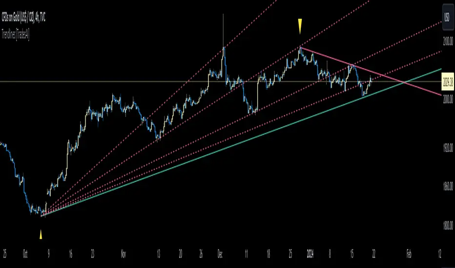
Impulse-Correction MappingAbout
Impulse-Correction Mapper is an indicator of impulses and corrections (valid pullbacks).
Consecutive candlesticks moving in the same direction means an impulse, and a pullback below/above the previous candlestick means a correction.
This way you can identify IDM zones and find significant POIs on the chart.
Below, you can observe valid pullbacks :
And now, the invalid pullbacks :
The impulse and correction shows us the strength of the bulls or bears and also helps us to identify important liquidity areas, including IDMs.
Each high and low of the impulse-correction serves as liquidity for the institutional algorithmic bots.
The indicator can be a self-sufficient tool for market analysis and identification of liquidity swaps. If the price made a liquidity sweep - it can serve as a signal for a reversal to the nearest liquidity area.
When evaluating the daily movement, you can focus on the impulse-correction indicator: if there is a correction - it is very likely that the price will turn around and you can look for a confirmed entry point to the LTF.
The momentum-correction indicator is the basis of the entire Advanced SMC strategy - it is the foundation for determining the market structure.
CongestionautilusCongestions are formations in which a series of candlesticks opens and closes within the lows and highs of the candlestick that generated the congestion.
To be considered as such, congestion must have the main candle and at least three following candles with the body contained in the range.
Congestion is considered closed when a candle closes outside the indicated range.
Congestions, even if closed, can still act as points of interest in future movements, they are zones of interest for the price that can be re-crossed or act as support or resistance.
Using them can help in reading the dynamics of the price.
This indicator helps to quickly identify congestion and projects the area of the last congestion into the future.
